In Australia, the unemployment rate for neurodivergent adults hovers around 34%, nearly eight times the national average. Clearly, there is a stigma around hiring neurodivergent people and it stems from a fear of the unknown. One not-for-profit company, Australian Spatial Analytics (ASA), is working to fix that.
ASA was established in 2020 to increase workforce participation among young neurodivergent adults by training them in big data for the geospatial and digital engineering fields, then placing them in corporate and government sectors. At ASA, we leverage these employees’ cognitive strengths — attention to detail, pattern recognition, laser-sharp focus, and innovative problem-solving skills, all of which are invaluable in these fields.
Matching Interests to Jobs
About 80% of ASA’s staff identify as neurodivergent, which includes ADHD, autism, dyslexia, dyscalculia, and dyspraxia. ASA’s recruitment process goes beyond conventional practices; it assesses potential candidates based on transferable skills, hobbies, and interests, rather than relying on formal qualifications or previous experience. Many of the new data analysts we have successfully placed in jobs are in paid positions for the first time.
Yet the analysts’ value to their employers is without questions. Executives have praised the ASA-trained analysts who have joined their companies, citing their work ethic, dedication, and problem-solving skills.
Preparing for Job Interviews
During the job-seeking process, ASA provides candidates with sample interview questions 48 hours in advance to help minimize anxiety. Once hired, employees receive comprehensive and paid on-the-job training that includes soft skills like communication and self-advocacy coaching.
Based on our experience, creating a supportive and productive environment requires only minor accommodations. Flexible start and finish times, predictable routines, the option for hybrid work to reduce commuting stress, adjustable lighting, noise-canceling headphones, and direct communication make a profound difference, not only for neurodivergent people, but for everyone in the workplace.
To help change paradigms, ASA offers a Neurodiversity in the Workplace Training Program for other organizations. It covers neurodiversity awareness, plus effective strategies for communication, managing anxiety in the work environment, leading neurodiverse teams, and promoting neurodivergent inclusion.
Ultimately, our goal is to put ourselves out of business.
Karly Ischenko is a Human Resources Business Partner at Australian Spatial Analytics.
ADDITUDE IS HUMAN
Artificial intelligence does not create or edit any written content published by ADDitude. Our editorial team is 100% human, and our mission is simple: listen to and serve our readers with hand-crafted, expert-informed resources. To support ADDitude, please consider subscribing. Your readership and support help make our commitment possible. Thank you.
AI was supposed to replace designers. Instead, design jobs are growing — and industry leaders say AI is looking less like the new creative director and more like the ridiculously fast intern...
The world is set to miss its 2030 conservation goals as finance and action have fallen short, leaders recognized at a UN biodiversity summit in Armenia’s capital, where they agreed to step up efforts after a final overnight session.
Representatives from almost 200 countries gathered in Yerevan over the past two weeks to review progress on a landmark agreement set four years ago to protect about a third of the world’s land and seas by 2030.
The COP17 talks on biodiversity concluded on Saturday with a recognition that conservation efforts were so far too slow to realistically achieve the goals of the 2022 Kunming-Montreal Global Biodiversity Framework.
The Seoul-based artist transforms dreams submitted by people around the world into shimmering animations filled with pearls and sequins.
"A dream is something we've experienced, yet it can be difficult to explain, and even the memory of it changes after we wake up," says Moho, who has built an entire practice around that slipperiness.
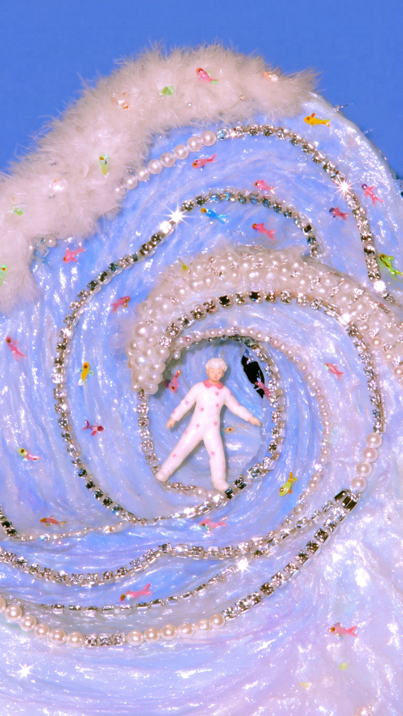
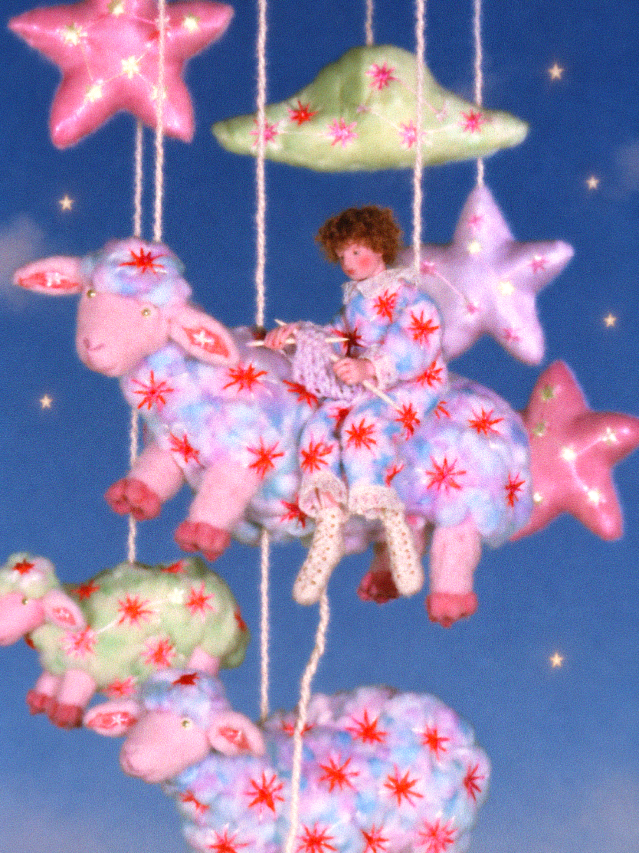
Hundreds of strangers have now sent their dreams through an online form, from a boy who finds an ocean beneath his bed to a shepherd who strings constellations across the night and a mermaid who gives away a single scale and then weeps gemstones. Moho turns each one into a short video where pastel velvet, pearls and sequins glow against deep blue skies, and a small amount of strangeness always sits inside the beauty.
Moho's name comes from the Korean word mohohada, meaning "to be ambiguous", and dreams seemed the most ambiguous subject available. Reading other people's recounts of their dreams revealed a pattern. "What interested me most was that they weren't simply beautiful," Moho says. "A beautiful scene might carry unease or strangeness, while a frightening story might feel unexpectedly tender." The work lives in that overlap, where a pink, porcelain-like face holding a swirling ice cream cone can suggest both mischief and grief at once.
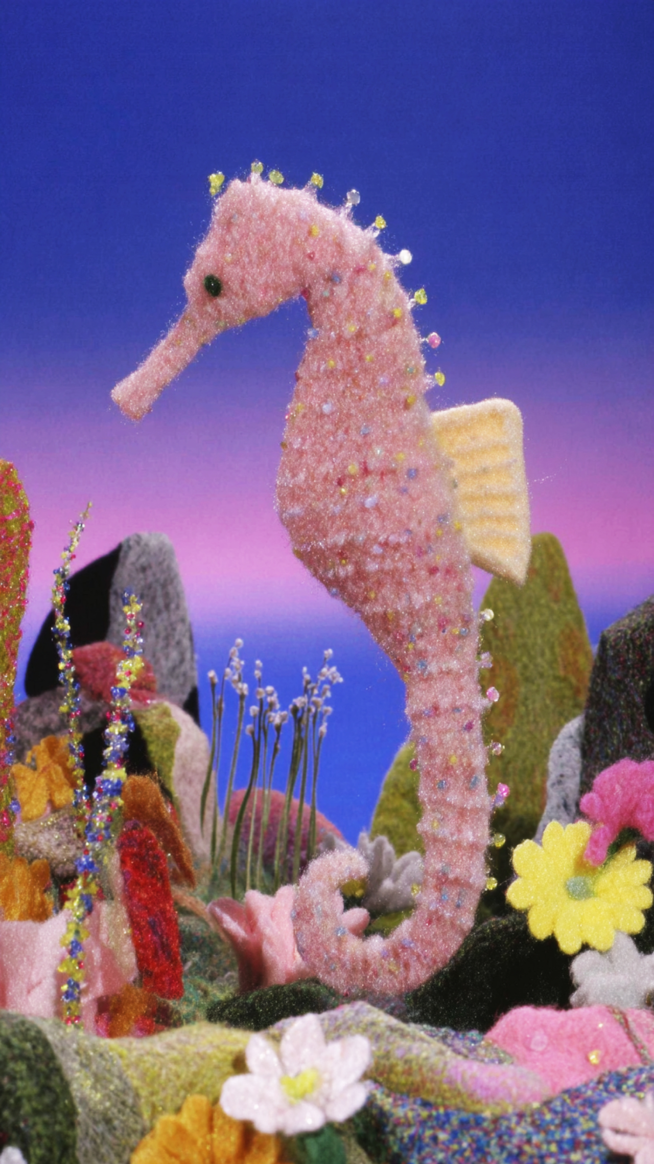
Looking Back at MyselfDream of a Little SeahorseDream of a Little Seahorse
Moho grew up in a small city in South Korea and now works from Seoul. A degree in media art taught Moho to use technology to express a private world, followed by a spell as a new media planner while the creative practice kept running alongside.
There are two sentences that a professor said to Moho which still guide their work today. The first was: "Use technology, but don't let the audience notice it. Before their eyes, technology should become magic." And the second: "Even something as simple as lighting a small bulb can create a remarkable world." Moho applies that same thinking to AI, one of the tools used in the studio today. "I hope viewers can feel, even for a moment, that the world in my work actually exists."
Love of a Lonely StarConstellation Swan
When making one of the pieces, each starts with a dream and a key visual, before Moho spends a good effort hunting for the right texture. "My criterion is whether a scene comes to mind as I read it," the artist explains, and the chosen image then has to find its material.
"The same form can evoke very different feelings depending on what it appears to be made of." Moho plays around with glass, jewels, tulle and fur until one of them matches the mood, and then the story will grow around that image, with plans kept loose on purpose because "something I discover while making one image often leads to the next one". Along the way, Moho keeps checking "whether everything belongs to the same world and whether the feeling that first drew me to the dream is still there."
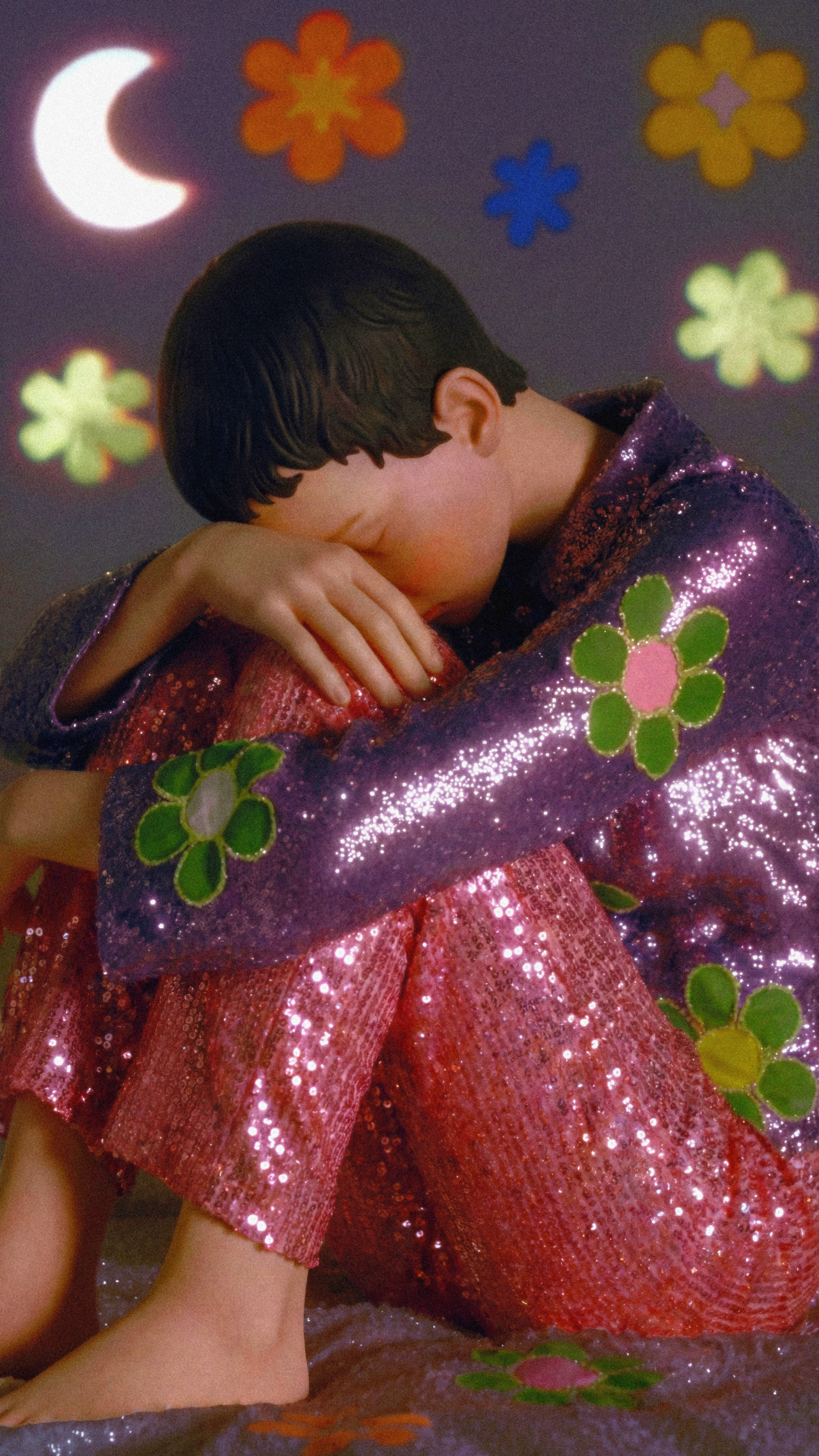
The Shepherd’s StarsA Letter Before a Closed DoorCoward Boy
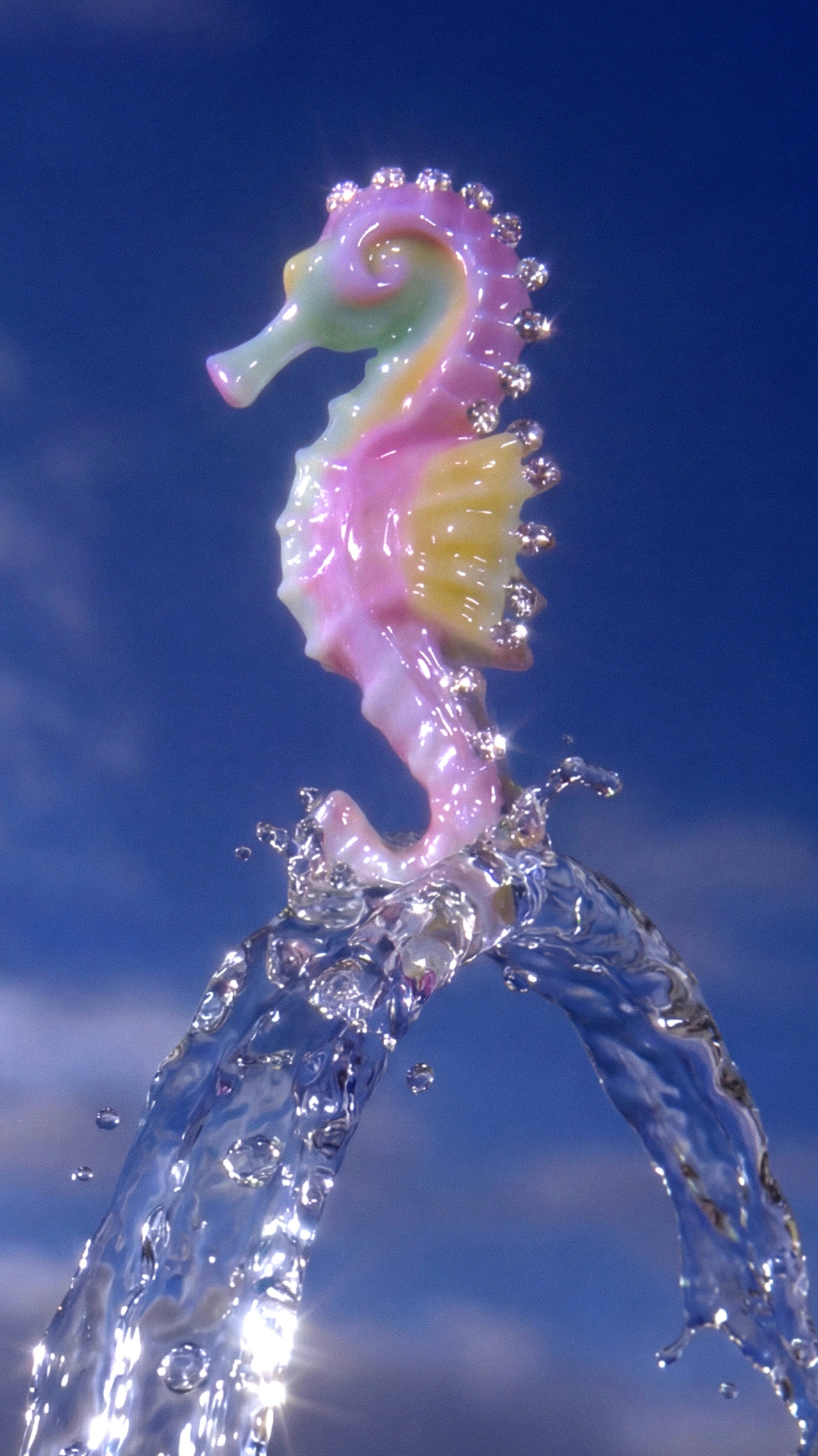
Dream of a Little Seahorse is where that approach clicked. Moho wanted a story that showed the world of Moho in a single image, and landed on a seahorse that looks fragile and out of place underwater, so it dreams of flying. In the finished video, a jewel-studded seahorse in pearly pink and yellow rises from a ribbon of crystal water into a blue sky, while elsewhere a tiny version of the creature floats between snarling, sharp-toothed fish.
"I used glass-like textures throughout the video. That fragility, the feeling that something could break at any moment, seemed to reflect the nature of dreams and ambiguity." Before this, Moho's work looked mostly like 2D illustration. "Making this video helped me realise how well these textures suited dreams, and it changed the overall visual direction of my work." And it also introduced Moho to a wider audience.
Looking Back at Myself
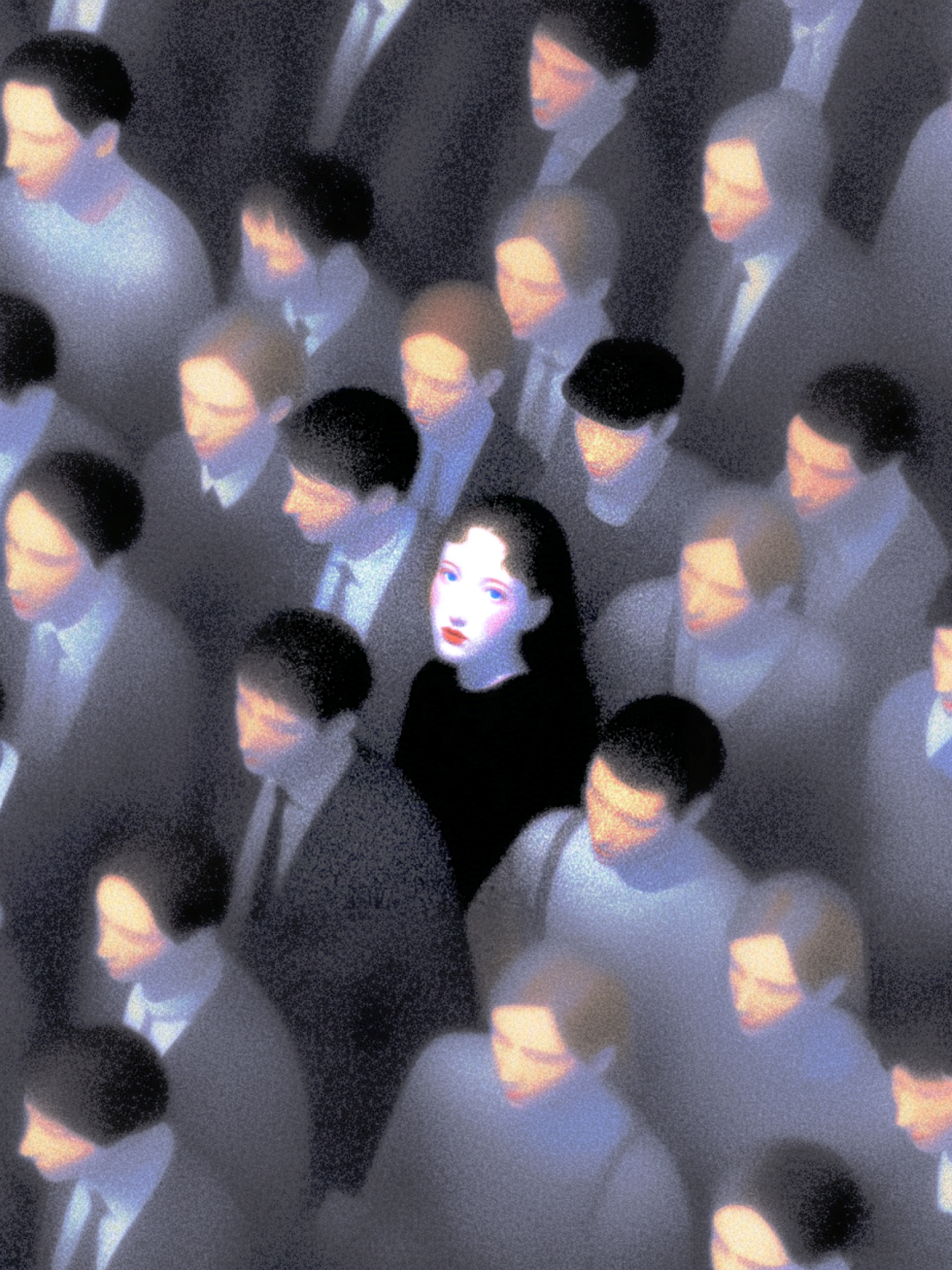
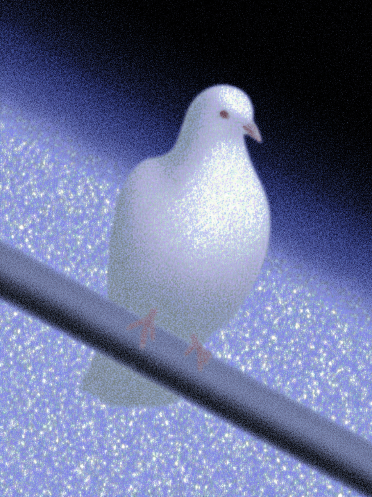
Look Back at Myself comes from Moho's own sleep during the years of working at an office job, where the artist felt trapped. In the dream, a bird perched inside the subway, and Moho thought, "I wish I could be that bird". Then came the plot twist: "I realised the bird was me." The artwork shows a pale dove on a dark pole, and a crowd of suited, downcast commuters in grey with one white-faced woman in black among them. "The self that felt trapped and the self that was free existed at the same time. It made me think that this free self had been within me all along, but I had been keeping it confined."
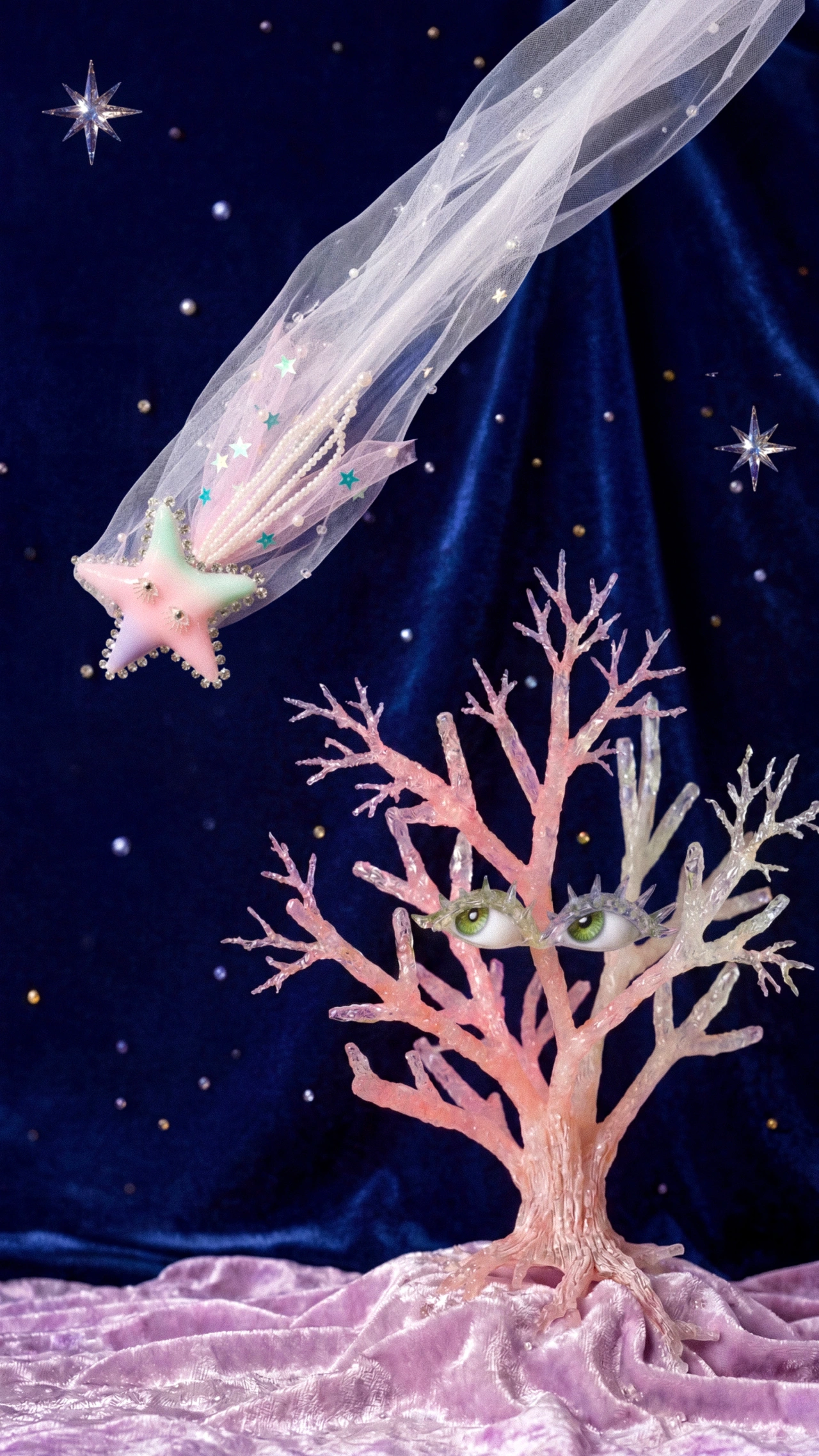
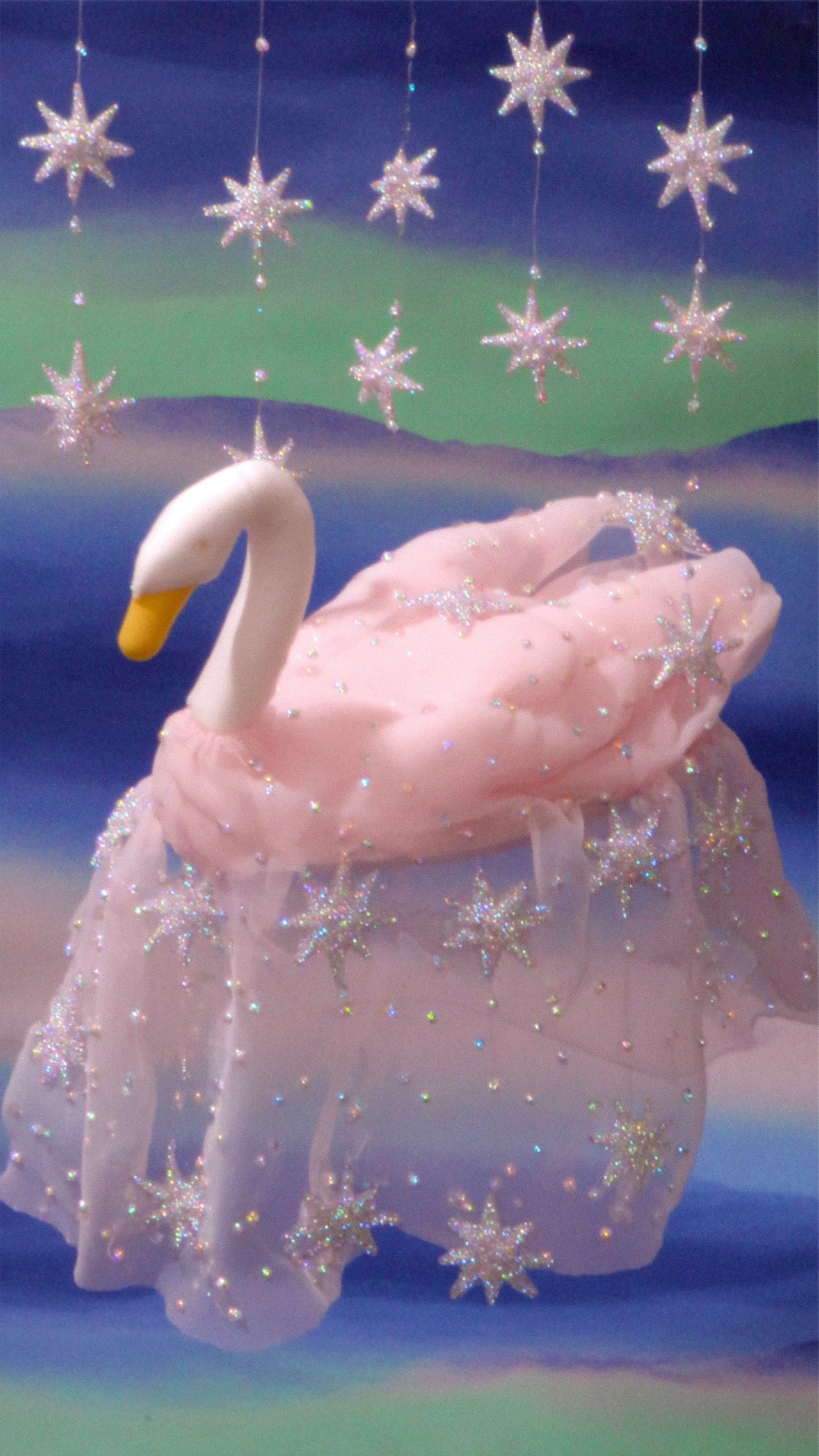
Elsewhere, a comet with a veiled tail falls towards a coral tree that has eyes, a swan made of pink tulle and stars crossed the night, and a boy in a sequinned suit hugs his knees among flowers. They appear familiar but also uncanny, similar to the feeling of dreaming – not knowing if you're awake, asleep, or if you're the character in the plot. "If someone encounters an unfamiliar scene in my work and thinks, 'I know this feeling', I think a connection can form between us, even if our experiences are different," says Moho. "I hope my work can give those things we haven't been able to name a place to stay, where we can look at them together."
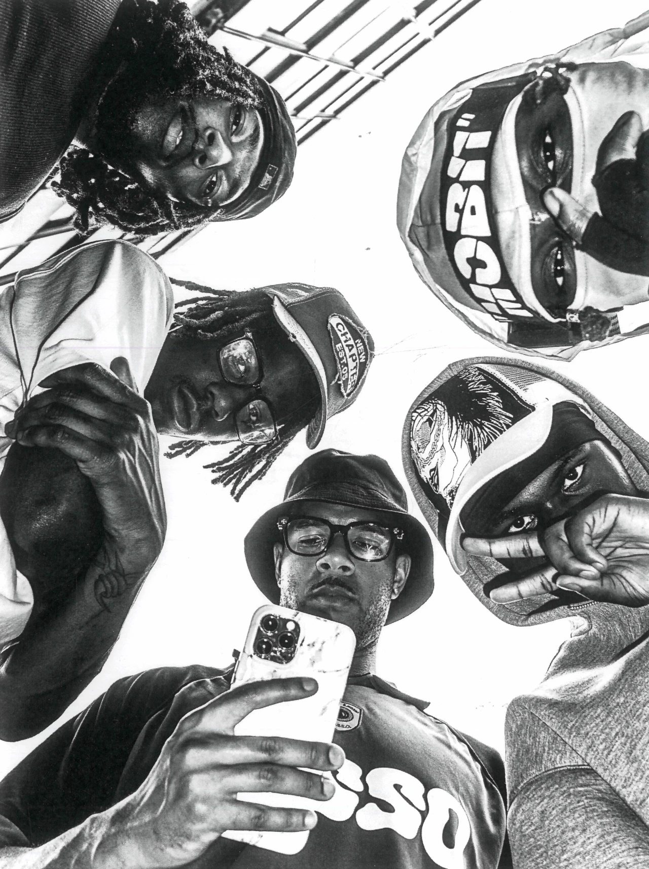
From an impromptu shoot with four curious kids to a sportswear campaign concept staged inside a car, the London photographer finds inspiration in familiar places and unplanned moments.
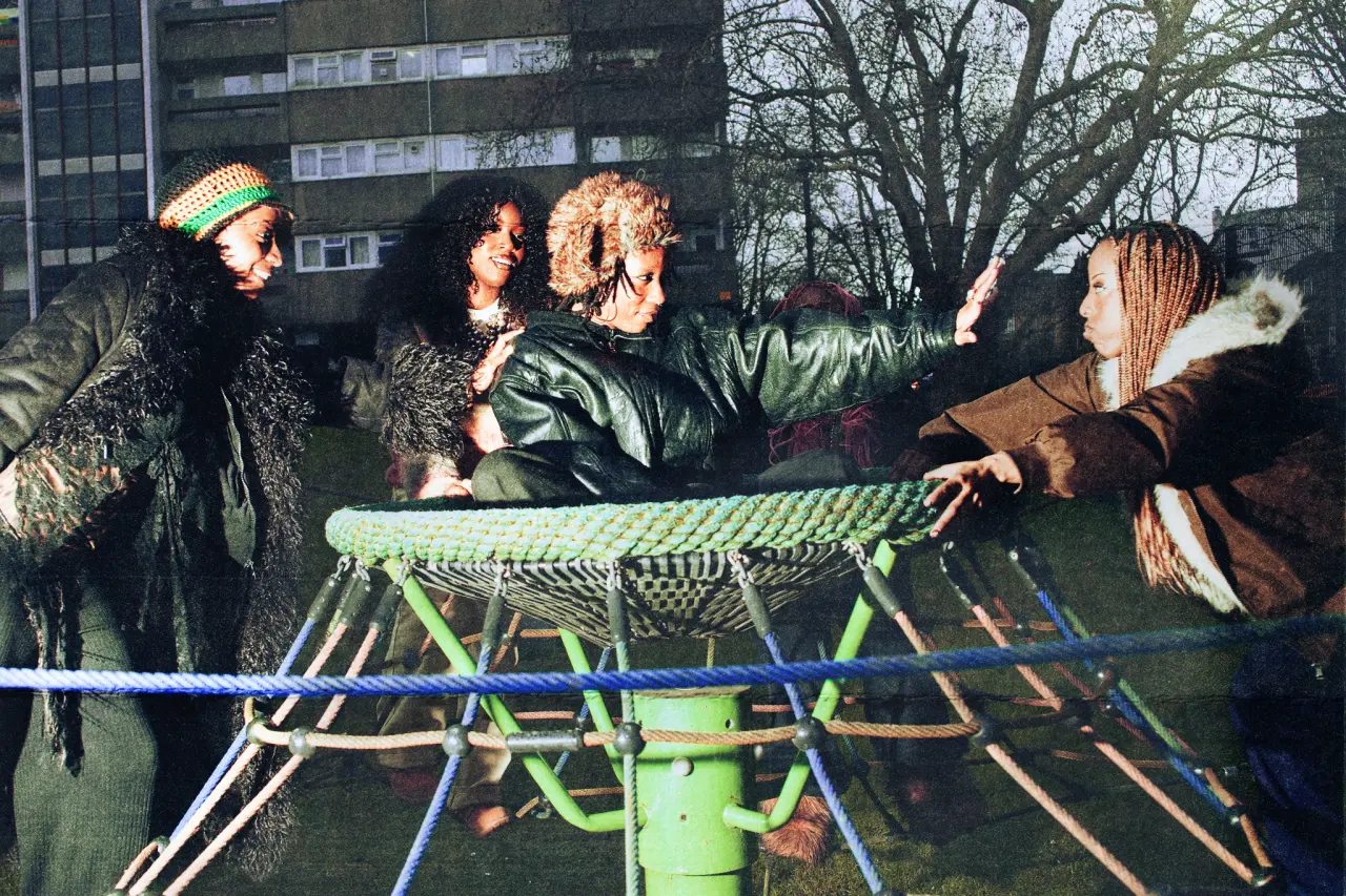
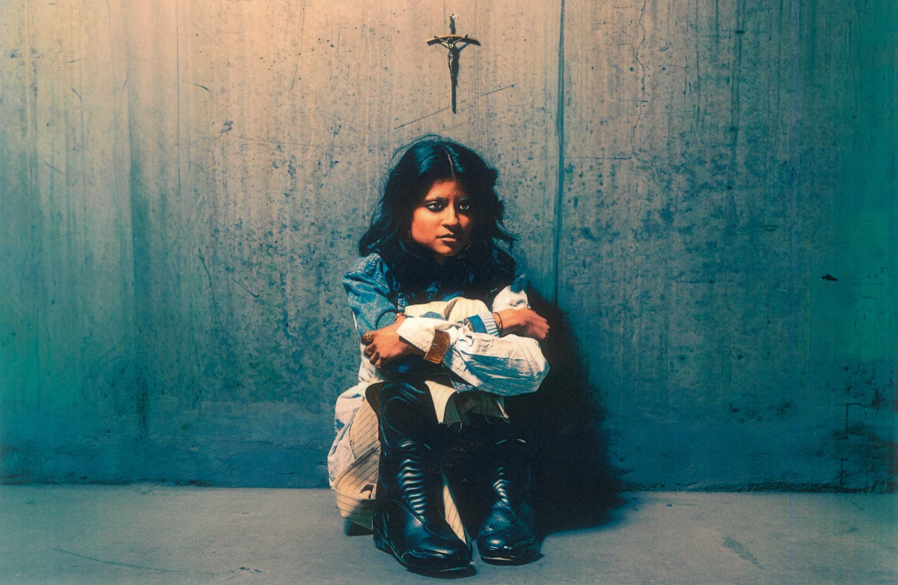
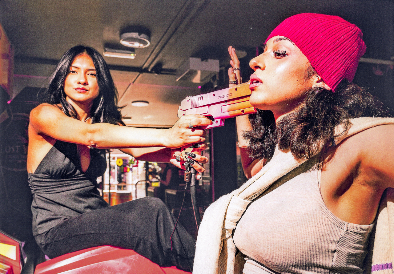
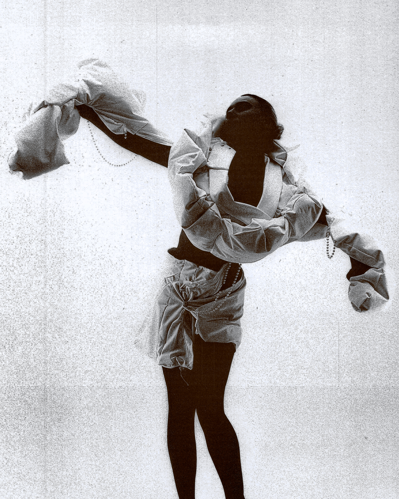
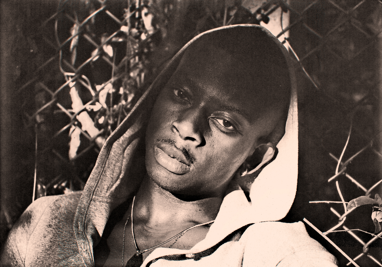
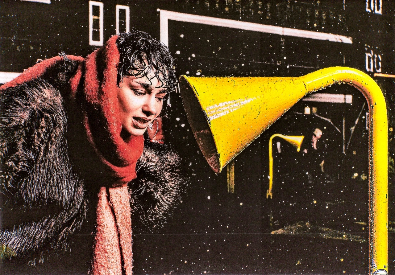
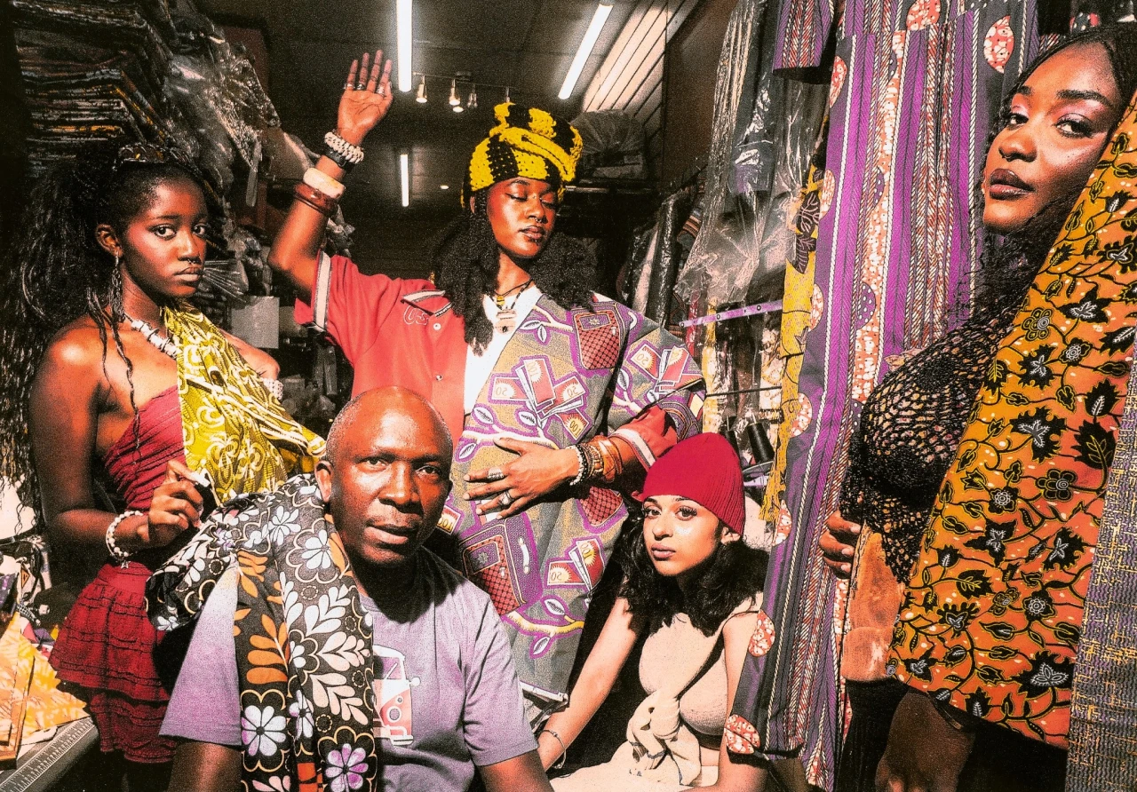
Elie N'Guessan picked up a camera while studying Product Design at Central Saint Martins. Two years on, the Peckham-born photographer has built a portfolio of fashion, editorial and commercial work, with magazine features and exhibitions along the way. His pictures depict crowds spilling out of cars, models dangling from climbing frames and figures sitting against concrete walls, all lit with a richness that makes South East London look like a movie.
For Elie, photography began as a welcome escape. "I was finding university difficult, and photography became something I really enjoyed doing outside my degree," Elie says. "It also helped me become more confident socially and meet people I probably wouldn't have met otherwise." His friends soon noticed, too. "I became known as the guy who was always carrying a camera, and I realised I wanted to take photography further."
His influences include photographer Gabriel Moses and creatives like Cashmere, and he talks about them in terms of a feeling he chases in his own frames. "I like work that feels cinematic but still has something real about it," he says. "There's so much going on around London, from the people and different cultures to the way people dress. Sometimes an idea can come from something as simple as a conversation with a friend." After each shoot, he prints his images and scans them again, letting the paper add dust and grain. "I like the texture and imperfections it creates because I don't want everything to look too clean or perfect."
A recent shoot, Dobs on the Back Seat, shows how that approach works for a brand. Made as a spec project for Adidas, it packs a group of models in tracksuits into a car doorway against a coral-red wall, with the three stripes glowing in the corner. "I wanted to approach sportswear photography in a more cinematic way," Elie explains. "I used an everyday setting to create something that felt different from a typical sportswear campaign. It was also a chance to experiment with the kind of commercial work I'd love to do more of."
God Helps Us All sits at the more personal end of his practice. A young woman sits hunched against a weathered concrete wall, a small cross hanging above her head. "This project is about my relationship with faith and a time in my life when I struggled with finding a sense of purpose," he says. "I was using different things to distract myself and numb the emptiness I was feeling. The forward gaze and empty background reflect that feeling of searching for something more, and how my relationship with God fits into that journey."
Then there was Daycare's Over, a shoot that rewrote itself that day. Elie had booked two models for a test, and four curious kids wandered over to watch. "They were nosy, playful and a bit cheeky, but really funny to be around," he remembers. During a break, an idea arrived.
"I used the football crossbar as a set, letting the kids play around while the models acted like exhausted after-school club workers who'd been doing unpaid overtime. It was completely unplanned, but it ended up becoming one of my favourite sets of photographs." The resulting frames show everyone swinging from a bar in front of a blue brick wall, and they hold more warmth than most campaigns manage. "Some of my favourite pictures have come from moments I didn't plan."
There's a sense of spontaneity that runs through Elie's work, even when a shoot is carefully planned. He prefers to keep things relaxed, giving people room to move and experiment in front of the camera. "I want people to feel comfortable in front of the camera. I also like experimenting with poses and movement," he says. "I like making people look twice at things they might normally overlook, whether that's a person, a location or the way someone dresses."
In the future, Elie wants to work with more photographers, stylists, magazines and brands, and to keep mapping London through portraiture. He'd also love to travel further afield, although the cost is proving something of an obstacle.
"I'm too skint right now to travel to new parts of the UK, because a train ticket costs an arm and a leg, but I'm trying to make it work," he says. "Ultimately, I want to keep improving, experiment with new ideas and develop a style that people can recognise as my own."
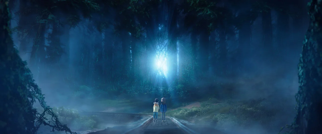
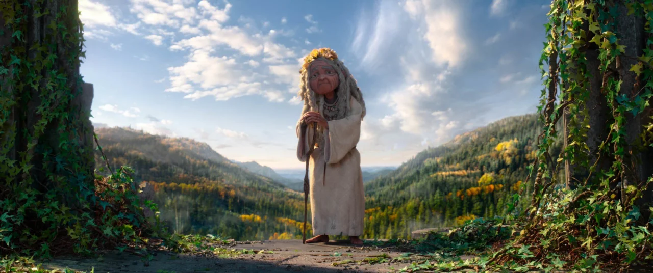
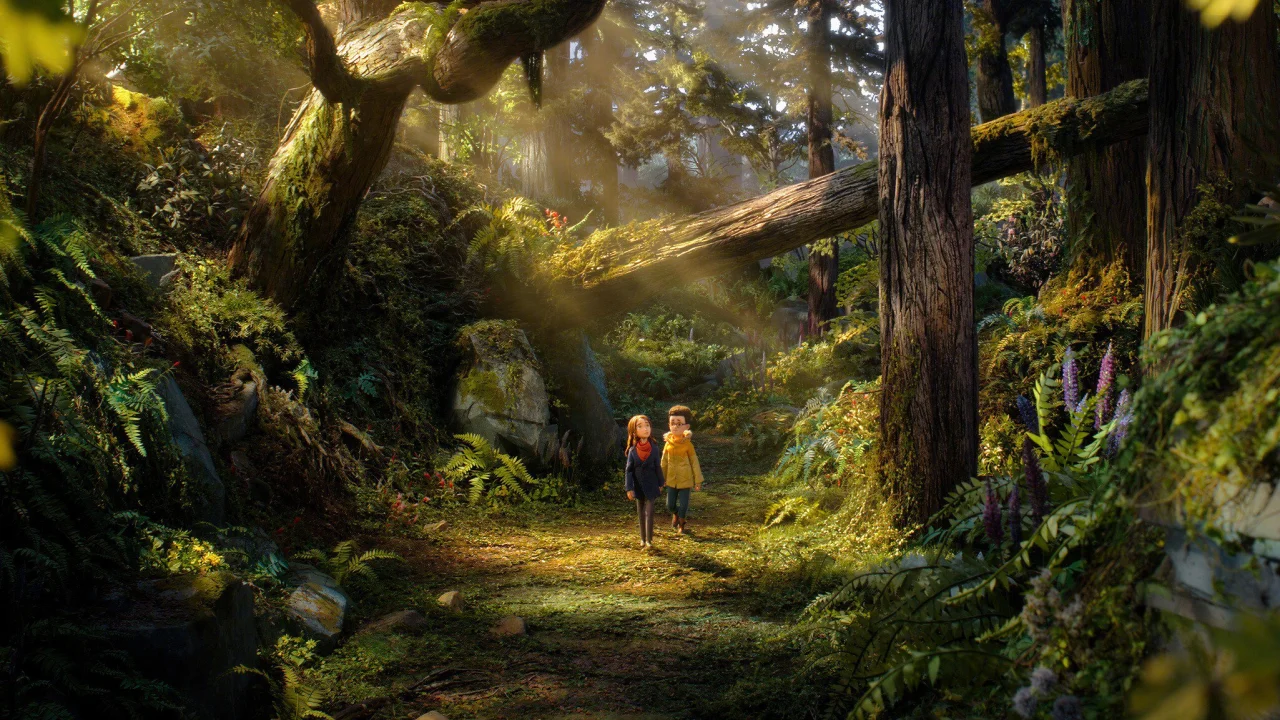
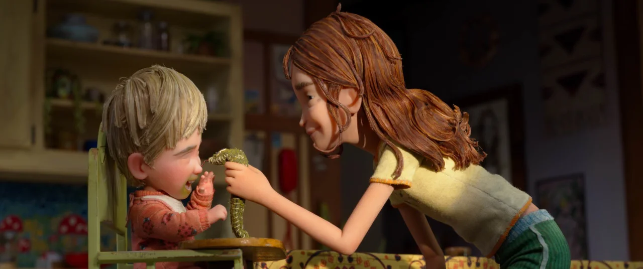
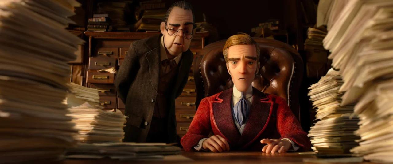
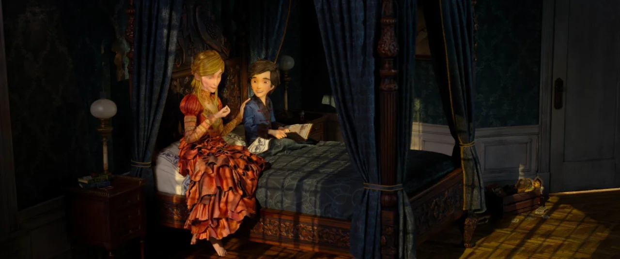
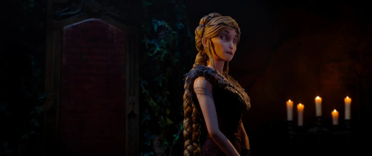
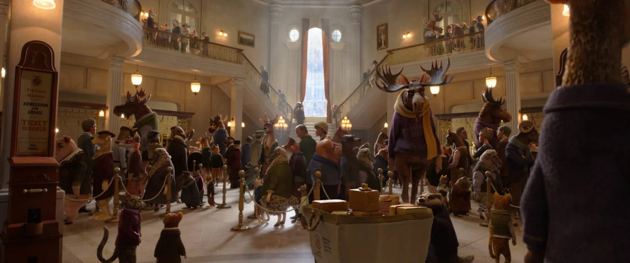
Laika's handmade epic blends stop motion and CG like nothing before it, and it deserves to win at the box office.
Last week I walked into a sold-out cinema screening, and let me tell you: it's been a while since that happened. Yet that's what I found at the Watershed arts centre in Bristol, where I watched Laika's epic animation Wildwood in a cinema so packed that couples were having to sit apart because there were no two seats left together.
I'd be lying if I said I wasn't worried, though. Yes, I knew all about the technical achievement behind Laika's latest film—I'd interviewed the art director Matthew Maldonado, for Pete's sake. But being technically impressive and being entertaining are two very different things. And I had no idea whether the animation style, a groundbreaking mix of stop motion and CG, would actually work for audiences on a big screen.
I shouldn't have worried. Within seconds, I was sucked into the action, and I stayed there, mouth agape, until the credits rolled. The following day, I couldn't get it out of my mind. The more I thought about it, the more I realised Wildwood isn't just a great film. It's a massive leap forward for the animation industry.
Best of both worlds
In case you have no idea what I'm talking about, Wildwood is the sixth feature from Laika, the Oregon studio behind Coraline, ParaNorman and Kubo and the Two Strings. Directed by Travis Knight and based on Colin Meloy's 2011 novel, illustrated by Carson Ellis, it follows a girl named Prue who… well, actually, I think the less you know about the story, the better.
My previous article was all about how everything, from 230+ puppets to 132 sets, was made by hand, and the enormous scale of the production. More than 1,000 artists worked over six years, during which animating a single second of film could take an entire day, or more.
But all of that would have been for nothing if the animation didn't look good. So I'm pleased to tell you that on a cinema screen, it looks absolutely epic.
I shouldn't have been surprised: people don't put this much time and passion into a project unless they're sure it's worth it. The facial performances, for instance, were animated on a computer and then 3D printed, with a new face made for every character in every frame: more than 140,000 in total. Meanwhile, the visual effects team scanned the physical sets and puppets to extend locations and fill out crowds.
The computer here isn't replacing the handmade; it's serving it. Because every process starts from, and feeds back into, something physical, the result is a level of subtlety and realness that neither CG nor stop motion could achieve on its own.
More real than live action
It's ironic, if you think about it. Most so-called 'live action' films are now largely made of CG. So, in one sense, they're animations too. Unfortunately, when a supposedly real world is made entirely of pixels, it often stops feeling visceral and real. In fact, most of us have stopped expecting to feel anything when we look at it.
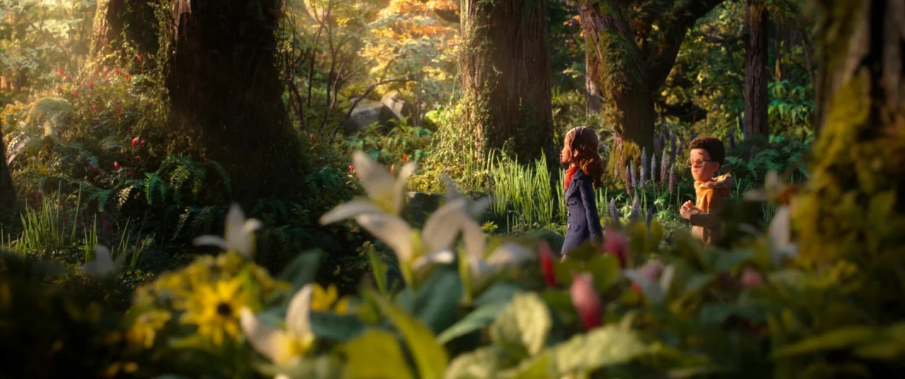
Wildwood is the opposite. Because the world on screen was physically built, it feels incredibly real. You can sense the weight of things: the texture of fabric, the grain of wood, the way light falls through the trees. The effect is subtle, but over time it draws you in and holds you in its grip.
Again, none of this would matter if the story was poor or the characters were undeveloped. But both are brilliant, intriguing, nuanced and endlessly thrilling.
Yes, there are elements of Alice in Wonderland, The Wizard of Oz, Labyrinth, The Dark Crystal and The Lion, The Witch and The Wardrobe here and there. But overall, this is a strikingly original film: not just original in the sense of not being a sequel, but original in the sense of "This feels fresh and new, and I have no idea what will happen next."
The need for scale
I did, I admit, get a little frustrated at times. Every set, costume and prop has clearly been obsessed over, so I kept wishing I could admire each frame like an artwork in a gallery. But the story kept pulling me along too much to linger.
So here's my main plea. If you work as a creative in any capacity, please see this film on a big screen. There's so much visual detail packed into every shot that a lot of it will simply be lost on a 50-inch TV, let alone a laptop or phone.
One more thing. If we want to push back against the slide of movies into AI slop, we have to prove audiences will turn out for something made with human hands. Because the only language Hollywood truly understands is box office.
So I urge you: don't just go and see Wildwood. Tell your friends, colleagues and the random guy on the bus to go and see it too.
1939's The Wizard of Oz didn't turn a profit on its first release, and only became the beloved classic we know after it was shown on TV in the 1950s. A generation missed out on that movie magic. Let's make sure that doesn't happen to Wildwood, and keep the word of mouth going. The future will thank us.
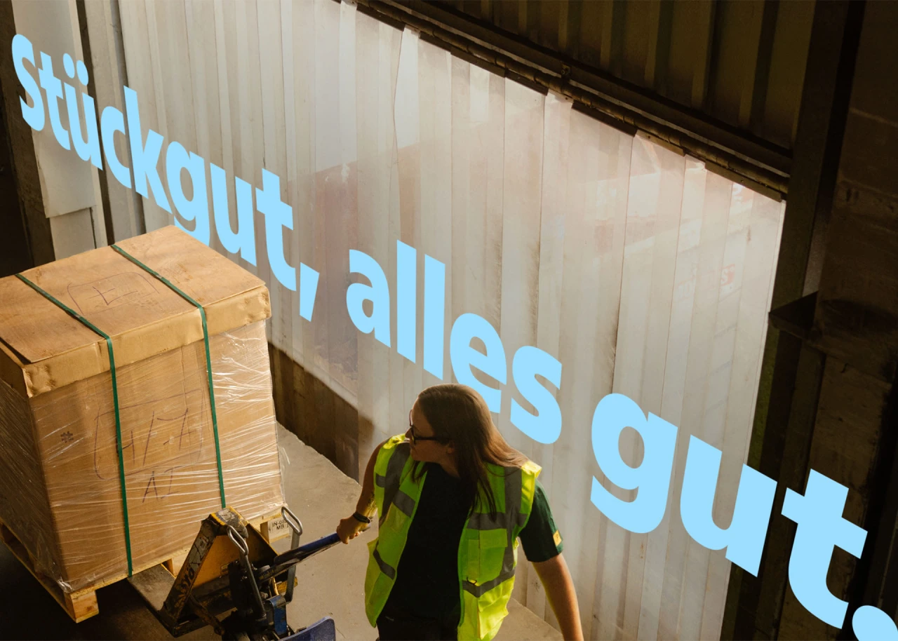
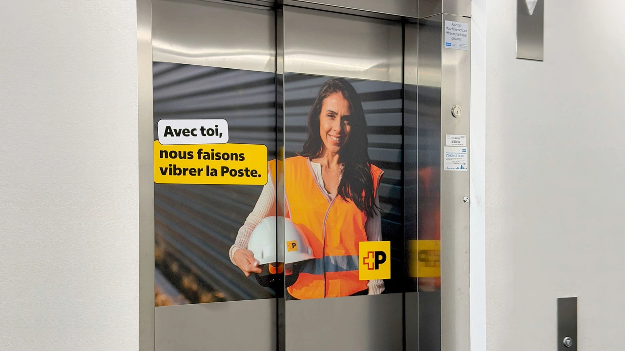
Creating a typeface for Switzerland's postal service took three years, and it came with many challenges.
When it comes to custom typefaces, designers are often faced with a dilemma. When clients have commissioned something for a lot of money, there's often a desire, whether it be conscious or subconscious, to make a splash. In other words, people seek a design that's distinctive, ownable, and noticeable.
However, there's an argument that, much of the time, a typeface is there to get out of the way. Its main aims should be clarity and legibility, not to draw attention to itself.
In practice, custom typefaces usually end up somewhere between the two extremes. But in the case of Swiss Typefaces's commission from Swiss Post, the brief was clear indeed: make a new font that nobody would notice at all.
The result is Swiss Post Sans, which took more than three years to develop. That might sound like a lot, but when you're working for a national institution that's part of daily life for millions, you need to take responsibility and put in the effort. And so that's exactly what Swiss Typefaces did.
Big challenges
The project had two phases. First, the team tackled upright styles, then the italics. Developing the former came with a major constraint.
The new typeface needed to let the previous one be replaced with a simple swap of font files, without requiring any adjustment to the designs or layouts. To do that, we had to strictly maintain the original font's overall typographic volume.
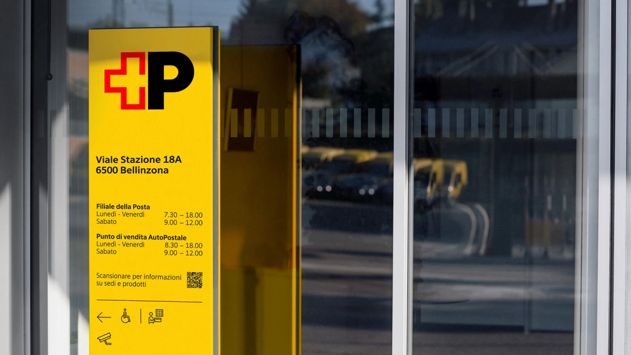
If you think that sounds tough, then consider this: communications needed to be produced in all four official languages of Switzerland: German, French, Italian, and Romansh. That meant every accent and less common glyph had to behave.
Oh, and one more thing: because so much of what Swiss Post publishes involves prices and timetables, the numerals needed to be tabular by default, so that figures would line up neatly in columns. To make this work, Swiss Post got access to beta files unusually early and tested them in real-life conditions with the help of a group of experts.
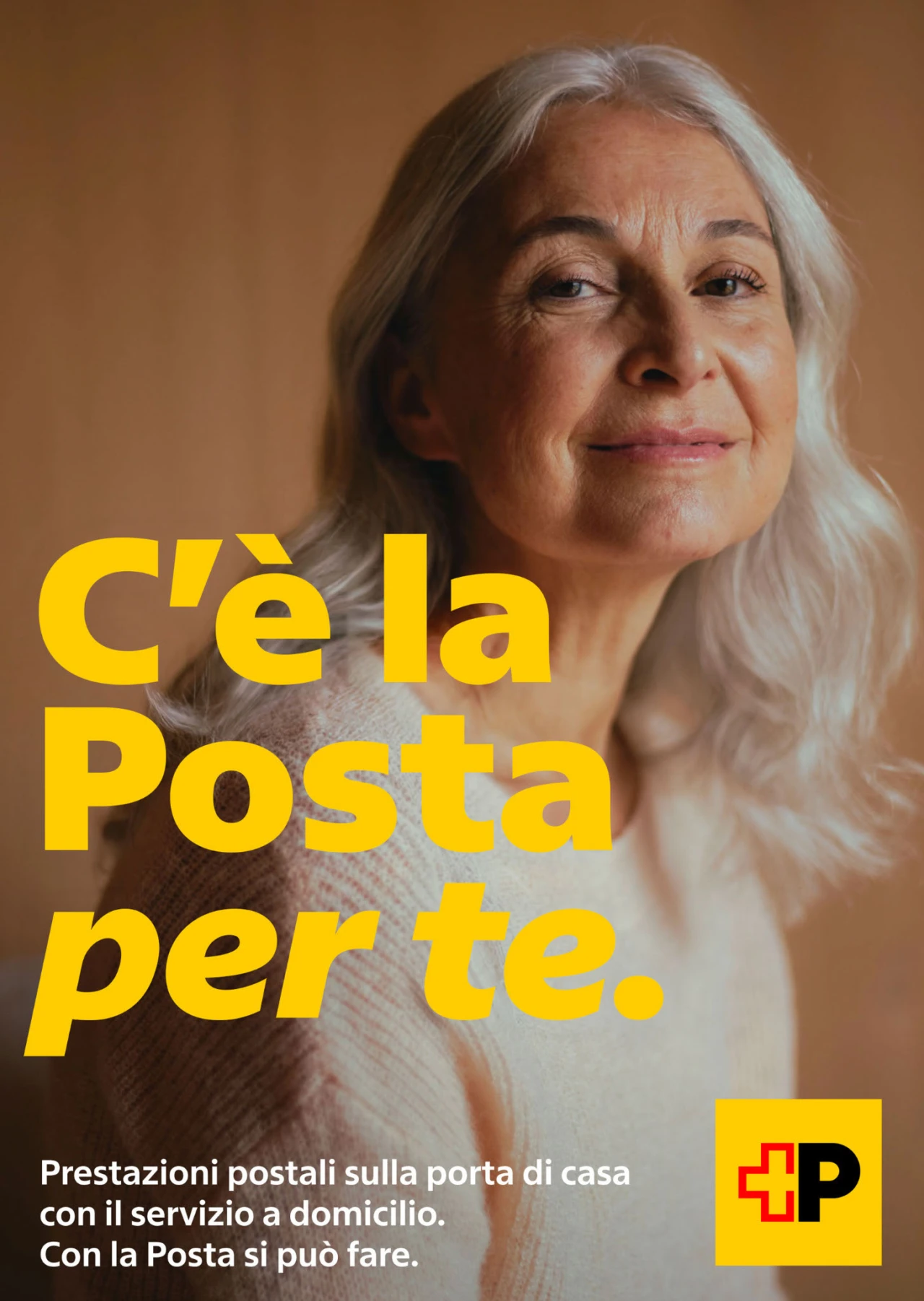
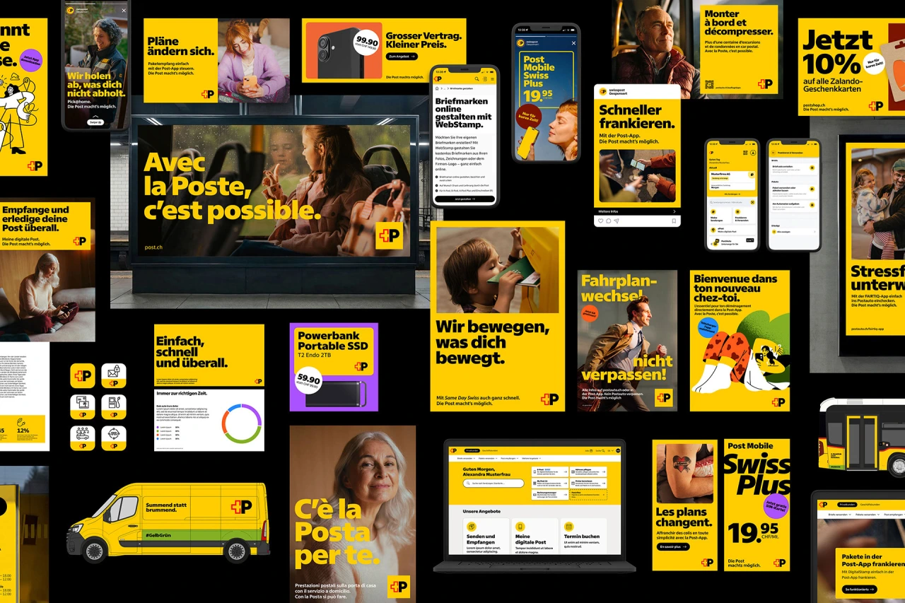
As the typeface was expected to last decades rather than years, Swiss Post used the opportunity to soften its tone. This involved giving it some humanist characteristics, making it warmer and more inviting than its predecessor, while steering well clear of anything quirky. One noticeable change came at the client's request: the square dots on letters like 'i' and 'j' have become round ones.
Creative freedom
If the uprights were an exercise in restraint, the italics were the opposite. They didn't have to match anything from the old typeface, giving the studio welcome creative freedom.
Some history is useful here. Swiss Post's old logo was set in uppercase italics, suggesting movement and speed. But now that the logo has been redesigned around a steady, bold, upright 'P', the italics can take on a new role within the brand.
Rather than just slanting the uprights, Swiss Typefaces took a hybrid approach, building in cursive qualities on letters such as 'a', 'b', 'e' and 'g'. Curves meet sharp, straight endings throughout; the lowercase 'f', for instance, drops below the baseline like calligraphy but ends in a crisp cut rather than a traditional return stroke.
The italics now work as a signature element in their own right, appearing at headline and XXL signage sizes as well as in running text. Because italics are largely absent from web design, that gives Swiss Post a distinctive typographic voice.
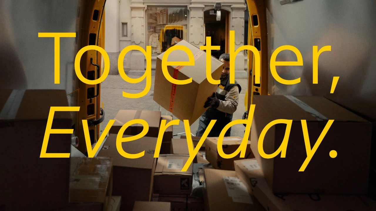
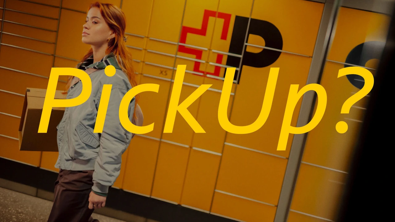
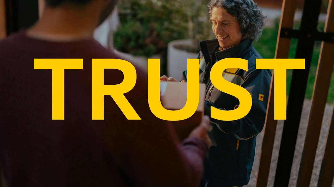
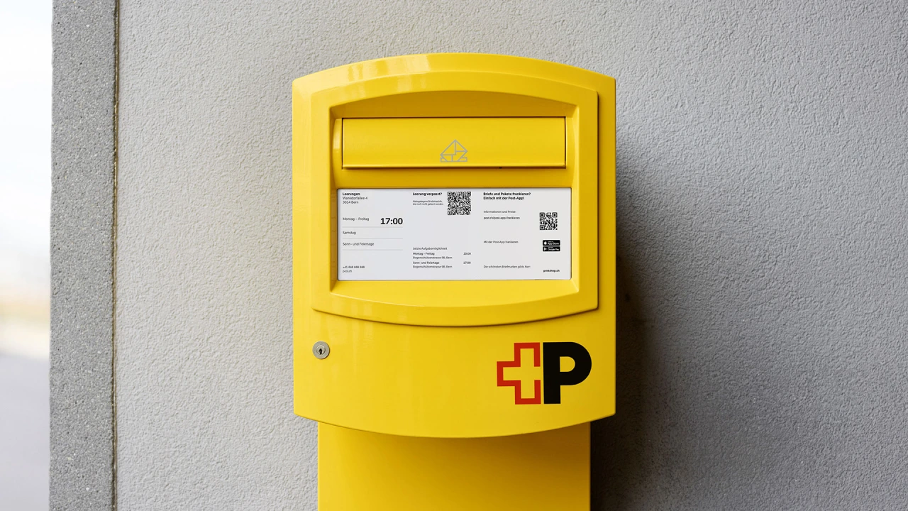
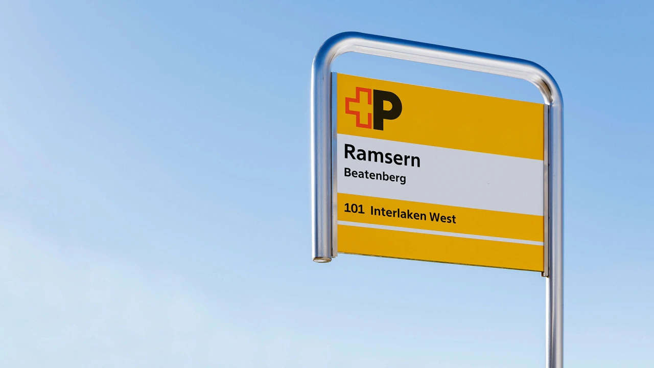
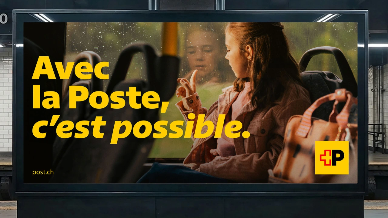
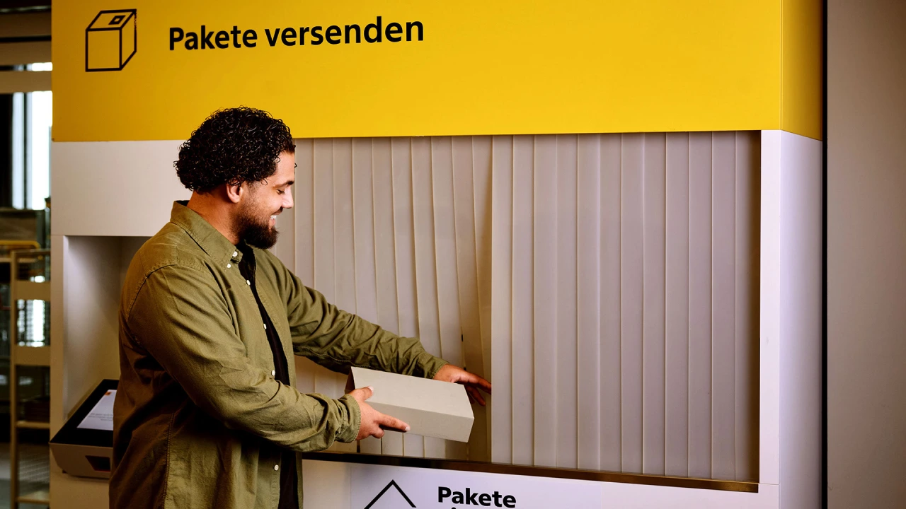
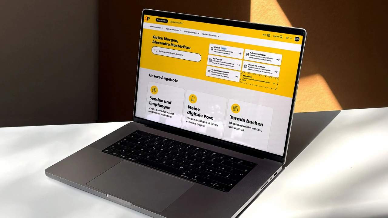
The new type family is now being used everywhere you can imagine: on street adverts, signage, trains, trucks, bus stops, pamphlets, stamps, mailboxes, websites, apps… the list goes on. And to my mind, what's lovely about it is that it doesn't rely on gimmicks. Its unique character simply comes from solving practical problems well.
In the team's own words: "It showed how a contemporary interpretation of typographic legacy can remain true to its roots while still feeling fresh, flexible and forward-looking."
Or, as Emmanuel Rey, executive creative director at Swiss Typefaces, puts it: "Swiss Post Sans is Swiss by nature, not only by design.
We're so starved of practical effects; even a spot promoting financial services can be magical in the right hands.
Ads for financial services are not something I go out of my way to watch. I tend to be almost entirely price-led, so if I'm seeking a loan, mortgage or whatever, I'll spend my whole time on comparison sites working out the best deal. I'm not really swayed by branding in this sector, and if an ad comes out, I generally zone out.
So this, for me, is a pretty rare thing: an ad for exactly this type of company that had me entranced.
That's partly because it features Keeley Hawes, whose mesmerising performance in Ashes to Ashes still haunts my dreams. (If you don't know what that is, and you can access BBC iPlayer, watch it now.) But it's also because of how it was filmed. In a nutshell, Keeley wanders a canyon of paper… and something magical happens.
Fresh perspective
Created by brand consultancy and creative agency Isobel, the campaign is called 'See your wealth differently', and it's built on a simple idea: good financial advice isn't about giving people more information, but helping them make sense of what they already know.
This is why the launch film, titled 'Answers', sees the actor wandering through a maze of towering walls made up of endless printed pages. As a metaphor, it's simple, but it works. We don't need a complex backstory: it's obvious that Keeley is lost in a world of confusing detail, something anyone who's applied for financial services will have experienced.
It's a warm, dreamlike sequence, with loose sheets drifting through shafts of light and piling up underfoot. The key for me is that it all feels so visceral. And I don't think it's a coincidence that there's no CGI.
Instead of building the canyon digitally, the team created actual walls made with actual sheets of paper and shot them in an actual studio. They also did so on the hottest day of the year, which can't have been fun under studio lights, but probably gave it an edge that somehow comes through as authentic: a much-abused term which I'm nonetheless happy to use here, because it feels deserved.
Don't get me wrong: I'm a huge fan of CGI when done well. But it's about what's appropriate, and what works. And here, the practical approach they've taken has absolutely nailed it.
Campaign rollout
The film was directed by ManvsMachine through production company Friend, with cinematography by Olan Collardy, colour by Selected Works, sound by 750mph and music by Lost Boy. The behind-the-scenes video below gives a flavour of what it was like on set.
The paper and hourglass motifs from the film are now being carried through into St. James's Place's wider brand, and the campaign runs across TV, VOD, print, social and radio.
For Isobel, which previously turned our heads with its their campaign for Clipper, this is another example of finding a tactile and human way into a category that needed a bit of shaking up.
In the press release, Rob Sanders, chief client officer at St. James's Place, says the campaign "brings to life the increasing complexity people face when making decisions about their finances, while demonstrating the value of having a trusted adviser to help navigate uncertainty and provide important support".
All of which I'd agree with… but that's a lot of words. The thing about this ad is, it doesn't need them. Show, not tell, triumphs again.
The design for Maria Rigol Ordi's first still wine takes the name's literal meaning and runs with it.
Creatives often wax lyrical about finding inspiration in the most unlikely of places: a rusty shipping container, a 1970s cookbook, the pattern on their nan's old curtains. All of which is lovely. But sometimes the best, most obvious ideas are right in front of you. And having the confidence to simply reach out and take it is a creative skill in itself.
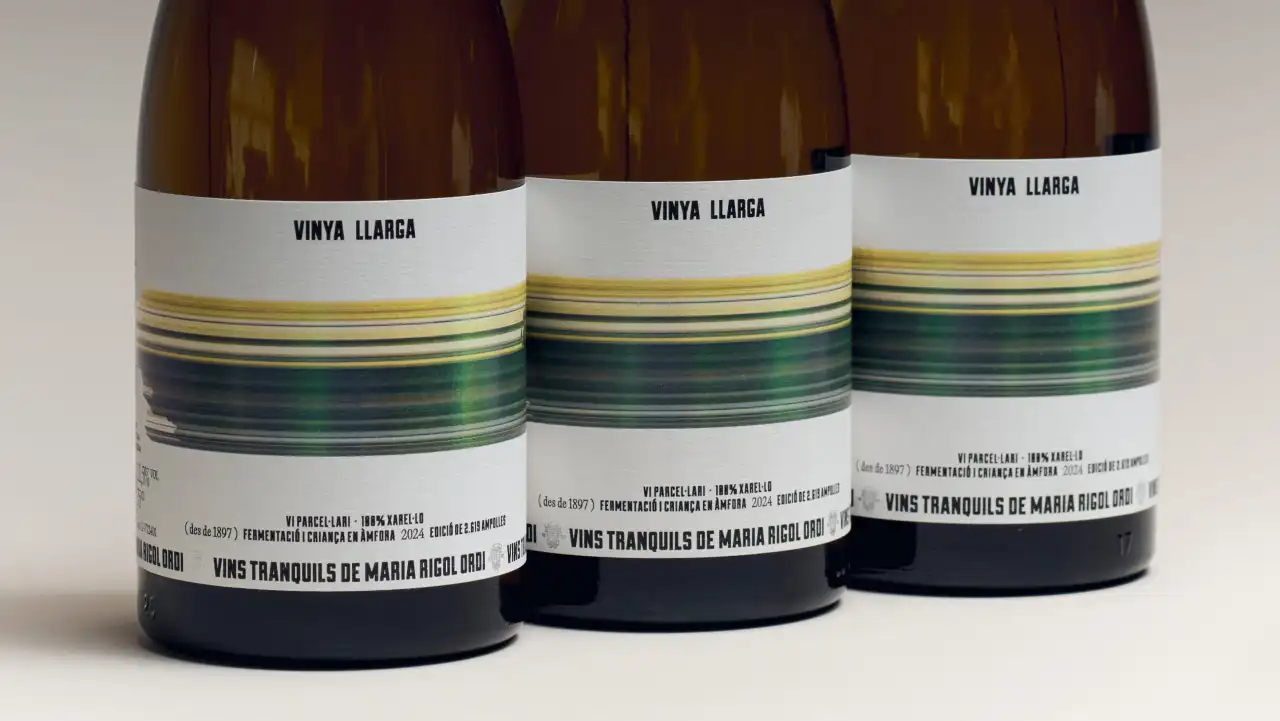
Here's a great example. When Barcelona studio Atipus was asked to create the label for a wine called Vinya Llarga, it didn't have to look further than the name.
Vinya Llarga translates from Catalan as "long vineyard". It's the first still wine from Maria Rigol Ordi, a producer based in Sant Sadurní d'Anoia in the Penedès region of Catalonia, known for specialising in cava.
As Fabiola Ureña of Atipus explains, that made it a big deal for the brand. "The challenge for this launch product, the first in a new territory, was to design a label that could reflect a new chapter with the same care for craft, but with a fresh point of view."
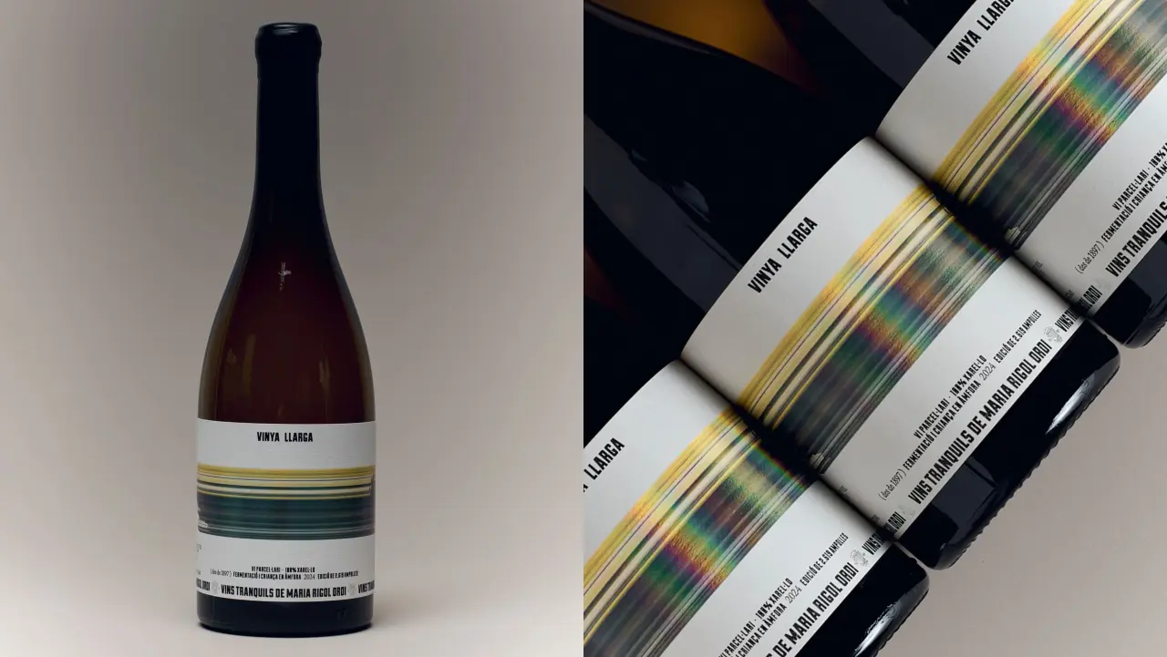
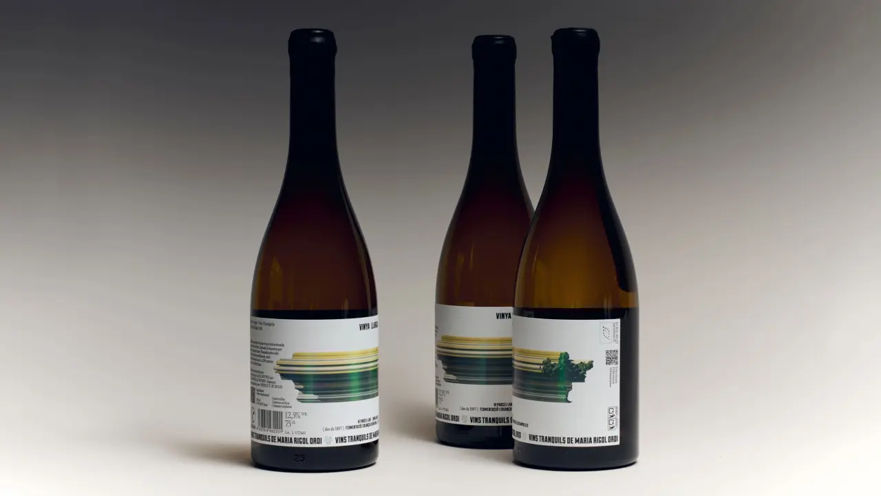
The main feature of the label is something that's literally "long": a band of yellow, green and blue streaks that runs right around the bottle. It looks a bit like a photo taken from a fast-moving train: you can just about make out a landscape, but mostly you see bands of colour. On the back label, the streaks resolve into something leafy and green, as if the scene is coming back into focus.
Sense of restraint
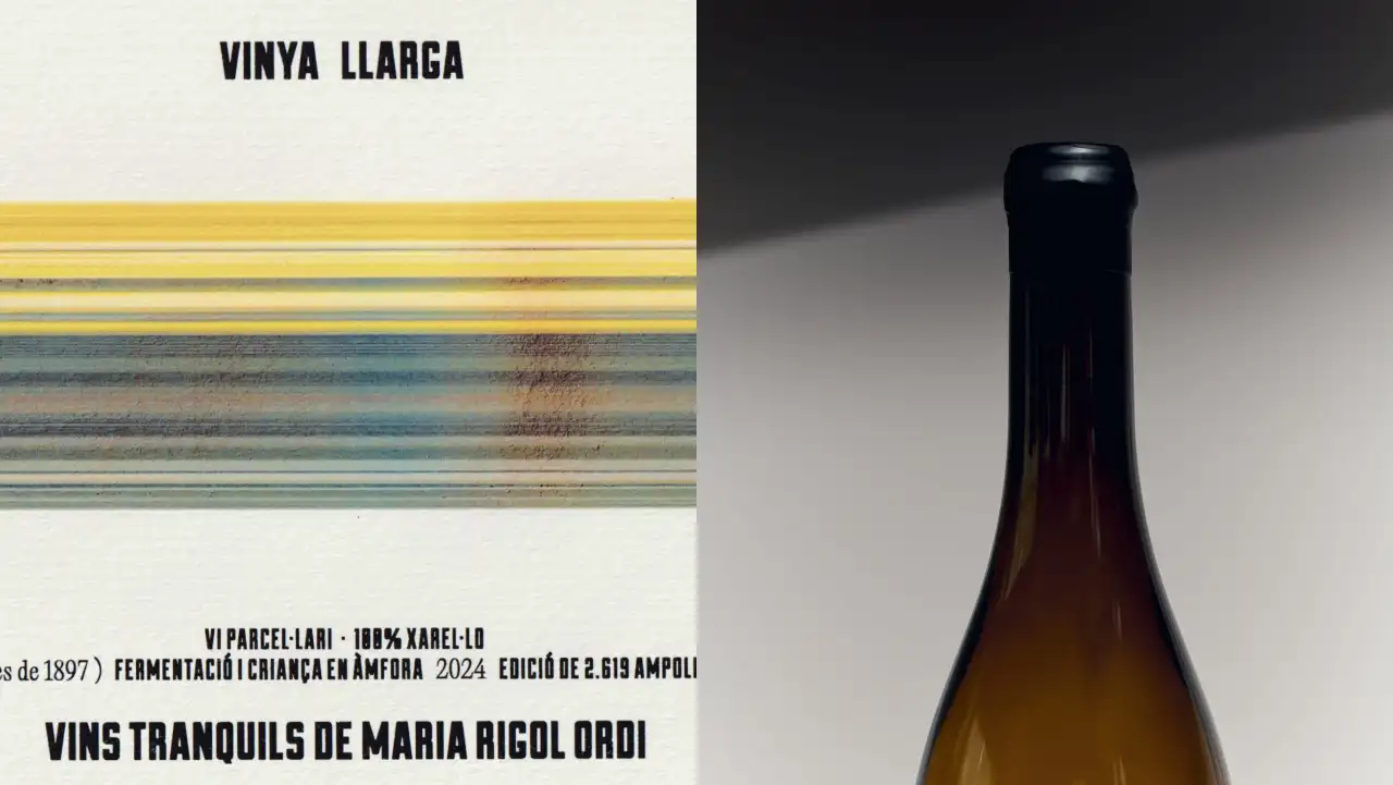
Importantly, the other elements in the design are deliberately restrained. The words "Vinya Llarga" sit in small, condensed capitals at the top of the textured white label, with the producer's name, Vins tranquils de Maria Rigol Ordi, running along the bottom.
Details including the grape, fermentation and the size of the limited run are set in small type in between, along with a nod to the vineyard's history dating back to 1897.
As Fabiola explains: "The bold colour gives the bottle a strong presence, creating immediate visual impact without losing its sense of warmth. The wax-sealed capsule adds a tactile, handcrafted detail. Together, these elements strike a balance between tradition and a more expressive, modern attitude."
"A simple idea allowed us to build a wine with character, rhythm and a playful edge," she concludes, "giving Vinya Llarga a distinctive presence while keeping the wine at the heart of it all."
The London studio began rebranding the psychic services platform with a chakra reading and a little charcoal, and the result is a rich, purple-hued brand world that feels alive.
It's almost Halloween, so forgive me if, on discovering that a branding project began with a séance, I immediately thought of that brilliant 'Day-O' dinner party scene in Beetlejuice. You know, the one with the late great Catherine O'Hara? I presume no one at Mother Design was forced into an impromptu calypso number, but it's a wonderful mental image.
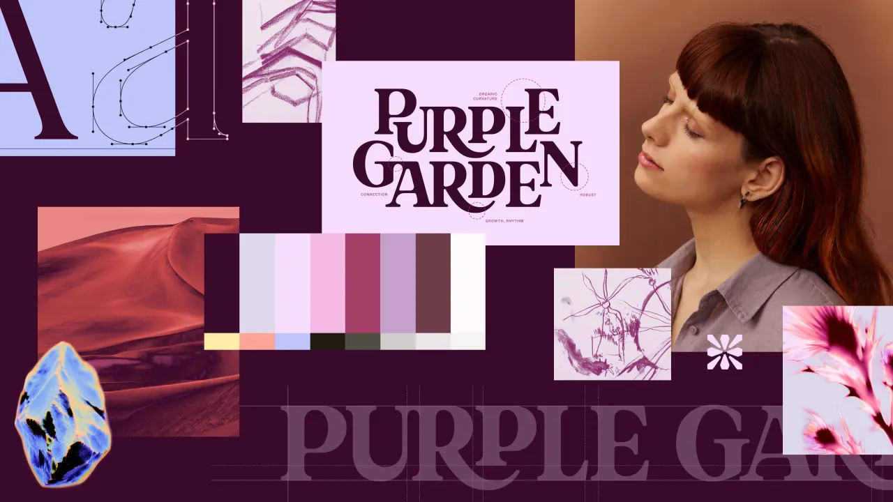
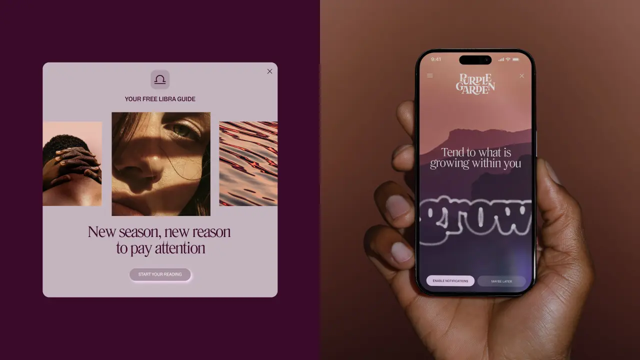
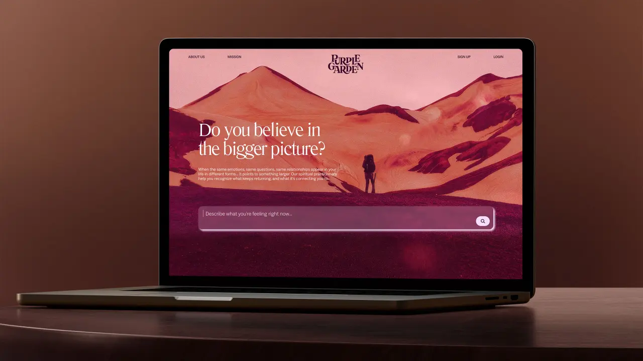
What actually happened involved way less dancing and uncontrolled lip syncing. The independent design studio, part of the Mother Family, has crafted a new identity for Purple Garden, the mobile and online psychic services platform. Fittingly, the team decided to lean into a more spiritual approach to get there.
The brief was to "bring the feeling of spiritual practice into the digital world", which was no easy task. The spiritual services industry is worth around $2.3 billion, and apps and online platforms are opening up new ways for people to connect with guidance. But things can get lost in translation on screen: the atmosphere, ritual, and energy – it's hard to replicate online when you're not in the room. Mother Design's job was to fix that.
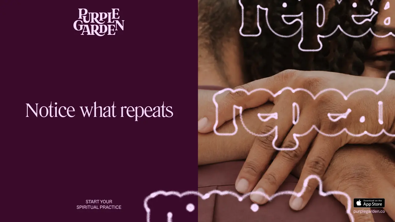
The new brand therefore reframes Purple Garden from somewhere you visit for a one-off reading into a home for ongoing spiritual practice. It's built on a rather lovely insight: some questions keep returning no matter how much life changes. The audience, which Mother calls 'Believers of the Bigger Picture', are "seasoned seekers" looking for growth and meaning. So the creative idea, 'A Living Practice', moves from passive advice to active clarity through repetition and growth.
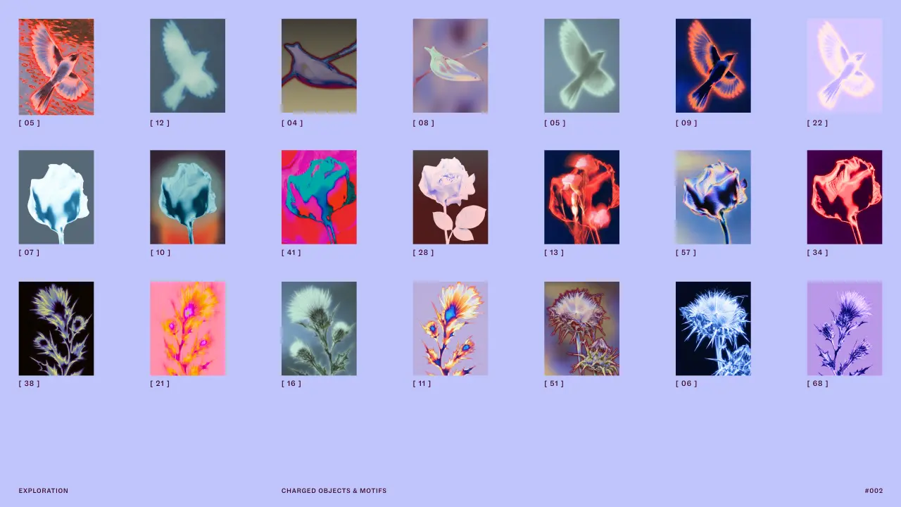
How did Mother Design figure all this out? They staged a séance and a chakra reading, alongside an automatic drawing and writing workshop led by one of Purple Garden's holistic practitioners. It's what we've come to expect from the studio, as it encourages its team to experiment with unfamiliar disciplines. Armed with paper and charcoal, they worked instinctively, trying to ignore and bypass conscious thought. The forms and feelings that emerged from the session then became the foundation of the identity.
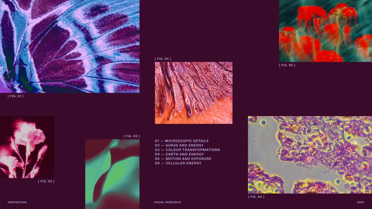
"So much of spiritual practice is about things you feel rather than things you can see – energy, intuition, connection and those moments when you feel altered somehow," says Joanna Tulej, creative director at Mother Design. "The challenge was how you translate that into a brand experience without falling back on the visual clichés of the category.
"We realised that if we wanted the identity to feel spontaneous and alive, we needed to allow some of that spontaneity into the way we designed it too. Starting with the séance and automatic drawing session gave us permission to step away from the screen and the rational design process. Some of the textures, energy and unexpectedness that came out of that experience found their way into the final identity."
I absolutely love this. Whatever you make of spirituality, it's nice to remember that the best work comes from being experimental and having fun. I think we need that now more than ever.
I was also fascinated to learn that the approach was partly inspired by the Swedish artist Hilma af Klint and The Five, the collective of brilliant women who experimented with trance-like states and automatic drawing to ignore conscious thought and let images and words emerge freely. (If you've not heard of her, look her up! Her paintings are considered to be among the first major abstract works in Western art history.)
But the inventiveness didn't stop at charcoal. During development, Mother Design moved back and forth between traditional design software and AI tools, iterating constantly to generate unexpected visuals and add more unpredictability to the process.
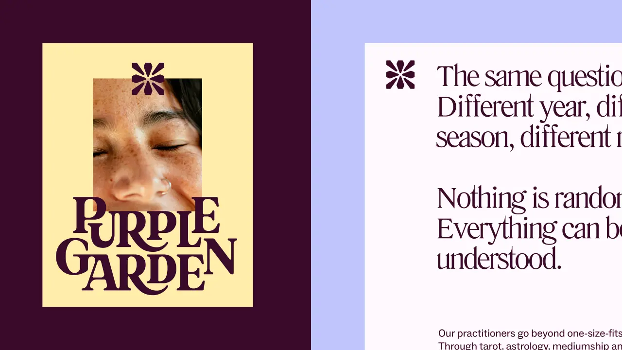
Looking at the outcome, I'll start with the typography because you can see all this play spilling through. The wordmark itself balances modern with whimsical. Elongated serifs and curved corners seem to grow outward. A "digital-first", crystal-like glyph acts as a symbol of guidance and forms the basis of the entire icon system for navigating the platform's many services.
Literatura Present and ABC Social complete the type system. Literatura's flowing descenders and serifs add to that sense of growth, and ABC Social does the functional, sensible stuff so things are easy to read on screen.
I really love the "living type" detail, inspired by cymatic patterns. That's the shape sound makes when it vibrates through a surface, if you didn't know. The subtle message is that Purple Garden helps you to grow, too.
Colour-wise, purple clearly takes the lead. But Mother Design has developed a palette of six warmer purples, deliberately moving away from the cool, blue-toned purples so common in this category. The imagery feels more intimate and tactile, while the motion reinforces the idea of growth.
The project follows Mother Design's recent rebrand of Keen, another spiritual guidance brand within the Ingenio portfolio. While Keen targeted a more mainstream, "spiritually curious" audience, Purple Garden is for those already seasoned in this space: two brands, two different jobs.
"Purple Garden is for people who already have a deep connection with spirituality and see it as an active part of how they navigate their lives," says Ariana Hellebuyck, CMO at Ingenio. "We wanted the brand to reflect the depth of the experiences our guides provide and make that connection feel just as powerful in a digital environment.
"Mother Design has created something that feels distinctive to Purple Garden and true to our audience, while giving us a richer and more immersive platform for the next stage of the brand."
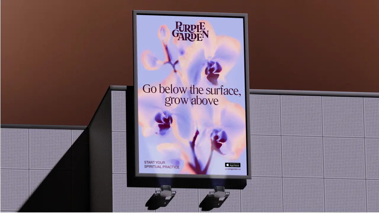
The new identity is now being rolled out across Purple Garden's website, app, advertising, and social channels over the coming weeks.
It's got me thinking about how I love to switch off. Admittedly, my rituals are less mystical and don't involve any summoning. I find ironing, getting out on my bike, or spending time in the garden helps me zone out. Not as exciting, but the principle is the same. Just like Hilma, this project reminds us to play and try new things. Don't be afraid to experiment. And let creativity flow. You never know what will come out the other side.
Inspired by the posters and placards of past civil rights movements, the rebrand makes people's rights easier to see and use.
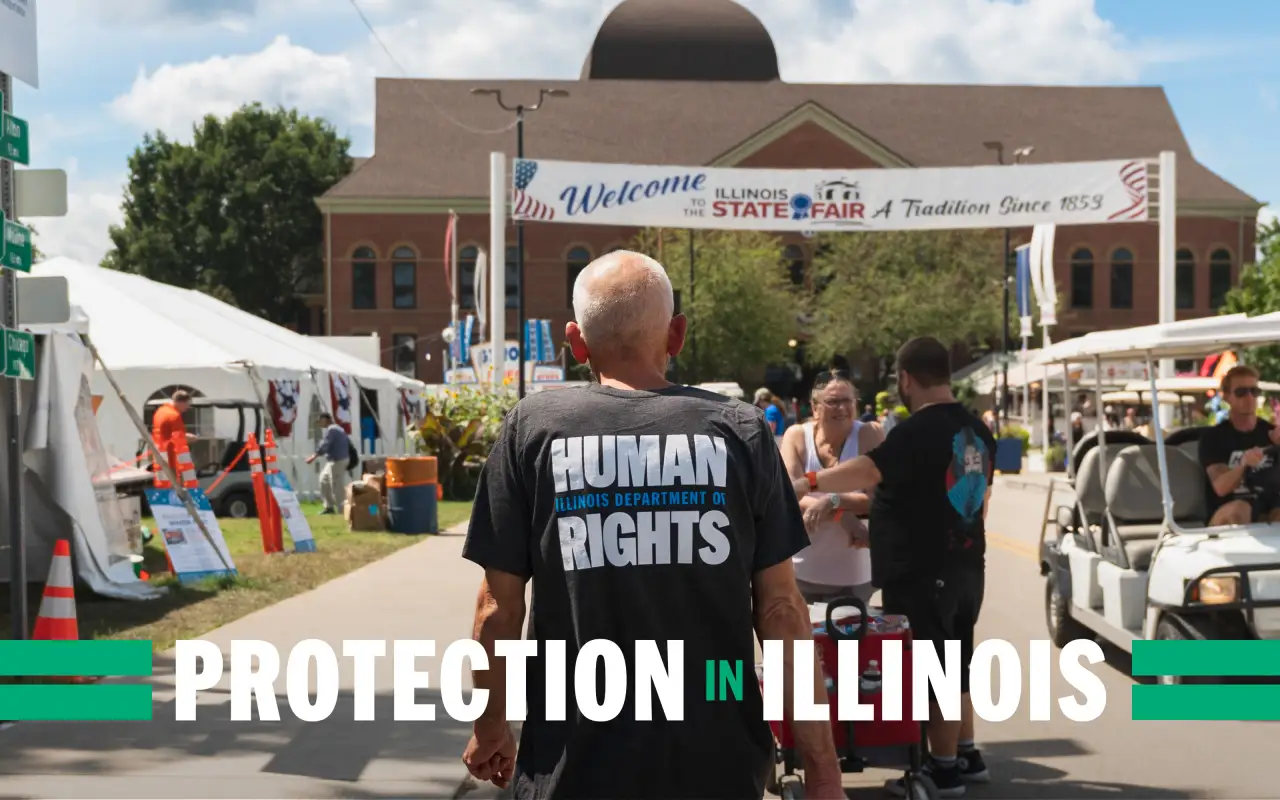
Since 1980, the Illinois Department of Human Rights (IDHR) has investigated discrimination in employment, housing, financial institutions, and public spaces based on race, sex, disability, religion, national origin, and age.
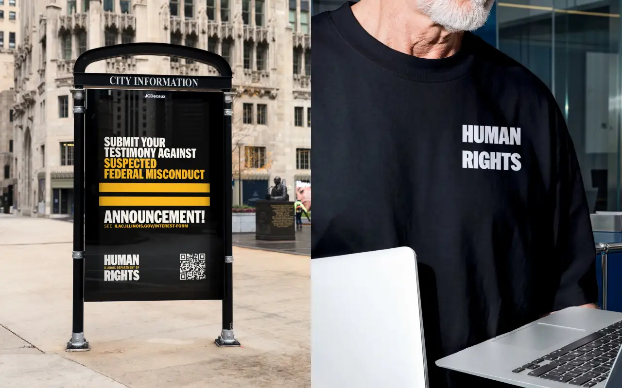
The organisation has now partnered with Chicago design studio Span on a people-centred rebrand. The aim: reinforce its commitment to protecting human rights while making those rights easier to see, understand, and use.
While IDHR aims to protect all people across Illinois, the department feared citizens could no longer see that purpose, as trust in government and public institutions has grown more fragile.
"There was a concern that the organisation was seen as rigid and bureaucratic, with its important work less visible," says Nick Adam, associate partner and design director at Span. "IDHR needed to remain neutral and fair in its work without becoming neutral about its purpose.
"And while they understood that a new logo couldn't mend an institutional divide, they knew that they could better protect people's rights by raising awareness; changing how IDHR speaks, organises information and shows up in public. After all, a right people cannot see is harder to use."
Focus on clarity
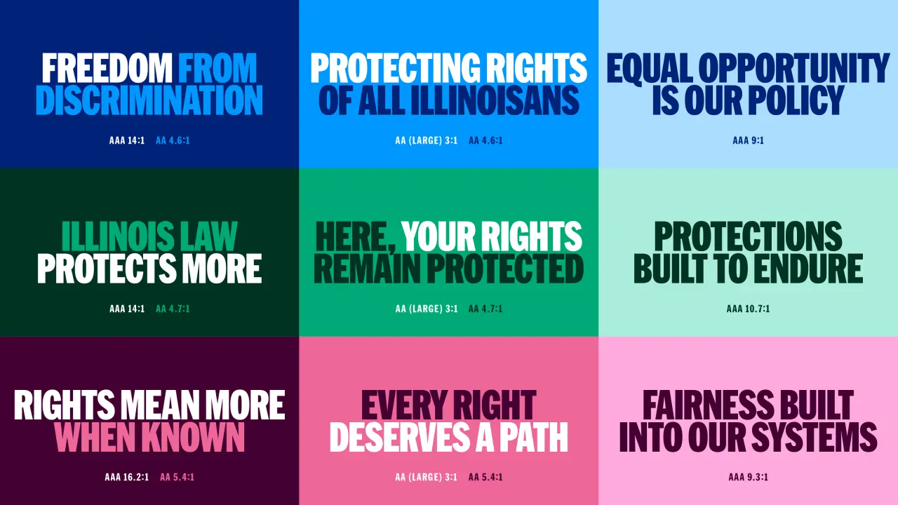
To meet this challenge, the new identity focuses on clarity to help users understand their options and feel supported.
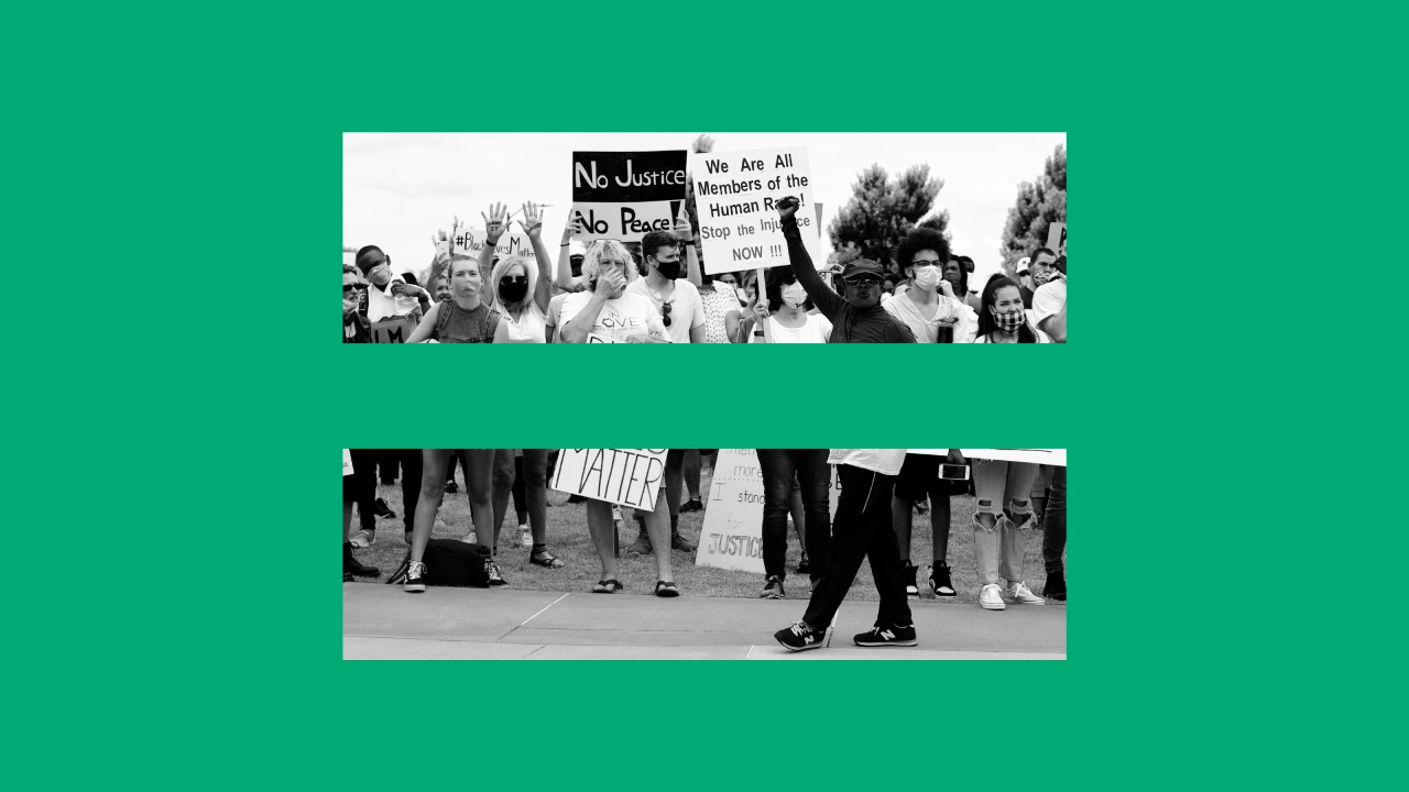
For inspiration, the team returned to the symbols of past civil rights efforts: posters, placards, banners, and declarations designed to be seen, understood, and remembered.
The main typeface, HEX Franklin, is bold and forceful, conveying confidence, credibility and trust.
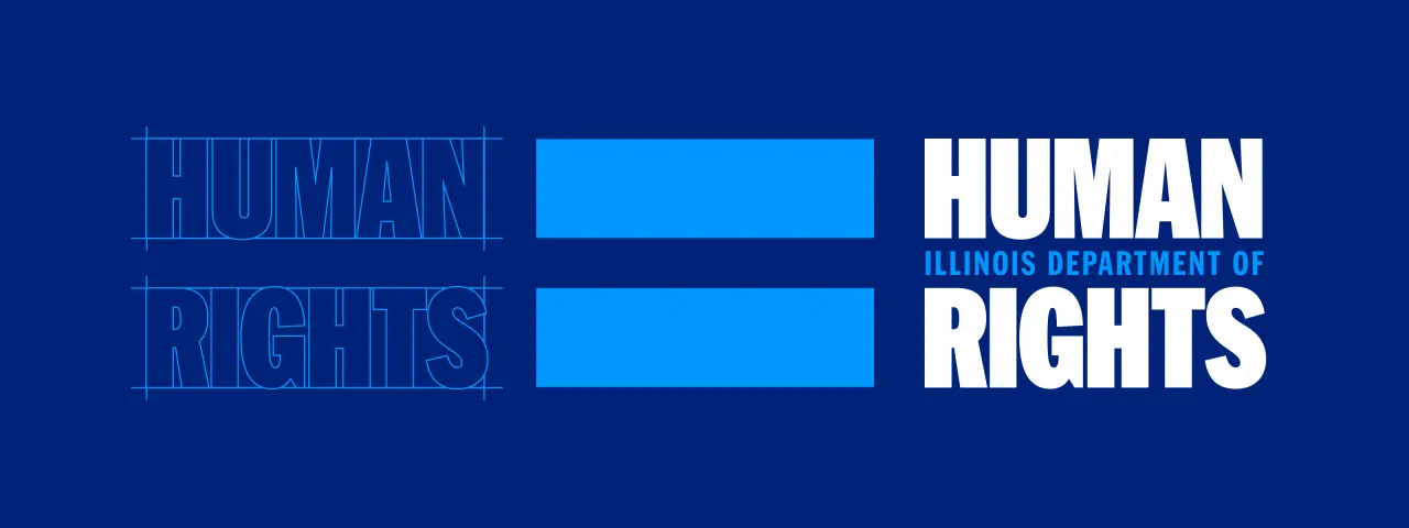
In the logo, the words "Human Rights" are emphasised to keep the department's mission front and centre, with "Illinois Department of" serving as both a descriptor and a connector.
Positioned between the two large lines of "Human Rights", it creates the visual impression of an equal sign: a simple but meaningful gesture towards fairness, reciprocity and balance under the law.
A sign of equality
"The equal sign gave us a way to make the idea of human rights visible before a single word is read," says Adam. "Equality belongs to everyone."
He adds that the lines echo both flag stripes and the graphic language of designers like Chicago's Lester Beall, celebrated for his work for the Rural Electrification Administration.
Social and rapid-response communications have been built as a deployment kit, with established ways to handle announcements, photography, rights information, events and urgent messages.
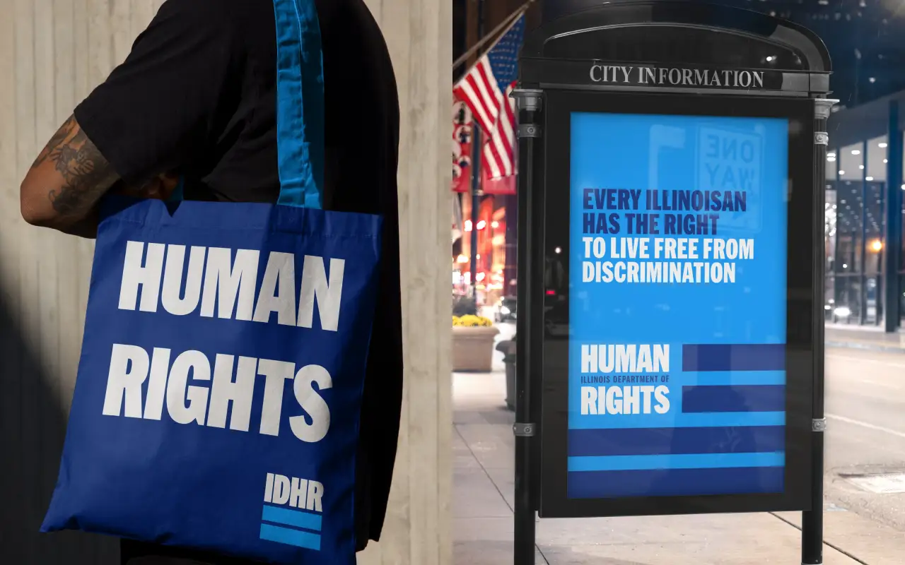
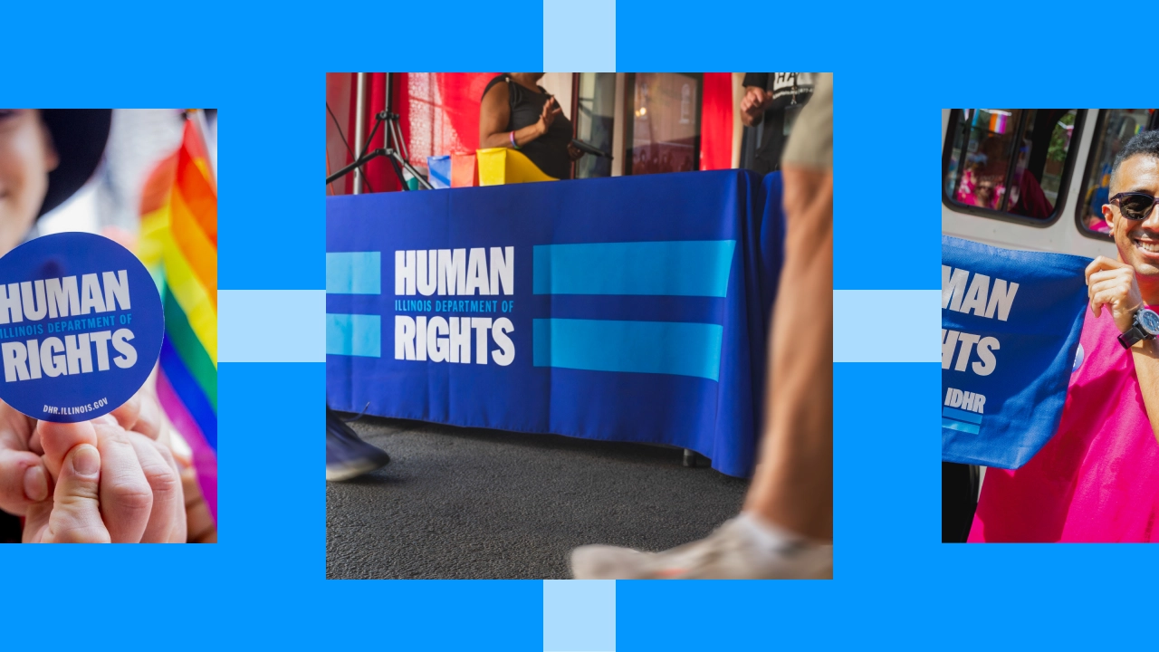
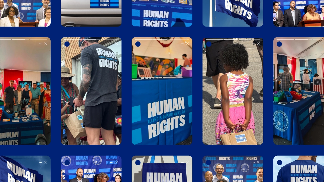
Public events required another ready-to-use system of banners, flags, step-and-repeats, table coverings, signage, presentations and printed materials.
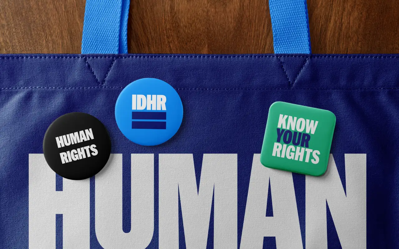
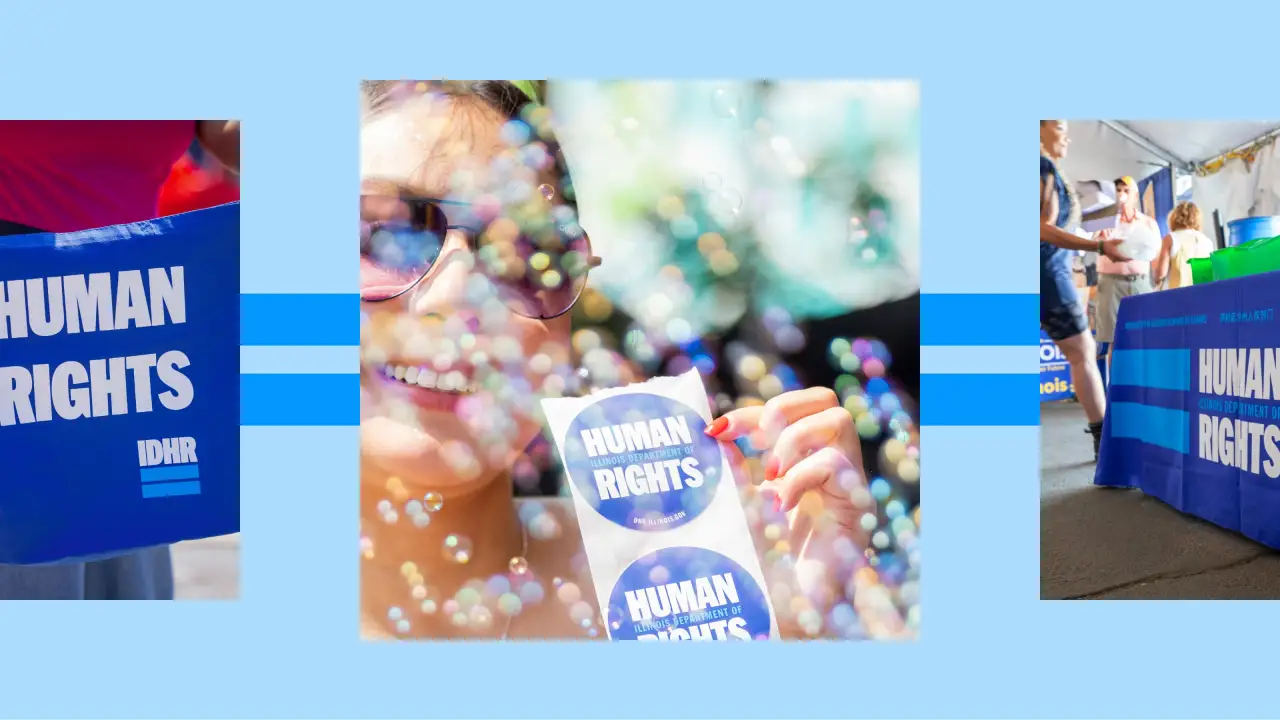
This has helped IDHR put rights information directly into people's hands at Juneteenth events and the Illinois State Fair. At Chicago's Pride Parade, it allowed the department to create and distribute stickers, buttons, apparel and other materials to the crowd.
Span has a longstanding relationship with IDHR, having previously helped launch the statewide support service Help Stop Hate. And Adam stresses that this project has been built for the long haul, dubbing it: "Conviction without propaganda. That feels especially important in design right now. And as Illinois locals, we can see and feel the impact of our own work in real time."
IDHR director Jim Bennett is delighted with the result. "Our goal was to create a brand that people could recognise, connect with and immediately know our agency exists to protect their rights," he says. "Every Illinoisan should know they are protected under state law, regardless of who they are, who they love, or where they come from."
We recently went to see “Mud is Everything” at Nottingham Contemporary, an exhibition by the Paraguayan sculptor Julia Isídrez: bulbous anteaters, yawning hippos and strange cylindrical beings, made from clay she gathers herself from the earth near her home in Itá. Her description of that clay echoes our pieces on the organisational substrate, only she says it with the mud in her hands: it is sediment, minerals, microorganisms, insects, mycelia and plant roots. And “it is full of ancestors.”
“All mud used to be something else, and it will be something else again. Mud is malleable but also holds memory.” – Julia Isídrez
Anteater, from “Mud is Everything” by Julia Isídrez
In the last piece on organisational substrate, I described it as the accumulated structures, technology, incentives, institutional memory and past stories in an organisation that determine what can thrive and what cannot. There’s an informal set of tests I think about for deciding what counts as organisational substrate and what doesn’t: roughly, does it change what can thrive in the organisation? Is it a condition of the organisation rather than an event?* And does it survive the turnover of people? If all or most of the answers are yes, it’s likely to count as substrate.
Just like Julia says, the past shapes the substrate; and in some ways the past is the substrate. Peat, for example, is basically nothing but past life, layer upon layer of sphagnum moss that grew and died faster than it could decompose, accumulating at about a millimetre a year. A ten-metre peat bog is ten thousand years of autochthonous moss: a landscape built from its own dead. And a coral reef is perhaps the purest example of this sort of substrate (and just like peat, very fragile and under-threat) – a living community growing on the accumulated calcified skeletons of its own ancestors.
“Land, then, is not merely soil; it is a fountain of energy flowing through a circuit of soils, plants, and animals.” — Aldo Leopold, A Sand County Almanac
Substrate is made by past life, influences the potential of future life, and is continuously reshaped by those living in it in the present.
The substrate contains memory of past conditions: the flood that deposited a layer of silt or the forest fire that is now represented by a thin dark layer in the soil. The Rothamsted Park Grass experiment shows how even an English meadow contains a detectable trace layer of nuclear weapons testing in the 1960s.
Organisations lay down similar layers in their substrate too, many of them made of stories. There’s a classic study from 1961 by Jacobs and Campbell, two social psychologists interested in how traditions outlive the people who start them. They used an optical illusion where a stationary point of light in a dark room appears to wander, and they asked people to judge how far it moved. As a group, they tended to settle on a shared answer. Into each group the researchers planted a stooge, who gave a confident and wildly inflated estimate, and the group’s shared answer settled higher. Then the stooge left, and members were gradually replaced one at a time until nobody from the original group remained. The inflated answer persisted even though every founding member was gone; the group was still giving an answer that was seeded by a person none of them had ever met.
The story that taught a factory to keep quiet
There’s also a far more recent real world example: Claudia Pferner spent nearly three years inside a German car plant, exploring the spread of cultures of silence. The whole study landed on a single event years earlier. Karl, who’d been at the company for years as a quality foreman, asked a question at the company-wide management meeting: why was one production area measured on volume when every other area was measured on quality? A few days later he was summoned to a meeting and given a “disciplinary measure involving personal coaching”. Thirteen other interviewees cited Karl’s case as the reason they no longer ask questions in those meetings, even though many of them weren’t even in the room at the time of the incident, and some joined the company after the event and learned the story from colleagues, who retold it as a warning.
A leaf decomposes and becomes part of the ground in the same way that folklore like Karl’s story does in organisations. New joiners absorb it as the conditions of life, simply what happens here to people who do that.
A caution, however, about stories like Karl’s: when we hear them, most of us cast ourselves as Karl. Very few of us hear it and recognise ourselves as the superiors who disciplined him. If we carry any power in our organisation, the honest question isn’t “would I have asked Karl’s question?”. It’s “have I ever responded like this to a question, and would anyone tell me if I had?”.
“People think that stories are shaped by people. In fact, it’s the other way around.” — Terry Pratchett, Witches Abroad.
Humans are storytelling animals; folklore, folk music, legend, myth and gossip are how we’ve deposited experience into communal knowledge for as long as we’ve been a species. Maybe it’s what actually makes us a species. The substrate is turned over constantly by the small, unglamorous work of people talking to each other, just like the unglamorous but essential work of earthworms. Darwin, in his worm book, said: “It may be doubted whether there are many other animals which have played so important a part in the history of the world, as have these lowly organised creatures.”
Institutional Memory as Substrate
There was a Roman fort called Trimontium in the Scottish Borders, named after the three Eildon Hills nearby, and during hot dry summers, marks appear in the fields where it once stood, showing the walls, tracks and ditches of the huge ancient complex that occupied them, clearly visible from the air. Of course, we’re not actually seeing the ditches and walls, only the crop’s indications of them. Crops growing over an ancient ditch might stay greener and ripen later than their neighbours, because they can root deeper; whilst crops growing over an old wall or a Roman road grow slower and less green. Most of the time this tiny effect is invisible, but drought, hot weather, and resultant stress exacerbate it, so much so that it becomes clearly visible.
Trimontium from the air. Photo by Tim Garratt. This archaeological technique was pioneered by O.G.S. Crawford, a WWI aerial observer who realised reconnaissance photography could read the past as well as the enemy.
Organisations are also full of backfilled ditches, old walls and connections that are no longer there, and whilst the memory of these may often be invisible, during times of stress, these old loyalties, rivalries and fractures can reappear, sometimes with a vengeance. In either case, stress didn’t create these patterns: it just revealed them.
“Learning belongs to the roots, while education belongs to the branches.” – Munir Fasheh, Palestinian thinker and writer
Which leaves the question: who gets a say in how the substrate is shaped? If the substrate is something we all live in and pass on to those who follow, then it follows that we should collectively maintain, improve and steward it for others and those who come after. This sounds rather like a commons, and commons come with very well-studied structures, rules and practices. That’s the next piece.
*an event can certainly affect the substrate, in much the same way that a forest fire isn’t substrate, but it surely affects it.
Darwin, C. (1881) The Formation of Vegetable Mould, through the Action of Worms, with Observations on their Habits. London: John Murray.
Haudricourt, A.-G. (1962) “Domestication des animaux, culture des plantes et traitement d’autrui”, L’Homme 2(1), 40–50.
Jacobs, R.C. & Campbell, D.T. (1961) “The perpetuation of an arbitrary tradition through several generations of a laboratory microculture”, Journal of Abnormal and Social Psychology 62(3), 649–658. Worth noting that the inflated answer did fade over enough generations: traditions with no function eventually die out.
Leopold, A. (1949) A Sand County Almanac. New York: Oxford University Press.
Pferner, C. (2026) “‘Have you heard!?’ The narrative roots of organizational silence”, German Journal of Human Resource Management, OnlineFirst. 48 managers, 128 interviews, over nearly three years at a German automotive site.
Pratchett, T. (1991) Witches Abroad. London: Victor Gollancz.
The creative lead at CESS has created a fun new Artphabet featuring 26 notable artists.
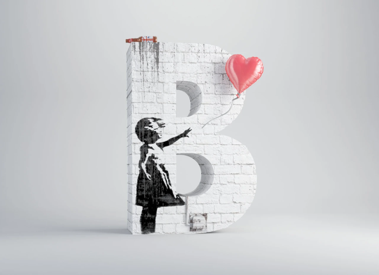
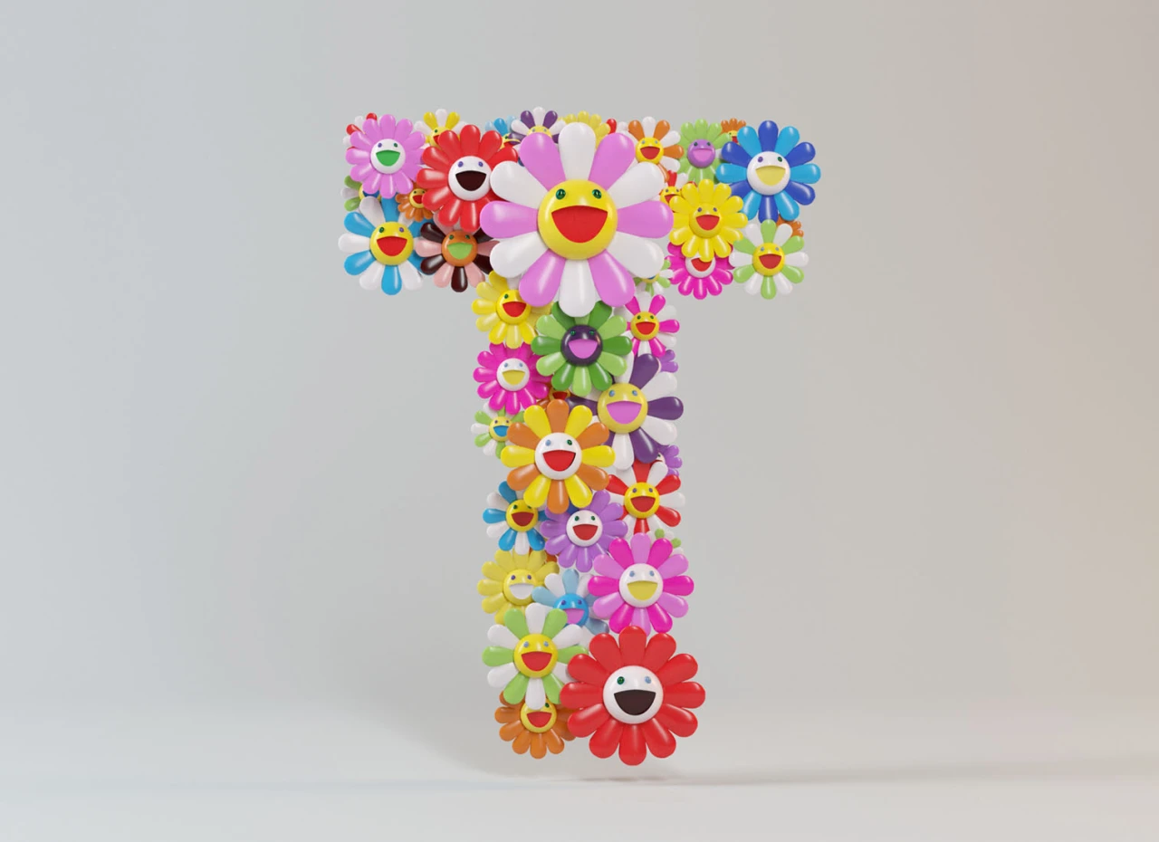
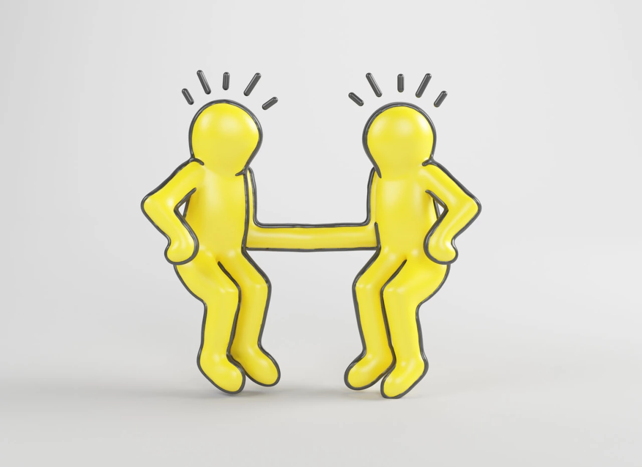
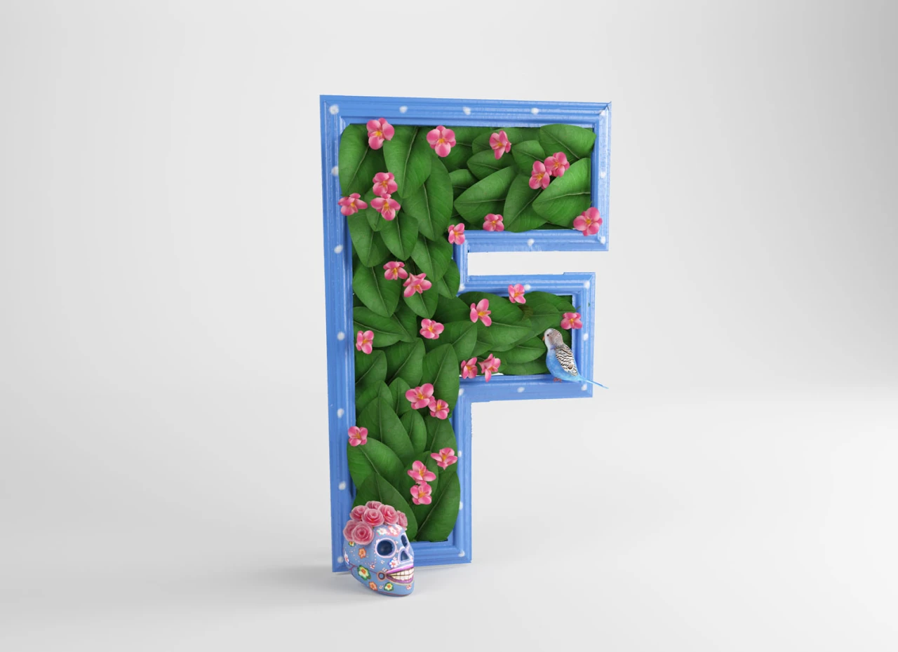
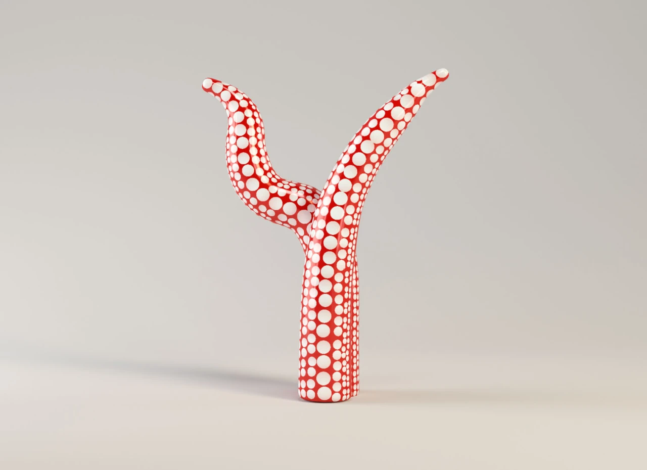
It's a testament to an artist's talent that their paintings can be abstracted and remain recognisable. César Cid proves this point 26 times over in The Artphabet, a 3D typographic series that turns famous artworks into letters matching their creators' names. And it all begins with an A-shaped Campbell's soup can inspired by Andy Warhol himself.
The Artphabet is a personal project for César, who works as the creative lead at the Madrid-based studio CESS by day. Inspired by the annual typography challenge 36 Days of Type, he wanted to bring his love of art and his 3D work together in a series that could explore different visual worlds.
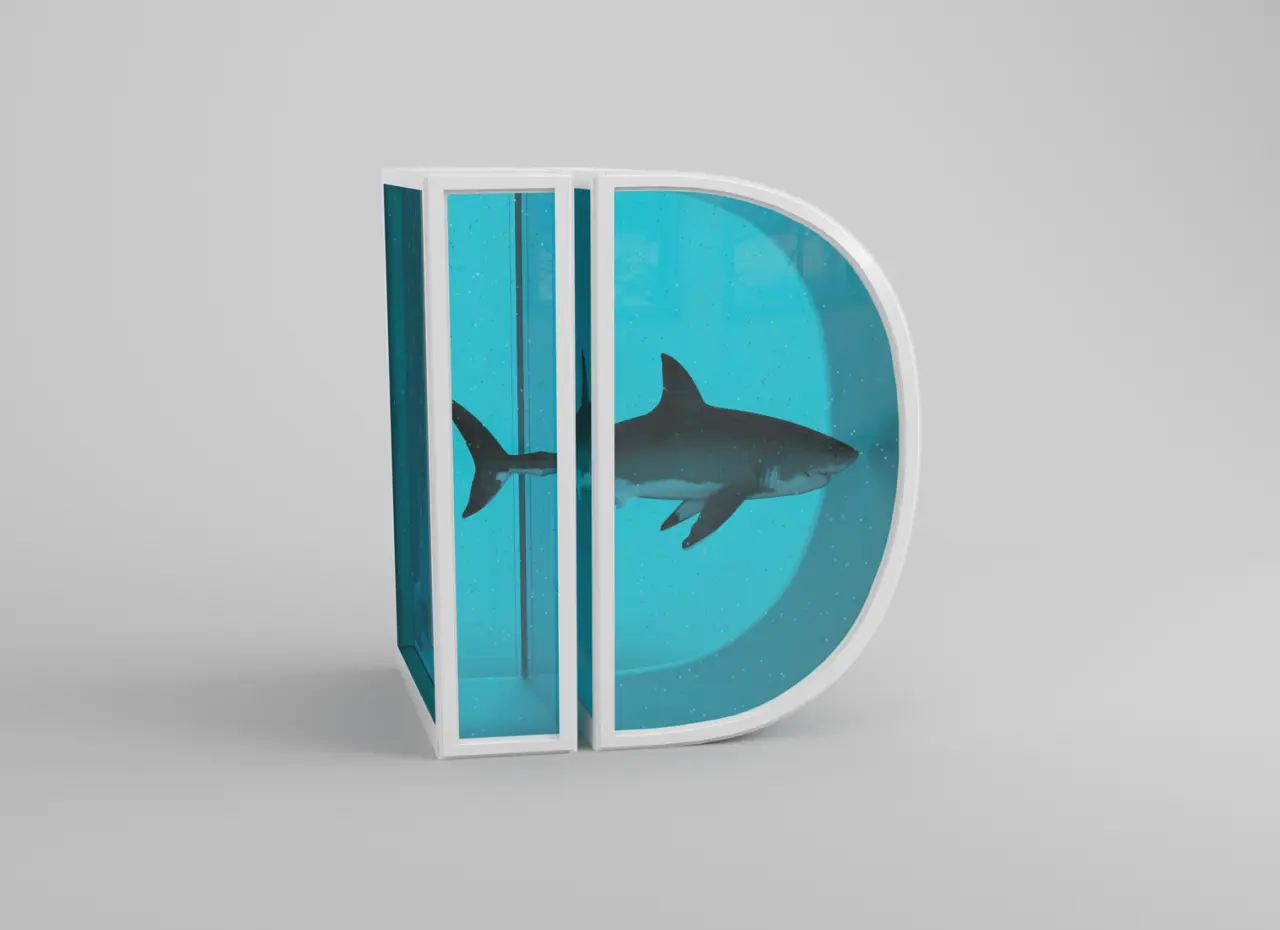
Rather than simply wrapping a famous artwork around typography, César wanted to imagine how an artwork's colours, shapes and materials could become a letter in three dimensions. D from the series is a perfect example, as it adapts the shark and formaldehyde tank from Damien Hirst's 1991 installation The Physical Impossibility of Death in the Mind of Someone Living.
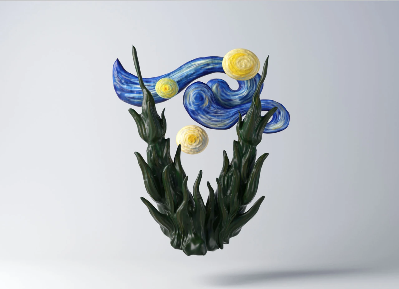
Elsewhere, Banksy's Girl with Balloon becomes the basis for the letter B, and the swirling pastoral imagery from Van Gogh's Starry Night inspires the letter V. Given the nature of the alphabet, though, creative liberties were taken with certain letters.
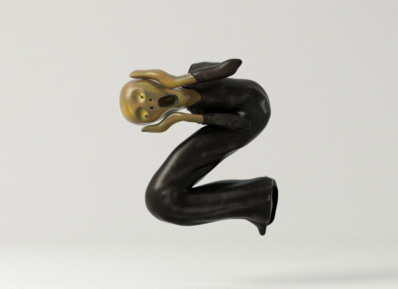
"My initial idea was for each letter to match the artist's initial, but that wasn't possible across the whole alphabet," says César, referring to how the terrified figure from Edvard Munch's The Scream becomes zig-zagged into the letter Z. "The process became a way for me to learn more about art, to look more closely at each artist's work and understand what makes their style distinctive."
Once the full range of 26 artworks was completed, The Artphabet soon found an international audience. This encouragement prompted César to release the images in other formats, such as a popular collection of physical prints. "I love seeing people choose these pieces for their homes, and connecting with the project beyond the screen has been especially rewarding," he says.
The Artphabet has already grown beyond the original digital project, and a "substantial number" of canvas prints are being bought through private sales and online auctions, but César isn't done with it yet.
"A book of The Artphabet will be published early next year, which is a big milestone for the project," he says.
"I'm also in ongoing conversations about expanding The Artphabet into other formats, and I'm always open to new collaborations with publishers, brands and cultural organisations. I'd love to keep finding new ways for people to discover and enjoy the collection."
Uncommon Creative Studio's visual identity swaps corporate restraint for kinetic type. We find out more.
For decades now, it feels like there's been an unspoken rule about law firm branding. That these are serious institutions and demand serious, conservative-with-a-small-c visual identities.
You might think of sober serifs, a navy blue palette, stock photography of gleaming skyscrapers and firm handshakes. Whatever the elements, the theme is: we are trustworthy. Possibly a little boring and samey. But if so, that's a feature rather than a bug.
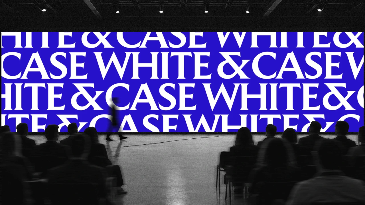
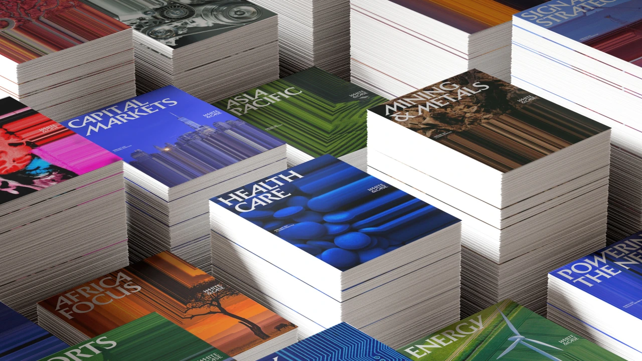
White & Case's new identity, however, is none of these things. Crafted by Uncommon Creative Studio, it's the New York-based global law firm's big rebrand in 13 years. And it's about as cliché-free as you could imagine.
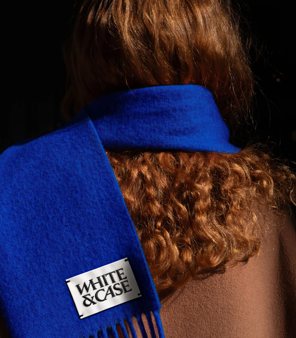
Navy blue is out, and an edgy, electric shade dubbed Catalyst Blue is in. Kinetic headline serifs add a welcome spot of verve and dynamism. And there's even a proprietary image tool that turns photography into streams of data.
Complexity as an advantage
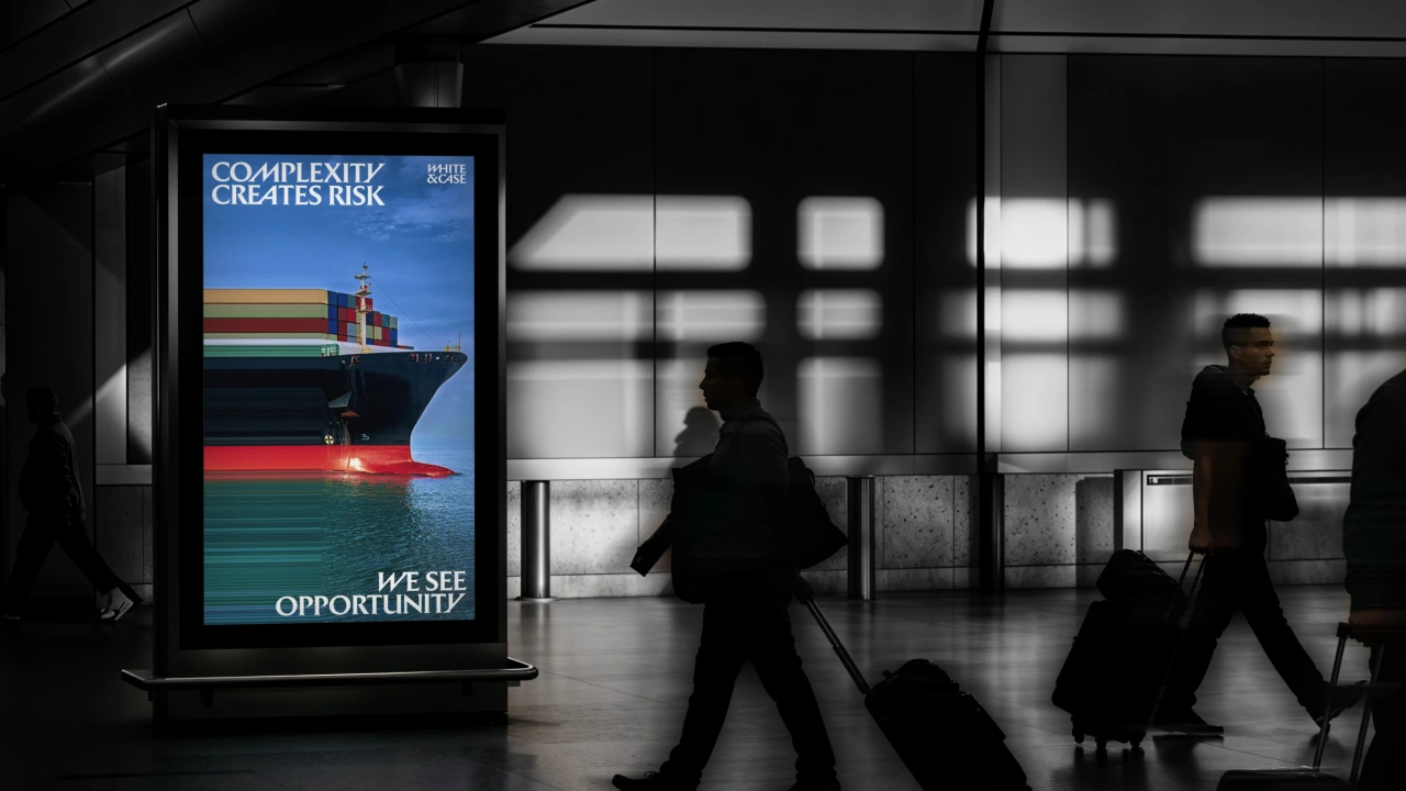
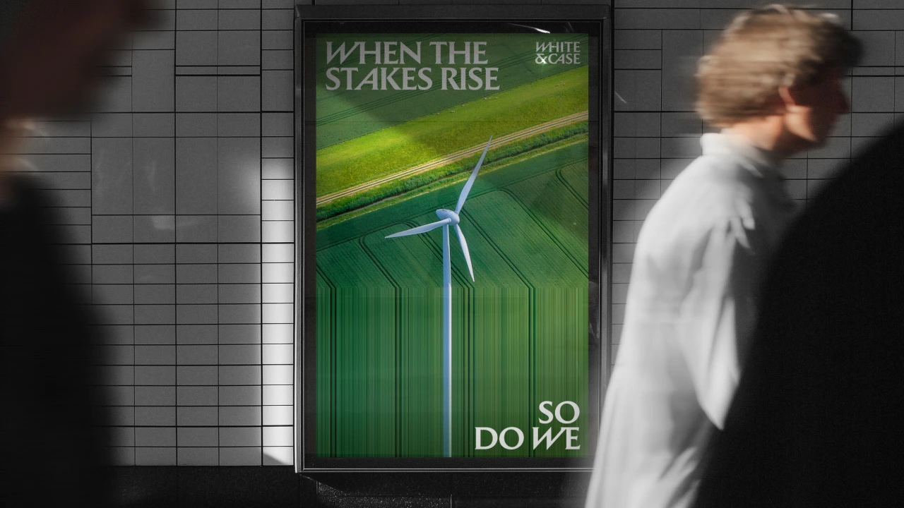
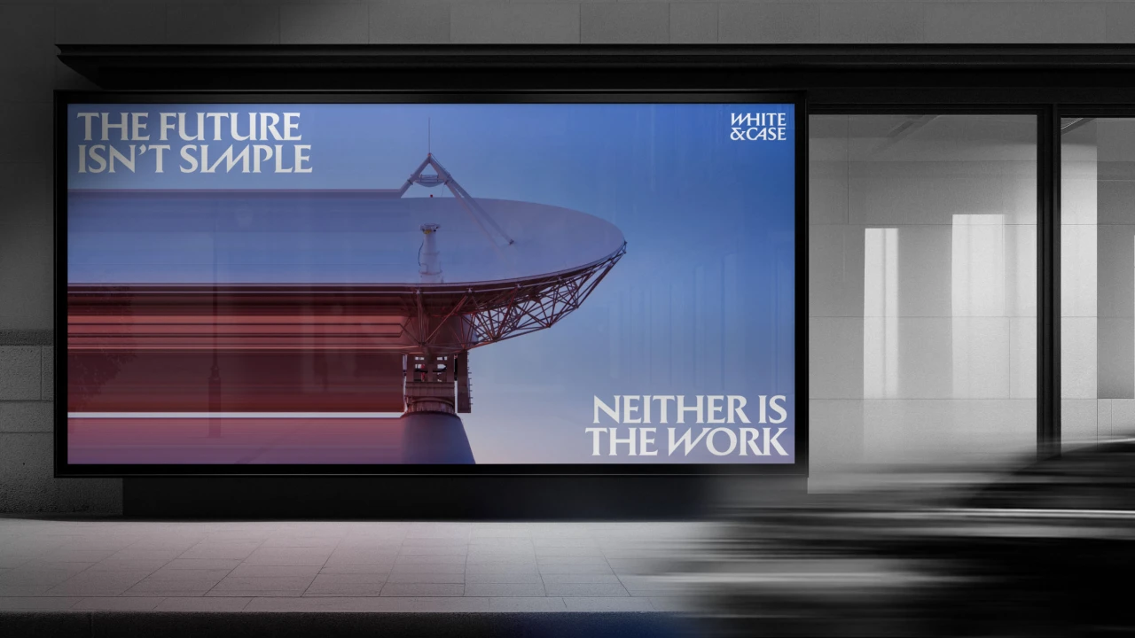
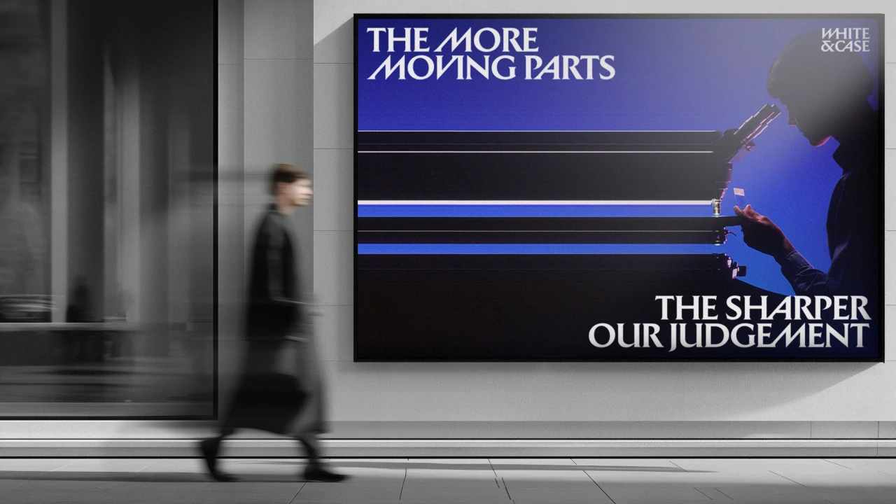
So what's the underlying concept here? Well, in an increasingly uncertain world, the 125-year-old law firm wants to frame complexity not as a bad thing, but as a catalyst for new thinking and opportunity. One poster makes this abundantly clear by teaming the words "Complexity creates risk" with "We see opportunity".
In other words, they're not talking down to their audience: quite the reverse. "Our clients are sophisticated business leaders navigating a complex world, and our category is intensely and increasingly competitive," says Jason Hill, White & Case's CMO.
"Those factors mean that brand can be a powerful source of differentiation and a driver of commercial growth. Our new design system reflects the catalytic energy and forward momentum of a powerhouse global firm."
Uncommon's brief then was to pull the firm out of a "sea of sameness". In the words of global chief design officer Lisa Smith: "The legal sector is drowning in navy blue slabs, borrowing from tired financial and tech clichés, and safe choices. White & Case is a firm built for polycrisis. They are high-stakes gladiators who step into friction when everyone else backs away."
Set in stone
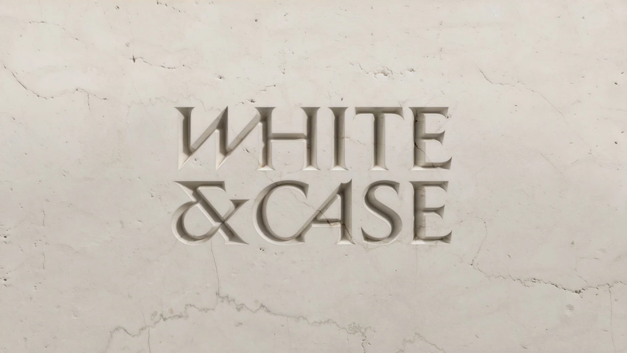
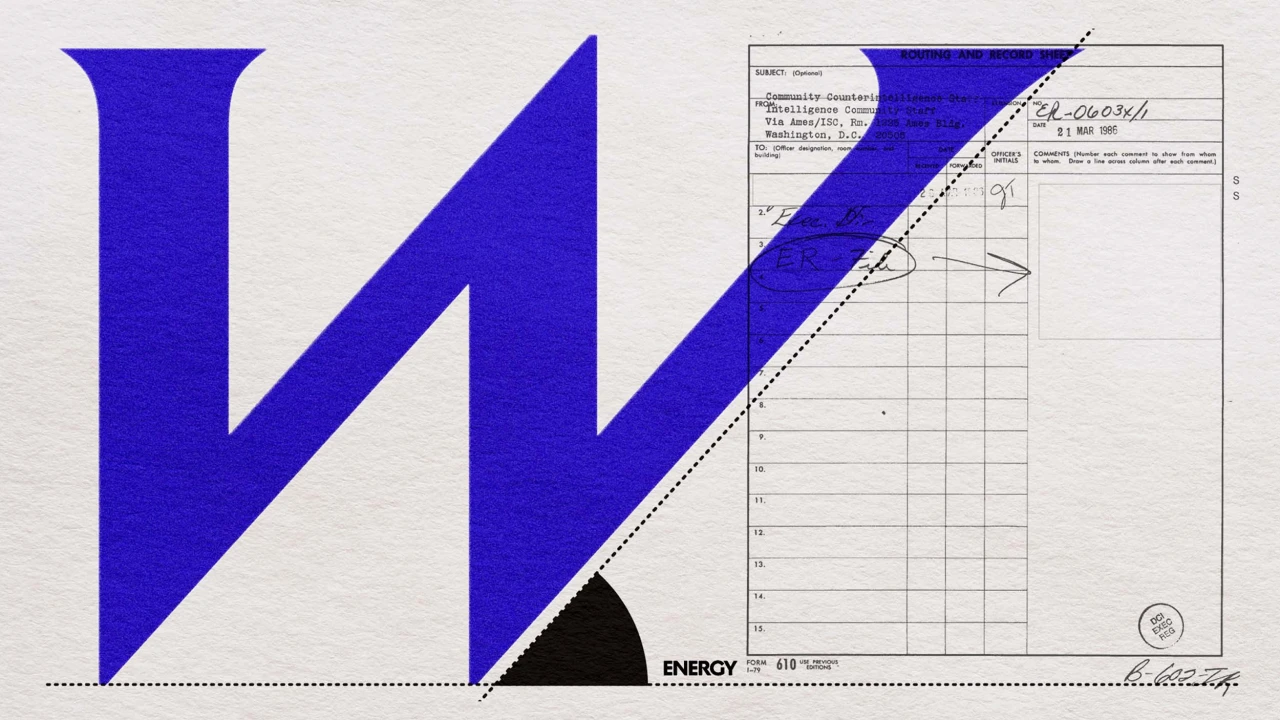
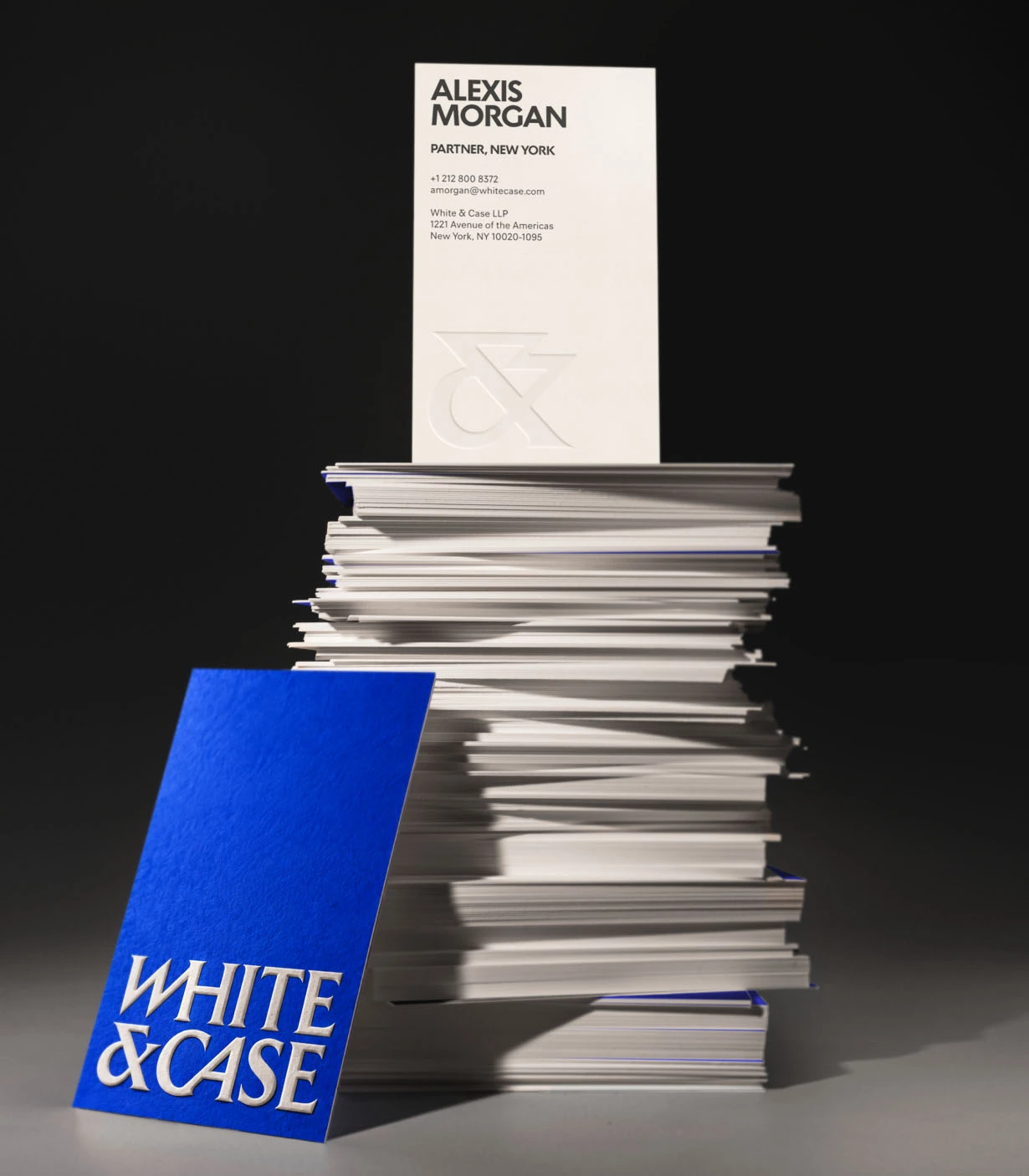
The new logo draws on the inscriptions on Trajan's Column and Roman stone carving, giving White & Case a sense of permanence and authority. It's a tightly stacked lockup in which diagonal cuts slice through the letters, such as the W, making them seem to lean forward.
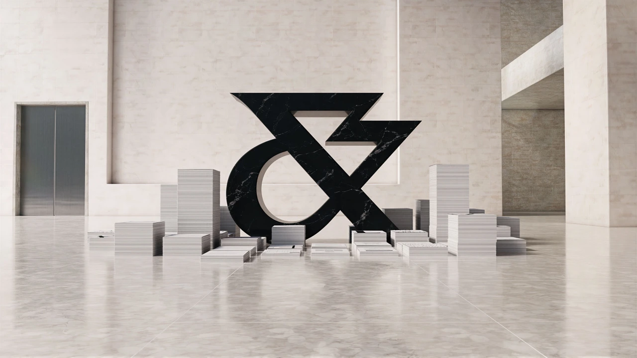
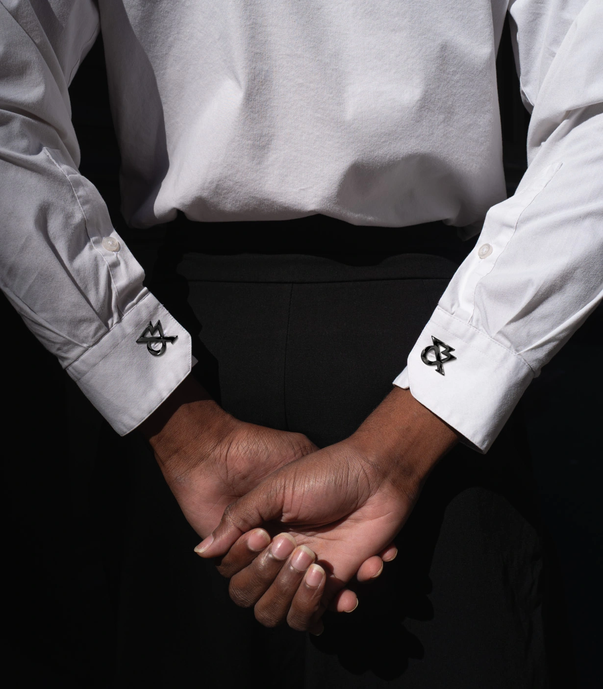
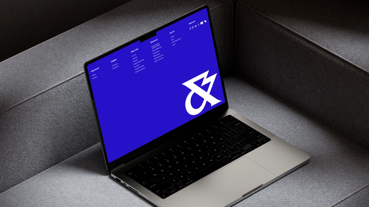
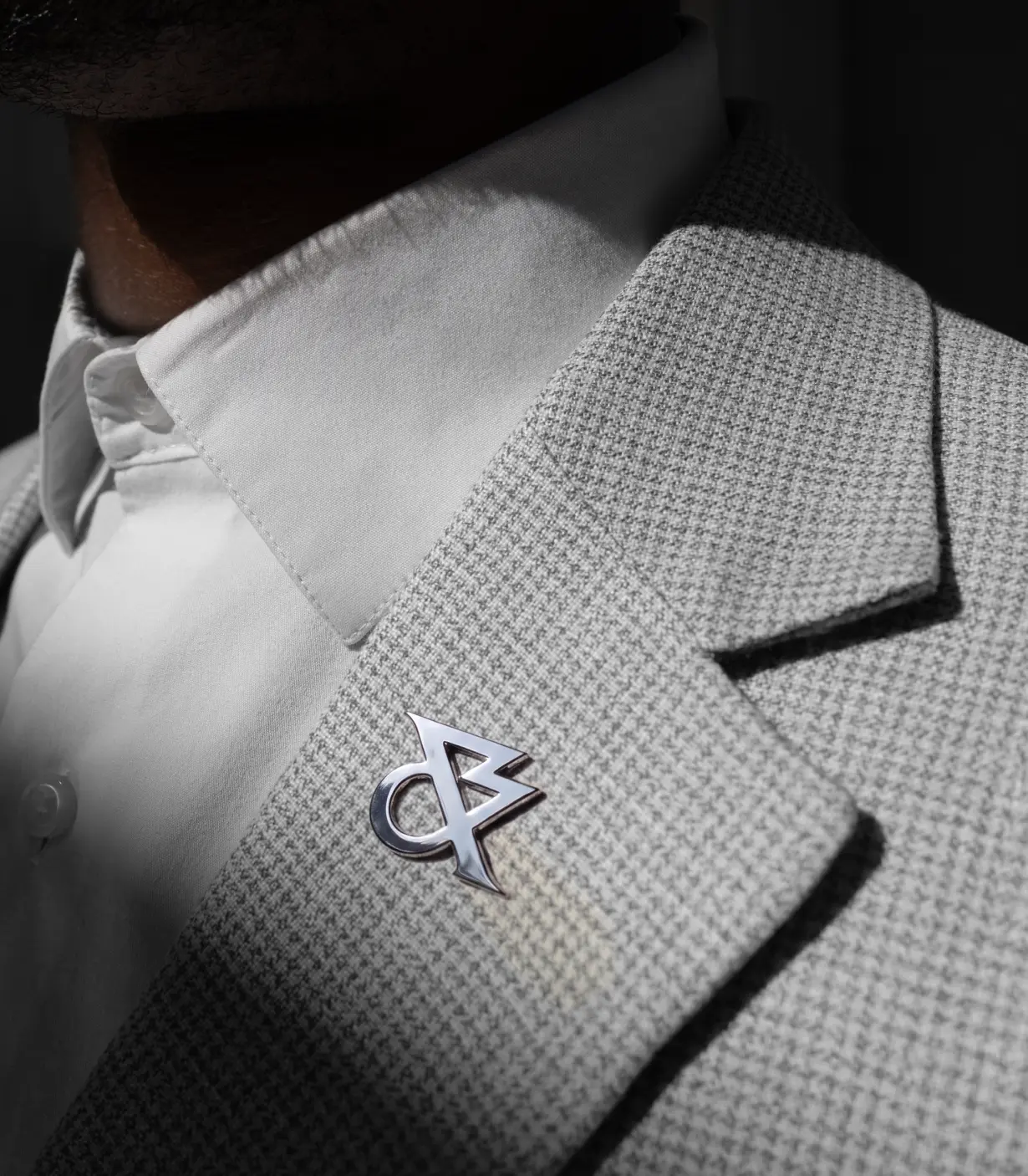
The ampersand, meanwhile, has been reworked as a standalone monogram. It's designed to celebrate the power of global partnership, and it looks equally at home on a laptop screen, a lapel pin or as a huge marble sculpture in a lobby.
Those directional cuts carry through to a set of custom-made headline serifs, designed to embody the idea of momentum and mirror how the firm's lawyers navigate complex legal landscapes. Set in large type, in phrases such as "Forward energy", they give the brand a real swagger.
Turning up the voltage
The main brand colour Catalyst Blue is drawn from the highest-energy end of the visible light spectrum. It's balanced out by Marble White and Ink Black, with secondary tones named Ion, Thermal, Solar and Ultraviolet, completing what Uncommon calls a "high voltage palette".
Then there's Energy Studio, a proprietary tool that applies a signature "energy effect" to brand photography. This stretches part of each image into sharp streaks of colour, so a volcano, a city skyline or a field of wind turbines dissolves into lines of data.
The new identity is rolling out globally across digital recruitment platforms, client collateral, pitch materials, paid advertising and a podcast, along with a brand film, The Power of Complexity.
Overall, this is a sassy, original and perhaps brave take on legal firm branding. "We built a dynamic, assertive identity that cuts through the noise," says Smith, "proving that design isn't just about how a firm looks, but how it multiplies its force on the world stage."
DutchScot's identity for Fjord, a sauna and cold plunge on San Francisco Bay, makes hot and cold its defining idea.
Personally, I really don't like saunas. The idea of baking your body in a small, suffocating oven, then shocking it by plunging into ice-cold water, appeals to me neither in theory nor in practice. But I imagine I'm in the minority. Most of my friends, young and old, across multiple continents, seem to enjoy what I consider torture. So who am I to disagree?
And my friends, it seems, are not alone. In recent years, saunas, both portable and permanent, have been popping up pretty much everywhere I've visited, as the practice has emerged from something only weird Scandinavians do to a worldwide wellness craze.
Yet when it comes to crafting a visual identity for these experiences, popularity can be somewhat of a double-edged sword. As more and more entrepreneurs enter the space, the more everything starts to look the same. Soft neutrals. Flowing serifs. Imagery of faces with eyes closed in contemplation. So I was pleased when I saw a new venue take a radically different approach.
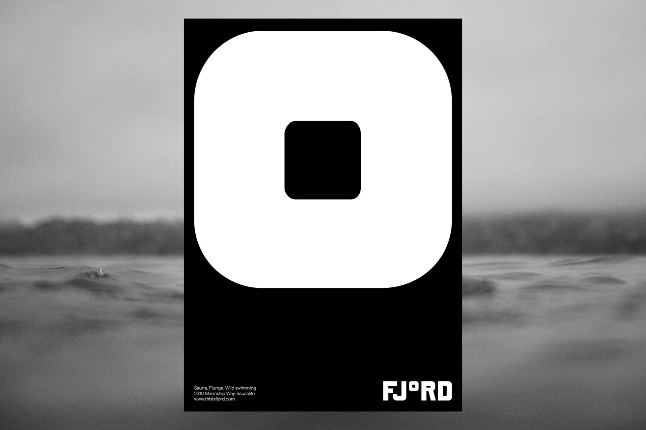
Fjord is a new floating sauna and cold water plunge in Sausalito, on San Francisco Bay. And its identity, created by London-based studio DutchScot, is swimming far, far away from the usual clichés you'd expect.
Clever to a degree
That's partly because the venue itself is defiantly different. As DutchScot puts it in its case study: "Fjord is not a spa. It does not sell spa services. Instead it provides a communal, outdoors, self-guided opportunity to enjoy the huge mental and physical benefits of hot and cold — and to enjoy a beverage afterwards with friends."
Seeking to sidestep sauna tropes, the studio worked with Fjord's founders, Alex and Gabe, to create a bold identity that inspired not by nature or wellness but by the area's industrial past. It's a stark black-and-white system that feels closer to a shipyard than a day spa.
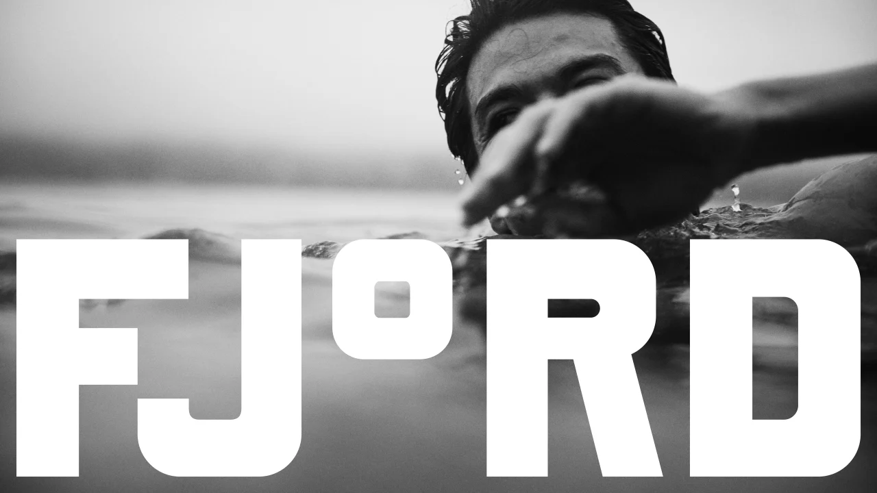
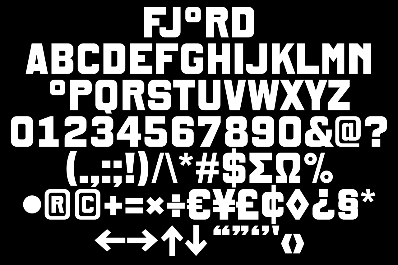
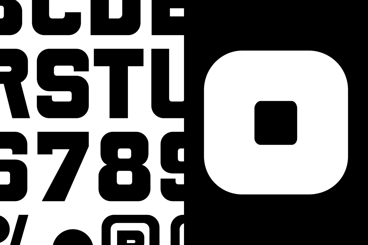
At the centre of the new designs is a bespoke typeface, created in collaboration with Danish type foundry Playtype. Its chunky, rounded-square letterforms have a sturdy, utilitarian feel, but the real star is the wordmark, which replaces the 'o' in Fjord with a degree symbol. It's a simple idea, but brilliantly effective: a sauna is, after all, defined by temperature if it's defined by anything.
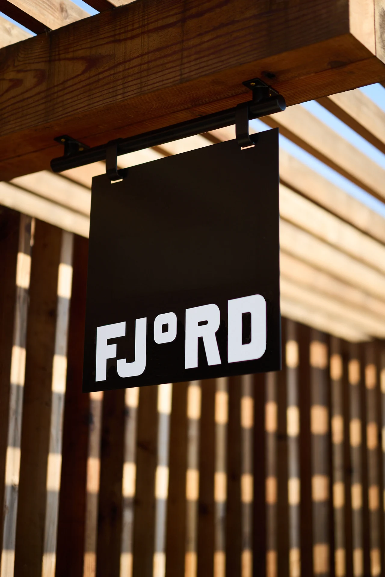
Better still, the degree symbol works well across the whole system. It pops up on its own as a graphic element, and when paired with the F to create a compact F° monogram for signage.
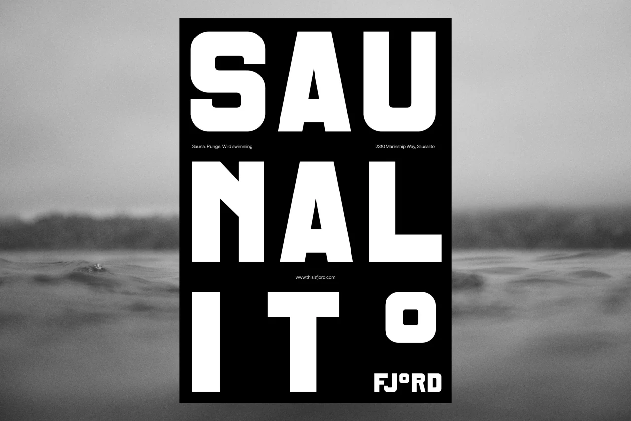
One poster pairs the sauna's 189°F heat with the bay's chilly 55°F waters, set in huge numerals alongside photos of steaming sauna stones and a splash in the bay. Another breaks the word 'Saunalito' over three lines, ending with a supersized degree symbol.
Marvellously moody
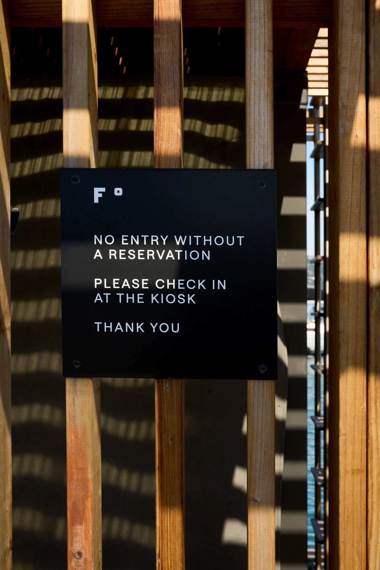
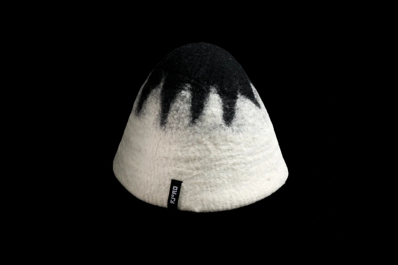
The concept carries through to digital as well. On Fjord's website, a 'temperature gauge' moves up and down as you scroll, while the navigation on the left echoes the markings on a thermometer. Wayfinding signage in black metal sits against the venue's timber slats, while merch includes a felted sauna hat in black and white, finished off with a small FJ°RD label.
DutchScot have even done something original with the gift tokens. Rather than providing them on a plastic card or an emailed voucher, they've designed them as a handmade soap in bespoke packaging. A thoughtful, tactile gift that fits the brand perfectly.
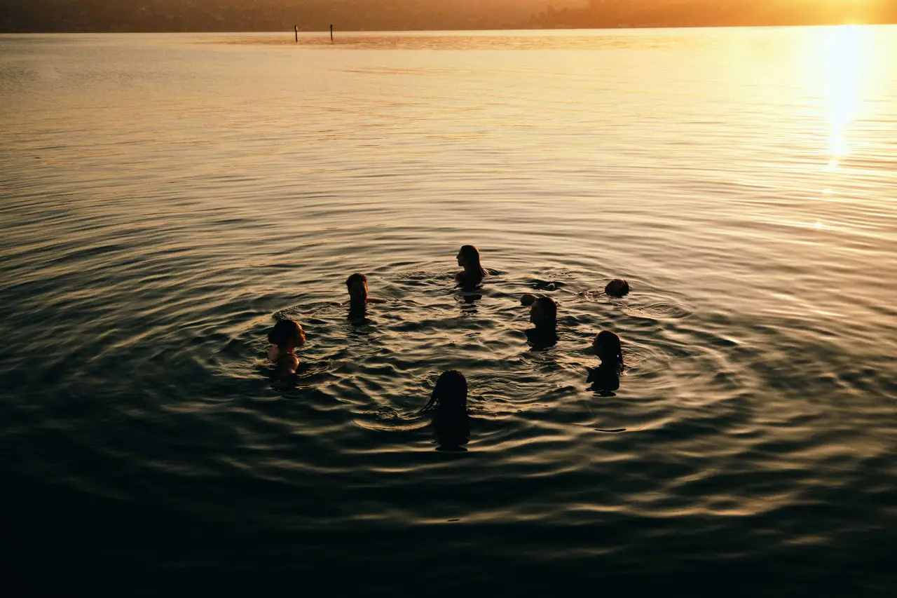
Photography by Alex Farnum, much of it in black and white, is suitably moody. Shots of swimmers bobbing in the bay at sunset, and close-ups taken at water level, capture the atmosphere without resorting to the usual spa imagery.
This all adds up to a confident identity that's packed with personality and proves wellness branding doesn't have to be soft and beige to work. Sometimes a single, smart idea, executed consistently, is all you need.
Fjord says it wants visitors to feel something. And hey, I can't stand saunas, and even I'm feeling it... so they must be doing something right.
The Maltese animator's debut short, Misophonia, combines risograph printing and an uncomfortable soundscape to draw us into a very different world.
For most of us, sounds like people slurping, chewing or sniffing can be a little irritating. But there's a world between that experience and suffering from misophonia: an aural disorder where specific sounds can trigger intense emotional and physical reactions.
Malta-based animator and printmaker Michelle Gruppetta wanted to explore what that's like to experience first-hand. And that's exactly the topic she explores in Misophonia, her debut short.
"Misophonia is a neurobehavioral condition associated with an intolerance, hatred or even disgust of specific sounds," she explains. "Noises such as other people chewing, breathing or sniffling, to name a few, induce discomfort and even rage in the person with the condition.
"People with misophonia are affected emotionally by the everyday sounds of other people that most typically don't notice," she continues. "The aforementioned examples trigger a fight-or-flight response that often results in anger or the need to escape."
But rather than just explaining what the condition is, the short sets out to make you feel it, by combining an unsettling soundscape of trigger noises with risograph-printed animation.
To get it right, she worked directly with people who have misophonia, running focus groups and taking on their feedback. Her aim, she says, is to "highlight that even the most innocuous sounds can have an effect on people, more than we might ever realise. By addressing this topic, this project contributes to a broader discussion on noise pollution in our everyday contemporary lives."
A soundtrack to make you squirm
Misophonia was released in 2025 and has since run on the festival circuit, with screenings this year at Pictoplasma and the Annecy International Animation Festival. Importantly, it doesn't follow a traditional three-act structure. Instead, the intense soundscape takes the viewer on a journey through what it's like to live with the condition.
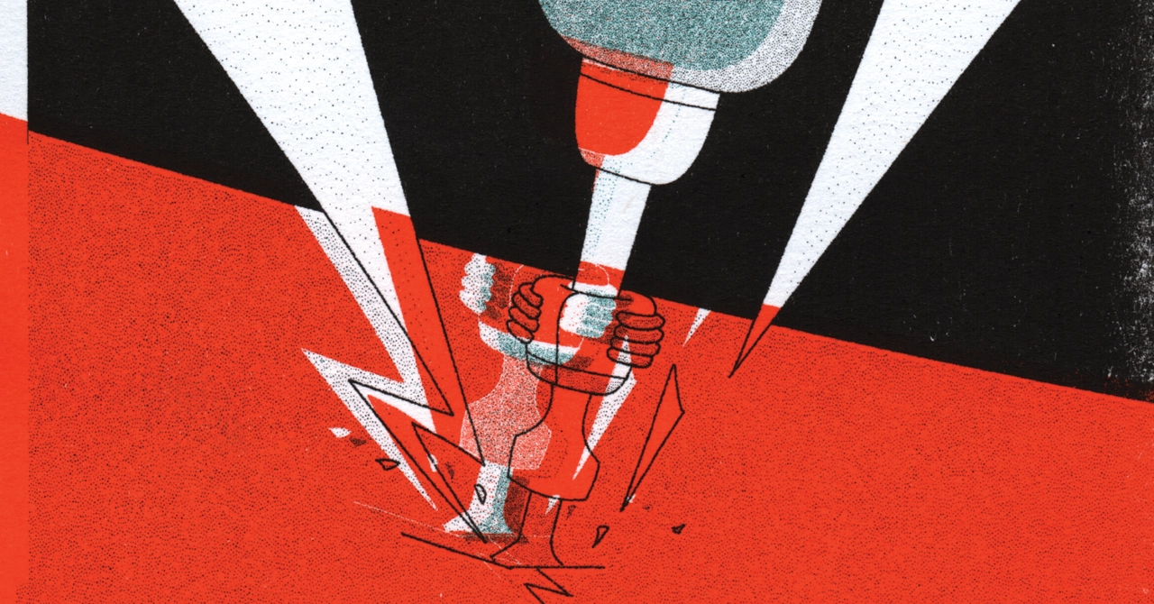
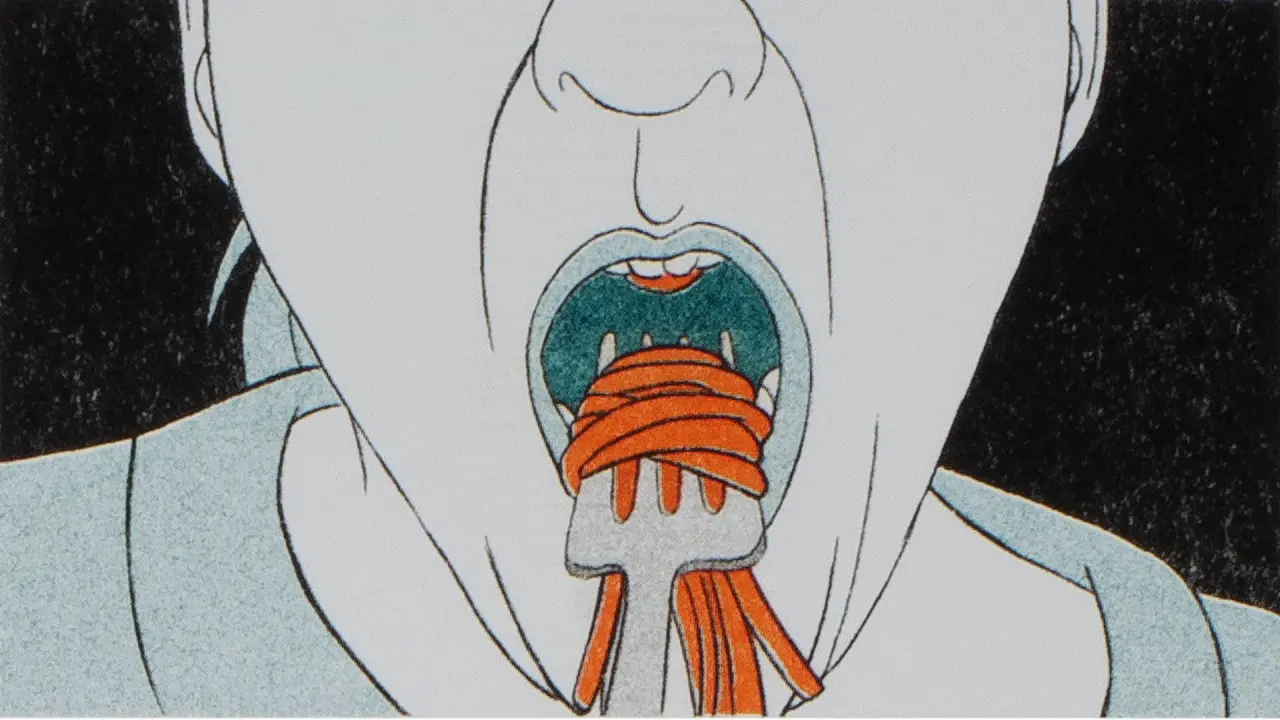
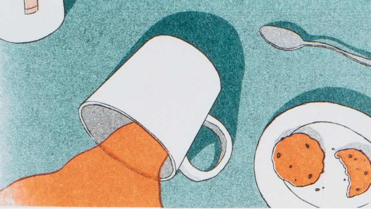
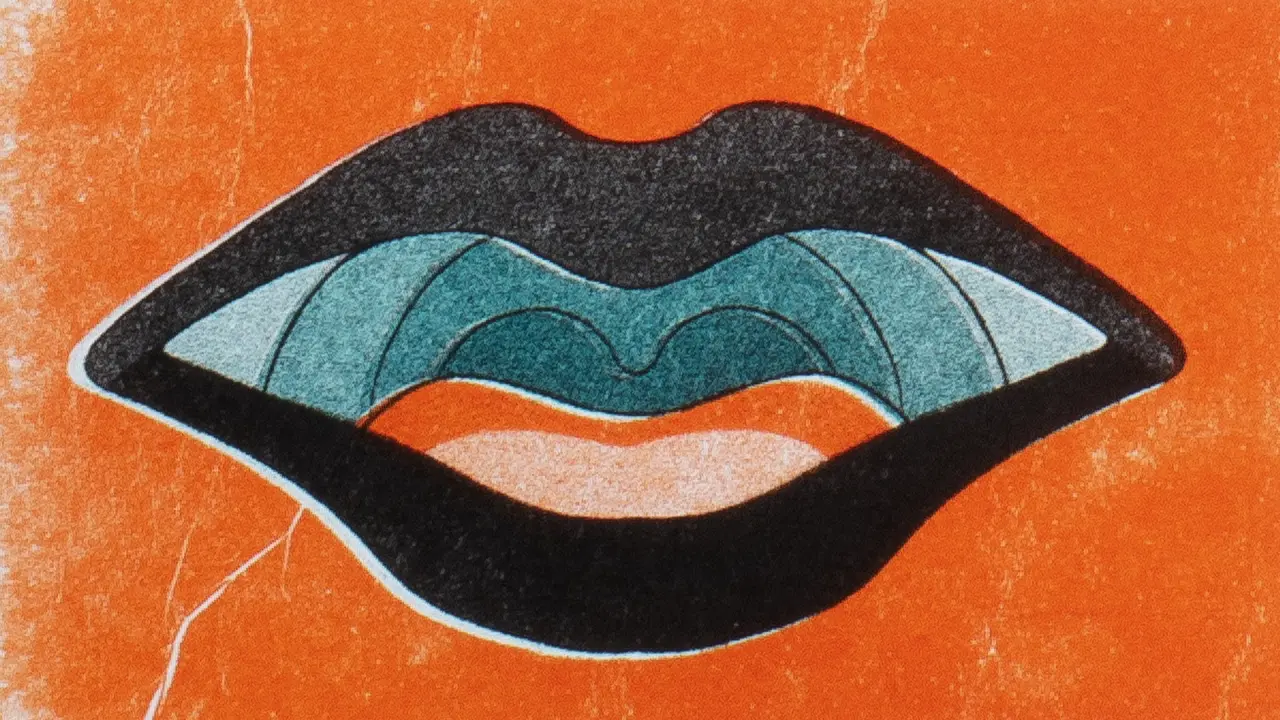
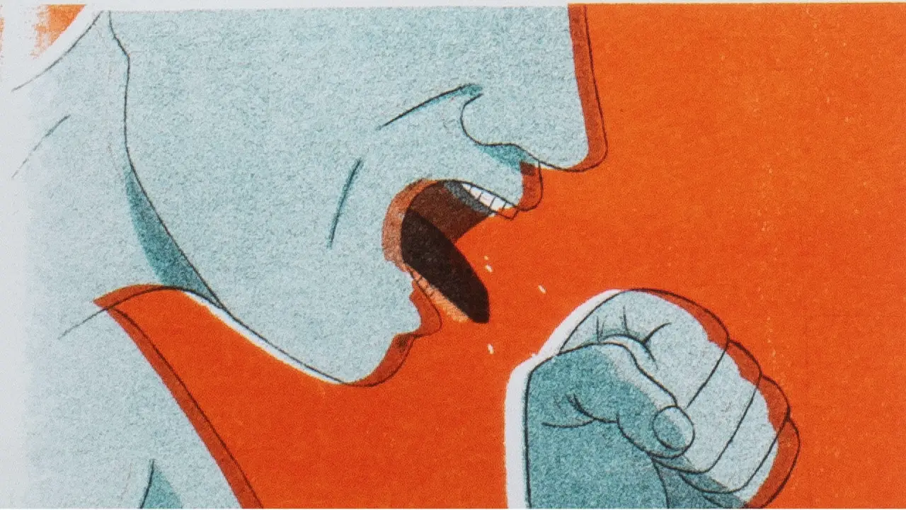
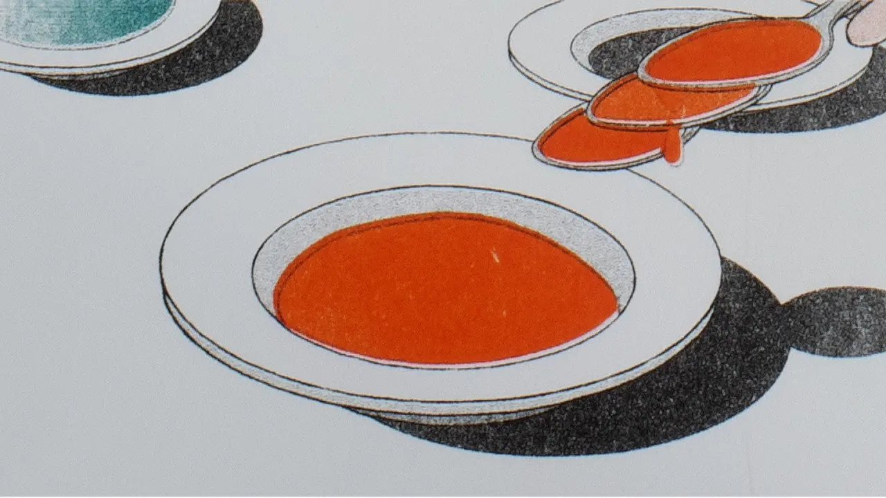
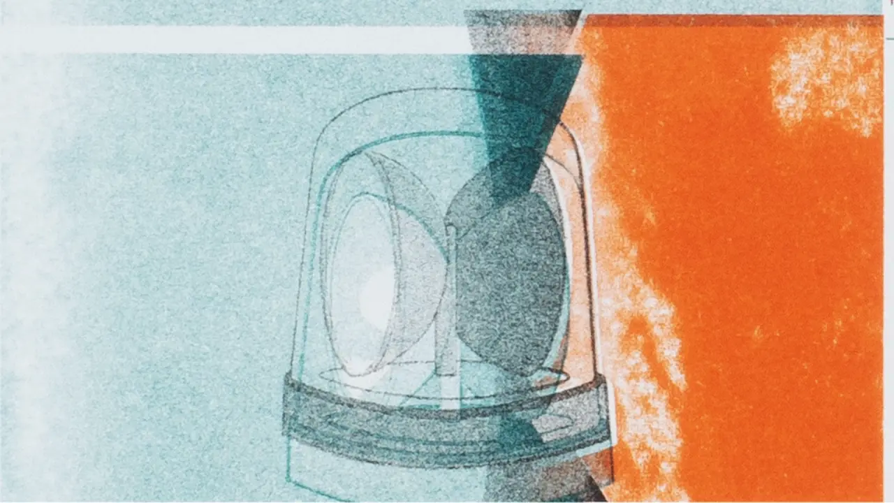
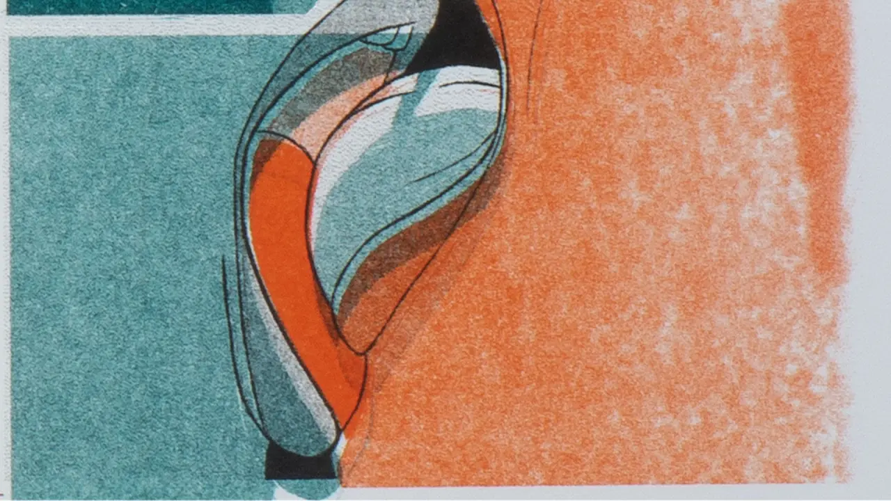
The visuals are as confrontational as the audio. Close-ups of mouths slurping spaghetti, spoons multiplying as they approach lips, a tipped-over mug and a half-eaten biscuit, a man yelling into his fist: all is rendered in a restricted palette of orange, teal and black, with all the grainy textures and slight misregistration you expect from riso printing.
The subject is a personal one for Michelle. Eight years ago, she relocated from Malta to Denmark to study character animation at The Animation Workshop. "I moved from one of the noisiest, most densely populated countries in Europe to one of the quietest," she explains. "And suddenly, just like that, I had unintentionally removed myself from a hidden daily pressure that I hadn't even realised was secretly overwhelming me." Towards the end of her time there, she was diagnosed with ADHD, which, she explains, "made complete sense of my general sensitivity to flavours, textures and, of course, sounds".
Since graduating in 2021, Gruppetta has worked as a freelancer in the world of animation, most recently with Blue Zoo, mainly as a 3D layout and previz artist on shows including LEGO City: No Limits. But while she considers herself lucky, she notes that: "This type of work doesn't encourage much creative input or decisions from a freelancer like myself, so I've heavily pursued trying to realise my own personal creative projects on the side, which is how Misophonia came to be."
Visual inspiration
As you've probably guessed, she has a passion for printmaking, and runs her own riso printing studio in Malta, Purċinella Press. In 2023 and 2024, she founded and organised PrintFest CPH, a one-day market in Copenhagen celebrating printmakers, zine makers and small press publishers. Since returning home, she's run a similar event, Marka+Stampa, during Malta's National Book Festival.
Her love of print was originally sparked by a visit to the MC Escher Museum in The Hague when she was around 19. "His work continues to remain a huge inspiration for me," she says. "I'm also inspired by other printmakers and animators such as Will Mower, Yana Yun Lin of riso.yyl, DTAN Studio, Zinehug and Ellis Tolsma, whom I met at Pictoplasma this year."
Next up, Gruppetta's work will feature in Urban Wildlife, a group exhibition at the Malta Society of Arts this autumn. "I feel that my own personal style is only now beginning to somewhat take shape," she says, "with a heavy emphasis on texture, graphical shapes and eye-searing colours. On the basis of Misophonia, we're looking forward to seeing it continue to develop.
This provocative campaign turns a familiar online request into a powerful reminder.
Call me a cynic. (Most journalists are, or at least the good ones.) But whenever anyone starts to wax lyrical about the liberating power of digital technology, I remind them that one of the things the internet is used for most is porn. In fact, it's pornified (if that's a word) our culture so deeply that when I use a phrase like "send nudes", everyone knows what I'm talking about.
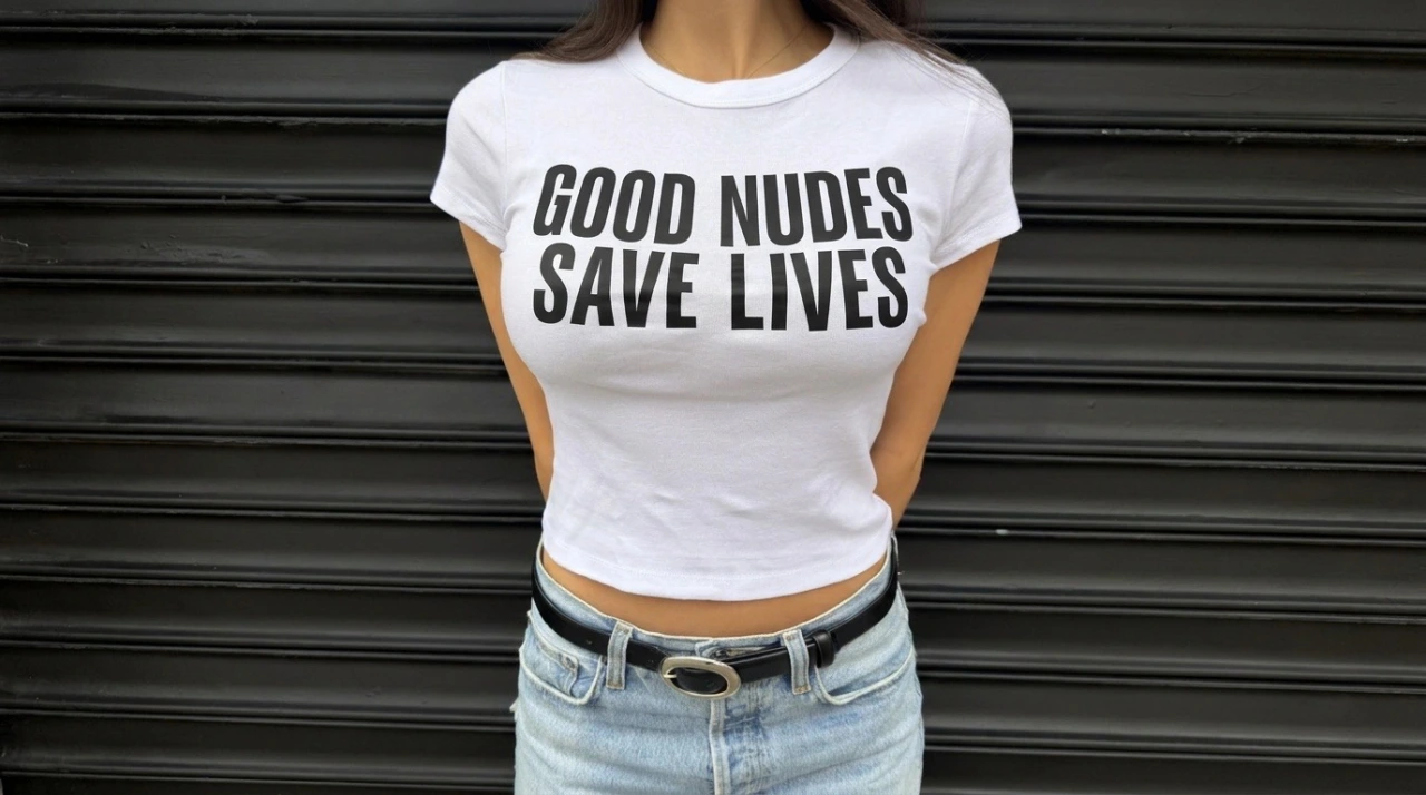
I would, I hasten to add, never use that phrase myself, at least not in polite company. But this Breast Cancer Awareness Month, female-owned and led creative agency Yard NYC has hijacked it for an even more wholesome reason.
The agency is literally asking women to take topless selfies, not for a partner or a stranger, though, but for the good of their health.
The point of the campaign is that by keeping a regular photo record of their breasts, women can spot changes over time, which might be an early sign of breast cancer.
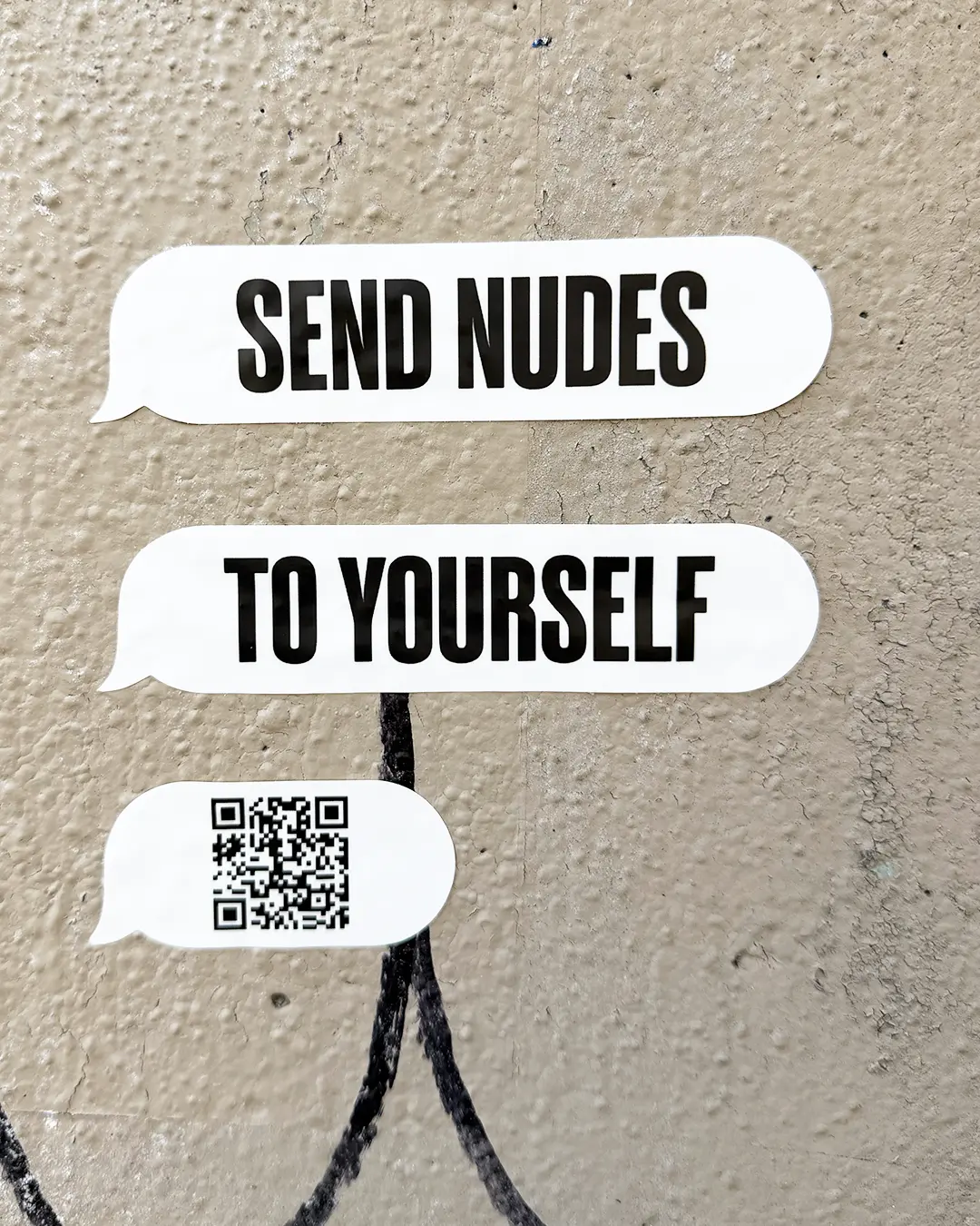
The twist, then, is that the request is very much to "send nudes"… but only to yourself.
Know your own body
Research shows that breast cancer rates are rising twice as fast among women under 50 as among women aged 50 and over, and 85% of women diagnosed have no family history of breast cancer. What's more, women in their 30s tend to think of breast cancer as an "older" woman's problem. In this light, taking photos of their breasts on a regular basis could be a lifesaver.
It's a personal issue for Yard NYC's CEO and co-founder, Ruth Bernstein. Her own experience with early breast cancer taught her that there are visual signs that can help women detect changes early.
"We know every line on our face, every grey hair on our heads, every squish on our bellies," she says. "Culturally, we're obsessed with all these other bodily changes, but we don't even notice our own tits. So what if we turned the familiar language of sending nudes into a reminder to know your own boobs?"
Hitting the streets
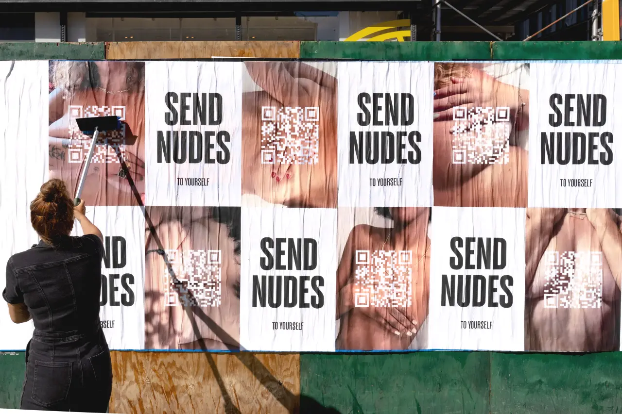
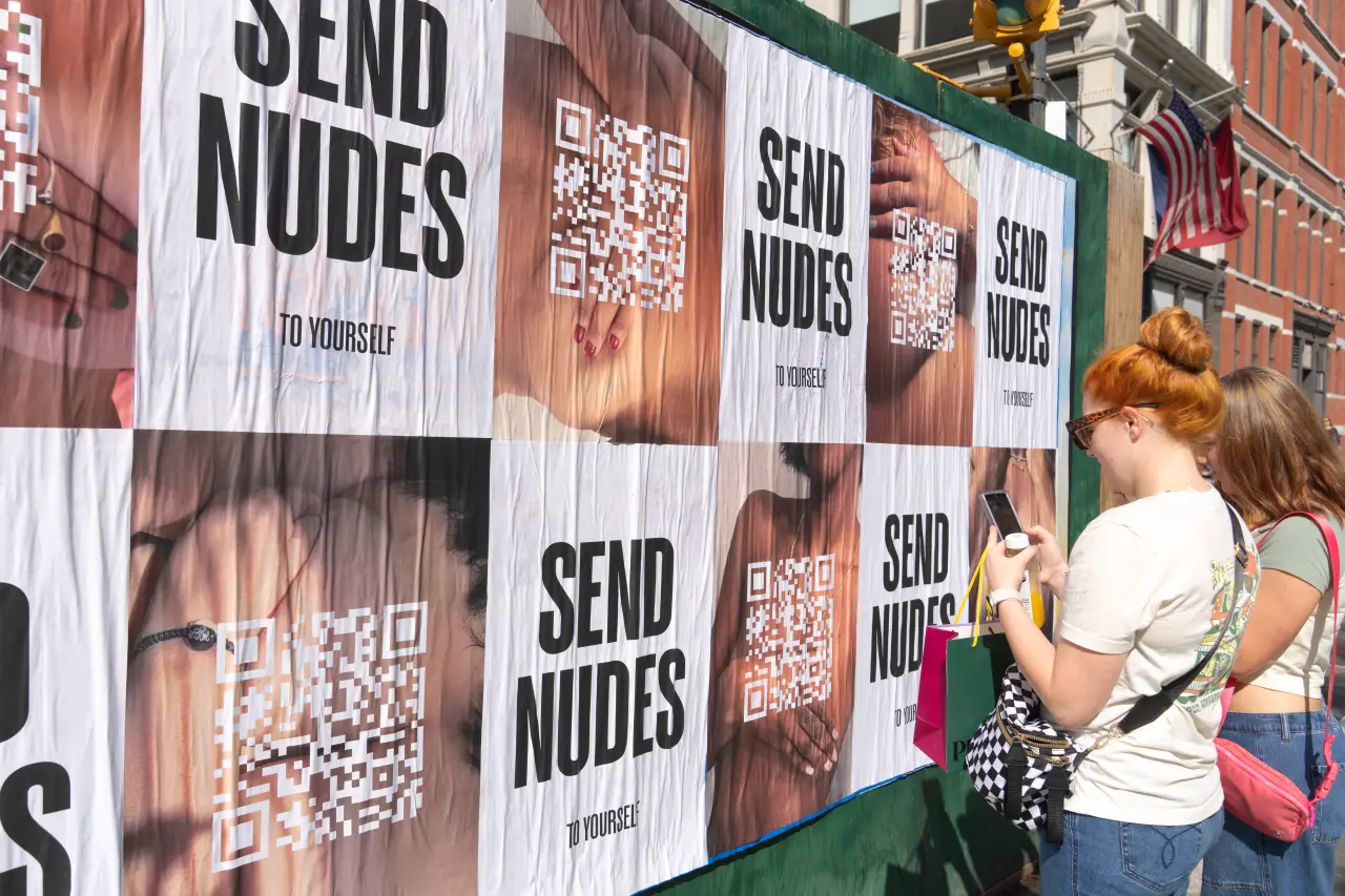
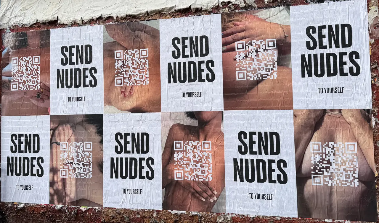
The campaign is being spread through wild postings around New York, at busy spots such as North 7th and Bedford in Williamsburg and near Dimes Square on the Lower East Side. Bold black "SEND NUDES" headlines alternate with tasteful topless photos of women, each with a QR code covering their chest.
Scan the code to land on sendnudestoyourself.com, which explains the point of the exercise and lays out the visible signs to look for. These include a new difference in the size or shape of one breast, flaky skin on the breast, redness or a rash on the breast, orange-peel texture on the breast skin, nipple discharge, a lump in the breast or armpit, breast dimpling and nipples that invert or change direction.
Normalising the check-up
"Send Nudes is about empowerment," says Caroline Seklir, chief strategy officer of Yard NYC. "Women are surrounded by messages about how our breasts should look, but far fewer reminders to actually know what our own breasts look like.
"The idea is that we're normalising this for a new generation of women that are coming of age in a selfie-driven world, and giving them the power of awareness on their own terms—long before they're of age for a mammogram."
Some might think it crude or offensive. But I'd suggest that by speaking the language of its audience, the campaign is far more likely to cut through. And isn't that the most important thing here?
Send Nudes runs until the end of October, with a social campaign also running across Yard NYC's Instagram and LinkedIn.
Founder Ryan Claydon was scrolling through one of our regular Instagram posts when he noticed the designer's work. He approached Davy Denduyver to refresh his agency's identity, just in time for its fifth birthday.
Around 18 months ago, I gave Creative Boom's Instagram a serious refresh. I treated it like a magazine and created a handful of regular series to fulfil our original mission: championing artists and designers.
One of those regulars is Ten Under 10K. The idea is simple. We pick 10 creatives with fewer than 10,000 followers and give them a spotlight. People then comment and nominate themselves or a friend for next time.
One week, Belgian graphic designer Davy Denduyver was featured, and we hoped it would help. We didn't expect an email a few months later saying it led to work. That email came from Ryan Claydon, founder and agent at illustration agency A Human Agency, who had spotted Davy in the post and hired him to create a new identity for AHA as it turns five.
"Davy's work has a tactility to it, and I was initially hooked by his identity for the Barcelona-based restaurant Mina," Ryan tells Creative Boom. "When I saw how he combined hand-drawn elements with typography, I knew he was the right person for the job. During our call, we were joking around as much as discussing the new identity; we both have an anarchic sense of humour, which I value a lot in a partnership."
I'm sensing a lot of "human" at play here. A nice bit of reassurance for anyone freaking out that people don't matter any more in the age of AI. I've always said business is about people and nothing has changed. So hearing Davy remembers that initial chat the same way is wholesome: "Ryan and I instantly clicked," he says. "I think we talked about the brief, less than just chatting, which is what I liked the most. Ryan really liked much of the work I'd done before, and it was clear what brought him to reach out. The project felt right up my alley from the start, and the smooth-sailing process reflects that."
Found, not followed
Davy marks nine years of working fully independently this month. Being discovered on Instagram says a lot about how designers can still find work. "It's always cool to see that those things do actually land you clients and connections with really cool people," he says. "I know the industry is at a weird place right now, but when it comes to getting work, I can't complain. I think the consistency and dedication it takes to do this is why it's working out. There's no marketing strategy behind what I do. I aim to make good work, and then I share it. Gladly, the right people still find me without having to be a content creator in addition to a designer."
This is why I run the series. It helps busy creatives to get noticed. We know those we spotlight will get more followers. Some message us afterwards to thank us, saying how it resulted in more than 1,000 new fans. Wow. But we never expect it'll lead to work. We hope it will. That's the dream.
As an agent, Ryan himself usually sits between artist and client. Being the client for once let him practise what he preaches. "I didn't want to be another 'I'll know it when I see it' client, as I know from 15 years of experience how frustrating that can be," he says. "I gave Davy a very clear brief outlining what I needed, but gave him a lot of creative freedom. We only had two minor changes throughout the entire project."
A clever name
AHA's new look builds on its name. And no, it's not brand new given all that's happening. It's been around for a while. It's just grown more meaningful over time. Ryan chose it in 2020.
"I was going through a redundancy process at my previous agency," he recalls. "Human connection and personal agency were at an all-time low, and I wanted A Human Agency to be a place where illustrators are championed for how they think and their perspective on the world, not just their creative output and the end product – although that is very important."
"Recently, though, I see the name as a pushback against the rise of AI slop within the creative industries and a way to connect with clients that seek human voices and authenticity of authorship."
Is this why Ryan wanted a new identity now? "A Human Agency turns five in January, and it seemed like a good time for a change of direction," he says. "I'm very glad I chose the name in 2020! Davy's identity is wonderfully imperfect, just as I wanted it to be: it has a folk, crafted feel, it's weird and unexpected, and it's tangled and surprising. Something that AI will hopefully struggle to replicate."
Stamped by hand
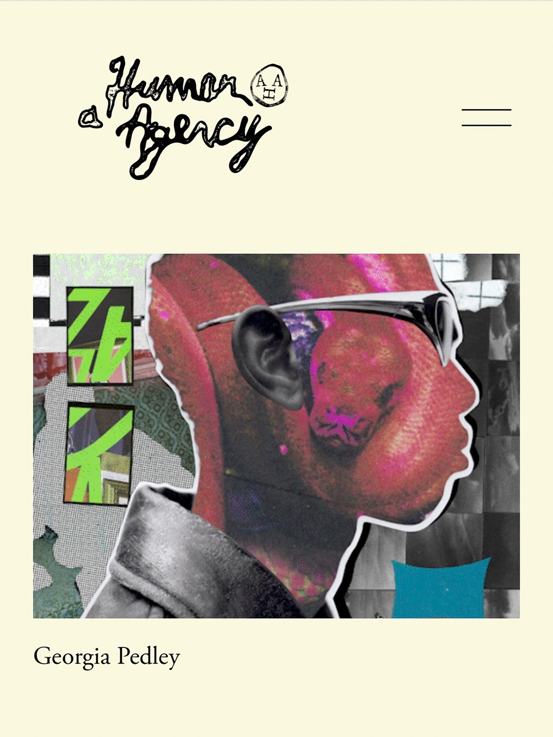
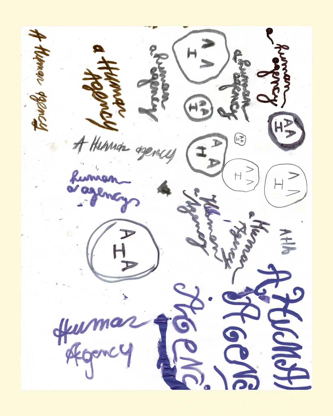
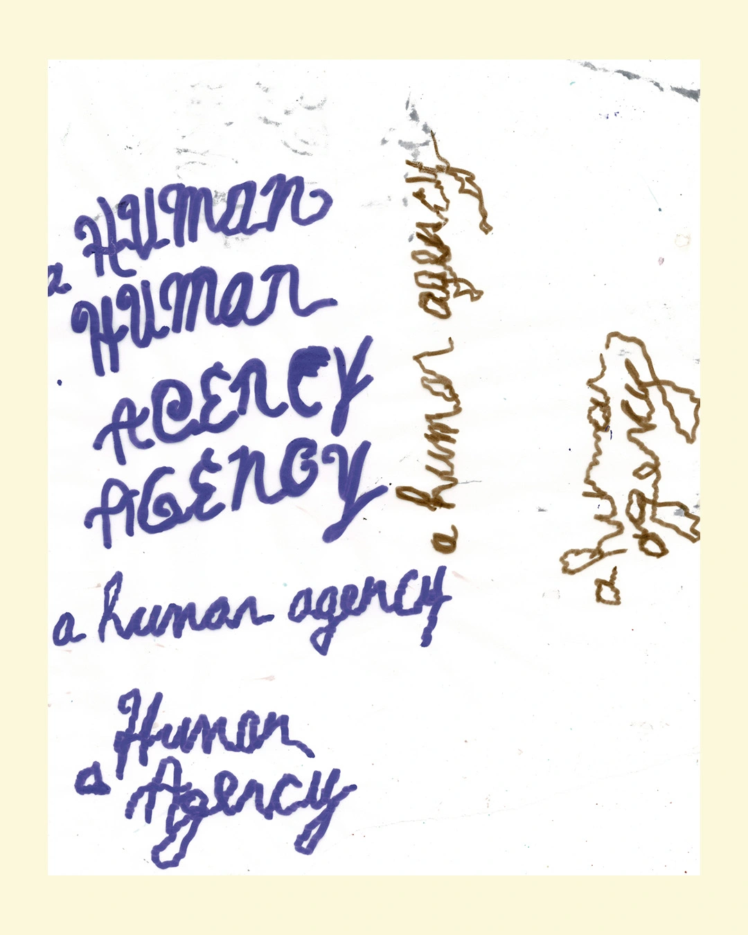
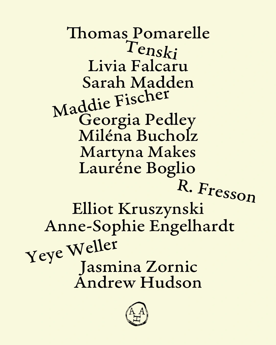
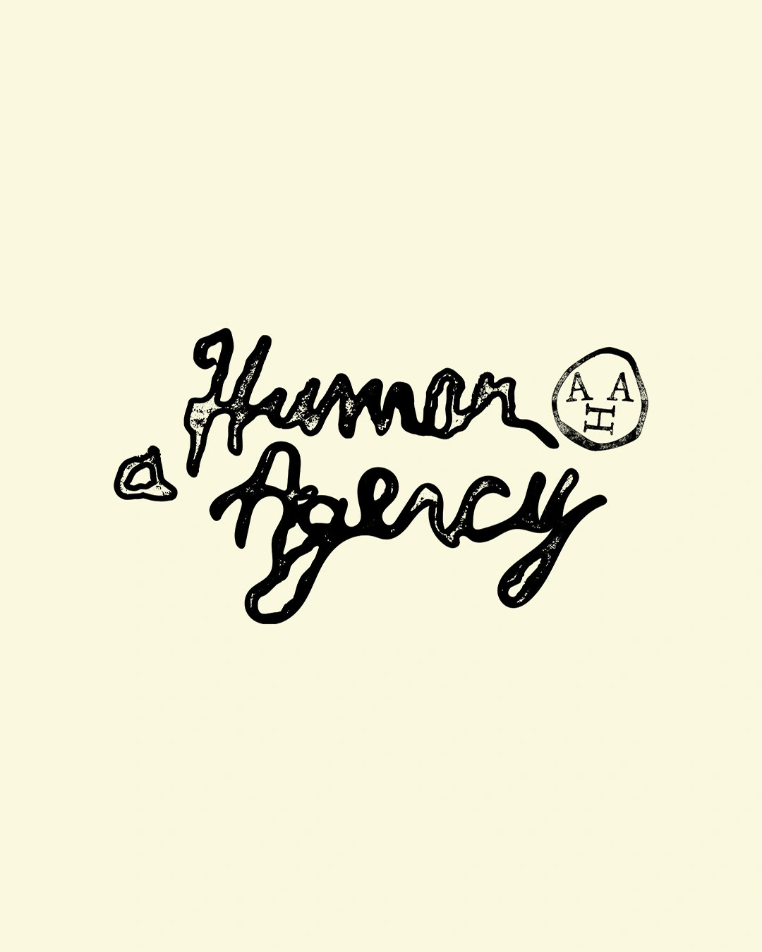
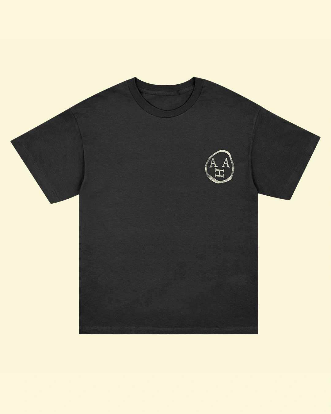
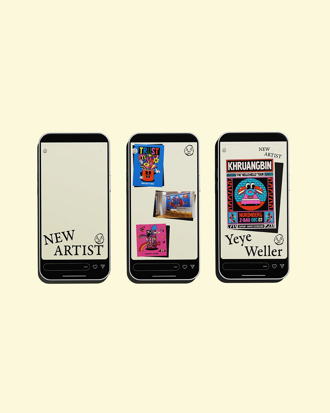
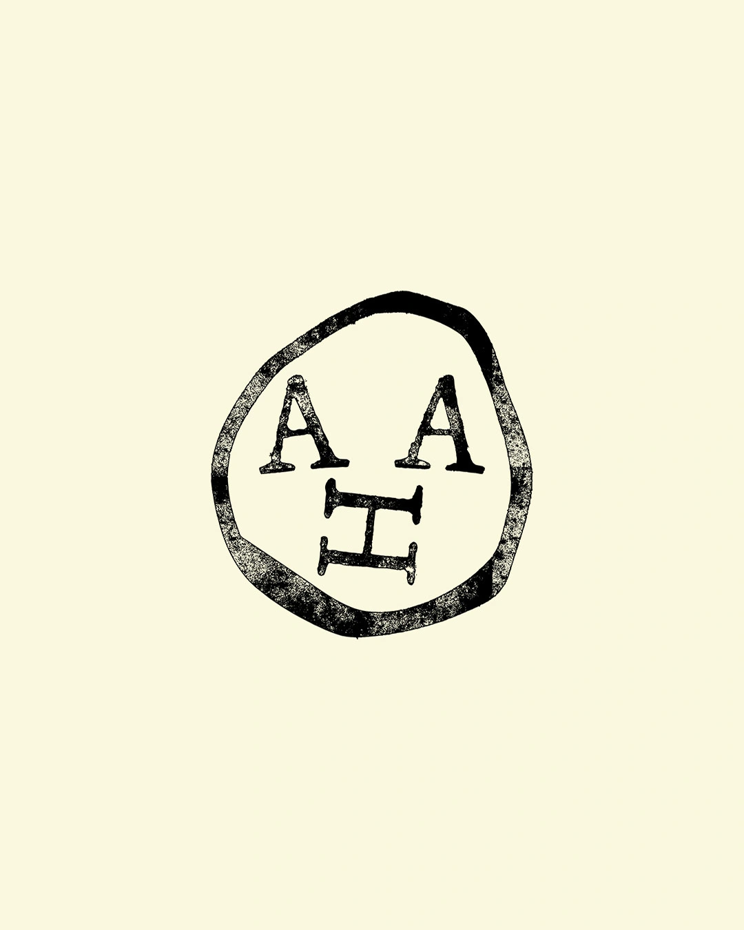
Illustration was ruled out early so the identity wouldn't clash with AHA's 14 artists. Instead, Davy created a hand-drawn wordmark and emblem, set on a soft cream-and-black palette, with serif type that tilts to add to the "human" effect.
"Both the wordmark and symbol are done by hand and are made to resemble stamps," says Davy. "I thought AHA was almost a museum, something that supports the work rather than hijacking it. The identity acts like a pedestal for the artwork."
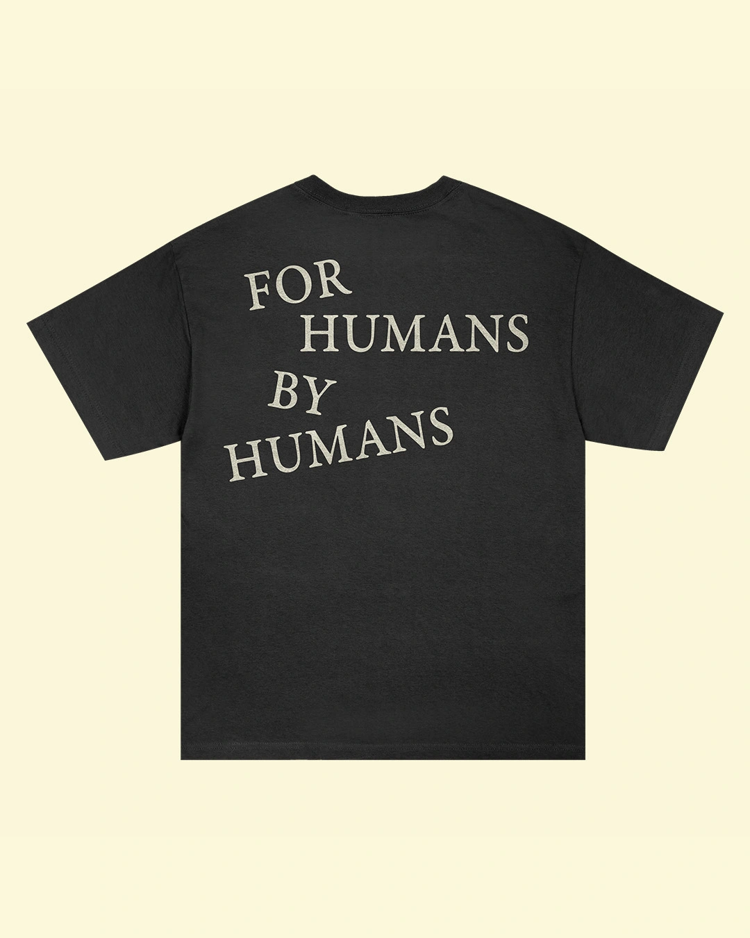
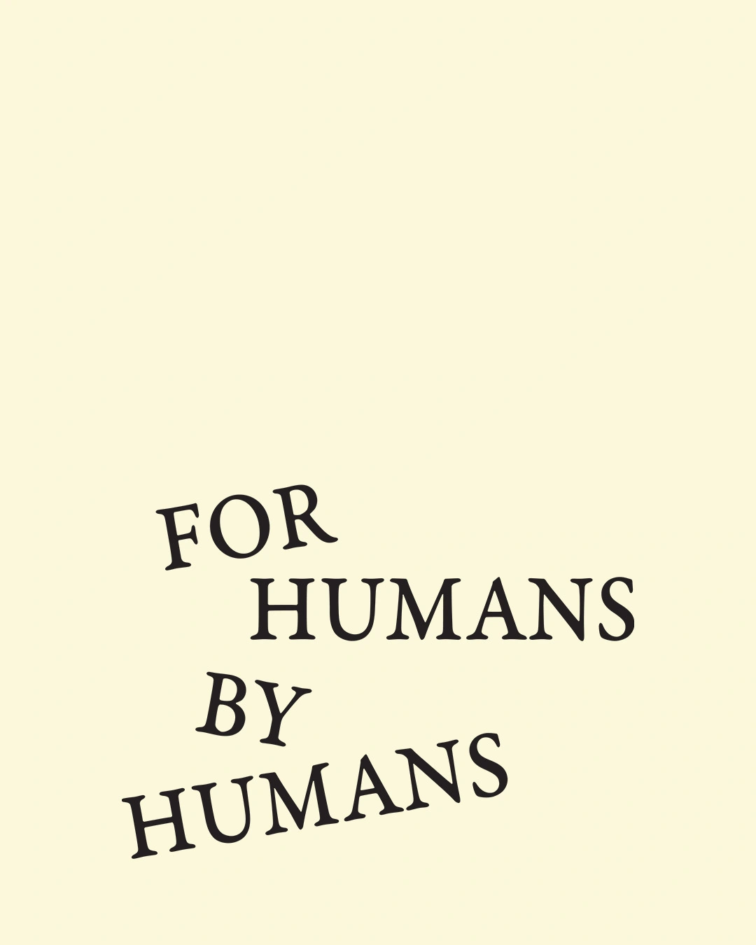
The brand motto, 'For Humans. By Humans.', runs across business cards, totes, caps, T-shirts and even packing tape.
Davy doesn't use AI at all. "I believe the process, experimentation, conversation and embracing imperfections is what makes design a beautiful field to work in," he says. "There's no prompt that can copy that."
As for what's next, Davy celebrates a decade in practice next year and wants to work with more international musicians. Ryan, meanwhile, plans to focus on charitable uses of illustration and on mentoring. "If the next five years are as good as the first five, then I'll be very happy," he says.
Inspired by awkward crops, harsh flash, blurred faces and unexpected details, the graphic designer recreates overlooked images lurking inside second-hand listings for his project Is This Still Available?
When you move house, there are a few things that tend to happen. First you pack up everything in a box, then you do the landlord spesh – i.e. the fill-the-hole-with-tissue-and-paint-over-job – and ask some strong people to help you lift everything. Now let's not forget an important step of the process, which involves either bin bags headed for the charity shop or selling anything that's worth a dime (and the effort of photographing it) online. Then once you've moved in, the rite of passage: the hours upon hours spent digging into Facebook Marketplace listings and finding some absolutely stellar bargains, sometimes sold to you with exceptionally artful or plain weird photography.
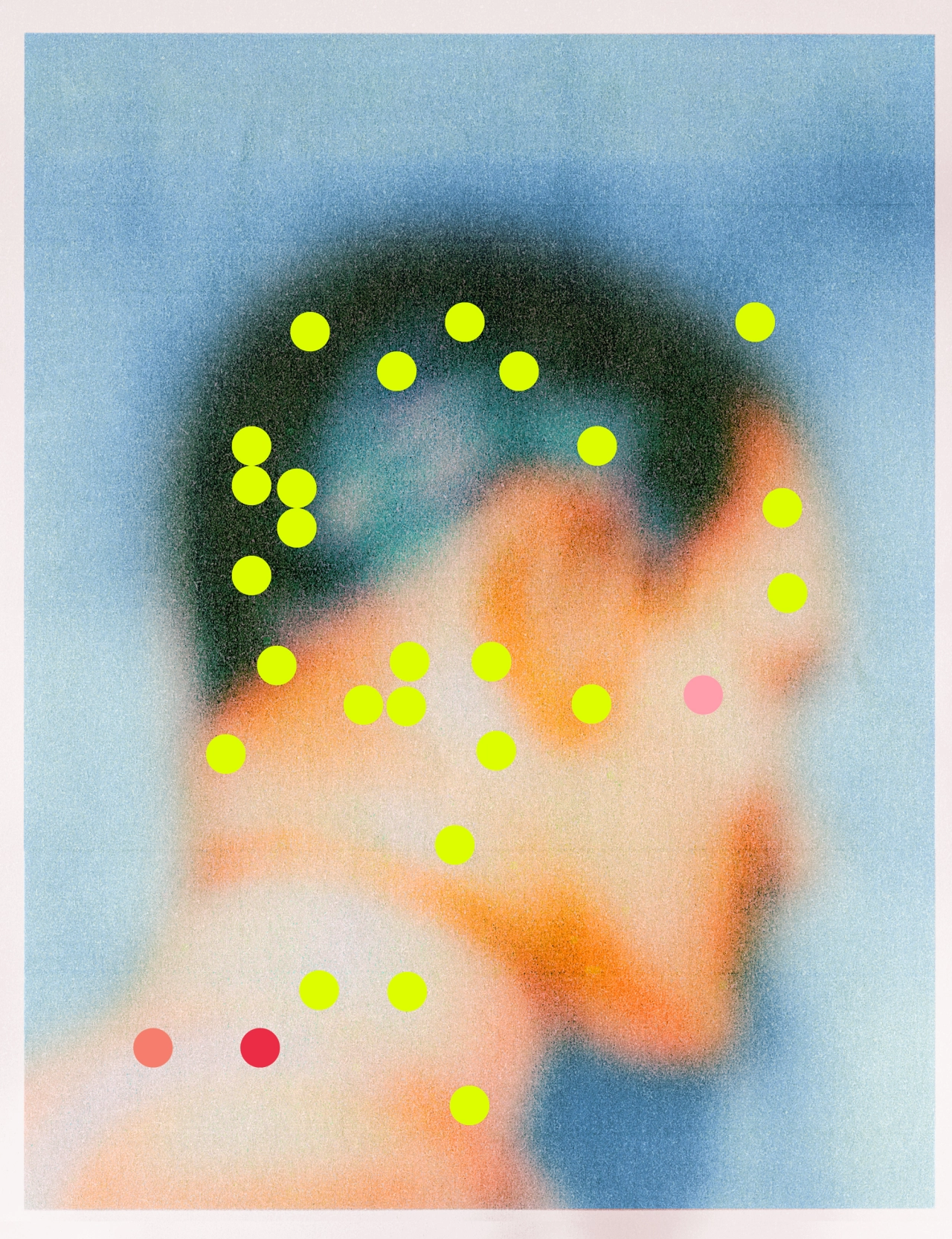
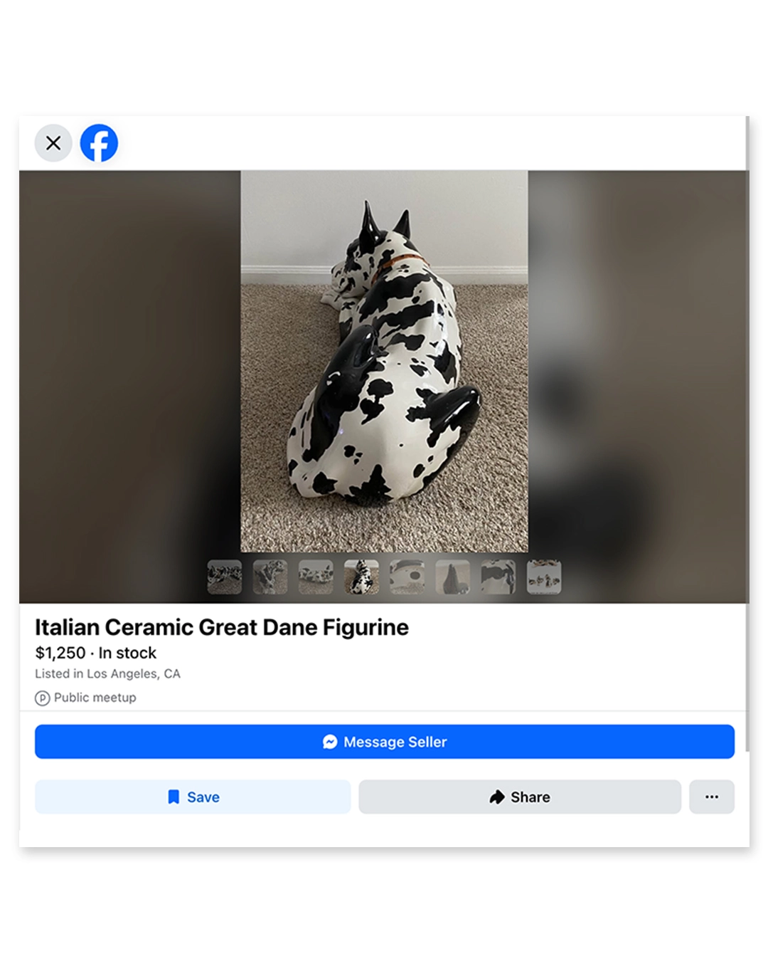
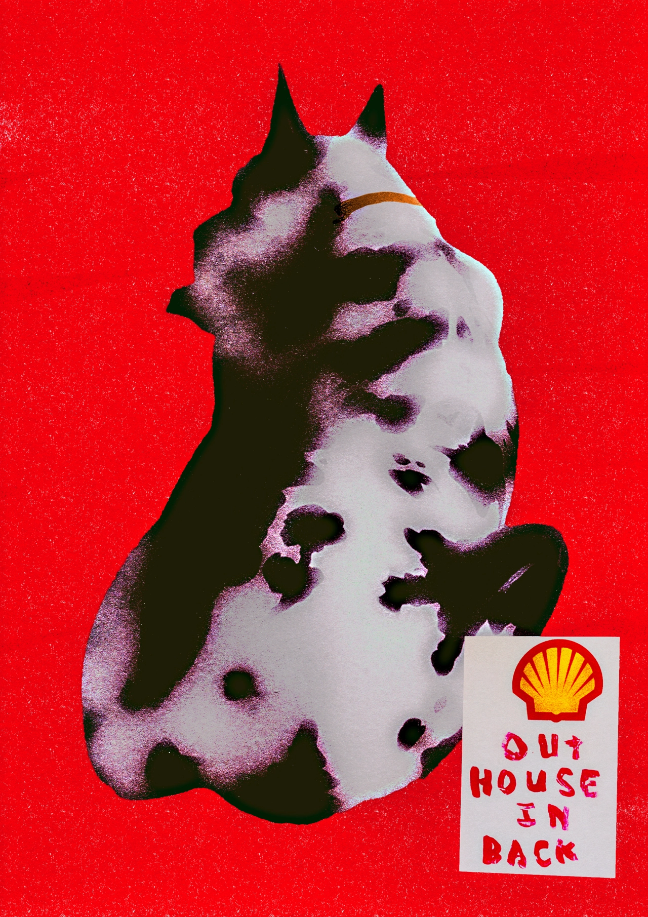
That's what happened when Casey Roarty moved house. As we all do in this situation, he found himself spending a "silly" amount of time on Marketplace and getting lost down many rabbit holes. "I started noticing a lot of strange and unintentionally beautiful images on there," he says. "Awkward crops, harsh flash, domestic lighting, blurred and scribbled-out faces and heavy image compression – giving the images a soft, almost painterly quality. Because these images are made purely for practical reasons, the beauty is often accidental and therefore overlooked."
Sandwiched between the countless fake ads for boneless sofas and images that have been duped from real-life brands and faked in Photoshop, that's where you'll find them. The real unsung heroes of Marketplace selling – the dimly lit, slightly fuzzy ones; the ones where you can see the seller's face reflected in the mirror; the ones that make you question whether they're ancient or just really badly shot; the ones taken by actual humans.
"I'd been thinking a lot about AI and what it means going forward for art and image making," says Casey. "We've moved into a time where perfectly polished images are incredibly easy to generate, and it's often hard to tell whether something was touched by a human at all. In that context, I think the story and process behind the work becomes more important than ever." This is what formed the making of his personal project, Is This Still Available? – an artistic recreation of the images found on this haven of second-hand goods.
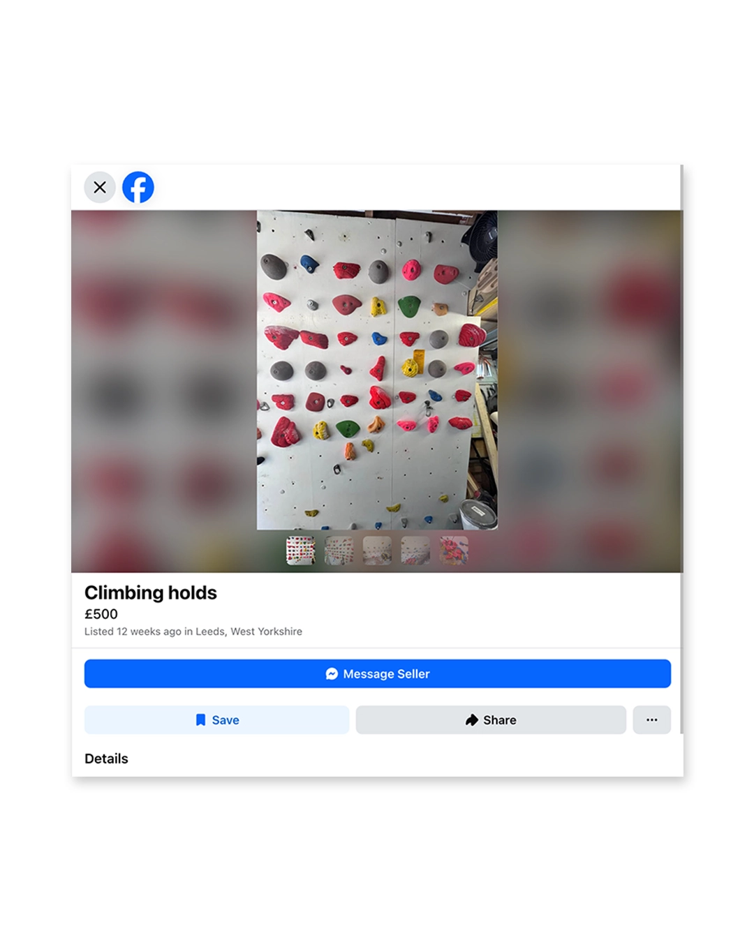
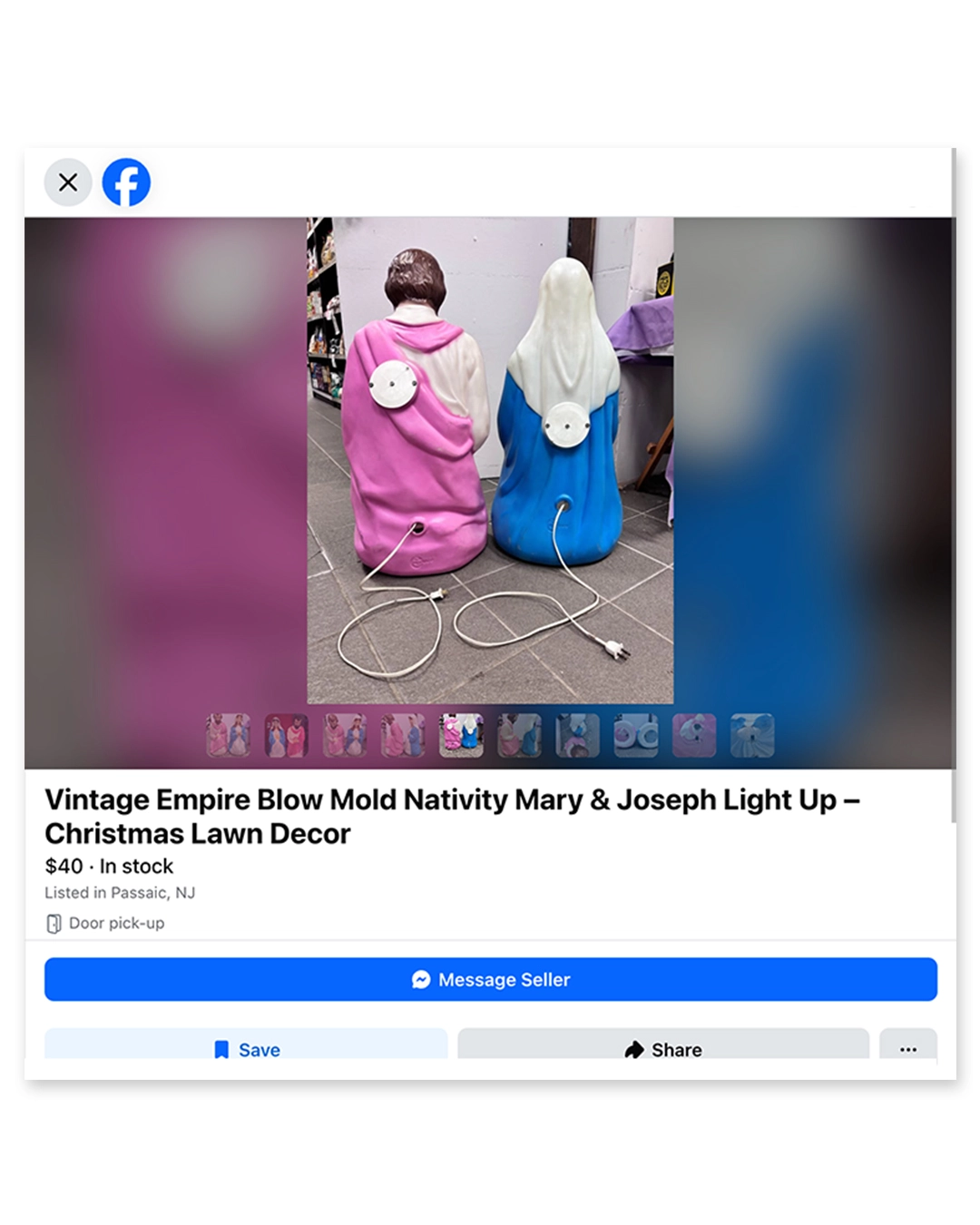
There are many things we love about this project, not least the weird and wonderful listings that would catch Casey's eye during his research. Sometimes it would be a fancy dress costume laid flat, the character completely warped, or a vintage toy that reminds him of his childhood, or the seller's hand creeping into the shot. "You have to dig, and the magic is in the third or the fourth photo in the listing – where you see the object from a different angle, or you see something unexpected that wasn't meant to be part of the picture."
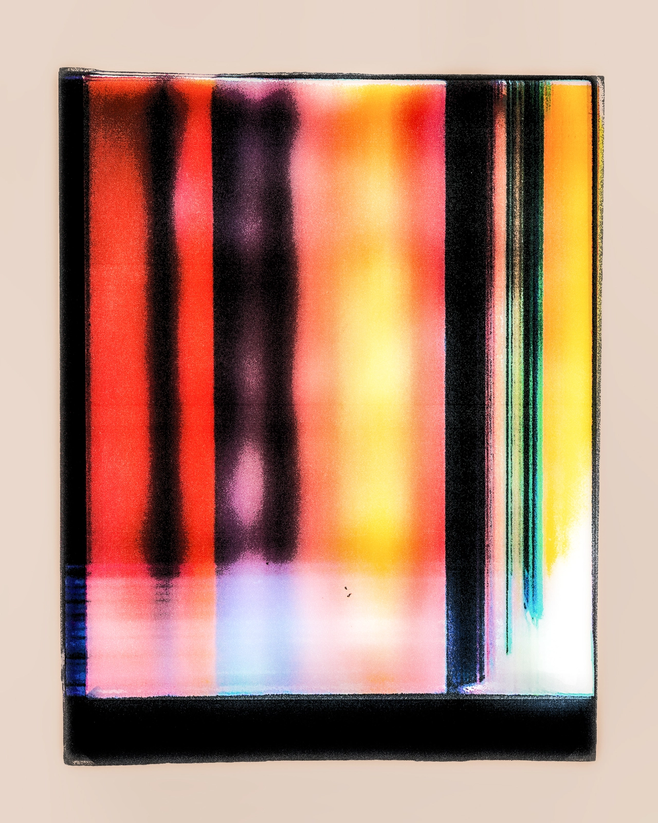
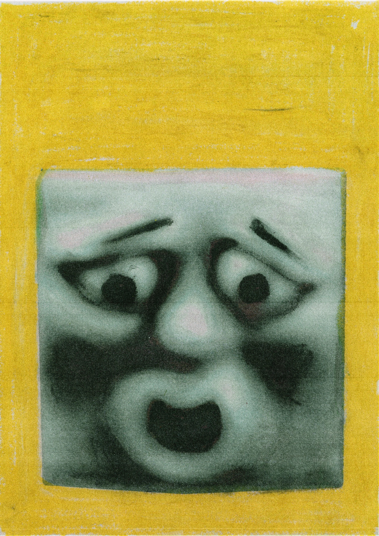
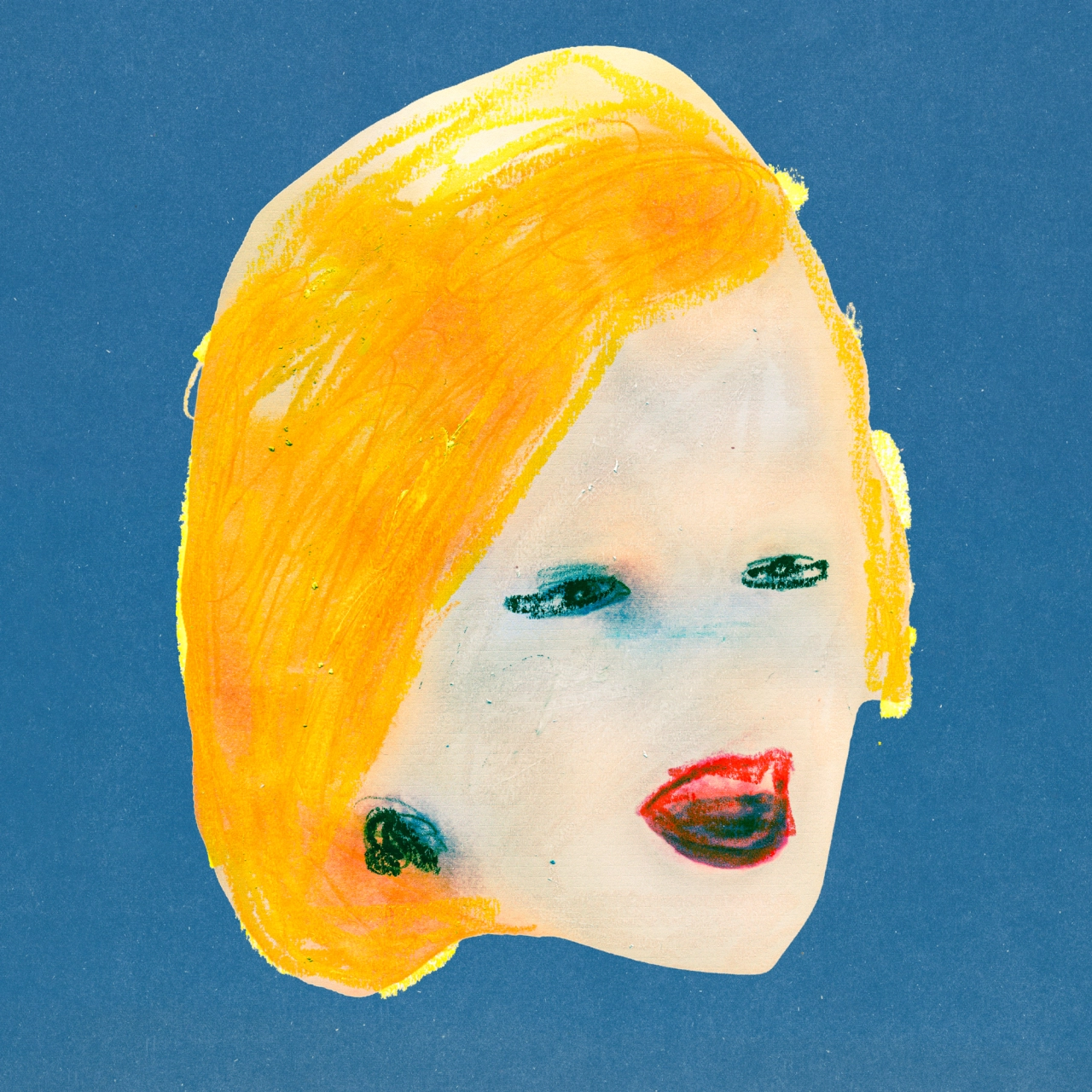
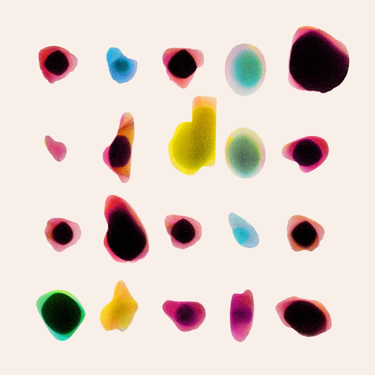
When he finds his golden image, Casey will tap into his graphic design background to crop into unusual details, to isolate and simplify the image, or to add handcrafted details like pencil or pastel marks, until it becomes a completely different thing. "It's a bit like staring at a word for too long until it stops making sense and you start seeing something else. That's what I'm often looking for."
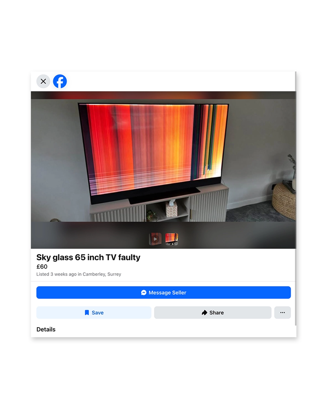
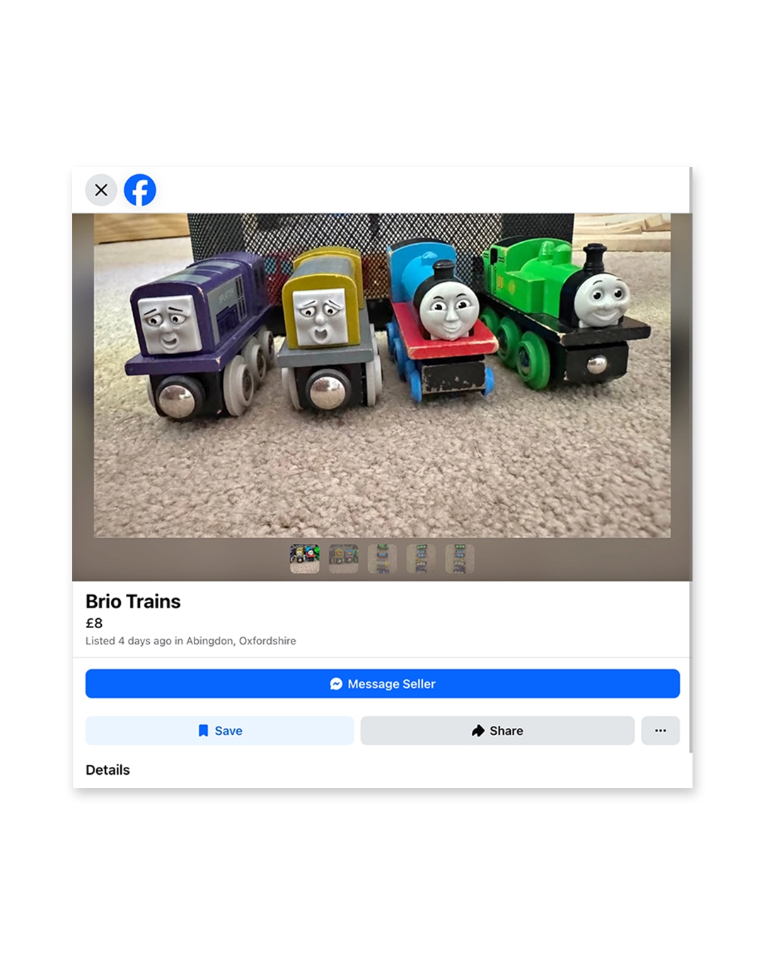
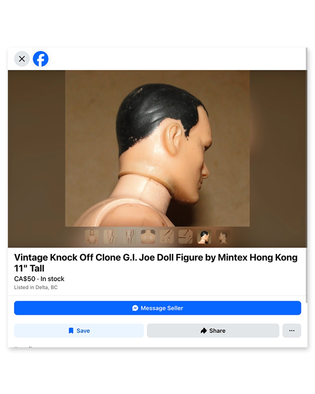
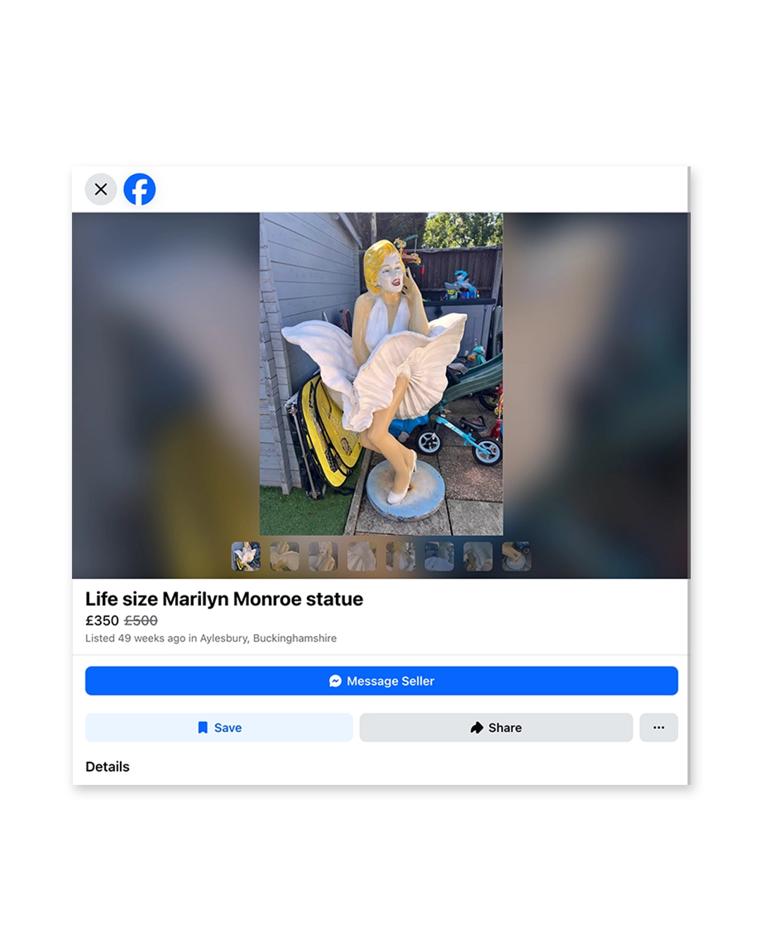
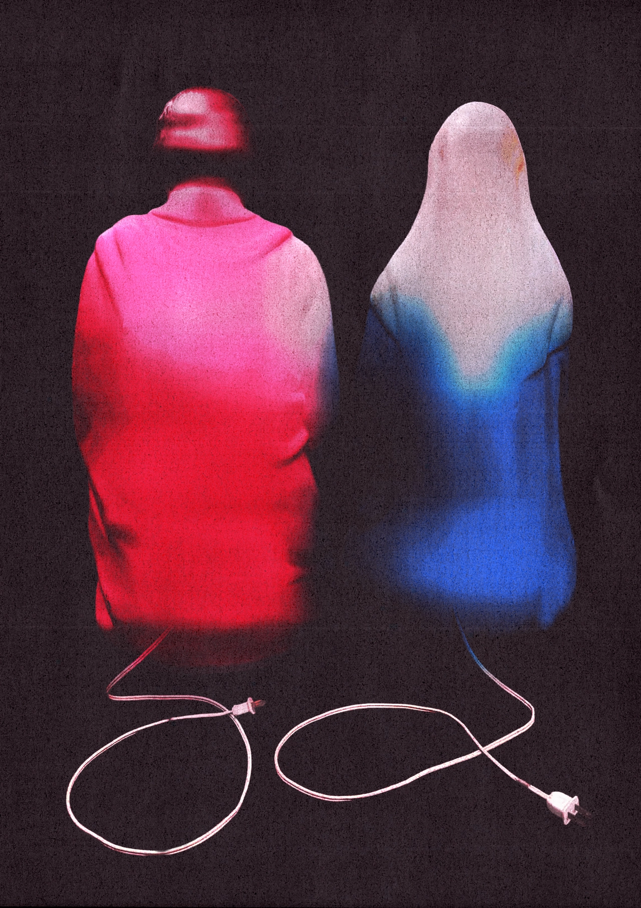
And let's just say the Marketplace algorithm was certainly in his favour. In the series, you'll see recreations of less unusual listings like a faulty 65-inch TV, wooden toy trains or a collection of vintage gold-framed wall mirrors. But then there are the weird ones: a knock-off G.I. Joe doll figure, a life-sized Marilyn Monroe statue, climbing holds pinned into a wall, vintage nativity figurines of Mary and Joseph (that light up and go on the lawn), and playground slides sold with a rock wall.
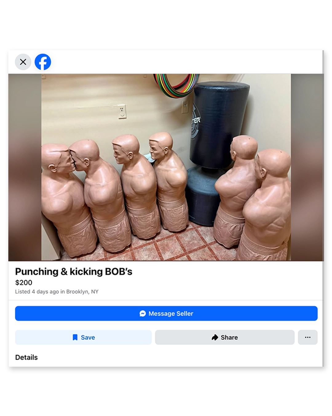
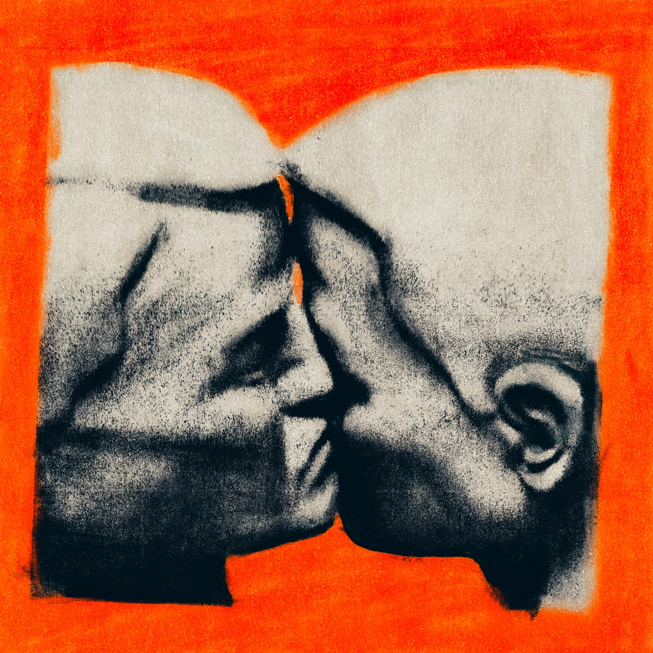
There's also a listing which sold dummies for martial arts – which is one of Casey's favourites: "These big, aggressive, human-like objects designed for punching and kicking," he says. "When scrolling through the listing images, I noticed two of them in the far-left corner of one of the images, squashed up against each other as if they were sharing a kiss. I cropped in on that detail, and immediately the context of the image had changed. Something built for violence had now become tender and intimate. Probably not what the seller was aiming for."
Casey is a freelance graphic designer by trade who found his way through music – making artworks for bands and also landing a job at Warner Music before going his own way. And through Is This Still Available? he's able to flex his creative muscles and see how far he can stretch the idea. "I didn't start it with any fixed outcome in mind, and that's part of the fun for me. It's just a space for me to keep experimenting and making things instinctively," he says.
"We're surrounded by so much slick, 'impressive' imagery now, and I've become more and more interested in things that feel odd, specific and human. I suppose the project is partly a response to that – digging around somewhere messy and uncurated to see what can be found and given another life."

 Login
 In Australia, the unemployment rate for neurodivergent adults hovers around 34%, nearly eight times the national average. Clearly, there is a stigma around hiring neurodivergent people and it stems from a fear of the unknown. One not-for-profit company, Australian Spatial Analytics (ASA), is working to fix that.