❌

Reading view

There are new articles available, click to refresh the page.

Just do it for me? Balancing human and AI input in content improvement

Working with student interns and contributing to the Drupal community, I’ve experimented with AI in various  tools designed to support content improvement. I reflect on what I’ve learned about peoples’ preferences for engaging with AI tools and consider wider design challenges for web content to support co-browsing.

Writing good quality, user-centred content has always been a challenge, and accordingly, a suite of tools evolved to address this; Hemingway, Grammarly and many more. With their ability to learn patterns and predict word sequences, the advent of LLMs provided a new direction for content improvement. Where previous tools had used fixed rules, algorithms and formulas to flag content problems and score sentences, LLMs changed the playing field as they were able to be prompted to rewrite and create text and to adapt words and sentences not only in line with fixed rules, but also aligned to different interpretations of style.

The UX Service’s content design course, Effective Digital Content, and our ongoing Content Improvement Club meet-ups are both designed to help staff publishing digital content for the University. It’s been encouraging to see a positive uptake for both training formats, however, we realise we can do more to help staff publish the best quality content they can, and to this end, for the past few years it’s been a privilege to support a series of interns in the UX Service to look at how we can innovate and apply AI to the persistent challenge of writing good quality, user-centred content.

Thinking beyond – embracing the spirit (or grasping the nettle, depending on how you look at it) of AI innovation, it’s sensible to note that, more broadly, the browsing landscape of the web is increasingly shifting to include AI agents as well as humans, giving cause to consider what using AI to design content to be consumed by AI might look like. That’s the subject of another blog post (or several).

For now, as I begin another phase of work with a new student in the role of AI and UX Innovation intern (Viktor Sharha), it felt timely to pull together what I’ve learned so far.

Designing, creating and editing content happens in various ways

When designing any user-centred assistive features, a good place to start is the current workflow or user journey people adopt to achieve the task in question. In other words, to look at the stages content editors currently go through to make sure their content is as good as it possibly can be.

One of my earliest research tasks when I joined the University was to usability test the Editorial Style Guide, to find out how publishers used it to keep their content consistent in EdWeb. This work gave me insight into the type of workflows publishers followed to get compliant content published. Some publishers worked in Microsoft Word, using the in-built spelling checker for typos, and cross-checking against a printed-out copy of the style guide for University-specific errors before pasting content into the EdWeb body text. Others went straight to EdWeb, checking their content line-by-line with a PDF version of the guide. Others relied on colleagues giving their work the once-over before pressing publish. Some used Grammarly and Hemingway, some didn’t.

Overall, there wasn’t a dominant content-publishing workflow, with unified friction points waiting to be alleviated through a standard user-centred design process. Instead, there were varied approaches, habits and ways of working which people had adapted over time to suit their specific circumstances and to address the areas they found difficult as individuals. Tools were used at different stages of the process, and to a greater or lesser extent depending on personal preferences.

Therefore, designing content improvement tools isn’t one-size-fits-all

It follows that, since people follow different pathways to create, design and edit content, tools to assist this process need to be developed in different ways to suit varied preferences. Since 2025, interns in the UX team have prototyped our own different content improvement tools to test with publishers, and we’ve also tested open-source tools that exist already, developed within the Drupal community. From our testing and research, we found pros, cons and nuances associated with different tools. The summary below pulls together detail of the tools and how they compared.

Tool 1: Drupal Editoria11y – no AI, flags errors in the editing interface

Editoria11y is a Drupal module built by John Jameson from Princeton University that automatically checks content inside the editorial interface. It was originally designed to catch accessibility issues, but it can be configured to check content against other rules too, such as institutional style guide conventions.

What it does and how it works: Editoria11y checks content as authors type, and also on previews and published pages. It includes an indicator bar to show how many issues are on the page and has inline markers to show where each issue is, as well as a dashboard summarising site-wide errors. When an issue is opened, a pop-up modal explains the problem and suggests a fix.

What worked well: In tests, publishers were able to make sense of the inline markers and understand how these related to the indicator bar for the whole page. They liked the tracked change visualisation in the pop-up modals, and were able to work through successive modals, accepting or ignoring the suggested changes.

What needed improvement:  Some publishers found the number of markers overwhelming, and since the pop-ups covered the text, it was difficult to judge each recommendation in context. In the pop-ups, some of the rule descriptions used formal grammatical terms (such as ‘ordinal suffixes’) which were unfamiliar to some publishers meaning they were confused about the problem to be fixed. Since rules were applied mechanically, there were instances where errors were missed, or where awkward fixes were suggested (such as swapping ‘1st floor’ for ‘1 floor’ due to straight removal of the ordinal suffix) – these degraded publishers’ trust in the tool.

Read more about what we found testing Drupal Editoria11y

Embedding the rules: What we learned UX testing a style guide helper tool built with Drupal Editori11y

Tool 2: ELM-powered content design chatbot – with conversational advice

This tool was developed by student Mostafa Ebid during a 2025 summer internship. It connected ELM, the University’s AI platform, to EdWeb2, so publishers could get help with their content by conversing with the University’s suite of LLMs without leaving the Drupal editing interface.

What it does and how it works: This tool sits in a chat sidebar next to the main Drupal editorial interface and offers three modes: Write Content, Design Content and Proofread. In response to a user prompt to improve content, it activates an orchestration of agents (each with specific tasks such as checking the style guide, structuring pages, profiling audiences) which read the page content and act on it accordingly, publishing the revised content in the chatbot window.

What worked well: In tests, publishers understood how the tool could be used as a writing partner, and were impressed with the way it restructured content with headings, bullet points and calls to action and hyperlinks.

What needed improvement: When faced with the empty chatbot interface, some publishers weren’t sure where to start, and they didn’t notice the three modes to work on content. Some were also unsure of the sources the chatbot was using for its revised content and skeptical that the revised content contained hallucinogenic content. They would have appreciated tracked changes to be able to pinpoint what had changed and found the long thin sidebar chat interface awkward to review the updated text. The chatbot was also limited to reviewing body text content, whereas publishers needed it to review content in other page components used in Drupal.

Read more about what we found developing and testing the ELM-powered content design chatbot:

Initial insights from UX testing our Drupal AI content assistant tool

Tool 3: QuillMark v1 and v2 – some AI, clusters errors with correction suggestions

QuillMark was an AI-enhanced tool which worked in Drupal to check content against the University’s Editorial Style Guide. Shlok Gupta built and tested two iterations of Quillmark during his 2026 summer placement as AI and UX Innovation Intern.

What it does and how it works: QuillMark sits in a side panel of the Drupal editorial interface and scans content on the page in two stages. The first stage uses code-based pattern matching (without AI) to catch straightforward errors. The second stage brings in AI to find deeper issues (such as passive instead of active voice) and to suggest fixes. Findings from both stages are displayed in the side panel – each finding describes the problem, links to the relevant rule in the style guide and offers an ‘Apply fix’ button (which can be reverted). Findings are grouped by category, and this panel also includes an indicator of the environmental impact and cost of the scan.

What worked well: In tests, publishers understood that the tool was there to help them correct content on the page, they liked the environmental and cost indicator, the suggested fixes and the links to the style guide reassured them that the tool was applying University-specific rules.

What needed improvement: Publishers reported feeling overwhelmed by the number of findings on a single page and they wanted a way to deal with related findings and fixes in bulk, to avoid going through them one-by-one. Related to this, they wanted

Read more about what we found developing and testing the QuillMark tool:

QuillMark, iterated. How user research helped us evolve an AI-enhanced Drupal style guide assistant

Tool 4: Drupal AI Content Review – full AI, with a plan provided to improve content

As part of the Drupal AI Initiative, I’ve contributed to shaping the self-explanatory Drupal AI Content Review module. This module plugs into a Drupal site, references content rules and good practice from context items in Drupal Context Control Center (within the same site) and uses the configured AI provider to review site content

What it does and how it works: The feature reads the page content and checks it against criteria set by the site owner, such as tone and voice guidelines, inclusive language rules and target readability levels. These rules are stored in the Drupal Context Control Center, along with examples of good and bad content. The review gives the page a score for each criterion and recommends fixes to improve it. Accepted recommendations become an improvement plan, which is applied in the editorial interface. Re-reviewing the page shows the updated scores, with the option to keep making improvements. Over time, the rules can be refined by adding more examples of good and bad content to the Context Control Center.

Read more about Drupal AI Content Review on Drupal.org

Read more about the Drupal Context Control Center on Drupal.org

View a demonstration of AI Content Review in a mocked-up university website as part of the Drupal AI demo on the Drupal Forge platform

What worked well:  In tests of this module within the AI demo, people liked seeing the red, amber and green indicators against page content for an easy visual highlighting areas to be worked on, and they liked being able to select a checklist of recommended improvements to apply to improve their content.

What needs improvement: The screens explaining the recommended improvements were difficult to scan read, and it was also difficult to compare the original text and the text with the recommended improvements side-by-side (despite colour shading to denote which was which). The stage where the recommendations were turned into an improvement plan felt like an unnecessary extra step, it would have been better to have implemented the recommendations directly. Also, it was presumed that implementing the plan would have corrected all errors resulting in a score of 100%, without the need for further work and re-review. Finally, it wasn’t immediately clear how to use the Drupal Context Control Center and the AI Content Review together.

When designing AI-enhanced tools, consider three AI design maxims

Taking on board variations in blending human effort and automated operations, there are three approaches to designing AI features and AI-assisted workflows worth considering. These are defined below, with ideas for how they may apply to content improvement.

1.      Human-in-the-loop

In this set-up, humans typically share the task-load with AI – actively working alongside an automated operator to supervise or influence actions, and to approve AI decisions before they happen (ensuring AI outputs are not released without the green-light from a person).

Human-in-the-loop tends to be adopted when:

  • there is a need for human judgement to get something correct
  • the consequences of an error could be high-profile or damaging
  • trust in an automated tool is still being built, and the boundaries of its capabilities are still being realised
  • the goal is for the system to facilitate shared learning between the person and the automation

For content improvement, human-in-the-loop is appropriate in these scenarios:

  • ensuring correctness of important factual data – for example, prices, dates, contact details, terms and conditions
  • checking the tone of sentences in line with inclusive language guidance
  • verifying accuracy of high-stakes published content such as legal information, policy wording or written instructional content
  • rewriting complex topics in plainer language
  • writing meta descriptions or page summaries to be accessed by search mechanisms
  • translating content into other languages

2.      Human-on-the-loop

These systems involve the AI or automator acting on its own, with the human reviewing and spot-checking at intervals, monitoring output quality over time, and intervening to correct failures periodically, where required.

Human-on-the-loop tends to be adopted when:

  • there is a high volume of low-risk tasks to be completed, which would be tedious for humans to do themselves
  • consequences of errors are minimal
  • there’s a need for tasks to be completed quickly, and including human-input at each task would be too time-consuming
  • consistency is required across tasks, and there’s a risk of human error introducing variability

For content improvement, human-on-the-loop is appropriate in these scenarios:

  • fixing straightforward style rule violations such as correcting spelling errors
  • categorising and tagging text content (for example, to facilitate its discovery in search)
  • scanning content for readability and accessibility, to flag or report areas to be addressed

3.      Human-out-of-the-loop

In this arrangement, the human sets up the AI to act autonomously, and leaves it to proceed, with no routine review.

Human-out-of-the-loop tends to be adopted when:

  • there are very low-risk, behind-the-scenes tasks to be completed where errors have little or no consequence and can be fully reversed

For content improvement, human-out-of-the-loop is appropriate in these scenarios:

  • autocorrecting typing errors
  • detecting content duplication
  • auto-optimising media content to defined parameters

Choice, pacing and transparency are constant design requirements

Testing four different tools has showed that options always need to be available, whatever balance of human and AI the tool includes. People approach AI differently based on preferences and past experiences. Some love nothing more than a good grappling of a sticky sentence, some just want an agent to do the work for them, and many sit somewhere in between, happy to have some AI help as long as they have the final say.

Alongside humans in, on and out of the loop, it’s important to remember the fourth option: human only, where people can choose to do their content unaided, using the methods they relied on before AI came along. AI shouldn’t be forced on anyone, so all tools need to come with a ‘no thanks to AI’ option.

AI is a fast-evolving and non-deterministic technology, so at any point in time it may work differently to the way it did before.  Responding to challenge from a design perspective, it’s important to factor in pacing. People need to be taken through how a tool works, and the options available. They need time and space to experiment and try it out, so they can learn for themselves how it can work for them. Pacing not only matters in the way tools are introduced, but also in the way their outputs are presented, to avoid the overwhelm that comes when AI does the heavy lifting all at once, and so people know what changed and how, and they have a way to accept, decline or edit what it produced.

If people don’t trust an AI tool, they won’t use it. Earning trust requires transparency, explainability, relatability and reliability – so AI tools need to be upfront about what they can and can’t do, with clear, intuitive interfaces and labels. Reliability will always be hard to promise given AI is probabilistic, so instead of accuracy guarantees which may fall short, a better approach is to design for experimentation, so people can find their feet and make their own judgements.

Designing for humans and AI together – metadata, markdown and MCPs

Looking at the broader digital landscape, the challenge widens from designing tools that help humans make content to designing websites with content ready for both humans and agents to use.

In co-browsing, people are increasingly arriving at a website with an agent alongside them, handing off some tasks while keeping control of others and wanting to see what their agent is doing. That means firstly deciding which tasks belong to humans and which one to AI, and secondly designing for each. Humans need intuitive interfaces. Agents need data they can read and act on without ambiguity:

  • metadata, such as schema markup that tells an agent what a page is about, who it’s for and how it connects to other content
  • markdown versions of pages and llms.txt files, which give agents clean, structured text without layout and navigation getting in the way
  • MCPs (Model Context Protocol servers), which let sites expose what they can do as well as what they say, from simple actions declared directly in HTML to more complex ones written in JavaScript – in preparation for use by the emerging WebMCP browser standard.

Labels matter for humans and agents alike, because words are becoming a currency that machines read as well as people. Alignment on terminology facilitates the creation of a single source of truth, to prevent the human experience from drifting from the agentic experience. On another level, humans need a way to consistently communicate with AI – to give AI the rules and instruct it and to train it with new insight. ‘Rosetta stone’ mechanisms like the Drupal Context Control Center will play an important part in designing for human and AI interaction and collaboration and I am excited to keep working and researching in this area to address these evolving design challenges.


 

Trump wanted to give No Kings no air. Then, Meta suspended its Instagram.

Over the weekend, the No Kings Coalition said Meta declined to commit to taking steps to prevent automated systems from suspending one of Instagram's most prominent pro-democracy accounts if activity surged around the page during the midterm elections.

A demand for action came after Meta apologized for temporarily suspending the No Kings Instagram account and disabling access for four hours at the peak of an early voting push from the group. In a post on X, Meta’s Andy Stone said the account had been using a Claude AI tool in a way that made it appear to be a bot. But even though automated review detected the error within an hour, Stone acknowledged that additional hurdles kept admins locked out. State and federal lawmakers—as well as a coalition of 14 attorneys general—have asked Meta to further explain its actions.

In a letter to No Kings, Meta offered to arrange a meeting with a technical expert who could better explain the mistake. But No Kings rejected the response, saying it failed to address any of the group's ongoing concerns and requesting a meeting with Meta senior leadership instead. The group stressed that the issue goes beyond its Instagram account, saying that Americans who rely on Meta's platforms need assurance that voting content won’t be suppressed ahead of or on election day. Among eight questions, the coalition asked Meta to publicly disclose any communications with the Trump administration about the No Kings account or the historic early voting day event.

Read full article

Comments

© Aurich Lawson | Getty Images | Minh Connors | Alex Wong

10 Ways to Build Radical TRUST in the Age of AI Junk

Everyone can spin up a website in seconds now—so why does everything feel fake? In a world drowning in AI-generated perfection, users are developing a sixth sense for authenticity—and most sites are failing the test. Here’s the uncomfortable truth: the only way to stand out in 2026 is to stop looking perfect and start proving you’re human.

Information Resources Intern’s first lessons: Time to unlearn “I like the look”?

My time at the Forrest Hill office as an Information Resources intern began four weeks ago under Edinburgh’s summer brilliance. Working as a part of the Portal Services team, I am responsible for creating and improving existing information resources about MyEd (the University’s online portal), including editing EdWeb2 pages, producing instructional videos, and refurnishing help and support SharePoints.  

Experiences designing promotional graphics, videos and syllabi for societies and events since high school made me a veteran of CapCut and Canva. It didn’t take me too long to get the gist of less familiar platforms like SharePoint and EdWeb2 (the University’s content management system) either, thanks to the self-paced online training courses. Freshly equipped with all the essential tools, I hit the ground running with high spirits. Like in any independent projects and commissions I did before, my creative visions, personal judgements and the mere intuition of “I like the look” carried me through the planning and proposal stage. I audited the existing EdWeb2 pages about MyEd to propose improvements, planned the refurbishment and new structure of the SharePoints, and storyboarded for the upgrade of the “How to use MyEd” video. Everything progressed beautifully smoothly and swiftly. The big frameworks and ideas were set up and ready to go.  


When “I like the look” starts to fail  

But as they say, the devil’s in the details; mine was waiting right around the corner at the execution stage.  

I was the most ambitious and eager with the upgrade of the “How to use MyEd” video, as it would be my first time creating official video for an organisation rather than for smaller commercial causes. My initial aspiration for upgrading this video was to make it as eye-catching and engaging as the promotional videos made by big companies like Substack: intricate transitions, animations, and rich colours. I wanted it to not only be informative, but charming enough to excite the new students about university life and this new portal system they’re starting it with. I spent nearly a week adapting to the PC version of CapCut, learning new transition techniques, and adjusting the properties of millions of key frames for about the millionth time until the movements are natural and the timings are perfect. With fondness and personal satisfaction towards the visual, I submitted the first draft for review.  

My manager responded:  

“Have you reviewed it with the accessibility checklist?” 

That’s when the design I was so proud of began falling apart like a house of cards. It became clear to me the first time that I’m no longer designing resources for a class of 30, but a community of 53,000+ students within a large institution. “I like the look” hardly stood valid against objective, rational standards like the WCAG (Web Content Accessibility Guidelines) and the University’s editorial guide for effective digital content. The sliding animations I designed turned out to be rather disruptive, as they create moving backgrounds under the text. This compromised the minimal contrast requirement (as text might blur into background) and created more challenges for users with attention or vestibular disorders. After re-reading the WCAG sections on video accessibility, I reduced the speed and frequency of motions on screen, avoided all-caps titles (which troubles users with dyslexia), and carefully checked font size and color contrast section by section.  

Around the same time, I came across Katie’s wonderfully illuminating blog on when videos and images genuinely add value to digital content: 

Videos and images – when do they add value and not just page weight? – Website and Communications Blog 

Although the blog was more about websites, its message inspired me to remove stock footage in my videos, which I previously employed for pure aesthetic reasons to make sections appear less static. Not only did they not add much informational value, but they also increased the video file size and created more moving backgrounds that hinder accessibility.  

Another lesson came through collaboration. Unlike society and event projects where I made every creative decision myself, this video formed part of the Pre-arrivals team’s “How to” series and therefore needed to follow an established visual identity. I will need to adapt the current draft to their prescribed templates, formats and requirements. With the same logic of branding in mind, I also replaced all colors in the video with colors from the University’s official branding palette. This way, in the long term, it could seamlessly fit into university websites, whether uploaded to Media Hopper or embedded into EdWeb pages.  

It would be dishonest to say it wasn’t a little heartbreaking to undo and cut work I had spent hours creating. Nonetheless, I came to understand that information resources differ from creative projects exactly because clarity, effectiveness, and accessibility must always come before visual aesthetics. I began seeing various guidelines and requirements less as constraints. They taught me a more rational and methodical approach to creating information resources than relying solely on the easy intuition and judgement of “I like the look”. Where I designed with my own palate and assumptions before, now I truly began my journey of designing for others. 


But does “I like the look” truly have no merit at all?  

Surprisingly, I would argue that it still does. “I like the look” is not something to unlearn completely, but it should be treated as the beginning rather than the end of the design process. From a different perspective, I have come to think that that instinctive thought is where UX (user experience) thinking begins. 

When I first opened the Notifications Service SharePoint that I was supposed to redesign, my immediate reaction was “I don’t like the look.” Except this time, rather than concluding the thought and jumping straight to redesigning based on personal preference, I attempted to find a rational “Why” by referring to all the guidelines and effective digital content tips I have learnt.  

The SharePoint was comprehensive, containing all the information staff would need to understand what notifications are and how to send different types of notifications. Yet as a first-time user that knows near nothing about the Notifications Service, I found it difficult to know where to begin. The original homepage was filled with large blocks of text and links with equal visual weight regardless of importance; Navigation of all the pages and materials relied heavily on users have prior knowledge on terminologies like “Notifications Template” and “Emergency Notifications”, and there was little visual hierarchy to guide attention or suggest the next step.  

That’s when I realised when users say they “like the look” of a website, they are often responding to not just colours or typography, but how intuitive, organised and effortless it feels to use. I decided not to simply edit the existing pages, but to rebuild the site’s structure in a separate testing environment.  

For instance, instead of letting the homepage act as a page of plain text, I plan to make it a clearer starting point for all types of users. I intend to include an image of Notifications Backbone (the system used to send notifications) alongside a direct button to access it. This way, experienced staff can access the system immediately, while first-time users are given some introductory visual and textual context before they continue exploring the site. The content changes minimally; my focus is to reorganise them around users’ journeys. Similarly, rather than presenting users with a long list of pages whose titles assume prior knowledge of relevant terminologies, I plan to reorganise the content into a small number of category cards based on what potential tasks users are trying to accomplish. I also hope to introduce a clearer hierarchy within the navigation menu, so that related pages are grouped more logically, and any information can be found more intuitively.   

Original homepage  v.s. New draft hompage 


Original information list  v.s. New draft categorisation  

New draft menu bar  

Being a student unexpectedly became an advantage in this process. Since I had similarly little prior knowledge of the Notifications Service as a new user, every point where I became confused while visiting the original SharePoint highlighted somewhere a common struggle might occur. Looking at the site with fresh eyes helped me identify problems that familiarity can sometimes hide. 


From “I like it” towards “We like it”  

But of course, just as I learnt with the review of the MyEd video draft, the work does not end once I think the design “looks right”. Everything I design  – SharePoint, websites, and videos – still need to be checked against the accessibility standards, follow editorial and branding guidelines, and most importantly, be tested with the people it is actually designed for (e.g. test MyEd video with students, the Notifications SharePoint with staff). Nick’s excellent guide on running usability tests has been particularly helpful in shaping how I plan to continue with the next steps.  

How to run a usability test – Website and Communications Blog 

“I like/dislike the look” has carried me through countless creative projects before. Four weeks later, I don’t think that instinct has been unlearnt but simply found its proper place. Rather than a justification for me to blindly follow personal preference and biased judgements, it has become the starting point for me to ask better questions about accessibility, usability, and the needs of the people I’m designing for. That is the perspective I’ll continue carrying into MyEd information resource that I will continue to create and develop throughout the rest of the internship.  


Using Cloud Storage for WordPress User-Generated Content

User-generated content is the proverbial double-edged sword. While it’s a powerful engine for engagement, it’s also a significant technical liability. User uploads are often unpredictable, unoptimized, and can consume server disk space and bandwidth at an alarming rate. This unchecked growth directly impacts site performance, inflates hosting costs, and complicates essential maintenance tasks like backups and migrations.

To manage this, you need an architecture designed for scale. This article will guide you through the strategies for offloading user-generated media to dedicated cloud storage. We’ll cover the foundational techniques for handling simple uploads, advanced methods for integrating with complex community plugins, and the critical best practices for managing file optimization and privacy in a UGC-driven environment.

The Unique Challenges of User-Generated Media

Handling user-generated media isn’t simply a matter of scaling your existing /wp-content/uploads directory. It presents a distinct set of architectural challenges that standard media management workflows are ill-equipped to handle. Before implementing a solution, it’s critical to understand the specific problems you need to solve.

Unpredictable Volume and Unoptimized Files

An administrator typically curates and optimizes media before uploading. Users do not. They will upload 8 MB photos directly from their phone for a profile avatar that will be displayed at 150×150 pixels. This creates an environment of unpredictable and explosive growth. A successful forum thread or community event can result in gigabytes of new, unoptimized media being added in a single day, placing an immediate and heavy strain on your server’s disk space and bandwidth.

Complex Privacy and Access Control

User-generated content may not be intended for the public. Consider a student’s assignment submission on an LMS site, attachments in a private message on a BuddyBoss community, or a member’s “friends-only” photo gallery. These files require sophisticated access control. Simply placing them in a publicly accessible cloud storage bucket is not a secure option, as the files could be accessed by anyone with the direct link.

Organizational Chaos

By default, WordPress places all uploads into date-based folders (e.g., /wp-content/uploads/2025/08/). When user content is added to this mix, your server’s filesystem becomes a chaotic blend of blog post images, user avatars, forum attachments, and form uploads. This lack of separation makes programmatic management, manual auditing, or bulk operations on a specific type of user content nearly impossible.

The Backup and Migration Burden

Routine server operations become increasingly burdensome as the /wp-content/uploads directory swells with gigabytes of user content. Full-site backups that once took minutes can take hours, consuming significant server resources and storage space. Migrating the site to a new host becomes a monumental project, involving massive, time-consuming file transfers that are frequently prone to failure. Separating this volatile user data from your core application files is essential for long-term maintainability.

Offloading UGC with WP Offload Media Lite

The foundational strategy for managing user-generated content is to intercept file uploads and redirect them to a dedicated cloud provider like Amazon S3, DigitalOcean Spaces, or Google Cloud Storage. This immediately separates the storage and delivery of these heavy assets from your web server’s primary responsibilities.

For some cases of UGC, this can be accomplished using the free WP Offload Media Lite plugin. Some plugins that allow frontend submissions—such as forms for guest posts, contests, or simple “upload your photo” features—are coded to use the standard WordPress Media Library uploader.

When a user submits a file through one of these forms, WP Offload Media Lite hooks into the process just as it would for an admin upload. The file is automatically copied to your configured cloud bucket, and its URL is rewritten to serve it directly from the cloud. This provides an immediate, effective solution for offloading user content generated through these standard channels.

However, this foundational approach has a critical limitation: it only works if the content-generating plugin funnels uploads through the core WordPress Media Library. This is often not the case for plugins that need more control over files.

For example, BuddyBoss uses custom handlers for avatars and cover images, and the eCommerce plugin Easy Digital Downloads intentionally stores digital products outside of the public Media Library for security. These uploads bypass the standard WordPress hooks and therefore aren’t detected or offloaded by WP Offload Media Lite. Addressing this requires a deeper level of integration.

Advanced Strategies for UGC Management

Overcoming these limitations and properly managing content from complex plugins requires a tool that integrates more deeply with your site’s ecosystem. The licensed version of WP Offload Media provides specific features designed to solve the core challenges of privacy, organization, and compatibility inherent to user-generated content.

Integration with Complex Plugins

One advantage of the licensed version when dealing with user-generated content is its library of purpose-built integrations.

For platforms that bypass the WordPress Media Library, the plugin doesn’t just watch the /uploads folder, it hooks directly into their specific functions. WP Offload Media intercepts the file at its source to ensure it’s offloaded correctly. In addition, it can process all historical content from these integrations, ensuring your entire existing community’s media is migrated to the cloud.

Managing Privacy with Signed URLs

Solving the privacy challenge is critical. You can’t store a customer’s purchased file or a student’s submitted paper in a publicly accessible bucket. WP Offload Media Pro handles this by allowing you to restrict access to offloaded media.

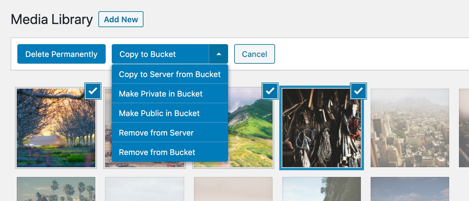
Media Actions

When a legitimate user needs to access the file, the plugin generates a signed, expiring URL on the fly. This unique URL grants temporary access to that specific user, after which it becomes invalid. This is the industry-standard method for serving private content securely from cloud storage, ensuring sensitive files are protected.

Integration-Specific Cloud Organization

Some integrations sort uploaded files into logical paths within your cloud bucket. The level of organization is tailored to the third-party plugin, with some integrations offering highly dynamic structures.

The BuddyBoss integration is the most powerful example of this. It automatically sorts the different types of community media into a structured path system based on context, such as:

  • User Avatars: uploads/avatars/{USER ID}/
  • Group Cover Images: uploads/buddypress/groups/{GROUP ID}/cover-image/
  • Photos & Videos: uploads/bb_medias/{YYYY}/{MM}/

This deep, automatic organization is a key benefit of specific integrations designed to handle complex, user-driven content. However, for many other plugins, the integration’s primary focus is on different challenges, such as security and compatibility.

For many plugins, the most critical function of an integration is to handle security for private files or to ensure that URLs work correctly within complex environments like page builders.

For eCommerce plugins like Easy Digital Downloads and WooCommerce, the integration’s primary role is security. When you upload a digital product, the integration automatically offloads the file, sets its permissions to private in your cloud bucket, and ensures that when a customer makes a purchase, the file is delivered using a secure, expiring URL. This protects your digital assets from unauthorized access.

For page builders like Elementor or plugins like Advanced Custom Fields, the integration focuses on compatibility. These tools often store URLs in their own cached data. The integrations ensure that when media is offloaded or settings are changed, these URLs are correctly found and rewritten, preventing broken images and “mixed content” errors that would otherwise be very difficult to troubleshoot.

Essential Best Practices for Any UGC Platform

A robust storage architecture is the foundation, but a truly resilient UGC platform also requires proactive measures to manage the content itself. Implementing a tool like WP Offload Media solves the “where,” but the following best practices address the “what” and “how” of user content, ensuring your platform is secure and efficient from end to end.

Validate and Sanitize at the Source

The most effective time to stop a problematic upload is before it ever consumes server resources. Your frontend forms are your first line of defense, and it’s critical to implement strict validation to control what users can submit.

This begins with enforcing a strict file type whitelist, where you explicitly define the exact extensions you will accept—such as jpg, png, or pdf—rather than attempting to block specific malicious types. In addition to controlling the file type, you must also set a sensible maximum file size, like 5MB or 10MB, to prevent users from bogging down your server with enormous video files or uncompressed high-resolution images.

Automate Server-Side Image Optimization

You cannot expect your users to upload optimized images. Therefore, you must automate the process on the server. By integrating a plugin like EWWW Image Optimizer, you can process every user-submitted image before it gets offloaded. Such a tool can automatically resize images to appropriate maximum dimensions, apply powerful, lossless compression, and even convert them to efficient formats like WebP. This ensures that only lean, optimized files are sent to your cloud storage, saving on both storage costs and your visitors’ bandwidth.

Establish a Clear Moderation Process

The fact that content was uploaded by a user doesn’t absolve you of the responsibility for what that content is. You must have a clear and consistent moderation workflow in place. Consider whether user-submitted content should be held in a “pending review” state before it goes live, and who on your team is responsible for that review. This should be supported by a public-facing Terms of Service or Acceptable Use Policy that clearly outlines what is and isn’t permitted on your platform, giving you a firm basis for any moderation decisions.

Wrapping Up

User-generated content transforms a website into a living community, but it introduces architectural stresses that can easily undermine the platform’s stability and performance. Treating UGC as just another part of the Media Library is a short-term approach that creates long-term technical debt, resulting in a site that is slow, expensive to maintain, and difficult to migrate.

A professional-grade storage architecture is the solution. By offloading media to a dedicated cloud provider, you immediately solve the core problems of storage and server load. When this foundation is enhanced with deep plugin integrations, secure handling for private files, and disciplined best practices for validation and optimization, you transform UGC from a technical liability into a truly scalable asset.

Ultimately, this is about more than just managing files. It’s about building a technical foundation that allows your community to flourish without limits. By implementing these strategies, you are free to encourage user engagement and foster growth, confident that your platform is engineered to handle the success that follows.

The post Using Cloud Storage for WordPress User-Generated Content appeared first on Delicious Brains.

❌