Reading view

There are new articles available, click to refresh the page.

Using scenario-based research to understand how colleagues find inclusive language guidance

Earlier this year, the User Experience (UX) Service researched how colleagues find and use the University’s Inclusive Language Guide. This post explores why we used scenario-based research, what it revealed about colleagues’ behaviour and how the findings are improving the guide. 

The Inclusive Language Guide is only useful if people can find it 

The Inclusive Language Guide sits within the University’s Editorial Style Guide and provides practical guidance when writing about disability, race and ethnicity, and sex, sexuality and gender. The guide was developed in 2022 through a co-design process involving colleagues from across the University.

Inclusive Language Guide 

Having useful guidance is only part of the challenge. Colleagues also need to know it exists and be able to find it when they need it. 

More recently, we reviewed the Inclusive Language Guide to understand how discoverable it was for colleagues creating digital content. Emma Horrell has written about how this work prompted improvements to the guide’s visibility and signposting across the University. 

You don’t know what you don’t know: Improving the way we position inclusive language at the University

Why we used scenario-based research 

We wanted to understand more than whether colleagues were aware of the Inclusive Language Guide. Awareness alone does not tell us what people do when they need support, so we used realistic scenarios to observe how colleagues responded to situations where they might need guidance. 

We focused our research questions on four areas: 

  • How colleagues approached decisions about inclusive language. 
  • Where colleagues looked for support and whether they could find relevant guidance. 
  • Colleagues’ awareness of the Inclusive Language Guide and what they expected it to help with. 
  • Any gaps, ambiguities or areas of confusion. 

These questions shaped the structure of the interview and activities we designed. 

Researching colleagues approach to inclusive design decisions 

We combined semi-structured interviews with scenario-based activities to understand both colleagues’ existing experiences and how they approached real content decisions. 

We spoke to nine colleagues who create digital content 

We carried out nine interviews with colleagues in different roles across the University. Participants had a range of experiences creating digital content, including two student interns who brought perspectives of those newer to the University’s digital landscape. 

We began by exploring participants’ existing experiences 

Before looking at the scenarios or the guide itself, we asked participants about the types of content they create and whether they had ever needed to check terminology or wording before publishing. For example, we asked whether they had been in a position where they needed to consider how to word something to make sure the language was not excluding anyone. 

This helped us understand the approaches colleagues already used and the sources they relied on when dealing with these topics. 

Realistic scenarios showed how colleagues look for guidance 

We introduced a series of realistic scenarios based on everyday content tasks. 

Rather than asking whether participants knew about the guide, the scenarios allowed us to observe how they approached these situations in practice.

Example scenarios included: 

  • writing promotional content about a Pride initiative and wanting to ensure the language used was fair and respectful 
  • writing about someone who had experienced trauma and wanting to avoid misrepresenting them 
  • checking the preferred terminology for the chair of a company board before publishing a news article 

In posing the scenarios, we gained insight into where participants would usually look for this type of guidance, how confident they felt making language decisions and what they understood by the term ‘inclusive language’.

We adapted our scenarios as we learned more 

One of the original scenarios asked participants how they would write about someone elected to lead a company board. Rather than focusing on terminology, several participants described how they would research the individual or organisation before publishing. 

While this reflected realistic editorial practice, it did not help us answer the research question we were exploring. 

For later sessions, we refined the scenario so that it focused specifically on checking the preferred terminology for the role before publication. This encouraged participants to think about language choices and produced richer insights into where they expected to find guidance. 

What we learned: Four themes around finding and using inclusive language guidance

Across interviews, there were four themes that emerged consistently. 

Colleagues valued inclusive language even when they had not heard of the guide 

Across the interviews, participants consistently demonstrated that they valued using respectful and inclusive language. They were already thinking carefully about inclusive language, but they did not always know where to access University specific guidance.  

Many described that they would check terminology with colleagues or seek advice from specialist teams when writing about unfamiliar topics. They wanted confidence that they were using appropriate language. 

Awareness of the importance of inclusive language was much higher than awareness of the Inclusive Language Guide itself. 

Colleagues expected to find guidance through different routes 

The scenario-based activities helped us understand where colleagues naturally looked for support. 

Participants frequently described turning to colleagues, managers, Equality, Diversity and Inclusion (EDI) resources, staff networks and external websites. A few participants did eventually land on the guide, but they had not recalled it or looked there first. 

Several participants also relied on previous examples when writing content. Others spoke about balancing official guidance with lived experience and perspectives from the communities being represented. 

This highlighted an important consideration. Colleagues expected inclusive language guidance to be connected to the places they already look for support, linked from elsewhere rather than existing solely within the Editorial Style Guide.  

Improving signposting therefore remains just as important as the guide itself. 

Colleagues understood the phrase ‘inclusive language’ in different ways 

Participants interpreted the phrase ‘inclusive language’ in different ways. 

Some described it as “using the correct terminology”, while others framed it more broadly as “not leaving anyone out”. Those with accessibility backgrounds often drew direct connections between inclusive language and accessibility. 

Despite these differences, the term ‘inclusive’ was recognisable, with several participants using it unprompted when working through the scenarios.

Colleagues looked for practical guidance first 

After exploring how participants would approach different situations, we asked them to navigate the Inclusive Language Guide. This helped us understand whether the structure matched their expectations when looking for support. 

Several participants were unsure where the practical guidance began. Some mistook the introductory blog post for the guide itself, while others expected the examples and practical advice to appear much earlier on the page. 

Although participants valued the context and principles behind the guidance, they prioritised practical information they could apply immediately. The examples within the guide were consistently highlighted as the most useful content. 

The research continues to inform improvements to the Inclusive Language Guide 

Our findings have allowed us to identify some key areas for improvements to the Inclusive Language Guide.

Making practical guidance easier to find 

One area of focus is the guide’s landing page. We are reviewing its structure so that practical guidance is easier to find while retaining the contextual information that participants found valuable. 

The findings highlighted that the current structure does not always support the way colleagues use the guide. Participants wanted to move quickly to practical guidance while still being able to access the wider context when needed.

We are also reviewing page titles, navigation labels and the ordering of content to make it clearer where the guide begins and how it relates to the wider Editorial Style Guide. We’re considering how to better support both first-time and repeat use, making it easier for people to quickly find practical guidance while still providing the context and principles that many participants found valuable.

We’ll also consider how best to surface practical examples and support the different ways colleagues use the guide, whether they are reading it for the first time or returning to quickly check terminology and writing conventions.

Improving connections with related guidance 

The research also prompted us to consider how the guide connects with related guidance across the University’s web estate. 

Participants frequently expected to find inclusive language guidance within EDI resources or other specialist guidance. Improving discoverability means not only improving the guide itself, but also making sure it is connected to the places colleagues naturally go when seeking support.

As outlined in Emma’s blog, since completing the research, we have worked with colleagues responsible for complementary guidance across the University’s web estate to improve signposting between services.

This work will help ensure colleagues can find appropriate support regardless of where they begin their journey. 

Scenario-based research helped us understand behaviours 

The research reinforced an important principle in content design: guidance needs to be easy to find as well as useful.  

By combining colleagues’ existing experiences with scenario-based activities, we gained a better understanding of how people approach inclusive language decisions. These insights have already informed improvements to the Inclusive Language Guide and will continue to shape how we approach future content research.

QuillMark: The Technical Details Behind My Drupal Style-Guide Assistant

I previously introduced QuillMark, a tool I built to help web publishers check content against the University’s editorial style guide. In this post, I explain the technical design and methodology behind the prototype.

Introduction

My name is Shlok, and this summer I am working as an AI and UX Innovation Intern in the Information Services Group (ISG). During my internship, I have been developing QuillMark, a prototype tool designed to help web publishers check their content against the style guide. This post outlines the system design, methodology and AI pipeline behind the prototype, including how deterministic checks, language models and a MapReduce approach work together to improve reliability while keeping publishers in control.


QuillMark highlights violations in your existing text rather than generating an entirely new version. This:

  1. avoids the risk of AI making unnecessary changes to unrelated parts of the page, which would require a manual audit each time
  2. allows publishers to clearly see each violation and accept or reject suggested changes
  3. reduces output tokens, lowering both hallucination risk and cost


Problem: The style guide contains a large number of rules, around 60–70. If all rules are sent to the LLM at once, the model may not check the text against every rule reliably.


Research: https://openreview.net/pdf?id=R6q67CDBCH


Solution → MapReduce (Divide and Conquer: Map → Collapse → Reduce)


System Design and Methodology


Pipeline:

  1. Deterministic checks to flag blatant violations
  2. Fine-tuned small model flags likely obvious violations
  3. Large model audits the final page deeply for complex deeper violations


The deterministic checks are used to flag “obvious” violations that are directly detectable using regex or code. For example, this could include the use of a forbidden word, or a spelling convention such as using “benefited” instead of “benefitted”. These issues can be detected using a direct search of the page and do not require AI.


The second stage uses a smaller fine-tuned model. This model would be fine-tuned on the Style Guide rules and training examples. It would again be used to detect relatively “obvious” violations, but ones that are not simple enough to be detected reliably through deterministic checks. These issues are not highly complex, so they should still be visible to a smaller model.


After the publisher fixes the deterministic violations and the violations found by the fine-tuned small model, there are likely to be remaining deeper and more complex issues that both previous approaches did not pick up. The final large model can then focus mainly on these more complex issues. This means it spends less attention on obvious violations and more attention on issues that are easier to miss.


This improves the process in two ways.


First, it allows the final large model to focus on deeper issues. If the whole page was passed directly to the large model from the beginning, it would likely flag many obvious violations first and might miss some subtler issues. By fixing the most obvious issues earlier, the large model can focus more on smaller, judgement-based, or easily missed problems.


Second, it may reduce cost compared with running the large model multiple times. One alternative would be to run the large model once, fix the obvious issues + some deeper ones it finds, and then run the large model again to find the remaining deeper issues. In the first run, the large model may spend much of its output on obvious violations. In the second run, after those obvious issues are fixed, it may be able to look more deeply. The proposed approach tries to achieve a similar effect more cheaply by using deterministic checks and a smaller fine-tuned model before the final large-model review.


This pipeline is shown in Figure 1.


Style Guide Violation Detection Pipeline
Figure 1: Style Guide Violation Detection Pipeline


Using MapReduce to reduce instruction-following degradation

Based on personal experience with large language models, as well as existing research such as the Curse of Instructions, we cannot rely on a large language model to follow a very large number of rules at once. In this case, the style guide contains around 60–70 rules. If all of these rules are passed to the model in a single request, the model may not check the page against every rule properly. It may follow some rules, ignore others, or miss violations because there are too many instructions to apply at the same time.


To solve this, I propose using a MapReduce approach, which is a divide-and-conquer technique: Map → Collapse → Reduce.


The rules would be broken into smaller chunks, with each chunk containing a fixed number of rules. Each chunk would then be sent as a separate request, asking the model to check the page only against that smaller set of rules. This allows the model to focus on fewer rules at a time and check them with more attention.


After all the chunks have been processed, the responses would be gathered together and combined into one report. This is the collapse stage. The combined findings would then be passed through another large language model request in the reduce stage. This final request would clean up the output by removing duplicate findings, resolving overlapping issues between chunks, and filtering out possible false positives or hallucinated violations.


This approach makes the checking process more reliable because it avoids asking the model to apply all 60–70 rules at once. Instead, each group of rules is checked more carefully, and the final report is produced by combining and cleaning the results. This helps ensure that all rules are checked with more equal rigor, rather than relying on the model to remember and apply every rule in one large prompt.


The MapReduce approach is shown in Figure 2.


MapReduce Approach for Style-Guide Rule Checking
Figure 2: MapReduce Approach for Style-Guide Rule Checking


Update: Large-Model Cleanup from the Reduce stage was excluded from the prototype as the probability of duplicates occurring is low and the cost of such a cleanup is relatively high with minimal benefit.


Read more about the technical system plan: https://blogs.ed.ac.uk/website-communications/building-quillmark-testing-a-drupal-style-guide-assistant-with-web-publishers/

Watch a video demo: https://media.ed.ac.uk/media/t/1_yozad8ie


Future enhancements:

  • Strengthen Deterministic Regex-matching with more training data (web pages)
  • Audit deterministic findings using a cheap, local AI

Building QuillMark: testing a Drupal style-guide assistant with web publishers

I introduce QuillMark, a Drupal prototype designed to help web publishers check content against the University’s editorial style guide. I reflect on how I developed and tested the tool with publishers, focusing on what their feedback revealed about usability and how it will shape the next version.

Introduction

My name is Shlok, and this summer I am working as an AI and UX Innovation Intern in the Information Services Group (ISG). During my internship, I have been developing QuillMark, a prototype tool designed to help web publishers check their content against the style guide. This blog post explains the problem I was trying to solve, how I built and tested the prototype, what I learned from publishers and what I plan to do next.


The problem

Our style guide contains more than 60 rules covering areas such as spelling, punctuation, tone, formatting and terminology. Previous research showed that web publishers found it difficult to remember and apply every rule while writing and editing content.


This is understandable. Publishers are often working under time pressure, and checking a page manually against dozens of rules adds a significant cognitive burden. Even experienced publishers can miss small details, particularly when they are concentrating on the meaning and accuracy of the content.


I began exploring whether a tool could make this process easier. The aim was not to replace publishers’ judgement or rewrite their content automatically. Instead, the tool would identify possible style-guide violations, explain the relevant rule and allow the publisher to decide whether to apply or dismiss each suggestion.


This became QuillMark.


Read more about the Style Guide


Why I built the prototype in Drupal

Drupal is where publishers already create and edit web content, so it made sense to build the prototype directly into that environment rather than create a separate tool.

Before starting development, I attended Drupal in a Day to understand the platform, its content-editing interface and how a custom tool could fit into an existing publishing workflow.


Building QuillMark within Drupal meant publishers could check their content without copying it into another system. It also allowed me to test the tool in a realistic environment, using the same types of fields, buttons and interactions that publishers encounter in their day-to-day work.


Read more about Drupal in a Day


Planning the checking process

Before writing the prototype, I planned the system in detail.


One of the main design decisions was that QuillMark should highlight individual issues in the existing content instead of generating a completely rewritten version. Rewriting an entire page could introduce unnecessary changes and would require the publisher to audit every sentence. Showing individual findings makes it clearer what the tool has identified and keeps the publisher in control. This also prioritises the HITL (Human-in-the-Loop) framework, which I intend to use in my AI-based projects to ensure that people remain involved in reviewing decisions made by AI.


The system design proposed three types of checking:

  1. Deterministic checks for clear violations that can be identified using code or regular expressions, such as prohibited words or spelling conventions.
  2. A smaller AI model for relatively straightforward issues that require more context than a simple text search.
  3. A larger language model for more complex, judgement-based rules involving areas such as tone, structure or plain language.


The plan also used a MapReduce-style approach. Rather than asking a language model to apply all 60–70 style-guide rules in one prompt, the rules would be divided into smaller groups. Each prompt could then concentrate on a limited number of rules before the results were combined. This was intended to reduce the risk of the model overlooking instructions because it had been given too many at once.


The original design included an additional AI step to remove duplicate findings and resolve overlaps. I left this out of the prototype because duplicates were expected to be relatively uncommon, while the extra model request would increase cost and complexity.


Read more about the technical system plan: https://blogs.ed.ac.uk/website-communications/quillmark-the-technical-details-behind-my-drupal-style-guide-assistant/

Coding the prototype

I developed the prototype iteratively, beginning with a small number of style-guide rules and expanding the checks once the basic workflow was working. For development, I used Codex. I gave it my plan and asked it to design the architecture. After reviewing it, I asked it to proceed with the implementation.


The first stage used deterministic checks for issues that could be found reliably without AI. These checks searched the content for recognisable patterns and returned the location of the issue, the relevant style-guide rule and, where appropriate, a suggested correction.


The second stage used a large language model to identify issues that depended more heavily on context. I divided the rules into smaller prompt groups so that the model could focus on a manageable set of instructions during each request.


The prompts asked the model to return structured findings rather than a rewritten page. Each finding needed to include enough information for QuillMark to:

  • identify the relevant content;
  • explain the problem;
  • show the related style-guide rule; and
  • suggest a possible correction.


Publishers still had to approve or dismiss each finding. This human-in-the-loop approach was intentional. Style rules can depend on context, and an automated suggestion will not always be appropriate. QuillMark was designed as a decision-support tool, not an automatic editor.


Watch a video demo: https://media.ed.ac.uk/media/t/1_yozad8ie


Designing the usability test

Once the first iteration was complete, I adapted an existing usability-testing template to create a test for QuillMark.


I conducted three sessions with web publishers. Participants were asked to work through a series of tasks covering the main parts of the prototype, including running the checks, understanding the two stages, locating an issue in the editor, reviewing a rule and applying or reverting a suggested fix.


I observed how participants used the interface, where they hesitated and whether the information on screen matched their expectations. I also asked how they might use the tool as part of their normal publishing process.


The purpose was not only to find technical bugs. I wanted to understand whether the concept itself was useful and whether the interface communicated how the tool was intended to work.


What publishers told me

The publishers thought the tool would be useful as a final check before publishing. They said they would still use their own judgement and would not automatically accept every suggestion.


Most of the feedback was about the usability of the tool. Some parts were unclear, such as the difference between the two stages and some of the button labels. There was also too much information on the screen, and some issues were repeated. The publishers also wanted to see what a suggested fix would change before applying it.


What I learned

The testing suggested that the core idea is useful, but the user experience needs to become simpler.


Publishers do not necessarily need to understand which checks use regular expressions and which use an AI model. They need to know what issue has been found, why it matters, what the proposed change is and what action they can take.


The sessions also reinforced the importance of designing for scanning. More explanation does not always create more clarity. In a publishing workflow, concise labels, clear states and well-grouped findings may be more valuable than displaying every piece of supporting information at once.


Next steps

My next step is to refactor and review the prototype code before making changes based on the usability feedback. This will include reviewing the AI-generated code to check whether each section is needed, whether the same result could be achieved more simply, and whether any parts repeat code that already exists. I will compare the generated code with the rest of the codebase so that it follows the same structure and does not add extra functions or files without a clear reason.


Where the code is longer than needed, I will simplify it by removing repeated checks, combining similar sections, and reusing existing functions. I will also keep individual files to a manageable size, generally no more than 1,000 to 3,000 lines depending on the file. Larger files will be split where this makes the code easier to follow, and hardcoded rules will be moved into the database where possible.


The next iteration will focus on:

  • clarifying or simplifying the two-stage workflow;
  • reducing repeated and overwhelming findings;
  • improving button labels, status messages and colour distinctions;
  • previewing changes before they are applied; and
  • making the interface more concise and easier to scan.


What I am working on as a Digital Developer Intern (Figma)

In March, I started my internship as a Digital Developer within the Website and Communications team. My internship focuses on exploring Figma, the industry-leading digital design tool, and the user interface (UI) component library that the University has been developing within it.  

First impressions as an intern 

On my first day – somewhere between onboarding, learning a whole new set of acronyms, and unexpectedly getting free pizza – I began to get a sense of what the next few weeks might look like. I also met with colleagues I’d be working with closely on the project: Sonia Virdi (Human Centred Specialist in Web Strategy and Governance) and Mel Batcharj (Content Designer in UX and Digital Consultancy).

Looking back, that first week was a bit of a whirlwind. From getting to grips with the University’s structure, to navigating room bookings in the Edinburgh Futures Institute, to settling into the Forrest Hill office (and quickly becoming a fan of the huge monitors), it took some time to find my rhythm. 

Attending my first stand-up and adjusting to a new way of working was all part of that process. At the same time, I began exploration and research, which quickly became central to my day-to-day work. What stood out most was how quickly the experience shifted from unfamiliar to genuinely engaging, especially as I explored the problem space in more depth. 

The platforms and tools behind this project 

Several platforms and tools underpin this work, helping us design, document and maintain digital components while ensuring consistency between design and development. 

EdGEL (the University’s coded component pattern library)

EdGEL is the University’s coded component pattern library. For those unfamiliar, a pattern library contains all the digital assets that are required when building and creating digital products and services. EdGEL’s underlying design framework is Bootstrap, which provides the starting point when developing coded components.

Bootstrap

EdGEL is widely used across websites and web applications. It acts as a central source of truth for how interfaces should be branded, structured and implemented at the University. It was developed in 2015 when the first Drupal installation of the University’s central web platform, EdWeb, was launched. 

EdGEL website 

Documenting EdGEL components (Pattern Lab and Storybook)

The assets contained within EdGEL are currently documented within Pattern Lab, which is being replaced by the tool Storybook. Both tools provide a practical way for developers to explore the available EdGEL components and understand how and when they should be used.

Storybook implementation of EdGEL pattern library 

Figma Design 

Figma Design is an industry-standard tool used to create user interface designs (UI), prototypes and support teams through its collaborative features. It’s widely adopted by organisations (from startups to large enterprises ) because it brings design and development workflows closer together, reducing inefficiencies in how digital products are created and iterated on. 

More recently, Figma has introduced AI-powered features for prototyping and layout generation, making it an exciting tool in the current digital software landscape. 

What is Figma? (Figma article)

Building a University UI component library in Figma

In 2021, as part of the University of Edinburgh’s design system project, Figma was adopted to develop a library of digital UI components.  

Blog on the University’s design system project 

The goal was to make the University’s branded EdGEL components more accessible to a wider range of colleagues, align the two libraries and streamline digital development workflows. Additionally, the project’s aim was to simplify the process of making design changes and improvements to the EdGEL components, ensuring they are fit for purpose across a broad range of University environments. The work to create the Figma UI component resource would support a variety of roles involved in designing and developing digital platforms. 


Screenshot of the University's Component Library showing various components, such as Buttons & Links, Card Blocks, Event cards

The University of Edinburgh’s User Interface Library of components.


Why Figma was chosen 

Figma was selected for several reasons: 

  • Its functionality outweighed any other digital tool in respect to component development. 
  • It helped bring design and development practices closer together, creating a more efficient workflow. 
  • It enabled component and resource sharing across the University, reducing duplication of effort. 
  • It supported more consistent use of the University’s branded components across digital products and services. 
  • The strong user community provided a rich resource for learning best practices and obtaining support. 

My internship has two key aims

The two aims of my internship both focus on Figma, however, they approach the challenge from different angles. The first is about understanding how staff across the University currently design and deliver digital work, and where Figma fits within that landscape. The second is about improving the University’s existing Figma component library to better support its users. 

Understanding how Figma fits in at the University

The primary aim of my internship is to learn more about how Figma supports digital development processes across the University. This involves assessing Figma alongside the other tools teams use every day and understanding where it could add value.

We focused on understanding how people work

As a second-year computer science student, I was keen to move away from a purely engineering perspective and instead immerse myself in the user side – exploring not just Figma as a tool, but the people using it.  

Understanding how staff design, collaborate, and deliver digital work is central to this. Importantly, we’re not just interested in Figma itself, but in the wider workflows and tools that people rely on.

To guide this work, we focused on a few key questions: 

  • What tools are people using day-to-day? 
  • How do these tools support their work? 
  • What works well and what does not? 
  • How does or could Figma improve their workflow process? 

A survey helped us reach staff across the University

To help us understand how people work, we created a survey to reach a large proportion of internal staff across a range of roles. These included: 

  • marketing and communications staff producing high volumes of digital content 
  • visual designers working on platforms and services 
  • developers building and maintaining applications and systems 
  • user experience (UX) professionals carrying out human-centred research and design 
  • academic staff designing and prototyping their own tools 
  • others (such as project managers working with product teams) 

A key decision we made from the start of my work was not to focus solely on “designers.” Through discussions, we recognised that design isn’t confined to traditional visual design roles. People across the University make design decisions about layout, content, structure, and user experience, often using whatever tools are easiest to access within the University. 

Working with This Is Milk to enhance and improve the existing Figma UI library

Our work is being supported by the design agency This Is Milk, who are helping us make better use of Figma’s newer features while improving the University’s UI component library.

This is Milk 

This will involve: 

  • making the library easier to access and integrates into users’ workflows
  • improving synchronisation between the EdGEL codebase and the Figma UI library to reduce maintenance effort 
  • developing training resources to help colleagues get started with Figma 

What I’ve learned so far

Developing my own understanding of design systems and Figma

Alongside our research, I’ve been developing my understanding of both design systems and Figma. 

The internship has given me the opportunity to build on concepts I was already familiar with, like components and variant properties, while exploring newer ideas, including design tokens and more scalable system structures.

Adopting a user-first mindset

So far, the experience has shown me that designing digital systems isn’t just about creating components or choosing the “best” tools. It’s about understanding people, workflows, and the small details that make something either frictionless or frustrating to use.

Importantly, the internship has pushed me to think more from a user-first perspective, grounding decisions in usability, accessibility, and real user needs rather than focusing only on the tehcnical or visual aspects of a solution.

Looking ahead

As my internship continues, I’m particularly looking forward to getting more hands-on with improving the design system and component library, as well as continuing to engage with staff to better understand how these tools can support their work. 

Myself, Sonia and Mel will continue to blog about the project as it progresses. Our next post will explore the survey research in more detail, including how we carried it out, who took part and our initial findings.

How to run a usability test

In our May Content Improvement Club session, we focused on how to run a usability test. We ran through the basics of putting a script together, watched a clip from a test and had a go at prioritising some issues.

Two problems for people working with content

We started this session by outlining two problems for people working with content.

We don’t see people using our websites

The first problem is that we don’t typically see people using the things we create. We build a website based on our best assumptions of what our users need and how we think they will interact with it. Then at some point in the future, someone uses the site. They might find it easy to use. They might find it difficult. But we don’t know, because we don’t get to see.

It’s hard to self-assess our own website

The second problem is that it’s hard to self-assess a website that we’re already familiar with. When we look at the site, we bring our understanding of the structure and the context it sits in. We know what the acronyms mean. We know where to find the contact form. We know where the links go.

This isn’t necessarily the case for a user coming to the site for the first time.

Here’s Steve Krug, author of Rocket Surgery Made Easy:

“If you’re building something, you’re not going to be able to see where it’s going to confuse people. It’s not going to confuse you. You know too much about it.”​

Steve Krug interviewed on the Brave UX podcast

This is sometimes known as the ‘curse of knowledge’. Erika Hall, author of Just Enough Research, explains:

Whenever we learn things, we forget what it’s like not to know those things. […] The more you know, the more you expect other people to know. And if you become a real expert in a topic, forget it.

Erika Hall writing in the Mule Design Studio newsletter: Don’t chicken out about talking to people

Usability testing is a way of addressing these problems. It gives us a chance to see what it’s like for someone visiting our site for the first time and it counteracts the curse of knowledge. That gives us valuable insight into where a design is working and where it isn’t.

A quick definition of usability

Before we go any further, a quick word about what we mean by ‘usability’.

In short, usability refers to how easy, effective and satisfying something is to use.​

The cover of Don Norman’s book ‘The Design of Everyday Things’ features a coffeepot with a spout and handle on the same side. This would score poorly in a usability test as it wouldn’t be easy, effective or satisfying to use.

The cover of the Design of Everyday Things, featuring a coffeepot with a spout on the same side as the handle.

One of French artist Jacques Carelman’s impossible objects, as featured on the cover of the Design of Everyday Things.

ISO definition

There’s also an international standard (ISO 9241-11) definition of usability:​

“The extent to which a product can be used by specified users to achieve specified goals with effectiveness, efficiency and satisfaction in a specified context of use.”​

ISO definition of usability

This is a more technical definition, but it’s worth bearing in mind. It emphasises the fact that we need to think about specified users and their goals. That will come up when we get to writing our script.

A simple usability test

The simplest usability test you can do takes about 5 minutes:

  1. Grab a colleague / friend / family member who doesn’t know your site​.
  2. Sit them at a computer and open the homepage of your site.
  3. Set them a task. For example: “Imagine you’re a student and you want to get a replacement student card”.​
  4. Sit quietly and watch as they try to complete the task.

This doesn’t take much effort, and sometimes you uncover a usability issue or two.

In Content Improvement Club, we looked at how to run a more extensive usability test. But we wanted attendees to know from the outset that usability testing doesn’t have to be a big complicated process. It can still be beneficial even if you do it on a small scale.

There are three roles in every test

In a usability test, there are three roles:

  • A moderator, who reads the script, sets tasks for the participant and asks questions​.
  • A participant​, who completes tasks on a website​, thinking out loud​ as they do so.
  • An observer​, who watches and takes notes​.

There can be any number of observers, who watch the test live or on a recording.

We watched an example of a usability test

The best way to understand how a usability test works is to watch a recording of one.

Here’s Steve Krug demonstrating how he runs a test:

Usability Test Demo by Steve Krug (YouTube video, 24 minutes)

In Content Improvement Club, we watched a short clip of someone completing a task on a library website at a UK university.

This was the task:

You’re working on a presentation with four other people from your course. You need to find a study room in the library for the four of you this weekend. Can you find out if a suitable study room is available at the library?

We noted down the issues that we saw, and then we shared them on a Microsoft Whiteboard. Even though it was a single task, there were a lot of issues, which is fairly typical. That’s why it’s often helpful to follow your observations with a prioritisation exercise.

We prioritised the issues

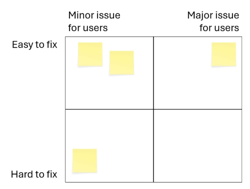
In the session, we demonstrated how you can prioritise issues using a matrix like this:

A matrix showing Easy to fix and Hard to fix on the vertical axis, and minor issue for users and major issue for users on the horizontal axis. Blank sticky notes are in some quadrants.

To place things on the matrix, you make a quick assessment of how significant the issue is. Then you assess how easy it would be to fix. The issues you typically want to focus on first are those in the top right quadrant: major issues that are easy to fix.

It can be helpful to have a set of questions to establish whether an issue is major or minor.

These are adapted from Dave Travis’s work on Red Route usability testing:

  • Does the problem occur in a task that is highly important to you or your users?
  • Is the problem difficult for users to overcome?​
  • Did multiple participants experience the same problem?

Red route usability: The key user journeys with your web site (Dave Travis / archive.org)

Using questions like these give you a shared set of criteria when assessing the significance of usability issues in a group.

But we’re getting ahead of ourselves. How did we get to this point?

How to write a script

Before you can run a series of tests, you need a script.

Use a template

We shared our usability testing script template, which draws on the work of Steve Krug:

Research brief and usability testing script (DOCX, 51KB)

The template includes:

  • a brief, where you articulate the goals of the testing
  • a lead-in script, which you read to participants before testing begins. This covers what the session will involve and sets expectations. ​
  • a set of tasks, presented in a table with two columns. One column contains the task, and another the expected path to complete the task.​

Come up with tasks

We start by identifying tasks and then develop them by adding a scenario.

We practised this in the session. Attendees suggested tasks that someone might need to carry out on a university library website. For example:

  • Check opening times
  • Find a book on your reading list

Develop tasks by adding scenarios

Next, attendees developed these tasks by adding a scenario.

For example, “Check opening times” becomes:

  • You’re a student and you want to check the opening times of the library during the winter break. How would you go about doing this?

“Find a book on your reading list” becomes:

  • You’re a new student and you want to find the book “Campbell’s Biology”, which is on the reading list for your course. Can you show me how you would find out if the library has a copy of this book?

Tips for writing good tasks and scenarios

We shared some tips for turning tasks into questions​:

  • Aim for 5 to 10 scenarios per session.​
  • Keep tasks focused: one goal per task.​
  • Frame tasks as realistic scenarios, not instructions.​
  • Add light context to make it realistic.​

We recommend running a pilot usability test before going ahead with a round of testing. This helps you see how the full usability test flows from start to finish. ​It also gives you a chance to refine the script and ​ensures the session runs smoothly for participants on the day.​

Logistics

Ahead of the Content Improvement Club session, we asked attendees if they wanted us to cover any topics in particular. Most of these came under the wider topic of logistics.

When should you test in a design process?​

Test earlier rather than later. Testing earlier in a design process is ideal because it’s easier to make changes based on what you learn. If you’re creating something new, this usually involves creating rough drafts or prototypes, and then later, a high-fidelity version.

Changing a prototype is easy because no one is very attached to it. But when a design is a later stage of development, it tends to be more painful to learn that something isn’t working. By this point, you and your colleagues have usually invested a significant amount of time in an idea. If the fix involves changing something fundamental to the product, you might have to undo work that’s already been done.​

How long does a testing session take?

It varies, but we usually run testing sessions of about 30 minutes.

How many tasks do you set?

In 30 minutes, we can usually fit in between 5 and 10 tasks.

How many participants do you need?

Three to five participants is a good target. Jakob Nielsen argued that five participants is enough for one round of tests. This is because when you run the same tests with multiple people, you tend to see the same usability issues reoccurring. It’s a case of diminishing returns: by test number six, you aren’t usually learning anything new.

Why you only need to test with five users (Nielsen Norman Group)

In Rocket Surgery Made Easy, Steve Krug recommends three participants per round of testing. This way you can run more rounds of tests – for example, by testing an initial idea and then a later iteration of the same design.

How do you recruit participants?

Mailing lists, Teams channels and surveys are great places to put call outs. We advise that you avoid revealing the testing topic or content in advance.​

Aim for participants who reflect real users where possible. This can prove difficult, so don’t let it stop you if you can’t find participants who don’t match the profile of your users.

How do you take notes?

Obviously, you can scribble notes anywhere you like. When we’re running a series of tests, we often take notes in a spreadsheet. This allows us to quickly spot which tasks caused problems for multiple participants.

Usability test results spreadsheet (XSLX, 36KB)

How can we make testing more accessible and inclusive?

Accessibility and inclusivity should be considered from the very start of the testing process. One important step is asking participants early on whether they use any assistive technology, so you can understand their setup and make any necessary arrangements. Our own introduction questions and templates include this for that reason. In the template, this is an introductory question, but if you’re recruiting via a survey, you could mention this there.​

​Having a diverse participant group will usually lead to more useful and representative findings. For example, if you’re testing a student-facing service, including both undergraduate and postgraduate students can help capture a wider range of experiences and needs. Again, this can sometimes be a challenge, but if possible something to aim for.​

Ideally, usability testing should include participants who regularly use assistive technologies. This provides valuable insight into accessibility barriers that might otherwise be missed. However, this can sometimes be challenging due to recruitment costs, specialist panels, or limited budgets.

Some resources that can help:

Acting on the findings​

So you’ve run a round of testing. What happens next?

Involve senior colleagues in playbacks

In 2015, Caroline Jarrett wrote about a phenomenon she and Steve Krug had noticed when working on websites. They would run a set of tests on a website and uncover some usability problems. But then six months later, the problems were still there: no one had gone in and fixed them. To investigate why this was happening, they ran a survey of UX professionals.

Caroline Jarrett and Steve Krug’s analysis of why usability problems go unfixed

Out of 131 responses, the most common reason was that findings from usability testing conflicted with a decision maker’s opinion.

One way to address this is to get decision makers in the room (or on the Teams call) when you watch a highlights reel of test recordings. There really is no substitute for seeing user behaviour first hand. Reading about it in a report doesn’t carry the same weight.

Use the momentum created by testing

Testing creates a shared motivation to fix things​. Use this to your advantage. If you can, take action to fix usability problems while people’s memories are fresh​.

Make small changes first

Sometimes usability testing highlights small problems that are easily fixed. A link that doesn’t go where someone expects it to. An item missing from an A-Z.

Sort these things out first. Small wins like this give you the motivation to sort out the knottier problems.

If you want to find out more

This was a quick introduction to running your own tests. If you want to learn more,  Steve Krug’s introductory guide is a great place to start:

Rocket Surgery Made Easy by Steve Krug (listing on DiscoverEd)

We post about case studies of usability testing at the University on this blog:

The Prospective Student Web Team do the same:

Acknowledgements

Various points made in this blog post are taken from this 2015 post by Neil Allison:

Making usability testing agile

How to hear about future sessions

We promote these sessions via our mailing list. If you’re interested, please sign up:

Join the UX and Content Design mailing list (University login required)

Suggest a topic for a future session

We picked usability testing following a suggestion from the community. We’re keen to continue covering topics that colleagues across the University would find useful. It would be really helpful if you could let us know any ideas you have using this form:

Suggest a topic for Content Improvement Club (University login required)

Other training that we offer

More training is listed on the User Experience Service website:

Training | User Experience Service

Do students actually watch videos on websites?

It is difficult to think of a university that does not treat video as a core part of its content strategy. Across admissions, communications, and academic departments, the assumption has quietly taken hold that if something can be filmed, an open day, a student or alumni testimonial, it probably should be. The result is that video has become the default format for a huge amount of content that might once have been written.

What that assumption rarely accounts for is the environmental cost sitting behind every piece of video content. Streaming and hosting video is energy intensive, and the carbon footprint of digital content at scale is a growing concern across the sector. For universities with sustainability commitments, that adds another layer of responsibility to decisions about when and why video is the right choice.

But when we sat down to observe how students actually engage with video content, the findings were more nuanced than that assumption would suggest. Rather than confirming that video is universally valued, the research pointed that engagement depends heavily on context, framing, and the individual’s immediate needs, and that for a significant portion of users, video is simply not the preferred way to receive information.

We ran a small qualitative study with three student participants, observing their natural behaviour as they encountered video content embedded in university communications, including emails and webpages. It is worth noting that the videos in question were informational videos hosted on university websites, part of a central university service, and not lecture recordings, online courses, or other educational media.

Most students do not want to watch videos

This was the clearest finding from the research. Two of the three participants showed low or no interest in video content. One stated outright that she actively avoids videos, citing a short attention span and a strong preference for reading. Another would only engage if the video was directly and immediately relevant to her situation, and even then her decision rested heavily on the title and how long the video appeared to be.

Only one participant engaged readily with video, and notably, he was at a specific point of relevance: he was actively working on job applications, and the content matched his immediate need. This matters because it suggests that video engagement is not simply a question of format preference, it is a question of timing and context. The same video, shown at the wrong moment, might not get watched at all.

Even though 15 minutes isn’t long, I would like to know what I spent it learning. You decide in the first few seconds if you want to continue watching.

– Participant, Graduating student

The title is the first and most important decision point

For participants who were willing to consider watching, the title was the single biggest factor in whether they clicked. Titles that named a problem the viewer already had, and implied a clear answer, consistently outperformed broader or more generic framing.

A title like “Why wasn’t my application successful?” performed well because it is direct, addresses something the viewer is likely already worried about, and signals that the video will answer a specific question. By contrast, titles like “Top Tips” or broad sector titles were seen as vague, leaving participants uncertain about what they would actually gain from watching. One participant put it plainly: she did not know what she would get out of a broader title, and that uncertainty was enough to stop her from starting.

What this tells us is that if a title does not tell someone what they will learn and why it matters to them, most students will not give the video a chance to do so itself. The window to make that case is a matter of seconds.

Attention spans are shrinking among students

Multiple participants mentioned short attention spans without being prompted. None were willing to watch a video over an hour long, and one participant was explicit that long videos were simply not something she would engage with at all. The upper threshold for something being considered watchable appeared to sit somewhere under 15 minutes, and even then only if the content felt directly relevant.

This is not simply a case for keeping videos short. One participant suggested that chapter-style signposting at the start of a video would significantly change her willingness to engage. If she could see upfront what would be covered, and at what point in the video, she would feel more in control of her time. Knowing that the section she needed was four minutes in would make her far more likely to watch than facing an unlabelled block of content with no way to navigate it.

When written content already exists, the video is less likely to be watched

When participants knew or suspected that the same information existed in text form elsewhere on the page, or as an automated transcript on Media Hopper, they were noticeably less interested in watching a video covering the same ground.

Videos should not be used as a parallel format for content that already works well in writing. It should be reserved for things where the medium genuinely earns its place, such as demonstrations, walkthroughs, or anything where showing something is meaningfully better than describing it. Using video to duplicate written content risks producing material that most users will simply scroll past. It is also worth noting that every video hosted and streamed carries an environmental cost. According to the Carbon Trust, streaming one hour of video generates approximately 55g of CO2 equivalent.

Can audio do the job?

Video should not be the default. Given the low and conditional engagement observed in the research, it should be reserved for content that genuinely benefits from the medium, such as demonstrations and walkthroughs, rather than anything that could be communicated equally well in text. Where written content already exists in the newsletter, avoid duplicating it in video form. Participants are less likely to watch if they can read it instead, and every unnecessary video adds to the environmental footprint of the platform.

Where audio adds value but visuals are not needed, consider using the MP4 audio format instead. Audio files are significantly smaller, require less energy to stream, and can carry the same content at a fraction of the environmental cost.

Get the title right

If the title does not tell a student what they will learn and why it matters to them, most will not click. Use direct, problem-focused titles that address something the viewer is likely already thinking about. “Why wasn’t my application successful?” works because it names a specific concern and implies an answer. “Top Tips” does not, because it could mean anything. Where possible, address the viewer directly in the title. It signals relevance immediately, and relevance is what drives the decision to watch.

Keep it short and make it navigable

The research pointed to an upper threshold of around 15 minutes for something to feel watchable, and even then only if the content felt directly relevant. But length alone is not the whole picture. One participant was clear that chapter-style signposting at the start of a video would significantly change her willingness to engage. Knowing what would be covered, and when, made her feel in control of her time in a way that an unlabelled block of content did not. Opening each video with a summary of what will be covered, and using timestamps or chapter markers throughout, gives viewers the information they need to decide whether to watch and where to start.

Turn off autoplay

Autoplay is likely to cause disengagement, particularly among users who prefer text and did not actively choose to watch. It also adds unnecessary weight to the page, causing video to load and stream regardless of whether the user has chosen to engage with it. Disabling autoplay is one of the simplest changes a publisher can make, and it has both a user experience and a sustainability benefit.

Always provide a transcript and a written summary

A text transcript alongside every video supports users who prefer reading, users with accessibility needs, and those who want to skim content before committing to watching. A short written summary below each video allows text-preferring users to get the key points without watching at all, and reduces the likelihood of users loading a video only to abandon it partway through.

Think before you film

The research does not argue against videos. It argues for using it more carefully, with a clearer sense of when it earns its place and when something simpler would serve students better. And given the environmental cost sitting behind every videos we produce and host, that question of whether it is really necessary is worth asking every time.

Stop chasing, keep researching: Why continuous contextual learning is the only way to build useful AI features

AI development keeps evolving as do the ways people seek to use AI. Traditional software development runs the risk of trying to perfect AI features people won’t use. Revisiting our previous AI research helped me tease out new opportunity spaces for AI features to help with content design tasks.

Last summer, Mostafa Ebid joined the UX team for a summer internship and built an AI assistant tool which integrated the University’s main AI provider ELM into EdWeb2, our Drupal content management system. The idea for the tool came from hearing University describe the difficulties they experienced when publishing web content. The tool included the capability to write content, design content and proofread, and was designed to work by typing prompts in a chatbot interface, right-aligned to the main part of the editorial interface. When prompted, an orchestration of AI agents were triggered to read textual content and use ELM to make suggestions for improvement based on what the publisher had asked for. Improved text was displayed in the sidebar chatbot interface for the publisher to review and consider using.

Read Mostafa’s blog post about how he developed the tool:

Integrating ELM with EdWeb – Building an AI tool for publishers

Initial tests of the tool with publishers revealed some potential, but identified the need to do further tests, specifically to understand limitations around the user interface display and to learn if the tool was useful to publishers in the context of content they were familiar with (as opposed to generic stock content that was used in the first round of tests).

Read my blog post about the initial tests of the tool:

Initial insights from UX testing our Drupal AI content assistant tool 

Mel Batcharj accessibility tested the tool, focusing on keyboard navigability, and Nick Daniels ran tests with two publishers in October last year. I recently reviewed the findings of this research to consider advancements in Drupal AI in the past 12 months, to assess whether the original premise for the tool was still valid, and to think about residual content design challenges AI could potentially help with.

Advancements in Drupal AI have resulted in improved AI features

The Drupal AI Initiative began in April 2025 with a group of participating organisations making a commitment to collaborate to build the future of AI in Drupal. As a result of the initiative, various workstreams began to shape Drupal’s infrastructure to support AI, to experiment with new innovations and to improve the UX.

Read more about this workstream:

Drupal AI Initiative project page on Drupal.org

A more accessible AI chatbot is now available as a Drupal recipe

Our original AI content assistant tool was built into a panel of the editorial interface as a custom build, which worked well when using a mouse, but which accessibility testing showed was restrictive when navigating using a keyboard. Since the tool was built, however, accelerated development in the wider Drupal AI community prompted the creation of an open-source AI chatbot freely available to apply. Adopting this chatbot was preferable as it avoided the need to maintain custom code and it was possible to use it with a keyboard only.

There’s an active Drupal issue to address the need for the AI chatbot interface to be expandable

Several of the participants who took part in Mostafa’s tests of the tool last year found it awkward to scroll through the AI chatbot output as it was presented in the narrow left-aligned interface. The same problem had been noted in the wider Drupal community, and therefore I raised an issue to have this rectified, which is being worked on as part of the AI Initiative task backlog.

We did more tests on our AI tool – this time using participants’ own content

In the first round of tests, four participants were all presented with the same piece of content (on the topic of safety procedures) and asked to use the AI tool to improve it in specific ways (such as writing it for user needs, making link text better, and so on). This approach turned out to be limited, as since participants were unfamiliar with the content, they were unable to assess whether the outputs of the AI tool were an improvement on the original content or not.

In a subsequent round of tests we therefore adopted a looser approach – asking participants to supply a piece of content they were already working on, and then asking them to use the AI tool to improve it to suit their needs. The results from these tests were more indicative of how useful publishers found the tool to make content improvements.

Results of these tests highlighted how the AI tool needed to change

Since we placed participants in a situation where they were using AI on content they knew well and could critique and appraise authentically, the results of these second-round tests gave clearer indications of what worked with the existing tool, what didn’t and where AI could be best applied to help with content design tasks.

Participants didn’t notice the content options in the AI tool, or the help text

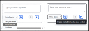
The tool contained three different content options: Design Content, Write Content and Proofread, presented in a dropdown menu in its interface.

Initially, participants didn’t notice these options and used the default Write Content option.  When they later experimented with the Proofread option they found no discernible difference between these options in terms of outputs, which led them to believe that a simpler version with a single conversational interaction option would be preferable.

The tool defaulted to reading the content on the page, and working on this when prompted. Participants were initially unclear that this is how it worked, and they didn’t notice the help text to enable or disable this mechanism presented in the tool interface. Taken together, this feedback suggested that a simpler version of the AI chatbot, such as the one from the Drupal recipe, would be easier for publishers to use.

Close-up screenshot showing detail on the AI assistant tool chatbox

Close-up screenshot showing the content options and the help text on the AI tool

The AI tool had some value as a writing partner to suggest restructures to textual content

Responding to the task to experiment with the AI tool to improve their content, the participants quickly got used to how the tool worked, and recognised its use as a writing partner to prompt about their content and receive suggestions for improvement in a conversational way.

Prompts they used to improve a page of content in the body text field included:

  • ‘Rephrase copy to condense, highlight key messages and make it accessible to pet owners looking to join practice’
  • ‘Proofread copy so that it appeals to pet owners non clinicians’
  • ‘Turn this page into web ready content. It needs to be concise, easy to scan, readable to a wide range of audiences’

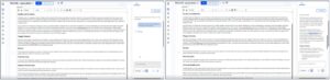
These prompts resulted in edited versions of the page content, typically including structural elements like headings, bullet points and calls to action, delivered in the chatbot interface.

Screenshot showing the output from the AI tool before and after a prompt to rephrase the content for a specific audience (before on the left, after on the right)

Side-by-side screenshots showing the prompt entered in AI tool to improve content for an audience (on the left) and after (on the right), with the output response to the prompt.

The tool lacked capacity to tweak or iterate on previous versions of content – which participants wanted

Once they had reviewed the tool’s initial outputs, both participants entered conversational turns with the tool, asking it to perform successive tasks on the content it had previously produced, to edit it further, in line with their specific requirements and rules.

Prompts they used to tweak initial AI outputs included:

  • ‘Remove adjectives and exclamation marks’
  • ‘Remove brackets’
  • ‘Remove any unnecessary words, fix typing errors, suggest improvements for SEO’

With every new prompt in the conversation, the tool produced a fresh output, meaning the publisher was left to review a succession of different versions of the edited content, presented in the chatbot interface, without any indication of what had been changed. Participants found it difficult to review edits, as they would usually do when working on a piece of content, in order to compare the ‘before’ with the ‘after’ – ultimately to assess whether the AI tool outputs were to their satisfaction.

They said they would have liked the tool to have presented the edits in a ‘tracked changes’ format that they were familiar with from word processing programmes.

Screenshots showing outputs of the tool before and after a prompt to iterate on improved content

Side-by-side screenshots showing a prompt entered to improve existing content (on the left) and (on the right) the output from this prompt – showing a new version of the content

Participants didn’t really need the tool in the interface as they tended to edit text content elsewhere

When describing their usual content process, participants said they would usually prepare their content in a word processing programme like Microsoft Word rather than edit directly in the Drupal editorial interface. There were several reasons they chose this method – a key ­­reason being the need to involve others to check (and in some cases, sign off) their content in preparation for the website. They were more familiar with referring others to check their content or proofread it when it was in the Microsoft suite, than when it was in the Drupal editorial interface.

Furthermore, Microsoft Word accommodated the addition of comments and tracked iterative changes to pieces of content which was not possible within the Drupal editorial interface. This content preparation habit suggested that while the AI tool was useful to suggest content edits, this would have been more useful before the content was in the interface, and therefore could be achieved by pasting content to be edited into a browser-based AI tool or app (such as ELM).

Within the interface, the tool only had use as a ‘final check’ mechanism, to catch any typos, errors or style misalignments before the content was ultimately published.

The tool needed to be able handle more than text as pages were typically made of multiple elements

Reviewing the test set-up and comparing it to their usual ways of working with EdWeb2, the participants said the pages they worked on would usually be made up of more than just textual content in the body text field. They would typically work on pages with multi-column layouts, making more extensive use of Drupal paragraphs or including structural elements like accordions, feature boxes and cards. They were interested to know how the tool may make appraisals or suggest improvements for those sorts of pages to help them arrange their content in appropriate ways.

We identified new opportunities for AI content publishing features

Extrapolating on the feedback from the tests, several use cases and scenarios for applying AI to content design tasks emerged, which will help inform our ongoing work to apply AI to make content design tasks easier for publishers.

AI-assisted content structuring

Describing their typical content writing workflow, participants said they found it difficult to move from a text-based editor like Microsoft Word into the Drupal editorial interface where they needed to make use of Drupal Paragraphs as well as page elements like accordions to structure the content. Potential areas for AI development could therefore include:

  • A mechanism to convert textual content into appropriate structural elements
  • A way to make suggestions for accordion labels or structure
  • A feature to ensure uniform creation of cards or feature boxes
  • A means of cross-checking style consistency of pages made of multiple elements or with a specific layout

AI- assisted content design for SEO/GEO/AEO

Having their content picked up by search engines or being machine read was something participants wanted, but they were unsure how to write, tag and structure their content to make this happen effectively. Potential areas for AI development could therefore include:

  • A way to have their content analysed for SEO effectiveness, based on signals like content quality, scannability and key word alignment
  • A mechanism to suggest content changes aligned to specifically defined SEO goals and target user engagement measures

AI assisted content reviews – against specific style conventions and contexts

As well as ensuring their content followed the rules of the University’s Editorial Style Guide, both participants mentioned other conventions that they needed to apply to their content, that existed at a more local website level. For example, one participant’s site had a rule not to use brackets or exclamation marks, or to overuse adjectives, so they would have found it helpful to have a way to cross check content against these rules before publishing.

The Drupal Context Control Center is an emerging feature designed to handle the application of context rules within a site across various scopes and use cases, and Drupal AI Content Review is a related feature, designed to appraise content against given context rules and conventions. Together, these Drupal features may be a good fit to help University web publishers make use of AI to shape their content with the uniformity they require.

Read more about the Drupal Context Control Center and its development in my recent blog post:

Think like a machine: How building a Drupal context-handling feature is providing a new lens of content design and style rules

Read about AI Content Review on Drupal.org

We’re changing the direction of the AI tool based on what we’ve learned

Last summer it seemed certain that an in-interface AI chatbot content assistant helper was what we needed to build. A few improvements to the UI to make it expandable and navigable with a keyboard and it would be ready to go. As it turned out, things had moved on, and these problems were addressed by the wider Drupal community. This meant we could go back to our research findings to re-examine how AI could be best applied to aid content design tasks, and to consider how it could best fit into existing workflows of our publishers to assist them with difficulties they faced. As we continue with internships this summer, we’re excited to re-focus and plan more research to explore some of these emergent opportunity areas. Aligning with in-progress Drupal AI developments, we’re open to learning how we can apply and adopt the work of the Drupal community to our University digital publishing context.

When good product practice tells you to stop: What we learned trying to externalise our Effective Digital Content course

Riding on the success of our internal Effective Digital Content course, we set out to expand by building an external version for the short courses platform, taking a product thinking approach. Three months on, experimenting with a proof-of-concept course has convinced to pause this work – to avoid falling into a build trap.

The success of our relaunched Effective Digital Content (EDC) course, to date completed by more than 400 University staff, prompted ambitions to reposition the course for external audiences by including it in the University’s Short Online Courses platform. With the help of colleagues from the Short Online Courses team and the Learning Technology team, we did some market research, identified target audiences, defined a product vision and goals and began using the Canvas platform to develop a proof-of-concept.

Read more about our plans to reposition EDC as an external course in my blog post from March 2026:

Repositioning Effective Digital Content as a short online course: A product approach

At the end of sprint three (of a total of seven planned sprints) we faced unknowns and unanswered questions preventing us from achieving some of the fundamentals we’d defined in the product vision and goals. Resisting a sunk-cost fallacy-motivated urge to continue building, we made a sensible decision to stop and to pause until we’re in a better-informed place to have the confidence to continue.

In this post, I reflect on the benefits of adopting product thinking, the discomfort with facing difficult questions upfront and the practicalities of learning about audiences for expansion opportunities.

Revisiting the Product Kata helped clarify feelings of uncertainty

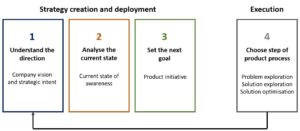
Melissa Perri’s book ‘The Build Trap’ contains a helpful framework to guide product development which I have become familiar with through my involvement with Drupal product teams. On the strategic level, this framework helped me set out a vision for an external version of the Effective Digital Content course, establish the problem the course was aiming to solve and its audiences, and work out the learning outcomes associated with each course module.

Entering the execution phase, however, taking each course module at a time and building each one out to meet the needs of the established audiences, things took longer than planned, and felt more difficult than we’d anticipated.

Pausing for reflection, we unpicked where things were going wrong. Going back to our vision, we had wanted to repeat the success of the internal EDC course, giving learners practical experience of writing digital content for their audiences. We had been able to instill this experience in the internal course because we had been able to regularly engage with University web publishers, to fully understand their content design challenges and design practical experiences for them that specifically addressed their friction points. Without such detailed insight into external audiences, we were effectively basing our course design decisions on guesswork and assumptions, which explained why our initial efforts seemed to be missing the mark. The strategic vision was sound, but our capacity to fully explore the problems and optimise associated solutions was limited, therefore execution was flawed.

Adaptation of the Product Kata diagram from Melissa Perri's book 'The Build Trap' showing the stages: Understand the direction, (Company vision and strategic intent), Analyse the current state, (Current state of awareness), Set the next goal, (Product initiative), Choose step of product process (Problem exploration, Solution exploration and Solution optimisation)

Adaptation of the Product Kata from Melissa Perri’s book ‘The Build Trap’ showing the split between strategy creation and deployment and execution

The practical workbook is EDC’s best asset – but is hard to replicate for broader audiences

A lightbulb moment in our reflections came when considering what worked well about our internal EDC course. When staff complete this course, they are required to complete exercises in a workbook which they submit to the UX team for feedback. This tests learners’ ability to do fundamental content design tasks like structure headings, write hyperlinks and turn lengthy text into chunks to be scan-read. Reviewing more than 400 submitted workbooks, we affirmed the importance of this element of the course both for learners and for our team as owners of the course as a product. Through these workbooks,  learners are able to practice content design in the specific context of the University sites they are responsible for, and as the product team, we are able to see impact the course has had in improving content design knowledge.

Replicating the workbook concept for external audiences would require knowing about the contexts and content they were working with, in order to design exercises that required them to test those skills. Without knowledge of our audiences’ circumstances, the best we could do would be to design a generic set of exercises, devoid of the nuances needed to really engage learners in practising content design techniques.

Testing what we had built so far taught us what we didn’t know

In UX and product design there’s a saying: the best time to test is yesterday, failing that, test now. Resisting the urge to keep building EDC modules, we made the decision to take the three modules that had been built and to test them with University publishers. Feedback from the tests was positive, which was nice to hear, but didn’t really help us assess if the modules we had made were a good fit for external audiences. University staff wouldn’t take an external Effective Digital Content course as they had already taken the internal version. To assess if we’d made a good product we needed to know answers to questions such as:

  • What needs should we prioritise for our target audiences?
  • How do our audiences currently meet these needs?
  • Would univerisities with a distributed content model find an external course useful?
  • What would motivate our target audiences to take this type of course?
  • How well do existing courses meet user needs and expectations?
  • Will our proposed course be valuable to target audiences?

In another of Melissa Perri’s books ‘Product Operations: How successful companies build better products at scale’ by Melissa Perri and Denise Tilles, the authors use a case study at a financial services organisation, Fidelity, to show the relationship between user research and the product design lifecycle. Applying this relationship by positioning EDC external as the product, it was clear that our outstanding questions fell into the ‘Core UXR question’ category at the ‘Discover’ ‘Define’ and ‘Design’ stages and therefore needed to be addressed before proceeding to the ‘Develop’ and ‘Deploy’ stages.

Having worked with other teams both within and outside the University, we knew all too well the potential risks and consequences of building without adequate research – and resolved that it was better to stop building to avoid wasting effort.

Successful expansion will rely on targeting audiences and researching their needs more fully

Taking a pause in the build will allow us to take time to assess the gaps in our knowledge of our target audiences, and work out ways of learning what we don’t know. Understanding the nuanced needs of our target audiences will help us familiarise with the market for content design training in the public sector to assess the value of the expansion opportunity. Referring again to ‘Product Operations’, learning the differences between the markets associated with our expansion opportunity (the total addressable market, the serviceable addressable market and the serviceable obtainable market) will help us decide whether the proposition is viable, deliverable and desirable or not.

In the meantime, we’re using what we’ve learned to improve internal EDC and training

As a team, we really value what we learn from time spent in research, and we always endeavour to act on what we have learned and make sure research does not go to waste. In this case, going through the process of reworking three course modules to aim them at external audiences has pinpointed ways to improve the internal version of our course – in particular to make the introductory module clearer and more impactful and to be clearer on some accessibility concepts. Submitted workbooks and feedback from our regular Content Improvement Clubs also provide a constant source of learning, to identify areas publishers still struggle with that we can continue to address with subsequent tweaked versions of EDC and topics for additional publisher training sessions.

How the Effective Digital Content course led to a collaborative project to explore ways to improve the School of Informatics course materials site

In January 2026, Alex Burford, a learning technologist from the School of Informatics contacted the UX Service following completion of the new Effective Digital Content online course. Alex had really enjoyed the course and was keen to explore ways to implement the content design best practice principles it teaches within Open Course – the platform that the School of Informatics use to share their course materials.

Informatics Open Course Materials

Screenshot of the homepage of the School of Informatics Open Course materials page. There is a title 'Welcome to the Informatics Open Course Materials' heading, followed by some paragraph text and part of a table listing out the courses available to access.

Screenshot of the homepage of the School of Informatics Open Course Materials platform.

Identifying key areas for improvement

Alex had received positive feedback from students who were able to successfully locate their course materials. However, from our discussions and a review of the content on the Open Course platform, (which relies heavily on tables), we both felt there was scope to review the current layout and explore potential alternatives.

Within the tables, we also identified that a more consistent and informative approach to formatting links as well as creating more effective headings could improve the user experience.

In addition, Alex was keen to look at the best ways to support Open Course publishers with content design and embed ways to make it easier for them to prepare effective content. To this end, we talked through potential guidance and training that could be developed with a specific focus around Open Course content.

We spoke with Open Course publishers to gain their perspectives

Before progressing any further with our ideas, we were keen to establish a baseline understanding of how Open Course is currently used by those who publish content on it. This would help us to learn about their processes and approaches, identify pain points as well as areas that were working well.

Alex reached out to Informatics colleagues to see if they would be happy to speak to us about their experiences of using Open Course. In late January / early February 2026 we carried out a series of semi-structured interviews.

Format and aims of the interviews

The UX Service facilitated the interviews via Teams, observed by Alex, to learn about the experiences of Informatics colleagues who published content on Open Course. Informatics colleagues shared their screen and talked through how they achieve content publishing and formatting tasks in Open Course. This enabled us to see first-hand how they went about these tasks and hear their perspectives and feedback.

The aim was to confirm areas that were working well and also the main pain points. We were keen to learn the reasons why tables were used, what the experience was like for those editing content within them and understand more about their approach to writing headings and links.

We gained a lot of useful information from the interviews both from a content perspective, but also in relation to more technical aspects relating to the platform itself which Alex could feedback to Graham Dutton, the developer working on Open Course.

This information then provided the basis on which to form an action plan around how to make improvements and decide on the best way to provide support and/or guidance.

Tables: were they necessary, if so could they be improved?

Following our discussions with Alex and the semi-structured interview insights, we felt we had a good understanding of how tables were used and the pain points relating to editing content within them.

We first wanted to explore whether tables were needed, or if there were alternative layout options to avoid the need for tables completely. If they were needed, we could then look at how they could be improved?

Prototypes were created by the UX Service

The UX Service mocked up some prototype tables, initially in Word before also creating them in an Open Course playground site we had access to. We used the following ‘Schedule and materials’ page, where almost all information was displayed in a table.

INF2-SEPP: Schedule and Materials | Open Course Materials

Prototype one

Our first prototype involved removing tables completely and using headings and paragraph text to display the same information. What we soon realised was that this made the information hard to scan and increased the length of the page. We felt from trying this approach, there were definite benefits to having a structured column layout to help communicate key dates and materials for course participants efficiently.

A screenshot of a word document prototype taking information from the Open Courses platform and displaying it using headings and paragraph text rather than tables. The screenshot includes the page title and a short summary paragraph. Followed by the Week 1 heading which tells you the week, dates and name of the topic. Following this there are section headings for lectures, tutorials, drop-in labs and milestones, with necessary details under each as paragraph text.

Screenshot of a word document prototype displaying information from Open Course using headings and paragraph text rather than tables.

Prototype two

Our second prototype then explored how we could improve the current table layout and make it as accessible as possible. The existing page had a continuous table with six columns. All headings and links were included in the table itself which made it quite hard to navigate. Also, the number of columns meant that text was wrapping onto two lines quite often, which again impacted on readability.

We explored presenting the same information in a two-column layout, using rows with clear left-hand headings to signpost key information. We also split the continuous table into multiple tables, one for each week of the term. Column and row headers were also applied within the table editor tools. These changes we felt improved the overall look and feel of the page but also made it easier to navigate to the information you needed.

A screenshot of a word document prototype taking information from the Open Course platform and displaying it in an alternative table format. The screenshot includes the page title, a short summary paragraph. Followed by the heading 'Week 1' and then a table with two columns and six rows, one column has various headings such as 'Dates', 'Themes', 'Lectures', with the corresponding information displayed in the column next to it.

Screenshot of a word document prototype displaying information from Open Course in an alternative table format.

Stress-testing prototype two

After sharing both options with Alex, we decided to proceed with prototype two and carried out some further testing to make sure it was fit for purpose.

JAWS – Screen reader testing

Using the prototype in the our Open Course playground site, we used JAWS to test out how the content on the page would be navigated and interpreted by a screen reader.  Whilst this approach may not fully capture how all users of assistive technology navigate, interact and experience the page, it did provide useful insights around how tables in Open Course interact with screen readers. Overall, the new table layout responded well.

We found that JAWS:

  • read out the number of columns and rows in a table as expected.
  • navigated the table content in a logical order. It interpreted tabled cells moving from left to right, first reading the column headers (‘dates’, ‘themes’) before information and links within the cells.

JAWS didn’t pick up on blank cells within the table. Instead, it moved to the next table cell which had content within it. Therefore, we recommended that if this table layout was adopted that there should be no blank cells to aid clarity. Where there was no information to put within certain cells, text such as ‘no milestone’ or ‘no tutorial’ should be used.

We are also aware that screen reader users can and may wish to jump from table to table on a page. When navigating in this way, JAWS moved table content to table content without reading out the assigned ‘Week X’ heading we had inserted. Therefore, when you have multiple tables on a page, it’s hard for the user to tell which table they are on. A potential solution to aid understanding could be to incorporate the week number within the table itself, rather than using headings.

Magnification and responsiveness on mobile

When tested, the page (including tables) responded well to 400% magnification, with no loss of information. This check was carried out to ensure that the content reflows correctly for users who routinely view web pages using zoom functionality. We wanted to ensure that information did not move off screen or overlap when zoom was used.

The tables also responded well in mobile view, including when the screen was rotated. This is important to test given the increased usage of mobile devices to access digital content, to ensure all users were able to easily read / navigate the information on the page.

UX Service recommendations

Recommendation to use prototype two table layout going forward

Following our prototyping and stress-testing, we reported back to Alex that prototype two was the option we would recommend.

Recommendation to consider best formats for guidance on headings and links

From reviewing the pages and considering the insights gained from the interviews, we also felt that it would be beneficial to create guidance around:

  • writing effective headings and using correct heading levels in tables
  • how to use links and write effective link text.

Having this guidance close to hand, ideally accessible directly from the edit screen of the Open Course platform would be preferable to enable ease of access for users.

Reflections and next steps

As a team, we really enjoyed working with Alex on the project. It provided us with the opportunity to apply the content design best practice principles that we teach specifically to learning and teaching content. It was interesting to explore and test out options for using tables in a different context, outwith the central EdWeb 2 Content Management System, for student-facing content.

We are glad that the Effective Digital Content online course provided the impetus for this work. We hope that the course continues to provide the starting point for interesting conversations about how digital content can be improved as it reaches wider audiences around the University.

We look forward to continuing to work with Alex in relation to the guidance and potential implementation of the new table layout before the next semester or at an appropriate time in the future.

Think like a machine: How building a Drupal context-handling feature is providing a new lens on content design and style rules

AI tools to support content tasks are becoming more and more widespread. As part of my contributions to open-source Drupal I’ve been researching how to prepare and package content design and style rules that these tools can use effectively.

Using AI to help with content design tasks (and indeed, any other type of tasks) is now standard practice for many. As anyone who has experimented with it knows, the value the AI can provide is largely dependent on the prompt it receives, and the contextual data and information it is given to work with.

The way you provide your chosen AI with context affects the results you get

I have encountered two main methods for providing AI with context data. The first is the ‘prompt and pray’ approach, where you start with vague instructions and then engage in back-and-forth to drip-feed the AI the necessary information in the conversational turns. The second is the ‘context engineering’ approach, where you front-load information to proactive guide the AI, for example, defining its role, setting explicit goals, providing background and adding contextual constraints and rules.

Context engineering is more proactive than prompt and pray

Prompt and pray is better suited to a standard LLM interface or chat assistant (like ELM or Claude), and is the preferred choice when you’re looking to brainstorm and experiment, and are happy to take variable outputs. Context engineering relies on a more structured interface, designed to handle workflows (like Claude Skills) and is therefore the best choice if you’re looking for consistent, predictable outputs within set parameters, but it requires you to prepare your context data upfront, and for your chosen AI mechanism to have a way of handling it.

The Drupal Context Control Center is a management system for context data

Context data is a term given to the structured, site-specific knowledge – such as brand guidelines, regulatory requirements, editorial rules, and terminology – that tells an AI how you want it to work, to ensure its outputs reflect your actual preferences and standards rather than generic defaults.

In January 2025, our team was fortunate to spend a day of Drupal AI experimentation with specialist company Freely Give, in which we applied AI solutions to some of the web content management and design problems faced by the University. One of our experiments involved prototyping a basic style-guide checker into EdWeb2.

Read about this early experiment in my blog post:

An automated Editorial Style Guide? Experimenting with Drupal AI Automators

Looking back, this experiment was a very basic form of context handling, and since then, following the launch of the Drupal AI Initiative in June 2025, there have been rapid developments in thinking about AI and context. The Drupal Context Control Center (CCC) was initiated specifically for the purpose of enabling AI to handle context data and I am proud to have worked on its design, collaborating with Kristen Pol, Aidan Foster and others from the AI Initiative.

Read about the Context Control Centre on its project page on Drupal.org

To design the CCC architecture we brainstormed context application scenarios

Starting with a blank page, we started trying to come up with the main building blocks that the CC needed to have, but we found it very difficult. Drupal is phenomenally flexible which meant every function we wanted could be achieved in various ways. We quickly moved from thinking in the abstract to considering real-life scenarios when people would want to use AI to make use of context data to control what happened with their content which helped us tease out the tasks we wanted the CCC to support.

An example scenario was as follows:

Content creator wants to refresh a prospective student recruitment campaign. They ask the AI, integrated in the content management system, to help. Acting on the instructions, the AI prepares a sample campaign page which includes a slogan that doesn’t match the voice and tone and contains images from winter when the campaign is for summer. The content creator rectifies this by providing the voice and tone guidelines and updated imagery. The AI tries again, it’s better but this time there’s a word spelled differently from the style guide. The creator uploads the style guide rules. The page looks good, but the content creator wants another version to compare. The AI comes up with a version 2. The content creator wants to track interactions with the first version and swap to the second based on performance. To do this they connect their Google Analytics Acquisition reports and give the AI instructions of the thresholds to look for, to initiate the change.

We defined building blocks of the CCC and the relationships between them

Considering what would be needed to support the scenarios we came up with, we identified that the CCC needed to house several types of data and we thought about the dependencies and interactions the CCC would need to support.

1.     Data items that set out ‘the What’

First and foremost, the CCC needed to include the context items (rules and guidelines) such as:

  • Brand guidelines
  • Voice and tone rules
  • SEO keywords
  • Campaign or project briefs
  • Style guide
  • Image bank
  • Pattern library

In addition, it needed to contain subcontext items (more refined versions or child/subsets of the context items) such as:

  • New product brand guidelines
  • Seasonal campaign copy
  • Seasonal image set
  • Landing page pattern set

2.     Data that set out ‘the When and How’

As well as the various sorts of rules and guidelines, the CCC also needed to include details of the circumstances and situations in which to apply them. Collectively, these were called the context scopes and they mapped out boundaries and constraints such as:

  • Global (site-wide)
  • Site sections
  • Content types
  • Use cases (for example – writing teaser copy, working with images)

3.     Mechanisms that control how agents select context

Connecting the ‘what’ with the ‘when and how’ relied on AI agents identifying context scopes and selecting appropriate context items to apply. For this to occur successfully, the CCC needed to include some means of facilitating as well as guardrails to steer suitable choices. These included:

  • Context limits (limiters on numbers of context items and tokens)
  • Scope subscriptions (agent configurations to define opt-in or opt-out)
  • Target entities (specified content entities with context built-in)

We tried out terms in practice before deciding on labels

Labelling parts of interfaces is always tricky, particularly within Drupal where certain words have legacy meanings and, owing to its flexibility the functionality associated with terms may change over time. It was especially important to make careful label choices for the different parts of the CCC architecture, given its anticipated universality.

To inform my work on the CCC I decided to re-read ‘Design by Definition’ by Elizabeth McGuane, which book sets out and appraises a range of approaches for deciding upon terminology, labels and names for objects.

When choosing a name to fit a system, the author recommends appraising the options against three criteria:

  • Novelty – how standard or unique the name needs to be
  • Flexibility/mutability – how well the name works in different contexts
  • Memorability – how easily the name is recalled

Applying this idiom helped us decide upon several key CCC terms, including:

Context item: any piece of information fed into an AI powered mechanism (typically an agent) to help the AI’s working memory to produce responses and outputs that are accurate and tailored to the users’ requests.

Context source: origin of any piece of information fed into an AI powered mechanism (typically an agent) to help the AI’s working memory to produce responses and outputs that are accurate and tailored to the users’ requests.

A screenshot showing an interface from the beta release of the Drupal Context Control Center, showing the use cases and the context items (with inter-relationships). Arrows point out these different areas.

A screenshot showing an interface from the beta release of the Drupal Context Control Center showing the main building blocks

For the CCC to work as intended, inputs need to be machine-readable

With key parts of the CCC defined and the architecture mapped out, we started to consider how well the CCC could handle variations of context data loaded into it. This required us to think more broadly about how AI makes sense of information.

In the excellent book ‘Machine customers: The evolution has begun’ by Katya Forbes, the author outlines many use cases where people enlist AI agents to take care of tasks for them and diagnoses the underlying factors necessary for the AI to satisfactorily work on behalf of the people concerned.

In one such use case she breaks down the stages required for a human to take a purchasing decision compared to a machine.

For a human to decide on a purchase, they go through the following stages:

  1. Awareness – ‘I have a problem’
  2. Interest – ‘This might solve it’
  3. Consideration – ‘Let me evaluate my options cognitively and emotionally’
  4. Intent – ‘I’m leaning toward this choice’
  5. Purchase – ‘This feels right’

For a machine to decide, the stages are different:

  1. Query initialisation – parameters received ready to begin search
  2. Discovery – options identified that meet basic criteria
  3. Evaluation – comparing options against weighted parameters
  4. Verification – validating performance claims and reliability
  5. Selection – optimal choice identified based on data

From this comparison use case, it is clear that designing contextual data such as guidance documents to be used by AI requires a different approach to designing content to be read by humans. In particular, writing guidance information that relies on sentiment and/or subjective interpretation will be lost on AI and therefore not applied in the ways intended.

In its current form, our Editorial Style Guide is only partially AI-ready

Last year, in the early days with ELM, members of the UX Service tested ELM’s ability to apply the rules of the style guide to check content. They found it had limited success and found that in some cases, ELM applied its own rules to checking the content which couldn’t be traced to the style guide. Reviewing this experiment in light of the machine customer journey, it becomes clear that for an AI like ELM to faithfully and consistently apply style guide rules, the rules need to be written in a way that demands minimal interpretation, in other words, a deterministic way.

Read John Wilson’s blog about experimenting with ELM and the style guide:

Testing ELM’s ability to return useful results with prompts about the Editorial Style Guide

Adopting a ‘machine-first’ lens to the Editorial Style Guide to analyse content in selected sections, it is possible to pull out some of the deterministic (automatable) rules to compare with non-deterministic (requiring judgement) ones.

Analysis revealed deterministic and non-deterministic rules in the Editorial Style Guide

I completed a quick review of three sections of the style guide to assess how AI-ready they were.

  1. In the Headings and page titles section

Deterministic rules:

  • Do not skip heading levels
  • Do not use H5 or H6 headings (maximum four levels)

Non-deterministic rules:

  • Use word and language your users will be looking for and familiar with
  • Write descriptive headings – avoid vague words
  1. In the Acronyms and abbreviations section

Deterministic rules:

  • Do not put full stops or spaces between letters of an acronym
  • Do not abbreviate Professor to Prof
  • Do not use eg, ie or etc

Non-deterministic rules:

  • Spell out acronyms multiple times on long pages or pages with accordions
  • Well-known acronyms don’t need spelling out
  • Use abbreviations only when better known than the full version, or when space is limited
  1. In the Links section

Deterministic rules:

  • Do not use a URL as link text
  • Do not use ‘click here’, ‘more information’, ‘learn more’ as link text
  • Put links on a new line, not inline in a sentence

Non-deterministic rules:

  • Add details about what a link will do (open in a new tab, require a University login) where relevant
  • Avoid duplicating links where you can
  • Reserve button styling for the most important links

Going through this short exercise with our style guide established that before we can make valid use of AI-powered features like the CCC, there is preparatory groundwork required to some of our content design guidance and rules more AI-readable, and potentially to create a new machine-readable version of the Editorial Style Guide.

I’m looking forward to investigating the potential for the CCC at the University

My work with others in the Drupal community on the CCC has led to a successful release of a beta version, with a release candidate coming soon, planned alongside the regular Drupal AI module release cycle.

Building on our early AI experiments with the style guide, I am keen to lead the UX team to explore the CCC’s potential to handle and apply editorial rules within a Drupal-powered CMS like EdWeb2. Our previous research with web publishers tells us that applying the style guide consistently can be genuinely difficult, and as AI-powered content design tools like the CCC continue to emerge, there is real opportunity to put this to work on the challenges our publishers face.

Read about our previous research with publishers about using the Editorial Style Guide

An analysis of responses to our Editorial Style Guide survey by Hannah Watson

Usability testing the Editorial Style Guide site by me in my previous Content Designer role

Full automation of good content design is unlikely and undesirable but it may be possible to offload some of the more straightforward rules to an AI mechanism like the CCC, freeing publishers to focus their attention on the trickier aspects of content preparation. Taking a machine-assisted view will also provide the chance to revisit existing non-deterministic rules to assess whether some could be made more granular, broken into sub-contexts or context scopes for more precise application.

In line with our broader aim of improving the tools available to content publishers, I am excited to see what the CCC can offer for real-world content design challenges at the University.


You don’t know what you don’t know: Improving the way we position inclusive language at the University

Progressive thinking about inclusive content combined with a review of our content design tools prompted us to look at the effectiveness of our Inclusive Language Guide. Before we could think about improving the guide, however, we needed to ensure staff knew it existed.

Since the relaunch of our Effective Digital Content course last year, and following a succession of content improvement club sessions regularly attended by web publishers and content creators, it’s been gratifying to see more and more University staff learning about content design and putting theory into practice. The raised awareness and interest gave the UX team cause to review the guidance we direct staff to follow, to check that it’s as clear and easy to apply as possible.

The Inclusive Language Guide (ILG) was published In June 2022, following months of careful research, investigation and analysis by Ari Cass-Maran, former Senior Content Designer of the UX Service. Nearly 4 years on, amidst increasing UX and content design maturity, it was timely to revisit the guide with a view to improve it. Before we could think about improvements, however, we firstly needed to appraise how well the guide was known and being used by University staff.

Read more about the origins and publication history of the Inclusive Language Guide in Ari’s blog posts:

Inclusive Language Guide

Inclusive Language Guide: how we co-designed with our community as part of a human-centred Design System

Inclusive language awareness and practices have advanced since we published our guide

Since 2022, there have been many positive developments in inclusive language practices and approaches in the public sector and beyond. In November 2023, members of the Home Office Digital team created inclusive language guidance as part of their goal to embed diversity and inclusion into their research and design practices. In September 2024, the Department for Education published the first release of an Accessibility and inclusive design manual and initiated research to learn how easily users could find information within it, with a view to making improvements for a second release. Further afield, in 2024, the Council of Europe published inclusive language guidelines and the European Institute for Gender Equality published ‘Words Matter’ a guide and associated toolkit designed to encourage more gender inclusive language practices. Content-design publications like ‘Considerate Content’ by Rebekah Barry and ‘Designed with Care: Creating Trauma-informed content’ by Rachel Evans and contributors helped shed light on practical ways to prepare content in more sensitive ways, for example, taking into account needs associated with neurodivergent conditions and needs triggered by previous difficult experiences. On a more conceptual level, Karen Yin’s book ‘The Conscious Style Guide: A Flexible Approach to Language that includes, respects and empowers’ prompted a philosophical approach to inclusive language use, going beyond lists of ‘do’s and don’ts’, instead, calling for engagement with changing cultural norms to make decisions around language use within a framework guided by content, context, consequence, complexity and compassion.

Read about some of the developments in inclusive language practices:

Conscious Style Guide website

Inclusive language by design, published 22 November 2023 on the Home Office Digital blog

Accessibility and inclusive design manual blog, published 29 October 2024 on the GOV.UK website

Guidelines for the use of language as a driver of inclusivity by the Council of Europe

Words Matter: Supporting Gender Equality Through Language and Communication, published by the European Institute for Gender Equality

Before we could make improvements, we needed to understand the guide’s current use

Working in UX, with its overarching aim of making things better for people, it can be tempting to track developments in user-centred design and apply emerging thinking directly to the work in front of you – in this case, the iteration of our Inclusive Language Guide. But to make changes that are meaningfully impactful, it is often better to pause first and understand the current state in order to plan accordingly. In this instance, that meant taking time to assess how our existing guide was performing – to find out whether it was known, adopted, and being applied by  University staff with content publishing responsibilities.

Appraising the guide’s effectiveness involved assessing receptiveness, discoverability and findability

We weren’t certain whether staff knew about the Inclusive Language Guide, let alone whether they were using it. In order to find this out, we identified two broad categories of behaviour that would indicate successful engagement with the guide.

The first related to receptiveness – did staff realise the need to write inclusively, or recognise that inclusive language was something they needed to think about at all? , in other words,  that inclusive language was’a thing’?

The second related to information-seeking- once staff had identified the need, how did they go about addressing it? The answer depended on whether the guide was findable (for those who knew it existed) or discoverable (for those who didn’t).

These behaviours mapped neatly onto a framework from an old but still salient blog post from 2006, in which Donna Spencer wrote about four modes of information-seeking:

  • Known item seeking – looking for something specific you know exists
  • Exploratory seeking – browsing when you have a general sense of what you need
  • Don’t know what they need to know seeking – no clear awareness of the gap or what would fill it
  • Re-finding seeking – locating something you’ve accessed before

Four modes of Seeking Information and How to Design for Them (Boxes and Arrows blog)

When it came to the Inclusive Language Guide, the staff who already knew it existed would draw on known item seeking or re-finding behaviours, and if those succeeded, the guide could be considered findable. Those who had identified a need but didn’t know the guide existed would rely on more exploratory methods, and if those succeeded, it could be considered discoverable. Our research needed to probe for all of these.

We developed a scenario-based test to understand perceptions and expectations around inclusive language

Before beginning any piece of research, the UX team thinks carefully about what we want to learn, framing our intentions as explicit research questions. Working together, Mel Bacharj, Content Design Assistant, and I identified three core questions to guide our research:

  • Do staff know the guide exists and the type of guidance it includes?
  • Do they know what it can help them with?
  • Can staff recognise situations where it would be useful to them?

Drawing on UX and product literature, we identified a scenario-based approach as the right method for testing whether staff felt a genuine need for the guide. Rather than asking directly about the guide itself, we would present participants with a content preparation scenario where the guide’s rules could apply, and observe whether they recognised the need unprompted. This approach is grounded in the principle of ‘talk about their world instead of your idea – described by Rob Fitzpatrick in the book ‘The Mom Test: How to talk to customers and learn if your business is a good idea when everyone is lying to you’ – which cautions against asking people about a product or tool directly, since doing so tends to invite polite, unhelpful answers.

From there, the research followed a logical sequence. If participants identified a need for guidance on writing inclusively, the next stage would ask how they would naturally go about finding that information – testing whether the guide was discoverable. If they located it, the final stage would assess whether they could find relevant guidance within it to help them write inclusively in the content preparation scenario we had tasked them with.

Based on initial findings, we’ve improved the guide’s visibility by adding it to key websites

Following our research plan we conducted testing with staff volunteers and the results were insightful – revealing staffs’ current perceptions, expectations and understanding of inclusive writing practices. Further, more detailed analysis will follow, however, having watched participants search for inclusive language guidance, an primary research finding was that the guide was not that easy to find.

We wanted to act upon this finding as soon as possible, so we reached out to relevant site owners and have now successfully added a link to the guide from the following webpages:

Disability Information | Help | Information Services – Linked from the question: ‘How do I make sure I use the right words to write about disabilities and disabled people?’

Helpful links | Help | Information Services – Added to the list of resources

The Social Model of Disability | Health & Safety | Health and Safety Department – Linked from a paragraph ‘The University’s Inclusive Language Guide contains advice about how to write about disabilities and disabled people’.

Staff EDI Learning | Equality, Diversity & Inclusion | Equality, Diversity and Inclusion – Linked from the Available Learning section

Further Reading and Learning | Equality, Diversity & Inclusion | Equality, Diversity and Inclusion – Added to the list of resources

Resources – by topic | Institute for Academic Development | Institute for Academic Development– Added to the list of resources

With the guide linked from more places, we are in a better place to work on improving its content, to ensure it can be found and used more effectively by those preparing content for the University.

Site Search in an AI-First Web

A question has been doing the rounds recently: do we actually need site search?

It’s a fair question and one I have been giving a lot of thought to. With AI-powered summaries increasingly answering queries before users even reach a website, and with navigation that, when it works, can get people where they need to go, it’s reasonable to ask whether a search box is still earning its place.

I want to make the case that not only do we still need it, but that there is more we could be doing to hear what it is telling us, and that in a changing web landscape, the stakes of getting this right are higher than they might appear. This is my take on that question.

The visitors who remain are asking harder questions

AI-powered search, Google’s AI Overviews, Bing’s Copilot, and a growing ecosystem of assistants are increasingly handling the easy, surface-level queries. What are the entry requirements? Where is the main library? When does the term start? Users may well be getting their answers without ever clicking through to a website.

The people who do arrive are doing something more complex. They’re navigating nuance, completing a task, or looking for something specific that a summary couldn’t resolve. They are, almost by definition, higher-intent users, and they are maybe more likely to reach for the site search to find what they need.

This is where the opportunity lives. But there’s a subtler risk worth naming first.

We don’t control what AI says about us, but we control what happens when someone arrives

When a user asks “how much does it cost to study at the University of Edinburgh?” in Google or Bing, the AI summary doesn’t necessarily draw from our content. It synthesises from whatever it finds, and that might include a comparison page from a competitor institution that frames us as the expensive option, or an aggregator working from outdated figures. The user absorbs that framing before they’ve visited us at all.

This matters because users arrive with expectations already shaped. If our site then delivers a confusing, hard-to-navigate experience that doesn’t quickly surface authoritative answers to the questions they came with, we’ve failed twice: once in the AI layer we don’t control, and once on our own platform where we do control the content.

A strong on-site search experience is part of the answer. When users can quickly find accurate, up-to-date information on our platform, in our voice, with our context, we’re not just serving them better. We’re giving them a reason to trust our content over whatever summary brought them here. That matters especially for high-stakes queries around fees, entry requirements, and outcomes, where a third-party framing in an AI summary could genuinely influence a decision.

But here’s the question I keep coming back to: how would we know whether we’re actually delivering that? How confident are we that when someone arrives and searches for fee information, or scholarship options, or how to apply, they’re getting a result that reflects our best, most accurate content and not something buried, outdated, or missing entirely?

That’s where site search starts to feel like something more than a navigation tool.

Site search as a content performance monitor

A search tool you control gives you a feedback loop that no external analytics can replicate. Search logs tell you what people came looking for and couldn’t find through your navigation or from an AI summary. That’s not just useful data, it’s a content audit running continuously, written by your users.

Queries with no good results point towards content gaps. Repeated searches for the same thing might signal a labelling or findability problem. High search volume on a topic you thought was well-covered could mean the content exists but isn’t structured in a way that surfaces it.

Unlike external analytics, which tells you what happened, site search logs can tell you why: what someone was trying to do when they gave up, clicked away, or drilled deeper.

Interrogating both sides of the search

The real power, as I see it, comes from owning the full picture: what goes in, and what comes out.

On the input side, you have user queries, unfiltered, unsanitised, and often surprisingly candid about what your content is missing or getting wrong.

On the output side, you have the results your search returns: which content is being surfaced, how confidently, and whether it’s actually relevant. A query returning weak or irrelevant results is a signal. A query returning nothing is a louder one.

When you can interrogate both ends of that pipeline, you can start to close the loop. You can identify underperforming content before a user gives up on it. You can spot where your taxonomy doesn’t match how people actually talk about things. You can track whether content improvements change what gets returned for a given query. And critically, you can start to test whether your most important content is performing as you’d hope, including the answers to the questions AI is already being asked about you.

This feels like a feedback mechanism that no external tool can give you, grounded in what your users searched for, on your platform, against your content.

There is an argument that site search itself could go further, using ELM to surface AI-generated summaries grounded in our own content, rather than leaving that layer entirely to Google and Bing. But that is a conversation for another post.

Content quality sits at the foundation

Site search can surface problems, but fixing them is a separate conversation, one about content ownership, editorial process, and where responsibility sits. What site search data can change is the evidence base for that conversation. Instead of relying on assumptions about what content is needed, or waiting for user feedback to trickle in, there’s a continuous signal available.

Good titles, clear headings, accurate metadata, and well-structured content aren’t just best practices. They’re what make that signal readable. The better the content is structured, the more faithfully a search tool can reflect what’s actually there, and the more useful its logs become as a diagnostic. It also stands to reason that when AI systems draw on that content, they’re drawing on something accurate and well-framed, rather than leaving the field open to whoever has structured their content better.

Rethinking what success looks like

If AI is handling the top of the funnel, raw session volumes seem to me to be an increasingly unreliable measure of whether a web presence is doing its job. Site search offers a different kind of evidence: did people find what they were looking for? What were they looking for that wasn’t there? Where did the content let them down?

These feel closer to the questions that actually matter, and a well-instrumented site search can start to surface them.

Back to the question

So, do we need site search?

My view is yes, but perhaps not only for the reason you might expect. It’s one of the few tools we control that can tell us, in our users’ own words, what our content is and isn’t doing. When users arrive, already primed by AI summaries we had no hand in, it’s often the fastest route to the authoritative answer we’d want them to find. And without it, we’re largely guessing whether our most important content is performing as we’d intend.

In a web landscape where external signals are becoming less reliable, that feedback loop seems more valuable, not less.

The question isn’t whether we need it. It’s whether we’re actually listening to what it’s telling us.

Three things I’ve learned about UX leadership in the last three-and-a-bit years: Reflections from an award-winner

Last month I was honoured to receive a national award for Outstanding Leadership from industry body UCISA, recognising my work driving positive change through UX. This achievement prompted me to reflect on my experiences leading UX in different realms over the past few years, and to think about what UX leadership means to me.

At the start of 2025 I was asked to step up to a senior leadership position within the global open-source Drupal community. Drupal, the primary content management system used by the University, has a long-standing reputation for being developer-centric and, coinciding with the launch of a new low-code site-building product, they needed help to steer it towards non-technical audiences.

Without thinking too hard, I jumped at the opportunity. I knew it wouldn’t be easy but I was motivated by the chance to use UX as a force for positive change. I didn’t really have much of a plan, but I was confident I could draw on the UX knowledge and experience I had and figure out ways to make things better. Looking back, this represented a milestone in my UX leadership journey and my broader approach to leadership.

I took over running the University UX Service in October 2022. At the start of 2023, I was a UX team of one and I needed to recruit some team members to rebuild and re-establish the service. I was fortunate to be able to bring in some amazingly talented people to work in my team and with their help, and with some successes, failures and near-misses along the way, was able to transform the UX Service into what it is now – a thriving unit delivering sustained value for the University, one improved digital experience at a time. With that behind me, at the start of 2025, I was open to new opportunities to stretch my leadership capabilities. I had accepted that I would get things wrong before I got them right, but I was drawn for the associated learning, which I recognised would help make me become a better all-round leader.

As it turns out, 2025 became quite the year. I won the Women in Drupal Define Award (in October 2025), and the inaugural UCISA Outstanding Leadership award (in March 2026). Taking on the challenge of leading UX in Drupal paid off in more ways than I could have anticipated. Seeing my work bring about positive UX change in Drupal provided me with a renewed sense of purpose in my job leading the University UX Service, as well as in my roles running the UCISA UX Group and contributing to W3C. I’ve boiled down my thoughts on what successful UX leadership looks like for me into three reflections which I’ve turned into action points to take forward as I progress in UX leadership.

UX needs an adaptive leadership approach, and you always need to promote UX value

When I run brainstorms for UX events with the UCISA UX Group committee, ‘Getting buy-in for UX’ is a topic that regularly comes up. How do we get senior decision-makers to invest in UX? Surely making digital services, products and systems more user-centred is something everyone wants?

Well, yes, but it’s complicated. UX can be disruptive. UX research reveals problems, and once problems are unearthed, there’s an obligation to address them, and that requires time, resource and effort which may not be readily available.

Keeping this in mind helps me shape my UX leadership approach. When I’m contributing to Drupal, I take into account that Drupal is a volatile, fast-moving, open-source community, where new ways of thinking and novel ideas are the norm. There is room for UX amongst the many other forces driving change. The Drupal community has autonomy to make changes and is a solutions-powerhouse, ready to react and respond to the needs and demands arising from UX research. Taken together, this mean I can effectively lead UX in Drupal by presenting and talking about UX on a conceptual level, conducting UX research and openly sharing the findings to prompt and rally the community around making user-centred changes.

Leading UX in the public-sector context of the University context needs to be handled differently. Before initiating any UX research activity, I take time to understand the nuances of a situation, to anticipate the context-specific value UX may bring, and honestly assess the resource and commitment required to achieve that value.

The UX Service receives many requests for UX help, but a fraction of the requests we receive are not progressed, meaning digital experiences that could be improved are left unchanged. I recently led a retrospective with my UX team to understand reasons why, and to look for patterns. We concluded that in a number of cases, there is a gulf between people’s expectations of what UX improvement involves and the reality of making improvements happen. This gap is often what causes teams to abandon their UX plans.

This insight shapes how I lead UX at the University. Rather than describing it in purely conceptual terms, I make a point of bringing teams into the practical reality – the sometimes messy, non-linear steps required to achieve improved UX. Leaning on  the persuasive power of word-of-mouth, myself and my UX team take every opportunity to cite and promote successful case studies and testimonials from teams we’ve worked with, demonstrating the real-world value UX brings, and praising teams that choose to apply agency and sustained will to make things better, acting on what they’ve learned from user research.

If you’re going to be a good UX leader, you need to be worth following

As part of her talk at the UCISA Leadership Conference in March 2024, the inspirational rugby player Maggie Alphonsi shared a short video of a person dancing alone at an outdoor event to make a point about leaders and followers. As the seconds ticked by, another person joined the first dancer, and then another and another until a crowd formed. I reflected that being a leader (akin to being the first dancer) is a lonely existence unless people follow you, and that doesn’t come as a given, it all depends on your actions and the impression people have of you, and whether they can meaningfully relate to you.

Since UX is universally applicable, leading it effectively requires more than UX expertise alone. In the service dominant logic model, value only emerges when operant skills (in this case, UX skills and techniques) are applied to operand resources (digital experiences to be improved) through genuine partnerships. Successful partnerships depend on trust and shared understanding, which in turn rest on contextual knowledge and empathy. To lead meaningful UX improvements, I need to retain a constant understanding of what good digital experiences look like, and that means stepping out of the UX bubble to engage with emergent technologies, developing standards, market forces and digital trends.

Distilling down the focus of UX down to ‘making digital experiences better’ leading UX carries a perpetual invitation to innovate, and to seek creative ways of addressing problems. I approach this with a magpie’s mentality – actively scanning to learn about anything that might help me do my job better, whether that’s a change framework, a data modelling tool, an assessment approach. My radar is deliberately wide and I opt not to stay in my lane, always aspiring to grow my sphere of knowledge, influence and connections, motivated by the learning rewards and staying true to the mantra: ‘to get different results, do things differently’.

The breadth of that knowledge pays dividends. As a UX leader, stepping outside familiar territory and taking a genuine interest in different fields puts me in a stronger position to build partnerships across a wide range of spheres — and to respond intelligently to the UX challenges that arise within them. Technology is constantly evolving, as are human needs from it. So I never turn down an opportunity to learn. Furthermore, adopting a humble position of learner means I can absorb knowledge freely, without the constraints of defending expertise I’ve already declared.

Managing and growing partnerships, is of course, just one dimension of UX leadership. In his Driesnote recorded at DrupalCon Chicago 2026, highly-respected Drupal leader (and all-round duderocker and legend) Dries Buytaert reflected on his own leadership journey, describing how his drive and ambition for building and growing open-source Drupal led to him becoming an ‘accidental leader’.  I reasoned that, being an effective leader needs an inherent passion, goal and inner sense of worth, which emulates to others like the energy from the lone dancer, drawing them to follow.

As a UX leader, you’re responsible for shaping future UX leaders

I take my leadership roles very seriously, and I am committed to using my position as a platform to support and encourage widespread adoption of UX approaches and practices. My goal as a UX leader is not just to convince people of UX’s value, but to inspire them to practise it and learn for themselves.

When I was invited as a guest lecturer to speak about running the University’s UX Service to students from the University of Edinburgh Business School, I emphasised the time and effort I devote to building operational capability – in other words, thinking bout the future, and pre-empting needs and demand for improved digital services and developing a strategy to address these in a sustainable way.

A core part of my UX Service strategy is a UX coaching model, built in response to a clear reality – there will always be more user experiences to improve than there are UX professionals to improve them. Coaching others in UX techniques and approaches is an effective way to address the imbalance. When colleagues have the ability to carry out UX research to diagnose UX problems themselves and then apply UX techniques to address them, it’s a win-win. Not only are more  digital experiences improved, problems are caught earlier and UX becomes firmly on the radar.  Democratising UX skills through coaching embeds UX capability, driving a future-state mindset where UX is part of normal software and digital management processes and procedures across the institution.

As well as converting colleagues to the UX cause, there’s the next generations of UX leaders to consider. In summer 2026, the UX Service will continue working with interns and we will grow the number of student workers in our team from three to four. As in previous years, I am excited for the opportunity to support and learn from these emerging UX leaders, to encourage them to bring  their new ideas, provocations and thoughts on how we can do better. Because when it comes to UX leadership, there are always ways to do things better and therefore continual opportunity for motivation and drive.

Here are some photos of my UCISA award and me

I was unable to attend the UCISA Leadership Summit when my award was presented, but it was transported back to me to enjoy and celebrate after the event.

Photo on the left showing UCISA leadership team and judges with my award for Outstanding Leadership being presented at the Leadership Summit in Liverpool. Photo on the right shows Emma Horrell with the award in her garden

Photo on the left shows the UCISA leadership team and judges with my award for Outstanding Leadership being presented at the Leadership Summit in Liverpool. Photo on the right shows me with my award back home in Scotland.


From recommendations to reality: Applying UX design thinking for a technical solution for staff profiles

The Role of Profiles project produced 10 recommendations for an improved University profile provision. To start actioning these, I assembled a working group of specialists and drew on UX design principles – implementing practical prioritisation while seeking innovative solutions that addressed the research findings.

Recognising the widespread value and strategic importance of communicating the work, accomplishments and status of University staff, the UX Service undertook a research project to investigate the needs and requirements for an improved provision to publish profile content within the University web estate. The project uncovered many insights, brought together in a series of technical and non-technical recommendations. Since the research project closed, I have been looking for ways to act upon the recommendations, in a bid to make them happen and crystallise a new profile provision for the University.

Read about the profile research project in our series of blog posts

To start bringing the recommendations to life, I needed a UX design process to follow

In the absence of a formal follow-up project to implement the recommendations, and recognising the unwavering importance of profile content being available on University websites, I was keen to retain momentum and to keep profiles on the agenda. Having worked as a UX Lead in different realms, I have learned about various UX design processes to effect technical builds. I was keen to experiment with an approach based on the Agile Squad method, which brings together individuals from multidisciplinary teams to focus on specific feature areas of a technological solution. This seemed like a good fit for profiles, firstly as a way to break down the recommendations into smaller tasks, and secondly as a way to harness the University-wide knowledge and expertise about profiles my team had uncovered as part of the research.

Read more about the Agile Squad Model in project management in an article on daily.dev

I set up a specialist squad to continue making progress on profiles

In the latter stages of the profiles research project, I had ran two successful co-creation workshops, bringing together colleagues from different teams, Schools and Groups, all with different perspectives yet a shared interest in profiles. These workshops had demonstrated that, across the University, there were colleagues already developing profile solutions, and that there was a bank of innovative ideas to tap into – to help achieve an improved profile solution.

In the interests of starting small and keeping things simple, I formed a Teams channel which included staff from the Business School, the School of Engineering, the PURE team, IS Apps and EDINA. I initiated a round of discussions, brainstorms and show-and-tells to harness expertise and gather perspectives from each team in turn.

Reviewing the recommendations, I ranked them by what to tackle first

With the help of squad colleagues, I revisited the 10 recommendations from the research project to better understand the dependencies and complexities and accordingly, sort them into a prioritised order. The recommendations that required EdWeb2 expertise needed to be accommodated within the existing EdWeb2 roadmap and therefore were placed in a queue behind other priorities. Recommendations relating to profile creation and maintenance had dependencies on the updated provision being in place, and similarly, it was logical to schedule training sessions to help colleagues write effective profiles to occur once the new provision was available to use.

See the full list of project recommendations in my blog post: The Role of Profiles is to represent our staff: Recommendations and reflections from our project

It made practical sense to start by investigating data exchange solutions

One of the more sizeable recommendations from the profiles project was as follows:

Profiles should support the display of content from other repositories using technical solutions where feasible

This recommendation recognised the tendency of profile owners to publish content about themselves and their work in multiple sources, and their wish to be able to bring those content sources together, to display in a University of Edinburgh profile. To address this recommendation, I began some investigation work – primarily to find out about existing solutions for data exchange (both for profiles and more broadly) that would provide food for thought about how to break the recommendation down into small tasks.

A simple diagram served as a boundary object to align thinking and prompt collaboration

In technology design and innovation, reference is often made to the value of prototypes and wireframes as a way to crystallise thinking and to spark ideas. In this piece of work, a diagram depicting the expected interactions to achieve data sharing between different systems served as a useful artefact to bring a shared way of thinking across the teams and to prompt ideas for achieving the different aspects of the proposed idea.

Diagram to show proposed model for data sharing. On the bottom are three data sources: People and Money, PURE and a School database, these feed into a middleware application which feeds into a presentation layer which ultimately feeds into EdWeb2, University websites and Search

Diagram of the boundary object used to describe the proposed model to achieve presentation of profile data on EdWeb2, other University websites and search via a middleware app, pulling from sources such as People and Money and PURE.

A workshop with Business School colleagues helped formulate a proof of concept

UEBS operates a non-EdWeb site, and to meet the need to display profile content of UEBS colleagues, the technical team had devised a solution that parsed data from fields within PURE (the University’s primary research repository, operated by Elsevier) and displayed it in UEBS staff profiles. As part of the profiles squad, the UEBS team shared details of their solution to enable critique and assessment of its suitability for wider, scaled-up production.

Having learned about what worked, what didn’t and the associated requirements and dependencies, and keeping in mind the user requirements from the research project, it felt appropriate to propose developing a minimal viable product (MVP) for the University-wide profile solution. Defining the MVP was helpful to give us something to aim for in the short-term, and we recognised that in the process of working towards delivering the MVP, we would learn along the way and ultimately get closer to a solution that was feasible to deliver for the whole University.

The MVP contained three parts:

  1. Profile data coming from PURE or from another identity source, such as People and Money or the Active Directory
  2. A Drupal 11 site within EdWeb2 with a profile entity to handle the data
  3. A School site to ingest the data
Diagram to show the MVP where data from PURE is ingested into a Drupal 11 site ready to be presented on a School site

Diagram to show the MVP where data from PURE enters a Drupal 11 site ready to be ingested by a School site

Breaking this down further, we agreed that the first step would be to make some PURE profile data available to be consumed by the Drupal 11 site – envisioned to be achieved with a single PURE ID of a person. A subsequent step would be to expose the data as a JSON feed from the Drupal 11 site, ready to be consumed by the School site.

Meeting the PURE team helped tease out typical repository dependencies

Given a key part of the MVP was data-sharing from PURE, the next logical step was to learn from the PURE team about the possibilities for data extraction from this system. On the technical side, the team shared PURE API documentation with details of data endpoints and new data formats to help with modelling the data consumption planned for the MVP. They also shared information about PURE’s upgrade path and ongoing maintenance needs which was important to consider within the context of the planned profile solution. Reflecting on requirements of PURE end-users, the team revealed trends for PURE profile data – for example, the need for academics to not only capture detail of their publications but also of their research activities within PURE. This was interesting to hear as it mirrored a finding from the profiles research project relating to profile content.

Furthermore, the team provided insight into broader requirements for the use of PURE data, including integrations with other systems, for the purpose of support and publicising research activities in alignment with high-level University strategic objectives (such as REF 2029). Understanding the wider landscape was helpful to reinforce the potential of the improved profiles provision we are aiming to achieve and the key role of PURE within that.

Learning about integrations from IS Apps colleagues offered an innovative way to look at data sharing

The team from IS Apps recently presented about their use of Choreo – a cloud-native platform which powers their newly-launched integration service. Choreo has the capacity to manage APIs and integrate services and systems, affirming its potential usefulness as part of our improved profile provision. Meeting the IS Apps team to explain our goals for a profiles MVP, we began to consider options for being able to make use of identity data APIs to receive baseline data to populate profiles for part 1 of the MVP.

Read more about the Choreo technology on the WSO2 website

Wider interest from the Higher Education Drupal community suggested opportunities for contribution

Having contributed to open-source Drupal for several years, I have built up a network of useful contacts for shared learning about Drupal solutions. Raising awareness of our profiles project in the Drupal community provoked a response from people in other institutions trying to achieve similar goals, leading to knowledge-sharing with institutions such as the University of Cambridge, Stanford University and the University of Bergen. As our squad progresses with its work, I hope that the University of Edinburgh can contribute an open-source technical solution that may benefit organisations like ours, and that may be taken and adapted for more and more use cases.

With EDINA and Drupal we ideated for potential use of AI: balancing opportunities with risks

Reflecting on ways of achieving data exchange between systems, it was natural to consider how AI could assist. Consulting colleagues from the ELM team within EDINA we explained our plans for the MVP as a provocation to understand the potential for AI. Between us, we identified the potential for MCP servers for contextual data transformation, to potentially deliver repository data dynamically in AI-ready formats. We also identified an idea for ELM to potentially deliver profile data from defined sources conversationally, in response to queries. Both ideas were subject to dependencies and further investigation.

Drawing on earlier learnings about use of AI to formulate profile content, we recognised the need for profile owners to be able to sense-check the content before it was displayed, to ensure it did not misrepresent them. For this reason, we resolved that if either of our suggested AI ideas proved technically viable, user research with profile holders should occur to inform actions and progress, to ensure full agency for personal data remained with those the data belonged to.

Read about a project experimenting with AI to generate profile content in the blog post: An AI tool for generating academic staff profiles using a pre-trained LLM – findings from a study

Considering tried-and-tested use cases for ELM, we identified that profile owners may like to make individual use of ELM to assist with the wording of their profile content, in particular to undertake tasks like writing the content in particular styles conference abstracts, providing ELM with the necessary contextual sources to be used to shape profile content in particular ways. I identified a potential test use case for a new Drupal AI module I have been contributing to, the AI Context Control Center (CCC), currently under rapid development within the Drupal community.

Read more about the development of the AI Context Control Center on Drupal.org

We have a way to go to implement the recommendations, but we’ve made a good start

All things considered, we’re getting incrementally closer to an improved profile provision, but we’re not there yet. Taking a UX design lead on developing a profile solution is helping to ensure we keep sight of the recommendations formed from the research project. Working in a squad that brings together people from multiple disciplines from the wider University provides a welcome way to learn about different colleagues’ ways of working, ideas and approaches. It is heartening and motivating to see the appetite and interest in profiles from colleagues around the University and from the wider content management community, and I feel confident that, with continued support, we will, in time, arrive at a better profiles provision to serve staff at the University.

Concept testing: The UX research approach driving user-centred development of Drupal’s interfaces

Drupal is the University’s content management system and Drupal CMS – its new ready-to-use site-building product – is developing apace. As Drupal UX Research Lead, I’ve used concept testing to gather quick insights that keep interface decisions user-focused and keep development moving.

As part of the Drupal CMS leadership team, I take responsibility for improving Drupal’s UX based on findings from user research. In this blog post, I reflect on how I’ve adapted my research approach to ensure we have evidence to hand ready to guide rapid, iterative product decisions at the interface level, while remaining faithful to the overarching product goals.

Ensuring UX research informs agile product development is a well-known challenge

I first grappled with fitting UX into Agile as UX Lead on the University’s Web Publishing Platform (WPP) project. Defining a UX and Design process to keep the project focused on user needs prompted me to think about how UX research and development complemented each other and the need for data-based feedback.

Dual-track Agile emerged as a good way to align the disciplines – with a UX strand focused on continuous discovery around tasks feeding into a staggered development strand focused on defining features.

Dual-track process with a 'Discovery track' on the top with a 3 loops each representing research around a user need. Beneath is the delivery track with 3 loops each representing a feature being built following the research. Feedback occurs at points between the 2 series of loops

Diagram depicting the dual-track Agile process, adapted a diagram by Jeff Patton, from his book ‘User Story Mapping: Discover the Whole Story, Build the Right Product’


When I considered how to implement this in Drupal, I realised the importance of defining a prioritised list of user tasks to act as the target for research and therefore the basis for future feature development.

In September 2025 I blogged about three key task areas on my shortlist for Drupal CMS UX improvement. These included:

  1. How people make sense of Drupal interfaces through the Drupal labels on different features and functionalities
  2. How people maintain and extend their Drupal sites, to keep things up-to-date and add in extra functionality
  3. How people use Drupal AI functionality in a range of contexts within Drupal sites

Keeping these broad task areas front-and-centre helped me remain clear on our research priorities, to ensure I gather appropriate data to pass to the development strand to inform the ongoing build and configuration of the Drupal CMS product.

Read my earlier blog post about aligning UX and Agile:

Making Agile and UX work together – reviewing the UXD process for the Web Publishing Platform project

For the long-term, the Drupal CMS product strategy keeps high-level priorities in focus

When working in tight development cycles, concentrating closely on shaping a product, it is easy to get lost in the small decisions and lose sight of the wider product purpose. When Drupal CMS began (initially as Drupal Starshot), it was launched with a product strategy. Using the framework from the book ‘Playing to Win: How Strategy Really Works’ by A.G. Lafley and Roger L. Martin’ the strategy set out:

  • Our winning aspiration: Putting the power of Drupal into the hands of marketers, content creators and other non-technical users
  • Where we will play: Focusing on marketers, targeting organisations in the mid-market segment
  • How we will win: Prioritise ease of use, ability to grow and scale, directed use of innovative technologies (such as AI) towards marketer and content creator use cases
  • The capabilities we must have: interfaces that are intuitive for non-technical audiences, out-of-the-box marketing and content creation capabilities, and simplified ways to extend site functionality

Keeping points of the product strategy front-and-centre has been essential for me to ensure I design the right research approach, to enable learning about what’s most important in the least amount of time to unblock technical development decisions. It has also helped me remain grounded when working in a constantly-changing development environment.

Read more about the initiation of Drupal CMS in my blog post from 2024:

UX leading the newest developments in Drupal – a mindset shift for Drupal CMS

Read more about Drupal CMS in the Drupal CMS product strategy (on Drupal.org)

Read my post from September 2025 setting out the research priorities for Drupal CMS:

UX leadership in open-source Drupal: Insights, lessons and future aspirations

In the short-term, Drupal interfaces can be constantly changing

As content management systems go, Drupal CMS is no ordinary product. The fact that it is an open-source product means the pace of development and innovation associated with it is particularly rapid and changeable as it can be shaped by an ecosystem of factors in a dynamic global community.

Most recently, innovative solution opportunities have arisen due to the development and launch of Drupal Canvas (Drupal’s newest visual page builder). The launch of Drupal Canvas in November 2025 signalled a new approach to creating and handling content in Drupal, and was a perfect fit for Drupal CMS given the target audience of marketers and content creators, therefore it was added into the v2.0 release of Drupal CMS.

Referring back to my three prioritised task areas, the inclusion of Drupal Canvas in Drupal CMS brought considerations of Drupal interfaces to the forefront. I identified the need to understand how target audiences would make sense of Drupal features and functionalities based on how they were presented in Drupal CMS.

Read more about Drupal Canvas within Drupal CMS in the announcement of Drupal CMS 2.0 on Drupal.org

Concept testing gathers user insights quickly, to support a fast pace of development

Given the rate of change in Drupal, I realised I needed a fast way to seek user feedback on interface designs, so I could feedback findings while development was in flight. Concept testing is a research technique deployed to test product ideas to assess whether they are worth progressing, to sense-check understanding of content and interaction patterns, and to gauge how people instinctively react to interface layouts and arrangements. This approach follows the Lean UX methodology – doing the least amount of work to learn the most important thing – and is particularly valuable in new product development, to avoid wasting effort and time developing solutions or heading in directions which may not align with user expectations.

Access the Lean UX Canvas (Jeff Gothelf)

By continually capturing ideas as visual mock-ups, I’ve built up a bank of concept testing material

Drupal’s flexibility lends itself to experimentation and many ideas and concepts arise from people setting up a Drupal instance and playing with the functionality it provides. Following the progression of Drupal innovations I have started the habit of collecting screenshots of the concepts being mooted on the fly. As things progress, I have been able to use prototyping and wireframing to turn the screenshots into visual representations for test participants to look at. Developing appropriate test scenarios around these visuals, I have been able to run quick online sessions with test participants to gather insights to feed into ongoing development.

Findings from my concept tests with users have provided direction in ambiguous circumstances

Over the past 6 months, I’ve completed multiple rounds of concept testing, drawing on my network of contacts for help shaping appropriate scenarios and recruiting participants that match the Drupal CMS target audience. In some cases, the sessions have focused on engaging participants around a single concept (sometimes referred to as monadic testing), in others I have asked participants to view multiple concepts in sequence to make comparisons and contrast.  My test findings have helped guide Drupal CMS interface choices in changing circumstances – I’ve summarised a selection of the learnings and the decisions made.

Changing the label ‘CMS’ to ‘CMS Content’ will improve understanding while we work out the wider architecture

Drupal Canvas was included in the release of Drupal CMS v2.0, however, it was not technically feasible for Canvas to replace the form-based node-editing content interface traditionally found in Drupal. Therefore, in v2.0, both types of content creation mechanism needed to be present and it was unclear of the best way to present these options, recognising that the architecture could change. Distilling the different possibilities into a series of mock-ups, I ran several tests to find out which made most sense to users. One test sought to discover whether the label ‘Pages’ to access the Drupal Canvas editing interface and the label ‘CMS’ to access different content types was something users would understand.

In a test scenario, I asked participants to imagine they were responsible for a website and needed to look at content that had been published to review it. I presented them with the mock-ups and asked them to talk through what they would expect to find by selecting the different options in the left-hand menu. When they had described their expectations, I showed them what they would actually find, in order to check alignment.

Results of the test revealed that participants associated ‘Pages’ with an editor for individual pages, indicating that it was an acceptable label for entry into the Drupal Canvas editing interface. Participants were less clear of what to expect by choosing ‘CMS’, and they did not associate it with content. When they saw the content types they would find by selecting this label, they grasped the concept. These findings affirmed ‘CMS Content’ would be a better signifier for users, at least in the short term until bigger architectural decisions were made.

Screenshot of Drupal CMS showing the 'CMS' label (outlined in red) and the screen that appears once 'CMS' is selected

Screenshot of Drupal CMS showing the ‘CMS’ label and the screen that appears once ‘CMS’ is selected

Removing icons  for menu labels will reduce ambiguity and cognitive load

As the test participants analysed and commented on the different menu labels, I took the opportunity to seek their interpretation and understanding of the icons associated the labels themselves. There was no clear consensus on the icon meanings from the participants, therefore the decision was made to remove the icons in the interim, to avoid unnecessary confusion or misinterpretation.

Screenshot showing the different icon options for the 'Pages' and the 'CMS' menu labels

Screenshot showing the different icon options for the ‘Pages’ and the ‘CMS’ menu labels

Removing ‘Create’ will make the menu options simpler in the interim

In the same series of tests probing users’ understanding of the labels for the different content options, I asked test participants when they thought they might choose the ‘Create’ option compared to the ‘Pages’ and the ‘CMS’ options. From their responses, it emerged that they were unclear when they would choose ‘Create’, signalling that this label was a ‘nice to have’ rather than a necessity. In the interests of decluttering the interface and making it easier to access content options, this label was removed.

Screenshot showing side-by-side Drupal CMS dashboard designs, the one on the left has the create option (outlined in red) the one on the right has the create option removed

Screenshot showing side-by-side Drupal CMS dashboard designs, the one on the left has the ‘Create’ menu option (outlined in red), the one on the right has the ‘Create’ menu option removed.

Using a vertical arrangement of filter options provides more flexibility than an horizontal layout

Engaging participants further in the test scenario, I sought to gather their preferences for finding content using the Drupal CMS interfaces. By questioning them about their usual search and filtering approaches, it became clear that there were many different facets and factors they could draw on to find content. It became clear that arranging these in a horizontal way would lead to unsightly wrapping and a clunky interface design, which prompted a decision to opt for a vertical filter arrangement.

Reflection: Concept testing is delivering strong returns for minimal effort

Findings from my short series of experiments demonstrate the value and usefulness of concept testing as a research approach, and I am keen to apply it in more areas of my work. The ease with which it can be executed highlights it as an excellent entry-level UX research technique, and as such I am especially motivated to work with both technical and non-technical colleagues in the community to coach it so that others may realise the benefits for themselves.

How can people trust AI-generated content? Designing provenance data into our prototype AI searchbot

As AI-generated content becomes increasingly prevalent, questions of trust emerge, prompting a growing need for transparency about the creation of digital content. As part of an academic study, I designed and prototyped ways to display provenance data for synthetic content made by an AI searchbot on a University website.

Working in UX, I’m always eager to understand how people respond to digital services, systems and products. With AI fast becoming a part of all aspects of our digital lives, myself and my team have carried out UX research to understand what people expect from these new technologies and how they respond to them. Having watched students and staff interact with AI features, I’ve observed the fundamental importance of trust and learned that if people don’t trust the content from an AI chatbot or interface, they won’t use it.

Read about our UX research of AI features:

How do students respond to AI in an enquiry service? What we learned testing AskEdHelp

How do students respond to AI-powered search, and how does it compare to Google?

Initial insights from UX testing our Drupal AI content assistant tool

Transparency matters when building trustworthy AI features

A research paper looking at how people trust AI systems found that trust depended on various factors, including:

  • How people already feel about AI based on previous experience (antecedent-based cognitive and emotional factors)
  • Accountability – who is responsible for the AI system and its output
  • Accuracy and correctness of output from the AI system
  • Data considerations – what sources the AI system uses and how it handles data
  • Transparency – ensuring the AI system is not a mysterious ‘black box’

Source: Omrani, N., Rivieccio, G., Fiore, U., Schiavone, F. and Garcia Agreda, S. (2022) ‘To trust or not to trust? An assessment of trust in AI-based systems: Concerns, ethics and contexts’, Technological Forecasting and Social Change, 181, August [pp 1-10] (available on DiscoverEd with University login)

It’s important to take all of these factors into account when designing AI features and it is especially crucial to recognise that trust cannot be assumed. It’s  impossible to control the preconceptions a person will bring to something like an AI chatbot – everyone will come with different expectations and prior experiences.

With this in mind, including transparency in the design considerations of AI features is of paramount importance to allow users to be informed enough to make their own judgements. Being upfront and clear about how an AI feature works, what it can do, the data it uses, its accuracy, and who is accountable for it is a responsible approach to take since it enables people to make evidence-based decisions about whether to use it or not to trust it.

The University follows this maxim, highlighting the need for transparency and provenance in its staff guidance about AI use.

Be transparent. If your output is published, cite the tool, version and date, and keep a brief record of prompts/outputs where a provenance trail may be needed – excerpt from Using Generative AI in Your Work: Guidance for Staff

I was interested to consider how to design for trust by ensuring transparency in the context of one of our AI experiments, the AI searchbot built on a demonstration University website, described in this blog post:

Can AI help or hinder search? Trials with Drupal AI-boosted search and AI Assistants

View demonstration video of AI searchbot (on MediaHopper)

CP2A defined an open standard to verify the provenance of digital content

The Coalition for Content Provenance and Authenticity (C2PA) is a global initiative, formed to address issues of digital misinformation and content authenticity. It created a standard to verify the provenance of digital content. This standard sets out specifications that define a Content Credential which is essentially, a record attached to a piece of content to demonstrate its provenance. The Content Credential (or C2PA Manifest) contains different types of provenance data, including:

  • Where the content came from, who made it and when it was created
  • How it was created (whether AI was used)
  • What edits or modifications were made to it (and with which tools)

When considering how to embed the transparency principle in the design of the AI searchbot and its AI-generated responses, it seemed appropriate to try to adopt and apply the CP2A standard. By following the standard’s specifications, I worked out how to show the verifiable history of the AI-generated search responses – which would serve as provenance data to enable people to judge whether to trust the content or not.

Read more about the formation of the CP2A and its uses in these BBC articles:

Mark the good stuff: Content provenance and the fight against disinformation (5 March 2024)

Does provenance build trust? (24 May 2024)

Read more about the CP2A on its website:

CP2A website

Read the full CP2A specifications in the guidance document:

C2PA User Experience Guidance for Implementers: C2PA Specifications

I took part in a study to apply the CP2A standard to our AI searchbot

As part of a research initiative led by DECaDE, the UKRI Next Stage Centre for the Decentralised Digital Economy, I completed a task to design provenance data for the AI searchbot responses. The task required me to work through multiple stages, I needed to:

  • Understand how C2PA terms applied in the context of the AI searchbot responses
  • Identify categories of provenance data to be displayed
  • Decide which types of data would be useful to and expected by the user during their interaction with the AI searchbot
  • Consider placement of the provenance data alongside the AI-generated content

I worked through each of these stages in turn.

I identified three types of provenance data for the AI searchbot responses

Before beginning the design task, I studied the C2PA specifications to understand how they applied to content from the AI searchbot. I extracted key C2PA terms and identified their relevance to the searchbot and its responses, laying this information out in a table:

C2PA term Application to AI searchbot
Asset The AI-generated response
Assertions (actions that made the asset) Indexing and search mechanisms that produced the search results

ELM, the LLM interpreting query and making a conversational response


Ingredients (what is included in the asset) Raw search results (source links)

Details of the models in ELM, used to make conversational response

AI prompt used to shape response

Signer (party responsible for the asset) University of Edinburgh
Timestamp (detailing when the asset was made) Date and time extracted from the AI logs


I established that a Content Credentials record for an AI response produced by the searchbot would contain three types of provenance data:

  1. Content certification data, including:
  • Details of the signer vouching for the response (the University of Edinburgh)
  • Timestamp/date showing when the response was created (from the AI logs)
  1. Digital source data, including:
  • Raw search results (source links)
  • AI model within ELM that created the response
  1. Transformation processing data, including;
  • Search mechanisms that produced raw search results
  • AI prompt used to create the conversational response

Mapping user interaction patterns guided my decisions to display provenance data

To decide how to display the provenance data about the AI response, I referred to my previous research observing students using the AI searchbot. I mapped out their needs and expectations at each stage of the interaction, and referred to levels of data disclosure described in the C2PA standard to work out what provenance data to display and when.

Screenshot of user journey map showing the stages of interaction with the AI searchbot, the user sentiment, searchbot displays and the levels of C2PA provenance data displayed at each interaction stage.

Screenshot of user journey map showing the stages of interaction with the AI searchbot, the user sentiment, searchbot displays and the levels of C2PA provenance data displayed at each interaction stage.

To begin, the user is shown that provenance data is available

At the initial stage of the interaction, the user types in a query to the AI searchbot, and expects a response to be returned. Depending on their previous experience of AI, they may be skeptical about the quality of the response they will receive. I reasoned that a ‘level 1’ C2PA disclosure – typically denoted by the C2PA Content Credentials icon – could be appropriate – as this would show them that some verification was available. If the icon was accompanied by some text which could be expanded for more detail, this would enable the user the option to learn more if they were curious to understand what a Content Credential is.

Screenshot showing the AI searchbot displaying the Content Credential logo to indicate provenance data is available

Screenshot showing the AI searchbot displaying the Content Credential logo to indicate provenance data is available

When the AI searchbot response is generated, the user is shown that the content comes with provenance

Once the user has typed a query and received an AI-generated response, (formed from the search results as part of the search and indexing process), they are in a position where they will want to assess the quality of the response, to judge whether it answered their question and whether they can trust it. I felt that C2PA disclosure at level 1 (the same as in the initial stage of the interaction) would be relevant at this stage,  to show the user that there was provenance data available to accompany the synthetic content in the AI searchbot.

Screenshot showing AI searchbot with a response and associated Content Credential logo to indicate provenance data

Screenshot showing AI searchbot with a response and associated Content Credential logo to indicate provenance data


When the user expands the Content Credentials they see the categories of provenance data available and can choose to expand these

I thought that some users would be satisfied knowing provenance data was available for the AI response – this would be enough for them to make decisions on whether to trust the content or not, and accordingly, decide how to use it. Other users may want to know more specific details of the content provenance before deciding how to proceed with it. To cater for users with this need, I included labels of the different categories of provenance data to indicate what was available, so the user could choose to expand one or more of them to find out more details.  I labelled the categories of data ‘Content certification data’, ‘Digital source data’ and ‘Transformation processing data’ based on my earlier analysis of what was included in the Content Credentials record. Referring back to the C2PA guidance, this design was classed as level 2 C2PA disclosure when the expandable sections were closed, and level 3 C2PA disclosure when they were expanded to reveal the full extent of the provenance data.


Screenshot to show the interface of the AI searchbot with the different categories of provenance data available

Screenshot to show the interface of the AI searchbot with the different categories of provenance data available


Screenshot showing the AI searchbot interface showing all the provenance data available

Screenshot showing the AI searchbot interface showing all the provenance data available (with the categories expanded)


I reflected on the process of designing transparency into AI features

Taking part in the study was insightful from various perspectives. I found it useful to refer to what I learned from earlier research to put myself in the position of someone interacting with the AI searchbot and to consider how they would decide whether to trust the content in its responses. Added to this, the design challenge and thinking about how the the provenance data could be consumed along with the content itself prompted me to think about a future of designing machine-readable content.

I found it useful to unpick how the AI response was formed to affirm its provenance

Before I could design how to display the provenance data for the AI-generated response, I needed to work out the steps in the synthesis process. Having been involved in the development of the AI searchbot, I had an understanding of the various parts, but before feeling confident to describe this in terms to match the C2PA requirements I reconnected with the Drupal AI experts who constructed it, to check I had things correct. This was a useful exercise as it prompted me to think about which signs would indicate that parts of the process had occurred successfully, and similarly which indicators would flag if parts of the process had failed, and how the provenance data would change as a result.

It was difficult to know which provenance data to display – how much was too much?

With the process clear in my own head, I found it a challenge to know where to start with describing it in a way that could be meaningful to anyone who used the AI searchbot. On one hand I wanted to make the information as easy to understand as possible, but on the other I wanted to be completely transparent about the process as the C2PA specification required. I was conscious that every piece of provenance information I included gave the user more to read and parse, and that there was a balance to strike to avoid overwhelm. Thinking about the data in different categories (certification data, source data, processing/transformation data) helped me work out what to include and how to present it.

In the Digital source data  I opted for an overarching sentence to explain where the response came from, which read: ‘AI generated textual answer from content indexed from hca.ed.ac.uk website in response to typed user query’. Thinking about what the users sought in the response I included the links to the source pages. I felt it was relevant to include the model that generated the response as this could be meaningful to users familiar with competencies and reviews of different AI models.

In the Transformation processing data I opted not to go into great detail about the specific steps involved to create the response. Instead, I chose to include an overview of the AI-powered search, which read: ‘Website content indexed by Drupal Search Module for keyword matching. Embeddings created from web content with Milvus vector database for semantic matching’. I was conscious that the style of the response depended on the back-end prompt of the AI searchbot, so I also included the prompt within the processing data (which read: ‘You are a chatbot that can answer questions about the University of Edinburgh History Classics and Archaeology School. Only ever answer questions with content from this website. DO NOT have opinions about things that the user asks for. DO NOT use your own knowledge to provide information, just the context you are given, If the context that you are given does not answer the user, just answer with ‘I am sorry, I do not know that, would you like to ask something else?’.)

I would like to test my designs and experiment with different user interface patterns to display the data

User testing would be a sure-fire way to establish whether my designs made sense to people using the AI searchbot. Assumptions to focus on in a round of testing would include:

  • if they cared about seeing provenance data about the AI response
  • if they grasped the concept of provenance data
  • if people understood what the C2PA Content Credentials icon signified
  • if the names for the different categories of data made sense to them

Testing would also establish if the user interface pattern I had chosen resulted in overwhelm. I wanted the provenance data to be positioned in proximity to the AI response, but given the narrow window of the searchbot, it was a lot of textual data (especially at the C2PA disclosure level 3) to cram into a small space which felt like it would overwhelm the user. To counter this, I would like to explore other patterns to use to display textual data that might be easier for users to cope with.

I was aware that the provenance data may not be read by humans, instead parsed by machines

Thinking about the way people increasingly consume content, I reflected that my goal to display the data in a user-centred interface could be misguided. There could be a scenario where a person typed a query into the AI searchbot and then made sense of the response through automated means (for example an AI summary or an agent) without even looking at the original source of the content.  In this case they might get the points of the AI summary combined with the provenance data in a separate piece of AI-generated content. Would that need provenance data as well?  I considered a provocation from the book ‘Machine customers: The evolution has begun. How AI that buys is changing everything’:

We need to be designing for how the technology wants to work, rather than forcing it into patterns built for fingers and eyeballs –  Katya Forbes

This kind of thinking seemed too meta for the design task in the study, but perhaps something that would become a reality in the not-too-distant future.


Edinburgh Innovations Case Study: Redesigning the Inventions and Intellectual Property Pages

Let’s get acquainted

Hello! I am Dono, a fourth-year Government, Policy, and Society student. In my role as Green Digital Design Intern on the UX team, I work on projects that integrate user-centred design and sustainable digital practices, with the goal of helping the University meet its net-zero targets by 2040.

In November, I took over from the previous intern, Zbigniew Kanabrodzki, and began working with Edinburgh Innovations on their website. My first project focused on improving the Inventions and Intellectual Property pages, as Edinburgh Innovations wanted these pages to be more user-friendly, impactful, and supportive. This project required me to think carefully about who the digital content was for, rather than approaching it from an institutional or insider perspective. While Edinburgh Innovations works daily with intellectual property and commercialisation, many of its users, particularly early-career researchers, may be encountering these processes for the first time. This shift in perspective became central to how I approached the work.

Identifying the focus: why the Inventions and Intellectual Property FAQ page matters

Following an initial consultation with Edinburgh Innovations, we identified the Inventions and Intellectual Property FAQ page as a key starting point for improvement. This page is one of the most important entry points for new users, particularly academics and researchers who may be unfamiliar with Edinburgh Innovations and are exploring how to commercialise their research.

Reflecting on this, it became clear that the page plays a significant role in shaping first impressions. For a first-time user, the clarity of language, structure, and tone can influence whether they feel confident and supported, or confused and overwhelmed. This raised important questions about assumptions embedded within the content, such as whether users are expected to understand acronyms, internal processes, or technical terminology.

Auditing the Inventions and Intellectual Property FAQ page from a user perspective

I began by auditing the existing Inventions and Intellectual Property FAQ page from the perspective of researchers and academics, especially those encountering Edinburgh Innovations for the first time. Rather than assessing the content purely on completeness, I focused on how it might be experienced by someone unfamiliar with IP or commercialisation. I guided the audit using the following UX-focused questions:

  • How easily can users locate the information they are looking for?
  • Does the page support users who may not be familiar with intellectual property or commercialisation terminology?
  • Are acronyms and technical terms clearly explained, or are users expected to already know them?
  • How does the structure affect readability and focus, particularly for users scanning rather than reading in full?
  • Are there opportunities to reduce cognitive load while still providing comprehensive information?

One of the key observations was that the content was quite dense and text-heavy. While the information was informative and accurate, presenting it in smaller, more digestible sections could make it easier for users to navigate and engage with. From a user-centred perspective, breaking up the content in this way can help reduce cognitive load, particularly for users who may be encountering innovation or legal processes for the first time.

This stage of the audit also prompted broader reflections about content governance. Questions emerged such as: How was the Inventions and Intellectual Property FAQ page originally created? Were the questions based on real user queries, or internal assumptions? Is this information duplicated elsewhere on the site, and if so, does it remain consistent? These considerations highlighted that UX work often extends beyond design into content strategy and organisational practices.

Exploring design solutions with sustainability in mind

To address these challenges, I explored design approaches that could improve clarity and usability while remaining aligned with sustainable digital design principles. Rather than adding new content or visual complexity, the focus was on restructuring existing information to make it more accessible.

I developed two alternative design options using accordion-style content. This approach allows users to engage with the page progressively, expanding only the sections relevant to them. From a user perspective, this reduces visual overload and supports scanning behaviours. From a sustainability perspective, it encourages purposeful interaction rather than unnecessary scrolling and repeated page visits.

Both options were documented on a Miro board, where I worked closely with Katie Spearman (Content Design Assistant) to run a structured brainstorming session. Together, we:

  • Mapped the current state of the Inventions and Intellectual Property FAQ page
  • Identified pain points from a first-time user perspective
  • Considered where language could be simplified or clarified
  • Analysed the advantages and disadvantages of each accordion option
  • Made detailed suggestions around content hierarchy, ordering, and clarity

This collaborative process ensured that design decisions were grounded in user needs while remaining realistic within the organisational and technical context.

Prototyping and technical exploration

In parallel with the design exploration, I implemented both design options on my training site in EdWeb 2 to demonstrate how they would function on a live page. Viewing the designs in context helped surface practical considerations, such as how easily users could locate key questions and whether the structure supported intuitive navigation.

Consultation, feedback, and preparing for user testing

Following a further consultation with Edinburgh Innovations Ben Gracey (Digital Marketing Manager), we reviewed the proposed design options and agreed on a direction to take forward. My manager, Emma Horrell (User Experience Manager), guided me throughout this process, providing feedback and advice to ensure that design decisions aligned with both user needs and organisational priorities. In addition, feedback from Effortmark, a consultancy that advises the team, helped validate several of the reflective questions raised during the audit stage. In particular, their feedback reinforced the importance of avoiding duplicated content, clearly defining terminology, and ensuring that FAQ questions are grounded in real user needs rather than assumptions.

Building on this, in February we will host three user testing sessions to evaluate the selected design. These sessions will involve:

  • Researchers with no prior knowledge of Edinburgh Innovations
  • Participants from different academic schools and disciplinary backgrounds

The aim is to observe how users interact with the Inventions and Intellectual Property FAQ page as a first point of contact. Insights from these sessions will directly inform further improvements to the Inventions and Intellectual Property pages.

Reflections

This case study demonstrates how user-centred design, sustainability thinking, and stakeholder collaboration can work together to improve digital experiences. By prioritising user experience while keeping digital sustainability in mind, the project sought to create content that is clear and accessible for diverse audiences.

By viewing the Inventions and Intellectual Property FAQ page from the perspective of first time users and considering language, structure, and content origins, the work moved beyond surface level design changes. The auditing and prototyping carried out to date has helped surface key assumptions and hypotheses about how different academic audiences might navigate and interpret the content. As the project moves into phase two, planned user testing will be essential in exploring these assumptions further, revealing which design decisions resonate with users, which require refinement, and how the page can continue to evolve in line with Edinburgh Innovations’ ongoing efforts to support researchers across the University.

Resources we’re using to support our work on the editorial style guide

In this post, Digital Content Style Guide Intern Hannah Watson examines the research and existing guidance that have supported our work on the University’s style guide.

The UX team have recently been working to refresh the University’s editorial style guide. As part of my internship, I have been doing research to assist with this project. This has involved exploring other style guides and looking at the evidence they provide to support their choices. These resources have enhanced our understanding of digital content guidance, allowing us to provide more precise and nuanced information as we develop the editorial style guide at the University.

In this post, I’ll cover some of the most useful of these sources, why they have been helpful and how they can help you when working on your own content. This post may also be useful to anyone outside of the University who is looking to update a style guide.

Australian Government Style Manual

The Australian Government provide a comprehensive style guide designed for publishers on government sites within the country. Their guidance often aligns with the University of Edinburgh’s guidance and so has helped us to better understand some of the stylistic positions taken by the University. This has helped us to provide more thorough guidance with better examples for users to follow.

In particular, the Australian Government Style Manual has helped us with the formatting and punctuation sections of our style guide. Specific examples in these sections helped us to reflect on our style guide and consider what these aspects could look like.

The Australian Government Style Manual also has a heavy emphasis on ensuring accessibility of their web publications. We wanted to keep this in mind for our guidance as this is also a top priority for University publications.

Australian Government Style Manual

Content Design London’s Readability Guidelines

Content Design London are a content design consultancy company in the UK. Working with Lizzie Bruce and a large group of collaborators, they produced a detailed guide called the Readability Guidelines. This offers guidance, context, examples, and further reading on each topic covered within the guidelines.

Once again, this set of guidelines has been useful in editing and rewriting all of the style guide sections so far: formatting, punctuation, and using plain language. Especially helpful has been the extensive list of references that they include at the end of each page, meaning that if anything is unclear, or even just interesting, the option to do a deeper dive into that topic is always available. This has also been valuable when creating an evidence base for our style guide, as it means there is not a shortage of discourse on each section.

You can view Content Design London’s guidelines if you are interested in learning more about what influences decisions made withing web publishing guides.

Content Design London’s readability guidelines

Caroline Jarrett’s post on plain language and Plain English

Caroline Jarrett’s post, ‘Why plain language and Plain English are different’, has helped us to clarify terms used when having discussions about plain language use. The article explains how often these terms are used interchangeably despite having different, context-dependent meanings. This has helped us to be clear and precise in our descriptions and examples of plain language in the style guide.

Why plain language and Plain English are different

University of Reading’s Centre for Information Design Research

A team from the University of Reading were commissioned to assess the content principles used by GOV.UK. They used both quantitative and qualitative studies to illustrate why these principles exist and why they work. For example, they use a study by Nielsen Norman Group which concluded that users tend to scan in an ‘F-shaped pattern’. If content is structured so it can be scanned in this way, the accessibility and readability of the content is improved.

This is reflected in our guidance on formatting in our style guide, which emphasises clear and concise headings with accurate hierarchies, avoiding long blocks of text, and using well-formatted lists.

GOV.UK content principles: conventions and research background

NHS digital service manual

The NHS digital service manual explains why having a guide for digital content is necessary. This is specifically in reference to health literacy (the ability of the general public to understand content related to health). They explain that unclear, inconsistent content can have a knock-on effect when it comes to the decision making of digital content users. This is relevant to the University, albeit on a smaller scale, since inconsistencies could lead to a spread of misinformation throughout the University.

Content guide – NHS digital service manual

Conclusion

Overall, these resources have provided us with additional context, evidence, and examples to help us improve the efficiency and usability of the editorial style guide. If you are looking for additional information on a particular area of the guide, then they are likely an ideal place to start.

How usability testing helped the Library to improve their website

The User Experience Service worked with colleagues from the Library to assist with their content development work. In this post, we’ll summarise what this collaboration involved and how it helped the Library to improve their site. 

Aims for this work

In Autumn 2025, the Library team got in touch with the UX Service to get help with a project to improve their website.

Library website

Working with the Library, we established that some user research would help us to know what needed to be improved. Through this research, we wanted to:

  • find out if users can complete important tasks using the Library website by locating content
  • understand if the Library website is easy for users to navigate
  • identify any usability issues with the current Library website, which can then be prioritised and resolved
  • understand users’ perceptions of the Library website and its purpose
  • understand what role the Library website plays in users’ information-seeking behaviour

We agreed that running a short series of usability tests would help to identify where the existing site design was working well and where it could be improved. The testing would also provide an opportunity for staff to talk to students and learn about both their impressions of the site, and the role it plays in helping students to answer queries about library-related topics.

How a usability test works

In a usability test, you ask people to complete tasks on your site while you sit on the sidelines and watch. Participants are asked to share their thought process as they navigate through the site. Sometimes you find that participants can complete the tasks easily and without too much fuss. With other tasks you notice that participants encounter obstacles and have difficulty getting to an answer.

By testing like this with a small number of people, you get an indication of where users might be struggling with your site. This then helps you to identify which elements of your site design you might want to change.

We created tasks for test participants

In this work, the Library wanted to focus on the experience of students using their site. We started by making a list of the tasks that students need to complete. These included tasks like:

  • check if a book is overdue
  • request a book for an assignment I need to write
  • find the opening times for the Main Library

We then worked with the Library team to develop these tasks into scenarios that we could include in a usability test.

Developed into a scenario, the tasks looked like this:

  • You need to find a study room in the Main Library for four people to work on a presentation at the weekend. Where would you go to find out if a suitable study room is available at the Main Library?
  • There’s a book chapter you need to read for an assignment, but there’s no e-book available, and the only print copy is at the University Collections Facility. One of your friends says that the Library can provide a scan of a book chapter, but you’re not sure how to request one. How would you find out how to request a scan?

With the test script finalised, the Library recruited six student interns working within Information Services to take part in the testing.

Running the tests

The UX team ran a pilot test session with the Library to try out the script and to demonstrate what’s involved with running a usability test. For the rest of the testing, Library staff ran the tests. This upskilled their team in this method of user research, which supports any future testing that they want to carry out on their site.

When running a usability test, Library staff needed to:

  • read through the script
  • make participants feel at ease
  • ask questions where appropriate
  • make notes of any usability problems that occurred

It was also important to hold back from helping participants to complete a task. In usability tests, we often find that we learn the most when a task doesn’t go smoothly. So although it can be difficult to watch, it’s useful to see where people get tripped up and work out what might be causing the problem.

The tests took place over Microsoft Teams, with members of the UX team sitting in on the call to make observations of any common themes.

What we found out

When the testing was complete, we all met up to compare notes.

Some of our observations included the following:

  • The horizontal navigation menu was an important way for participants to get to the content they wanted. Getting the language right in this section was therefore critical to participants being able to find key content.
  • The meaning of some section names such as ‘Academic Support Librarian’ were not sufficiently clear to participants, and this proved to be an obstacle in some tasks.
  • Information about laptop loans was difficult to find, with some participants looking for answers in the wrong part of the site.

As a result of the testing, the Library made changes to their site design. These included changes to the menu.

In the tests, the menu looked like this:

Screenshot of the Library menu. A menu item for Academic Support Librarians is highlighted.

The Library menu as it looked during the testing.

After the testing, the Library renamed the ‘Academic Support Librarians’ section to ‘Study Support’. This also addressed an issue where participants were looking in the Research Support section for a task that really called for study support.

In addition to this, the order of the menu items was changed to better align them with the order of cards on the homepage.

The new menu looks like this:

Screenshot of Library website menu. Academic Support Librarians menu item has been replaced with a new item called Study Support. The new item has been moved nearer the start of the menu.

The Library menu following changes made after the testing.

Finding out about how to borrow a laptop was identified as a challenging task to complete. As a result, the Library created a new ‘Laptop loans’ link in the menu to make this service easier to find:

The Library menu opened at a section called Using the Library. There is a new item called Laptop loans.

The Library menu now has a link to information about laptop loans.

The Library have also noted several other areas of the site that they plan to address at a future date. In particular, the testing uncovered a need to clarify the relationship between location information used in DiscoverEd and corresponding information on the website.

Looking back on the work

We were delighted to hear that the Library team benefited from this collaboration.

Working with your team was such a positive and useful experience. I really appreciated that you were able to steer us through the whole process from writing the scenarios, to doing a test run and providing independent feedback from observing the testing. Not only has it made us look at our web content with new eyes, but we now have a group of experienced UX testers.

– Angela Laurins, Library Learning Services Manager.

The Library is a high-profile site at the University and it was a privilege to help them review their content. We enjoyed collaborating with the team and it was interesting to learn about how students are interacting with EdWeb 2.

Find out more about usability testing

If you would like to learn more about how usability testing can help to inform decisions about your site, get in touch.

Contact the User Experience Service

❌