❌

Reading view

There are new articles available, click to refresh the page.

Ziggity is a Helpful Tool for Power Users Who Still Use Git Manually
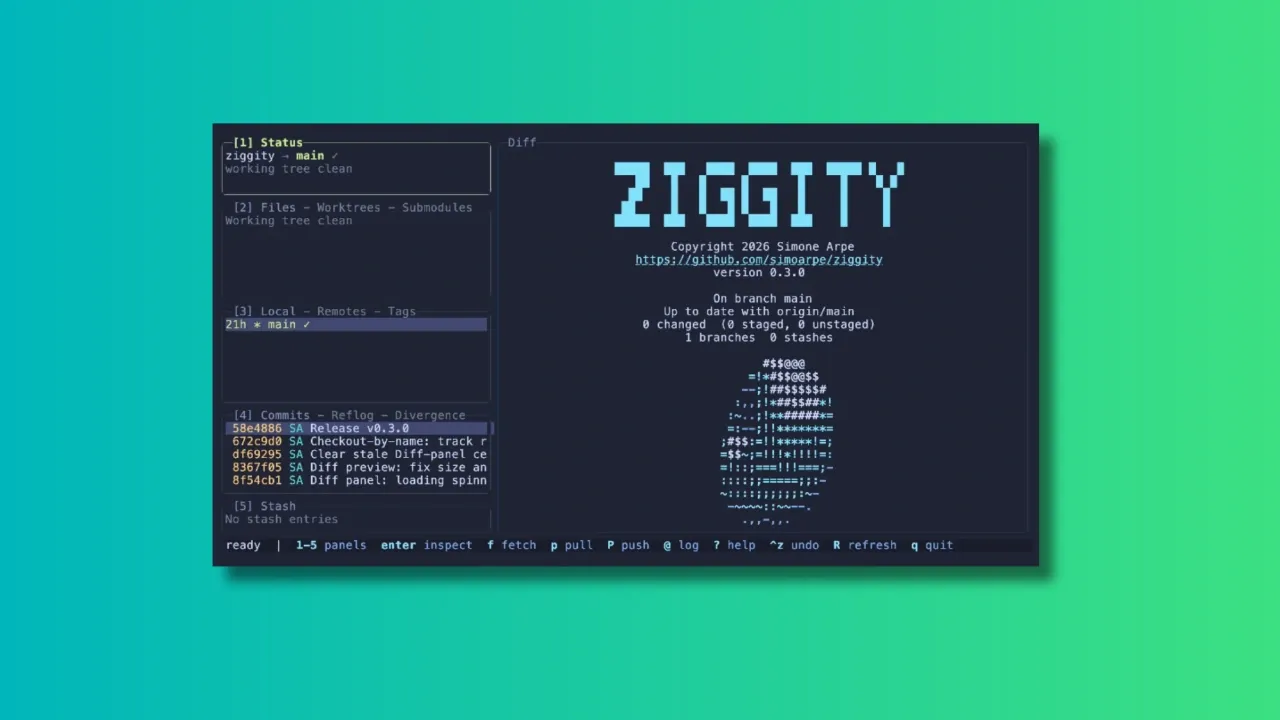
Ziggity git client

In the age when people are not even looking at the code generated by AI, I am reviewing a terminal-based client that gives full visibility and control over your git repositories. Because not everyone has handed over all the critical thinking to AI, I presume.

Over the years, many Git clients, both GUI and TUI, have emerged to make working with repositories easier. Tools like lazygit have become popular among terminal users, and Ziggity is another addition to the world of terminal-based Git interfaces.

What Makes Ziggity Special?

Let me show you some of the main features of Ziggity.

Ziggity Is Small and Quick to Launch

One of Ziggity's main selling points is its lightweight design. It compiles into a single static binary, and the footprint stays small by design rather than by tuning.

The project also leans entirely on the Git installation already on your system instead of bundling something like libgit2, which keeps the binary itself down to a couple of megabytes. The project's own benchmarks, run on a Mac against lazygit, put Ziggity's process startup at a few milliseconds against tens of milliseconds for lazygit, with a noticeably smaller resident memory footprint once things settle.

Of course, benchmark numbers will vary depending on your hardware, your repository size, and the machine's other workload at the time.

Git Operations Don't Get in Your Way

Speed at launch is one thing, but a responsive interface while you actually work matters just as much.

Ziggity handles potentially slow operations such as fetching, pulling and pushing away from the main interface. This means you can continue browsing your repository, checking diffs, or reviewing commits while the operation runs quietly in the background.

A spinner in the Status panel is the only indication that something is happening, and a short one-line summary appears once the task wraps up. If it fails, that's when you actually get interrupted with a dialog.

The same philosophy carries over to longer, multi-step operations such as merges, rebases, autosquash, bisect sessions, and applying patches. Rather than dropping you back into a raw terminal and asking you to press a key to "return" to the app, something anyone who has used git clients will recognize, Ziggity simply keeps its interface up the whole time.

Even authentication is handled without leaving the app. If a push over HTTPS needs a username and token, Ziggity opens an in-app prompt, masks the token as you type, and retries the operation once you're done. There's no dropping to an external credential helper, and if a saved keychain is configured, it's reused automatically the next time around.

First-Class Mouse Support

Terminal applications are usually associated with keyboard-only workflows, and Ziggity absolutely supports that. But if you are more comfortable with mouse, you can very well use it.

You can click on any panel to focus it, click a row to select it, and use the scroll wheel across lists, diffs, dialogs, and even the commit graph. In the staging view, you can click directly on a line and stage just that line with a keypress.

Ziggity also supports proper text selection. Click and drag over a diff, a commit, or any other panel, and the selected text lands straight on your clipboard, with color codes stripped out and indentation preserved. This even works over SSH, since it relies on the OSC 52 clipboard mechanism rather than anything terminal-local.

A Better Way to Look at Git Diffs

Diffs are where you spend a good chunk of your time reviewing changes, so a clear way to read them matters.

Ziggity supports comparing branches and commits with a single keystroke.

The diff view also does word-level highlighting. Instead of painting an entire changed line red or green, Ziggity picks out the specific words that changed within a line, so a one-character edit in a long line doesn't get buried.

For long lines, think Markdown or documentation files, you can toggle soft wrapping on demand instead of having to scroll horizontally. The word-level highlighting keeps working correctly even once a line wraps across rows.

History Navigation That Understands What You Want

The commit graph is a real rendering of git log --graph, in git's own colors, and it loads without freezing the interface. By default it shows your current branch and its upstream so you immediately see what's incoming, and there's a shortcut to widen it to every branch or jump straight back to HEAD.

There's also a dedicated Divergence view that separates your outgoing commits from incoming ones relative to upstream, and history-editing actions are deliberately disabled there so you can't accidentally try to rewrite commits you haven't even pulled yet. Commit hashes are color-coded by push state, so commits that haven't left your machine, and are therefore safe to rewrite, stand out at a glance.

A More Flexible Way to Stage Changes

Staging changes is a routine part of the Git workflow, and Ziggity gives you a few ways to handle it without overcomplicating things.

You can work directly from the staging view and use the mouse to select individual lines before staging them, which gives you finer control when a file contains several unrelated changes that shouldn't land in the same commit.

It's a small feature, but a genuinely useful one if you care about keeping commits focused rather than staging an entire file at once.

Checkout by Name, Without the Detached HEAD Surprise

Press the checkout shortcut, start typing any ref, and pick from live suggestions.

If you type the name of a remote branch, Ziggity checks it out with tracking set up automatically, landing you on a proper local branch rather than a detached HEAD. Existing local branches switch normally, and tags or commits detach, because that's the only thing that makes sense for them.

This is a small but real usability improvement over some other terminal Git clients, where typing a remote branch name in the checkout prompt can leave you in a detached state with no local branch created.

Writing Commit Messages Gets Some Extra Help

Ziggity puts real thought into the commit message experience. Its built-in editor nudges you toward the 50/72 commit message convention with live, configurable limits, and it supports prepare-commit-msg hooks including hooks that derive a ticket number from your branch name.

There's also optional AI-assisted commit message generation from your staged changes. Rather than locking you into one provider, Ziggity calls out to a configurable external command, so you can point it at whatever model or subscription you already use.

Installing Ziggity

Ziggity is easily installable via Homebrew. If you have Homebrew set up on your system, use the command below to install it:

brew install simoarpe/ziggity/ziggity

Other than that, Ziggity offers prebuilt binaries for several architectures. You can download the appropriate binary from the official GitHub releases page.

Extract and copy the binary to a folder that is in your PATH. You can then run Ziggity from the terminal using the command:

ziggity

Wrapping Up

Terminal-based Git clients are not new, and there are already some excellent options available for those who prefer managing repositories without leaving the command line.

Ziggity enters this space with a focus on staying lightweight, staying out of your way during slow operations, and getting small usability details like checkout behavior and force pushes right.

The project is still a relatively new addition to the TUI Git client space, but it already offers a solid set of features. Whether it can replace an established tool like lazygit will ultimately depend on your workflow and the features you rely on.

Have you tried Ziggity yet? Or do you already have a favorite Git client for the terminal? Let us know your thoughts in the comments.

FAA expands AI advice to manage air traffic congestion across entire US airspace

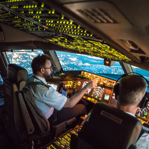
The US government has expanded the use of an AI tool for advising air traffic controllers to assist in managing air traffic across the entire national airspace system. Airline executives have voiced support for the rollout, but the US labor union representing air traffic controllers has said it was not involved in designing or testing the AI-driven system.

The Federal Aviation Administration (FAA) says the $875 million SMART system has helped reroute 180 flights since being implemented in airspace over Washington, DC, on September 21. The agency claims that this saved an average of 10 minutes per flight and almost 80 gallons of fuel per flight—and it is apparently hoping such results can be replicated nationwide through the expanded deployment.

“After a successful initial rollout to the National Capital Region in September, the FAA will now use SMART in the airspace of all 22 centers across the country to reduce delays, reduce fuel consumption and improve the travel experience for the flying public,” according to the agency statement posted on November 10.

Read full article

Comments

© Rathke | Getty Images

FAA expands AI advice to manage air traffic congestion across entire US airspace

The US government has expanded the use of an AI tool for advising air traffic controllers to assist in managing air traffic across the entire national airspace system. Airline executives have voiced support for the rollout, but the US labor union representing air traffic controllers has said it was not involved in designing or testing the AI-driven system.

The Federal Aviation Administration (FAA) says the $875 million SMART system has helped reroute 180 flights since being implemented in airspace over Washington, DC, on September 21. The agency claims that this saved an average of 10 minutes per flight and almost 80 gallons of fuel per flight—and it is apparently hoping such results can be replicated nationwide through the expanded deployment.

“After a successful initial rollout to the National Capital Region in September, the FAA will now use SMART in the airspace of all 22 centers across the country to reduce delays, reduce fuel consumption and improve the travel experience for the flying public,” according to the agency statement posted on November 10.

Read full article

Comments

© Rathke | Getty Images

Using a survey to understand digital design tool usage across the University (as part of the Figma design component library project)

This year, as part of the Figma component library project, we researched how colleagues across the University use digital design tools in their work. This post explores how we approached the research, from designing and distributing the survey through to analysing the responses and identifying emerging themes. 

In a previous blog post, intern Kaile Liu introduced the wider Figma project, and its aims and objectives: 

What I am working on as a Digital Developer Intern (Figma) 

Request access to the project brief for more details:

Figma project brief

We needed to understand how digital design work happens across the University 

To begin with, we needed to understand how staff across the University design, collaborate and deliver digital work. 

There are a wide range of tools, workflows and practices currently in use. Understanding these existing ways of working would help us explore where Figma fits within the wider digital landscape, rather than looking at Figma in isolation. It also supports the work we are doing to improve our Figma component design library.

To hear from colleagues across a wide range of roles and disciplines, we chose a survey as the main method for this research.

Five questions framed our research 

As well as understanding what tools people use, we wanted to find out how those tools support their work and where there may be opportunities to improve existing ways of working.  

Our research was underpinned by five key questions: 

  • What tools are people using day-to-day? 
  • How do those tools support their work? 
  • Where do people experience challenges or inefficiencies? 
  • How do teams collaborate when creating digital content and services? 
  • Where are there opportunities to provide better support, guidance and training? 

These questions helped us build a broader picture of digital working practices across the University. Additionally, working this way allowed us to look beyond any individual or singular tool.

Hearing from more than just traditional design roles was important 

Design work happens across many different roles at the University, including roles not traditionally associated with design or that do not have ‘design’ in the job title. For example, a communications officer creating digital content, a developer sketching a wireframe, a UX practitioner co-creating a prototype or a learning technologist building online resources may all be making design decisions as part of their work. 

This meant looking beyond traditional design roles and hearing from colleagues who use digital design tools in different ways.  

Initial conversations helped us shape the research 

Before designing the survey, we carried out an initial set of user interviews with staff from across the University. We also drew on existing University communities and communities of practice to understand the different roles involved in digital design work. These conversations gave us an early view of how colleagues use and collaborate through digital tools. They helped us identify the groups we wanted to hear from and shape the questions we wanted to ask in the survey.

Adapting our survey to broaden our understanding of ways of working

Based on these interviews, we recognised that a single set of questions would not capture the differences between roles particularly well. Instead, we adapted the survey so that respondents would answer shared questions and then be filtered to questions relevant to their role and ways of working.

This, in essence, would give us a more consistent set of responses while still allowing us to explore some of the differences between roles.

Role categories allowed us to tailor the survey 

We created a filter with seven options: 

  • Marketing and Communications 
  • UX and Human-centred Design 
  • Graphic and UI Design 
  • Developer 
  • Project or product manager 
  • Research 
  • Other (for participants who did not feel represented by the other groups) 

Participants selected the options that best reflected their work, determining which role-specific questions they were shown. They also provided their job title.

The survey combined common and role-specific questions 

The survey consisted of three main sections. The questions included a mixture of multiple-choice and open-ended responses. This allowed us to identify broader patterns while also giving colleagues opportunities to explain their experiences in more detail. 

The opening section included five common questions about participants’ roles, the types of digital design work they do and the tools they use, including tools for collaboration, diagramming and presentations. 

The middle section included around four to six role-specific questions, depending on the participant’s selected group. These explored aspects of digital working relevant to each group. For example, marketing and communications colleagues were asked about the tools they use when designing marketing materials, while developers were asked about the tools and approaches they use during the design phase of projects. 

The closing section included 15 common questions focused on colleagues’ experiences and expectations of digital design tools, including Figma. We asked which tools colleagues would be likely to use, whether they experienced challenges with their current tools and how their work might be affected if they lost access to Figma. 

We wanted the survey to reach as many colleagues as possible

We distributed the survey primarily through existing Teams channels and University communities, which helped us reach a wide range of roles. These included groups focused on marketing and communications, human-centred design and digital development, as well as distribution via heads of IT. 

The survey received 55 responses  

We heard from 55 staff across a range of roles. Based on the categories participants selected when completing the survey, these were as follows: 

  • Marketing and Communications: 20 
  • Developers: 10 
  • UX and Human-Centred Design: 6 
  • Graphic and UI Design: 3 
  • Project or product manager: 2 
  • Other: 14 

Although seven categories were available in the survey, no participants selected ‘Research’ as their primary category, so it is not shown in the breakdown. 

The ‘Other’ category included colleagues working in areas such as product and project management, learning technology and academic support. 

We refined the groups when analysing the responses 

The survey categories gave us a useful starting point, but participants did not always recognise themselves within the roles specified (even when their job title directly reflected one of the options). For example, a participant selected themselves as ‘Other’, but their job title indicated that their work was within graphic design.

In order to evaluate the responses effectively, we revisited participants’ selected categories alongside their job titles and descriptions of their work.

This helped us six create groups that gave us a more useful basis for comparing responses:

  • Developers and technical specialists 
  • UX practitioners 
  • UI and graphic designers 
  • Marketing and communications staff 
  • Product and project managers 
  • Learning technology and academic support staff 

Some of these groups needed to be created on the back of this, as we had not identified those specific roles. For example, Learning Technologist was not an option for participants to select, but emerged as a useful category based on the number of respondents who had this as their job title. 

After this assessment, we were in a better place to begin analysis, as these groups gave us a more useful basis for comparing responses while still reflecting the range of roles represented.

Analysing the survey results required two approaches 

The survey produced both quantitative and qualitative responses, and we used different approaches depending on the type of question and response. 

For the role-specific questions, we used FigJam (Figma’s whiteboard for online collaboration) to review and compare responses across the different groups. This included both quantitative and qualitative responses, allowing us to look at the detail within each role as well as compare responses across the wider dataset. We used Power BI, a data visualisation platform, to explore the common quantitative questions, which gave us a consistent set of responses across all participants. 

We used FigJam to explore the role-specific responses 

We created a large collaborative FigJam board to organise the responses. FigJam supported discussion within the project team, allowing us to work in tandem and analyse the data as a group (in person and asynchronously).

We read through responses from each group, compared them across different roles, and identified recurring patterns and themes. FigJam also allowed us to consider the quantitative responses alongside the more detailed qualitative answers, giving us a fuller picture of ways of working. 

Screenshot of three frames on FigJam full of stickies. There is a blue section, titled Developers, an orange section titled Marketing and Communications, and a green section titled Graphic visual and UI design.

Section of our analysis on the FigJam board

Power BI helped us explore the common quantitative responses 

Power BI allowed us to visualise responses across the opening and closing questions. We wanted to do this as they were common questions asked of all participants. Power BI allowed us to bring our data to life by presenting the data in a more visual way, highlighting the common patterns and themes more easily.

Screenshot of Power BI visualisations. There are seven individual bar graphs of different colours, alongside a larger bar graph with these seven combined. The large bar graph has a right skewed narrow tail. There are also two sets of pie charts, each consistening of seven smaller charts and one larger combined. The data itself is not visible.

Section of our Power BI visualisations for the project.

Grouping responses helped us identify recurring themes 

The open-ended questions in the role specific sections had more detailed responses. This required us to compare responses across the different role groups and group similar comments together to identify recurring themes. 

As we worked through the responses, we also noted areas where a follow-up conversation with a participant could provide more context.

We also captured key quotations that illustrated what participants were telling us in their own words. These will be useful for when we playback findings to colleagues and complete a written report. 

The research will inform the next stage of the project 

The research highlighted both the diversity of digital working practices across the University and common themes across different roles. 

The next stage will bring these findings together into a report. It will highlight where Figma currently supports existing workflows and where its integration will provide more consistent, unified delivery of digital practices across the University.

30 Google Secrets You’ll Wish You Knew Years Ago

Think you know Google? Think again—hidden deep within that simple search bar is a subterranean network of secret search operators, hidden diagnostic tools, and buried privacy toggles that change everything. From listening to your saved voice logs to uncovering secret files and bypassing algorithm bubbles, here are 30 game-changing Google secrets you were never supposed to find.

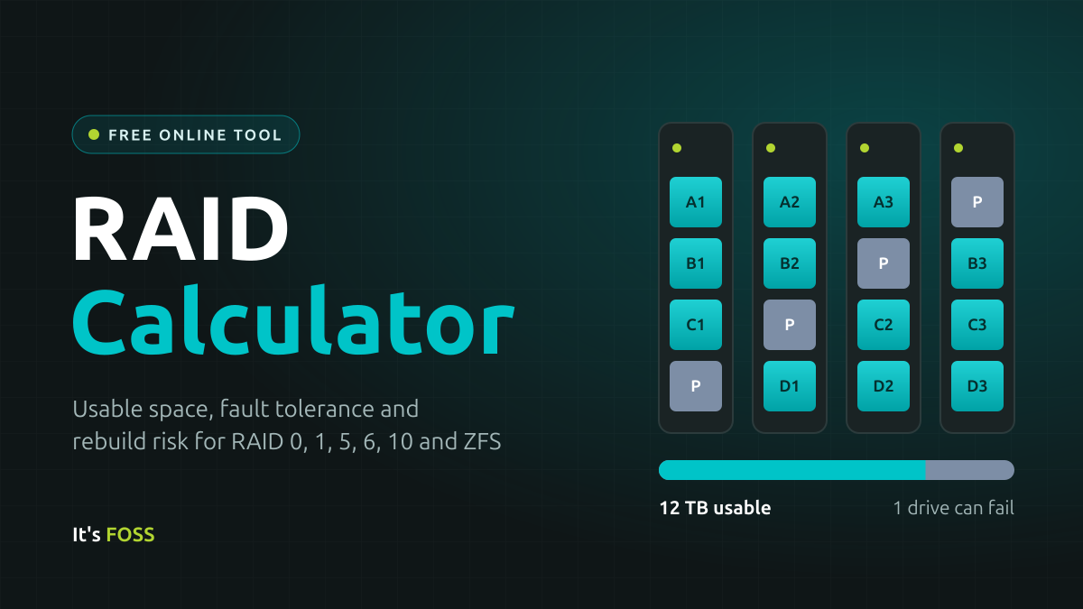
RAID Calculator

RAID Calculator

How to use this RAID calculator

It's quite simple, actually.

  1. Pick the RAID level or ZFS layout you are considering.
  2. Enter how many drives you plan to use.
  3. If all drives are the same size, enter that capacity. If they are not, switch to Mixed and enter each drive.
  4. Choose the drive class. Check your drive’s spec sheet for its URE rating. Most desktop drives are 10¹⁴, and NAS drives like WD Red Plus or Seagate IronWolf are usually 10¹⁵.
  5. Read the results: usable capacity, how many drives can fail, and how much raw space goes to parity or mirroring.
  6. Scroll to Compare layouts to see the same drives in every layout side by side.

You can save a configuration or copy a link to share it. Saving and sharing both basically mean the RAID calculator is filled with the values you have selected. Data doesn't leave the browser.

How usable capacity is calculated

N is the number of drives and S is the size of the smallest drive.

LayoutMinimum drivesUsable capacityDrives that can fail
RAID 02N × S0
RAID 12SN − 1
RAID 53(N − 1) × S1
RAID 64(N − 2) × S2
RAID 104 (even number)N ÷ 2 × S1 guaranteed, up to N ÷ 2
RAIDZ13(N − 1) × S1
RAIDZ24(N − 2) × S2
RAIDZ35(N − 3) × S3

RAID 10 can survive more than one failure, but only if each failed drive comes from a different mirror pair. If both drives in the same pair die, the array is gone. That is why the calculator counts it as one guaranteed failure.

How the rebuild risk is estimated

When a drive fails, the array has to read every surviving drive in full to rebuild it. The calculator multiplies the data read by the drive’s URE rating to estimate the chance of hitting at least one unreadable sector along the way.

Take four 8 TB drives in RAID 5. A rebuild reads the three surviving drives, which is 24 TB or about 1.9 × 10¹⁴ bits. With consumer drives rated at 1 error per 10¹⁴ bits, the spec sheet says the chance of at least one error is around 85%. With NAS drives rated at 10¹⁵, it drops to around 17%.

Real drives usually beat their rating, so treat this as a worst case. It still explains why RAID 6 and RAIDZ2 are the usual advice for big drives. A second parity drive means one bad sector during a rebuild costs you nothing.

Does this work for Synology, QNAP, UGREEN or TrueNAS?

Yes, for the standard RAID levels. QNAP, UGREEN and Synology all use Linux software RAID underneath, so RAID 1, 5, 6 and 10 give the same usable capacity shown here. For TrueNAS, use the ZFS mirror and RAIDZ options.

What this RAID calculator does not cover

It shows capacity and redundancy, not speed. Real performance depends on your controller, drives and workload. The figures are also before filesystem overhead. ZFS reserves a little over 3% of a pool as slop space, and your OS shows sizes in TiB, so expect the free space you actually see to be lower.

RAID terms explained

Here is a brief explanation of the terms used on this online RAID calculator.

Striping

Data is split into chunks and written across several drives at once. It is fast because every drive works in parallel, but nothing is stored twice, so losing one drive loses everything. This is RAID 0.

Mirror

The same data is written to two or more drives. If one dies, another still has a complete copy. Simple and safe, but you only get the space of one drive per mirror. This is RAID 1.

Parity

Extra data calculated from your files, like the answer to a sum. If one number goes missing, you can work it out from the rest. Parity lets the array recreate a failed drive without keeping a full copy, so it costs less space than mirroring.

Single parity

One drive's worth of space holds parity, spread across all drives. The array survives one failed drive. RAID 5 and RAIDZ1 work this way.

Double parity

Two drives' worth of parity, so any two drives can fail. That includes a second drive dying while the first is being replaced, which is when it is most likely. RAID 6 and RAIDZ2 work this way; RAIDZ3 adds a third.

Striped mirrors

Drives are paired into mirrors, then data is striped across the pairs. You get the speed of striping and the quick recovery of mirrors, but only half the raw space. This is RAID 10.

Rebuild (resilver)

After you replace a failed drive, the array recreates its data by reading the other drives. ZFS calls this a resilver. Until it finishes, the array has less protection than usual.

ZFS vs. traditional RAID

Traditional RAID, from a hardware card or Linux's mdadm, only sees blocks of data and cannot tell if a block has gone bad. ZFS is a filesystem and RAID manager in one. It checksums every block, so it spots silent corruption and repairs it from the redundant copy. It only rebuilds the space actually in use, and a read error usually costs one file rather than the whole array. In return, it likes plenty of RAM, and growing a pool is less flexible: adding a single drive to an existing RAIDZ only arrived in OpenZFS 2.3.

URE and drive class

A URE (unrecoverable read error) is a spot on a drive that cannot be read back. Manufacturers rate how often this can happen. Consumer drives are usually rated at 1 error per 10¹⁴ bits read (about 12.5 TB). NAS and enterprise drives are rated at 1 per 10¹⁵ (about 125 TB). A rebuild reads a lot of data, so the calculator uses this rating to estimate the chance of hitting an error mid-rebuild. These are spec-sheet worst cases; real drives often do better.

How is the power draw estimated?

Each drive type uses a typical average draw for a drive that is spinning or active but not under heavy load:

  • 3.5" HDD: 6.5 W
  • 2.5" HDD: 2.5 W
  • 2.5" SATA SSD: 2.0 W
  • NVMe SSD: 4.0 W

The array total is that figure multiplied by the number of drives. The yearly figure assumes the drives run 24 hours a day, every day: watts × 8,760 hours ÷ 1,000 = kWh.

It counts the drives only. The CPU, motherboard, fans and power supply losses add more, while spinning drives down when idle lowers it. Treat it as a ballpark for comparing layouts.

Frequently Asked Questions

Here are the answers to common questions you might have:

Should I use RAID 5 or RAID 6?

RAID 6 is the safer choice for arrays built with large modern drives (8TB and above). RAID 5 tolerates only one drive failure, and rebuilding after a failure requires reading every surviving drive in full. A single unreadable sector during that window can compromise the rebuild. RAID 6 adds a second parity block, so the array survives a second failure or read error during that window. The cost is one extra drive's worth of capacity. RAID 5 remains reasonable for small arrays of small drives or non-critical data.

Is ZFS RAIDZ better than a ZFS mirror?

Neither is universally better. RAIDZ (especially RAIDZ2) gives you more usable capacity from the same drives, while mirrors give faster resilvers, better random I/O performance, and simpler expansion, since you can grow a pool by adding another mirror pair. For most home NAS builds with 4 to 10 drives where capacity matters, RAIDZ2 is the common recommendation; for performance-sensitive workloads or pools you expect to expand gradually, mirrors are often the better fit.

Is RAID a backup?

No. RAID protects against drive hardware failure and nothing else. Accidental deletion, ransomware, file corruption, controller failure, theft, and fire all affect every drive in the array simultaneously. RAID keeps your system available when a drive dies; a backup lets you recover data you have lost. You need both, and the standard advice is the 3-2-1 rule: three copies of your data, on two different types of media, with one copy off-site.

How much usable space do I get from RAID 5?

RAID 5 gives you the capacity of all drives minus one, based on the smallest drive in the array. Four 4TB drives yield 12TB usable; six 8TB drives yield 40TB usable. Note that your operating system reports capacity in TiB (binary units), so 12TB will appear as roughly 10.9TiB. The space is not missing; it is a difference in units.

Can I mix different drive sizes in RAID?

Yes, but every drive in the array is treated as if it were the size of the smallest drive, and the extra capacity on larger drives sits unused. Mixing a 4TB drive into an array of 8TB drives effectively turns them all into 4TB drives. If you must mix sizes, replacing the smallest drive is usually the cheapest way to reclaim capacity. Some systems (like Unraid or Synology SHR) handle mixed sizes more gracefully than standard RAID.

How many drives can fail in RAID 5, RAID 6 and RAID 10?

RAID 5 survives one failure and RAID 6 survives two. RAID 10 survives one for certain and more if they are in different mirror pairs. RAIDZ1, Z2 and Z3 survive one, two and three.

What is the advantage of RAID 5 over RAID 1?

Capacity. With four 4 TB drives, RAID 5 gives you 12 TB. RAID 1 mirrors always give you half or less. In exchange, RAID 1 rebuilds faster and is simpler to recover.

Can I add drives to a RAID 5 array later?

Usually, yes. mdadm can grow a RAID 5 array in place. Synology and QNAP support it from the storage manager. ZFS RAIDZ expansion arrived in OpenZFS 2.3, and space written before the expansion keeps its old parity ratio until you rewrite it.

Is RAID 0 worth it?

Only for data you can lose, like a scratch disk or a game library. One drive failure wipes out everything on every drive.

Why do I see less free space than the calculator shows?

There are two reasons. Your OS counts in TiB, so 12 TB shows up as about 10.9 TiB. Filesystems also reserve some space.

Terminal Text Editor: Like VS Code But in Linux Terminal

Terminal Text Editor

I spend a lot of time in the terminal. Whether it is writing scripts, editing configuration files, or managing remote servers, the terminal remains the place where I get most of my work done. But when a project becomes slightly complex, I often find myself reaching for the comfort of a graphical code editor like Zed.

I'll be honest, while I can appreciate why people love tools like Vim and Neovim, learning a modal editor has always felt like more of a commitment than I was willing to make.

My editing needs are fairly straightforward, and spending hours memorizing keybindings, configuring plugins, and building a workflow from scratch never felt like a worthwhile investment for me.

That's why TTT caught my attention. The project describes itself as a real alternative to VS Code, Zed, and Sublime Text that runs entirely inside the terminal.

✋
Like most of the new open source software, TTT is also developed with the help of AI assistants.

Installing TTT

On Linux, to install TTT, you can use the official installer script. That's fashion these days. No package, just an installer script curled right into your system.

curl -sSfL https://raw.githubusercontent.com/eugenioenko/ttt/main/install.sh | sh

This will install the binary in ~/.local/bin. To run it, open your favorite terminal and use the command:

ttt

There are also prebuilt binaries available to download so that you can place it in a folder of your choice and use it in portable mode.

TTT features I liked

Instead of trying to emulate traditional terminal editors, it aims to provide a modern, GUI-like editing experience in the terminal application with virtually no configuration required.

Sure, not all of these features might be unique, but they are good to have in an editor.

Syntax Highlighting

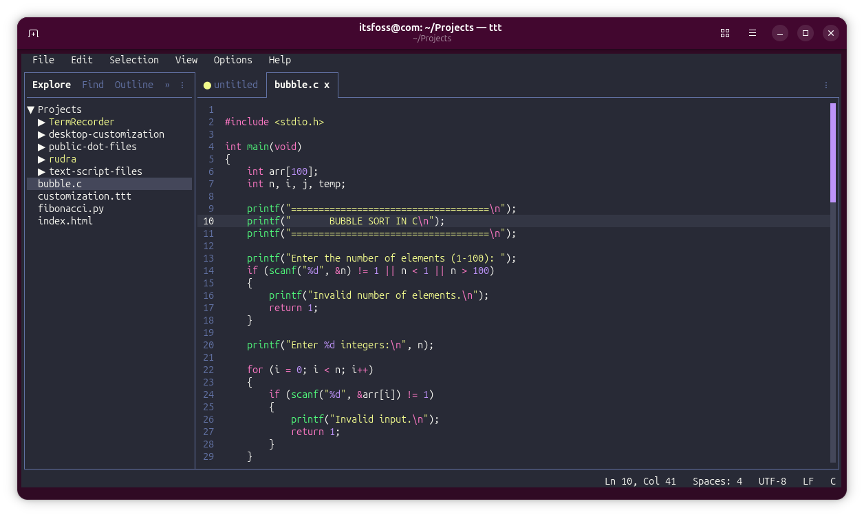
TTT uses textmate-go for syntax highlighting, a Go implementation of Microsoft's TextMate engine that powers syntax highlighting in VS Code. It claims to support more than 120 languages out of the box, giving it a surprisingly mature editing experience for a terminal-based application.

Syntax Highlighting in TTT shown using a sample C file.
Syntax Highlighting

Multi-Cursor Editing

Multi-cursor editing is one of those features I started appreciating after spending some time with Helix. It's something I now instinctively look for in any editor.

Thankfully, TTT ships with multi-cursor support out of the box, so there's no need to install plugins or configure anything before getting started.

The workflow feels familiar if you've used modern editors before, like Sublime Text.

Pressing Ctrl+D selects the next occurrence of the highlighted text, while Alt+Click lets you place additional cursors exactly where you need them.

Multi-Cursor Editing

Mouse Support

Many terminal editors advertise mouse support, but often that simply means you can click around and scroll. TTT goes much further than that.

The mouse interactions felt surprisingly close to what I'd expect from a graphical editor rather than a typical terminal application.

You can click to position the cursor, drag to select text, and right-click to access context menus.

0:00
/0:30

Mouse Support in TTT

The latter ended up being my favorite part because the menu isn't just a generic list of actions. Depending on where you click, TTT presents relevant options, making the whole experience feel far more polished and GUI-like than most terminal editors I've tried.

LSP and Auto Completion

A code editor doesn't feel complete these days without intelligent auto-completion, and TTT checks that box through Language Server Protocol (LSP) support.

Getting it up and running is fairly straightforward as you only need to install the language server for the programming language you work with.

The project also maintains a dedicated guide covering language server setup for a wide range of languages, which can save some trial and error during the initial configuration.

Once configured, you get the kind of code completion and language-aware features you'd expect from a modern editor, but without leaving the terminal.

LSP Autocompletion

Multi-folder Workspaces

Multi-folder workspaces allow you to group related folders into a single workspace and treat them as one project, much like VS Code's multi-root workspaces.

What makes this even more useful is that the workspace can be saved to a workspace.ttt file and reopened later with the exact same setup. So instead of manually opening the same collection of directories every time, you can simply load the workspace and continue where you left off.

For example, I have this customization.ttt file that has the content:

{
  "folders": [
    { "path": "/home/itsfoss/Projects/text-script-files/" },
    { "path": "/home/itsfoss/Projects/public-dot-files/" },
    { "path": "/home/itsfoss/Projects/desktop-customization" }
  ]
}

Now, I can always open this workspace by using the command:

ttt --workspace ~/Projects/customization.ttt

You don't need to manually create this file since you can add location to a workspace and later save it all via File -> Save Workspace As option.

0:00
/0:41

Multifolder Workspaces

Modern Search with Ripgrep

TTT uses ripgrep under the hood, which is already a favorite among developers thanks to its speed and ability to handle large projects without feeling sluggish.

In practice, this means you get fast, project-wide search capabilities directly inside the editor.

Combined with shortcuts like the Ctrl+K F for workspace search and Ctrl+K R for search and replace, it feels much closer to the experience you'd expect from a modern GUI editor than a typical terminal-based tool.

Search in TTT

💡
You need to have ripgrep installed on your system.

Git Integration

TTT provides a dedicated Changes panel where you can stage, unstage, discard, commit, pull, push, and sync repositories without dropping back to the command line.

The built-in diff viewer is particularly nice to work with because it combines Git diffs with syntax highlighting, making code changes easier to read.

The Git gutter indicators and inline blame information help provide context while editing.

If you're working with multiple repositories in a workspace, TTT automatically groups changes by repository, which keeps things organized when juggling several projects at once.

0:00
/0:33

Git Integration

Integrated Terminal

You may find it funny that one of my favorite features in a terminal-based editor is... another terminal. But in practice, I found it incredibly useful.

Whenever I needed to run a command, I didn't have to open a split terminal in my terminal emulator or switch to another tab. Everything stayed inside TTT, which helps maintain focus on the task at hand.

TTT's integrated terminal is a full terminal emulator rather than a basic command prompt. It supports multiple terminal tabs, true-color rendering, scrollback, and can be toggled between panel and fullscreen modes with keyboard shortcuts.

For a project that aims to bring a GUI-like experience into the terminal, this feature fits perfectly, eliminating one more reason to leave the editor while working.

0:00
/0:41

Integrated Terminal

Plugins

TTT already comes with many of the features I normally install plugins for in other editors. But the more I explored it, the more I appreciated the approach.

TTT supports Lua-based plugins that can add commands, panels, and keybindings, allowing you to extend the editor without turning it into a configuration project.

Plugins run inside a sandboxed environment and must explicitly request permissions to approve each plugin's capabilities.

To add even more convenience, you can install plugins through a dedicated panel within the TUI.

You may read more about the plugins in their official documentation.

Plugins in TTT

Theming

TTT ships with a decent collection of built-in themes, including popular options like Dracula, Monokai, etc., making it easy to find something comfortable without downloading anything extra.

The built-in theme picker offers live previews as you browse themes, and you can customize virtually every aspect of the interface through JSON files, from syntax highlighting and diff colors to the sidebar, status bar, and even terminal colors.

Themes in TTT

Wrapping Up

After spending some time with TTT, my biggest takeaway isn't that it's a great terminal editor. It's that this thing often doesn't feel like a terminal editor at all. In many ways, it feels like a full-blown GUI application that just happens to live inside a terminal window.

Now, I don't know how many of you will actually approve of that direction. The Linux and terminal communities have long maintained a clear distinction between TUIs and GUIs, and plenty of users prefer terminal applications precisely because they don't try to mimic desktop software. TTT deliberately blurs that line. Whether that's a good thing or not will ultimately depend on what you want from a terminal editor.

I found TTT's approach refreshing. It takes many of the conveniences people expect from modern GUI editors and brings them into the terminal with surprisingly very few compromises. If that idea sounds appealing, TTT is absolutely worth a look.

By the way, TTT is not the only editor of this kind. We have covered several other terminal editors that are easy to use since they provide terminal user interfaces that can be used with a mouse. If you are not allergic to Microsoft, their open source Edit editor is also worth a look.

I welcome your comments on TTT and other terminal based text editors you prefer.

NordVPN 6.0 for Linux is coming – with ‘breaking’ changes

NordVPN logo overlaid on the Linux penguin mascot.NordVPN are updating their Linux app to offer a “cleaner, simpler way to manage VPN connections” from the command line. The NordVPN 6.0 update, which is coming soon (so not out yet), “cuts down” the number of commands that “overlap”. The company say this will make it easier for users to enable and configure VPN settings. Among the changes, NordVPN 6.0 combines protocol and technology settings in a nordvpn set protocol command, while obfuscation is now handled by NordWhisper, rather than a separate setting. And now that standard servers support P2P traffic, there’s no longer any need to create a […]


You're reading NordVPN 6.0 for Linux is coming – with ‘breaking’ changes, a blog post from OMG! Ubuntu. Do not reproduce elsewhere without permission.

NordVPN 6.0 for Linux is coming – with ‘breaking’ changes

NordVPN logo overlaid on the Linux penguin mascot.NordVPN are updating their Linux app to offer a “cleaner, simpler way to manage VPN connections” from the command line. The NordVPN 6.0 update, which is coming soon (so not out yet), “cuts down” the number of commands that “overlap”. The company say this will make it easier for users to enable and configure VPN settings. Among the changes, NordVPN 6.0 combines protocol and technology settings in a nordvpn set protocol command, while obfuscation is now handled by NordWhisper, rather than a separate setting. And now that standard servers support P2P traffic, there’s no longer any need to create a […]

You're reading NordVPN 6.0 for Linux is coming – with ‘breaking’ changes, a blog post from OMG! Ubuntu. Do not reproduce elsewhere without permission.

Meet Krea 3: the fast, easy-to-use tool built for editing (not replacing) your work

Krea's new model focuses on giving us faster, cheaper control over our own creative projects.

As a creative, it can feel like every AI company is trying to put you out of business. Each week brings a new model that promises to generate creative work from nothing, and these generally seem to be aimed at people who'd rather not hire a designer, illustrator or photographer at all.

Krea is different. Its platform is made by working creatives, for working creatives. And it's built on a simple idea: bring your own work, and it helps you do more with it. That philosophy is even clearer in Krea 3, the company's new in-house image model. Most AI image tools are built mainly to generate, but Krea 3 is first and foremost an editing model.

It's very intuitive, so you could just try it yourself for free, right now, at krea.ai. Or, if you'd like to know more, read on.

What is Krea?

Before we get to the latest model, let's take a step back and explain how the platform works as a whole. Essentially, Krea brings the leading AI models together under one roof: image, video, 3D and more. So rather than juggling half a dozen subscriptions and interfaces, you can do everything in one place.

White silhouette of a figure floating against a textured deep blue background
Person in red clothing holding a trophy stands next to a large white emu in a hotel reception area
Man in emerald green tracksuit holding a golden trophy stands next to a black horse in a hotel reception area

Say you're a photographer working on a product shoot. You can upload your images and tweak, extend or retouch them without leaving Krea. The same goes for your video footage. Krea is also refreshingly free of the hard sell. "When users come into the platform, we're not shouting at them to buy this thing or that thing," says Felix Gil, product engineer at Krea. "We're just trying to let people do their work."

Krea 3 is built to make complex edits from simple, plain English. For instance, you might want to change the materials, outfits, lighting, setting or text in an image while keeping everything else intact. Brilliantly, you can work from up to six reference images at once.

This really helps take the grunt work out of the creative process. Designers might want, for example, to place furniture into an empty room while keeping its walls, window and raking sunlight. Or maybe you want to translate a poster into German and place it in a bus shelter, or reskin a roadside billboard with a different message. Architects, meanwhile, might turn a pencil sketch of a mid-century house into a golden-hour photograph, while product designers can take a marker sketch of a lamp and render it as a photorealistic image.

It helps you work faster

Krea says that Krea 3 is comparable in quality to the leading editing models, Google's Nano Banana Pro and OpenAI's GPT Image 2.5. But where it really pulls ahead is speed and cost.

For instance, Krea 3 can make a high-quality 2K edit in under eight seconds at $0.06 per image through the Krea API. In the same test, Nano Banana Pro took 30 seconds and cost 15 cents, while GPT Image 2.5 took 80 seconds and cost 22 cents. After a while, that level of difference really adds up to how much time and effort you spend on a project.

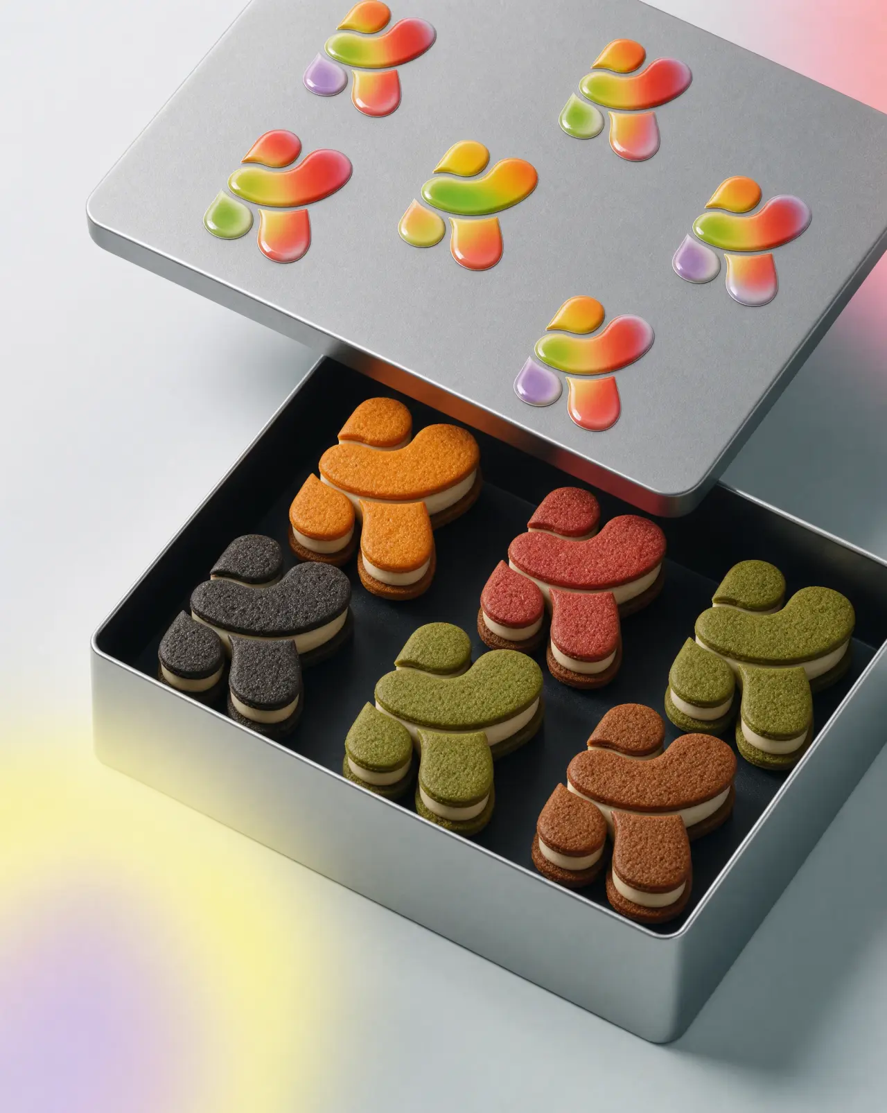
Colourful mushroom-shaped biscuits arranged in a black box below a grey lid showing gradient illustrations of the same designs
Man in cream suit and sunglasses sitting on green chair on tennis court with dalmatian dog and scattered tennis balls, mountains visible in background
Man in white suit and sunglasses sits in pink armchair next to a lion on a tennis court at night under stadium lights, with tennis balls scattered on the ground
Illustrated man in cream jacket and light blue jeans jumping mid-air against a blue sky with flying birds, city skyline visible below

There are also different modes, ranging from real time to maximum quality, so you can choose the trade-off between speed and quality that suits the specific job. And here's one more feature that sounds particularly useful for creatives.

Krea 3 is the first editing model with dedicated support for style references. That means you attach up to four images and the model applies their aesthetic to your output. It won't copy them, but whatever you create will share their look and feel.

Woman in yellow suit sitting on light blue vintage car next to a white goat in a modernist interior space
Woman in hot pink suit sitting on a red vintage car in a swimming pool with turquoise water, next to a pink flamingo
Woman sitting on a red chair on a frozen lake next to a pink caravan, wrapped in a grey puffy jacket
Woman in bright red puffer coat sitting on a red stool in shallow water next to a silver Airstream caravan on a calm blue lake

Most models tend to drift on that kind of detail, so this could be seriously useful if you work in product design, film or architecture. Krea 3 generates natively at 2K. And more generally, because this platform is geared towards creatives, there's a lot of stress on visually interesting results rather than the glossy and generic outcomes you might be expecting.

Coming soon

All that's just for starters. Regional editing and bounding boxes are already available, so you can select part of an image or draw a box and tell the model exactly what should go there. Krea is also planning for three specialised versions of Krea 3: one for e-commerce, one for filmmaking and a real-time version made with fal.

And for anyone uneasy about AI, here's the most important thing: Krea isn't a substitute for human creativity. Its team, after all, comes from a creative background themselves.

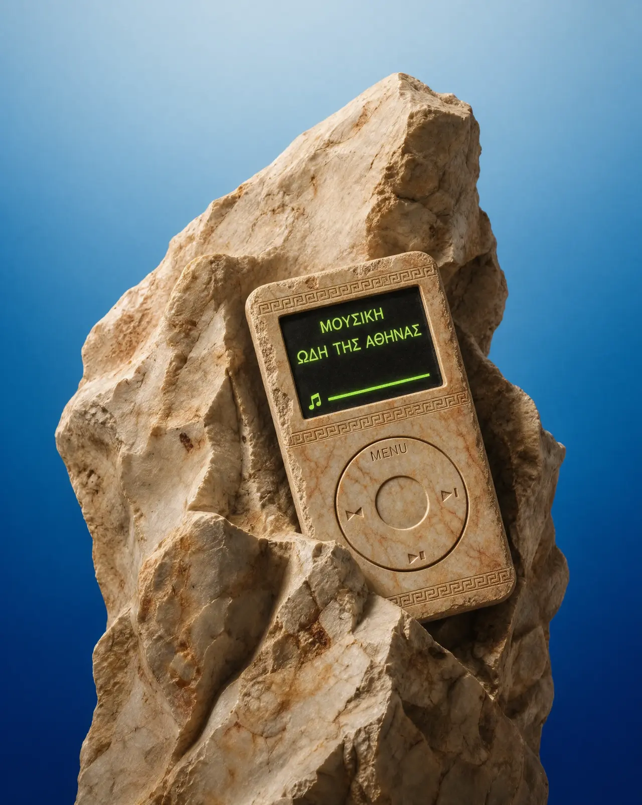
Stone column against a clear blue sky with an ancient Greek-style portable music device displaying Greek text on its screen
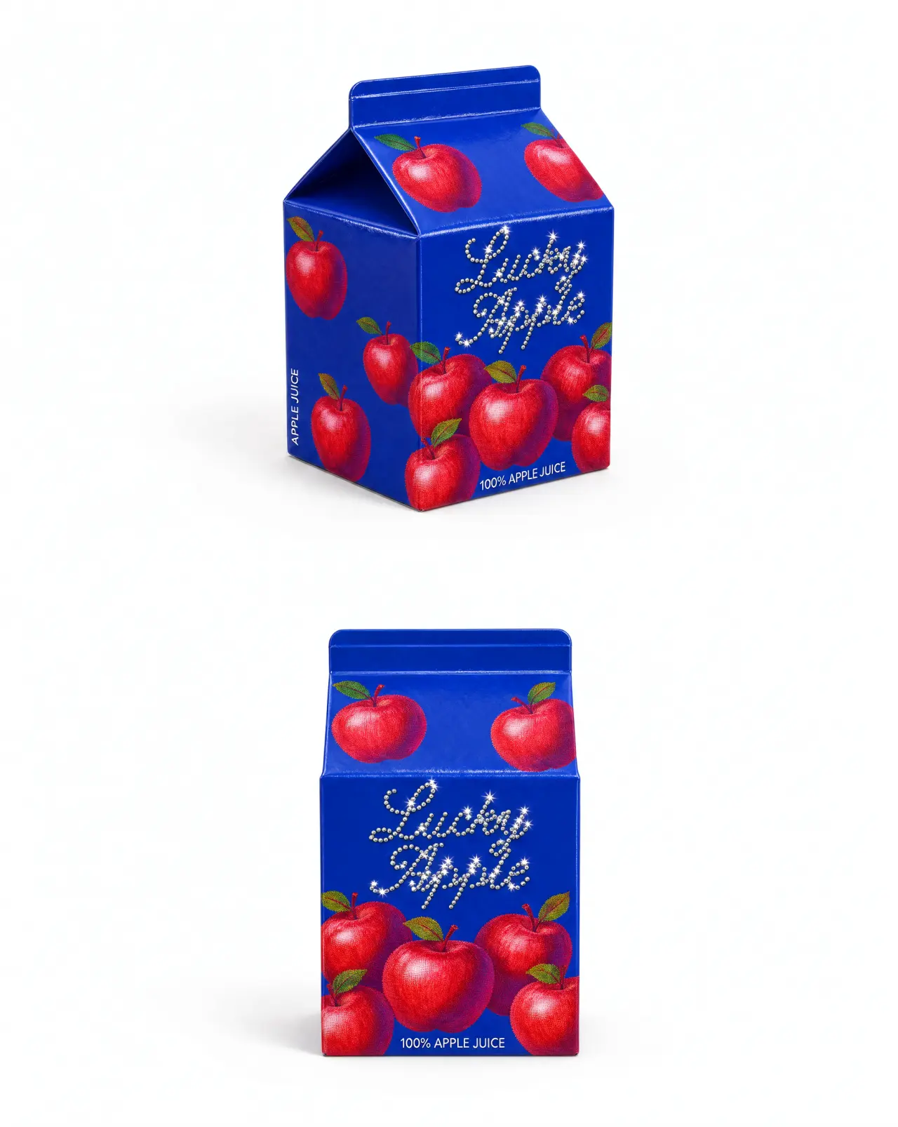
Blue apple juice carton packaging mockup with red apples and "Fresh Apple" text, shown from two angles

"We're not replacing creatives, and we don't want to replace creatives: that's not our thing," says Felix. "We're creatives ourselves, so we know what we're talking about. We're a tool that can be used in any part of the creative process: at the beginning, at the very end with editing, or somewhere in the middle."

In other words, Krea doesn't want to do your job for you. It wants to help you do your job faster. So why not try it out with the free plan? Its intuitive interface is easy to use, so you can get going right now without any fuss at all.

Obscura VPN now offers a desktop app for Linux

Obscura VPN has launched a native Linux app, giving desktop users an easier way to access it (without wrangling Wireguard configuration files). Linux isn’t short of VPN providers, but Obscura, founded by former Bitcoin Core contributor Carl Dong, has a different pitch to most. Rather than your traffic being routed through a single provider, Obscura VPN uses a two-step relay: it acts as the ‘entry node’ (seeing your original IP address) while another VPN provider, Mullvad, acts as the ‘exit node’ (the websites you visit). Obscura’s Linux app also supports the QUIC-based stealth protocol, which disguises your VPN connection as […]

You're reading Obscura VPN now offers a desktop app for Linux, a blog post from OMG! Ubuntu. Do not reproduce elsewhere without permission.

Obscura VPN now offers a desktop app for Linux

Obscura VPN has launched a native Linux app, giving desktop users an easier way to access it (without wrangling Wireguard configuration files). Linux isn’t short of VPN providers, but Obscura, founded by former Bitcoin Core contributor Carl Dong, has a different pitch to most. Rather than your traffic being routed through a single provider, Obscura VPN uses a two-step relay: it acts as the ‘entry node’ (seeing your original IP address) while another VPN provider, Mullvad, acts as the ‘exit node’ (the websites you visit). Obscura’s Linux app also supports the QUIC-based stealth protocol, which disguises your VPN connection as […]

You're reading Obscura VPN now offers a desktop app for Linux, a blog post from OMG! Ubuntu. Do not reproduce elsewhere without permission.

❌