❌

Reading view

There are new articles available, click to refresh the page.

'It's going to be scary': a week on from Adobe MAX 2026, creatives get honest about the future

I left this year's Adobe MAX Sneaks feeling a bit wary. So I asked creatives what scares them most about their work, listened to what two of Adobe's most senior people had to say, and ended up facing a few of my own fears.

If you're familiar with Adobe's Sneaks, you'll know they've earned legendary status at Adobe MAX over the years. It's an hour or two when the people who build the experimental tools get up and show them off to a live audience, livestreamed to millions of creatives worldwide. A nerve-racking experience, I'm sure... Not just because the whole world is watching, but because anything could go wrong.

Usually, there are loud whoops and almost cult-like, frenzied excitement as Adobe proudly reveals its latest innovations. Not so much this year, from where I was sitting, or indeed the last. Certainly not as much since Adobe started to introduce AI into its suite; maybe the audience was just too stunned to applaud.

For more than a decade, I watched from my desk in Manchester in the middle of the night, scribbling down notes for readers who wanted to know what was coming next. How their working lives were about to get easier thanks to the software they'd spent ages learning. This year, I was right there in the room in Miami Beach, as an editor, sitting with the other British journalists. Terry Crews was hosting, dressed head to toe in a bright pink suit with shiny blue shoes and pink socks. And much like anyone who watched, I'm still processing it.

So what did Sneaks show us?

The tools come straight out of Adobe Labs, and none of them is guaranteed to ship, although some do. And yeah, AI played a leading role. Of course it did. The future is here.

As always, I'm pretty nuanced about these things. It's not so black-and-white. If Adobe can empower creatives to skip the mundane stuff and focus on their creativity, then brilliant. If it can open the playing field to those who previously didn't have the means to create, then I'm all for it. The computer, after all, opened the gates to so many more people back in the 1990s, and the internet welcomed even more.

But there are multiple fine lines. Where AI might be useful in one corner, it feels unwelcome in another.

Ten projects took to the stage. Some were very much welcome, and those were the ones that got the whoops. Project Rinse Repeat copies edits you've made in one area of an image to another, while keeping everything editable in Photoshop.
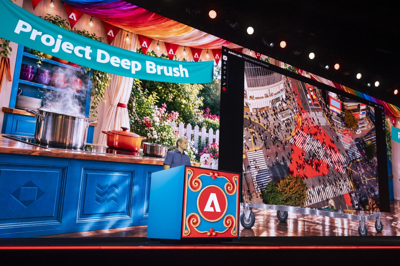
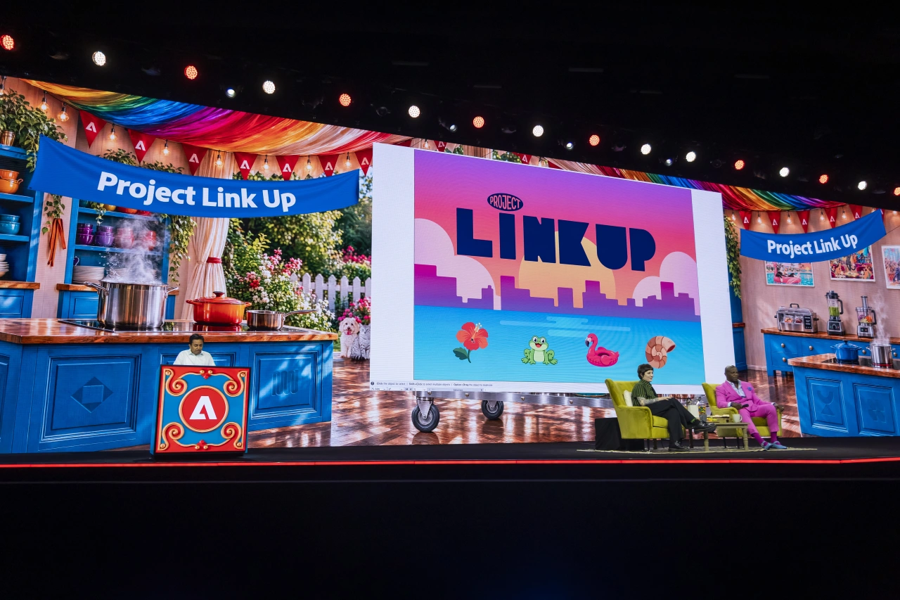
Colourful stage display at Adobe MAX showing "Project Deep Brush" on a bright blue panel, with video screens displaying creative work and decorative lighting above
Colourful stage at Adobe MAX conference displaying Project Link Up logo with animated graphics and blue branded booths on either side under rainbow lighting

Project Link Up lets you drag design elements into a scene and sit back and watch their perspective, scale and style adapt to fit, landing as editable vector artwork. Project Deep Brush, my personal favourite, understands an image's shape, colour and lighting, so you can quite literally paint light into a scene. All clever, time-saving stuff.

Others were not so welcome. Project Screen Test lets you build a fictional character's look, voice and personality, and then chat to them. I mean, it was incredible, sure. But is it really necessary? Project Live Set changes a subject, a set or a camera move while the video is still playing.

Project Sight Span turns a single image into a 3D-style space that feels like you can step into it and walk around, framing shots that were never taken in real life. And then Project Sound Bender lets you describe a sound and pick it clean out of a finished mix. Mind-blowing, but I'm not sure the audience was happy.
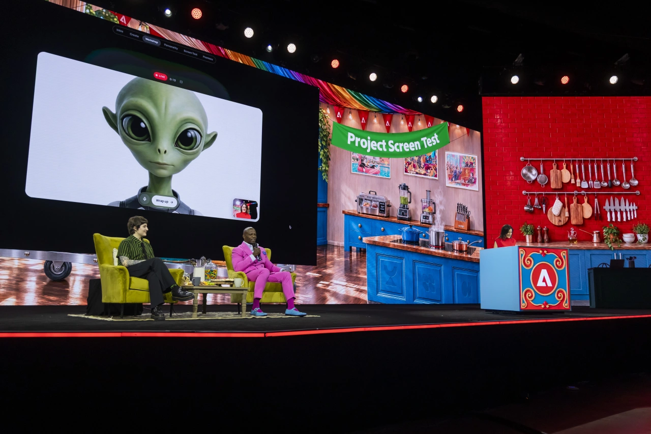
Terry Crews hosts Adobe MAX Sneaks presentation on stage with a large screen displaying an AI alien character, seated in a yellow chair with colourful stage set behind him

As I sat there, looking around at my startled fellow attendees, I finally realised how fast things are moving. Casting, set design, location scouting, sound editing... whole corners of the industry flashed past in a few minutes each. I've been using AI tools for three or four years now. I'm an adopter, and I'm not going to pretend otherwise. But sitting there in that big conference hall, I felt a bit sick rather than excited.

So, still in Miami, I did what I always do in these situations. I asked you.

What keeps you up at night

I posted a simple question on LinkedIn: what are you most scared of in your work right now? More than a dozen replied, and their thoughts offered some brilliant insight.

For some, yes, the fear is real. "I used to have three to five projects monthly, and this year I had three to five in the year," says illustrator and lettering artist Ana Moreno ChΓ‘vez. Tom Grattan, managing director and co-owner of consultancy EXP, has been meeting graduates who see a bleak future while watching "an Instagram feed of Adobe MAX attendees celebrating what feels like an accelerating decline of an industry".

Then there's what clients now expect. "I'm not afraid of the tools," says motion designer Oleksandr Merkulov. "I'm worried about clients getting used to 'fast and fine' and losing patience for that one extra round that makes the work 'good'." Designers Kieron Lewis and Bijesh Amatya see it too: people reaching for AI, as Kieron puts it, like "a takeaway because it's quicker and more convenient".

Elsewhere, others raised concerns about what we might lose if things get easy. "When the first attempt already looks finished, we lose the friction that turns a good idea into a great one," says Isabella Wordsworth, a designer at D&P in London. "Experimentation is becoming a luxury... It sits at the core of our industry." Francesca Oddenino, co-founder of Vicine, says her best work "is always born out of discomfort". Web developer Tom Harrison feels "very little pride making things this way".
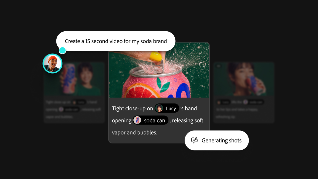
Adobe Firefly interface showing a generated soda can advertisement with text prompts and "Generating shots" button visible

Of course, juniors kept coming up. They're "being replaced by AI, but who do they train to become seniors?" asks brand designer Sophie O'Connor. A senior creative at a fast-growing start-up, who asked to remain anonymous, told me everyone at her company uses AI, and she misses the grunt work. "That's where I cut my teeth," she says, and she's scared for newcomers who won't get it. And she can't say any of this publicly. "I feel ashamed in a way, using it so much."

And then there's the even bigger elephant. "I'm scared of jumping on the 'bandwagon' and playing my role in the demise of my own role. And at the same time shunning AI and playing my role in the demise of my own role," says UX and UI designer Andrew Areoff.

Designer Bart Fish was the most forthright: "I am very concerned about how creatives are embracing this technology, even as it steals from them and threatens to replace them. I'm concerned that creatives think adoption will provide job security, even as they train the models and are asked to create systems intended to displace them."

Putting all this to Adobe

As it happens, I got the chance to sit down with two of Adobe's most senior people at MAX the day before Sneaks, and many of these same fears were swimming around my head. In fairness, much of what you told me you're scared of isn't Adobe's doing alone. And naturally, it's their job to be optimistic. But neither brushed my worries aside, which I really appreciated.

Karen Robinson is Adobe's vice president and associate general counsel, and she spends much of her time talking to lawmakers in the UK, EU, US and Australia. I asked whether the backlash from creatives in 2024, when the government floated its opt-out proposal for AI training, was justified. "I mean, yes, of course it was," she says. "You have people who are worried about what their livelihood is going to be like."

But two years on, she believes there's a reason for "some level of confidence". Artists are still earning a living, she argues, and "the sky did not fall". (Ana, with her three to five projects a year, might disagree.)
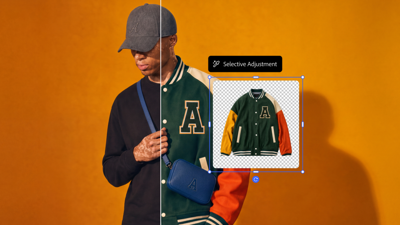
Adobe's Selective Adjustment tool being demonstrated on a model wearing a green and gold varsity jacket with a blue shoulder bag against an orange background

What was really interesting was her view that the fear itself has changed. Because what Adobe is hearing from creatives, she explains, is "candidly now less about the training and more about the output, because ultimately... AI-generated output is the thing that will compete directly with artists and creatives". She goes on: "And so what we're hearing is: we don't want to be pushed out of a market that our own art has created. So we want to talk about style protection. If I am an artist and I have a demonstrable style, I should be able to protect that." Right now, she says, you can't.

It's why she reckons licensing alone won't save any of us. She tells me about asking an illustrator Adobe works with how much licensing money would make it acceptable to be pushed out of the market by AI copies of her style. The answer? There isn't enough. "They want to control their art... If you're an artist and you make a very particular type of art, and now somebody comes, knocks off your style and starts putting it on aprons and oven mitts, that's not what you want," she says. "And so that requires protection on the output side that does not currently exist."

Essentially, we're in the Wild West again. The geeky lawyer in her (her words) also offers some perspective. When cameras arrived, photographs weren't eligible for copyright, because the machine supposedly did all the work. It took a series of court cases to recognise that the photographer (the human) was making creative decisions about subject, lighting and angle. And plenty of painters never picked up a camera at all. There will always be room, she says, for artists who don't want AI anywhere near their work.

She was candid about trust, too. The row over Adobe's terms of use in 2024 taught the company it had to communicate better. "In a time of uncertainty, companies aren't going to get the benefit of the doubt," she says. "And I don't mean that as a negative... It is our responsibility to clearly articulate what we're doing."
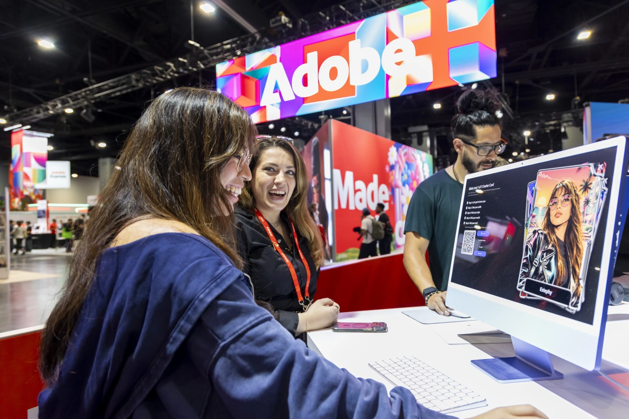
Visitors interact with Adobe staff at the Adobe MAX exhibition booth, with colourful Adobe branding visible overhead and product displays on the desk

Eric Snowden, senior vice president of Adobe Design, is another optimist. He's also been a retoucher for 20 years, and he doesn't believe Photoshop is going anywhere. How do I know? I asked him outright with a cheeky chuckle: if AI can do pretty much anything, will anyone still need Adobe's tools? Will we even be using Photoshop in three years? "When I generate an image, I'm still editing every single one in Photoshop," he says. "I'm doing high-end retouching, I'm doing frequency separation, I'm doing all these things, like traditional Photoshop, and you'd be surprised at how much they still need that."

Without that human precision? "They come out looking good, and I think especially to an untrained eye they look good. But at the level our customers care about the details of these images, they do not look good enough."

He's not pretending these next few years will be painless, though. "Things are going to change. It's going to be scary... But there are some really bright spots, where we're also incredibly empowered to do things we've never been able to do before," he says. "Lean into that."

Scared? Yes. And still here

So, should we be scared? I think we're in a period of adjustment. A lull phase. A temporary era of people struggling, perhaps, before more work comes out of this revolution, not less.

But perhaps I'm deluded. Maybe I'm hoping optimism will overcome my fear. Fear for the juniors coming up behind us. Fear for my own career. And fear for the industry I've spent nearly two decades championing.

It's like being on a train with a party on board. Everyone's enjoying the champagne and the party food, knowing the track might run off into a deep chasm at any point. But we can't get off.

Much like you study the faces of the cabin crew on a bumpy, final descent, I realise I'd been studying Adobe's own people, looking for reassurance. Are we going to be OK? I kept thinking. What I got was honesty. Karen didn't tell me the fear was unjustified. And Eric didn't tell me it would be fine. "It's going to be scary," he said, with a smile. And then he told me to lean into it.
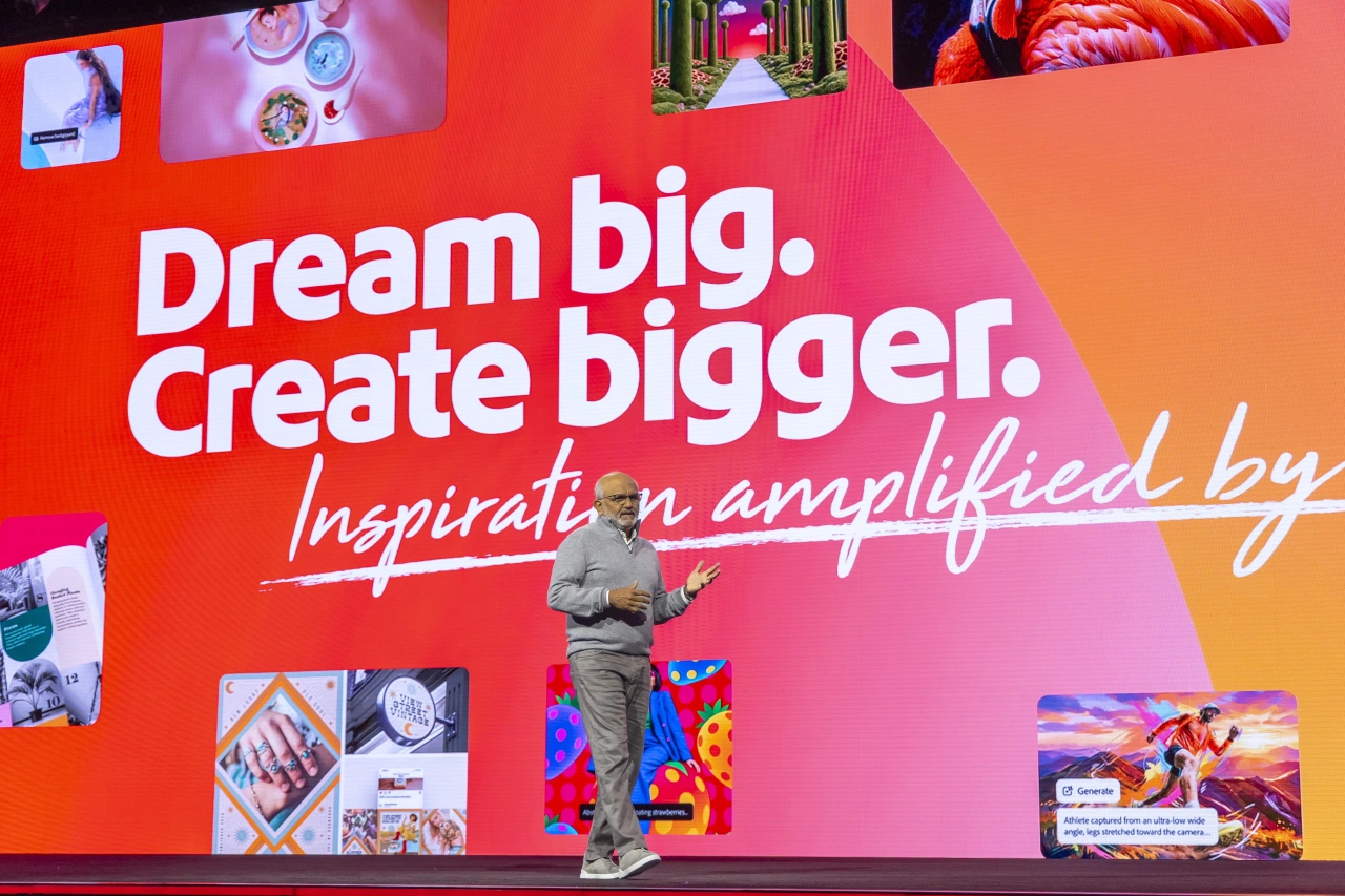
Shantanu Narayen speaks on stage in front of a large screen displaying "Dream big. Create bigger. Inspiration amplified by" with colourful imagery visible above and around the stage.

Google's Yi Xiang on how to build a design career across global borders

The senior UX designer reveals the lessons that moving between different cultures has taught him.

Ever dreamt of working abroad? I did, back in the early 2000s, and it led to a three-year career break from journalism to teach English in Japan. I loved every minute of it, but it also taught me something profound.

Previously, when people banged on about Asian cultures being totally different from the West, I'd taken it with a pinch of salt. People are the same everywhere, I'd thought. But living in Tokyo, I discovered that cultural differences really are a thing.

The Japanese people I made friends with really did seem to focus more on the collective than the individual, which meant living and working there was quite a culture shock. For me, it was a good shock, but I could also understand why some fresh recruits only spend a couple of days in the country before hurriedly booking the first flight back to the UK. The shift in behaviour and attitude can be... a lot.

I was thinking about this when I started chatting to Yi Xiang, a senior UX designer at Google, whose work has been recognised by the iF Design Award and A' Design Award, and who's turned his personal portfolio into an ever-evolving home for creative coding experiments.

Putting my own experience aside, Yi's career path has taken him to four distinctive places around the world, each with its own strong and unique culture.

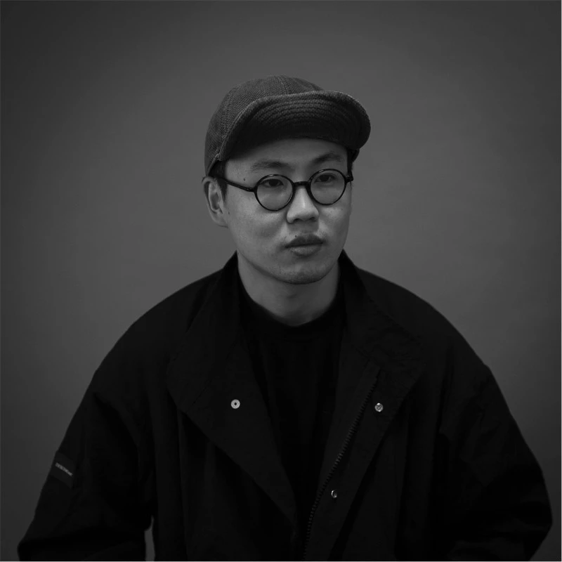
Black and white portrait of Yi Xiang wearing glasses and a dark cap against a neutral background
Yi Xiang

Born in Jiangsu, China, Yi began his journey with a degree in interactive arts and technology at Simon Fraser University in Canada. Later, he earned a Master's in interaction design at The Hong Kong Polytechnic University.

His design career then took off in mainland China, where he worked at R/GA in Shanghai before moving to TikTok, where he worked as a product designer on TikTok.com. Then in late 2025, he relocated to San Francisco's Bay Area and started working in Silicon Valley.

Despite all this experience, Yi admits he wasn't very familiar with the US job market or its work culture when he arrived. I wanted to know more about how he navigated that shift.

Building a relationship with place

Arriving somewhere new typically means a struggle to fit in. But Yi takes a philosophical approach. While he admits to moments of unfamiliarity, he doesn't think he has to become a particular kind of person to 'belong' anywhere. "People build a relationship with a place in different ways," he says. "Keeping your own background and habits doesn't prevent you from contributing."

What attracted him to Silicon Valley, he says, was the number of talented people working in a world where design meets tech. He wanted to learn how they think and work, and challenge himself. So he's been actively seeking out designers with local experience and asking them for honest feedback to understand where he still needs to improve.

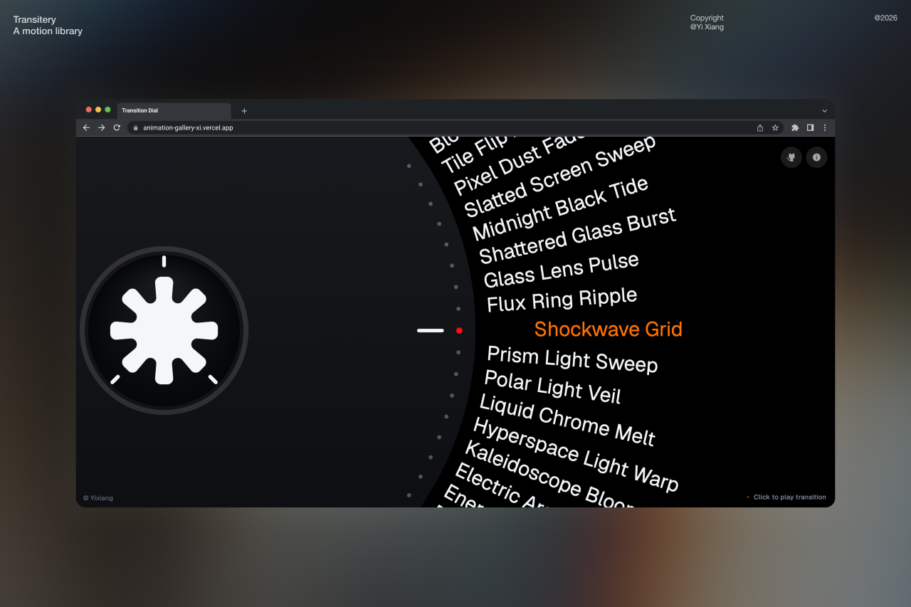
Browser window displaying a list of visual effects or animation filters with "Shockwave Grid" highlighted in orange, alongside a white splatter icon on dark background

"It's not about assuming I belong," he explains, "but about continuously learning and pushing myself to become a designer who can contribute at that level." For him, confidence isn't about faking it till you make it. "My confidence comes from learning, feedback and making things, rather than simply telling myself that I'll be fine," he says.

American vs Chinese differences

Language has, he says, been a challenge at times. "Being able to express an idea is one thing; helping people from different backgrounds understand it and contribute to the discussion is another," he reasons. Yet Yi is wary of making broad generalisations about Chinese and American design as a whole.

The differences he's experienced, he says, have as much to do with the specificsβ€”the stage he's at in his career, the teams he's working with and the products he's designingβ€”as they do with geography. Underlying it all, he adds, good design shares the same underlying principles everywhere. It's just the details that need to change for different contexts.

Some of the obvious differences are rooted in language itself. Chinese, he notes, can say a lot in relatively few characters, but those characters themselves can be visually complex, which affects choices around type size, weight, line spacing and hierarchy.

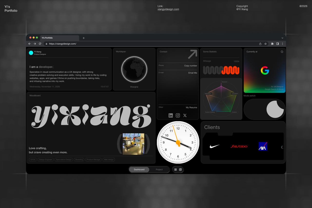
Dark-themed portfolio website displaying Yi Xiang's design work including typography, data visualisations, client logos and creative projects

Other languages bring similar challenges, longer labels to right-to-left reading in Arabic. The overall challenge then lies in recognising that "internationalisation means maintaining coherence, while making room for those differences."

Yi adds that some Chinese digital products prioritise speed and breadth of function, while some Western ones focus on motion and micro-interactions. But overall, it's not a big concern. "What interests me is how thoughtful details can make an efficient experience feel more human, without getting in the way of what people came to do," he says.

Portfolio as laboratory

While Yi is firmly focused on his career, he's smart enough to know that side projects can only help, not harm, those efforts. Hence the work he puts into what he calls his portfolio, even though it's less an archive of past work than a laboratory of current experiments. With these, he's heavily leaning into AI-assisted coding, which he says has let him build ideas that had sat in his head for years.

Serving as both a hobby and an investment in his future practice, these experiments include Transitery, an open-source collection of transition animations, and Vibe Text, which renders typed words in materials ranging from wood to jelly.

Yi makes it clear, though, that doesn't let the AI have the final word. "Generating something is only a starting point," he says.

What 50 years in business has taught Springetts about building brands that thrive

As it celebrates its half-century, the agency that named The Happy Egg Co., Nuii and Frubes shares the wisdom it's acquired along the way.

Most UK businesses don't make it to their fifth birthday; according to the ONS, fewer than four in 10 do. Getting to 50, to many, can seem like an impossible dream. So when a studio spends five decades successfully serving food and drink brands through recessions, retail revolutions and the rise of social media, it's worth hearing what it has to say.

I'm talking here about Springetts, which today describes itself as a "brand life-stage agency". Founded in 1976 by Rod Springetts, its list of clients reads like the contents of my kitchen cupboard right now: Weetabix, Walkers, Ryvita, Kettle Chips, McVitie's, NestlΓ© Fab, Linda McCartney and Rubicon among them.

It's also created a fair few brands of its own, coining Frubes, Frijj, The Happy Egg Co., Walkers Salt & Lineker and, more recently, the premium ice cream brand Nuii. (Anyone else feeling peckish yet?) Along the way, it's picked up 24 Pentawards and 19 Design Effectiveness Awards.

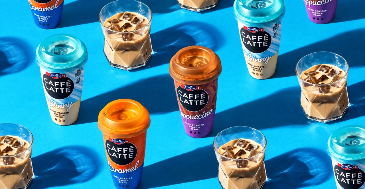
Caffe Latte iced coffee drinks arranged on a bright blue surface, featuring various cup designs with orange and purple branded labels
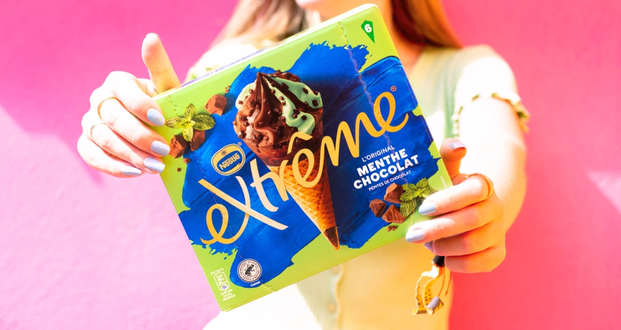
Person holding Nuii premium ice cream packaging featuring a chocolate-covered ice cream cone against a bright pink background
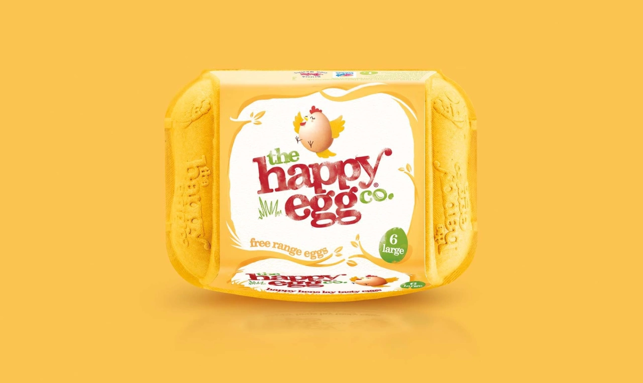
The Happy Egg Co. six-egg carton in bright yellow packaging against a matching yellow background
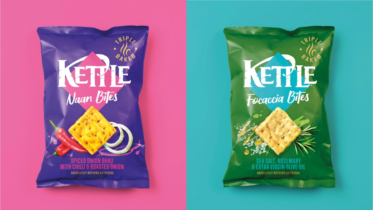
Two Kettle Chips packets side by side on pink and turquoise backgrounds; left packet in purple shows Naan Bites flavour, right packet in green shows Focaccia Bites flavour

After 50 years of this kind of success, you might expect the agency to be feeling pretty smug about itself. But rather than resting on its laurels, it's marking its anniversary with a burst of fresh energy, relaunching with new positioning and a refreshed identity.

And here's where Creative Boom readers can benefit directly: it's also launched a field guide to help others learn from its success.

What you can learn

Titled How Brands Live Forever, the guide distils half a century of experience into a framework the agency calls Forever Brands. So what's it all about, exactly?

The central idea of the guide is simple but often overlooked: design for longevity rather than novelty. That involves, according to the agency, a level of restraint.

As creatives, we of course are constantly chasing the new. But designing for 'forever' isn't about that. Instead, it's about tying fresh ideas to what's already familiar and protecting what existing customers love. It's about going deeper into what a brand already has, rather than tearing it up every few years because someone fancies a change.

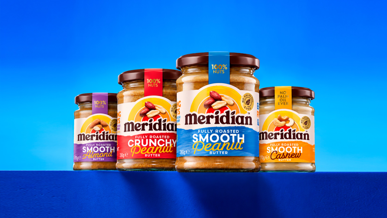
Meridian peanut butter range displaying four jars with different varieties against a bright blue background
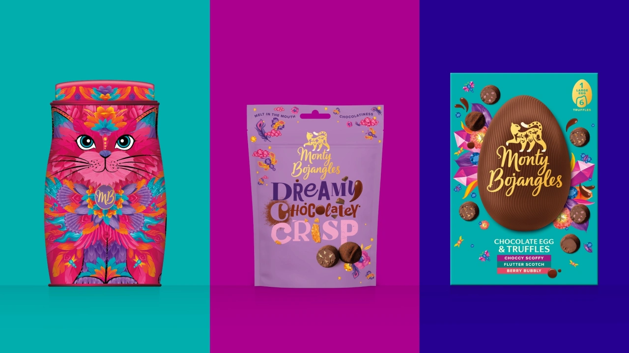
Three colourful product packages featuring bold patterns and designs: a pink cat-themed box on a turquoise background, a purple Monty Bojangles Dream Chocolate Crisp packet, and a turquoise Monty Bojangles Chocolate Egg and Truffles box
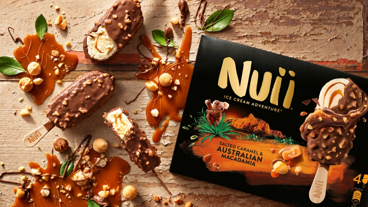
Nuii premium ice cream products with chocolate and nuts displayed on a textured surface alongside the branded black packaging box
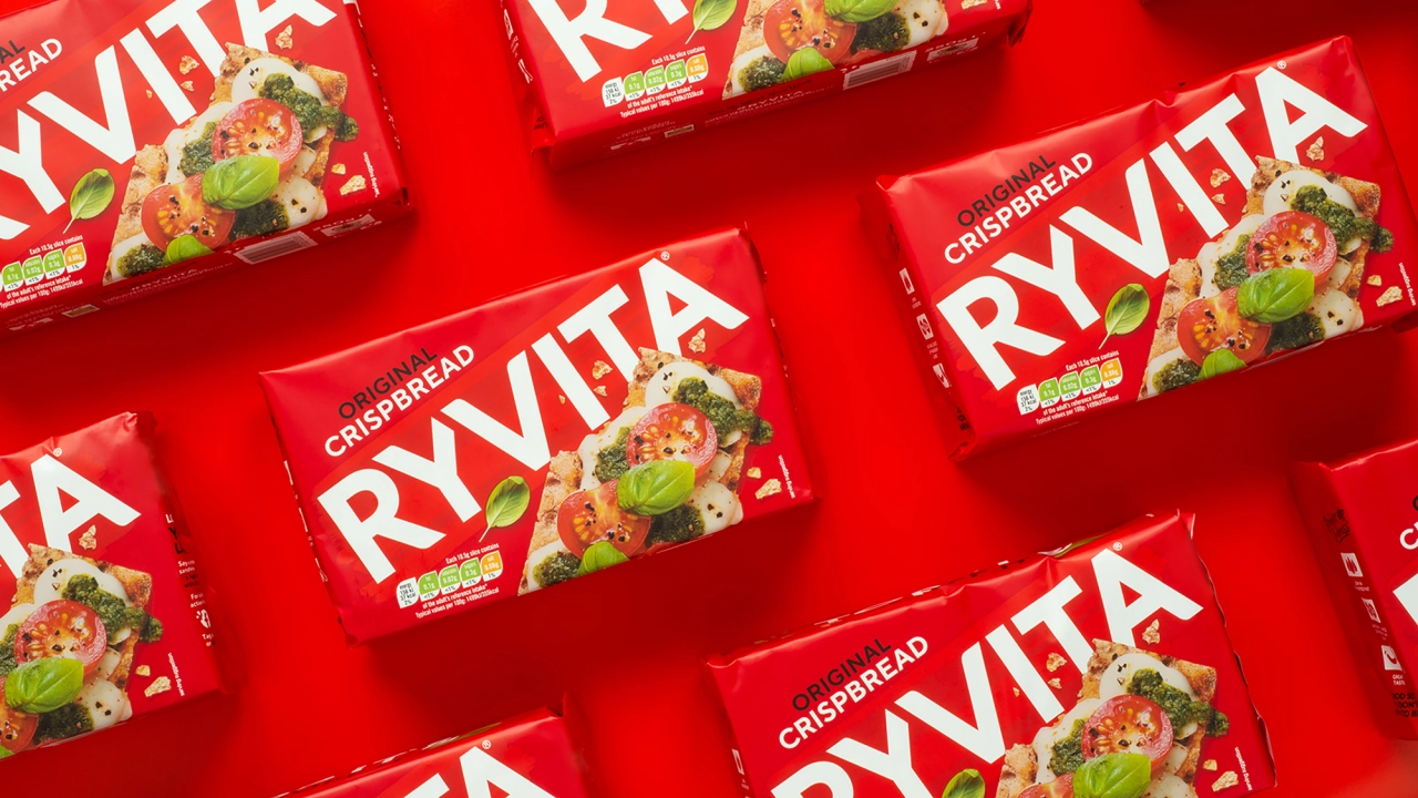
Ryvita Crispbread boxes arranged in a grid pattern against a bright red background
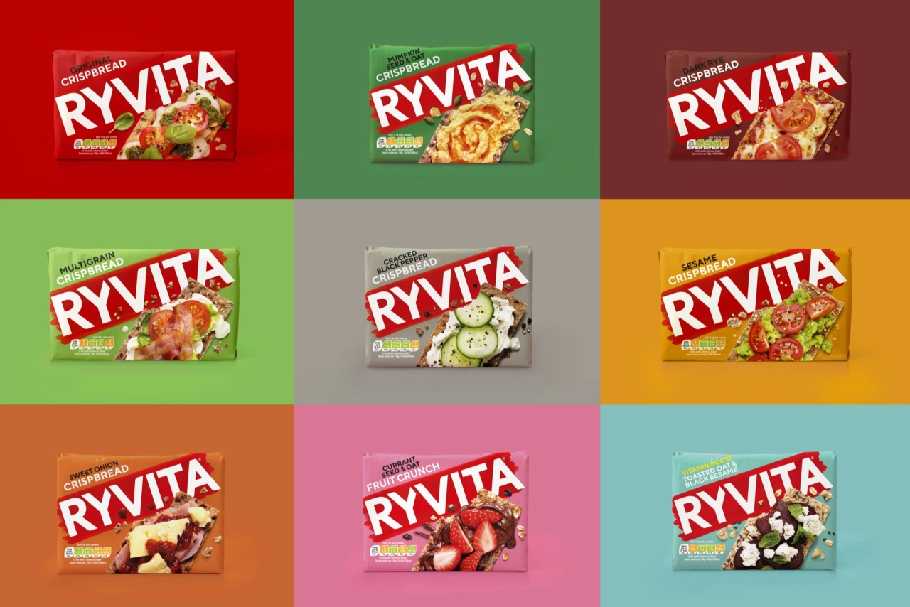
Nine Ryvita crispbread boxes in different flavour varieties displayed on coloured backgrounds in a 3x3 grid

"A great brand story isn't just told. It's retold again and again," stresses CEO Paul Williams. "Food and drink brands are never purely functional. The job is understanding the emotional role they play, and the story people want to be part of. That's how you make brands loved for generations to come."

In practice, that means thinking beyond individual packs and products, and building systems of recognition that flex across every channel and keep the story going.

The four life stages of a brand

At the centre of this approach is the notion that brands pass through four distinct life stages, each with its own job to do:

  • Launch: make an entrance, create attraction and ignite the spark.
  • Grow: build momentum, grow desire and make people want more.
  • Extend: gain new ground, deepen attachment and give people more to love.
  • Renew: reclaim relevance, reignite interest and make people fall in love again.

Starting with the Launch stage, the guide says: "Every new brand enters a crowded room. When 85% of new brands fail, the challenge is not simply to exist; it's to be instantly understood, emotionally felt and easy to remember."

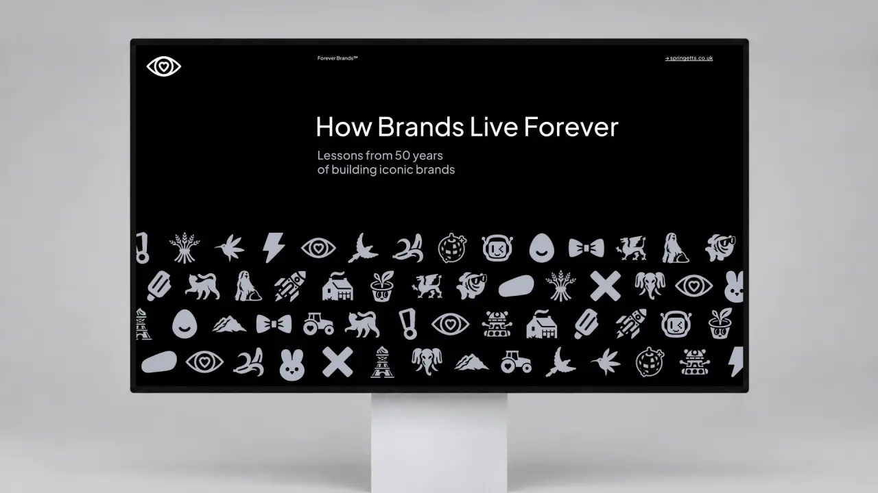
Springetts agency website displayed on a monitor showing "How Brands Live Forever" title with a grid of brand logos and icons below on a black background
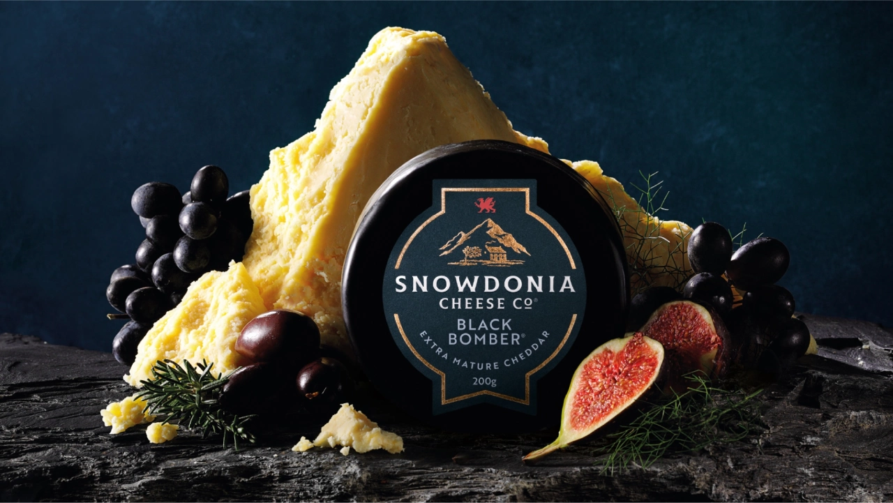
Snowdonia Cheese Co. Black Bomber cheese wedge surrounded by black grapes and fresh figs against a dark teal background
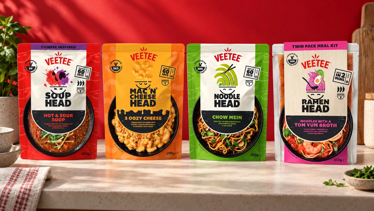
Four Veetee noodle soup packets in red, orange, green and white packaging displayed on a wooden surface against a red backdrop
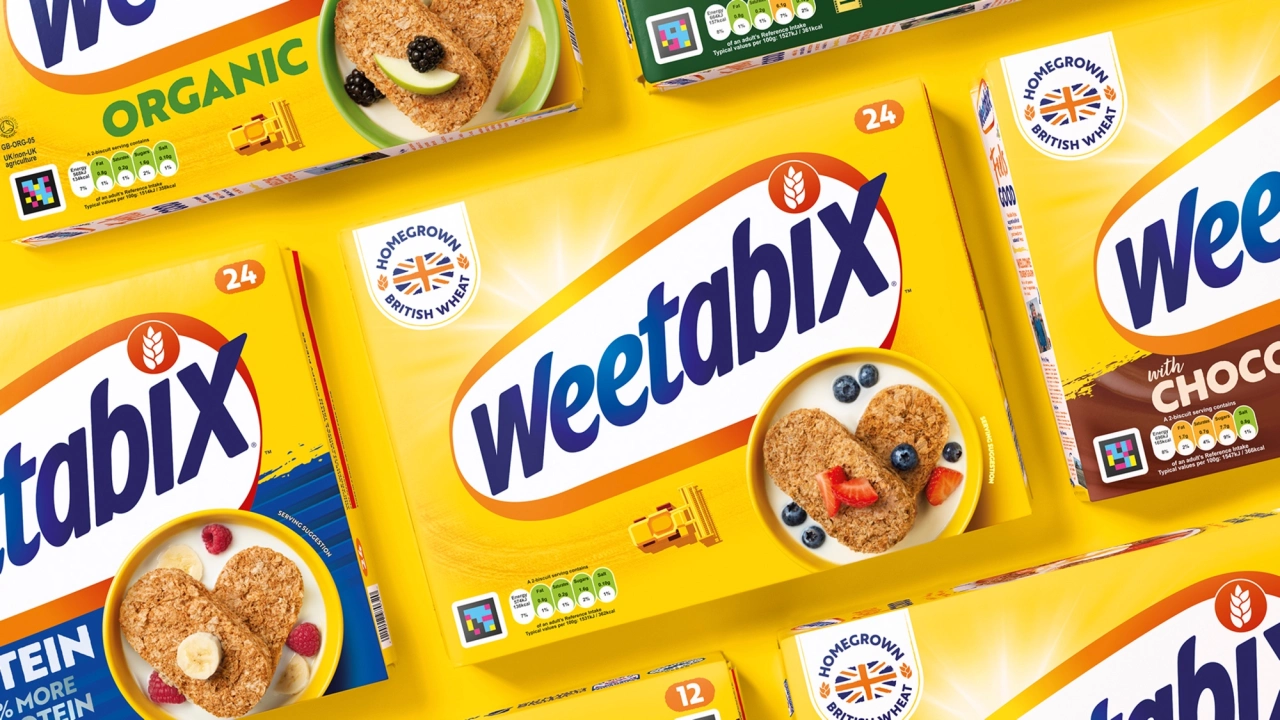
Weetabix cereal boxes with fruit and chocolate varieties arranged on a yellow background
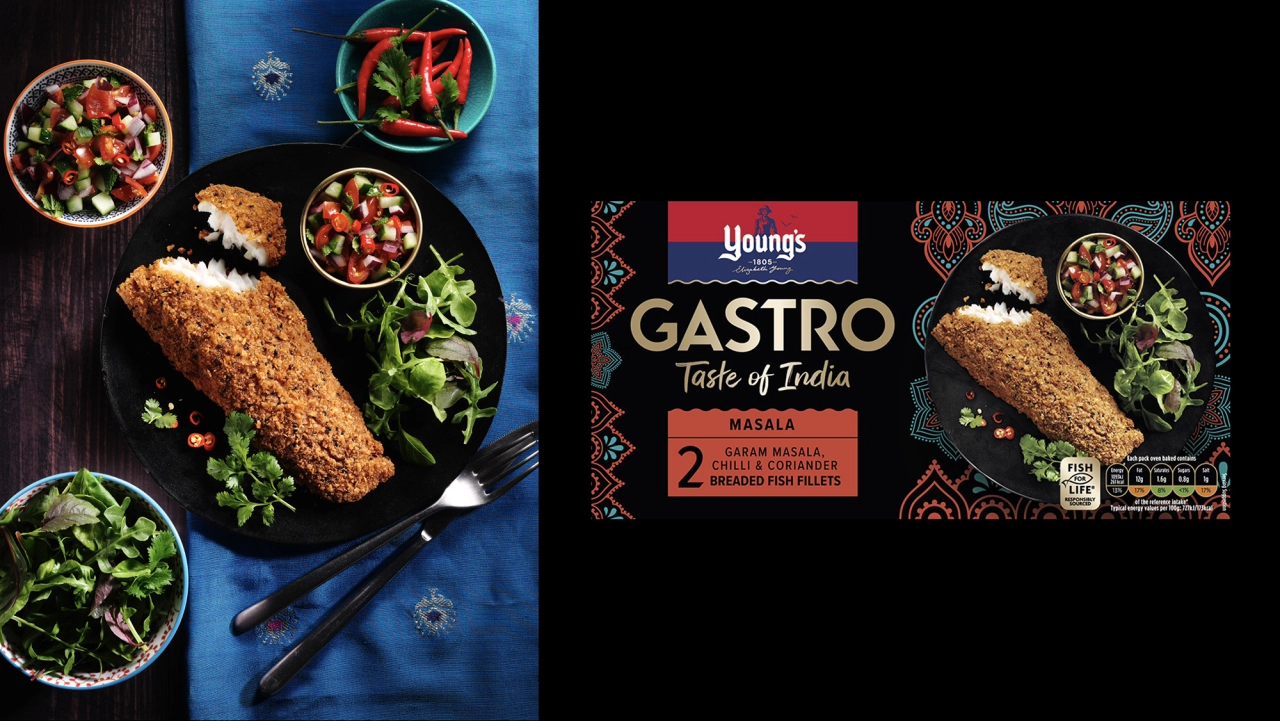
Youngs Gastro Taste of India masala packet displayed alongside a golden-breaded chicken cutlet and colourful vegetable sides on a dark table

It then breaks this stage into four principles: start with a point of view, build memory blocks, bend category codes and design for becoming, not just being. (The point of that last one is that a launch identity needs room to grow, into channels, products and audiences that don't exist yet.)

At the other end of the life cycle, the Renew stage is about rescuing brands that have faded into the background. "The danger for legacy brands is not age, it's invisibility," says design director Sophie Broderick. "Renewal gives a brand back its presence, its point of view and its reason to be chosen now."

The importance of culture

Another thing Springetts says has contributed to its 50-year success is its culture. The company has always been fiercely designer-led, and says it does so without the usual layers of account management.

That means designers own the client relationships and lead the strategic conversations about business challenges and opportunities, which means the thinking and the doing are blended together: what it calls the 'designer brain'.

To learn more about all of this, you're best off reading the guide itself. But I'd say the main lesson is that the brands that last don't get complacent; they adapt. Fifty years on, with a new look and a philosophy written down clearly, Springetts seems to be taking its own advice.

The Balbusso Twins on revisiting The Handmaid's Tale, and why book illustration is like making a movie

Anna and Elena share their process, influences and hard-won lessons from returning to Gilead for Folio Society's new limited edition.

Few illustrators get the chance to revisit one of their most celebrated projects more than a decade later. But that's what happened to Anna and Elena Balbusso, the Milan-based duo known as the Balbusso Twins.

In 2012, they illustrated Folio Society's edition of Margaret Atwood's The Handmaid's Tale, which won them a gold medal from the Society of Illustrators. Now they've returned to Gilead, the dystopian nation in which the classic novel is set, for a new limited-edition box set that brings together the novel with its sequel, The Testaments.

Their original Handmaid's Tale illustrations are joined by a new ninth plate, and there's a fresh set of illustrations for The Testaments, all housed in a newly designed clamshell box.

This caps a triumphant year for the twins. They not only celebrated their 25th anniversary, but also extended their first solo exhibition in New York by nine weeks due to popular demand. They also became the first Italian artists to win the Society of Illustrators' Hamilton King Award.

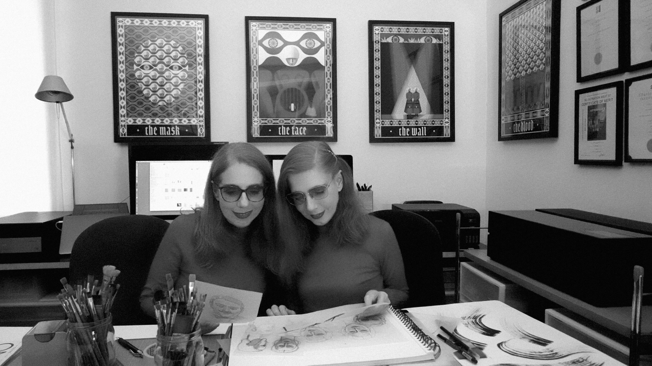
The Balbusso Twins sitting at their workspace surrounded by sketches, brushes and framed tarot-inspired illustrations on the wall behind them
Anna and Elena Balbusso, aka the Balbusso Twins
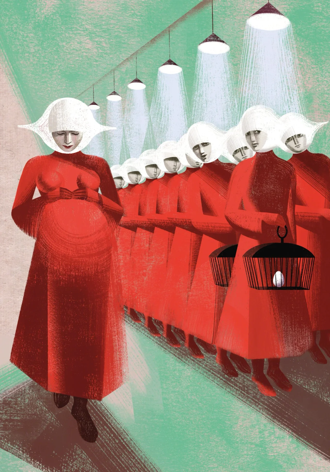
Handmaids in red robes and white winged headdresses stand beneath hanging showerheads, illustrated by the Balbusso Twins for Folio Society's The Handmaid's Tale
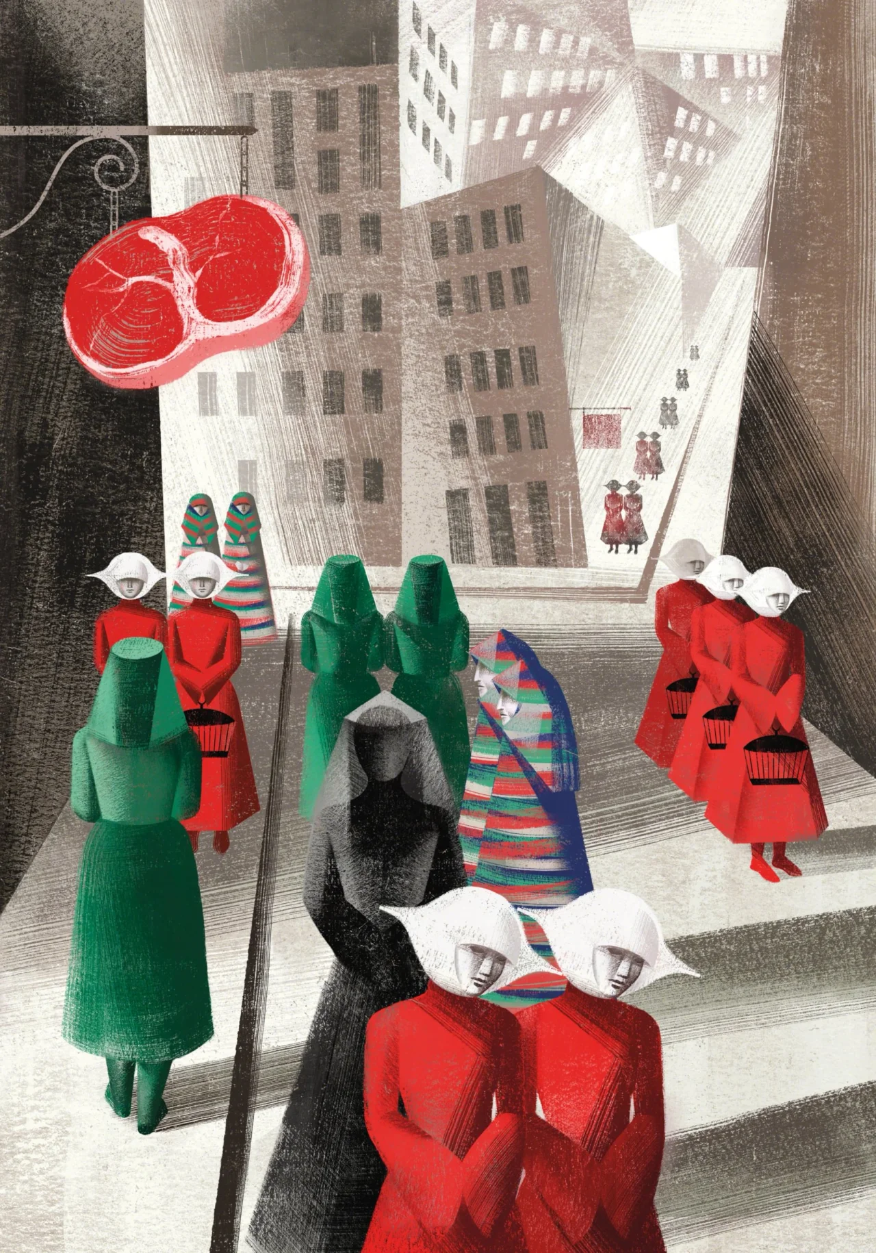
Illustration of figures in red robes and white bonnets standing in an urban street, with a giant red heart floating above and tall buildings in the background, from the Balbusso Twins' artwork for The Handmaid's Tale

Here, the duo reveal how they approached the Folio Society project, and what other creatives might learn from it. (Note: contains mild spoilers for the books if you haven't read them yet.)

Think like a director

They begin with an interesting comparison. "For us, creating illustrated books is very much like making a film. After carefully reading the story, we select the scenes we want to illustrate, choosing compelling narrative points that allow us to express our most authentic interpretation while balancing the total number of illustrations throughout the entire book."

These choices, then, are in no way trivial. "The selection of scenes defines what we wish to communicate. It is deeply bound to our creative intuition and is fundamental to the project, as it represents the artist's genuine emotional point of view: their very soul and sensibility."

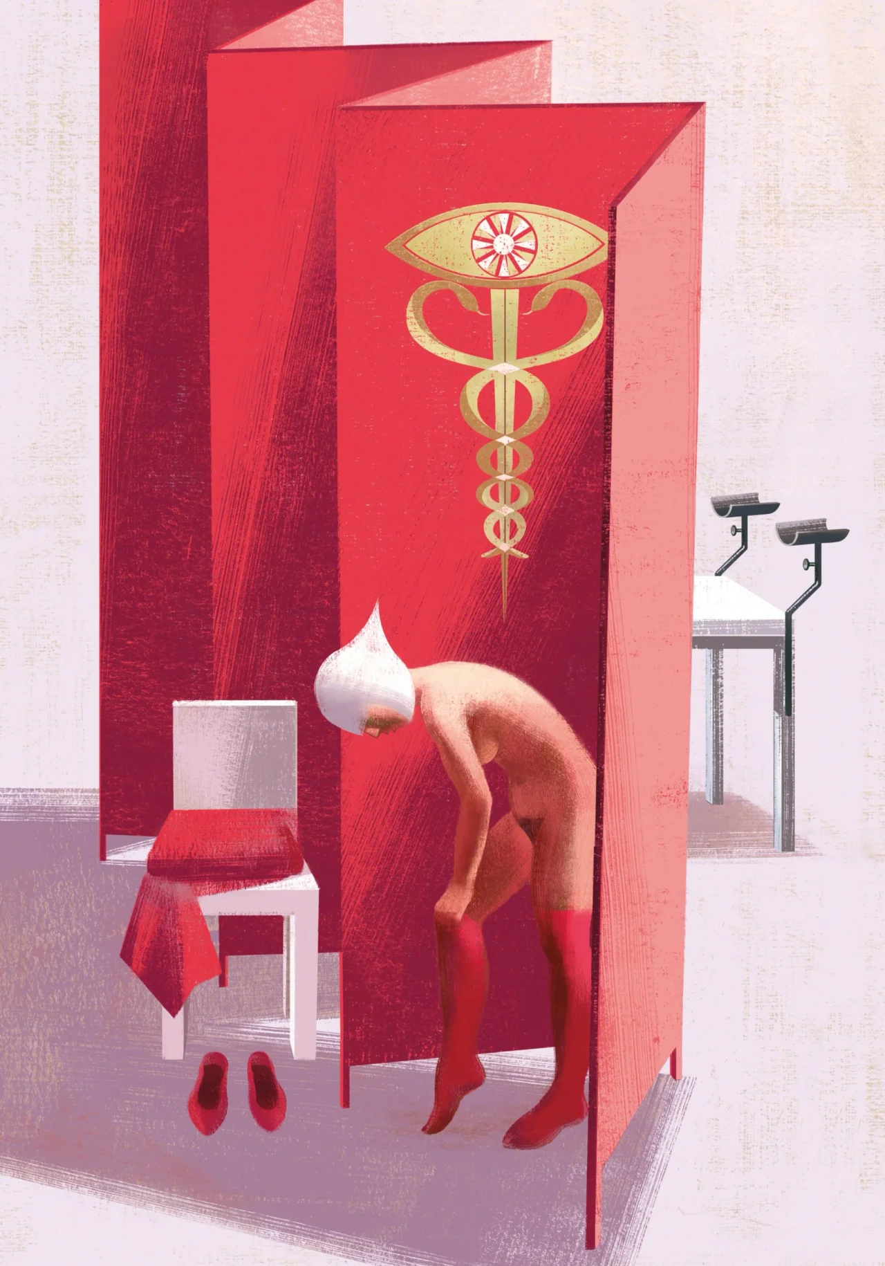
A figure bends before an altar featuring a caduceus symbol and eye motif on a red wall, with a white chair and ceremonial items in a stark medical or religious setting
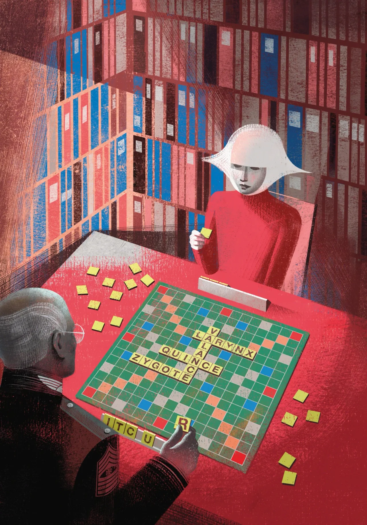
Two figures play Scrabble at a red table against a backdrop of a red brick building with blue-framed windows, evoking the dystopian world of The Handmaid's Tale

From there, the twins begin to build out an entire world, just as a film crew would. For the novels, "we had to build an entire, comprehensive world: imagining the characters, the environments, the costumes, the set design, the cinematography and the overall colour palette"

Artistic licence

Interestingly, though, they don't see their job as simply depicting what's on the page. "We intentionally reject a purely literal or educational approach to illustration," they say.

"We believe the image carries the exact same artistic value as the written text; it must never serve a subordinate role, but must add an authentic, independent artistic interpretation: a new, autonomous point of view. In this sense, total creative freedom in the choice of subjects and style is essential to our creative process."

Taking The Handmaid's Tale as an example, author Margaret Atwood set her story in a world of Georgian and Victorian architecture. Instead, the twins swapped it for the hard lines and angles of Russian Constructivism and Italian Futurism.

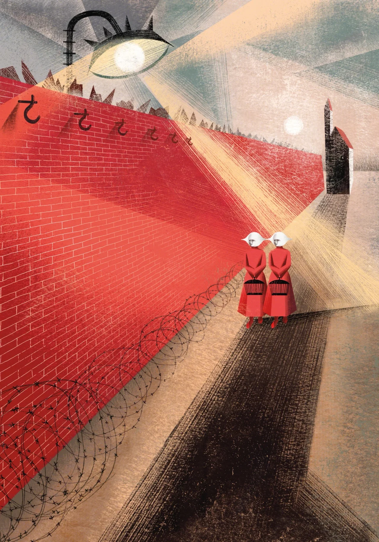
Two figures in red robes and white bonnets stand before a massive red brick wall topped with spikes, illuminated by a stark street lamp, with a dark tower visible in the distance
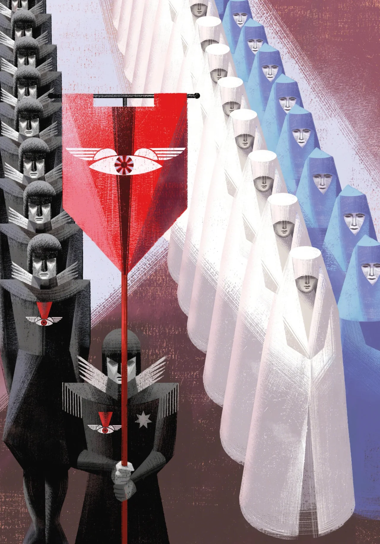
Illustration of figures in white hooded robes arranged in columns, with a commanding figure in black on the left and a red banner with a stylised eye symbol in the centre
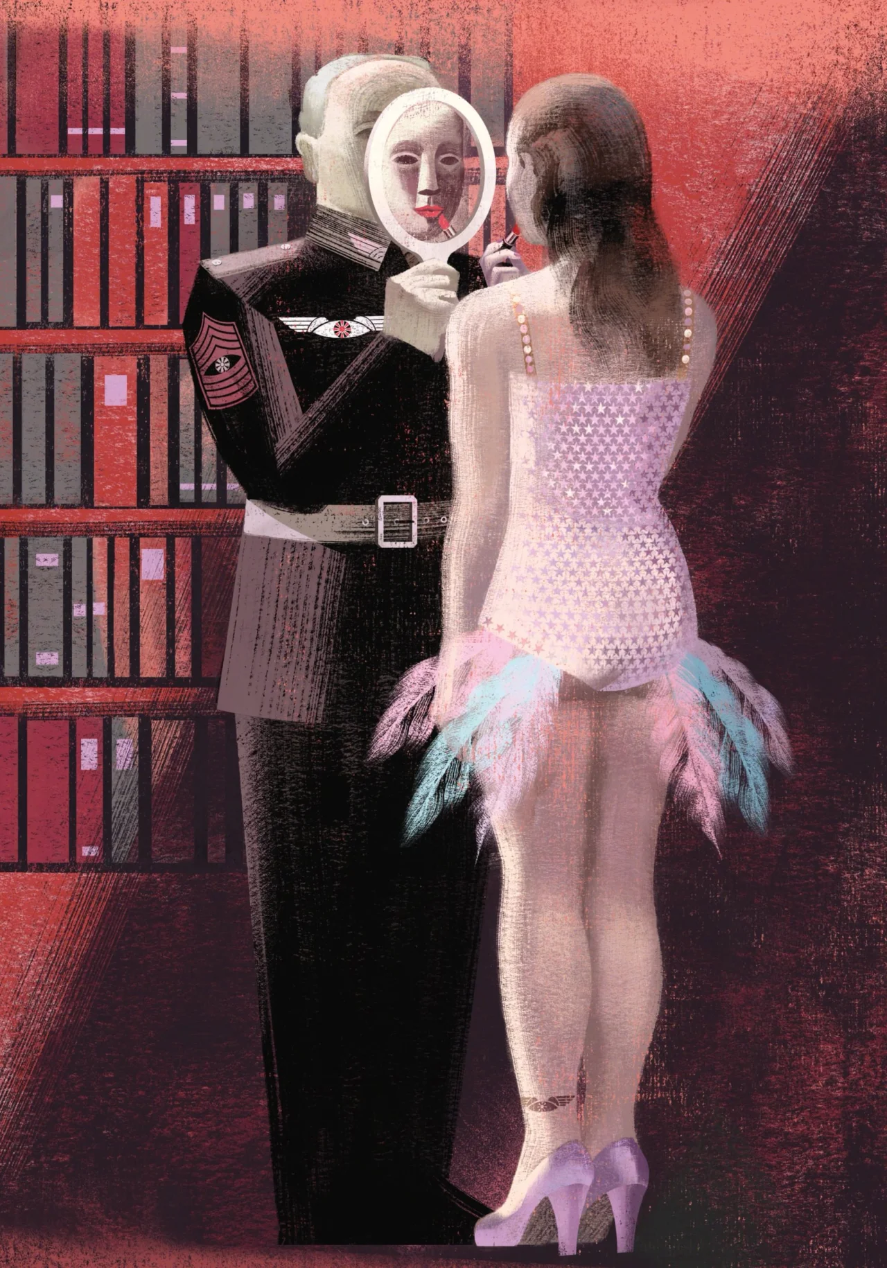
Figure in black military uniform holding mirror reflecting woman in pink dress with feathered hem, set against red background with bookshelf, illustration from The Handmaid's Tale by the Balbusso Twins

"Replacing the colonial decorative framework of the narrative with the geometry of straight lines and angles of the avant-gardes allowed us to visually amplify the sense of totalitarian oppression," they say.

The most striking liberty they've taken to date is with The Wall, where corpses of the Gilead regime's enemies are hung for all to see. For the 2012 book, they turned it red, while admitting: "In Atwood's novel, there is no chromatic reference to a red wallβ€”she only mentions the old Harvard stone wall. Yet our pictorial intuition was so powerful that it became deeply rooted in the collective visual imagination, subsequently appearing in the 2017 television series and the work of other artists.

"Likewise, our choice of an essential silhouette interpretation for the cover of The Handmaid's Tale became an iconographic milestone that subsequently inspired covers of the same novel."

How they research

At the start of a project, the twins approach each project like researchers, going "directly to historical and iconographical sources. In all our work, the absolute foundation is the history of art."

Here, along with Russian Constructivists such as Kazimir Malevich and the Italian Futurists, they've drawn on the volumes and light of Piero della Francesca and the solemn weight of the Novecento Italiano painters Felice Casorati and Mario Sironi.

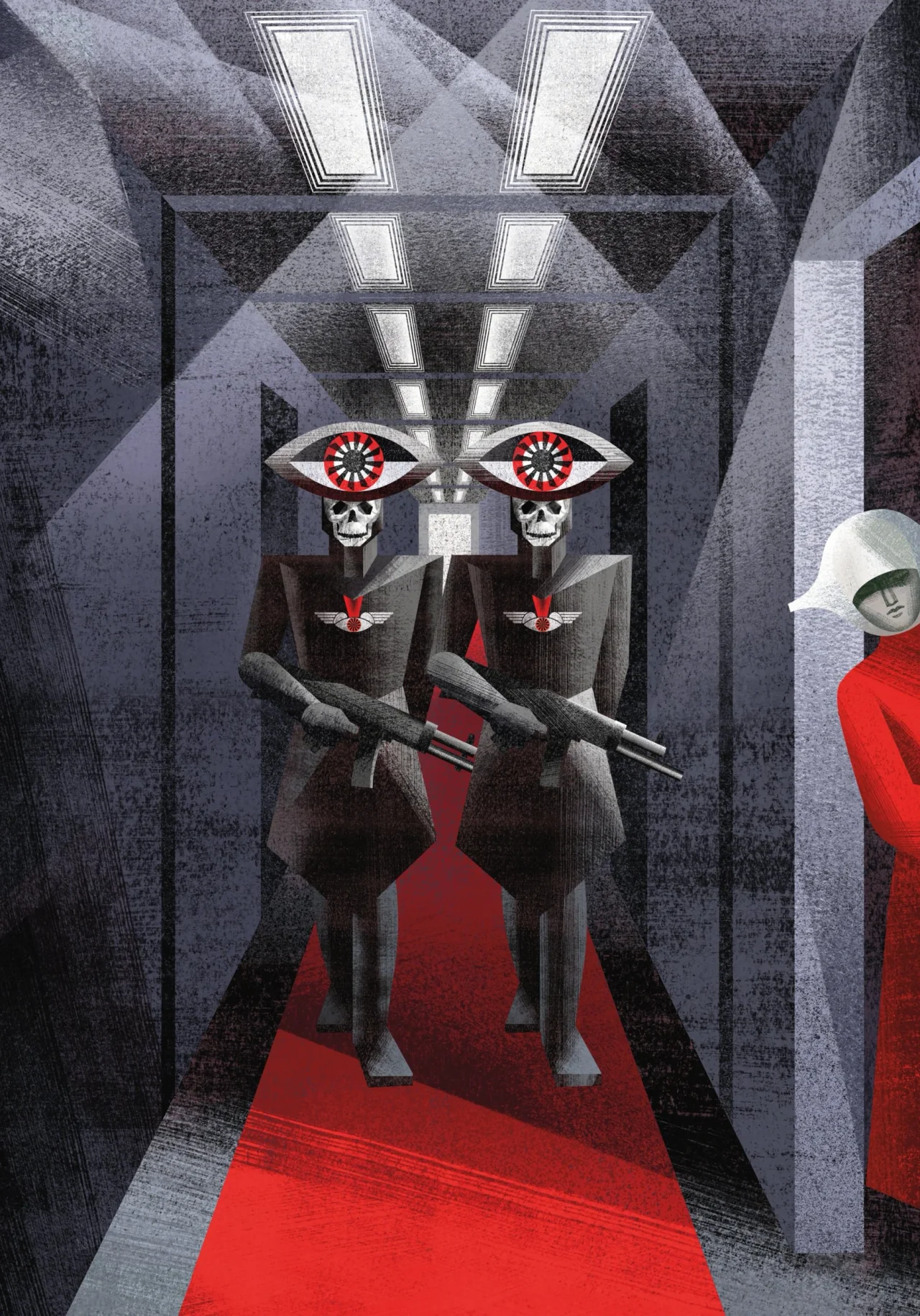
Two skeletal figures with striking red eyes wearing dark suits and holding rifles stand in a stark geometric corridor with a red carpet, flanked by figures in red robes
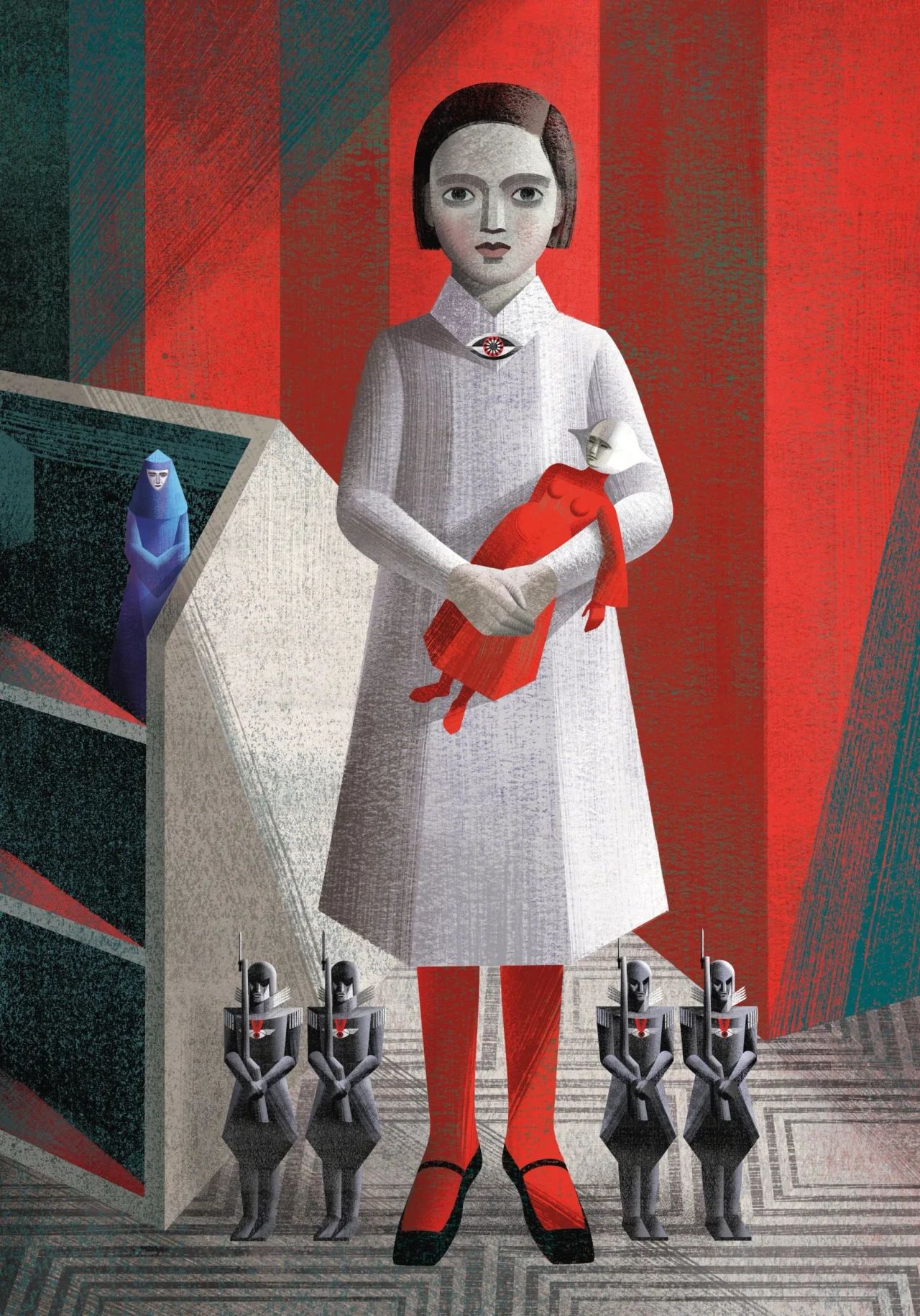
Illustrated figure of a young girl in white dress and red tights holding a red object, standing against striped red and teal background with smaller figures below, for The Handmaid's Tale
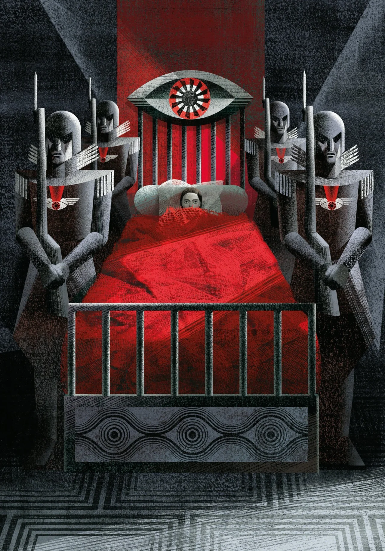
Surreal illustration featuring a figure in bed surrounded by stone guardians with an all-seeing eye looming above against red and grey tones

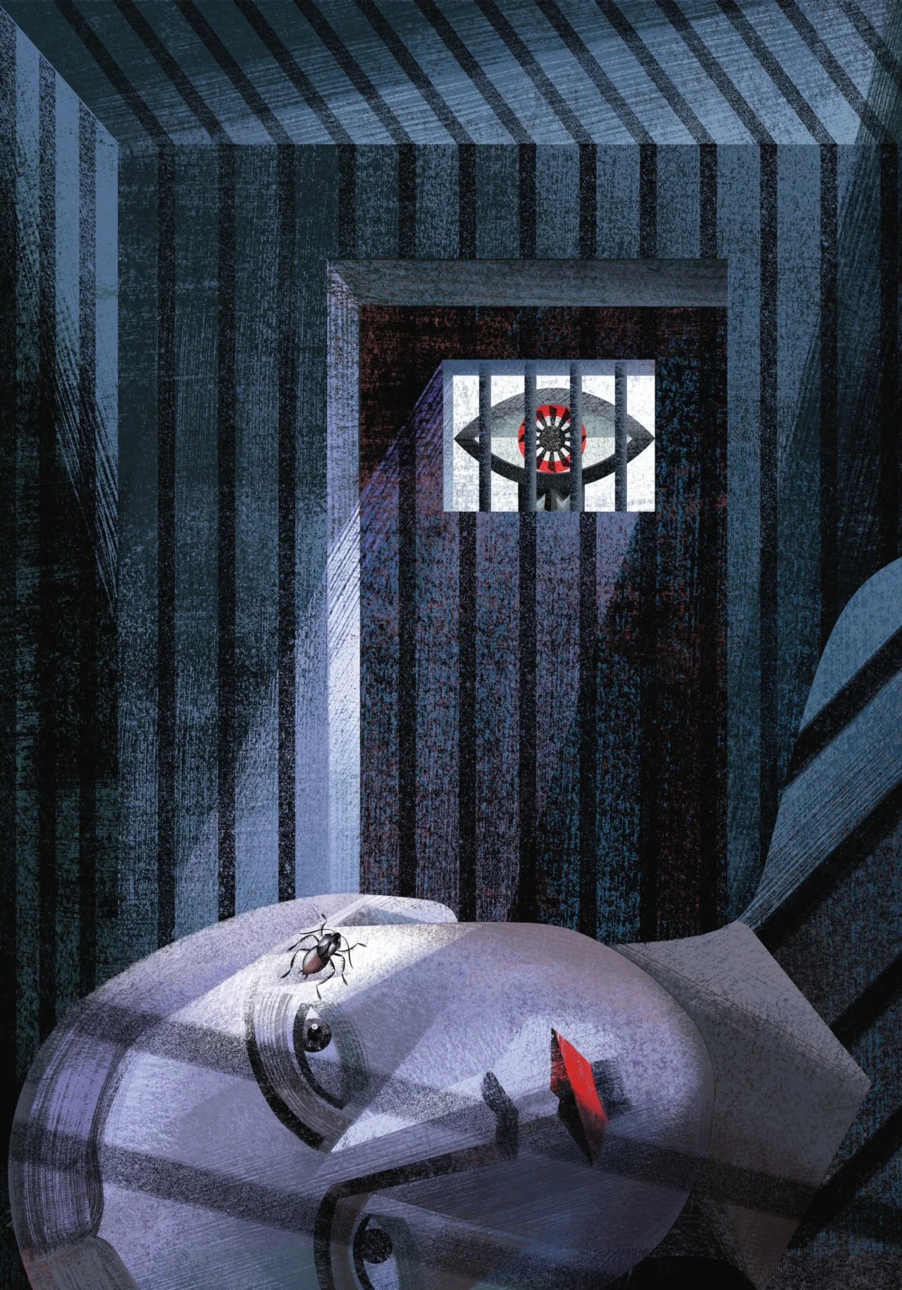
The Testaments, meanwhile, brought a new influence: "Surrealism, a component that was entirely absent from our first book. If the guiding thread of these new artworks for The Testaments could be distilled into a single word, it would be Nightmare."

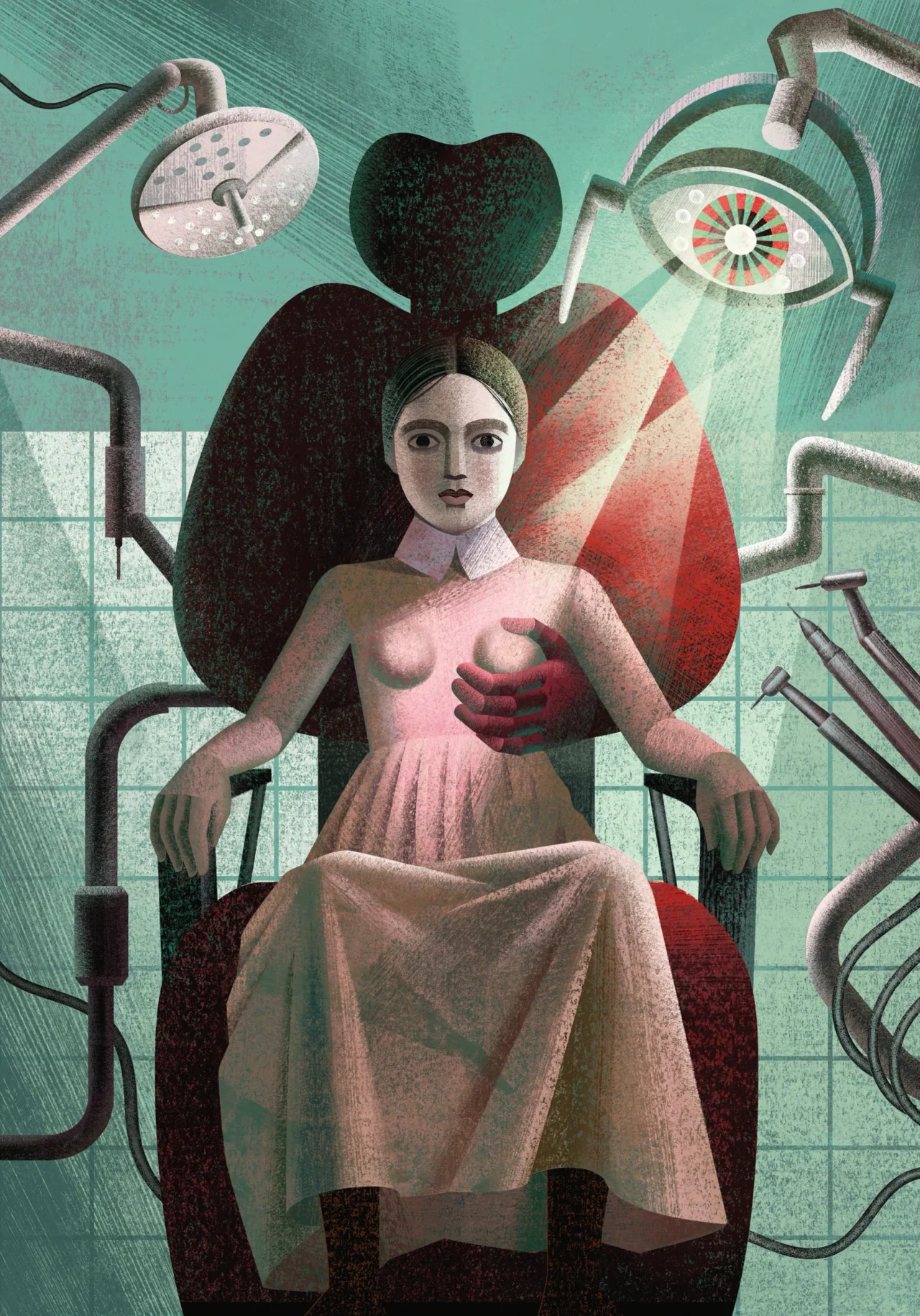
That surreal streak shows up in the new plates. A disembodied hand emerges from a dentist's chair, the sky fills with watchful eyes, and the guards known as the Eyes wear headgear shaped like a giant eye.

Avoiding shortcuts

The twins' technique combines traditional and digital methods, but they're scathing about anything that smacks of automation. "There are no shortcuts, no tricks and no virtual filters or ready-made brushes: only intense, time-consuming hard work, profound dedication, patience and care," they say.

Typically, that means using pencil, pen, watercolour, gouache and tempera, then bringing them together in Photoshop. They also spray acrylic onto paper and scan it to create gradients with a subtle analogue grain. "Each texture and brushstroke is created by hand on paper, then scanned and layered," they say. "The colour is built in depth, mimicking the texture of a traditional fresco where the physical depth of the raw pigments can be visually perceived."

A figure hunched in a confined striped space gazes through a barred window at a large eye symbol, with a spider crawling on their shoulder
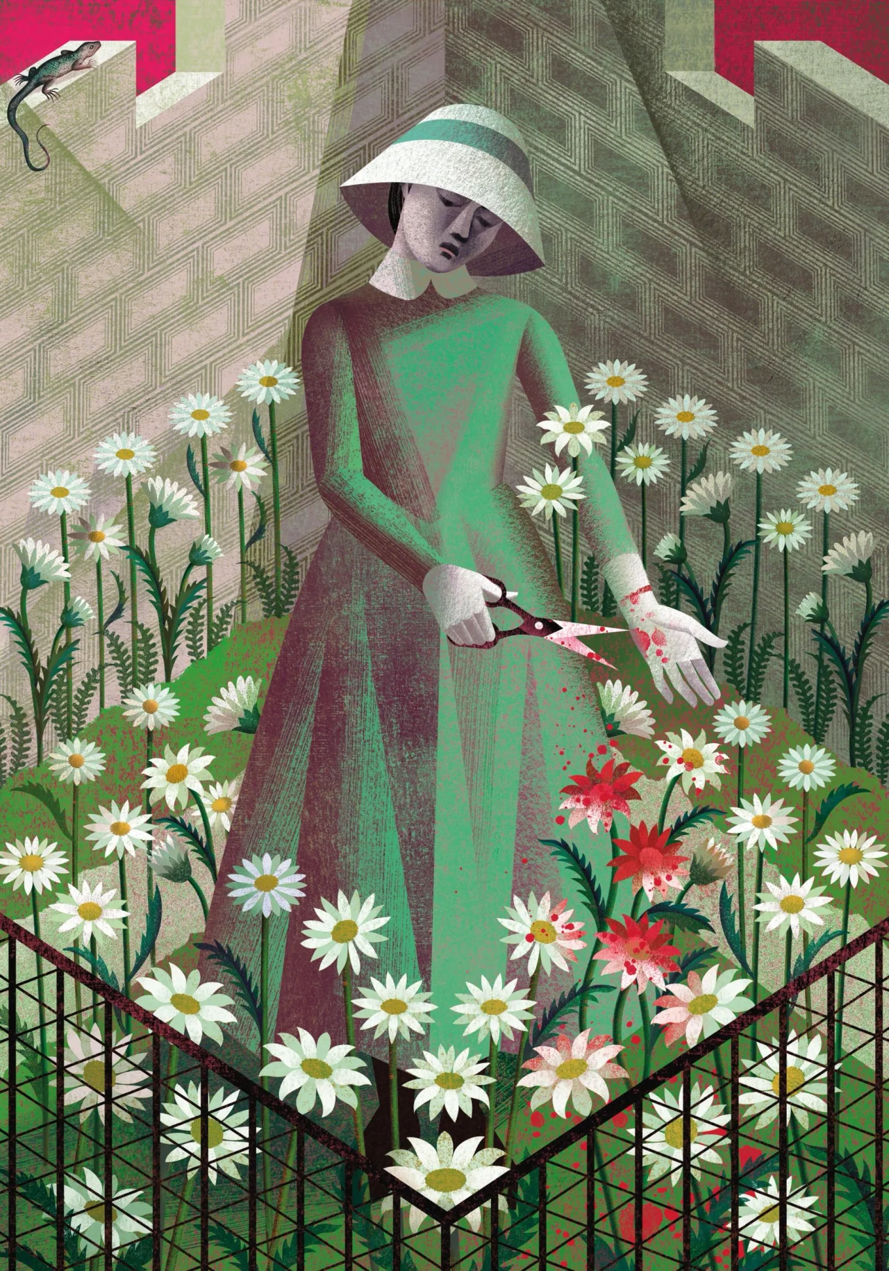
Figure in green dress and white hat deadheading white and red flowers among garden plants, with a lizard perched above
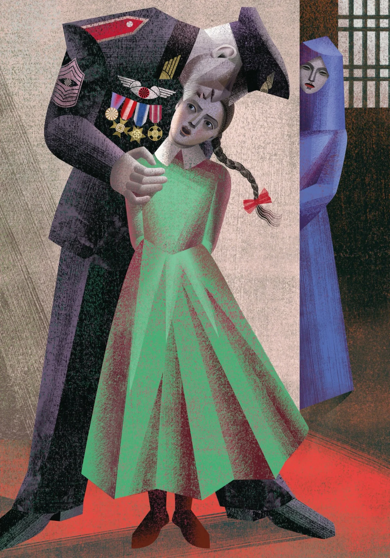
Authoritarian military figure in dark uniform with medals looming over a young woman in a green dress, whilst a woman in purple watches from the right

Colour carries much of the narrative weight. For the first book, the twins limited their palette to white, black, grey and red. "For us, colour is a living being; reducing the colour palette mirrors the totalitarian reduction of freedom of thought," they say.

For The Testaments, they've expanded this in line with Gilead's own rules: green for girls ready for marriage, grey for Pearl Girls and pink for schoolchildren. That colour-coding also shapes the minimalist, Constructivist-inspired slipcase and covers, where the green and grey of The Testaments act as a counterpoint to the Handmaid's Tale red.

Adding callbacks

Returning to a project after so long also gave the twins a chance to create visual callbacks. In the new frontispiece, the young Agnes holds a doll of a pregnant handmaid, an echo of their award-winning 2012 frontispiece, Pregnant.

"That powerful maternal figure now becomes a toy or fetish in the hands of her daughter, who evokes her biological mother Offred through the only facsimile allowed by the regime."

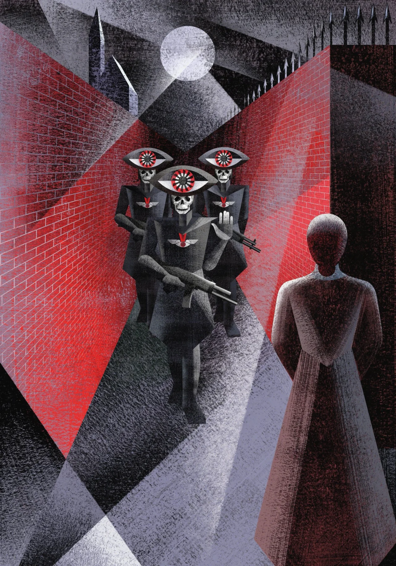
They also added a new ninth illustration to The Handmaid's Tale, showing the Eyes arriving to take Offred away. This mirrors the final plate of The Testaments, in which the same armed guards cross paths with the Aunt in the dead of night shortly before her arrest. "We established a direct, symmetrical dialogue with the closing illustration of The Testaments, anchoring the entire saga," they say.

Woman in pink dress seated in medical chair surrounded by surgical lights and dark shadowy figures against turquoise background, illustration for The Testaments by the Balbusso Twins
Stylised illustration of figures in red and black uniforms with large eye symbols on their heads, standing before an aircraft, with patterned eyes repeated across the sky above
A figure in a red-brick corridor confronts three dark-robed figures with ornate eye symbols on their faces, beneath a full moon and spiked architecture, in the Balbusso Twins' illustration for The Handmaid's Tale and The Testaments

Margaret Atwood has made her approval clear, writing in her introduction: "It's fitting that the illustrations in this Folio edition echo both the feel and the colour palette of the thirties and forties, the age of the rise of the major dictatorships."

Collector's piece

The finished edition is limited to 750 copies, each hand-signed by the twins. With suitable theatrical flourish, these were printed by Venice's oldest book printer, then taken out of the city by gondola to be bound in leather by Graphicom. The publication also features a foreword by British writer Naomi Alderman, author of The Power, another modern classic of speculative fiction.

For the twins, this project offered the opportunity to show that illustrators needn't be pigeonholed. "We are not artists confined to so-called 'female' genres," they say. "We tackle any literary text without boundaries."

TomΓ‘Ε‘ Brousil on how to choose typefaces that work in the real world

The founder of Prague's Suitcase Type Foundry shares his four best tips for selecting the right fonts for your projects.

Every company that designs typefaces wants to show them off in the best light. And I have to admit, writing articles about typography for Creative Boom, I'm all in favour of that. Everyone likes a bit of eye candy, right?

The danger, however, comes when people get too distracted by the eye candy and ignore the fundamentals. That's something that TomΓ‘Ε‘ Brousil, who's run Suitcase Type Foundry single-handedly in Prague since 2003, is keen to point out.

"A mockup is just an attractive simulation in which the designers present their typeface under ideal conditions," he notes. "It's like an advertising photograph of a hamburger, where all the ingredients are carefully crammed onto the side facing the camera. After two bites, you'd be left chewing on an empty bun. To exaggerate a little, all you really learn about the typeface is that it has a few attractive characters."

Crabath Collection printed marketing materials fanned out, displaying coral-coloured crown logo and typography on cream and pink backgrounds
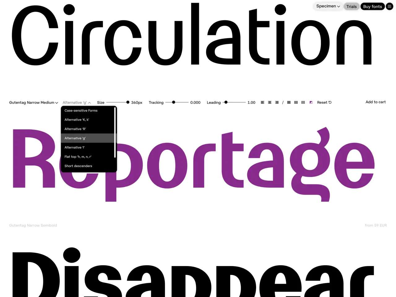
Circulation and Reportage typeface names displayed in purple and black with a dropdown menu showing alternative weights and styles
Gallery of diverse brand applications showcasing fonts in real-world use, including ALOK, Kvadrat Headline, Harvestica and Lagerhaus branding examples

That's why the new Suitcase website goes in a very different direction. Featuring both the foundry's 50 retail families and its custom work, it focuses less on colourful mockups than on serious tools: interactive font testers, a growing collection of real-world Fonts in Use, editorial features and simplified licensing.

Now the hope is that more designers will be able to benefit from Suitcase's vast experience in crafting typefaces that work as hard in a footnote as they do in a headline.

So what has that experience taught TomΓ‘Ε‘ about choosing type that will hold up in the real world? It's a topic all designers need to consider, so I was keen to discover his thoughts. Thankfully, he was very forthcoming…

1. Look for systems, not size

TomΓ‘Ε‘'s first tip is to think in terms of systems rather than numbers. "For me, a type system isn't simply a large family with lots of styles," TomΓ‘Ε‘ explains. "What's important is that its individual components have clearly defined roles and can be meaningfully combined."

Icona Sans and Icona Serif typefaces displaying uppercase and lowercase letters with select characters highlighted in cyan and coral to demonstrate design features
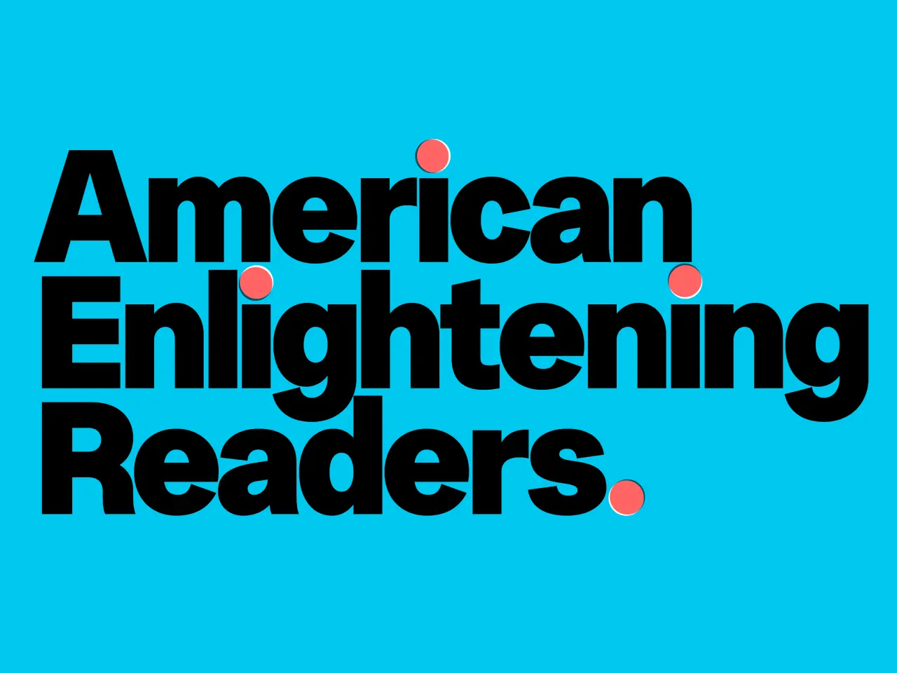
Bold black sans-serif text reading "American Enlightening Readers" with red circular accents on a bright turquoise background
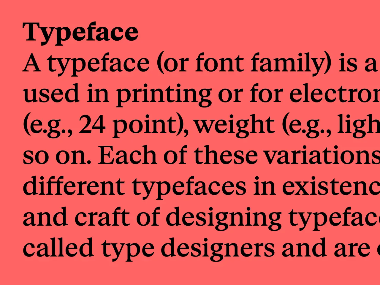
Definition of typeface displayed on coral background, explaining font families and their variations in size, weight and style
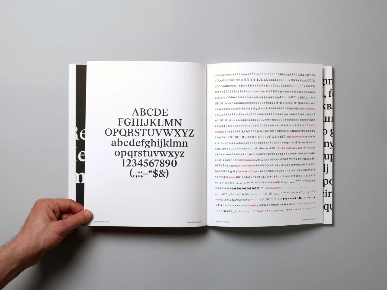
An open book displaying a typeface specimen with uppercase and lowercase letters, numerals and special characters on the left page, and dense text samples on the right page, held open by a hand against a white background

So how can you tell if they do? "I'd start by evaluating the typeface at different sizes," he explains. "You have to consider how it will function across an entire typographic hierarchy: headlines, subheadings, body text, captions and navigation. A specimen usually presents ideal conditions, but a good type family has to work not only in an attractive demonstration, but also in the least glamorous situations."

2. Be details-oriented

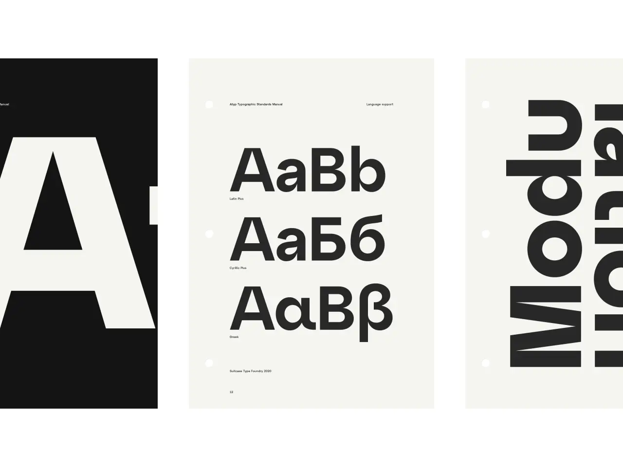
TomΓ‘Ε‘ also urges you to pay attention to the smallest details: figures, currency symbols, small caps, tabular figures, language support. "Will I be setting foreign names? Will the client be operating in international markets?" he asks.

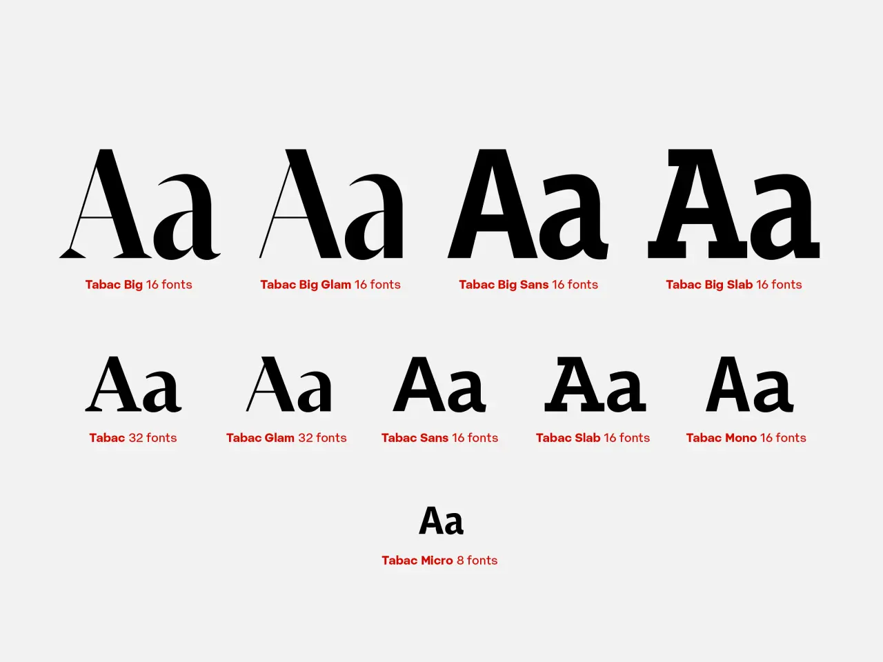
That's why Suitcase offers both basic trial fonts for quick layout tests, then full trials with the complete character set and OpenType features. Tabac, which TomΓ‘Ε‘ has developed from a diploma project to a full-scale superfamily over 10 years, shows what this looks like in practice. One thing he's learned is that the most practically valuable additions aren't necessarily the most visually obvious ones.

Nine variations of the Tabac typeface family displayed in different weights and styles, ranging from thin to bold, with labels indicating font counts for each version
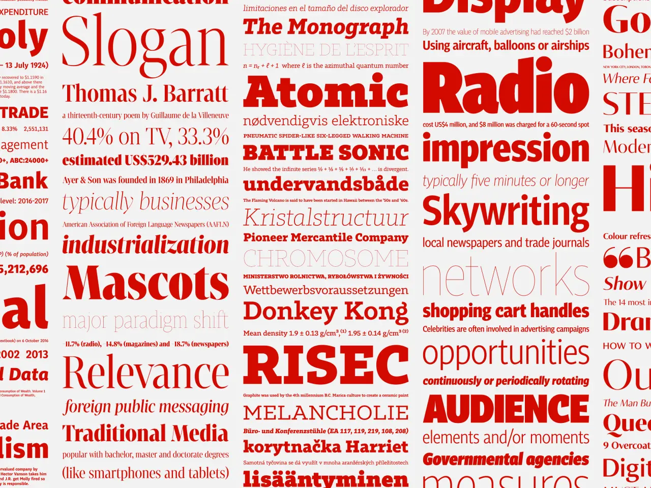
A collage of red text and typography terms including Atomic Radio, Battle Sonic, Skywriting, RISEC, Donkey Kong, Audience and Mascots on a white background
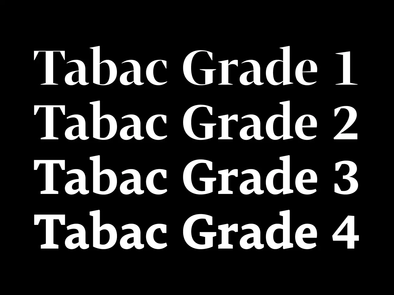
White text on black background showing four typography grades labelled Tabac Grade 1 through Grade 4
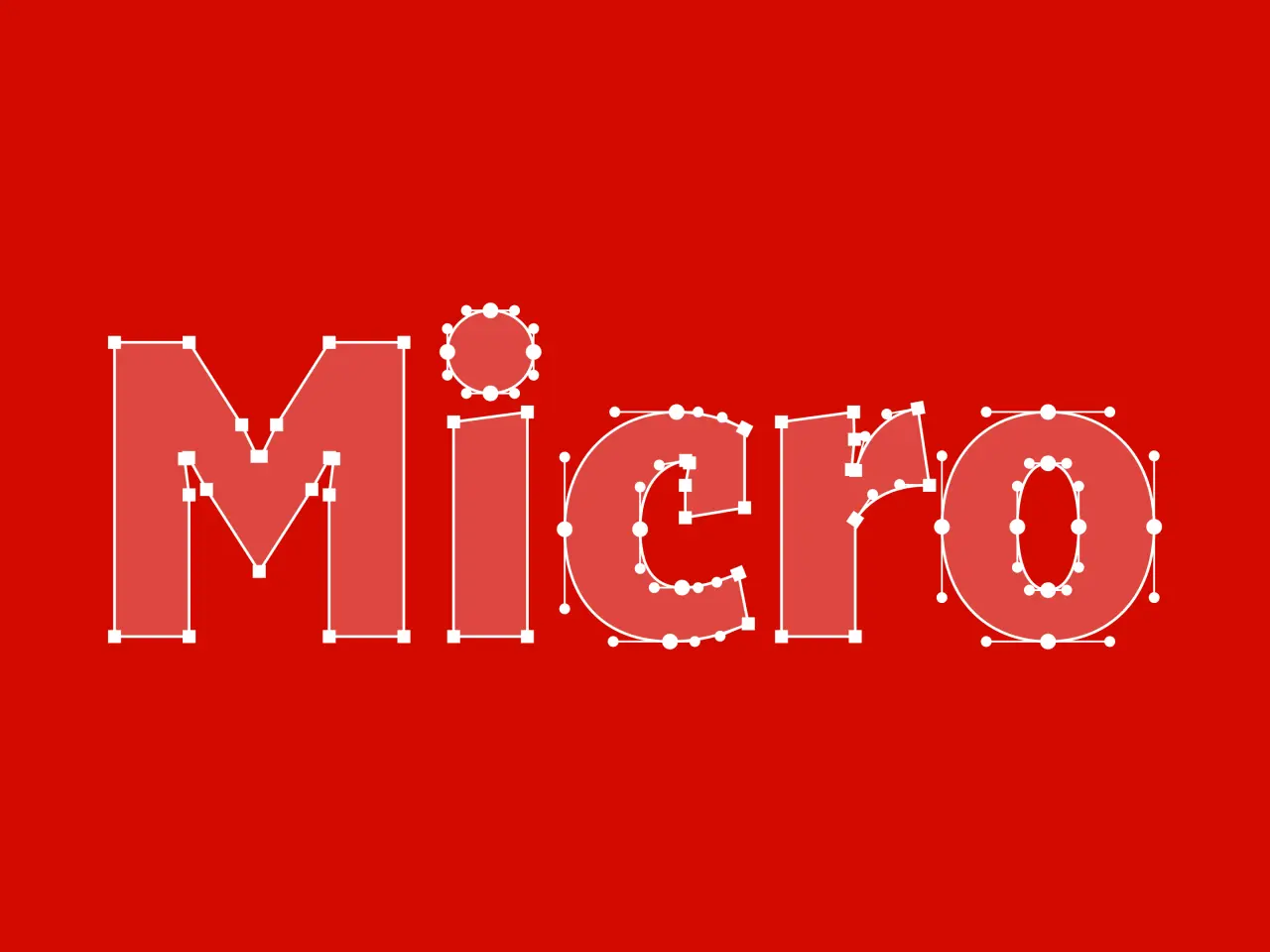
The word "Micro" outlined in white dots and lines forming a geometric typeface design on a red background

"One of the greatest benefits is certainly the range of optical grades in the original Tabac serif family," he begins. "By adjusting the thickness of the secondary strokes, you can adapt the contrast to different sizes, papers, or printing technologies without changing the character widths and, consequently, the line breaks."

The Tabac Big display families also play an important role. "Their extreme contrast, shortened terminals, large x-height, and compact construction make it possible to create headlines with a completely different visual character from the basic text styles." At the opposite end of the spectrum is Tabac Micro. Its larger x-height, more generous spacing, emphasised punctuation, ink traps and slightly condensed characters all help keep footnotes and other small text legible.

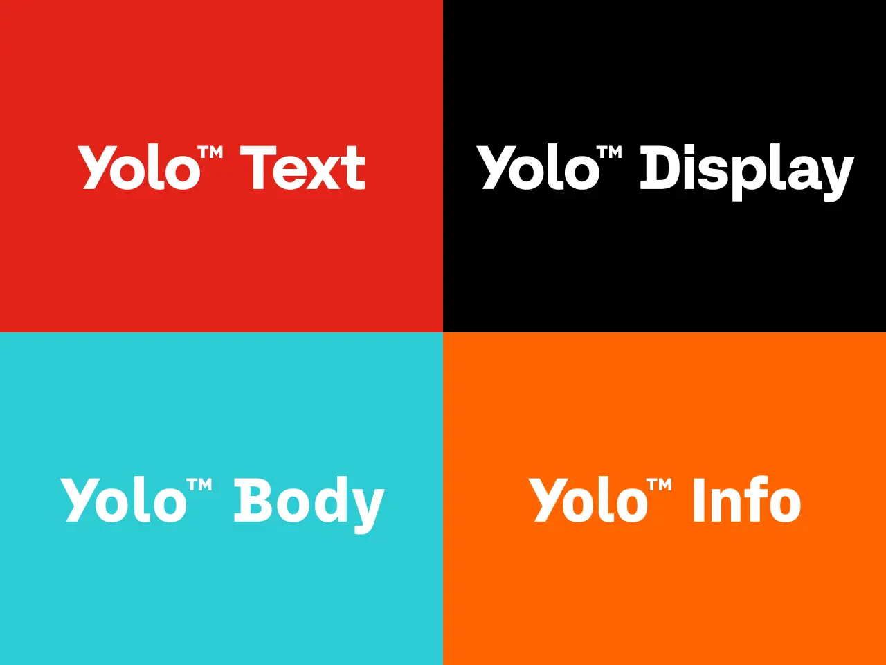
Four coloured panels showing Yolo Text, Yolo Display, Yolo Body and Yolo Info typeface families from Suitcase Type Foundry
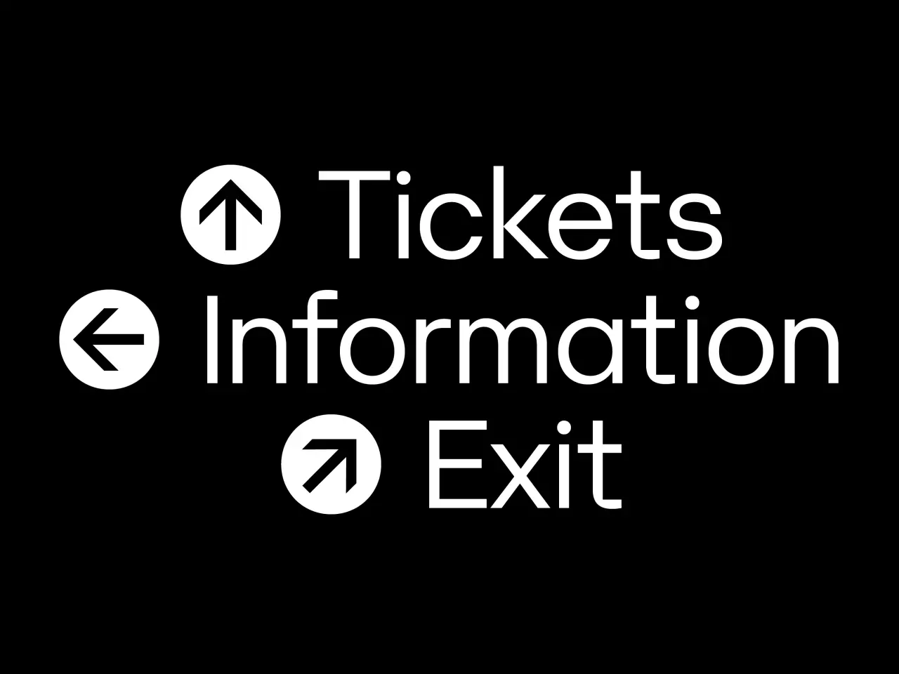
Wayfinding signage showing directional symbols and text for Tickets, Information and Exit against a black background
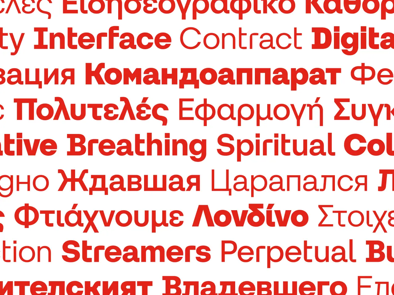
Multilayered text in various languages and typefaces demonstrating font selection and typographic variety in red and grey tones

"A graphic designer doesn't have to create hierarchy simply by changing size or weight," TomΓ‘Ε‘ notes. "They can combine different type classifications without losing the publication's overall visual coherence."

3. Custom type isn't always the answer

The idea that "you get what you pay for" is a handy maxim across most areas of life. And so you'd expect TomΓ‘Ε‘ to say that, if you can afford it, custom type is always the way to go. Not least because Suitcase makes exactly that for clients ranging from Morgan Stanley and Electronic Arts to the Czech Republic.

But actually, his approach is surprisingly balanced. "A retail typeface is often the most sensible choice," he believes. "A well-designed, extensive family can cover practically all of a brand's needs. It's also finished, tested and ready to use. There's no reason to commission a custom typeface simply because a company can afford one."

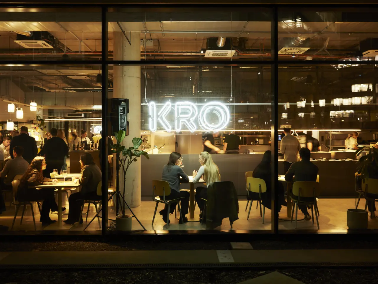
A good example can be seen in one of Suitcase's recent projects: the visual identity for KRO, a growing network of bistros, cafΓ©s, and a bakery in Prague.

KRO neon sign glowing inside a contemporary restaurant with diners seated at tables by large windows at night
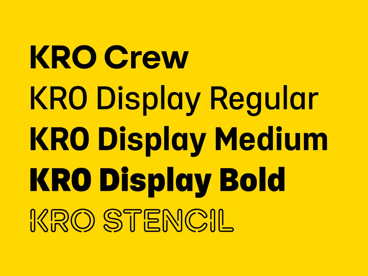
KRO typeface family displayed in five weights and styles on a bright yellow background, showing Crew, Display Regular, Display Medium, Display Bold and Stencil variants
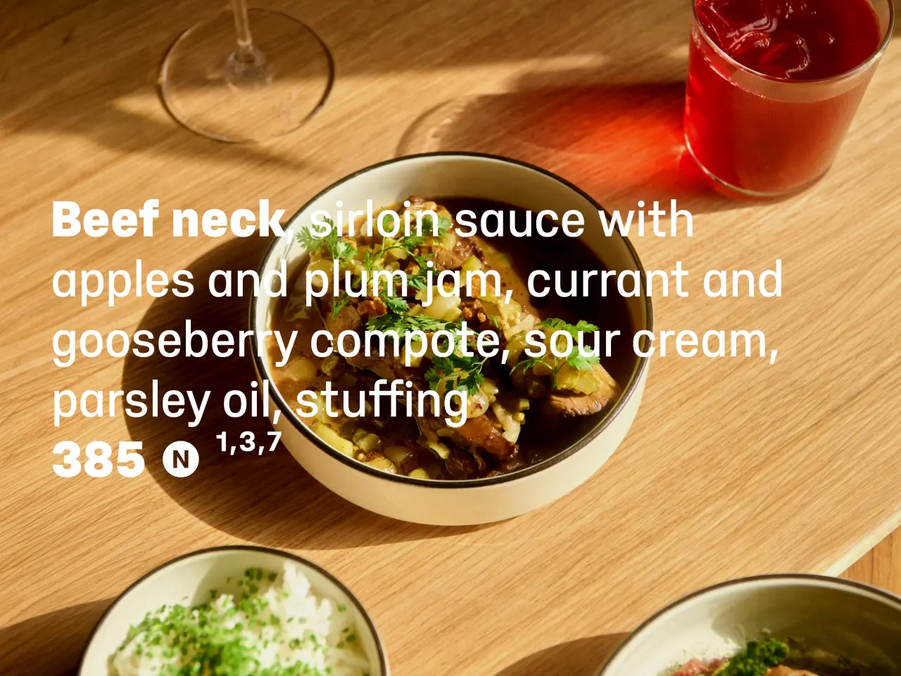
Beef neck in rich sauce with apples and plum jam, served on a wooden table with a glass and red drink beside it
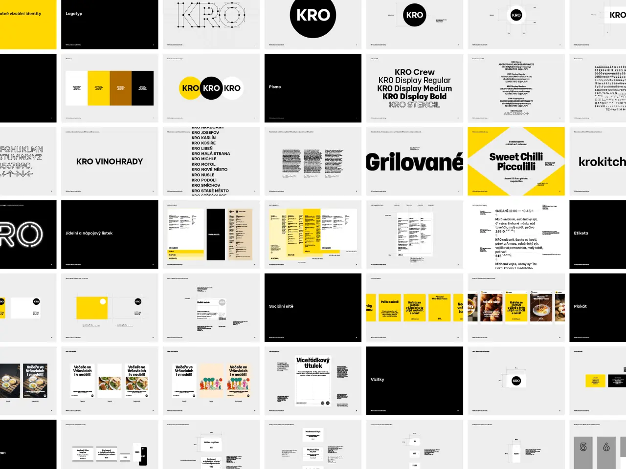
Grid of graphic design mockups and type samples from Suitcase Type Foundry's website, featuring various fonts, logos and branding applications in black, white and yellow

The foundation of that system lay in three custom-modified typefaces based on TomΓ‘Ε‘'s Yolo family. "KRO Crew was developed for the logotype and headlines, with adjusted proportions, contrast, and several distinctive characters," he explains. "KRO Display was designed primarily for food and drinks menus." But perhaps the most interesting development was the third typeface, KRO Stencil.

"Originally, this was simply a technical modification of three letters for producing a neon logotype," says TomΓ‘Ε‘. "But the eventual construction had such a distinctive character that we expanded it into a complete set of uppercase letters, figures, arrows, and pictograms. Today, it's used for wayfinding, signage, and physical applications."

For TomΓ‘Ε‘, it's the way these typefaces were continuously adapted to the needs of the business that's key. "I think that's precisely what makes a good custom project," he says. "Not simply creating something distinctive, but designing a solution that will continue to work in everyday practice over the long term."

4. Avoid these common mistakes

We'll wrap up with a few of the most common mistakes designers make when it comes to type selection. "I think one is choosing a typeface purely for its visual character, without thoroughly checking its technical and typographic capabilities," says TomΓ‘Ε‘.

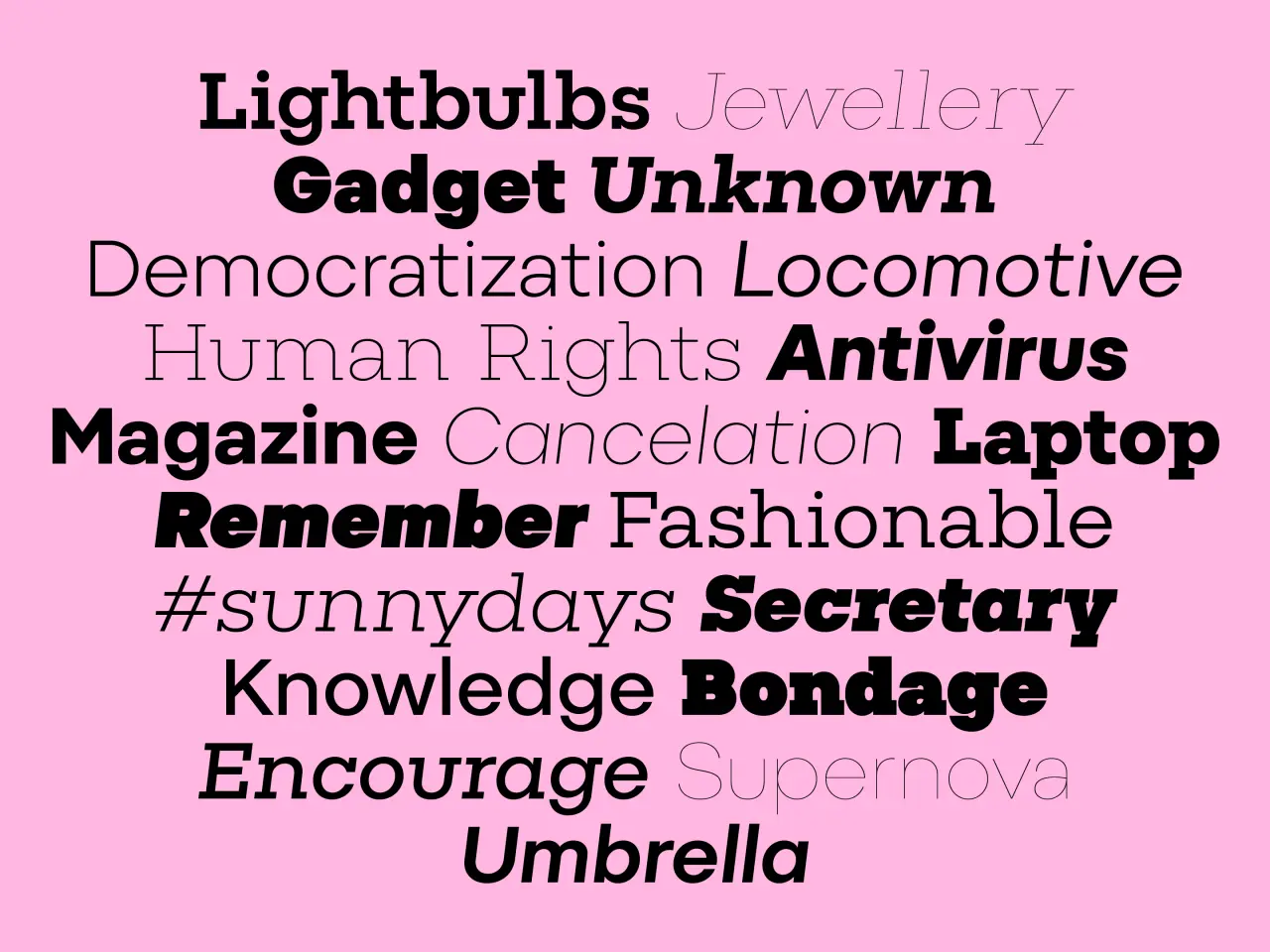
Pink background with words in various typefaces and sizes demonstrating font diversity, including Lightbulbs, Jewellery, Gadget Unknown, Democratization, Locomotive and Antivirus
Three pages from Suitcase Type Foundry's website displaying typeface specimens and typography samples in minimalist black and white design
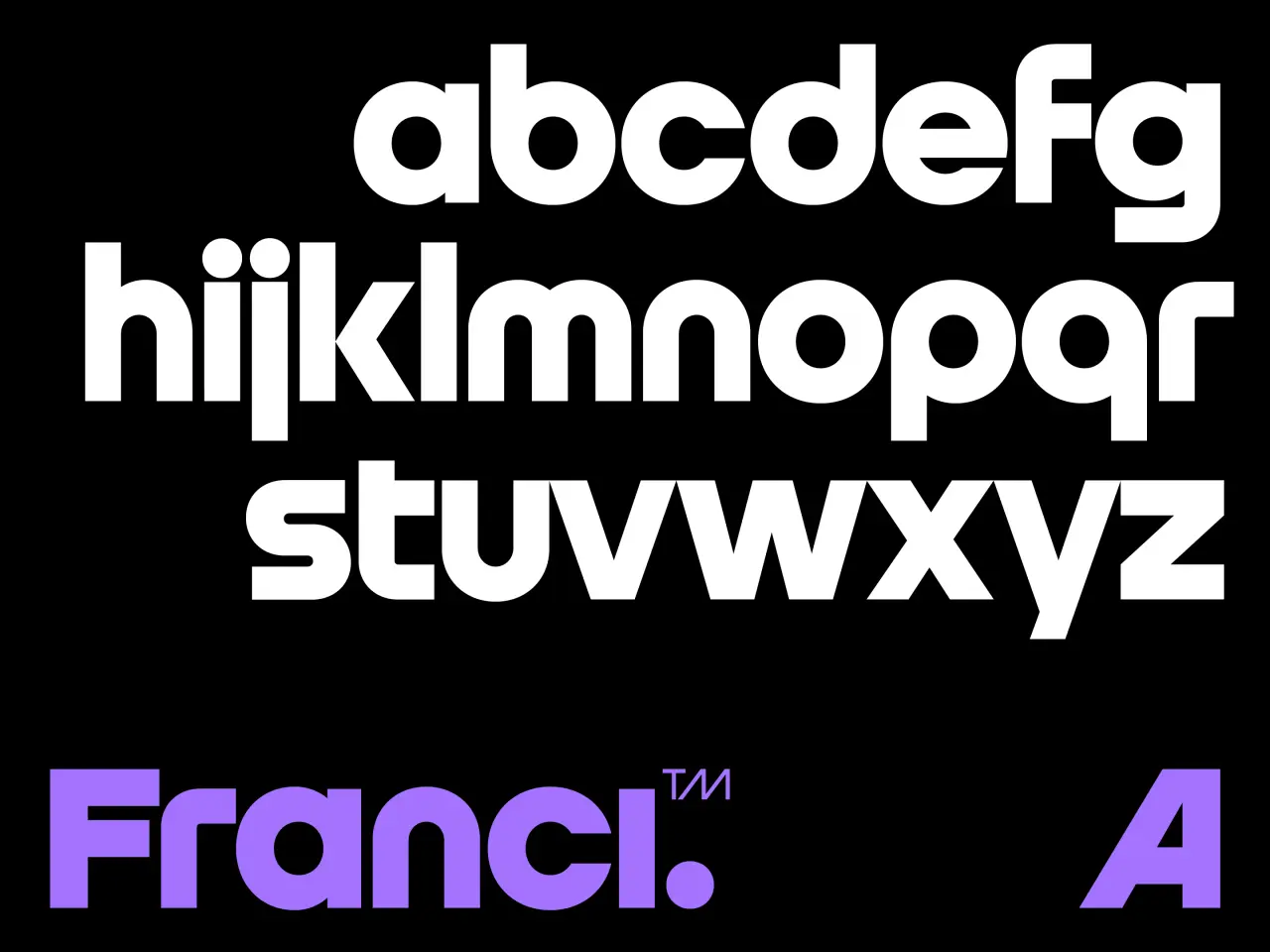
Complete lowercase and uppercase alphabet of Franci typeface in white and purple on black background

When it comes to using typefaces, he's sometimes disappointed to see optical sizes or OpenType features being overlooked: for example, alternate characters that could offer a better solution in a particular situation.

"And as for licensing, there will probably always be some confusion or misunderstandings when choosing the appropriate licence," he adds. "I imagine every type foundry encounters this. Clearer licensing terms, a comprehensive FAQ, and personally answering customer questions all help reduce these mistakes."

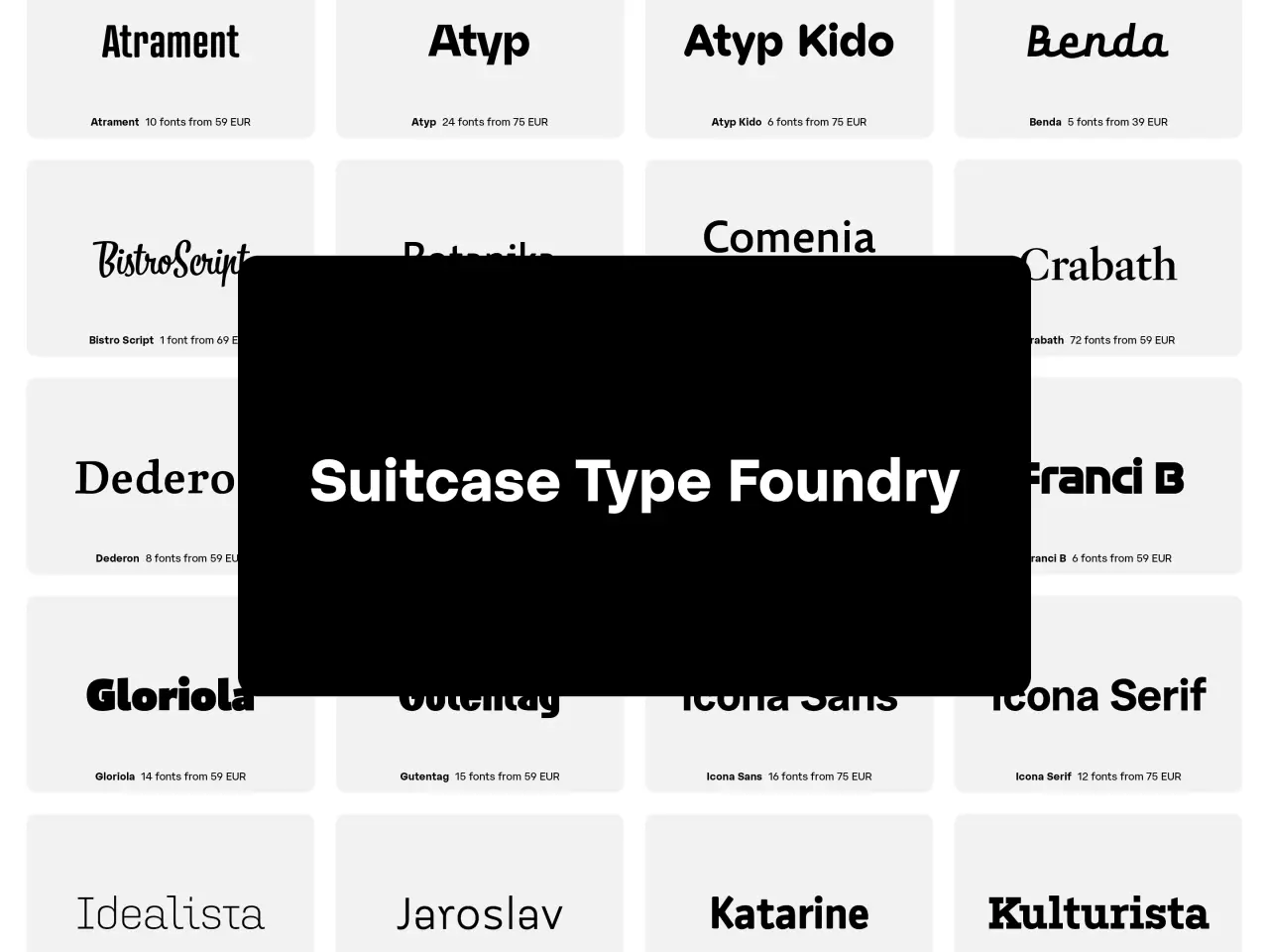
Grid displaying typeface samples from Suitcase Type Foundry including Atrament, Atyp, Atyp Kido, Benda, Bistro Script, Comenia, Grabath, Dedero, Grand B, Gloriola, Gutenbag, Icona Sans, Icona Serif, Idealista, Jaroslav and Katarine fonts

Andstudio on the challenges of building a global studio from Lithuania

As the Vilnius agency celebrates its 10th birthday, co-founder Augustinas PaukΕ‘tΔ— discusses transforming a local firm into an international player.

Ten years ago, two designers in Vilnius, Augustinas PaukΕ‘tΔ— and Doman MikΕ‘ys, launched Andstudio with no clients and no plan. Today, they have 14 people on staff, a client list including Ikea, NordVPN and the Berlin character design festival Pictoplasma, whose new identity we covered last month. In 2025, Andstudio was ranked the number one design firm in the ADC Europe ranking by The One Club.

Here, Augustinas looks back on what he's learned along the way: from going undercover as a student to moving his entire team to Florence.

Long and winding road

It's been quite a journey so far. Augustinas co-launched Andstudio shortly after graduating. Before then, he'd spent his summers interning at advertising agencies, as this was more or less the only place to get creative experience in Lithuania at the time.

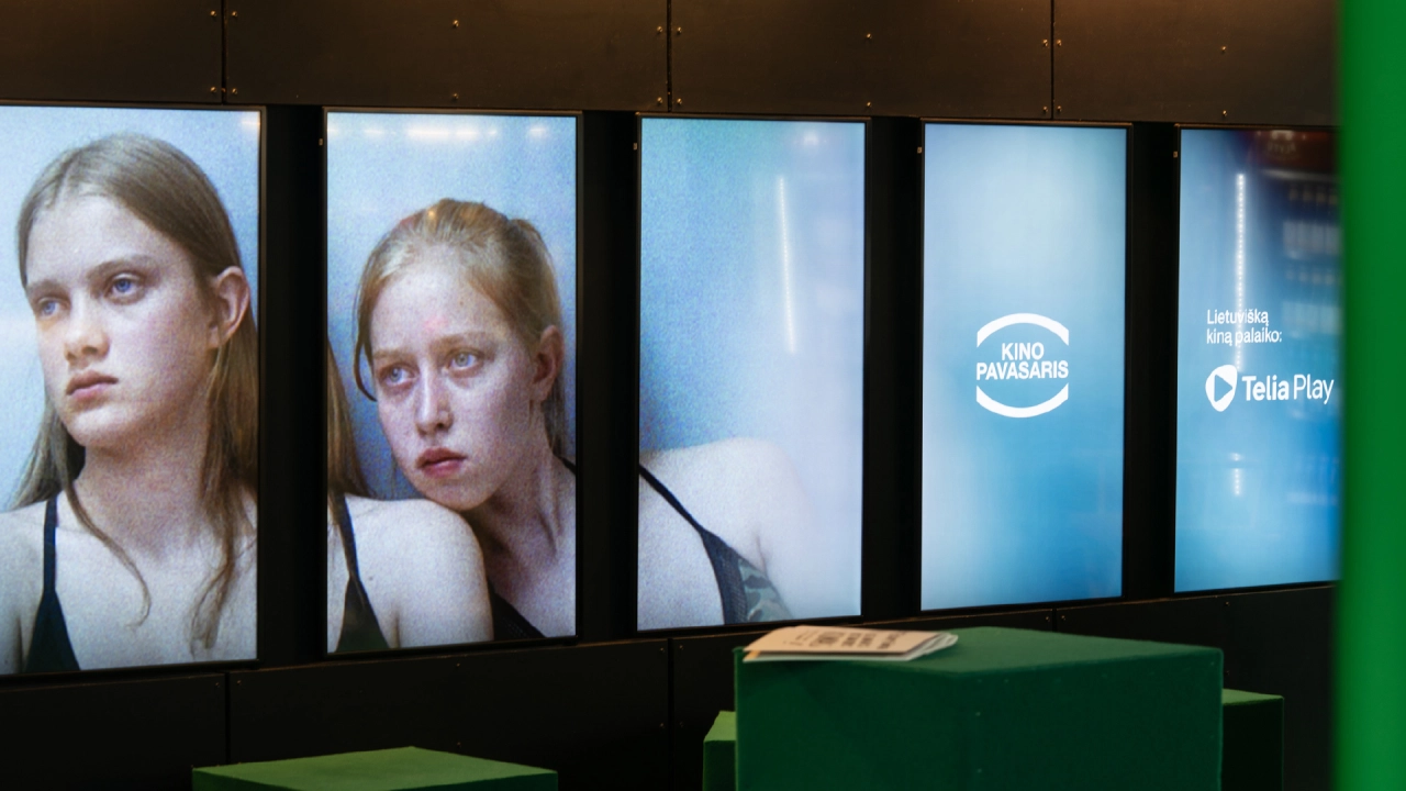
Large display panels showing portraits of two young women and Kino Pavasaris and Telia Play branding
Kino Pavasaris
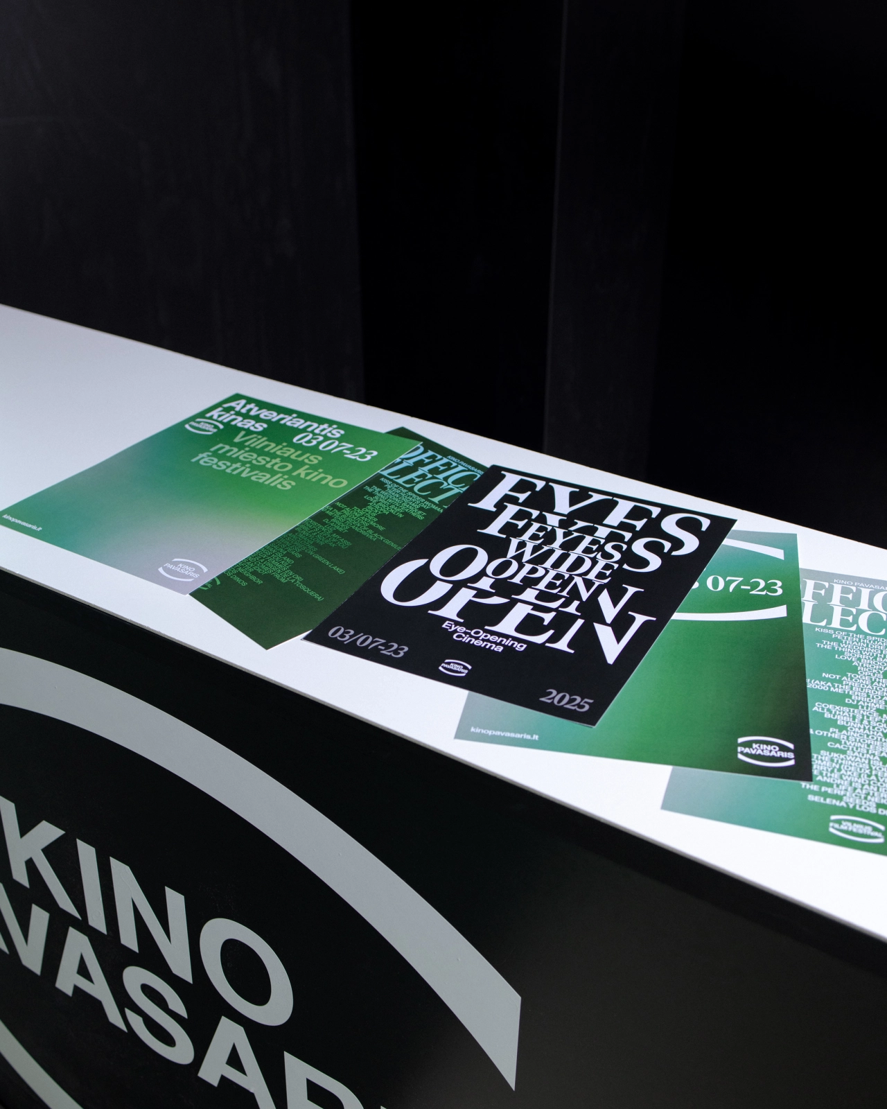
Printed promotional materials for Eyes Wide Open festival displayed on a white surface, featuring green and black design with white typography and dates 07-23
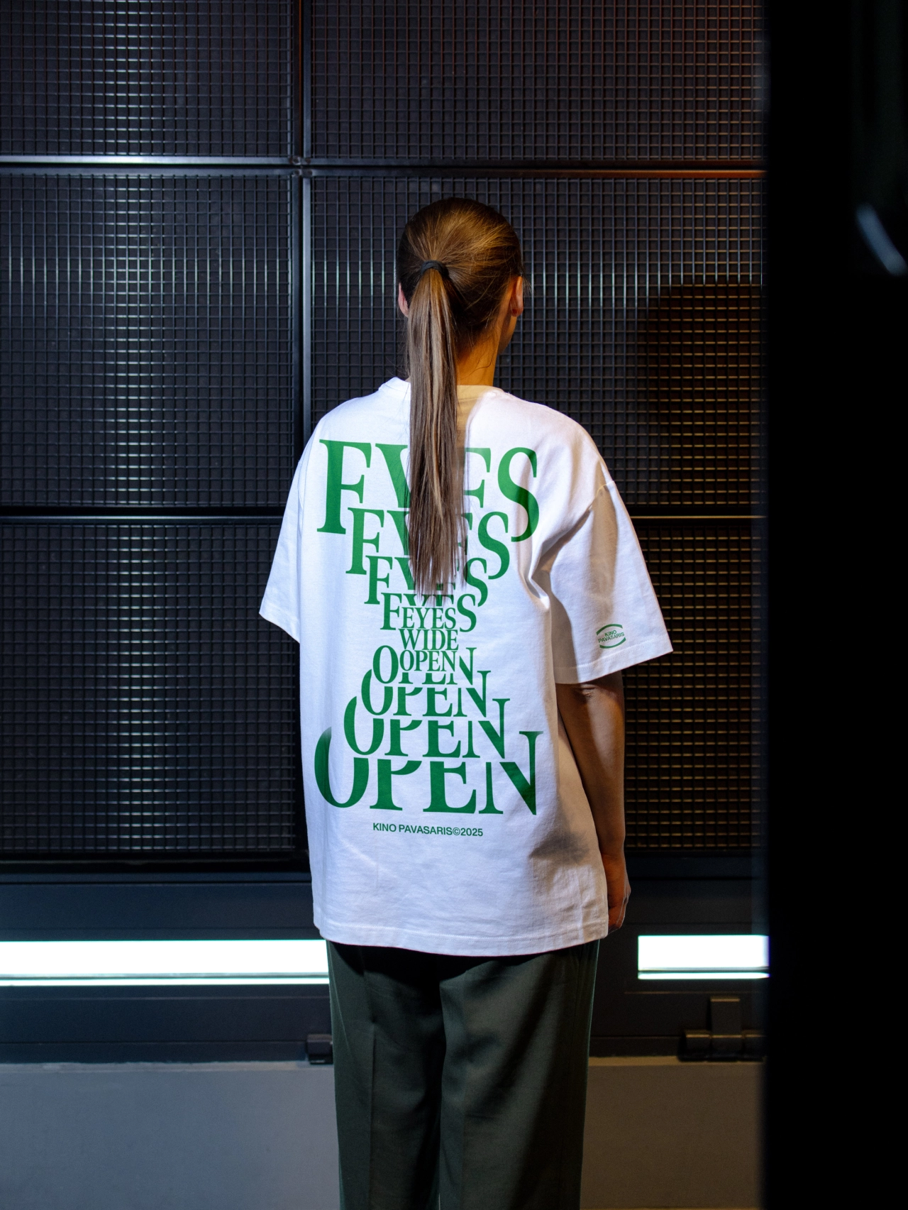
Person wearing white t-shirt with green "Eyes Wide Open" text printed on back, standing in front of dark textured wall panels

In those early agency jobs, Augustinas says, good design wasn't always the priority. "Copywriters and art directors led the conversation, and designers executed," he explains.

"If I did it again today," he reflects, "I think I would first go to work in a real branding studio, to see how it works from the inside. But there's also a big advantage to starting early. When you are young, you don't have much to lose."

Gap in the market

Timing is also important when starting a new business. At that time, Augustinas believed there was a clear gap in the market.

"The Lithuanian scene at that time had two extremes," he explains. "Small, radical studios did culturally exciting work but made almost no money. Big agencies made money with the biggest clients in the country, but the work was not so interesting."

Augustinas wanted something in the middle: a small studio focused on craft, but one that could also solve business problems. "So we tried to bring the model of the studios we admired to Lithuania," he says. "Not the look of their work, but their way of working: strategy first, respect for craft and a studio culture built around branding and design."

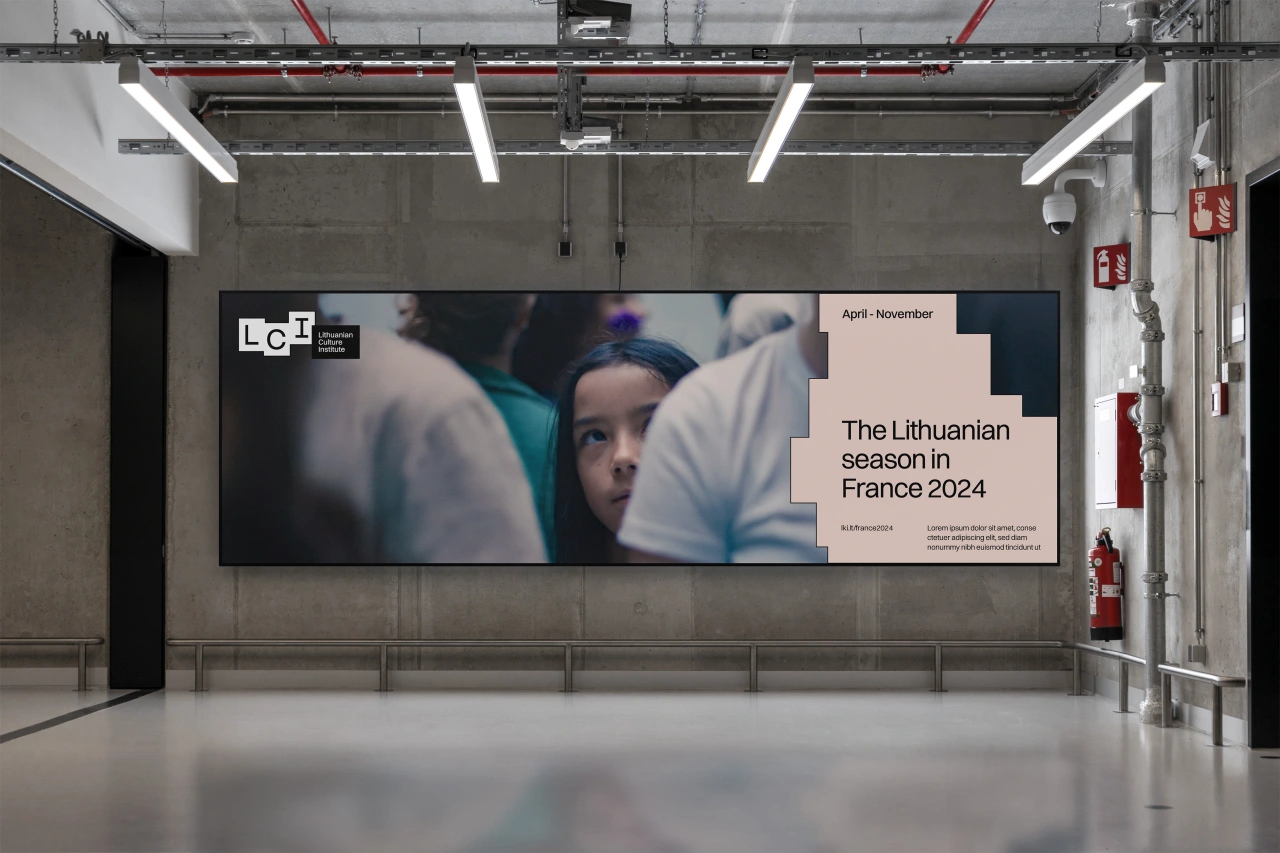
Large display screen in an industrial gallery space showing a child's face and text reading "The Lithuanian season in France 2024
Lithuanian Culture Institute
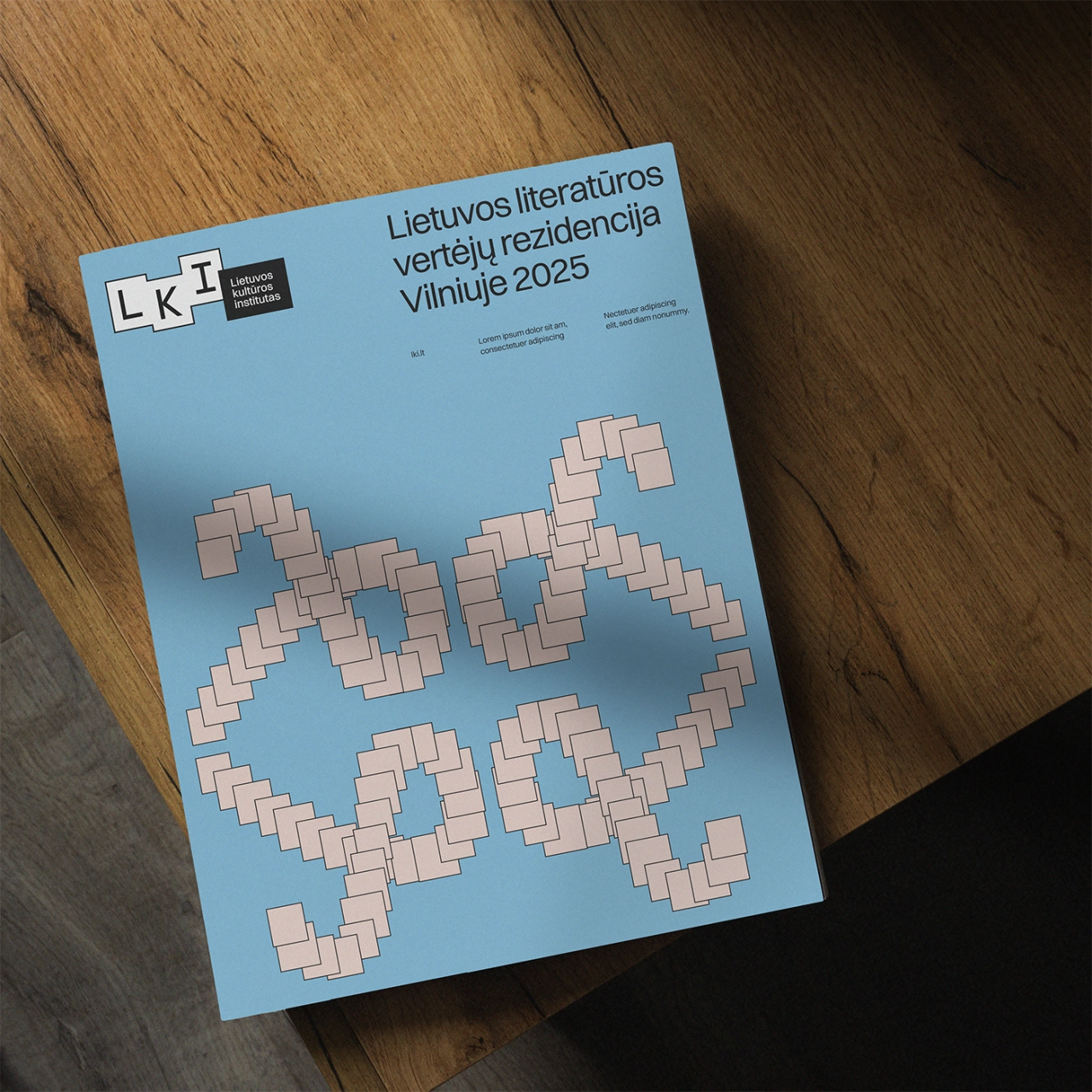
Blue cover for Lithuanian Literature Prize 2025 residency programme featuring pixelated text design in pink and beige tones

One of their first projects was for SMK University College, Lithuania's largest private higher education institution by student numbers. Inspired by how DesignStudio's team had travelled and experienced Airbnb's service before redesigning the brand, they came up with a lower-budget version of the same approach.

"We went undercover as students," says Augustinas. "For one week we attended classes, spent time with other students and experienced the college from the inside, instead of only listening to what the client told us."

Lessons from the tech world

Lithuania's tech founders offered another lesson. "We're a very ambitious country," Augustinas stresses. "Companies like Vinted, NordVPN and Oxylabs never wanted to be the best Lithuanian company in their category. They wanted to compete with everyone in the world. And because their benchmark was global, they didn't see each other as enemies. Founders met, shared information, talked openly about their mistakes and helped each other grow."

Unfortunately, he says, the advertising and design community in the country took the opposite route. "Everyone was competing with each other: who won which local award, who got which client," Augustinas bemoans. "If your only benchmark is the same 20 people you see at every event, you start measuring yourself inside a very small room. And you stop sharing."

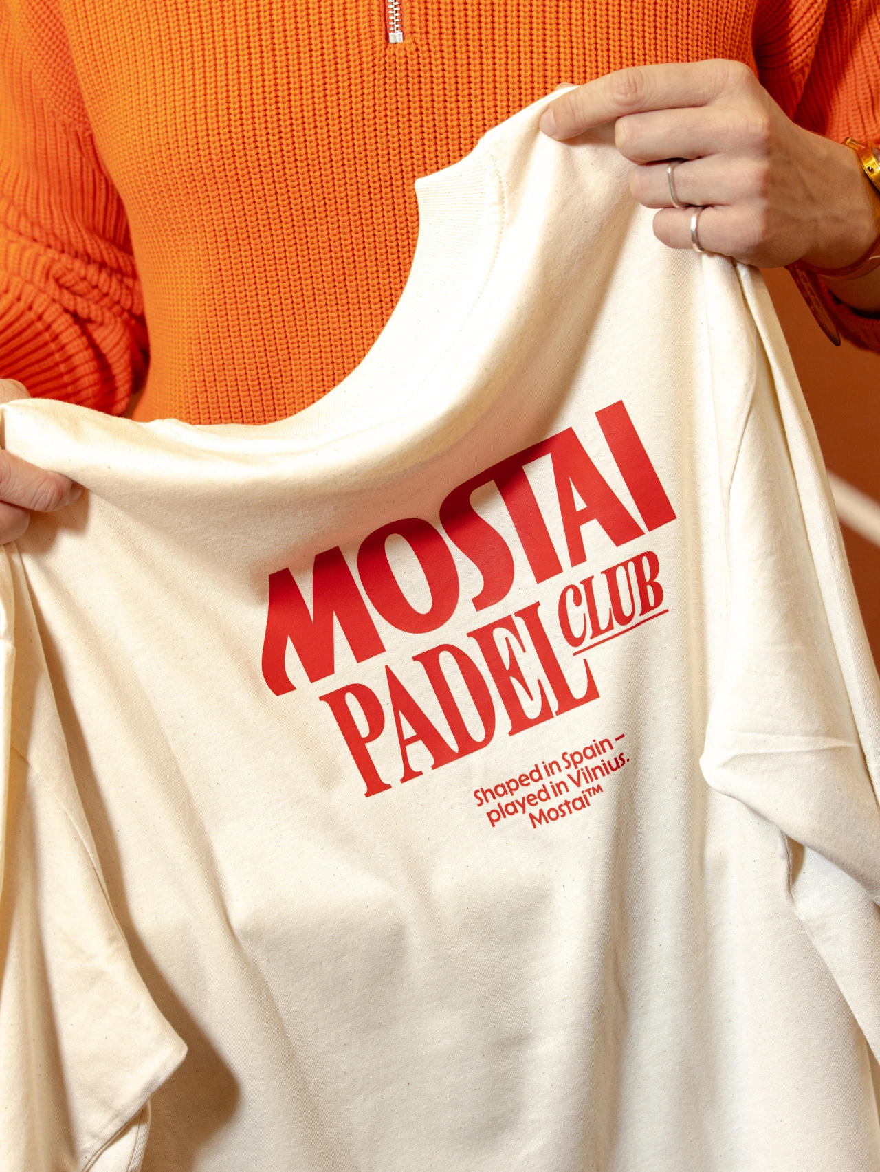
Person in orange jumper holding a cream-coloured t-shirt with red Mostai Padel Club branding and text about the club being based in Spain and played in Vilnius
Mostai Padel Club
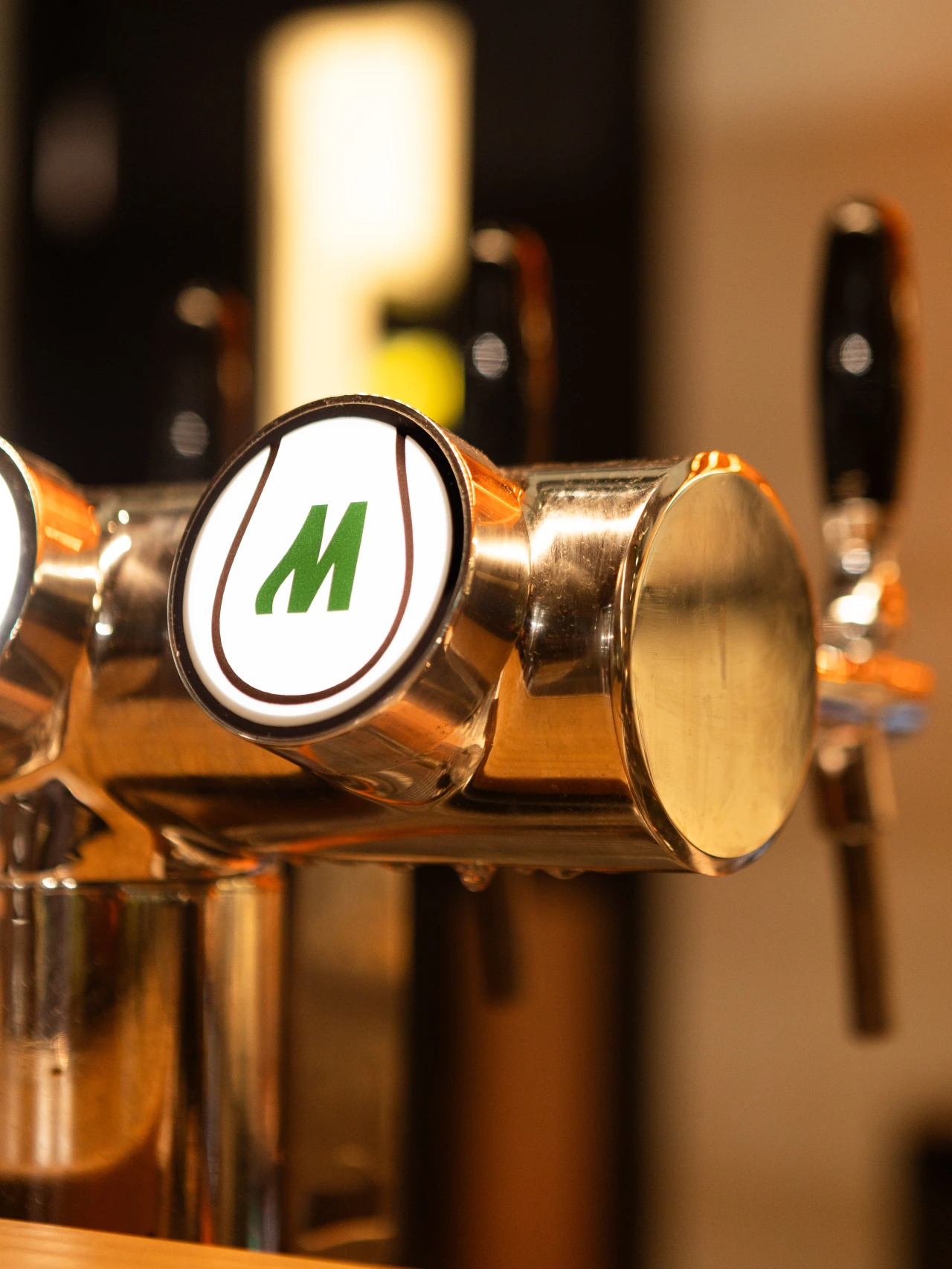
Close-up of a polished metal tap or pump handle with a circular badge featuring a green M logo, part of Andstudio's branding
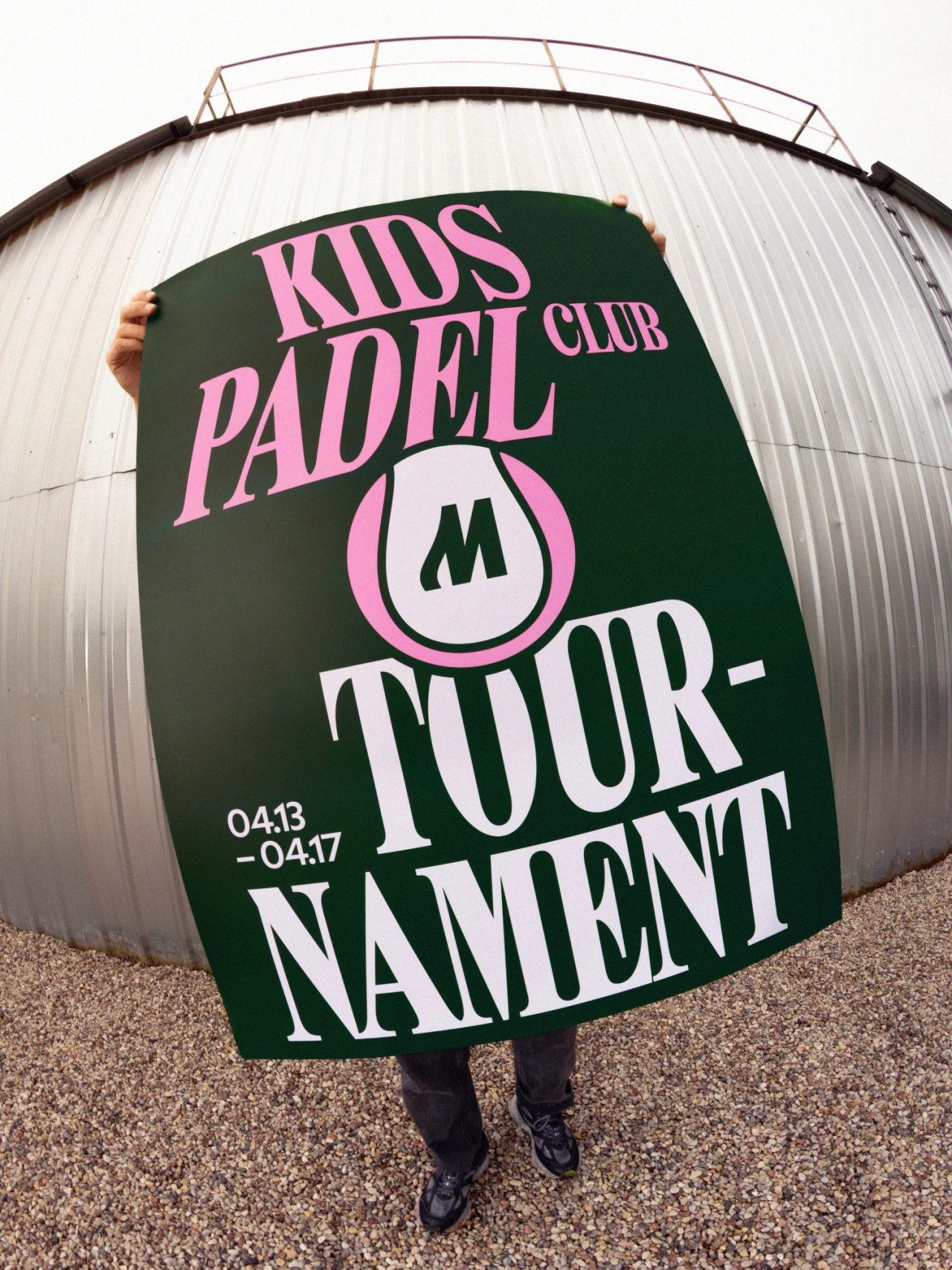
Person holding a green banner with pink and white text reading "Kids Padel Club M Tournament" dated 04.13–04.17, standing in front of a curved white corrugated building
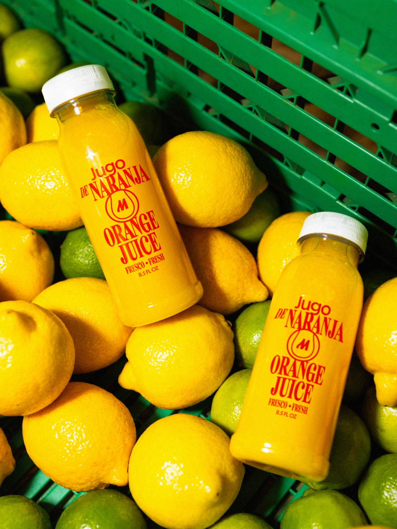
Two bottles of Jugo de Naranja orange juice with white caps surrounded by fresh lemons and limes in a green crate

Thankfully, he adds, those attitudes have changed over the last 10 years. But at the time, Andstudio was going against the grain by looking outside its borders. "We started sending our work to international blogs, to people who had no reason to care that it came from Vilnius. Sometimes they liked it. Slowly our work became international online, long before we had international clients."

Then they started something called Studio Exchange. "We sent invitations to design studios around Europe, and Studio Muttnik from Florence answered," explains Augustinas. "For two weeks we swapped: our whole studio moved to Florence and worked there on our own projects, while Muttnik worked from our studio in Vilnius."

Not a project but a feeling

"Florence felt very different from Vilnius," Augustinas says. "It is much more cultural. Everything felt more authentic and more crafty, like the city itself. The biggest thing we brought back was not a project. It was a feeling. We felt more free. When you take the whole team out of its usual office and routine, you see that many rules you follow every day are only habits.

Three instances of the Pictoplasma logo featuring two white circles above purple text on a bright magenta background
Pictoplasma
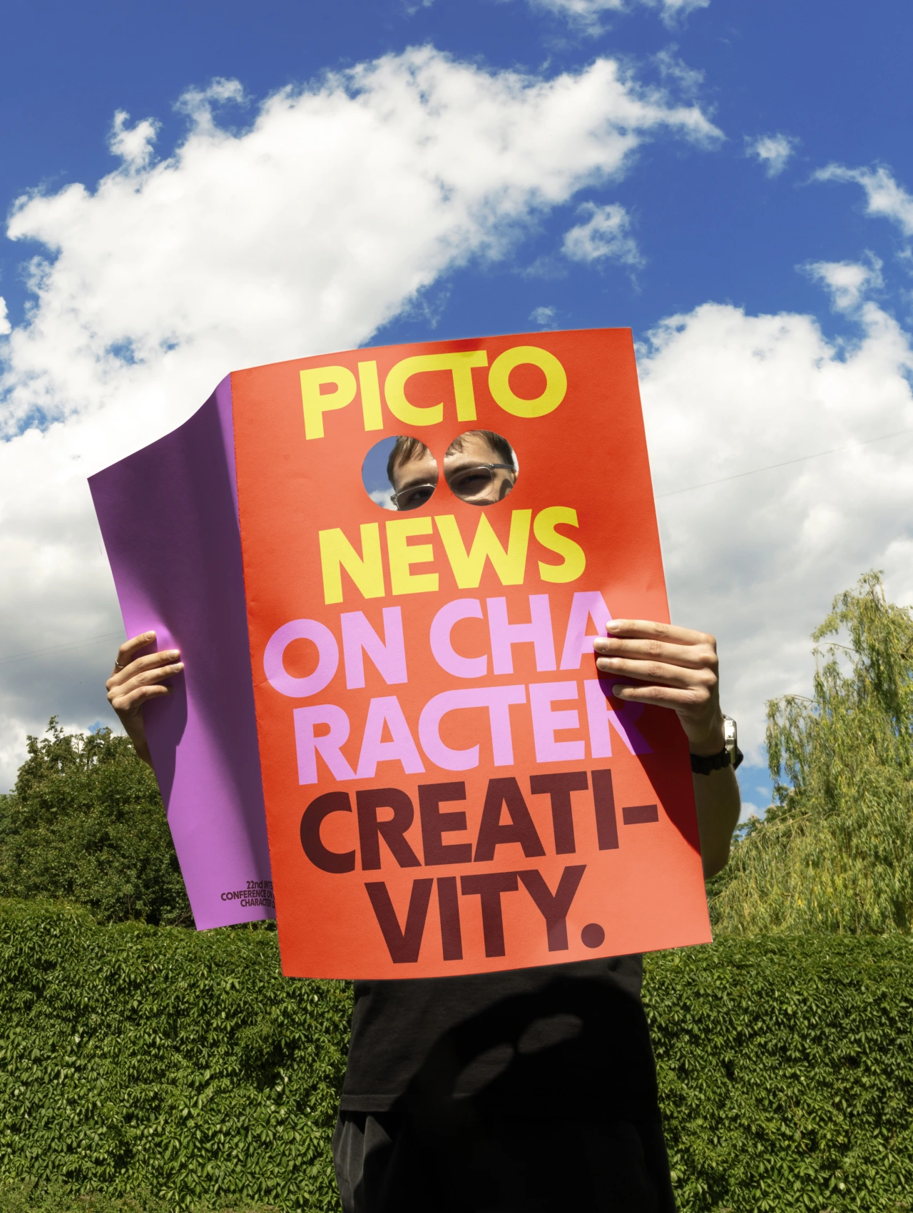
Person holding a colourful Pictoplasma poster featuring sunglasses and text about character design and creativity against a blue sky and green hedges
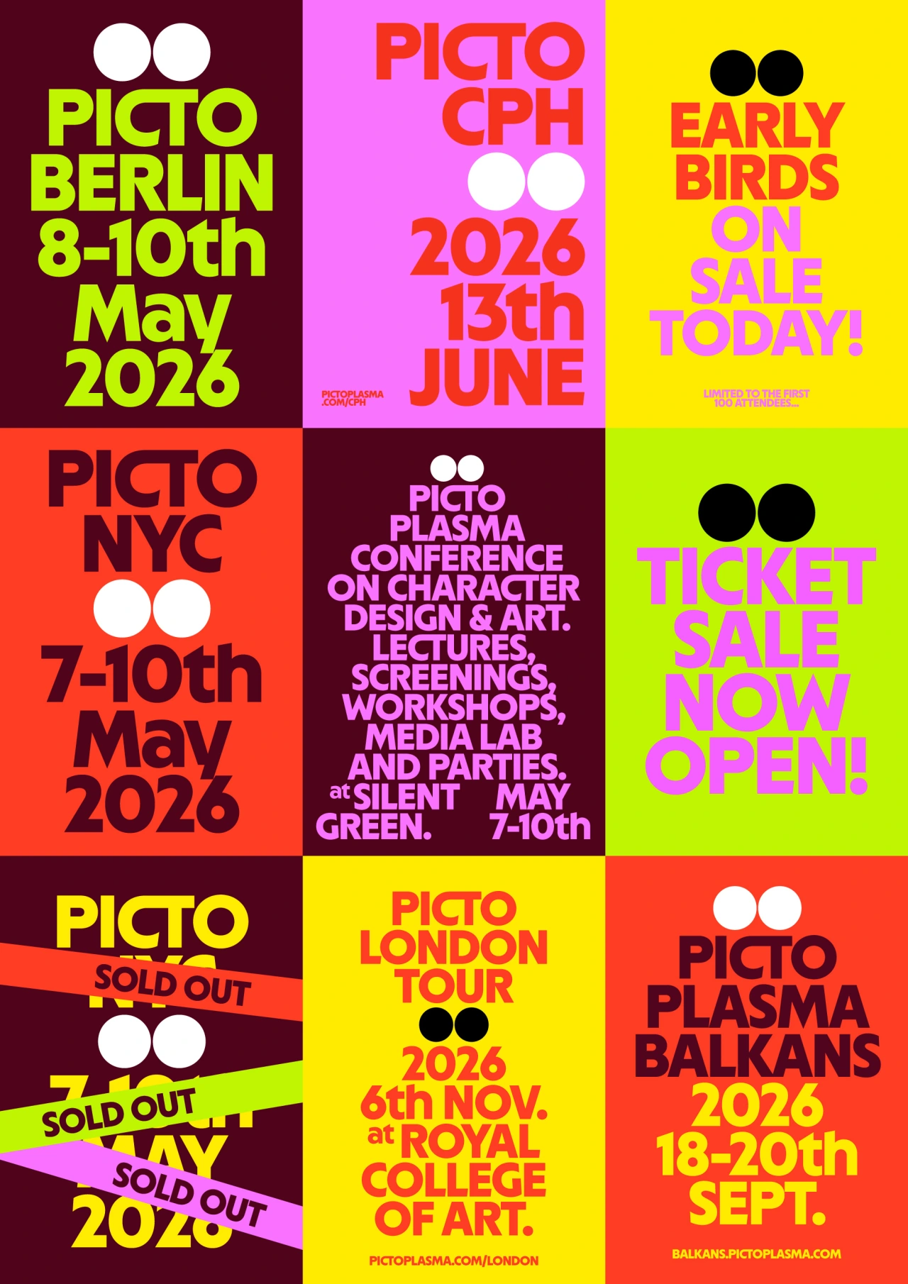
A grid of nine coloured squares showcasing Pictoplasma festival posters and event announcements with bold typography and two circular dots as the logo, featuring dates and locations for Berlin, Copenhagen, New York, London and Balkans events in 2026

Unfortunately, COVID and Russia's invasion of Ukraine brought Studio Exchange to a halt. But this year, it's returned in a new form called Wine Design Exchange, where the studio spends a week at an independent winery, creating a complete wine brand on site with the winemakers.

"For us, it is a way to test something we believe in more and more," he says. "Being in the same place, with the same people, for a short and intense time, can create better work than months of calls."

One of the best things about getting out to international conferences, if you're from a small country, is that it can help puncture imposter syndrome. "When I was younger, I imagined famous studios as perfect machines," he says.

Now, though, he knows most of their problems are the same: "Clients, cash flow, hiring and how to convince someone that the slightly strange idea is the right one. Sometimes I visit an independent studio in another country and feel like I met a parallel-universe version of myself, only in a different language."

He still feels the distance before going on stage at conferences. "Around me are speakers from studios I have admired for years, and I don't approach them before my talk. I feel I first need to prove that we are good enough to be there. Then I give the talk, people come to talk with me, and I realise that most of this distance was only in my head. Maybe this is the part of the small-country complex that takes the longest to lose."

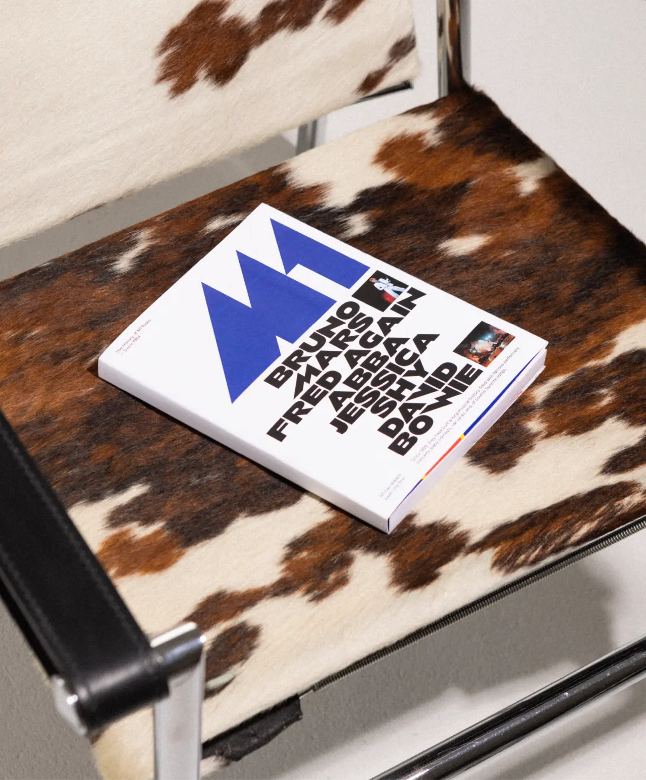
A magazine or publication with a blue triangular logo and bold typography lies on a brown and white cowhide-patterned chair cushion
M1
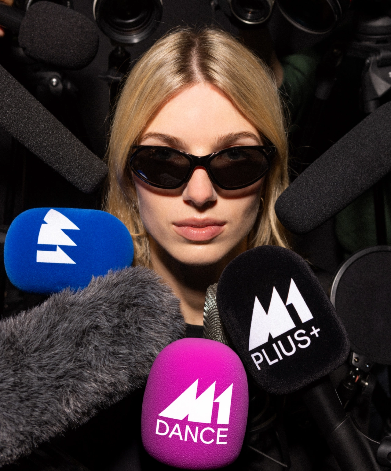
Woman wearing dark sunglasses surrounded by microphones branded with M1, M1 Plus and M1 Dance logos during a media interview
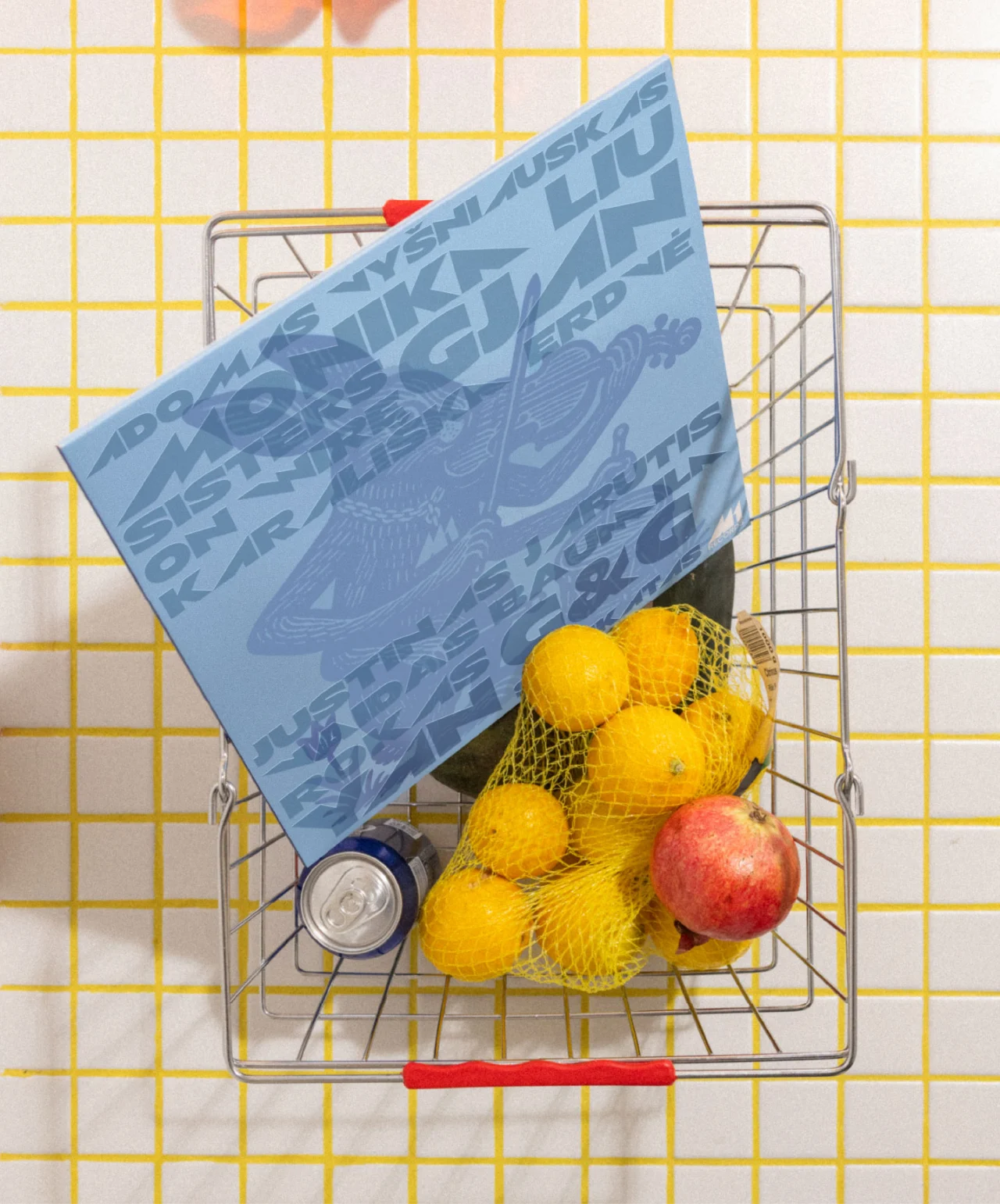
Miniature shopping trolley filled with yellow lemons and a red apple, with a blue vinyl record or case leaning against it on a yellow grid background
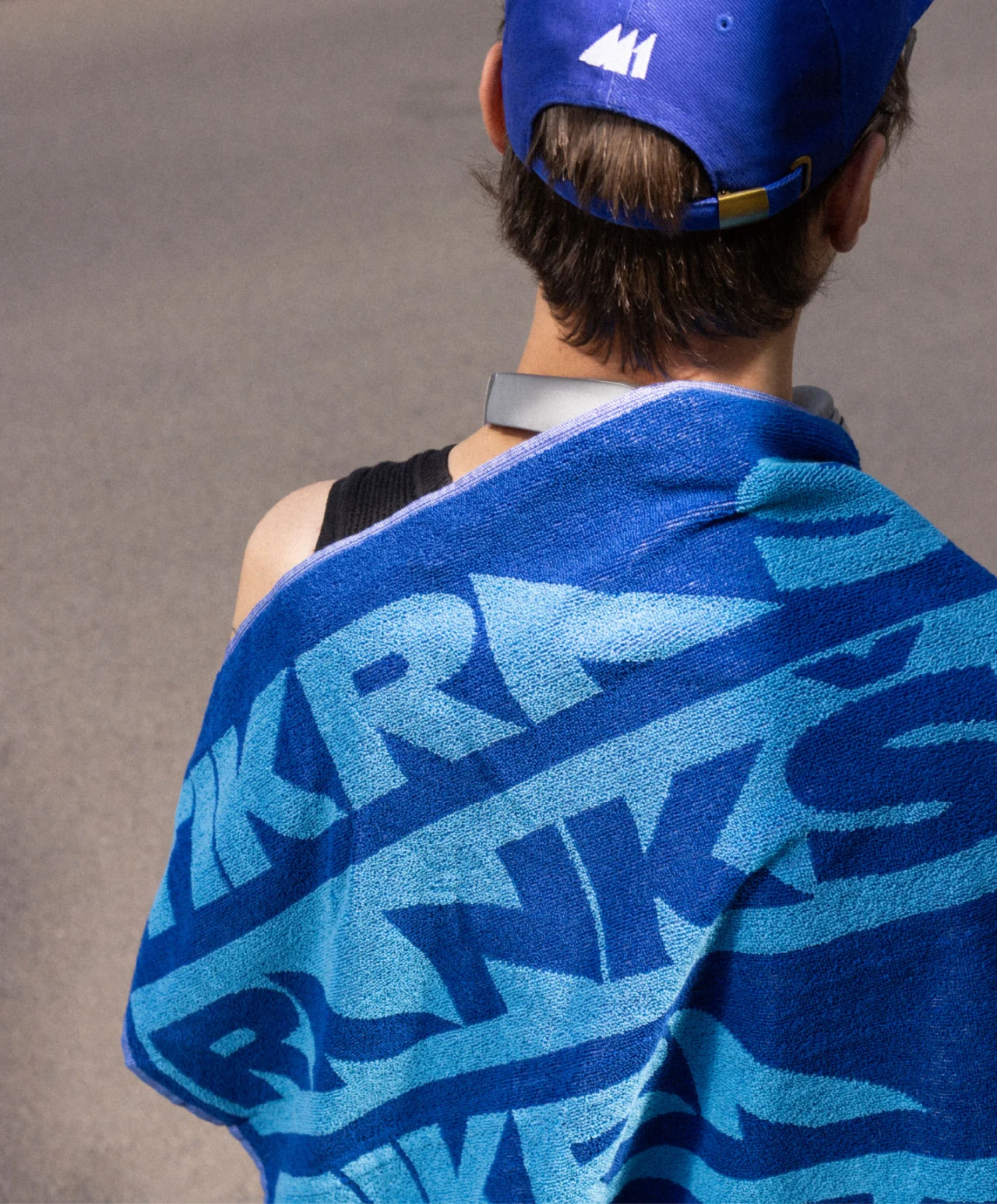
Person wearing a blue cap viewed from behind, draped in a blue towel with geometric patterned design

So what advice would he have for someone who's where he was 10 years ago? "If I had a beer with a 25-year-old designer starting a studio in Vilnius, Riga, Ljubljana or Bratislava, I wouldn't tell them to develop an international style," he responds. "I would tell them to write in one sentence what makes them different. And then go outside.

"Publish the work, enter awards, travel, meet people and be curious about how other studios work. Don't think that quality only happens somewhere else. But also don't spend your life trying to become Amsterdam. At some point, you have to build your own benchmark."

Koto: We need to talk about how all electric car brands look the same

The studio's new report asks a fundamental question: how EVs can stand out when they all look alike?

Here's something about the electric car boom that hasn't been widely reported, but for me is fundamental not just to the sector, but the future of branding in general. People who make the switch to electric overwhelmingly stay switched: 96% of EV drivers say they’d choose electric again. Yet only around half stay loyal to the brand they actually bought.

The industry, then, has done a brilliant job of selling the benefits of electric driving, but a terrible job of selling anyone on a specific model.

That’s the argument at the centre of a new report from global creative company Koto. As tech, interfaces and specifications converge, it says, car makers are going to get harder and harder to tell apart. And with the statistical evidence matching what we all know instinctively, every time we see an EV silently whizz by, it’s hard to disagree.

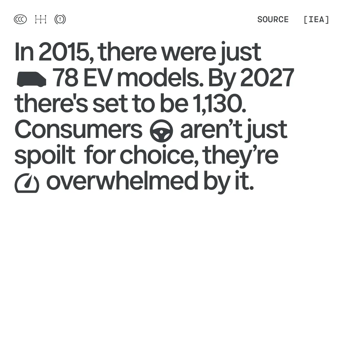
Typography and icons showing that 78 EV models existed in 2015, rising to 1,130 by 2027, leaving consumers spoilt for choice yet overwhelmed

Overwhelming the market

What I hadn't quite realised myself, though, was just how many brands we're talking about. According to the International Energy Agency, the number of electric models available globally rose from 370 in 2020 to nearly 1,000 in 2025.

As a result, buyers aren’t so much spoilt for choice as overwhelmed by it. No wonder brand loyalty is virtually non-existent. Online car shopping resource Edmunds found 85% of EV shoppers would buy from a manufacturer they’d never owned before. (Indeed, it makes you wonder why the 15% are bothered. Maybe they work for a specific manufacturer and get a discount. Maybe they misunderstood the question. Who can guess?)

The point is that when brands look, sound and behave alike, people choose based at price, specs and convenience. And with this level of competition, that’s not a race any company really wants to run in.

To find out what's really going on, Koto put 10 leading EV brands through its 18-point Brand Assessment Tool, which considers whether each brand comes across as "true, compelling and distinctive". The results showed a striking gap between sales and brand strength.

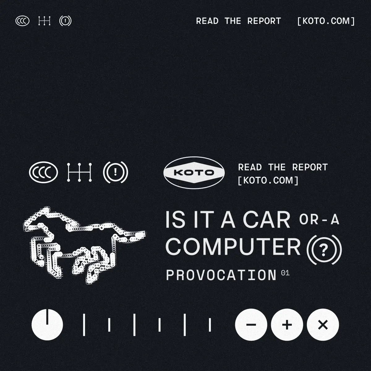
Koto studio logo and report title "Is It A Car Or A Computer(?)" with a stylised dotted outline of a car and playful UI elements on a dark background

Rivian ranked ninth for sales but first for brand, with a score of 7.8. Volkswagen was the reverse: third for sales but tenth for brand, scoring 4.8. Market leader BYD scored 6.9, while Tesla and Polestar tied on 7.2.

Three questions to ask

So what's to be done? The report suggests there are three main questions for the industry to answer. Question one is whether an EV is primarily a car or a continually updated computer. Tesla and Polestar lean firmly towards the latter, but Koto notes signs of the pendulum swinging to the formerβ€”in the West, at leastβ€”with Renault adding physical switches and VW bringing buttons back to its ID cabins.

In China, however, the car is increasingly seen as a connected service platform. Most brands, the report suggests, will end up blending the two. But if you're trying to be all things to all people, there's a danger you'll please nobody.

Question two is whether established brands should carry their heritage forward or reinvent themselves. Koto praises the Renault 5 E-Tech and BMW’s Neue Klasse for reinterpreting their pasts rather than simply recycling the names, and points to the backlash against Ferrari’s Luce as evidence of how much emotion is still bound up in legacy marques.

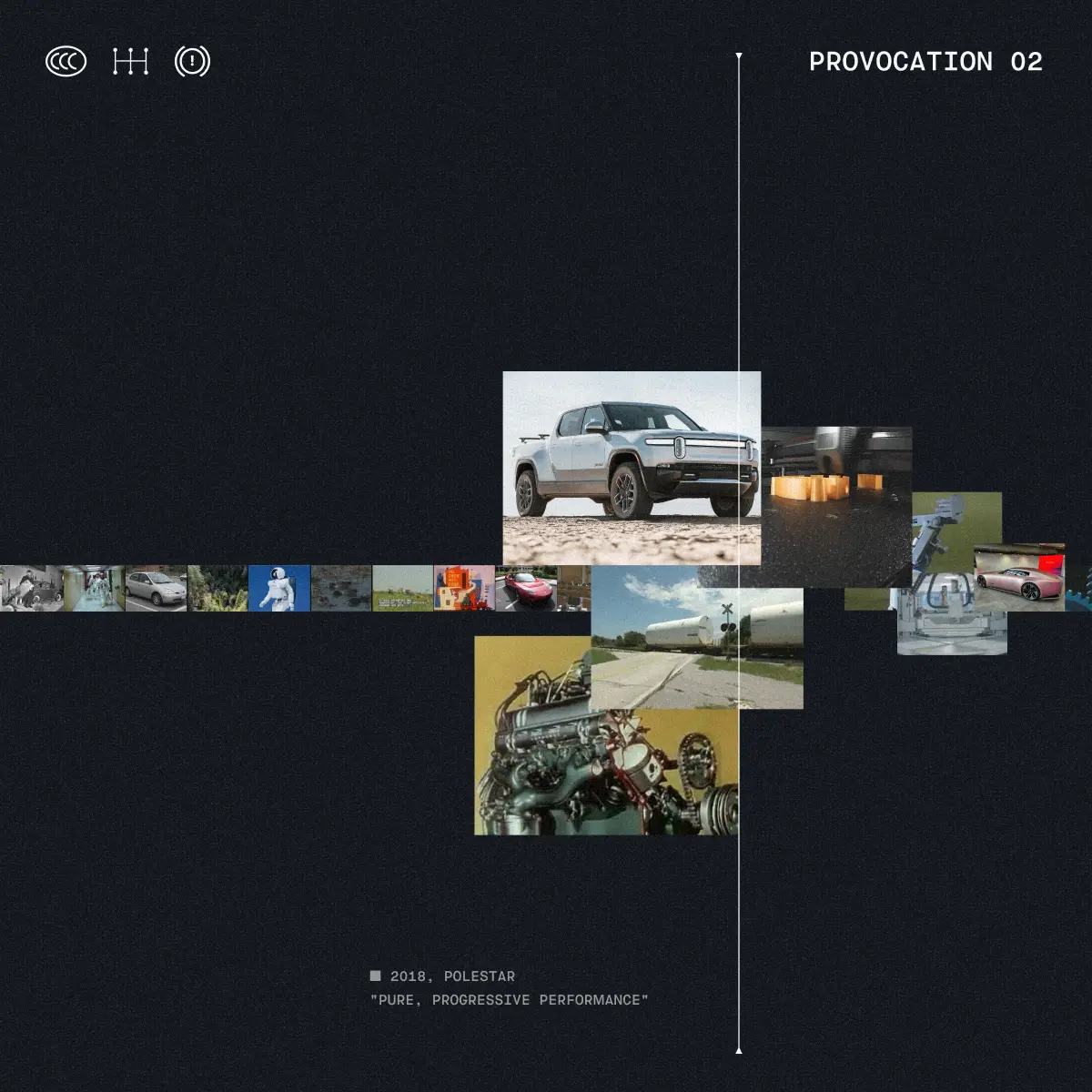
Koto's Provocation 02 report visualisation showing a central image of an electric pickup truck surrounded by a grid of diverse photographs exploring vehicle design and performance themes
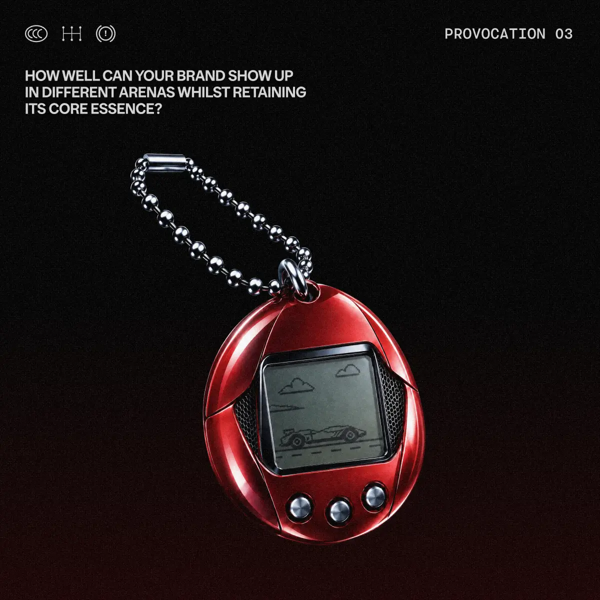
Red digital pet keychain toy with monochrome screen displaying simple car and cloud graphics, suspended from a silver ball chain against black background

Question three is how brands can stay coherent across a fragmented purchase journey that now runs through YouTube reviewers, review sites, word of mouth and AI agents. Here, Koto singles out Jaecoo, whose record sales haven’t yet been matched by brand affinity, and wonders whether its nickname of β€œTemu Range Rover” is a good or bad thing. (Personally, Jaecoo is the EV I'm most interested in buying, but maybe that says more about my own lack of class than anything else.)

Meat on the bones

What makes the report a great read is not just it's content, but how it’s been designed. Koto’s team borrowed heavily from car culture: rotating 3D car forms nod to the theatrical reveals of the motor show, while dashboard-inspired layouts and animated micrographics echo in-car interfaces.

It’s worth noting that this is a perspective paper rather than original consumer research, with its market statistics drawn from third-party sources. But like I said, the main thing for me is that it reflects what we're all thinking, and actually puts meat on those bones.

As the report puts it, the technology might be driving the transition, but brand needs to get back behind the wheel.

Wildwood: a big leap forward for animation that you need to see on a big screen

Laika's handmade epic blends stop motion and CG like nothing before it, and it deserves to win at the box office.

Last week I walked into a sold-out cinema screening, and let me tell you: it's been a while since that happened. Yet that's what I found at the Watershed arts centre in Bristol, where I watched Laika's epic animation Wildwood in a cinema so packed that couples were having to sit apart because there were no two seats left together.

I'd be lying if I said I wasn't worried, though. Yes, I knew all about the technical achievement behind Laika's latest filmβ€”I'd interviewed the art director Matthew Maldonado, for Pete's sake. But being technically impressive and being entertaining are two very different things. And I had no idea whether the animation style, a groundbreaking mix of stop motion and CG, would actually work for audiences on a big screen.

I shouldn't have worried. Within seconds, I was sucked into the action, and I stayed there, mouth agape, until the credits rolled. The following day, I couldn't get it out of my mind. The more I thought about it, the more I realised Wildwood isn't just a great film. It's a massive leap forward for the animation industry.

Best of both worlds

In case you have no idea what I'm talking about, Wildwood is the sixth feature from Laika, the Oregon studio behind Coraline, ParaNorman and Kubo and the Two Strings. Directed by Travis Knight and based on Colin Meloy's 2011 novel, illustrated by Carson Ellis, it follows a girl named Prue who… well, actually, I think the less you know about the story, the better.

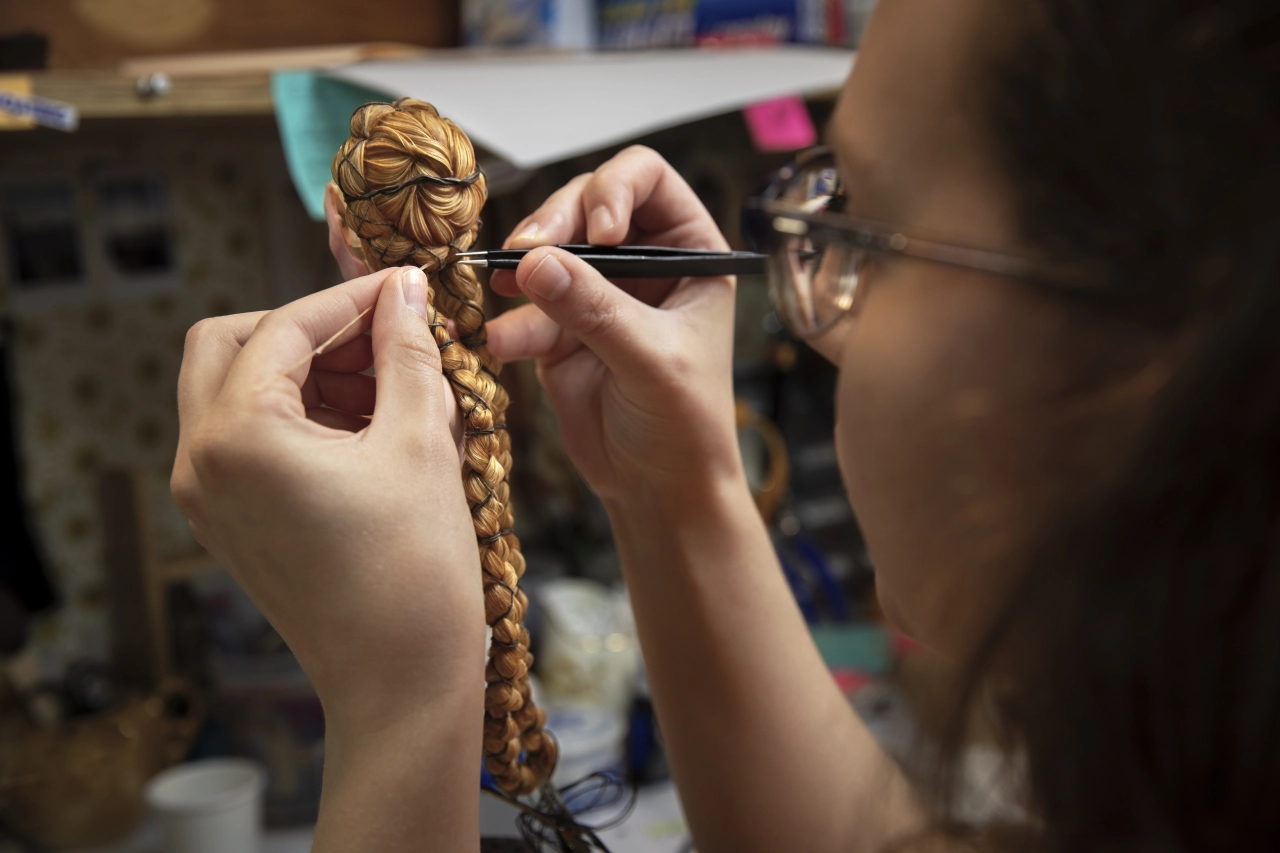
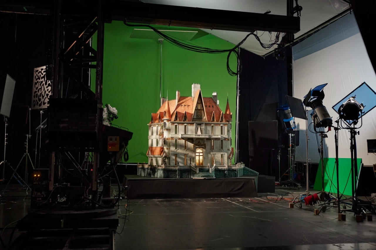
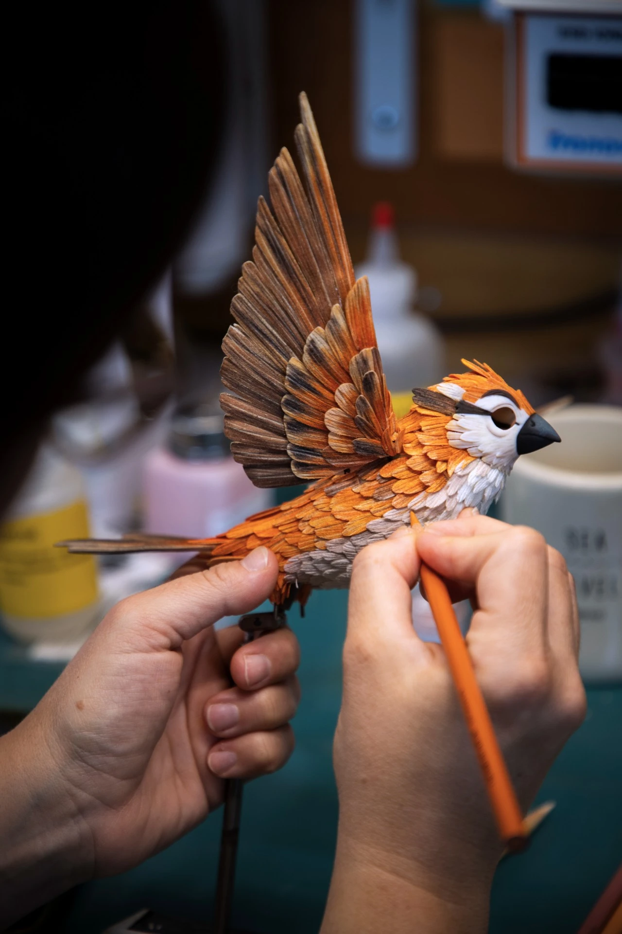
My previous article was all about how everything, from 230+ puppets to 132 sets, was made by hand, and the enormous scale of the production. More than 1,000 artists worked over six years, during which animating a single second of film could take an entire day, or more.

But all of that would have been for nothing if the animation didn't look good. So I'm pleased to tell you that on a cinema screen, it looks absolutely epic.

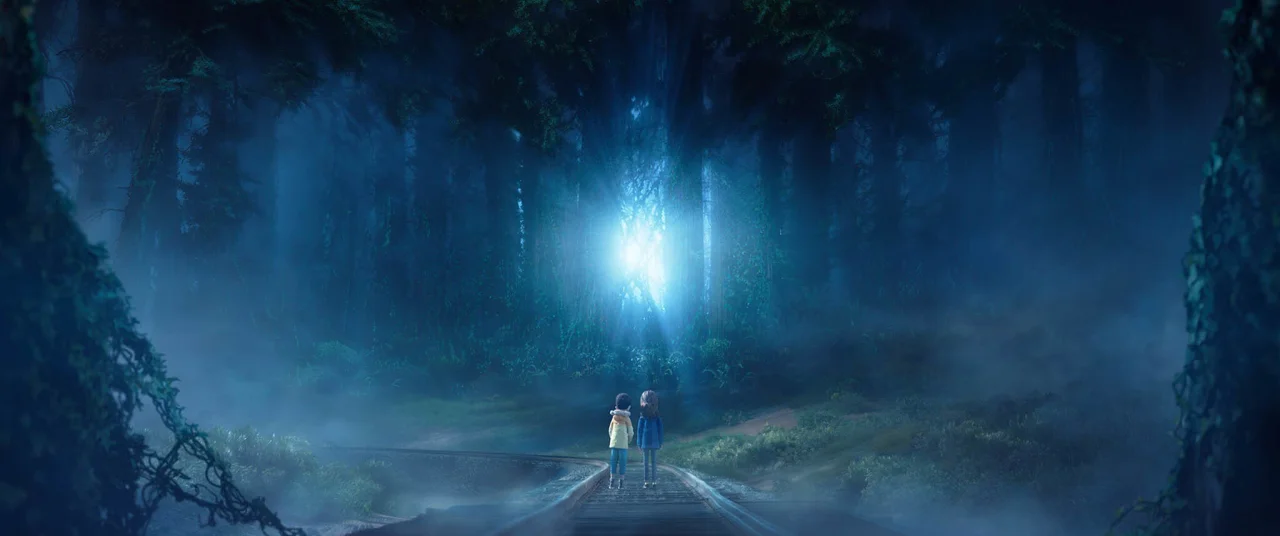
Two figures stand on a road leading towards a bright light source between towering cliff faces in a mystical forest landscape with blue tones
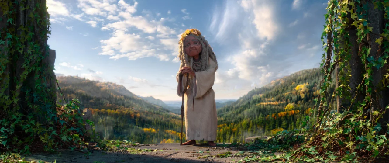
An ethereal figure in a long grey robe stands in a mountainous forest valley, framed by ivy-covered stone archways beneath a bright sky
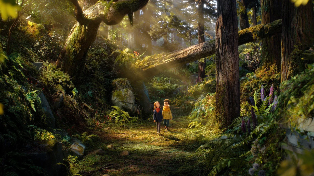
Two young characters stand in a lush, moss-covered forest with towering trees and golden sunlight streaming through the canopy in Wildwood

I shouldn't have been surprised: people don't put this much time and passion into a project unless they're sure it's worth it. The facial performances, for instance, were animated on a computer and then 3D printed, with a new face made for every character in every frame: more than 140,000 in total. Meanwhile, the visual effects team scanned the physical sets and puppets to extend locations and fill out crowds.

The computer here isn't replacing the handmade; it's serving it. Because every process starts from, and feeds back into, something physical, the result is a level of subtlety and realness that neither CG nor stop motion could achieve on its own.

More real than live action

It's ironic, if you think about it. Most so-called 'live action' films are now largely made of CG. So, in one sense, they're animations too. Unfortunately, when a supposedly real world is made entirely of pixels, it often stops feeling visceral and real. In fact, most of us have stopped expecting to feel anything when we look at it.

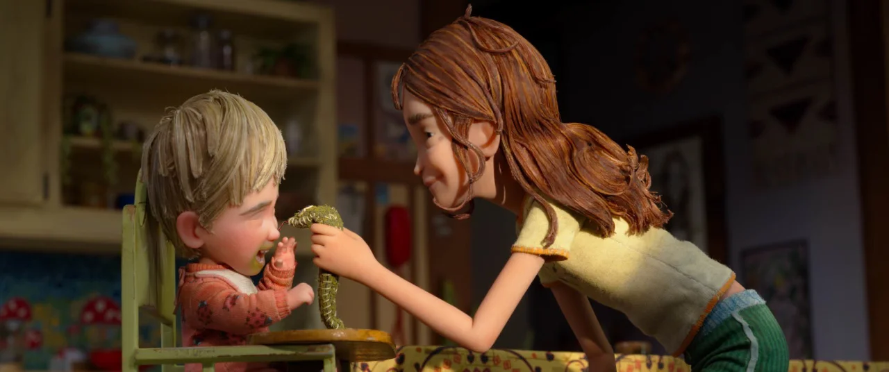
A woman with reddish-brown hair feeds a small child sitting in a green chair in a cosy interior setting from Laika's Wildwood
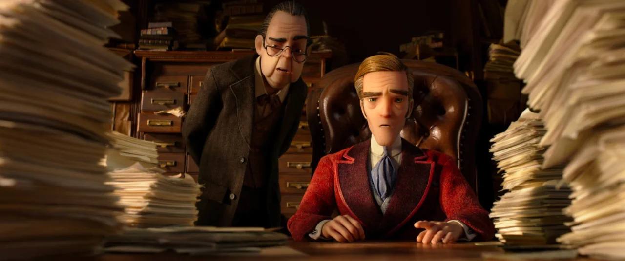
Two animated figures sit at a desk surrounded by tall stacks of papers in a scene from Laika's Wildwood
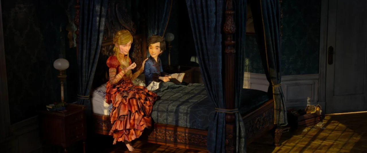
Two figures sit on a four-poster bed in a dimly lit bedroom with blue curtains and period furnishings in a scene from Laika's Wildwood

Wildwood is the opposite. Because the world on screen was physically built, it feels incredibly real. You can sense the weight of things: the texture of fabric, the grain of wood, the way light falls through the trees. The effect is subtle, but over time it draws you in and holds you in its grip.

Again, none of this would matter if the story was poor or the characters were undeveloped. But both are brilliant, intriguing, nuanced and endlessly thrilling.

Yes, there are elements of Alice in Wonderland, The Wizard of Oz, Labyrinth, The Dark Crystal and The Lion, The Witch and The Wardrobe here and there. But overall, this is a strikingly original film: not just original in the sense of not being a sequel, but original in the sense of "This feels fresh and new, and I have no idea what will happen next."

The need for scale

I did, I admit, get a little frustrated at times. Every set, costume and prop has clearly been obsessed over, so I kept wishing I could admire each frame like an artwork in a gallery. But the story kept pulling me along too much to linger.

So here's my main plea. If you work as a creative in any capacity, please see this film on a big screen. There's so much visual detail packed into every shot that a lot of it will simply be lost on a 50-inch TV, let alone a laptop or phone.

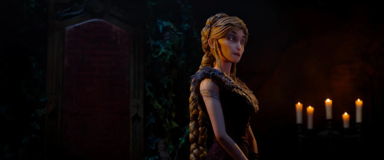
A young woman with blonde braided hair looks over her shoulder in a dark, candlelit Gothic interior from Laika's animated film Wildwood
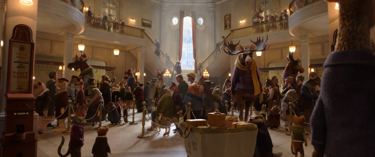
Interior of a grand museum or gallery space filled with visitors, featuring taxidermied animals including deer heads mounted on walls, ornate chandeliers, and classical architecture with arched ceilings and columns
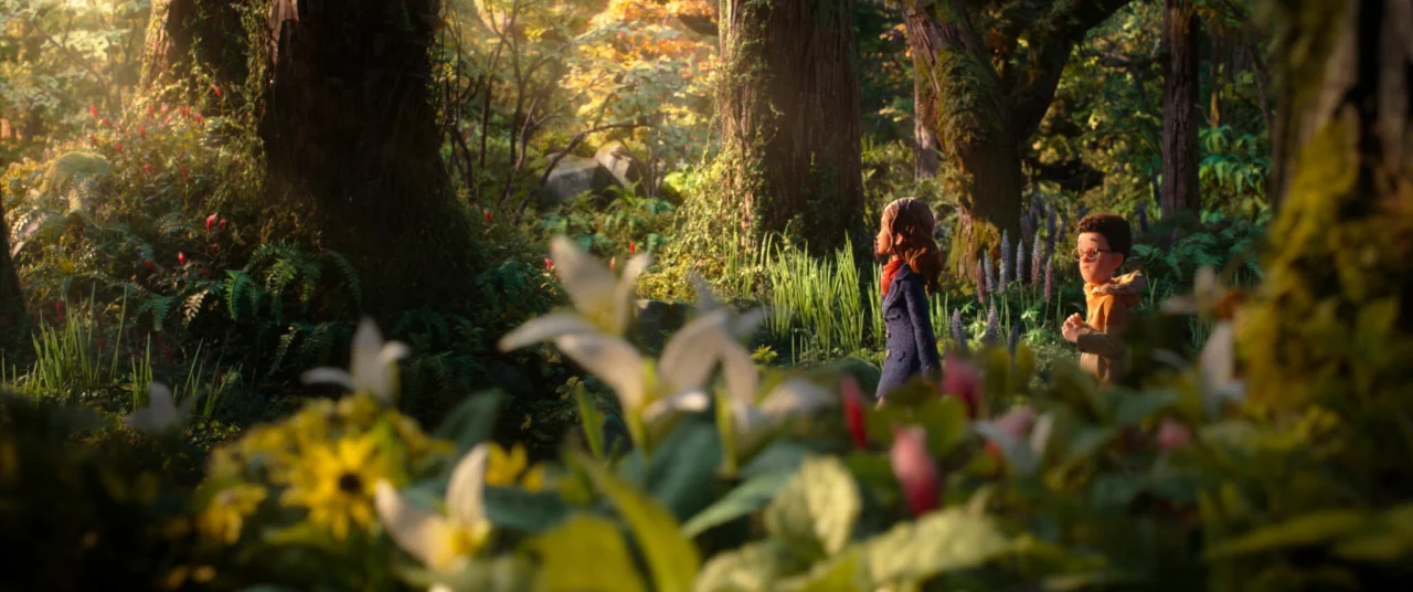
Two figures in autumn clothing walk through a lush forest with tall trees and undergrowth in the foreground, from Laika's animated film Wildwood

One more thing. If we want to push back against the slide of movies into AI slop, we have to prove audiences will turn out for something made with human hands. Because the only language Hollywood truly understands is box office. So I urge you: don't just go and see Wildwood. Tell your friends, colleagues and the random guy on the bus to go and see it too.

1939's The Wizard of Oz didn't turn a profit on its first release, and only became the beloved classic we know after it was shown on TV in the 1950s. A generation missed out on that movie magic. Let's make sure that doesn't happen to Wildwood, and keep the word of mouth going. The future will thank us.

Lego and Daft Punk's team-up highlights exactly how brands should interact with fans

From a cryptic teaser to a fan-designed set, this latest partnership is a masterclass in treating your audience as collaborators.

Remember the old days, when companies were obsessed with nothing more than competing with each other? Sometimes this could be thrilling. For instance, when I freelanced for music magazine NME back in the 90s, I was told never to talk to those ratbags at rival title Melody Maker, even though we were both owned by the same company and only one floor apart in the same building.

In the 2020s, though, brand collaborations feel like they've replaced brand rivalries. Everyone seems to be working with everyone else all the time. In fact, it's rare for a PR email in my inbox not to scream about an EXCITING COLLAB between company X and company Y. "Join them" is apparently the new "beat them".

All of which is to the good, in theory at least. But in practice, it often feels a bit meh. Two big names get together, slap their logos side by side on a product and hope their fanbases will get excited. I won't name names, but honestly, most are forgotten within a week.

LEGO logo on red background next to Daft Punk's black spiky handwritten text logo
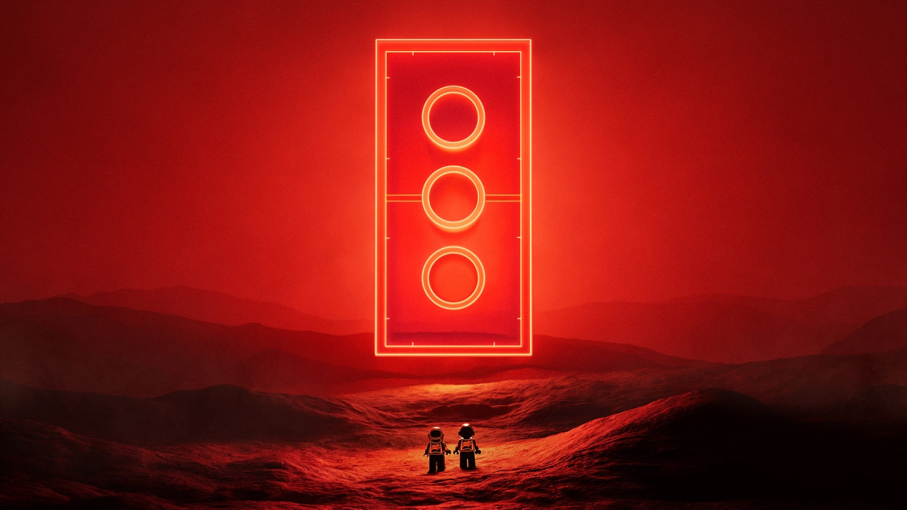
A neon red traffic light glows against a dark desert landscape with two silhouetted figures standing below it
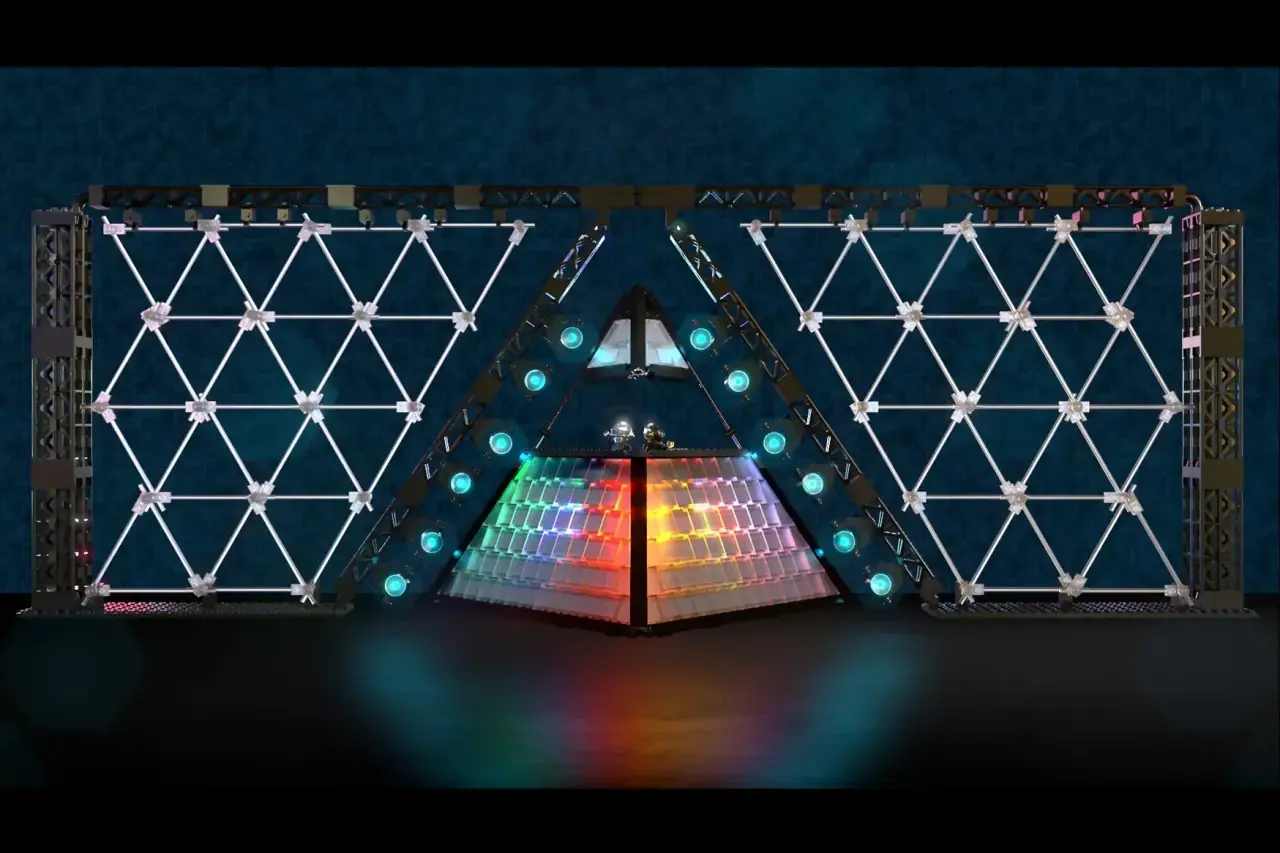
Illuminated Lego pyramid structure with geometric triangular patterns and glowing spheres, flanked by symmetrical diamond-patterned panels on a dark background
The original Pyramid Set design by Patrick Harboun and his son

Lego, though, does things differently. In fact, it's arguably the OG of game-changing collaborations. Ever since it launched its first Star Wars sets back in 1999 (wow, was it that long ago?), the toy brick brand has teamed up with everyone from Harry Potter and Nintendo to Ikea, Adidas and even Vincent van Gogh.

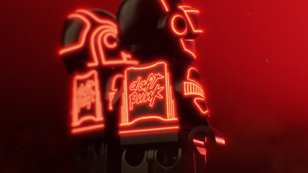
Now it's announced a new creative partnership with electro-pop icons Daft Punk, spanning products, content and brand experiences. It launches with a slick hero film in which the duo appear for the first time as Lego minifigures. And it's full of lessons for any brand or creative wanting to build a genuine connection with its audience. Here are four that stood out to me.

1. Let fans lead

The most important thing, I think, is that this collab came from the bottom up, not the top down.

The first Lego + Daft Punk product will be a set based on the famous pyramid stage from Daft Punk's 2007 Alive tour. This was originally designed by a Luxembourg-based father, Patrick Harboun, and his son as a lockdown project. Their model won the grand prize in the Lego Ideas Music to Our Ears challenge in 2020, then reached 10,000 supporters on the platform.

"This all started as a creative escape during lockdown between my son and me because of our shared love of Daft Punk and Lego building," says Patrick. "We never dared imagine it would take off in this way."

Neon-lit retro-futuristic scene with glowing orange robot and floating geometric shapes against a grid floor and red laser beams
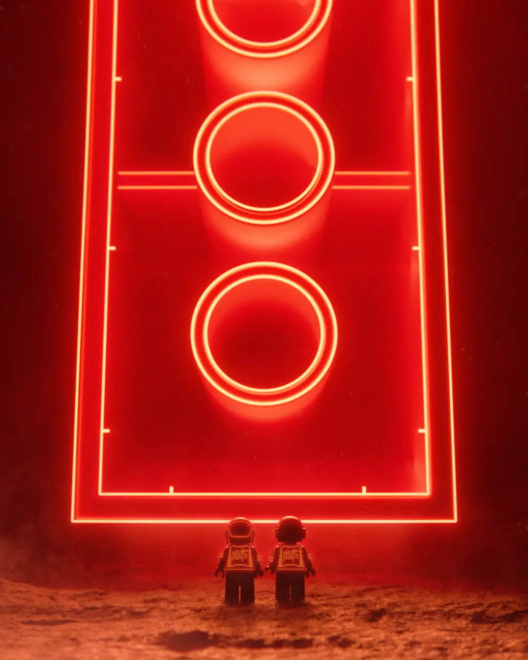
Two Lego astronauts stand on a red-dust landscape facing a massive glowing neon sign shaped like a football pitch with three illuminated circles

The lesson? Fans know what they want. So give them easy ways to share their ideas, and when you see a brilliant one, make the most of it.

2. Tease us a little

Rather than announce the new partnership with a big splash, Lego chose to trail it with a cryptic teaser.

Fans tuning in on 21 October were met with a 30-second clip of a red 2x4 Lego brick, with no accompanying text. Viewed from below, its three internal tubes were designed to evoke the woofers of a speaker.

The teaser gave dedicated fans something to decode and discuss, and made them feel like insiders.

The lesson? If your audience enjoys a puzzle (and you know, it's safe to assume this one does), give them one.

3. Speak both visual languages

When two big brands come together, you don't want anyone to feel one is dominating, so the visual language needs careful thought. To my mind, this collab blends the two perfectly.

In the launch video, animated by I Love Dust for Our Lego Agency, minifigures follow a giant, glowing red brick across a Martian landscape, get enveloped by holographic architecture, and end up at a brick-built DJ console.

The neon outlines, wireframe grids and floating bricks are pure Daft Punk. The building blocks are (literally) pure Lego. Even the soundtrack, pairing 'Voyager' with 'Human After All', feeds into a shared tagline: "Builders After All".

The lesson? When you collaborate, avoid one brand swallowing the other, but look for the overlap where both can shine equally.

4. Play the long game

It's as important to recognise what Lego and Daft Punk haven't done here as what they have. There's no rush to flood the market with tie-in products. Even the set is still in development: we don't know anything about price or release date, or even exactly what it will look like (the fan model shown isn't the final product).

As Julia Goldin, chief product and marketing officer at the Lego Group, puts it: "This is just the beginning of a bigger journey. And that's a good mindset for any partnership."

A neon orange robot with geometric patterns stands on a gridded floor in a red-tinted digital landscape with floating rectangular structures and laser beams overhead
Red neon sign displaying stylised text and geometric shapes against a dark background

The lesson? Fandoms are built over years, not weeks. So treat any collab as an ongoing conversation, not a one-and-done.

Key takeaway

Daft Punk may present themselves as robots, but their success has always been rooted in a human connection with their audience. Lego understands that too. And creatives would do well to take note.

It's pretty simple, really. Listen to your fans and give them a way to share their ideas. Give them credit when they share something brilliant. Reward their attention and build something together. It's not rocket science. It's just good building.

Stocksy's 2027 Visual Insights Report explores why some images connect with audiences so well

In an era when any image can be generated, Stocksy's annual report argues that representation is no longer enough. So what is? The secret, it appears, lies in five small prepositions.

Search your typical stock library for "couple walking on beach at sunset" and thousands of options will magically appear. Most will be bland and forgettable. Yet if you look long enough, you'll often find a couple that stops you in your tracks.

But that raises an interesting question. If they all use the same keywords and show the same subject, why do these pictures stand out from the crowd? And that's the question at the heart of Visual Insights 2027: Existential Grammar, the latest report from Stocksy.

In case you're not acquainted, Stocksy is the only artist-owned co-operative in stock media today. Its 1,800 artist co-owners and its curators choose every image in a collection of three million assets. Only 1.3% of artists who apply are accepted, and the library contains no AI-generated content at all.

In other words, this is a report from people who make and choose pictures for a living. And Stocksy's answer to this big question is that connection isn't a mood; it's structural.

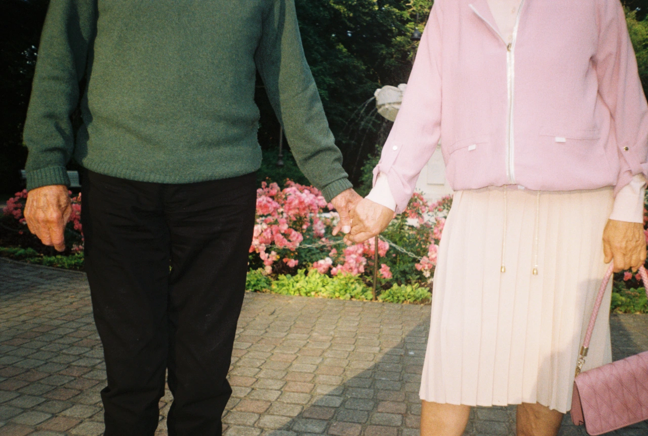
Two people holding hands while walking past pink flowers in a garden, wearing green and pink cardigans

Let me unpack what they mean by that. Typically, stock libraries organise images by nouns. A family. An office. A woman laughing. That identifies what's in a picture… but it isn't the same as connecting with it. In the report's words: "An image of connection shows people together. An image that connects is in conversation with its audience."

The connection comes from the relationships an image sets up: between a subject and its maker, between what's shown and what's withheld, and between the picture and whoever's looking at it. To describe those relationships, Stocksy reaches for the humble preposition.

In case you don't remember your grammar from school, a preposition is a word that connects a noun to other words ("in", "at", "from", "through", for example). These small words are almost entirely absent from image keyword searches. Yet as the report points out, they're "where agency, intention, tension, distance and direction live".

The report offers five prepositions: by, for, with, between and against. For each one, it gives a definition, a real-world example and a handful of questions plain enough to use in your next brief. Read on as I explore each preposition and what it represents, in turn.

1. By (authorship)

"Creative media may be entering its farm-to-table era," the report says. What does that mean, exactly? Well, consider how, 20 years ago, coffee and chicken stopped being anonymous commodities. Instead, their value started to become tied to where they came from and how they were produced.

Stocksy argues that creative work is now under the same pressure. Authorship isn't just a name in the credits; it's more like a supply chain.

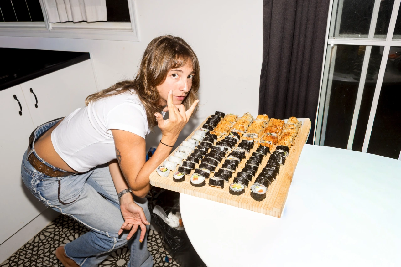
Woman crouching beside a wooden board displaying sushi rolls, pointing at one with a playful expression
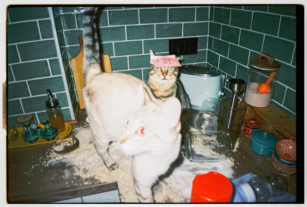
Tabby cat wearing a pink paper crown sits among flour and kitchen utensils on a dark countertop against green subway tiles

For example, every Hermès Kelly or Birkin is made by a single artisan, from first cut to last stitch, and carries that person's stamp inside it. "The mark is not decoration," the report explains. "It is the reason the bag costs what it costs."

Ask yourself: "Who made this? And can we stand behind how it was made?"

2. For (purpose)

The French literary theorist Roland Barthes once argued that a text finds its unity "not in its origin, but in its destination". The trouble is that destination is now forked. Most creative work has to speak to a person, while also satisfying a system. Stocksy's verdict is an honest one: "The system can deliver an audience, but it cannot make them stay."

One example is Velvet Sundown. In 2025, this group put two albums on Spotify and attracted more than a million monthly listeners, despite having never played a show. In July, it confirmed the group didn't exist: the music was generated by AI.

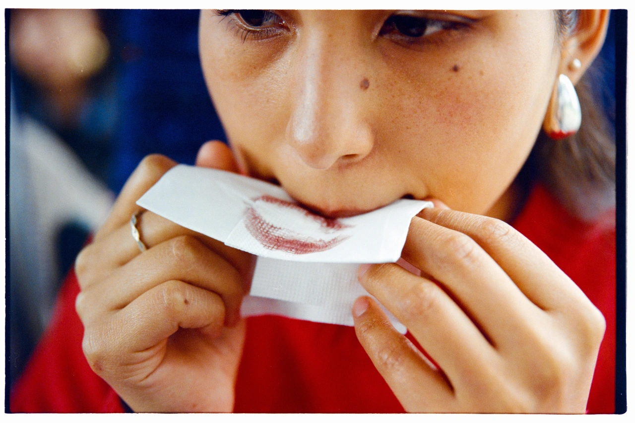
Girl in red shirt examining a lip print or lipstick mark on white paper held between her hands

A year later, Deezer reported receiving around 90,000 fully AI-generated tracks a day, more than half of everything uploaded to the platform. It also found that up to 85% of streams on fully AI-generated music in 2025 weren't human either: just bots listening to AI music to generate royalties.

In a world where machines make content for other machines, what happens to the human?

Ask yourself: "Who is this for? Picture one person."

3. With (presence)

"Nothing enters a frame alone," Stocksy writes in the report. And I know what they mean. Everything embodies meaning. A body arrives with posture. Light, a season. A room, evidence of its use. You get the idea.

These elements tell us where we are, when we are and how to feel. What feels intimate, tense or strange doesn't come from a caption. It's generated by the relationships between what's actually there.

Silhouetted figure doing a backflip against a dusty orange landscape with buildings and other people in background at sunset
Two people embracing in water with warm, golden light illuminating their skin in a tender moment together
Shirtless man wearing sunglasses holding a surfboard on a beach, with a sun protection sticker visible on his arm and the sea behind him

Stocksy also corrects a famous misquote along the way. Turns out the Gestalt psychologist Kurt Koffka never actually said, "the whole is greater than the sum of its parts". He insisted it was other than the sum of its parts. Put two things together, and you get a third thing that neither of them was.

Ask yourself: "Pull one thing out. What breaks?"

4. Between (emergence)

Ever noticed how often creative briefs feature pairs of competing values? Polished vs raw. Accessible vs specific. Elevated vs friendly. It's tempting to err on the side of caution and split the difference. But the report warns that such an outcome "often feels pleasant, competent and forgettable".

Stocksy argues that in work that resonates, one force leads while the other complicates it. It's this tension that gives the work shape and motion. One example is Boots' Life Is Brutiful campaign, which lets the brutal and beautiful moments of life (illness alongside pleasure, hot flushes on a night out) sit side by side.

Ask yourself: "Are we keeping the tension, or averaging it into something bland?"

5. Against (friction)

Every image inherits conventions about beauty, authority, progress, family and nature. Unless we decide where to resist them, the report argues, "those conventions make its decisions by default".

One example is Blood Normal. For decades, every sanitary pad ad poured blue liquid. In 2017, Bodyform and Libresse opted for red, showing period blood in its true colour. It won the Glass Lion Grand Prix at Cannes, and the blue liquid has been on the wane ever since.

Ask yourself: "What must the work push against?"

A man on horseback passes a white car broken down on a steppe road, with two people attending to the vehicle under a clear blue sky
Pale patterned snake on sandy ground next to a textured grey tyre, suggesting wildlife in an unexpected human environment

How do you put this into practice?

We've been through it all, and we've figured out how to adopt all of the above. Stocksy's grammar centres on four habits worth embracing.

  • Brief relationships, not adjectives: "Warm, authentic, aspirational" describes a mood. Instead, describe who's in the frame, who made it and who it's for: that'll give a photographer or picture editor something stronger to work with.
  • Picture one person and make it for them: Don't target a demographic or an algorithm; target a single, specific person who lives in the real world.
  • Decide which force leads: If the brief says polished and raw, choose which one's in charge. Avoid the forgettable middle.
  • Name the convention making your decisions by default: Every category has its blue liquid. Find yours.

Last year's Stocksy report gave us five visual trends. This year it hasn't given us any trends at all. Instead, it's handed us a toolkit for looking.

My key takeaway? In a year when anything can be generated, being able to show something counts for less and less. What still counts is the thinking behind the picture: who made it, who it's for and what it's willing to push against.

SEA turns 30 with a new anniversary book celebrating design that lasts

The London studio is marking three decades with a gorgeous silver-edged book and a party with industry friends. We chat with founder Bryan Edmondson about hard work, relationships built to last and why he wishes he could be starting again today.

In 1996, the year Manchester United won the FA Premier League and the Spice Girls released Wannabe, SEA set up shop in Bermondsey. The London design studio, founded by Bryan Edmondson, is celebrating its 30th anniversary with a new book and a gathering of friends and collaborators from across the industry.

Marking such milestones has become a habit for the London design studio. It did the same for its 10th and 20th anniversaries, so SEA 30 continues its tradition of taking stock every decade. The silver-edged volume brings together highlights of its visual identity work in a 304-page hardback, limited to 300 numbered copies. I've got one on its way in the post. "Do you have a favourite number?" Bryan asks during our fun Zoom call. "53," I replied, reason being it's the year my parents were born. Designed and edited by SEA, the book is printed by TEAM and case-bound by Diamond, using paper from G.F. Smith.

The book's description reads: "Now, as we reflect on three decades of SEA, the themes at the heart of what we do haven't changed very much; our love for what we do is undiminished, and our appetite to create outstanding work is stronger than ever. We're driven by solving problems through intelligent strategy and distinct, beautifully executed design."

Two bright blue books with white typography showing "30" and "SEA" on their covers, arranged on a dark surface
SEA's 30th anniversary book displayed open, showing pages with yellow typography and embossed details on cream paper with silver-edged pages
Open pages of SEA's 30th anniversary book showing blue pixelated text on the left and stacked colourful book spines on the right against a dark background
Open book spread showing a yellow page with a portrait photograph on the left and white page with repeated text reading "activate detox cleanse" in yellow and black on the right

The celebrations also saw a sizeable gathering of industry pals at The Crypt in Clerkenwell. "There were quite a few older designers who worked with us all those years ago," Bryan recalls. I bet they all have stories. Bryan found himself on the receiving end of some harsh but affectionate roasting, not least from photographer Rankin, whose "brutal" speech (so says Bryan) had people not knowing where to look or whether it was appropriate to laugh along. The evening, he tells me, continued at the pub next door until closing. I was invited but sadly couldn't make it. From what I hear, things got a little messy, in the best possible way.

Naturally, I couldn't resist getting in touch with Alan Dye of NB Studio fame. He's currently having a jolly around South Korea with friends. I asked him for some dirt on Bryan. He sent this: "It was the last century. 1992, to be precise. Bryan and I had just started at Roundel Design Group. Britain was in recession, and we were both grateful to have jobs, especially at Roundel, who were famous and flying high at the time.

"I had long black hair, white Levi 501s and, probably, a black polo neck. I was perched on a high stool with my back to the door when I heard a loud, cheeky northern voice. 'Hello chuck, what's your name?' I turned around. 'Alright, Bryan.'

"We've been friends ever since. We started our own studios at roughly the same time, pitched against each other, confided in each other, celebrated the highs, survived the lows and generally grew up together in this beautiful, crazy industry.

"We've always admired each other's work, though never without some merciless piss-taking. Through it all, Bryan has been there. His work has consistently shone, his enthusiasm has never dimmed, and I'm going to stop there... Love you, chuck."

Two men smiling at the camera in black and white photograph with shadows cast on wall behind them
SEA 30 party at The Crypt. Photography by Ryan Jones
Man wearing glasses viewed from behind standing in front of a black and white graphic display at SEA's 30th anniversary event
A silhouetted figure stands beside oversized clear bottles with white labels at SEA's 30th anniversary celebration event
Bryan Edmondson, founder of SEA design studio, stands with a colleague at the studio's 30th anniversary celebration event

Well, that was a treat. Thank you, Alan. As you were. Moving on... Bryan has weathered as many storms as the rest of us, so he's obviously happy about its survival. But the thing he's most proud of? "Not one of our marks has been redesigned. Yet," he says with a cheeky smile.

Another proud highlight is that they've had client relationships lasting for 26 and 27 years, with Regatta among SEA's oldest. "The way we approach work is for keeps," he explains. And seeing their work out in the world still gives him "a massive buzz", including when he spots it on his commute. "There is a particular satisfaction in encountering something you helped create and finding it still doing its job," he says.

What else hasn't changed is SEA's scale. Bryan says its team has stayed at around 12 to 15 people for the past 20 years, and he remains involved in every project. He recognises that others in the team are better than him in particular areas, but his role is to stay close to the work and lead through what he does. "David Beckham wasn't that vocal on the pitch, but he led by what he did on the pitch," he says.

And he appreciates SEA isn't for everyone. Some projects naturally require much bigger teams. But their size is also a selling point. Bryan tells me about pitching for a major project when a chief exec asked whether the people in the room would actually do the work. "If you don't like us, then there's not that many more behind me," he replied. It worked. The client said yes.

Black and white photograph of a design studio workspace with multiple people working at tables, a man in a black shirt standing centrally, and design materials pinned to walls
Motion-blurred figures walking past a white gallery wall displaying a Grown Alchemist product with black branding and geometric design

This gives us some nice insight into SEA's success. "I think luck..." he says when I push him on the secret to lasting this long. "We've never been in one sector. That's helped." The studio works in various sectors from finance to hospitality, so it's never got all its eggs in one basket. And that's wise because Bryan remembers how quickly things can change in any one industry. Virgin Atlantic was one of SEA's biggest clients when 9/11 brought the work to a halt. After three decades of ups and downs, Bryan's learned not to expect things to run smoothly: "There is always something."

Is he ready to call it a day? I felt cheeky for asking, but I'm considering my own options now I'm approaching 50, so I'm curious. Bryan doesn't sound ready to stop. He's drawing every day. He still rolls his sleeves up and gets involved in the work. He even tells me he'd love to start a studio now, with all of today's tools and technology. "I still don't think we've done enough," he says.

After almost two decades of running Creative Boom, I can definitely see a theme among those who stick around, and it's the same with SEA. It's nice to look back and be proud of what you've achieved. But the more pressing urge is to see what it can do next. I get the feeling Bryan is only just getting started.

Motion-blurred figure ascending a modern staircase with metal railings in a minimalist black and white interior space

NB Studio's Alan Dye on 29 years, starting again and why design needs more joy

After almost three decades, 50-odd D&AD pencils and champagne at Buckingham Palace, Alan Dye and Nick Finney have closed NB Studio. Alan tells Creative Boom why he's thrilled to be an absolute beginner again.

Alan Dye wants to show me something. Halfway through our Zoom call, he turns his camera round to show his screen. On it, he's just typed a single word. Joy, against a sunshine-yellow backdrop. "That's what it needs," he says. "A bit more joy."

I must admit, it wasn't the mood I was expecting from someone who's just shut the studio he spent 29 years building. NB Studio, the London agency he founded in 1997 with Nick Finney and Ben Stott, officially closed on 20 June 2026. They just announced it on LinkedIn. The farewell note was titled "So long, and thanks for all the kerning". If you know, you know.

"We decided to call it a day after 29 years," Alan says. "It's a big thing. But Nick and I had such a brilliant time. We started at Pentagram, kicked off not knowing anything really, worked with amazing people and made some lovely work that took us around the world."

Alan looks relaxed and happy in his newly refurbished home office in West London. Fresh white paint covers the walls, shelves are full of books, and neat frames hold typographic posters behind him. Natural light floods in. He can't sit still in his chair as he talks about the last 29 years, and I'm grinning. He turns 60 in December, and he's full of new momentum.

Five people sit around a red and white table in a studio space with colourful typographic posters covering the wall behind them.
NB Studio

Even though it's the first time we've actually spoken on a call, I've known Alan for years. He's been so kind to Creative Boom, and been a real cheerleader for all we're doing. He'd often pop up in my inbox or DMs, just to say hello and ask how I'm doing. That sort of thoughtfulness from someone so respected has partly kept me going these 17 years. And it's lovely to tell Alan that now.

Not a big fancy agency

His story began with two desks, back to back at Pentagram, and the pub next door, which became a makeshift office. "The dream was fun, fame and fortune," Nick and Alan write in their farewell. "The rest we'd figure out along the way."

Well, they did pretty well. When Ben left for Apple, they weren't sure NB would survive. But it did. Basically, on a vow to only employ people better than themselves. A wise approach. Students came through the door and never left. The studio shelf ended up with 50-odd D&AD pencils. Clients let them loose on "booze, babies, banks, theatres, universities, deep-tech start-ups and a fair amount in between", and the work took them to distilleries in Speyside, tea plantations in Sri Lanka and even Buckingham Palace.

Red line illustration of a hand holding an Anna Money debit card with card details and Mastercard logo visible
Anna Money
V&A logo with a silhouette of a head in profile filled with a gradient of yellow to deep red, with paint-like splatter effects
Work for the V&A: Uncomfortable Truths

Ahead of pulling together this piece and wanting to share some highlights, Alan says: "Just have a look on the website...it's still alive, I think. Take what you want." And so I've picked out a few highlights to share. Browsing through, it was a line on the about page that got me: "The fact is we're not a huge shiny agency – we're an enthusiastic and talented bunch of creatives who want to make a difference. Independent since 1997, we say what we think and stand up for the things we believe in." Yeah. We have a lot in common. Creative Boom has the same energy. I suspect it's also why NB's work never looked like anyone else's.

"NB Studio was very gridded and Swiss, with lovely fonts, but we always splashed it with a bit of something," he says. "A bit of colour. A bit of illustration. Nick and I were probably the biggest kids in the studio."

Doing things differently

That creativity is something Alan misses when he looks around today. He points to digital banking, as an example, where every brand seems to have the same green background. "Everything looks very homogeneous at the moment," he says. "Where's the wit and the humour? The lovely quirk of design, all the tactility?"

NB's back catalogue certainly doesn't look boring. ANNA Money, for instance, is a business admin app the studio branded with a warm terracotta orange instead of the usual cold banking hues. With doodles by illustrator Alice Bowsher as its handwriting, it definitely stands out.

Black text reading "ALMEIDA" with "THEATRE" mirrored below it on a light grey background
Almeida Theatre branding
Gold metallic burger stacked with layers against white background, theatre poster for The Merchant of Venice at Almeida, directed by Rupert Gould
Theatre poster for Mr Burns featuring a yellow hand illustration holding a charred object, designed by NB Studio for Almeida Theatre's 2014 production

Then there's Petit Pli, the children's clothing that grows with the child. NB's logotype pleats and stretches like the garments. Even the delivery box transforms into a wearable jetpack. It won three pencils at the 2019 D&AD Awards. For the Almeida Theatre, they put the word "Theatre" back in the name, then turned it upside down. And for Royal Mail, they marked 50 years of Pride with eight stamps illustrated by Sofie Birkin, brought to life in a hand-drawn film by Animade.

And when D&AD itself needed an identity for its awards night at the Roundhouse, NB sent out a pair of white-gloved hands and filmed them in a single take.

Back to the point about "sameness", Alan has seen it before. "In the early 90s, it was so rigid and grey and Swiss. And it was beautiful. But you needed a bit of colour to come through."

Much of the industry has been playing it safe for some time. You can hardly blame it. Creative Boom alone has gone from global economic crisis to pandemic and everything in between. It's no surprise people don't want to rock the boat. And now we have AI. Look around online, and if you're familiar enough with Claude Design, then you'll spot the telltale signs. People might be updating their websites a lot faster, but they're starting to look too familiar.

Colourful illustration of five people in vibrant clothing and accessories celebrating, with a "Glad to be gay!" banner and cityscape behind them
Royal Mail: 50 years of Pride
Five coloured belts stacked horizontally featuring grey text and circular elements in yellow, red, cyan, purple and orange
Work for Typographic Circle
Blue promotional posters for Vineyard Theatre featuring a woman in a chair, repeated across a weathered wall surface
Vineyard Theatre
Circular stone building with large black windows displaying D&AD Awards 2009 branding and white graphic designs on its facade
The D&AD Awards

Which raises the next question: does Alan think we're on the brink of a creative overhaul? "That's a good thing. I think it will happen, because it will have to."

So why close now?

The farewell note on LinkedIn puts it gently. "The world we walked into in 1997 was full of hope and possibility. It still is. It just looks different now, and so do we. Which is exactly why we're not getting comfortable."

Closing a studio is never easy, especially when you consider all the people who worked there. Alan and Nick call the designers, writers, strategists, client managers and studio managers "the heart of NB", and thank everyone who "worked alongside us and put up with us".

So NB Studio has closed. Alan and Nick "very much aren't". Both are now working independently, and sometimes together. They've just won a job as a pair, in fact. "Same love of ideas and design," they write. "Just a different shape."

Finding a new path

This new adventure has brought Alan back to the creative work. He started in 1990 at a parallel motion drawing board, so you'd think the nerves would have gone by now. "I'm back to designing again, and it's joyful," he says. "I'm a beginner again. An absolute beginner. It's always about the next project, so you go back to thinking, 'Oh, this is really difficult. Is it any good?'"

Simple black line drawing of a square divided by a diagonal line, with the letter R in the upper left section
Stylised illustration showing two rectangular boxes connected by flowing wavy lines with arrows on a pink background, representing the Ravensbourne rebrand
Ravensbourne rebrand
Royal Mail 150 Years of the London Underground stamp set featuring vintage transport posters and designs from the Underground's history
Royal Mail 150 years of the London Underground stamp set

With so much experience behind him, I had to ask – for anyone coming into the creative industry now, what would he say? He quotes Oscar Wilde: "Be yourself. Everybody else is taken."

He also shares a line he learned from the branding great Michael Wolff and attributes to Maya Angelou: "People forget what you say, people forget what you do, but no one will forget how you make them feel," he recalls. "I think that is beautiful. It sums up branding for me."

"Just do what you want to do," he adds. "If people like it, they like it." And if they don't? Alan has a short, cheerful and unprintable answer to that. "Life's too short," he concludes.

Of course, I couldn't resist asking what one thing he'd change about Creative Boom. "Just dial yourself up more," he says. From someone who's spent nearly three decades doing just that, I'll take it. (My bottom lip may have wobbled.)

Which leaves the small matter of what to call this feature. "Joy," he says. "I think just call it Joy."

Kiss Branding on what happens when studio founders stay out of their own rebrand

Co-founder and creative director Poonam Saini Kilb explains why she let her team create a new identity for the Leeds studio.

Ask any designer who their nightmare client would be, and quite often they'll come back with a pithy yet honest answer: themselves. As a result, agency rebrands tend to drag on for years, limping through a morass of conflicting opinions, half-finished ideas and a worry that this is all drawing focus away from paying clients.

It's worth, then, paying attention whenever a studio actually pulls it off. And so we were keen to speak to co-founder and creative director Poonam Saini Kilb at Leeds studio Kiss Branding about their recent rebrand.

Poonam and her co-founder Matt Kilb, it turns out, did something pretty unusual in order to reinvent their business, which they'd originally launched in 2017. The two of them came up with a strategy, wrote it down, handed it over and then kept their hands off the actual design. (Well, mostly. At one point Matt was caught peering over design director Alex Phipps's shoulder and was told in no uncertain terms: "Don't look, it's not ready yet.")

Kiss Branding logo in white script lettering on a bright red background
Pencil sketches of Cupid figure studies with winged cherub designs in various poses and angles

Their strategy was built on the lover archetype. "The idea was that the best brands spark instant attraction between a business and the people it's for," Poonam explains. "We call this 'Brands that Kiss'. Cupid is the literal version of that moment. He fires the arrow, and the connection is made."

Falling in love

The character very nearly didn't make the cut. "He was chosen as a bit of fun in the concept stage," says Poonam. "Initially I thought a cupid might be too obvious as a mascot. As the team experimented with the execution, though, we all fell in love with him. Some of the team members wanted to give him a name and riffed up Roger Bowman. Which stuck, to the annoyance of our design director! But I like it. It gives our cupid personality and a human touch, which is what we need even more nowadays."

That certainly lands with the way a lot of design is heading these days, and I reckon that's all to the good. Personally, I wasn't a fan of the sans-serif, strip-everything-down-to-the-bare-minimum obsession of the late 2010s, but as Poonam notes, it wasn't always like that.

"When I was studying graphic design, every identity book paired a type logo with a symbol," she says. "Then everything got stripped back to type; we all saw it with the fashion houses. But now you're seeing brands like Burberry bringing their emblems back."

Bright red display screen showing Kiss Branding's new identity with "Brands that Kiss" tagline, mounted in an office setting with bookshelves visible behind it
Man wearing glasses and dark sweatshirt holding a red mug and saucer, smiling in front of a mood board covered with sketches, prints and design references
Alex Phipps - Design Director
Poonam Saini Kilb sits in a studio space wearing glasses and a grey checked shirt, with colourful artwork visible on the wall behind her
Poonam Saini Kilb - Creative Director and Co-founder

"When so much looks the same, a character helps you stand out and be remembered," she adds. "Symbols are very primal. When a mark is personified, people give it emotion and movement in their heads that a flat logo just can't get on its own."

Sketch first, pixels later

Suitably enough, everything in the new Kiss Branding identity started on paper. Roger was built up from basic shapes, starting with a rough triangle and a vanishing point, and going through more than 100 iterations.

"A lot of that is down to designer Alex Lancastle, who draws icons constantly and knows how to make something this detailed read well even at ten pixels wide," says Poonam. "We then brought in Marco Palmieri. We loved his hand-drawn animation work. We thought he'd bring Cupid's cheekiness to life, and give him a joyful personality."

The wordmark took Alex Phipps around a month of drawing, printing, squinting and redrawing. "A hand-drawn script lettering suited the story we were telling, but we didn't want it tipping into twee, ribbony territory," explains Poonam. "So it carries Cupid's sharp corners and beautiful curves, plus a horizontal line running through it, which is his arrow being pulled back.

"The K and I join to hint at a heart, or a bow, very subtly, and that connecting line creates the tension and the pull. Even when static, your brain adds movement. You'd lose that if you started with a premade typeface."

Man with crossed arms standing at desk in creative studio with mood board of images and designs on wall behind him
Alex Lancastle - Designer and Illustrator
Laptop displaying a thermal-style image of two people about to kiss in red and yellow tones, positioned on a red desk with wooden panelling behind it
White letter L and O forming "LO" with black lines resembling Cupid's arrow on bright red background
Modern desk workspace with burgundy curved desk, tan leather chair, white globe pendant lamp, and vibrant colourful artwork on terracotta wall, alongside shelving unit with books and decorative objects

After they'd been so hands-off, the founders ended up waiting nervously for the big reveal, and it's given them fresh empathy for their own clients. "Matt and I both came out of it understanding the high stakes," Poonam says. "It's nerve-wracking leaving a brief with a team and then waiting for the big reveal. You're buying into the trust that your chosen team will deliver."

A shared life

Kiss Branding is, quite literally, a labour of love. Poonam and Matt had been dating for three years when they set up the studio, and they've now been together for 12. Given how often founders struggle to agree on the simplest of things, you might expect a rebrand to put a marriage under some strain. But apparently, not so.

"We're continuously working on it, but having a shared life-long project is a special thing," Poonam says. "The commitment levels required are another level. It does create strain at times, but it also brings us together.

"If anything, the rebrand took a weight off our shoulders, and we both really enjoyed the support and watching our team doing their best on it," she adds. "It meant we could actually briefly step back and marvel at the business we're building, albeit just for a moment."

That willingness to hand over control has proved useful in other ways. Poonam has been refreshingly open on LinkedIn about her pregnancy, and about still being partly involved with the business when cash flow demands. Her advice to other founders: prepare your team, then trust them.

Creative studio workspace with monitors, red desk lamp, laptop and wall covered with design references and typography samples
Poonam Saini Kilb and Matt Kilb, co-founders of Kiss Branding, seated together in their Leeds studio beneath illuminated pendant lights
Matt Kilb & Poonam Saini Kilb - Founders

"Having heard many perspectives from both sides, from some women working to the day before labour to those who fully took maternity leave, I'd side with easing off the gas pedal months before and empowering your team to feel confident they can make decisions without you," she says. "It gives you enough time to support them so they get to the level that you feel comfortable leaving them to it while you're off."

She's also realistic about how much luck plays a part. "I've been fortunate to run a business with my husband and a wonderful team who have proactively stepped up," she reflects. "If I didn't have that, or even if I was a solo business owner, it would be incredibly hard without a significant amount of savings to live off, as maternity allowance just won't cover it and the world doesn't stop while you're having a baby."

Her final piece of advice is simple: ask for help, and ask early. "In my life, I've seen far too many women suffer from not asking for help when they really need it," she says. "So if there's a freelancer who can cover a few hours for you, or a friend who can help with the baby, reach out to them and get those plans in place early."

Louise French quit London, cycled the Andes, and came home an illustrator who gets things done

The Manchester-based artist talks to Creative Boom about a wrong turn in Colombia that cured her self-doubt, how she ended up drawing live on stage for 200 people, and the children's book she refuses to give up on.

In 2019, just before the world stopped, Louise French and her partner quit the rat race and left London for Manchester. They took a bit of a scenic route. They went via Colombia, Peru, Bolivia, Chile – all by bike. They even explored some of the most remote places in the Andes. What's amazing is that neither had done much bikepacking before, "unless you count a weekend in the Peak District". I don't, but it was nice to learn of this part of Louise's journey, after having met her at a recent Creative Boom IRL in Manchester.

"It was a shock to the system when we arrived in Colombia, took a wrong turn and had to push our bikes up to a 3,500m pass," she tells us. "We didn't give up, though. We went on to cross even more high-altitude passes of up to 5,000m in Peru and Bolivia, camped in the clouds and next to giant glaciers, got stuck in three snowstorms, crossed the Salar de Uyuni, and covered the whole 1,240km Carretera Austral route through Patagonia in Chile. Not to mention getting stuck in the middle of a political coup in La Paz for three weeks."

Now, I'm not close to Louise. We've only met once. But we chatted a lot. And I can totally picture her, spreading maps out on a table, a huge excited grin on her face, being completely laid-back about the prospect of an adventure in South America, without actually realising what she's letting herself in for. And I mean that in the nicest possible way. She's the kind of friend, I imagine, who doesn't overthink things or let the old "what if it all goes wrong" worry hold her back. I like her. She's someone you want in your gang.

Two illustrated prints: left shows a figure with blonde hair enjoying pastries and coffee labelled "le petit dej"; right depicts a bald character holding cutlery above a plate labelled "L'OEUF
Framed illustration of a cat sitting on a person's head against a yellow background, displayed on a bedside table next to a black lamp and coffee cup

She survived, anyway. They got home in March 2020, six days before lockdown. But that was the easy part of her journey. What happened next was pretty tough in comparison, and it didn't involve any mountains. Louise had been freelancing full-time since 2014, and from the outside it looked fine. She'd just finished a project providing UI and game illustrations for Flight Club Darts, and more work was in the pipeline. All was good. But her own work had taken a backseat.

"In the years before we moved to Manchester, I really struggled with my personal work," she says. "I used to start so many things, only to give up halfway through because 'it wasn't good enough'. Confidence and self-doubt were the real issue. It wasn't as much of a problem with commissioned work. You were getting paid and had a deadline, so if it wasn't working, you had to keep going until it did. It took years to break through that pain barrier with my own stuff."

Oh gosh, I know that feeling. You're motivated when you're getting paid, but side projects? Bah. They need a different kind of energy behind them. And we often put way too much pressure on ourselves to make everything perfect. So we stall, and nothing gets done.

Grid of six coloured squares featuring stylised illustrations of a snake, bee, whale, squirrel, grasshopper and ptarmigan

Louise was so stuck that she even asked Ralph Steadman for advice at his own exhibition. "I remember him saying that everyone has a style they naturally work in, and it's best not to worry or overthink it. It was a good answer, and I definitely took it on board."

So when did it click into place? Ralph's advice? No, it was those difficult moments in the Andes. "When I was pushing my bike up that mountain, there was no option to stop because it was hard. You just had to keep going until you were at the top. Even if it was a snail's pace, you were still moving forward. I think that mindset carried over into my own work. I committed to finishing things, even when it was hard and the self-doubt crept in. And it's necessary to do this; otherwise you'll have no idea what works, what doesn't and what to do differently next time."

Looking at Louise's website now, it's clear she also found that style. It's friendly and cheeky, charming and whimsical – very much her. But there are homages to her adventures, too. She's created an entire South America series, one of my fave prints being Cycling Colombia. "There was so much inspiration, I felt the need to capture it," she says. She made them on the road, would you believe, on the rest days between expeditions, working fast so they could get moving again.

It was the first proper series of prints she'd ever completed, too. A whole seven years after graduating. Then lockdown arrived, the client work dried up, and she suddenly had more time. It was then that she launched her online print shop. "I definitely felt something click after that."

Illustrated desert landscape with colourful cacti of varying heights and textures against a blue sky with a white moon and distant mountains
Vibrant illustration of a person on a colourful bike cycling through a lush jungle landscape with towering plants and pink flowers
Person cycling through desert landscape with tall cacti and snow-capped mountains in the background, framed in natural wood

I know 2020 wasn't an easy time, but it did allow so many creatives to pause and consider what might be next. Especially when we couldn't do a lot "in real life".

Speaking of which, another of Louise's income streams disappeared overnight: live scribing. Through her studio, Think and Visualise, Louise draws keynotes in real time on two-metre walls, and the practice has taken her from UNICEF in Bangkok to Audible in New York. (Side note: She's one of those people I'd feel lucky to sit next to at dinner parties because you know she'll have a million and one brilliant stories to tell.)

Anyway, she's been doing this since 2013, and it still occasionally gets her heart racing. "At one particular conference, I was on stage behind the speaker. At one point during his keynote, I must have stopped drawing and was just looking at him, waiting for the key point. He turned around and looked at me in front of 200 people and went, 'What?' I said I was 'waiting for the key point'. The whole room laughed as if I was saying he was waffling or something. I probably went bright red. He carried on and eventually said, 'which leads me to the key point', emphasising it, and the room laughed again."

Oh, many of us have been there. It often turns out alright. But the closest Louise has come to disaster was a two-day event in Brussels when nobody had primed the canvas, and it simply drank her Posca pens. "I went outside to have a little meltdown and phoned my mum in a panic. She told me to go back in and get on with it, which I did – you have to, don't you? It wasn't my best work, but the client had no idea and was pleased with the result." There's a lesson in there somewhere about climbing mountains, mums, and getting back on the bike.

Louise French draws live illustrations on stage for an audience during a Creative Boom event at the Lowry in Manchester
Woman in red shirt drawing on a large mural featuring investment showcase graphics and renewable energy illustrations including wind turbines and hydrogen power symbols

What other happy challenges has Louise faced since then? She's become a mum. "I've had to turn down work due to two pregnancies and maternity leaves. Then there's the general fear that you'll get left behind as you don't have as much time. Also, I am generally exhausted trying to do it all. Our youngest is only one, so this is the hard bit," she says.

And then there's AI. "I've had periods where it has really gotten me down, and I've questioned what I am doing with my life," she admits. "Do I need to retrain? What would I even do? And as much as I'd love to live in an off-grid cabin and start prepping for the apocalypse, I have two kids now and need to be more optimistic about the future."

Ah. Now I remember why I enjoyed our chat. One of my favourite subjects! Off-grid cabins and surviving the end of times. We swapped some decent tips and observations. Recommended a few YouTube channels, too. But let's be honest, we do have to be optimistic. Louise's advice is to focus on what we can control and keep moving forward. "AI can't connect with us on a human level," she says. "So I'll keep doing my in-person live stuff, going to print fairs and meeting people in real life, touching grass, you know. And if not, then the cabin in the woods is a good backup."

Grid of six framed illustrations by Louise French featuring colourful depictions of South American landscapes, wildlife and cultural scenes including flamingos, cacti, jaguars and traditional figures

I've heard the plans. I know where she'd go. I've looked it up. But until then, what else is she working on? It transpires, a children's book. It's only a draft, but it's ready to go, and she has two more stories in the series. It was good enough to get an agent to sign her. So far, publishers have called it "a bit out there and maybe not commercial enough". Yet, she isn't giving up. "I've invested so much time and energy into it that I really want to get it out there," she says. "Maybe I will self-publish. Let's see."

Knowing what I now know about Louise, I wouldn't be surprised if she makes it happen. Anyone who can push a heavy bike up steep mountains all day and keep going has everything she needs to be a success. From where I'm standing, she's doing pretty damn well.

I helped shape McLaren's brand. Here's what worries me about the refresh

The reaction to McLaren's new identity has been loud and largely negative. Having spent two years as its head of brand, I don't think the objections are really about a logo.

In 1970 the Rolling Stones were apparently booed off stage. The crime? They played Brown Sugar. The crowd had never heard the song (it wouldn't be released until the following year) and they were there for the established hits. Whether the story is apocryphal or not, I was reminded of it last week by the reaction to McLaren's rebrand. The reaction has been considerable, subjective and largely negative. Ironic when McLaren is somewhat defined by its refusal to stand still. A business that has spent more than sixty years making things better, faster, lighter and more efficient, often by taking something already extraordinary and finding a way to reimagine it as something better still.

And yet here they are, in the midst of a social media pile-on over a change to their visual ID.

When Jaguar had their moment, I thought it fairer to wait a year before offering judgement. I hadn't been in the room. McLaren is different. I spent two years as Global Head of Brand and was involved in the new identity before leaving at the end of 2025. I have to be careful about what I say, and wouldn't want to second-guess those now responsible for it. But I can discuss the publicly released work and its compatibility with the particular kind of brand I believe McLaren is.

A familiar kind of luxury

The new identity features a revised wordmark, expanded colour palette and a visual system shared across Racing and Automotive. The familiar Papaya, Speedmark and kiwi (both speedy and 'fat') remain, alongside a refined heritage shield. The wordmark is inherited from the family garage in New Zealand, including its distinctive underlined C. It resembles a cedilla, a typographic mark that changes the pronunciation of a letter. Here it serves no such function. An appealing history, although the contemporary expression is rather more familiar.

Scroll through the Instagram films and social content, and you encounter the established vocabulary of luxury. Restrained typography, immaculate art direction, carefully controlled colour and the studied visual repertoire that has served fashion and hospitality for decades. One viral post called it the Chanel-ification of McLaren. The internet has also made much of the apparent similarities to Marriott Bonvoy and the unrelated construction company McLaren, none of which is particularly helpful to a business apparently reaching for distinctiveness.

A racing team that made road cars

For me, McLaren has always been a brand defined by its acts and deeds. Its reputation was established by the races it won, the cars it built and the extraordinary lengths its engineers pursued in search of marginal gains. There is something fundamental about the direction in which McLaren's culture developed. This was a racing team that decided to make a road car, rather than a road car manufacturer wondering what it might take to go racing.

For people arriving from Ford, JLR or other volume manufacturers, I imagine it can be a difficult culture to understand. Conventional product development begins with the customer, market opportunity and a proposition around which a vehicle can be designed and sold. McLaren's approach is different. In Woking it's decided what the car should be capable of, what the driver should experience, and then the engineers go to work.

The commercial proposition emerges from the result of those efforts (hopefully). The purest expression of this was the F1, followed by the P1 and W1. Three machines answering a similar question for successive generations. Icons not simply through design or craftsmanship, but because of what they could do. In brutal numbers, but also in how they made drivers feel.

When I joined McLaren, it was emerging from difficult years, blighted by reliability problems, complicated naming and a perception that the brand was cold and clinical...cold and clinical? I never thought it was. My view was that the stories it told had simply become detached from its history. We set about reconnecting them, from Senna's legacy and the Le Mans victory in 1995 to the people and great firsts informing the W1. Grounded in a brand idea centred on Authentic Racing Spirit, reconnecting the road car business to Racing, from Bruce to Lando, and giving us an almost ludicrous number of stories to tell. All that no other manufacturer could claim.

The commercial value of fandom

During this period, I often considered who the brand was actually for. The owners? The fans? The people working at MTC? I concluded it was for the enthusiasts, including those with absolutely no prospect of owning a car. The bedroom wall, LEGO set, forums, pub discussions and cars'n'coffee gatherings are the crucible where desire is formed. Where reputations are established, debated and celebrated.

There is a parallel with McLaren Racing. Its extraordinary commercial transformation under Zak Brown began well before the team's return to winning championships. Sponsors weren't buying success on track (yet); rather, they wanted access to one of the fastest-growing, most passionate fan bases in sport.

The same principle applies to the road cars. Buying a McLaren means acquiring something already meaningful to an enormous number of people. The car makes a statement rooted in the achievements of the business and the knowledge of its community. It suggests a preference for what the car can do over what its presence on the driveway communicates to the neighbours. Fundamentally a McLaren is an active object, rather than merely a trinket or signifier of wealth. Of course, some people buy one because it is expensive, exclusive and looks good. Their money is as good as anyone else's. But they benefit from a reputation accumulated by people whose relationship with the brand is quite different.

Put simply, the enthusiast community helps create the meaning that ownership subsequently confers.

The Chanel-ification of McLaren

In pounds and pence terms, the Chanel-ification might work. There are reasonable arguments for pursuing a wider luxury market. But this is not new. McLaren has always been a luxury brand. Its price point, scarcity, engineering and extraordinary products established that position long before the arrival of a more conventional luxury aesthetic. It doesn't need a sans serif typeface, restrained colour palette or collection of leather goods for permission to operate in this arena. However, adopting the visual conventions of luxury raises questions about whether they communicate the qualities that created McLaren's value. And, more worryingly, if they can sustain them.

Alongside the new identity McLaren has produced several narrative films. Performance remains central to the story being told, while the aesthetic increasingly draws on conventions developed by businesses whose propositions are rather different. Tom Ford, Yves Saint Laurent and Chanel have developed extraordinarily successful expressions of luxury. Borrowing their visual language doesn't reproduce the conditions that made them successful. Any more than fitting a body kit, oversized alloys and a sport button to a Land Rover suddenly turns the mud-plugger into a performance car.

The enthusiast reaction to all this is not positive. My feeling is that the objections aren't simply about change. They suggest an anxiety that the change is a signifier of something more fundamental happening. That the culture born out of racing, which produced some of the most extraordinary cars the world has ever seen, may no longer occupy quite the same place in Woking.

Bruce and the garage

Which brings me back to the historical inspiration for the wordmark. The McLaren family garage is a fascinating part of Bruce's story. It was where he developed his early engineering interests and built the car that gave him his first racing victory.

But when Bruce came to England and later established his own racing team, he could have adopted the identity of the family garage.

He chose not to.

He dropped the possessive S (and the cedilla) and created a new logo for the organisation he was building. We cannot know what Bruce would make of the business now carrying his name. But his decision invites a distinction between preserving a brand's historical artefacts and understanding the ambition that created them.

Start me up

And perhaps that is why I thought of the Rolling Stones. By 1970, the Stones had an extraordinary catalogue. They could have spent their careers playing those songs, occasionally releasing a 'Best of…' or a '…Live' album. No doubt their management would have been delighted. Instead, they continued writing music, risking the crowd's judgement (and more booing), but the hits kept coming. Songs subsequent generations would demand to hear.

McLaren has its own extraordinary back catalogue. Cars, drivers, tragedy, intrigue, heroes, villains, priceless artefacts, astounding achievements and world records. A history of an organisation doing things that have never been done before (many of which haven't been done by anyone else since).

The challenge for a brand with so much history is to find the moments from its past that provide a North Star for its future, rather than playing restomod with stories of questionable provenance.

And so, as the dust settles on the new identity, we don't know whether it will unlock new markets or alienate existing audiences. Or neither. Or both. Only time will tell.

What we do know is the Stones didn't become the Stones by turning into a tribute band. And Bruce didn't build McLaren by reproducing a version of the family garage in England.

Matthew Maldonado on why LAIKA made everything by hand for new film Wildwood

The stop-motion studio behind Coraline, The Boxtrolls and Kubo and the Two Strings is bringing its puppets and sets to London. Its art director explains how and why they were made.

Remember when the words "badly animated" used to mean something? These days, the same phrase is flung around on social media with abandon, but honestly, even the cheapest cartoons look pretty slick and well put together to me.

Digital animation software is so powerful now that you no longer need to spend decades skilling up before you can produce something that looks decent. The downside, though, is that most things increasingly look the same.

But here's one very big exception.

Founded in 2005 and based just outside Portland, LAIKA crafts its animated films not from pixels on a screen, but from real, physical puppets on real, physical sets. They move them by hand, a fraction at a time, and photograph them one frame at a time.

It's slow, tedious, painstaking work, but it's won them huge critical acclaim. All five of its features so far (Coraline, ParaNorman, The Boxtrolls, Kubo and the Two Strings and Missing Link) have been nominated for best animated feature.

Enter Wildwood

Now, LAIKA's sixth movie is on the way. Directed by Travis Knight, Wildwood follows a teenager called Prue who ventures into a hidden magical forest to rescue her baby brother, who's been snatched by crows. At 132 minutes, it's the longest stop-motion film ever made, using an astonishing 231 puppets across 136 physical sets.

Brits are also getting the chance to see some of those props in real life, at Wildwood: The Exhibition at the Design Museum in Kensington, London. This will be a rare chance to view puppets, armatures, costumes, sets, tools and concept art, with a free complementary display on the mezzanine covering LAIKA's 20-year history.

The man tasked with putting the show together was art director Matthew Maldonado, having spent five years designing and building Wildwood's sets. So I asked him the million dollar question: how much of Wildwood is physical and how much is digital?

Matthew's response is simple. "Every single thing was made by hand, truly," he stresses. "And every single thing that we built was either shot in camera or referenced by our effects department. We've got some really wide, expansive locations and there's some digital aspect to all of that. But if it wasn't on camera, on stage, it's a scanned asset or a reference asset, specifically made by the artisans in the art department."

That extends to things you'd never expect to be constructed physically. For instance, LAIKA's rapid prototyping team, known for 3D printing thousands of puppet faces, also helped the set department animate Portland's famous Benson Bubbler drinking fountains, using replacement parts to cycle the water frame by frame.

Hometown challenge

Wildwood is LAIKA's first film set in its hometown, and that brought its own unique challenges. One of Matthew's first sets, back in 2021 (these movies take a long time to make), was Portland's Waterfront Park: an outdoor location with a river, buildings, concrete walls and a boat splashing past. But none of that would fit neatly on a soundstage.

"So we'd look at the storyboards and assess what we needed to build for that specific shot," he recalls. "The storyboards and the concept art are our North Star; that's what we're essentially trying to get in camera. We break everything down and take it one step at a time."

In practice, that meant building just enough pathway for central character Prue to cycle along, towing baby Mac in his wagon, with the surrounding buildings made at a smaller scale. "That way we could shoot them, but we could also scan them and send them over to VFX, and that's exactly what they used for the background buildings," he explains.

This was even the case with the cherry blossom trees. The team built one practically, then the VFX team scanned it and used it as a complete reference to help build the others they weren't shooting on stage.

Two worlds, one gallery

Now Matthew's about to fly across the Atlantic for the opening of the exhibition. The film contains two worlds, the fantastical forest of Wildwood and the very human city of Portland, and the exhibition showcases sets from each, along with how they were designed to feel different. "A lot of the differences are really super subtle, but they've all been thought about by our design team and by the artists actually working on them," he explains. "A cup in Wildwood feels different from a cup in Portland."

Alongside the main exhibition, a display in the museum's mezzanine, put together with LAIKA's archive team, traces the journey from Coraline (2009) to the present day. "Coraline is one of the greatest movies," reflects Matthew. "But the technology back then versus where we are now is night and day."

If there's one thing he'd like visitors to discover about stop motion, it's this. "One of the common misconceptions is that these are tiny miniature sets that people build," he says. "But our sets are huge, and the artistry that goes into them is just absolutely breathtaking."

Miniature mansion

Case in point: Pittock Mansion, one of Portland's best-known landmarks, which appears in the film. "It's one of the sets we're highlighting in the exhibition, and this is a miniature of the miniature, because we built the Pittock at 50% scale," says Matthew. "But even at that scale, the Pittock is almost 13 feet tall."

The exhibition will include around seven of the film's 136 sets. "It's a small, bite-size sample of what we've done," he says. "But I think people will walk in and understand that it's a lot bigger than they probably would have imagined."

In an era when AI slop seems to be taking over, the idea of a stop-motion studio building a 13-foot mansion just to film it, then building a half-size one so people can see it in a museum, seems refreshingly analogue. Here's hoping that Wildwood is a big hit, and maybe, just maybe, the future of animation isn't AI after all, but a return to the handmade. Wouldn't that be great?

Beauty brands were writing slop before AI: here's how Uncommon won a D&AD Black Pencil for calling it out

Nils Leonard explains how painstaking craft turned a collection of annoying buzzwords into a parody of the periodic table, a campaign that's now won design and advertising's biggest award.

It's difficult to think of a snappy phrase that's ever summed up a cultural phenomenon as neatly as "AI slop". You don't need to be technical to immediately grasp its meaning. We've all seen it, read it, maybe even listened to it. We all instinctively know when we've encountered it.
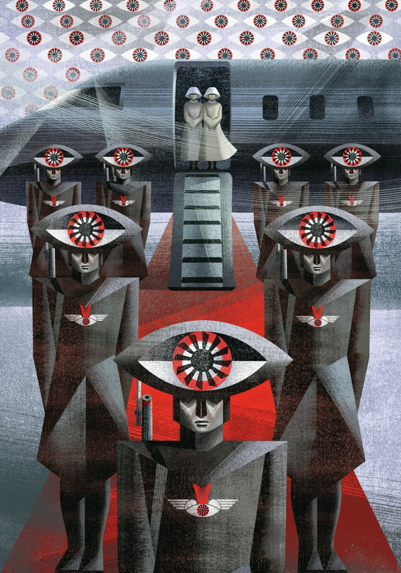
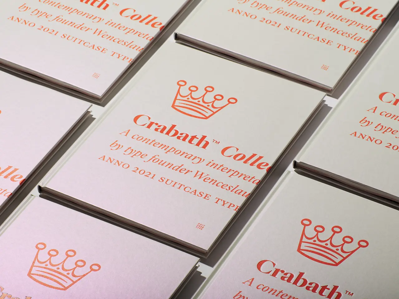
But it's worth remembering that AI didn't invent slop on its own. Unfortunately, our world was already dripping in human slop, and the beauty industry was one of the prime offenders.

Personally, I've got nothing against the beauty industry. I know a number of good people who work there, and its products generally make people happy and give them a sense of control over how they present themselves to the world. I've even drawn an income from it myself, in another life when I worked on high street women's magazines. But even its biggest adherents would have to admit: the beauty industry has long had a slop problem when it comes to its copywriting.

Person in white shirt and glasses standing next to a parody periodic table element reading "M Medical Grade" with "Ordinary" branding and number 4
Man wearing white shirt with face covered in white clay mask standing next to periodic table element card reading "Y Eternal Youth
Person in white shirt next to periodic table element square showing "Pr" for Precious with number 38, part of Uncommon's parody campaign

Look at a beauty product blurb from 2016, and it feels uncannily like something written by ChatGPT in 2026. On the one hand, it sounds impressive and well-written on the surface. But if you start to analyse it closely, it turns out to be abject nonsense.

The good people at Uncommon, working with skincare brand The Ordinary, had been thinking about this very issue. Their response was simple yet brilliant. And it's just won them a coveted D&AD Black Pencil. I chatted to co-founder Nils Leonard to learn more.
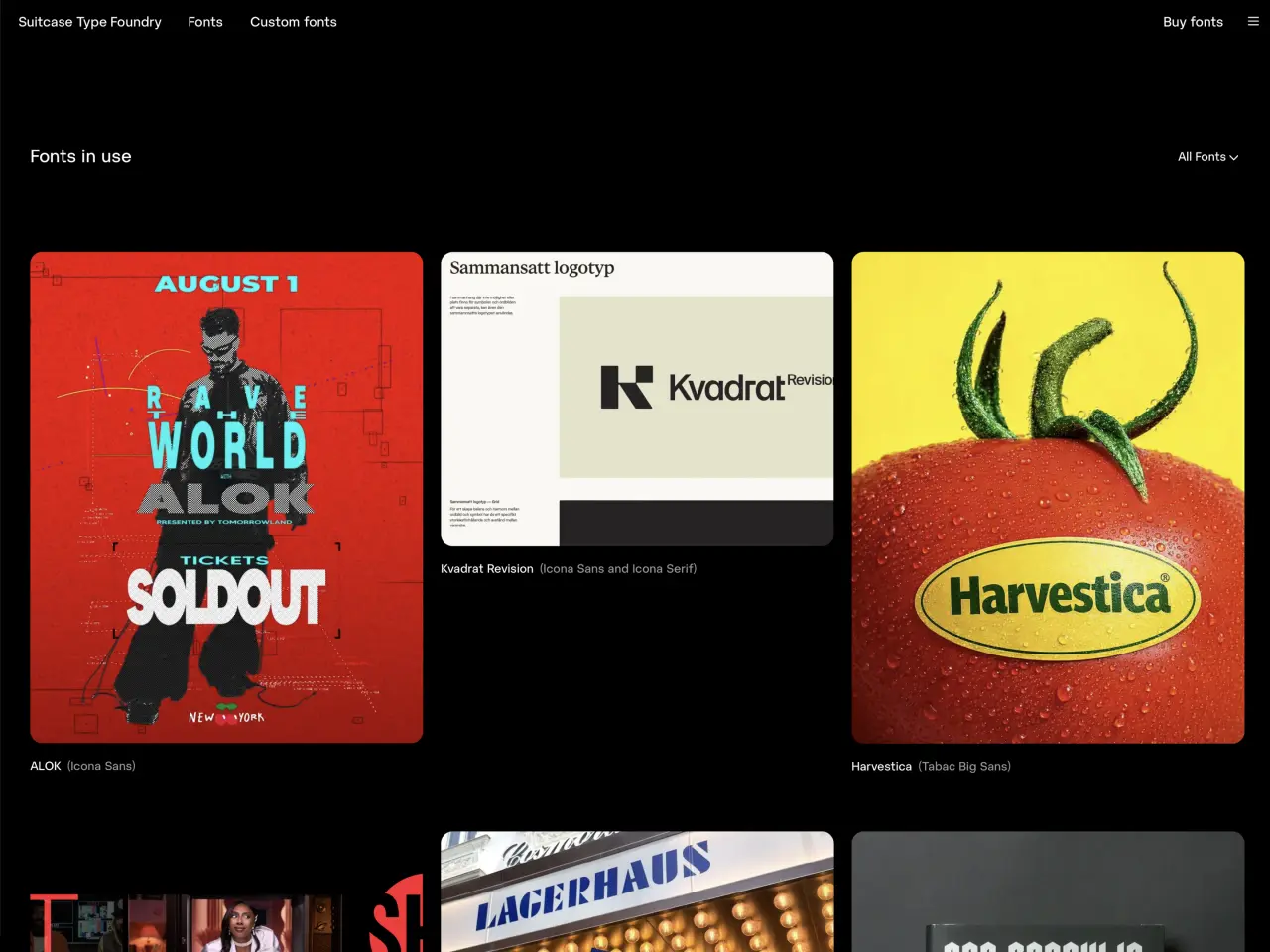
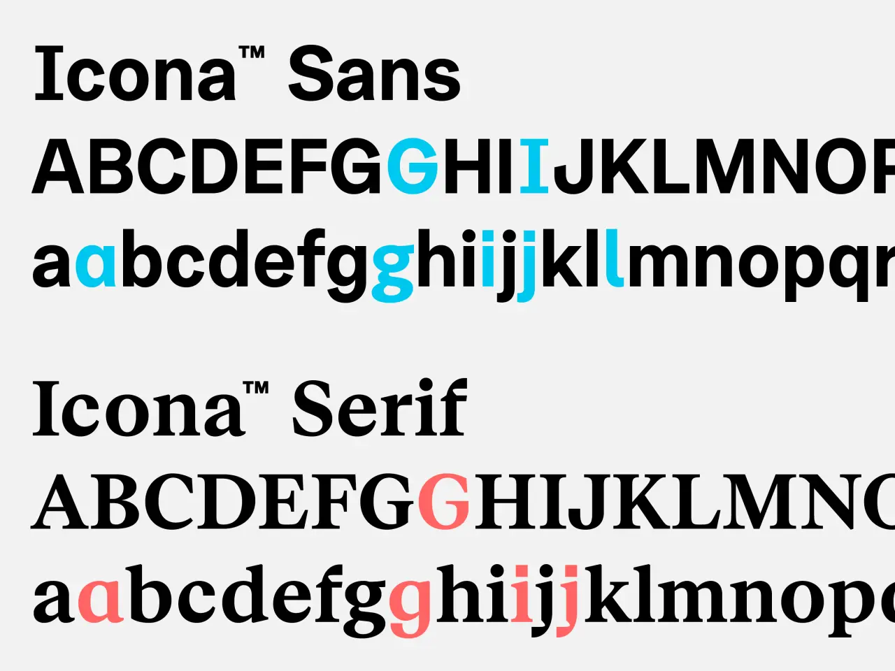
A dream client

The Ordinary is, ironically, no ordinary beauty brand, but one founded specifically to turn industry norms on their head. For Nils, that's made it a dream client to work with. "You're not working out how to nicely sell a block of cheese," he enthuses. "You're constantly looking at a category that really does need a poke in the eye."

Group of people seated on white chairs wearing white clothing against a light blue background in a minimalist studio setting
Person with shaved head covered in white face mask or clay treatment, wearing a white turtleneck against a pale blue background

Uncommon had already worked on a number of campaigns with The Ordinary, so how did this one come about? "We just started talking about all these made-up words, like elixir and age-defying," remembers Nils. "Age-defying is a literal lie. We started to pull at that thread, and we started wondering: how many of these words are there? We were just pissing ourselves laughing, because we kept coming up with more."

So what to do with them? "We said to ourselves: what if there was a system that we could use to host them all, and then just pop each one and talk about the realities of each one?" The idea of doing a parody around the periodic table felt perfect, because The Ordinary's whole identity is rooted in science.

Along with the empty buzzwords Uncommon uncovered, The Ordinary's team added plenty of their own, and the brand worked with scientists to check that each term definitely had no scientific or regulated basis.

The Periodic Fable, a parody of the periodic table with chemical symbols replaced by beauty industry buzzwords like "Ordinary," "Extraordinary" and "Synergy
Model wearing white collared shirt with pale makeup and bandaged jaw against dark background in beauty industry parody
Periodic table-style parody showing elements 9, 10 and 11 labelled H (Healing), Oa (Organic Snake Venom) and X (Elixir), mocking beauty industry buzzwords

For the final table, they settled on 49, ranging from "Flawless" to "Crushed Diamonds". Nils' personal favourite? "I'm obsessed with elixir; I think that's such a hilarious word to use," he laughs. "It's kind of King Arthur, bubbling in a pot."

Minimalist design

The design of the table itself is stark, monochrome, and highly legible, and I'd argue that restraint is what makes it work so well. Some might have been tempted to make, say, the typography more "scientific" looking. But taking a minimalist approach instead actually works better, because it helps the design get out of the way of the message.

"It's really tempting to try and do everything with everything," agrees Nils. "And there was definitely some scientific graphic language flying around. But we were really paranoid that people wouldn't get it."

The rollout was treated with the same level of thoughtful planning. Out-of-home sites showed individual elements in isolation, while others displayed the whole thing. Then there was the launch film, directed by Olivia De Camps and produced by Smuggler. Reminiscent of Apple's classic "1984" ad, it centres around a classroom of hypnotised students chanting the Periodic Fable elements while performing viral skincare rituals such as ice rolling.

"We were trying to shock people into noticing what's going on," says Nils. "When we make films, we always talk about: 'What's the shot that someone's going to print? What's the bit in it that someone's going to repeat, or pause on, or be affected by?'"

He credits both De Camps's gift for choreography, and the client's nerve in letting them make it in the first place. "Fair play to the client for genuinely partnering with us and trusting us on the provocation of that spot," he says, "because that's a pretty punchy thing to put out into the world."

Results and reflections

Once it launched, the results spoke for themselves: an 11.8x increase in website traffic, more than 80 pieces of press coverage and a 10.4% rise in purchase intent among American women. The mainstream beauty industry, meanwhile, mostly kept its head down. "I think the game with Big Beauty is that they just want to be quiet and carry on," says Nils. "If I'm really honest, what I've seen more is parts of the beauty industry starting to steal from The Ordinary's playbook."

Two parody periodic table element panels on a London Underground train displaying "Sp - Superfood-Infused" and "In - Intensive Therapy", mocking beauty industry buzzwords
Outdoor advertising billboard with periodic table design spelling "Tricks" and "Secrets", parodying beauty industry marketing buzzwords
Three panels mounted on a brick wall reading "Wrinkle Erasing", "Toxin-Free" and "Flawless" styled as a periodic table parody by Uncommon advertising agency

And here's where we come full circle: one brand even made its own AI-generated version of the Periodic Fable! "It was really bad," he grimaces. AI slop parodying a campaign about pre-AI slop, using slop? You couldn't make it up.

And that, in a nutshell, sums up why these campaigns matter. As Nils puts it: "In a world of AI and hacks and shortcuts, [real] work is sexy and attractive. When you see brands or people that have clearly taken the time and made the endeavour to make something like that, people want to reward it with attention."

That attention has now brought Uncommon a D&AD Black Pencil, and Nils doesn't hide that he's on cloud nine about the fact. "D&AD in my mind is the definitive award," he smiles. "Candidly, it's the hardest one to win. So I'm genuinely, personally, really chuffed."
How Kent Wood pivoted to motion design at 30, and what he's learned so far

The founder of Kwoo Studio discusses his career pivot, his move to another continent, and his approach to self-promotion.

Right now, many of us are contemplating either a career change or a geographical move (or both) as the twin engines of AI and economic contraction threaten the jobs we currently hold dear. And that's a scary prospect, but it's worth remembering that, actually, pivoting mid-career isn't itself a bad thing. People have been doing this for generations, for all sorts of reasons, and sometimes it could be the best thing that ever happened to you.

Kent Wood is currently going through that transition. "I used to think that by 30, you were supposed to have everything figured out in life," he says. "Instead, I moved countries, changed careers, learned motion design and started building a studio."

Having moved from America to England to support his partner, he's set up in business as Kwoo Studio. "My studio creates motion systems for brands," he explains, "essentially taking a brand’s existing static identity and bringing it to life, transforming it into a motion identity."

He's been writing about his experiences on social media and sharing his work, such as his concept case study for a fictional furniture brand, Belo. That's we first spotted him, and it turns out we're not alone.

"Since sharing my story online, I've had a flood of comments, DMs, and emails from people telling me they've recently quit their jobs, moved countries, or changed careers," he tells us. "We're in a time of rapid innovation, and that always brings big change. People of all ages are self-reflecting and rethinking what they truly want their lives to look like, particularly outside of work. My generation, Millennials and Gen Z, are on the front lines of it all, and a lot of us are taking huge risks as a result."

A global odyssey

That same thinking is what brought him to Manchester. "I'm here supporting my partner, who decided to return to academia after a brief stint in the corporate world and take up a new role at the university," he explains. "We eloped to Ireland back in 2022 and had always been open to living in the EU or UK if the right opportunity ever came along."

Sketch showing four microanimations for furniture, labelled select, open/approachable, tactile and friendly, each with simple line drawings demonstrating different motion concepts
Hand-drawn diagram showing four panels explaining furniture animation concepts: window pane simulation, open unambiguously sharing mass and weight, character movement, and the "be.lg" logo for Belo

His path to design, meanwhile, has not been straightforward. Having grown up in the Caribbean, he moved to Florida for university, where he studied kinesiology, the study of human movement. He's since lived in Florida, Texas and back in the Caribbean, where he founded a company distributing wholesale goods to hotels and restaurants.

"In many ways, the reason I eventually left feels familiar to what we're all experiencing in the design industry today," he says. "That business model was constantly shifting, and keeping pace meant working unsustainable hours while navigating shrinking profit margins, rising operational costs, and major supply chain disruptions. As the ground kept moving underfoot, I found myself questioning if I had a future there.

"The cumulative effect of constantly adapting to challenges and facing a model that no longer felt sustainable made me reconsider doing that work long term," he continues. "Around the same time, my partner was offered a role in the UK, so the move here presented an opportunity for a fresh start."

Passion for design

Running his own business was where he first developed a passion for marketing and design. "I had complete creative control," he says. "Pricing, inventory, the business name, the logo, colours, font pairings, imageryβ€”I taught myself to use a DSLRβ€”copywriting, radio ads, storefront graphics, even the website build."

Animation of fictional furniture brand Belo's logo

Having previously studied kinesiology, it felt like a full-circle moment when Kent eventually became a motion designer. He's since taken everything he learned from business and brand design into his own studio. "Focusing on motion systems for brands, I've morphed it all into what I call Motion Brand Design," he says. "In my view, it's the future of branding, where modern brand identity extends beyond static guidelines into motion identity systems."

On a personal note, he's found northern England a breath of fresh air. "I'd like to thank all the Northern creatives who have been nothing but welcoming since I started coming out to events," he enthuses. "As a newbie to town, that support has meant the world to me. I hope events like Process, The Northern Design Festival, and Motion North keep growing, and I look forward to becoming more involved as time goes on.

Minimalist dark blue icon of a rounded rectangular shape with two circular dots above it, suggesting a simplified face or character design

And he's determined to share his journey along the way. "I'm all in on putting yourself out there," he stresses. "You have to be smart about it, of course, making sure what you share aligns with what your brand stands for. But whether creatives should have a digital presence isn't even a debate in my opinion."

Sharing his story

In his case, it's already paid off. "I secured a meeting with a studio up north to walk through my case study and connect with their team of experienced designers," he explains. "Beyond that, sharing my story has helped me meet so many nice people and get on the radar in a place where I didn't really know anyone.

Kent Wood smiling at the camera wearing a cream jacket with brown collar, holding a coffee cup, with red brick buildings behind him

"I've been able to get to know, and even grab a drink with, loads of people in the industry doing amazing things, people I'd never have met if I weren't online. When you've shared your journey, there's a warmth to those introductions; people feel like they already know you, which makes meeting other freelancers and building your network so much easier."

He'd urge anyone in the same boat to do the same. "If you're like me and don't have a huge network of client referrals or agencies keeping you booked, it's the best way to make a name for yourself, market your business and promote your work," he reasons. "It's essentially free to post, for now at least, so we should take full advantage. At the end of the day, it should simply be viewed as your new digital business card."

The kinesiologist who now animates furniture: how Kent Wood found motion design's full circle

The founder of Kwoo Studio discusses how he's made a name for himself after a career pivot and a move across the Atlantic.

Right now, many of us are contemplating either a career change or a geographical move (or both) as the twin engines of AI and economic contraction threaten the jobs we currently hold dear. And that's a scary prospect, but it's worth remembering that, actually, pivoting mid-career isn't itself a bad thing. People have been doing this for generations, for all sorts of reasons, and sometimes it could be the best thing that ever happened to you.

Kent Wood is currently going through that transition. "I used to think that by 30, you were supposed to have everything figured out in life," he says. "Instead, I moved countries, changed careers, learned motion design and started building a studio."

Having moved from America to England to support his partner, he's set up in business as Kwoo Studio, and he's already attracted attention on social media, where he's been writing about his experiences and sharing his work, such as his concept case study for a fictional furniture brand, Belo. And it turns out he's not alone.

"Since sharing my story online, I've had a flood of comments, DMs, and emails from people telling me they've recently quit their jobs, moved countries, or changed careers," he tells us. "We're in a time of rapid innovation, and that always brings big change. People of all ages are self-reflecting and rethinking what they truly want their lives to look like, particularly outside of work. My generation, Millennials and Gen Z, are on the front lines of it all, and a lot of us are taking huge risks as a result."

A global odyssey

That same thinking is what brought him to Manchester. "I'm here supporting my partner, who decided to return to academia after a brief stint in the corporate world and take up a new role at the university," he explains. "We eloped to Ireland back in 2022 and had always been open to living in the EU or UK if the right opportunity ever came along."

Sketch showing four microanimations for furniture, labelled select, open/approachable, tactile and friendly, each with simple line drawings demonstrating different motion concepts
Hand-drawn diagram showing four panels explaining furniture animation concepts: window pane simulation, open unambiguously sharing mass and weight, character movement, and the "be.lg" logo for Belo

His path to design, meanwhile, has not been straightforward. Having grown up in the Caribbean, he moved to Florida for university, where he studied kinesiology, the study of human movement. He's since lived in Florida, Texas and back in the Caribbean, where he founded a company distributing wholesale goods to hotels and restaurants.

"In many ways, the reason I eventually left feels familiar to what we're all experiencing in the design industry today," he says. "That business model was constantly shifting, and keeping pace meant working unsustainable hours while navigating shrinking profit margins, rising operational costs, and major supply chain disruptions. As the ground kept moving underfoot, I found myself questioning if I had a future there.

"The cumulative effect of constantly adapting to challenges and facing a model that no longer felt sustainable made me reconsider doing that work long term," he continues. "Around the same time, my partner was offered a role in the UK, so the move here presented an opportunity for a fresh start."

Passion for design

Running his own business was where he first developed a passion for marketing and design. "I had complete creative control," he says. "Pricing, inventory, the business name, the logo, colours, font pairings, imageryβ€”I taught myself to use a DSLRβ€”copywriting, radio ads, storefront graphics, even the website build."

Having previously studied kinesiology, it felt like a full-circle moment when Kent eventually became a motion designer. He's since taken everything he learned from business and brand design into his own studio. "Focusing on motion systems for brands, I've morphed it all into what I call Motion Brand Design," he says. "In my view, it's the future of branding, where modern brand identity extends beyond static guidelines into motion identity systems."

On a personal note, he's found northern England a breath of fresh air. "I'd like to thank all the Northern creatives who have been nothing but welcoming since I started coming out to events," he enthuses. "As a newbie to town, that support has meant the world to me. I hope events like Process, The Northern Design Festival, and Motion North keep growing, and I look forward to becoming more involved as time goes on.

Minimalist dark blue icon of a rounded rectangular shape with two circular dots above it, suggesting a simplified face or character design

And he's determined to share his journey along the way. "I'm all in on putting yourself out there," he stresses. "You have to be smart about it, of course, making sure what you share aligns with what your brand stands for. But whether creatives should have a digital presence isn't even a debate in my opinion."

Sharing his story

In his case, it's already paid off. "I secured a meeting with a studio up north to walk through my case study and connect with their team of experienced designers," he explains. "Beyond that, sharing my story has helped me meet so many nice people and get on the radar in a place where I didn't really know anyone.

Man carrying a golden retriever in a black backpack whilst walking through a park in London

"I've been able to get to know, and even grab a drink with, loads of people in the industry doing amazing things, people I'd never have met if I weren't online. When you've shared your journey, there's a warmth to those introductions; people feel like they already know you, which makes meeting other freelancers and building your network so much easier."

He'd urge anyone in the same boat to do the same. "If you're like me and don't have a huge network of client referrals or agencies keeping you booked, it's the best way to make a name for yourself, market your business and promote your work," he reasons. "It's essentially free to post, for now at least, so we should take full advantage. At the end of the day, it should simply be viewed as your new digital business card."

❌