❌

Reading view

There are new articles available, click to refresh the page.

Scottish Web Folk 2026: a canny, reflective and honest conference

I’ve had the privilege of attending the Scottish Web Folk conference for the last three years and this year’s event was as informative and candid as always, tackling the topic of ‘Human vs Machine’.

At other conferences and in other industry presentations, excitement about what the machines, specifically AI, can do, often whips up a don’t-get-left-behind fervour. But at this event, I think it would be fair to say that the machines were being viewed with a canny, human eye. We are deep into our new AI era and have an increasingly solid understanding of its possibilities and parameters for safe use in web.

We’ve been here before

In his keynote speech, Andrew Millar from the University of Dundee kicked off the ‘Human vs Machine’ discussion by looking back at points in our industrial history where technological leaps had forced change in the labour market, and then made valuable the associated, human, skills that would correctly manage the new technology. The printing press, for example, made redundant scribes and copyists, created a need for typesetters, and had the knock-on effect of requiring judgement and authority to manage the wider dissemination of the printed word. When computers arrived in offices, the filing clerks that were able to shift from paper to software found their analytical and decision-making skills could usefully harness digital categorisation and reporting. Not long after inception, the internet brought new levels of digital publishing reach, and the associated friction between volume and credibility, but the human vs machine tension has taken a new turn with the introduction of AI-generated web content and AI search.

What I took from the keynote speech was not just that we’ve lived through technological change and adapted, but that we’ve been incrementally building the human muscle required to manage the current technological era where AI is ever more dominant. Judgement, authority, analysis, decision-making and credibility are going to be central to managing AI into maturity.

Highlights of the day

My thoughts were focused on advocacy and responsibility as the conference unfolded. What do we already know about wielding our new technologies well (or facing the fall-out afterwards)? A few sessions in particular stood out.

Just because we can doesn’t mean we should

Stratos Filalithis from UoE and Kris Purdy of the University of Glasgow gave an ‘unscripted’ presentation that shared their frustrations of uncovering enormous legacy web estates. Both Universities, beyond their central platforms, had experienced a two-decade boom in affiliated web publishing without fully centralised or localised content management.

Stratos and Kris shared their strategies to build an accurate picture of their Wild West estates, and then spoke of the challenges ahead of defining ownership and instilling governance to create a supported and managed herd. Not just ‘unscripted’, but ‘unfinished’, the honest, unpolished session offered no pat answers but was a resounding cheer for the humans that tackle backlogs and runaway technologies every day. Collaboration, sharing and never accepting defeat are still singularly human approaches.

We already know how to write for AI

Under-managed, Wild West web content poses a risk to reputation because it potentially serves redundant, out-of-date or incorrect information. Well-managed content, however, seems to be largely AI ready, so it’s heartening to hear that existing skillsets are still valuable here.

Paul Costello and Rob Allen from Numiko showed in their work for the University of Oxford that the findability strategies that have served SEO are still central to GEO (generative engine optimisation; optimising for AI chatbots like ChatGPT or Claude) and AEO (answer engine optimisation; optimising for AI search).

Nick Daniels, Katie Spearman and Mel Batcharj from the UoE UX team presented core approaches to writing for AI, and these are already embedded in existing content design practice. Clear, concise content, meaningful headings and links, and accessible text all create AI-friendly content. If you missed the talk at Dundee, and the session at the UoE, their blog is well worth bookmarking for actionable takeaways.

June Content Improvement Club: Is your content AI ready? – Website and Communications Blog

We have to design technologies for operators as well as end users

As technology and its associated processes mature, we have to design for its operators as well as its end users. This is high on the agenda for me as service manager for the University’s web platform, supporting our internal user community to deliver content for their external users.

Lauren Tormey’s session set out to apply design practice to the processes of an internal team creating user-centred content for UoE Degree Finder. In incremental stages, she workshopped a playbook with an already expert Prospective Student Web Team to

  • stress-test existing content guidance
  • uncover new contexts where ‘If X then Y’ had not yet been defined
  • empower the team through live editing workshops so that everyone was equally experienced in applying the styles as defined in all contexts

With major revisions overdue on our self-service resource, the EdWeb 2 Hub, I have direct takeaways from this session to recreate our existing content stylesheet and editing practices. The platform has evolved significantly in the 18 months since the Hub was initially published, but the team updating the Hub while also supporting the user community day-to-day is tiny. Workshopping our existing styles and processes to update the content might feel like a diversion under our current time pressures, but it’s also an opportunity to stress-test our content practices and invest in the team. It’s important that we are equally and consistently skilled at managing updates, whether working at volume during intense platform evolution or in a more settled pattern of rolling revisions.

Final thoughts

In his keynote speech, Andrew Millar quoted an episode of Doctor Who where an AI bot was nudging the world towards Armageddon. The Doctor observes that it’s not the machine that’s the problem, but the pressures and choices around it.

As professionals working in the higher education web space, it’s our responsibility to employ that canny, human eye to embrace the technologies that benefit us when used correctly. Are we using them because we should or because we can? Are we thinking of the legacy that our actions now will leave? What knowledge have we already accumulated that can inform our use of new technologies?

And how do we ensure that everyone using our technologies, whether operators or end users, is supported and protected from pressures to do more faster so that collectively we all contribute to the successful maturation of a new technology? I came away from the conference with the sense that as long as we keep sharing our experiences of past, current and new technologies, and are honest about our challenges and approaches to managing them, our choices can be positive.

40+ Best Logo Templates for Gamers in 2026

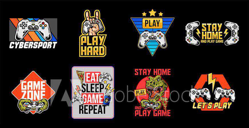
Logos are just as important for gamers as they are for professional athletes. The world of eSports demands a specific aesthetic that uses bold and bright colors to stand out on mobile and desktop screens. The challenge for designers is to create logos that capture the essence of the gamer or team while engaging with eSports fans.

This collection of professionally designed logo templates for gamers offers a range of options for individual athletes, streamers, eSports teams, clans, and fans. These logos showcase archetypal figures and bold design elements that effectively communicate the gamer’s brand and values.

Whether you’re working with an individual athlete or an eSports team, there’s a logo template to suit your needs. You can help your clients show their colors and spread the word with an engaging and fun logo that resonates with eSports fans.

For designers who frequently work with gamers and eSports teams, this collection includes gaming logo template collections that can be easily added to your design kit. With these templates, you can get to work quickly and efficiently, ensuring that your clients are winners in the world of eSports.

If you’re ready to press play and get started on designing stunning logos for gamers and eSports teams, this collection of logo templates is the perfect place to begin.

Ninja Assassin Logo Template

In PNG, AI & EPS Formats

Sleek and dynamic, this ninja assassin logo template for gamers is perfect for gamers who love their first-person shooters and always demonstrate incredible dexterity. This logo gives every gamer’s brand a suave look that shows they know their way around a stealth quest. It’s fully customizable!

Ninja Assassin Logo Template gamer video game

Gamer Boy Sports & eSports Mascot Logo Template

In AI & EPS Formats

If you’ve got a great eSports team on your hands or a distinguished streamer, you’re going to need an amazing logo. Enter: this retro-futuristic gamer boy mascot logo template. This logo is perfect for building a powerful personal brand and looks great on merch, too!

Gamer Boy Sports eSports Mascot Logo Template gamer video game

Shinobi Gaming Logo Template

In PNG, AI & EPS Formats

Powerful and futuristic, this logo template for gamers features a ninja in armor. It’s perfect for stealthy streamers and even eSports teams that want to rally audiences around their brands. You can completely customize this exciting logo template in Adobe Illustrator and make sure everyone remembers the name.

Shinobi Gaming Logo Template gamer video game

Gamer Mascot Logo Template

In AI & EPS Formats

Help your client’s viewers relate to them with this exciting and modern gamer logo template. It’s perfect for streamers who want to build a personal brand, although it works great for pro players, as well. The color palette and typography choices give this logo incredible movement!

Gamer Mascot Logo Template video game

Werewolf Esport Logo Template

In PNG, AI & EPS Formats

Help the fans show some team spirit with this exciting werewolf eSport logo template! This logo, with a blue and orange color palette, is perfect for teams that are ready to make bank at their next competition. You can easily customize the text and the colors in the Adobe suite.

Werewolf Esport Logo Template gamer video game

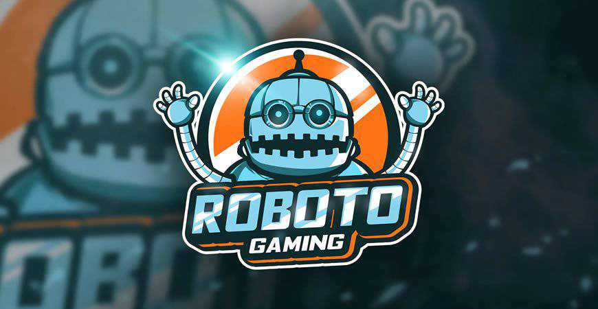
Roboto Gaming Mascot & Esport Logo Template

In PNG, AI & EPS Formats

Modern and unique, the Roboto gaming mascot logo template is definitely one of a kind! It plays with a variety of bold stylistic choices, from the interesting pose of the robot mascot to the dynamic gradient typography. It’s perfect for eSports squads that want to get more hype.

Roboto Gaming Mascot Esport Logo Template gamer video game

Dragon Sport Logo Template

In AI & EPS Formats

Dark and powerful, this dragon eSports logo template is perfect for the teams who know they’re the rulers of every game they choose to play. This logo exudes confidence and power, so it’s going to be a great fit for logos, merch, and other branding materials.

Dragon Sport Logo Template gamer video game

Hunter Gaming Sport & eSports Logo Template

In AI & EPS Formats

If your client is always the gamer who comes out on top, show it with this hunter eSports logo template for gamers. It displays a hunter gearing for a fight in the standard Call of Duty colors – black, grey, and white. This logo also works great for Twitch streamers!

Hunter Gaming Sport eSports Logo Template gamer video game

Gaming Suppport Sport & eSports Logo Template

In AI & EPS Formats

Are you working on a logo for an eSports team? Check out this template! It’s the perfect option for teams that provide strong support and powerful offense. With an illustrated hand grabbing for the controller, it’s perfect for teams that compete in console multiplayer games like Call of Duty.

Gaming Suppport Sport eSports Logo Template gamer video game

Excited Gamer eSport Team Logo Template

In AI & EPS Formats

If you’re working with an animated and dynamic streamer, they’re going to love this logo! This fun logo showcases a gamer experiencing the thrill of the fight and instantly gives off an engaging vibe. This gaming logo template works best for lone wolf players and streamers.

Excited Gamer eSport Team Logo Template gamer video game

Samurai Gaming Sport Logo Template

In AI & EPS Formats

Gaming fans who see this logo are bound to start cheering for the eSports squad sporting it! A combination of eerie and exciting, this samurai logo template is perfect for teams who take pride in the quality of their achievements and their stealth. You can customize it in Adobe Illustrator!

Samurai Gaming Sport Logo Template gamer video game

Worlds Games Sports Logo Template

In AI & EPS Formats

Are you looking for a great sports logo template for gamers? You’ve just found it! This sports logo is perfect for gamers who love feeling like they’re on the field even when in their living rooms, and it’s sure to rally loads of support around them.

Worlds Games Sports Logo Template gamer video game

Skull Gamer with Headphones Logo or Mascot Template

In AI & EPS Formats

Perfect for streamers, this logo template for gamers features a skull with headphones on. The illustration’s style is very fun and engaging, so it’s perfect for gamers who are ready to launch their first merch line. You can easily customize the logo to fit your client.

Skull Gamer with Headphones Logo or Mascot Template gamer video game

Human Gaming Logo Template

In AI & EPS Formats

This logo template tells a story, and it’s perfect for both streamers and teams! It’s versatile, so it works for all kinds of purposes, and you can easily customize this logo for gamers in Illustrator.

Human Gaming Logo Template gamer video game

Trooper Sports & eSports Logo Template

In AI & EPS Formats

Show everyone how great troopers can be in a battle (contrary to the Star Wars stereotypes) with this cool eSports logo template. This logo for gamers features a trooper helmet with a white, dark blue, and electric blue color palette. It’s definitely a powerful, on-brand choice for gamers.

Trooper Sports & eSports Logo Template gamer video game

Gamer Logo Template

In AI & EPS Formats

Wild and engaging, this gamer logo template is perfect for streamers who don’t mind hosting let’s play sessions with folks all over the world. This is a great logo template for gamers, and your clients can easily grow with branded merch and other products later on.

Gamer Logo Template video game

Ninja Game Mascot & Logo Template

In PNG, AI & EPS Formats

If your clients love ninjas but they don’t want to be too on the nose about it, this logo is perfect! It offers a new take on the popular ninja symbol in gaming and an engaging typography and presentation style. The logo is fully editable in Adobe Illustrator.

Ninja Game Mascot & Logo Template gamer video game

Game Girl Gaming Logo Template

In AI & EPS Formats

If you’re working with a client that wants to both emphasize her skills and her femininity, consider this logo. This wonderful logo offers both the enthusiasm of standard gaming logos while also presenting the audience with a cute (and amazing) gamer girl illustration. It’s a win-win!

Game Girl Gaming Logo Template gamer video game

Gamer Boy Logo Template

In AI & EPS Formats

Keep it simple and fun with this gamer boy logo template for gamers, streamers, and squads. If your client is ranking high on the leader boards of their chosen game, they might want a logo that emphasizes their passion. This loud and bright logo is a great and memorable choice.

Gamer Boy Logo Template gamer video game

Cowboy Game Logo Template

In PNG, AI & EPS Formats

Give your client the awesome Red Dead Redemption vibe with this cowboy gamer logo template. It’s great for streamers, as well as an eSports squad that isn’t afraid to give their audience the yee to their haw’s. You can easily customize it in Adobe Illustrator!

Cowboy Game Logo Template gamer video

VR Games Logo Template

In AI & EPS Formats

VR is pretty innovative, so if that’s the road you’re following, you’re going to need an innovative logo, too. This logo template for gamers showcases an illustration with gradient VR glasses and typography that follows the same style. It’s an amazing choice!

VR Games Logo Template gamer video game

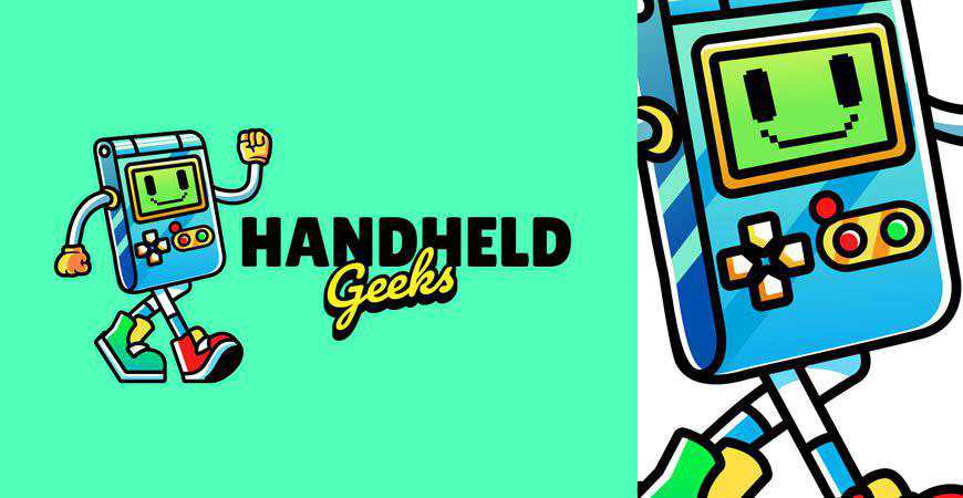
Handheld Gaming Logo Template

In PNG, AI & EPS Formats

If your clients love retro consoles and handheld gaming, they’re going to love this logo with retro arcade typography. Inspired by some of the most popular retro gaming design projects, this logo is fun, engaging, and perfect for creating a whole community of video game fans around it.

Handheld Gaming Logo Template gamer video game

Game Chat Logo Template

In AI & EPS Formats

The best gaming logos show the gamers’ personalities, and this one is perfect for squads and teams that love communicating with their loyal fans. Modern and minimalist, this gaming logo works like a charm for a variety of purposes. It can represent an eSports squad or a gaming-related project.

Game Chat Logo Template gamer video game

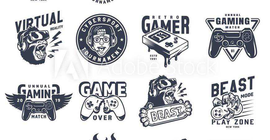
Vintage Monochrome Gaming Logo Templates

In AI & EPS Formats

If you often work with gamers who love old-school cool kind of style, then you need this gaming logo collection in your kit! You’ll get 16 logo templates for gamers inspired by vintage typography and visuals, with contemporary dynamism perfect for projects, squads, streamers, pro players, and more!

Vintage Monochrome Gaming Logo Templates gamer video game

Unlimited Gamer Logo Template

In PSD & EPS Formats

If you need a professional logo for gaming studios, developers, or other professionals in the gaming industry, this template is a great fit. It combines the image of a console with the infinity sign, and expresses movement through dynamic palettes. You can easily customize it in Adobe Photoshop or Illustrator.

Unlimited Gamer Logo Template gamer video game

Colorful Game Logo Template

In PNG, AI & EPS Formats

This colorful and vibrant gaming logo template is perfect for video game developers and studios that want to attract new fans to their projects! Featuring a cute console controller with minimalist sans-serif typography, this gaming logo template will definitely amaze your customers and make everyone want to play their games!

Colorful Game Logo Template gamer video game

Neon Video Game Logo Template

In AI & EPS Formats

Nothing beats the charm of neon! And if you’re working with vibrant clients who want to entertain their audiences, make sure you add this collection of 8 neon logo templates for gamers to your kit. These unique logos feature motifs such as handheld controllers, arcade machines, and more.

Neon Video Game Logo Template gamer video game

Infinite Game Logo Template

In AI & EPS Formats

Create an engaging and versatile logo for game developers and studios with this gaming logo template. With an interesting rendition of symbols seen on console controllers and gradient typography options, this logo definitely showcases professionalism. You can easily customize it to fit your clients’ brands in Photoshop and Illustrator.

Infinite Game Logo Template gamer video game

Game Over Logo Template

In AI & EPS Formats

This is the only ‘game over’ we ever want to see! This fun logo template features a skull with console controller buttons for eyes and a bold sans-serif heading. It works like a charm for individual players and streamers, as well as game developers and studios.

Game Over Logo Template gamer video

Video Gaming Logo Template Set

In AI & EPS Formats

Give your clients more options with these vintage-inspired gaming logo templates. This gaming logo collection features nine gaming logos perfect for gaming projects, tournaments, communities, and similar initiatives. From skulls to console controllers catching fire, these logos radiate charm. You can easily customize them to fit your clients’ brands!

Video Gaming Logo Template Set gamer video game

Gaming Academy Logo Template

In PSD, AI & EPS Formats

If you’re not looking to school your customers in PVP, and you actually want to educate them, you’re going to love these gaming academy logo templates! This gaming logo pack includes six professional logo templates that you can easily customize and use for your gaming courses.

Gaming Academy Logo Template gamer video game

Quest & Escape Room Logo Template

In AI & EPS Formats

If your gamers are known for playing mystery games or escape room games, they’re going to love these logos. Inspired by traditional mystery motifs, these logo templates for gamers are vibrant and engaging. Help your clients leave the right first impression and draw more fans into their mysteries!

Quest & Escape Room Logo Template gamer video game

Digital Gamer Logo Template

In AI & EPS Formats

Create a professional foundation for your gaming brand or project with this digital gamer logo template. It features a pixelated-style illustration and a modern, sans-serif headline. You can easily customize this logo to your liking in Adobe Illustrator. It’s sure to help you leave a great first impression!

Digital Gamer Logo Template gamer video game

Retro Gaming Club Logo Templates

In AI & EPS Formats

Make your retro gaming project more recognizable with these retro gaming club logo templates. Inspired by the 80’s game arcade style in both typography and illustrations, these logos have a particular charm to them, and they’re a bold choice for gamers who love old-school cool.

Retro Gaming Club Logo Templates gamer video game

Gameroom Logo Template

In PSD, AI & EPS Formats

If your clients prefer creating video games to playing them, they’ll love this gaming logo template. This two-tone logo template features console controller symbols and room for your brand name and a slogan. It’s perfect for gaming studios, developers, and other projects in this vibrant industry!

Gameroom Logo Template gamer video game

Gamer Mascot & Logo Templates

In AI & EPS Formats

Make the most of the ’80s video game aesthetics and modern ways to kick some serious tooshie with these logo templates for gamers! They’re perfect for individual players, as well as squads and other projects like communities. Retro’s going to make a major comeback!

Gamer Mascot & Logo Templates gamer video game

Game Play Logo Template

In AI & EPS Formats

Fully editable and professional, this logo template showcasing a console controller is a perfect fit for video game developers or development studios. Your branding will be improved with this beautiful rendition that both connects you to your gaming roots and signalizes innovation to everyone who sees it, gamer or investor.

Game Play Logo Template gamer video game

Collection of Video Game Logo Templates

In AI & EPS Formats

Perfect for gaming logos, merchandise, and a lot more, these gaming templates are stunners! The illustrations will throw you back to the ’80s (in the best possible way) with vibrant colors and motifs such as dinosaurs and consoles with bold typography. These designs are great for communities and apparel!

Collection of Video Game Logo Templates gamer video game

Gamer Joystick Logo Template

In AI & EPS Formats

Minimalist and abstract, this gamer logo template is really unique. It’s also incredibly professional, so it’s a great fit for gaming projects, developers, studios, and more. It features an abstract illustration of hands and a console controller, and you can easily customize it in Adobe Illustrator.

Gamer Joystick Logo Template video game

Neon VR Game Logo Templates

In AI & EPS Formats

Hello, retrofuturism! This stunning gaming logo template collection features four neon logos with both classic gaming and virtual reality gaming motifs. These logo templates for gamers are a great choice for bold gamers who aren’t afraid of exploring new frontiers, and they look amazing with darker color palettes.

Neon VR Game Logo Templates gamer video

Where to Display Your Gamer Logo

With your logo forged, it’s time to let it shimmer in all its glory. Here are the strategic locations in the gaming kingdom:

  1. Streaming Platforms: If Twitch, YouTube Gaming, or Facebook Gaming are your arenas, ensure your logo is prominently visible, be it on overlays, banners, or profile pictures.
  2. Social Media: Gamers are ever-present on platforms like Twitter, Instagram, and Discord. Your logo should mark its territory on profile images, pinned posts, and even watermarked on shared content.
  3. Website or Blog: If you maintain a gaming blog or official site, the header is prime real estate for your logo. And don’t forget the favicon!
  4. Merchandise: Many gamers and streamers diversify with branded merchandise like T-shirts, caps, and mouse pads. Your logo, emblazoned on these, becomes a symbol of loyalty for your fans.
  5. In-game Displays: If you’re into eSports, your logo can find its way onto virtual jerseys, banners, or even in-game billboards in some simulations.
  6. Business Cards & Stationery: Meeting fellow gamers at conventions or industry events? Hand them a card with your logo, leaving a tangible mark of your virtual persona.
  7. Gaming Equipment: Stickers or skins of your logo on consoles, PCs, or even controllers amplify your brand’s presence in the tangible realm.

Eat, Sleep, Game, and Repeat!

Help your clients show their style in the best possible way with these dynamic and fun logo templates for gamers.

All of these templates have been made with gaming aesthetics in mind, so you don’t have to start from scratch or conduct dozens of hours of competitor research to make sure you’re on the right path. Instead, all you have to do is find the right gaming logo(s) on this page and add them to your design kit.

Your clients will love it, and so will their fans. Who knows? Maybe one of these days, you’ll see the logo you designed on your client’s Twitch merch! So bookmark this page, download the templates that suit your client’s style, and get to work. All it takes is a few clicks, and you’ll be set!


The post 40+ Best Logo Templates for Gamers in 2026 appeared first on Speckyboy Design Magazine.

Webdesign: douglus.co

New web design inspiration:

Douglus Nguyen Web Designer from Vietnam : Douglus Nguyen : Independent web designer based in Vietnam, focused on website design, interaction design, and front-end development.

Webdesign: Lorenzo Lottici

New web design inspiration:

Lorenzo Lottici : Order in the chaos : I bring order to the chaos in your business. Outside, a site people recognize at first glance. Inside, automations and AI agents that work quietly.

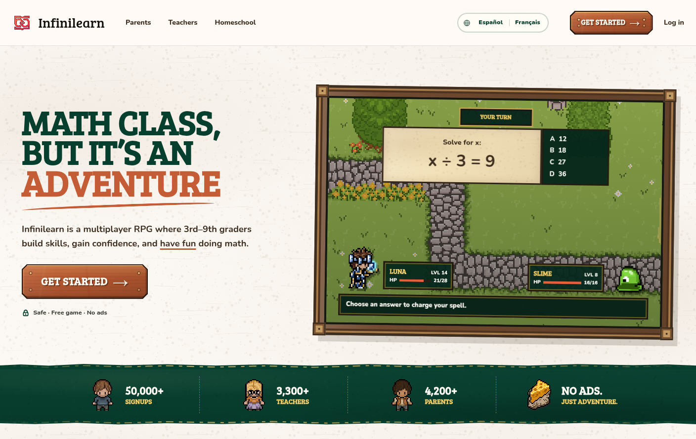
Webdesign: Infinilearn

New web design inspiration:

Infinilearn Free Math RPG : Math class, but it’s an adventure : A free fantasy RPG where students battle monsters by solving real math problems. No ads. Grade-level practice for grades 3–9.

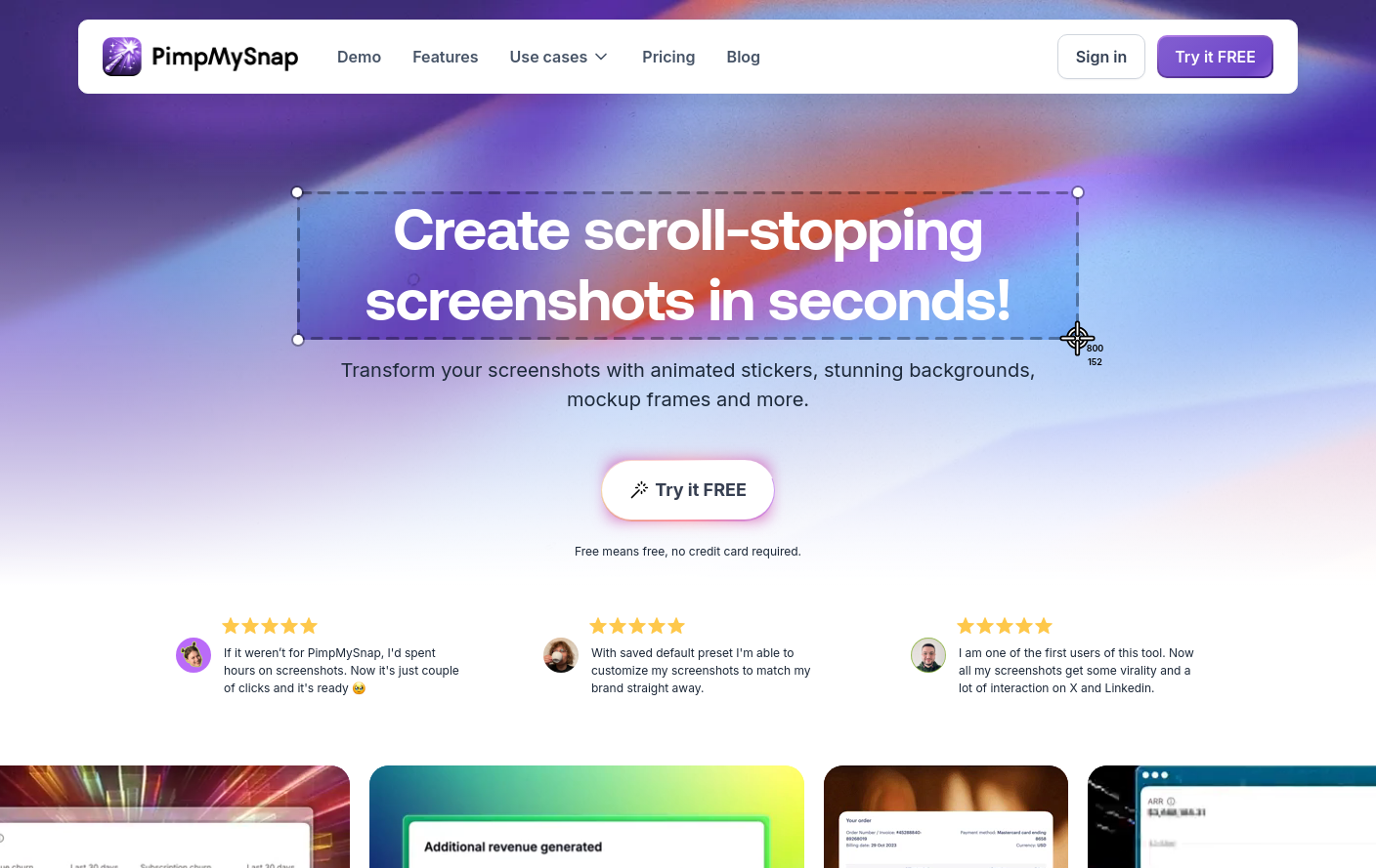
Webdesign: PimpMySnap

New web design inspiration:

PimpMySnap - Animate your screenshots : PimpMySnap is a powerful screenshot editor capable of transforming your screenshots into eye-catching visuals.

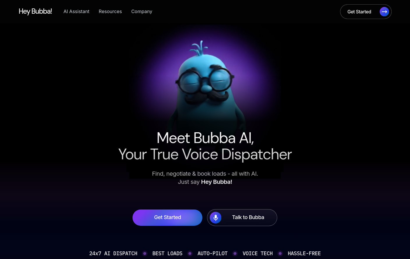
Webdesign: Bubba AI

New web design inspiration:

Bubba AI - AI Back-Office Automation for Fleets : Hey Bubba! is an AI back-office automation platform for fleets, automating dispatch, driver communication, paperwork and DOT compliance.

How to create consistent content using the editorial style guide: What we covered in October’s Content Improvement Club

We’ve been refreshing the editorial style guide to make it more useful for colleagues across the University. In October’s Content Improvement Club, we explored why consistency matters, what’s changing and how you can use the guide in your own work.

You can read more about the reasons behind the project in Nick Daniels earlier blog post:

Why we’re refreshing the editorial style guide

Using the editorial style guide to make consistent decisions

The editorial style guide helps us make consistent decisions about how we write and present information. It’s designed to help us create content that’s more accessible, readable and inclusive.

Editorial style guide

It covers a range of everyday editorial decisions, including:

  • when to capitalise something and when not to
  • how to spell words that have multiple possible spellings
  • how to explain abbreviations and acronyms

Exploring consistency through examples

In the session, we started by looking at some everyday editorial decisions to explore how the style guide can help us create consistent content.

How we write the University’s name

We looked at the different ways we might write the University’s name. It’s surprising how many variations we can come up with for something so familiar.

But using different versions can be confusing, particularly for people who don’t know the University as well as we do. A name is an important part of our identity, so we need a shared approach rather than everyone deciding what feels right.

Luckily, we don’t have to guess. The editorial style guide provides clear guidance (the correct wording is the University of Edinburgh).

University terminology style guide page

A slide with the question 'What are we called?' in the centre. A group of blue squares surrounds this, containing a variety of ways people have referred to the University of Edinburgh. These include 'UoE', 'Edinburgh Uni', 'Edinburgh University' and the correct version, 'The University of Edinburgh'.

How we write dates

We also looked at some of the smaller editorial decisions we make every day, using dates as an example. We showed four date formats in a poll and asked attendees which they would naturally use when writing University content.

Our options were:

  • A) 27/10/2026​
  • B) 27 October 2026​
  • C) 27th October 2026 ​
  • D) 27th Oct 2026  ​

Looking at the options, we discussed how it’s not that one format is universally right and all the others are wrong. Different formats can be appropriate in different contexts. For University content, though, we’ve agreed to use option B) 27 October 2026. Following the same convention helps us keep our content consistent, wherever it appears.

Dates and days editorial style guide page

Why consistency matters

Having looked at some practical examples, we asked attendees why they thought consistency was important when creating content. Using sticky notes, people shared their ideas. There was a lot of overlap between the reasons they identified and the ones we’d thought about beforehand.

One reason is brand reputation. We want people to recognise us as one University, wherever they come across our content. Using consistent terminology and conventions helps build that recognition and trust.

Consistency also supports readability and accessibility. Familiar, predictable formats make content easier to scan, understand and use.

It contributes to clarity and accuracy, too. Having an agreed approach helps avoid confusion and makes it easier for people to understand the information we’re sharing.

Finally, consistency helps create a joined-up user experience. Whether someone is visiting our website, reading an email or looking at social media, we want their experience of the University to feel connected.

Putting the style guide into practice

The session was a little different from some of our previous Content Improvement Clubs. Rather than spending most of the time presenting guidance, we wanted to give attendees the opportunity to explore the style guide for themselves.

We included two practical activities to help people get familiar with the guide.

Exploring the guide through example pages

We looked at two mocked-up webpages we’d created. Both contained deliberate editorial inconsistencies and mistakes. Attendees explored the guide for themselves, find the relevant sections and use the guidance to identify possible improvements.

They used sticky notes to highlight things they’d spotted and consider what they might change. This included things like flagging unexplained acronyms, link text that needed to be placed on a new line and incorrectly formatted bullet lists.

A page titled 'Tuition Fees and Loans for Students from Scotland' with eight sticky notes annotating issues with the content. These include comments like 'Use sentence case for page titles', 'Do not use all caps for emphasis' and 'Explain acronyms on first mention'.

The first example of a mocked-up page used in the session

A page titled 'Sports clubs' with 11 sticky notes annotating issues with the content. These include comments like 'Use -ise endings instead of -ize endings', 'Avoid ampersands' and 'Bullet list items do not end in punctuation'.

Second example of a mocked-up annotated page from the session

This gave everyone a chance to become more familiar with the guide and see how it can support everyday decisions when creating and editing content.

Where should you start with the style guide?

One thing we hear from colleagues is that there’s a lot to remember in the style guide. It can be difficult to keep every convention in mind when you’re busy creating and maintaining content.

Our advice was not to try to remember everything. Instead, we suggested starting with four priority areas:

  • Acronyms and abbreviations
  • Headings
  • Links
  • Dates and numbers

These are useful areas to focus on when reviewing your content. It’s also worth asking someone else to read it over. A fresh pair of eyes can often spot inconsistencies or things that you might have missed.

Reviewing our own content with other publishers

For our second activity, we used these four priority areas as a starting point. Attendees worked in breakout rooms to look at content from their own websites. People took turns sharing their screens and reviewing each other’s content.

The breakout rooms generated some interesting discussions about the practical challenges of applying editorial guidance. For example, we talked about using links within bullet lists and how much information to divide into separate headings and sections.

These decisions don’t always have a straightforward answer. The important thing is to think about what works best for the people using your content and use the guidance to help inform your decisions.

The activity also gave publishers a chance to get feedback from colleagues they might not usually work alongside and look at their content from a different perspective.

Experimenting with ELM to check content against the style guide

In the session, we also talked briefly about whether ELM (the University of Edinburgh’s AI innovation platform) could help publishers check their content against the editorial style guide.

We haven’t always had reliable results when using ELM for this purpose

As John Wilson explored in his February 2025 blog post, ELM can sometimes identify errors and correctly explain why they don’t follow our guidance, but it can also miss other errors or refer to guidance that doesn’t exist.

Testing ELM’s ability to return useful results and prompts about the editorial style guide

A text-based Markdown version of the style guide is what we’ve tested more recently

We’ve been experimenting with giving ELM the style guide as a text-based Markdown file. This means it can use the actual guidance to check a webpage against, rather than relying on its existing knowledge.

We tried this approach with the two mocked-up pages used in the session. ELM was able to identify the majority of the deliberate inconsistencies, although it still missed some issues, including an example relating to capitalising ‘University’ when referring to the University of Edinburgh.

It’s an interesting experiment, and one we’re continuing to explore. While tools like ELM may be able to help identify potential issues, they should not replace checking the guidance yourself and using your own editorial judgement.

We shared a couple of examples of what we’ve been working on in the guide

It’s been a big undertaking working through each section of the guide. We wanted to give attendees a flavour of the work by looking at a couple of examples.

Bringing University-specific terminology together

We’ve expanded the previous ‘Referring to the University’ page into a broader University terminology page. You can read more about the development of this page in our blog post:

Creating a new style guide page on University terminology

Restructuring the punctuation guidance

We’ve also restructured the punctuation guidance into separate pages.

Punctuation section of the editorial style guide

Previously, much of this guidance was grouped together using accordions. We wanted to move away from this format, which can make content less accessible and harder to navigate.

We’ve reviewed how the different topics are grouped, too. For example, colons and semicolons now sit together, making it easier to compare the two and understand when to use each.

Separating the guidance gives us more flexibility to provide the right level of explanation and include examples where they’re most useful, without simpler guidance getting lost among more detailed sections.

Keeping the guide up to date

We want the editorial style guide to remain a useful, living document rather than something we publish and leave untouched.

Alongside those mentioned in this blog post, some of the changes we’ve made to the guide have been much smaller tweaks or clarifications. We’ve been logging changes on the guide’s updates page, so if you’re interested in following how it continues to develop, you can see what’s changed there.

Updates page (editorial style guide)

How to hear about future Content Improvement Club sessions

We promote these sessions via our mailing list. If you’re interested, please sign up:

Join the UX and Content Design mailing list (University login required)

Suggest a topic for a future session

We’re keen to continue covering topics that colleagues across the University would find useful. It would be really helpful if you could let us know any ideas you have using this form:

Suggest a topic for Content Improvement Club (University login required)

Other training that we offer

More training is listed on the User Experience Service website:

Training | User Experience Service


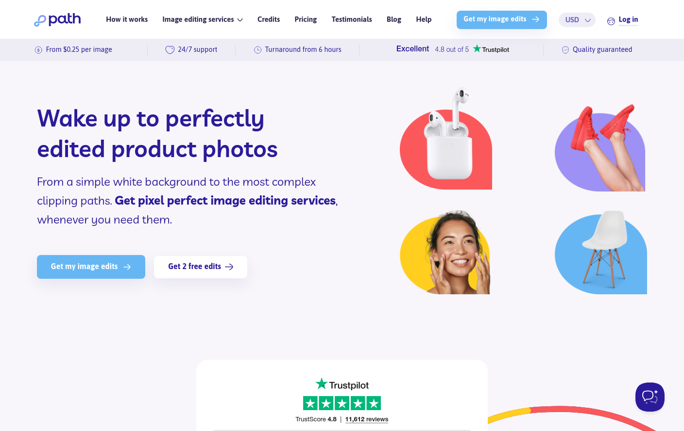
Webdesign: Path Edits

New web design inspiration:

Path Edits : Path Edits is your 24/7 virtual photo editing studio for hand-drawn clipping paths and crisp, clean cutouts you can put on any background.

Webdesign: Paul Melluzzo

New web design inspiration:

Paul Melluzzo Creative Director : Paul Melluzzo is a multi-disciplinary creative director, designer and artist based in Connecticut.

Webdesign: Warren Mahoney

New web design inspiration:

Warren Mahoney Architects : Everything is possible : We are an architecture practice based in Australia and New Zealand with approximately 350 highly engaged people from 35 countries, all eager to explore how design can meet the needs of a rapidly changing world.

Just do it for me? Balancing human and AI input in content improvement

Working with student interns and contributing to the Drupal community, I’ve experimented with AI in various  tools designed to support content improvement. I reflect on what I’ve learned about peoples’ preferences for engaging with AI tools and consider wider design challenges for web content to support co-browsing.

Writing good quality, user-centred content has always been a challenge, and accordingly, a suite of tools evolved to address this; Hemingway, Grammarly and many more. With their ability to learn patterns and predict word sequences, the advent of LLMs provided a new direction for content improvement. Where previous tools had used fixed rules, algorithms and formulas to flag content problems and score sentences, LLMs changed the playing field as they were able to be prompted to rewrite and create text and to adapt words and sentences not only in line with fixed rules, but also aligned to different interpretations of style.

The UX Service’s content design course, Effective Digital Content, and our ongoing Content Improvement Club meet-ups are both designed to help staff publishing digital content for the University. It’s been encouraging to see a positive uptake for both training formats, however, we realise we can do more to help staff publish the best quality content they can, and to this end, for the past few years it’s been a privilege to support a series of interns in the UX Service to look at how we can innovate and apply AI to the persistent challenge of writing good quality, user-centred content.

Thinking beyond – embracing the spirit (or grasping the nettle, depending on how you look at it) of AI innovation, it’s sensible to note that, more broadly, the browsing landscape of the web is increasingly shifting to include AI agents as well as humans, giving cause to consider what using AI to design content to be consumed by AI might look like. That’s the subject of another blog post (or several).

For now, as I begin another phase of work with a new student in the role of AI and UX Innovation intern (Viktor Sharha), it felt timely to pull together what I’ve learned so far.

Designing, creating and editing content happens in various ways

When designing any user-centred assistive features, a good place to start is the current workflow or user journey people adopt to achieve the task in question. In other words, to look at the stages content editors currently go through to make sure their content is as good as it possibly can be.

One of my earliest research tasks when I joined the University was to usability test the Editorial Style Guide, to find out how publishers used it to keep their content consistent in EdWeb. This work gave me insight into the type of workflows publishers followed to get compliant content published. Some publishers worked in Microsoft Word, using the in-built spelling checker for typos, and cross-checking against a printed-out copy of the style guide for University-specific errors before pasting content into the EdWeb body text. Others went straight to EdWeb, checking their content line-by-line with a PDF version of the guide. Others relied on colleagues giving their work the once-over before pressing publish. Some used Grammarly and Hemingway, some didn’t.

Overall, there wasn’t a dominant content-publishing workflow, with unified friction points waiting to be alleviated through a standard user-centred design process. Instead, there were varied approaches, habits and ways of working which people had adapted over time to suit their specific circumstances and to address the areas they found difficult as individuals. Tools were used at different stages of the process, and to a greater or lesser extent depending on personal preferences.

Therefore, designing content improvement tools isn’t one-size-fits-all

It follows that, since people follow different pathways to create, design and edit content, tools to assist this process need to be developed in different ways to suit varied preferences. Since 2025, interns in the UX team have prototyped our own different content improvement tools to test with publishers, and we’ve also tested open-source tools that exist already, developed within the Drupal community. From our testing and research, we found pros, cons and nuances associated with different tools. The summary below pulls together detail of the tools and how they compared.

Tool 1: Drupal Editoria11y – no AI, flags errors in the editing interface

Editoria11y is a Drupal module built by John Jameson from Princeton University that automatically checks content inside the editorial interface. It was originally designed to catch accessibility issues, but it can be configured to check content against other rules too, such as institutional style guide conventions.

What it does and how it works: Editoria11y checks content as authors type, and also on previews and published pages. It includes an indicator bar to show how many issues are on the page and has inline markers to show where each issue is, as well as a dashboard summarising site-wide errors. When an issue is opened, a pop-up modal explains the problem and suggests a fix.

What worked well: In tests, publishers were able to make sense of the inline markers and understand how these related to the indicator bar for the whole page. They liked the tracked change visualisation in the pop-up modals, and were able to work through successive modals, accepting or ignoring the suggested changes.

What needed improvement:  Some publishers found the number of markers overwhelming, and since the pop-ups covered the text, it was difficult to judge each recommendation in context. In the pop-ups, some of the rule descriptions used formal grammatical terms (such as ‘ordinal suffixes’) which were unfamiliar to some publishers meaning they were confused about the problem to be fixed. Since rules were applied mechanically, there were instances where errors were missed, or where awkward fixes were suggested (such as swapping ‘1st floor’ for ‘1 floor’ due to straight removal of the ordinal suffix) – these degraded publishers’ trust in the tool.

Read more about what we found testing Drupal Editoria11y

Embedding the rules: What we learned UX testing a style guide helper tool built with Drupal Editori11y

Tool 2: ELM-powered content design chatbot – with conversational advice

This tool was developed by student Mostafa Ebid during a 2025 summer internship. It connected ELM, the University’s AI platform, to EdWeb2, so publishers could get help with their content by conversing with the University’s suite of LLMs without leaving the Drupal editing interface.

What it does and how it works: This tool sits in a chat sidebar next to the main Drupal editorial interface and offers three modes: Write Content, Design Content and Proofread. In response to a user prompt to improve content, it activates an orchestration of agents (each with specific tasks such as checking the style guide, structuring pages, profiling audiences) which read the page content and act on it accordingly, publishing the revised content in the chatbot window.

What worked well: In tests, publishers understood how the tool could be used as a writing partner, and were impressed with the way it restructured content with headings, bullet points and calls to action and hyperlinks.

What needed improvement: When faced with the empty chatbot interface, some publishers weren’t sure where to start, and they didn’t notice the three modes to work on content. Some were also unsure of the sources the chatbot was using for its revised content and skeptical that the revised content contained hallucinogenic content. They would have appreciated tracked changes to be able to pinpoint what had changed and found the long thin sidebar chat interface awkward to review the updated text. The chatbot was also limited to reviewing body text content, whereas publishers needed it to review content in other page components used in Drupal.

Read more about what we found developing and testing the ELM-powered content design chatbot:

Initial insights from UX testing our Drupal AI content assistant tool

Tool 3: QuillMark v1 and v2 – some AI, clusters errors with correction suggestions

QuillMark was an AI-enhanced tool which worked in Drupal to check content against the University’s Editorial Style Guide. Shlok Gupta built and tested two iterations of Quillmark during his 2026 summer placement as AI and UX Innovation Intern.

What it does and how it works: QuillMark sits in a side panel of the Drupal editorial interface and scans content on the page in two stages. The first stage uses code-based pattern matching (without AI) to catch straightforward errors. The second stage brings in AI to find deeper issues (such as passive instead of active voice) and to suggest fixes. Findings from both stages are displayed in the side panel – each finding describes the problem, links to the relevant rule in the style guide and offers an ‘Apply fix’ button (which can be reverted). Findings are grouped by category, and this panel also includes an indicator of the environmental impact and cost of the scan.

What worked well: In tests, publishers understood that the tool was there to help them correct content on the page, they liked the environmental and cost indicator, the suggested fixes and the links to the style guide reassured them that the tool was applying University-specific rules.

What needed improvement: Publishers reported feeling overwhelmed by the number of findings on a single page and they wanted a way to deal with related findings and fixes in bulk, to avoid going through them one-by-one. Related to this, they wanted

Read more about what we found developing and testing the QuillMark tool:

QuillMark, iterated. How user research helped us evolve an AI-enhanced Drupal style guide assistant

Tool 4: Drupal AI Content Review – full AI, with a plan provided to improve content

As part of the Drupal AI Initiative, I’ve contributed to shaping the self-explanatory Drupal AI Content Review module. This module plugs into a Drupal site, references content rules and good practice from context items in Drupal Context Control Center (within the same site) and uses the configured AI provider to review site content

What it does and how it works: The feature reads the page content and checks it against criteria set by the site owner, such as tone and voice guidelines, inclusive language rules and target readability levels. These rules are stored in the Drupal Context Control Center, along with examples of good and bad content. The review gives the page a score for each criterion and recommends fixes to improve it. Accepted recommendations become an improvement plan, which is applied in the editorial interface. Re-reviewing the page shows the updated scores, with the option to keep making improvements. Over time, the rules can be refined by adding more examples of good and bad content to the Context Control Center.

Read more about Drupal AI Content Review on Drupal.org

Read more about the Drupal Context Control Center on Drupal.org

View a demonstration of AI Content Review in a mocked-up university website as part of the Drupal AI demo on the Drupal Forge platform

What worked well:  In tests of this module within the AI demo, people liked seeing the red, amber and green indicators against page content for an easy visual highlighting areas to be worked on, and they liked being able to select a checklist of recommended improvements to apply to improve their content.

What needs improvement: The screens explaining the recommended improvements were difficult to scan read, and it was also difficult to compare the original text and the text with the recommended improvements side-by-side (despite colour shading to denote which was which). The stage where the recommendations were turned into an improvement plan felt like an unnecessary extra step, it would have been better to have implemented the recommendations directly. Also, it was presumed that implementing the plan would have corrected all errors resulting in a score of 100%, without the need for further work and re-review. Finally, it wasn’t immediately clear how to use the Drupal Context Control Center and the AI Content Review together.

When designing AI-enhanced tools, consider three AI design maxims

Taking on board variations in blending human effort and automated operations, there are three approaches to designing AI features and AI-assisted workflows worth considering. These are defined below, with ideas for how they may apply to content improvement.

1.      Human-in-the-loop

In this set-up, humans typically share the task-load with AI – actively working alongside an automated operator to supervise or influence actions, and to approve AI decisions before they happen (ensuring AI outputs are not released without the green-light from a person).

Human-in-the-loop tends to be adopted when:

  • there is a need for human judgement to get something correct
  • the consequences of an error could be high-profile or damaging
  • trust in an automated tool is still being built, and the boundaries of its capabilities are still being realised
  • the goal is for the system to facilitate shared learning between the person and the automation

For content improvement, human-in-the-loop is appropriate in these scenarios:

  • ensuring correctness of important factual data – for example, prices, dates, contact details, terms and conditions
  • checking the tone of sentences in line with inclusive language guidance
  • verifying accuracy of high-stakes published content such as legal information, policy wording or written instructional content
  • rewriting complex topics in plainer language
  • writing meta descriptions or page summaries to be accessed by search mechanisms
  • translating content into other languages

2.      Human-on-the-loop

These systems involve the AI or automator acting on its own, with the human reviewing and spot-checking at intervals, monitoring output quality over time, and intervening to correct failures periodically, where required.

Human-on-the-loop tends to be adopted when:

  • there is a high volume of low-risk tasks to be completed, which would be tedious for humans to do themselves
  • consequences of errors are minimal
  • there’s a need for tasks to be completed quickly, and including human-input at each task would be too time-consuming
  • consistency is required across tasks, and there’s a risk of human error introducing variability

For content improvement, human-on-the-loop is appropriate in these scenarios:

  • fixing straightforward style rule violations such as correcting spelling errors
  • categorising and tagging text content (for example, to facilitate its discovery in search)
  • scanning content for readability and accessibility, to flag or report areas to be addressed

3.      Human-out-of-the-loop

In this arrangement, the human sets up the AI to act autonomously, and leaves it to proceed, with no routine review.

Human-out-of-the-loop tends to be adopted when:

  • there are very low-risk, behind-the-scenes tasks to be completed where errors have little or no consequence and can be fully reversed

For content improvement, human-out-of-the-loop is appropriate in these scenarios:

  • autocorrecting typing errors
  • detecting content duplication
  • auto-optimising media content to defined parameters

Choice, pacing and transparency are constant design requirements

Testing four different tools has showed that options always need to be available, whatever balance of human and AI the tool includes. People approach AI differently based on preferences and past experiences. Some love nothing more than a good grappling of a sticky sentence, some just want an agent to do the work for them, and many sit somewhere in between, happy to have some AI help as long as they have the final say.

Alongside humans in, on and out of the loop, it’s important to remember the fourth option: human only, where people can choose to do their content unaided, using the methods they relied on before AI came along. AI shouldn’t be forced on anyone, so all tools need to come with a ‘no thanks to AI’ option.

AI is a fast-evolving and non-deterministic technology, so at any point in time it may work differently to the way it did before.  Responding to challenge from a design perspective, it’s important to factor in pacing. People need to be taken through how a tool works, and the options available. They need time and space to experiment and try it out, so they can learn for themselves how it can work for them. Pacing not only matters in the way tools are introduced, but also in the way their outputs are presented, to avoid the overwhelm that comes when AI does the heavy lifting all at once, and so people know what changed and how, and they have a way to accept, decline or edit what it produced.

If people don’t trust an AI tool, they won’t use it. Earning trust requires transparency, explainability, relatability and reliability – so AI tools need to be upfront about what they can and can’t do, with clear, intuitive interfaces and labels. Reliability will always be hard to promise given AI is probabilistic, so instead of accuracy guarantees which may fall short, a better approach is to design for experimentation, so people can find their feet and make their own judgements.

Designing for humans and AI together – metadata, markdown and MCPs

Looking at the broader digital landscape, the challenge widens from designing tools that help humans make content to designing websites with content ready for both humans and agents to use.

In co-browsing, people are increasingly arriving at a website with an agent alongside them, handing off some tasks while keeping control of others and wanting to see what their agent is doing. That means firstly deciding which tasks belong to humans and which one to AI, and secondly designing for each. Humans need intuitive interfaces. Agents need data they can read and act on without ambiguity:

  • metadata, such as schema markup that tells an agent what a page is about, who it’s for and how it connects to other content
  • markdown versions of pages and llms.txt files, which give agents clean, structured text without layout and navigation getting in the way
  • MCPs (Model Context Protocol servers), which let sites expose what they can do as well as what they say, from simple actions declared directly in HTML to more complex ones written in JavaScript – in preparation for use by the emerging WebMCP browser standard.

Labels matter for humans and agents alike, because words are becoming a currency that machines read as well as people. Alignment on terminology facilitates the creation of a single source of truth, to prevent the human experience from drifting from the agentic experience. On another level, humans need a way to consistently communicate with AI – to give AI the rules and instruct it and to train it with new insight. ‘Rosetta stone’ mechanisms like the Drupal Context Control Center will play an important part in designing for human and AI interaction and collaboration and I am excited to keep working and researching in this area to address these evolving design challenges.


Show me your sources! What students make of content provenance data, AI signifiers and sparkles

The line between human-made and AI-generated content is blurring fast. I added a disclosure indicator to an AI-powered search tool and tested it with students, which taught me about perceptions of AI-influenced content and what signals authenticity. I reflected on the need for a shared language around provenance and disclosure.

Estimations of the proportion of AI-generated content on the web vary and are becoming progressively difficult to measure. New legislation advocates for disclosure of AI use, but the nuances of communicating how AI has been used within a feature, and detailing the finer points of the provenance of AI-generated content both remain a challenge.
Earlier in 2026, I took part in a study to design a C2PA provenance indicator into a prototype AI searchbot. I revisited my designs to test them with students, to assess if this authenticity data made sense and to understand its impact on students’ potential trust of the AI searchbot. In this blog post, I describe what I tested and what I learned, and make broader considerations of designing with provenance data, the impact of AI legislation and what makes people trust AI features.

People’s trust in technology depends on explicit and implicit factors

The ISO 9241-210 standard for UX defines user experiences as ‘a person’s perceptions and responses that result from the use of anticipated use of a product, system or service’, which sums up the influence trust can have on the way a person experiences a technology.

I was interested to explore more about the relationships between human trust and AI, so I read a selection of papers on the topic and extrapolated four factors that commonly affect how people trust AI technologies:

  1. Transparency (surface and presumed credibility)
  2. Reliability (earned and reputed credibility, how consistently it works and how dependable it is)
  3. Explainability (how clear the purpose of the AI is and how clear it is how it works)
  4. Relatability (how well the AI supports the person’s interests, how easily they can use it and how it resonates with them)

When it comes to designing AI features people trust, and communicating how AI has been used within those features, it’s important to try and convey each of these factors in ways that make sense to the user in context. In other words, striking a delicate balance of providing sufficient trust indicators to allow people to make reasoned judgements, without going overboard and running the risk of confusion or skepticism.

The EU AI Act has set out obligations to disclose AI usage

From an ethical perspective, advising people that they’re using an AI feature has always been the right thing to do, in order to foster a sense of user trust. Legislation published in August 2026 made the requirement to disclose AI usage more explicit and provided more detail. Article 50 of the EU AI Act details Transparency Obligations for Providers and Deployers of Certain AI systems and includes recitals which cover areas including the following:

  • Designing AI systems to ensure users know they are talking to AI
  • Marking content from AI systems (text, images, videos, audio) so it is detectable as such
  • Informing people of AI systems that include emotion recognition or biometric categorisation
  • Disclosing deepfakes (audio/video/image content that has been manipulated as well as public-interest text, unless human-reviewed with editorial insight) as AI-made
  • Clarity, timing and accessibility of AI disclosures – to be provided at the first interaction or exposure and to be clear and accessible.

With this legislation now in place, it’s anticipated that a growing number of ways to disclose AI usage will emerge, making AI disclosure as mainstream as AI features.

I adopted the C2PA digital content provenance standard into an AI searchbot prototype

When it comes to icons that disclose AI usage, sparkles, neurons, and robots are all widely used, but they only signify that AI is present or available, they don’t provide any detail of how it has been used or how it has shaped content. C2PA is an established provenance standard which has been designed to convey progressive levels of content provenance data. I incorporated C2PA to disclose how AI was used to shape synthetic chatbot responses in a search feature and wrote about my process in an earlier blog post:

How can people trust AI-generated content? Designing provenance data into our prototype AI searchbot

I concluded this design work with a resolve to test my designs with users to understand the following:

  • if they cared about seeing provenance data about the AI searchbot response
  • if they grasped the concept of provenance data
  • if they understood what the C2PA Content Credentials icon signified
  • if the names for the different categories of data made sense to them

Drawing on my recent reading into trust factors, and taking into account the new EU AI disclosure guidance I also wanted to use my designs to understand more about how users make sense of AI features, and what affects their trust of them in context.

Testing revealed students’ responses to progressive levels of AI disclosure in the searchbot

In a simple test, I asked the student participants to imagine they were in a scenario where they had used the AI searchbot to find information from a website. I then showed them mock-up screens with the indicator in progressive levels of disclosure, going from the C2PA ‘CR’ logo, to ‘content credentials’, ‘About this response’, ‘Certification data’, ‘Digital source data’ and ‘Transformation processing data’. At each stage, I asked them to speak aloud to describe what they saw, what they thought it meant, and how it resonated with them.

Screenshot showing the AI searchbot interface showing all the provenance data available

Screenshot showing the AI searchbot interface with progressive levels of provenance data on display

The C2PA icon was unfamiliar but content credentials made more sense

Students’ first exposure to the provenance data was as the C2PA ‘cr’ icon which was displayed at the opening interface of the searchbot (when the searchbot was ready to receive a user query). On its own, the icon was pretty meaningless to them. One felt it could be a watermark, others thought it was a button to make the chat window bigger, others said they would Google ‘cr’ to find out what it was. The next level of disclosure was a signifier that read ‘content credentials’, which appeared once the searchbot had received a query and produced a response. Students found this indicator more meaningful – they felt it was a way to verify where the response came from, and said they would be inclined to press it to find out more.

The level 1 disclosure ‘About this response’ was too vague to be useful

When asked what they thought they would find in the section ‘About this response’, students were largely unsure. Some thought it would contain a hallucination warning, others thought it would contain sources. When they read the generic descriptor about the C2PA provenance data, which explains that the response was AI generated and had content credentials and assertions to demonstrate authencity, they felt it was too vague to be useful to them, and didn’t feel it was telling them anything new. They were unfamiliar with ‘content credentials’ as a term and by the language, they reasoned that this message was aimed at a legal team rather than someone reading the output of the searchbot.

‘Certification data’ wasn’t a term that resonated with student participants

Reading the label ‘certification data’ students had mixed ideas of what this section would contain. Some felt it would reveal intellectual property details, some thought it would show licensing agreements relating to data entered in the searchbot, and others thought it would explain how the searchbot handled data. There was a further expectation that this section would contain the sources behind the searchbot response.

When they expanded this section to see the identity data (name of the organisation certifying the content) and the associated timestamp of when the content was certified, they were unclear what was being certified (the output of the searchbot or the AI model), and how they would use this information. Some reasoned that the responses from the AI searchbot were stored in a database and that this certification data could help keep track of a bank of these responses.

‘Digital source data’ made more sense to them

Of all the data categories displayed, ‘Digital source data’ was the one students gravitated towards. This is where they assumed they would find the links to the sources used to create the AI searchbot response, and their assumptions were correct. For many students, seeing the links to the sources proved the authenticity of the AI content more strongly than any other sections of the data they had seen. As well as the source links, this section included the C2PA Actions assertion (which recorded the stages used to create the digital content (or asset) including the AI model used). Students recognised the AI model but questioned the terminology ‘Actions assertion’, thinking it would be more straightforward to just list the AI model used.

In the ‘Transformation processing data’, detail of the AI prompts was of particular interest

Preconceptions of what they would find in the ‘Transformation processing data’ section varied from a logical set of steps to show how the responses were formed from source data, to details of how data inputs would be used to train AI models, to sustainability data showing energy expenditure in the formation of the AI searchbot responses. When they saw information labelled ‘Search mechanisms’ which detailed how embeddings were created and a vector database was used in semantic matching, most students felt this was too much technical detail. Some who were familiar with the process felt this section would be more appropriately labelled as a technical stack, rather than search mechanisms. The ‘Transformation processing data’ section also contained the AI prompt, and most students responded positively to this, saying they felt it gave them a fuller picture, it helped them understand ‘the personification of the AI’ and made the process more transparent.

The effectiveness of my C2PA designs largely depended on students’ existing knowledge

Reviewing the findings together, I concluded that my designs partly succeeded in communicating details of how AI had formed the searchbot responses, but this depended on students’ perceptions and what they knew already, as well as what they wanted to know. Overall, my designs fell short when it came to instilling a sense of trust in the students, largely due to unfamiliarity with the C2PA terminology, the challenges of targeting implicit trust factors and the partic.

Students familiar with AI responded positively, but others wanted a non-AI option

The C2PA indicators focused on the provenance of the AI-generated searchbot responses, but for some students this was irrelevant as they wanted a choice to be able to not use the AI feature at all. Several students were skeptical and negatively pre-disposed to AI features based on their previous experiences and concerns about the environmental cost, and therefore upon seeing the sparkle icon realising the searchbot was AI-powered they were sought for a way to turn it off, or to make a choice about whether to use it or not. This reinforced the need to ensure AI features are a choice, and in the case of the AI searchbot example, an alternative way to achieve the same task is provided.

The C2PA terminology was off-putting to students

As they read the data in the different categories, students felt alienated by some of the C2PA language, particularly terms like ‘content credentials’, ‘provenance’ and ‘assertion’. When they were able to see contextual detail associated with these terms, most were able to fathom what the terms meant, but I concluded that including these terms in the designs and in the labels of the different data categories was giving students an extra unnecessary hurdle of jargon to overcome before they could reach an understanding of the data presented to them.

Some C2PA data was clear and useful, other data felt unnecessary

The four categories of data resonated differently with the students, and, based on their reactions, some of these data sources felt unnecessary to show data provenance.

Most students found the source links useful, and what they expected in the category labelled ‘Digital source data’. They also found the AI prompt useful, but they didn’t expect to find it in ‘Transformation processing data’. Almost all felt the notification that the response was AI-generated (in the ‘About this response’ section) was unnecessary. Other data points that students felt confused and nonplussed by included the ‘CR’ logo, the identity data, the certification data (including the timestamp), and the technical terms describing the response-generation process.

Some of the data students were expecting was missing

As they reviewed the different categories of data they were presented with, students commented on data they would have expected to see. This included: environmental impact data, information about how input data would be used to train AI models, and details of how the data was processed and held by the searchbot feature. While these data points largely fell out of the realm of content credentials, it was interesting to understand the types of data students looked for when making judgements about whether to use and trust this type of AI feature.

The C2PA designs targeted some trust factors but not others

Re-examining factors that affect trust highlighted that trust is heavily influenced by implicit factors or emotional cues which are specific to individuals. Targeting subjective trust factors such as relatability, (which depends on how well something supports a person’s interests and resonates with them) was very difficult to achieve without research to understand the nuances of the target audience. Some students were reassured by the mention of AI models involved in generating the content, but for others, this merely caused confusion.

Targeting explicit trust factors like transparency and explainability in displaying content provenance was more straightforward, but it meant striking a balance. Providing too much technical detail about the production process, although this was intended to build trust by being upfront, could end up causing confusion and therefore result in the opposite effect, as I observed in the student tests.

Conveying reliability remains a challenge when AI is involved. Since AI is probabilistic, its results are variable, and in the context of a feature like an AI searchbot, it was not possible to make assurances in the provenance data. Instead, I used the progressive disclosure levels to encourage exploration and a gradual building of understanding, to help people come to their own conclusion about whether to trust the AI-generated content. I saw this working in the student tests, as they made reliability judgements about the AI responses when they saw the source data revealed.

Provenance indicators should replace the sparkles and it’s time for a unified AI vocabulary

The C2PA standard is several years old, yet content provenance is still a relatively unfamiliar concept. With new AI legislation published and the advent of more formalised requirements to disclose AI usage and application, I predict more rhetoric and discussions around disclosure, authenticity and provenance, to evolve the language and terminology around these concepts and to make them more mainstream.

Those who consume AI-generated content want to know how it was made, and the sources it came from, and those who use AI to generate or shape the content they publish have an obligation to disclose how AI was used, to ensure transparency from both perspectives. When designing AI features, consistent labelling will play an growing part in conveying meaning. As people become more familiar with AI, they will rely on these labels more and more to make judgements and decisions about AI features and AI-influenced content.

This small study has re-emphasised the importance of choosing terms and wording labels carefully, to strike a balance between technical and non-technical and to provide just enough detail to resonate with audiences but not so much that it confuses them. It highlights the need for a unified vocabulary for AI, to effectively communicate about its usage and application. As AI usage progresses, I expect provenance indicators and associated design patterns to continue progressing, and I’m keen to keep a close eye, to keep iterating on ways to display provenance data. I look forward to seeing sparkles replaced by more meaningful signifiers of AI usage and disclosure.

Webdesign: AITDK

New web design inspiration:

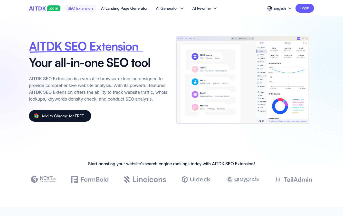
AITDK SEO Extension : An SEO extension that reveals any site's traffic, backlinks, on-page SEO issues and AI search (GEO) readiness in one click — yours or a competitor's.

Buttons are back and storage is king when it comes to car interiors

As with interior design for houses, interior design for vehicles is also subject to fashion trends. And like any fashion trend, even the best ideas can become stale and played out with overuse. Some ideas weren’t the best, either, like demonstrably worse human-machine interfaces that add to driver distraction; yet, they still proliferated throughout the industry and across the cars offered for sale. But the good news is that the pushback seems to be working.

“When the trend of the Piano Black and the switchless interior was happening, it was during a time when designers and companies and engineers and everybody were thinking that, 'Hey, we can just get rid of all these switches on the interior. We can put it all in the software. It'll save money. It'll save us tooling up all these extra parts for unique cars and all this stuff and make the interior more like a software experience.' And it was done with those intentions,” said Hiren Patel, senior design manager at Nissan.

That resulted in cars with minimalist interiors that looked good in the dealership. But people drive their cars on roads; they don’t just sit inside them, parked inside a dealership. “So lots of people were complaining about it and saying, 'Hey, it takes my eyes off the road to change the temperature or to adjust my seat or do whatever.' It's not as easy as doing something on your phone where it's just right at your fingertips and intuitive,” Patel said.

Read full article

Comments

© Nissan

❌