There's a famous quote that people in tech like to use. It was supposedly said by Henry Ford about the invention of the automobile:
If I had asked my customers what they wanted, they would have said ‘faster horses’.
There is no actual evidence that Ford ever said this - regardless, it has become a favorite adage for people talking about creativity and innovation. It’s often accompanied by a smirk and an air of superiority. The essential message being that users don’t actually know what they want or what true innovation looks like until a visionary comes along who presents it to them.
That mindset of “innovation against popular demand” seems quite pervasive in the IT industry these days, now that every tech company on the planet has decided that AI is the way to go.
Even though there’s an overwhelming chorus of consumervoices saying “we don’t actually want this”, most tech giants are so convinced that AI is the future that they’re still pushing it on every service and product under the sun.
Here’s the thing: that approach to innovation is a huge gamble. It really only works if the new, innovative thing is so undeniably better that once they see it, people will want to use it straight away.
The success of the iPhone, for example, was evident from the moment Steve Jobs first showed a breathless audience how to pinch-and-zoom a photo. Nobody had to force people to use it.
In contrast, most major tech companies have now started to opt-in users to their AI features against their will, sometimes making it almost impossible to disable them again.
Feature adoption doesn’t work if it’s forced; it has to come from a genuine user belief that the new feature can help them achieve their goals. And it certainly doesn’t work if the feature actually creates a worse user experience and degrades the quality of the product.
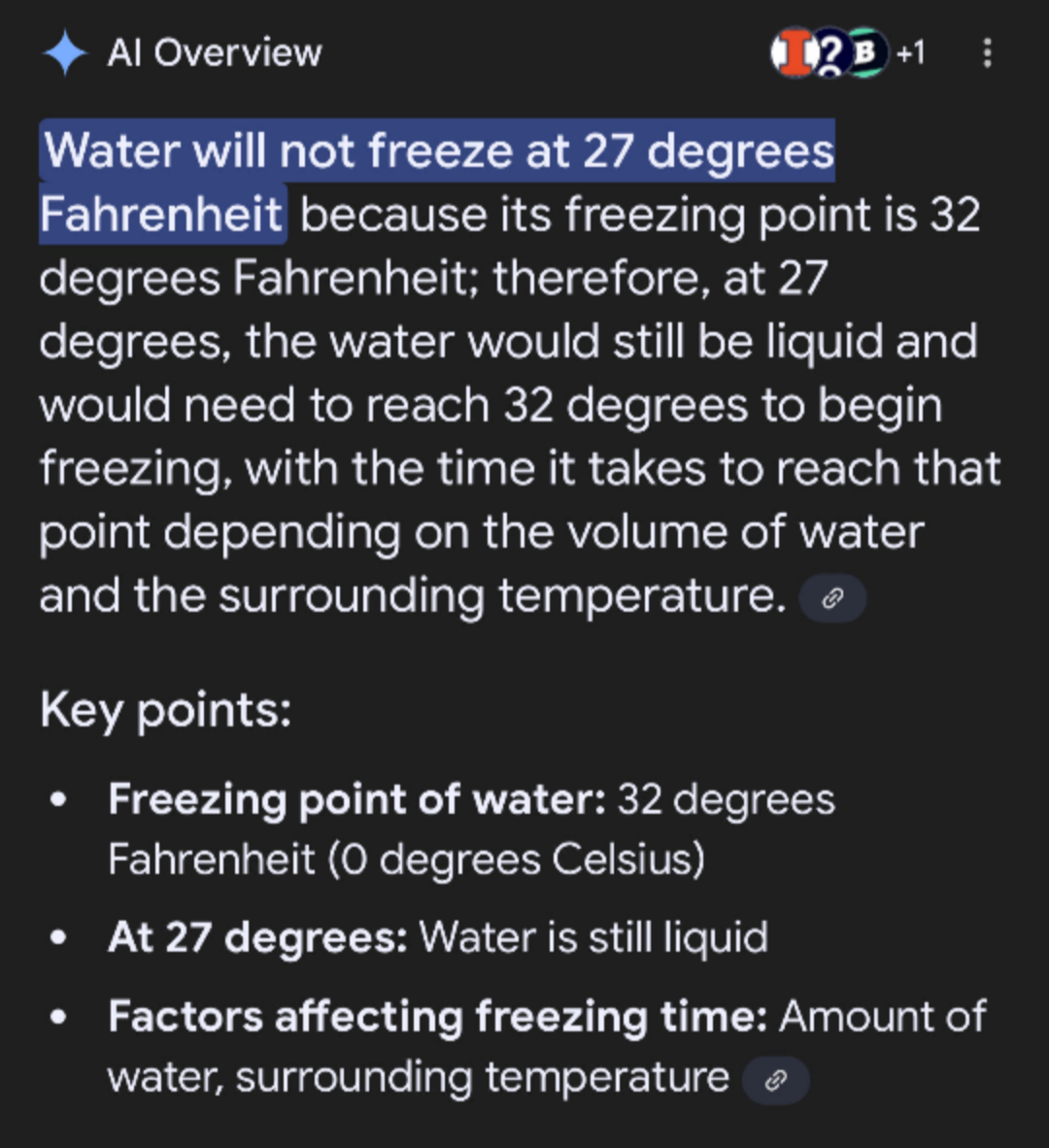
Google implementing AI search results has led to countless examples of misinformation, factual errors and hallucination. Google was already excellent at ranking information, guessing the intent behind a search phrase and modifying its results accordingly. They have now augmented that with a solution that gives either false (even dangerous) information or may just dream up answers on the spot.
The people might have asked for faster horses, but instead they got donkeys on LSD.
Water freezes at 32°F, so it's still liquid at 27°FCheese won't stick? Just add glue, friend!Damn, parrots are really versatile
I get that it’s not as fun to build “a faster horse”. To just make the thing you already have better, more reliable, more helpful. It doesn’t get your shareholders excited, and it doesn’t make you look like a visionary genius.
But in my opinion, the tech industry desperately needs less disruptive new shit for the sake of innovation and more listening to the actual problems users are facing out there.
To close, here’s a quote by Henry Ford that he did in fact say:
If there is any one secret of success, it lies in the ability to get the other person’s point of view and see things from that person’s angle as well as from your own.
2024 was in many ways a very challenging year for me, but it was also one of the most significant.
This year’s annual review post is a bit different.
In previous years, I reflected on the work that I did, the web projects I built, the posts that I wrote and so on. There was lots of that in 2024 too of course (well maybe except the blogging part, that seems to become a pattern).
But the truth is, most of my energy this year went towards building a life for our new family.
My son was born in November, and he’s happily sleeping on my chest as I am typing this. I’ve never felt more grateful or proud about anything in my life, and I still can’t believe he’s with us now.
First night in the hospital with my newborn son
The months leading up to his arrival were quite stressful at times, supporting my wife’s pregnancy and preparing everything as best I could for the steps ahead. We’re planning a move next year, and there’s still lots of work to do before we can settle into our new home.
But all of it is very rewarding, and I can’t wait to see where 2025 takes us. Despite everything that’s going wrong in the world right now, I feel hopeful for the future.
The year is 2005. You're blasting a pirated mp3 of "Feel Good Inc" and chugging vanilla coke while updating your website.
It’s just a simple change, so you log on via FTP, edit your style.css file, hit save - and reload the page to see your changes live.
Did that story resonate with you? Well then congrats A) you’re a nerd and B) you’re old enough to remember a time before bundlers, pipelines and build processes.
Now listen, I really don’t want to go back to doing live updates in production. That can get painful real fast. But I think it’s amazing when the files you see in your code editor are exactly the same files that are delivered to the browser. No compilation, no node process, no build step. Just edit, save, boom.
There’s something really satisfying about a buildless workflow. Brad Frost recently wrote about it in “raw-dogging websites”, while developing the (very groovy) site for Frostapalooza.
So, how far are we away from actually working without builds in HTML, CSS and Javascript? The idea of “buildless” development isn’t new - but there have been some recent improvements that might get us closer. Let’s jump in.
The obvious tradeoff for a buildless workflow is performance. We use bundlers mostly to concatenate files for fewer network requests, and to avoid long dependency chains that cause "loading waterfalls". I think it's still worth considering, but take everything here with a grain of performance salt.
The main reason for a build process in HTML is composition. We don’t want to repeat the markup for things like headers, footers, etc for every single page - so we need to keep these in separate files and stitch them together later.
Oddly enough, HTML is the one where native imports are still an unsolved problem. If you want to include a chunk of HTML in another template, your options are limited:
PHP or some other preprocessor language
server-side includes
frames?
There is no real standardized way to do this in just HTML, but Scott Jehl came up with this idea of using iframes and the onload event to essentially achieve html imports:
Andy Bell then repackaged that technique as a neat web component. Finally Justin Fagnani took it even further with html-include-element, a web component that uses native fetch and can also render content into the shadow DOM.
For my own buildless experiment, I built a simplified version that replaces itself with the fetched content. It can be used like this:
Right, so using web components works, but if you want to nest elements (fetch a piece of content that itself contains a html-include), you can run into waterfall situations again, and you might see things like layout shifts when it loads. Maybe progressive enhancement can help?
I’m hosting my experiment on Cloudflare Pages, and they offer the ability to write a “worker” script (very similar to a service worker) to interact with the platform.
It’s possible to use a HTML Rewriter in such a worker to intercept requests to the CDN and rewrite the response. So I can check if the request is for a piece of HTML and if so, look for the html-include element in there:
You can then define a custom handler for each html-include element it encounters. I made one that pretty much does the same thing as the web component, but server-side: it fetches the content defined in the src attribute and replaces the element with it.
This is a common concept known as Edge Side Includes (ESI), used to inject pieces of dynamic content into an otherwise static or cached response. By using it here, I can get the best of both worlds: a buildless setup in development with no layout shift in production.
Cloudflare Workers run at the edge, not the client. But if your site isn't hosted there - It should also be possible to use this approach in a regular service worker. When installed, the service worker could rewrite responses to stitch HTML imports into the content.
Maybe you could even cache pieces of HTML locally once they've been fetched? I don't know enough about service worker architecture to do this, but maybe someone else wants to give it a shot?
Historically, we’ve used CSS preprocessors or build pipelines to do a few things the language couldn’t do:
variables
selector nesting
vendor prefixing
bundling (combining partial files)
Well good news: we now have native support for variables and nesting, and prefixing is not really necessary anymore in evergreen browsers (except for a few properties). That leaves us with bundling again.
CSS has had @import support for a long time - it’s trivial to include stylesheets in other stylesheets. It’s just … really frowned upon. 😅
Why? Damn performance waterfalls again. Nested levels of @import statements in a render-blocking stylesheet give web developers the creeps, and for good reason.
But what if we had a flat structure? If you had just one level of imports, wouldn’t HTTP/2 multiplexing take care of that, loading all these files in parallel?
So maybe we could link up a main stylesheet that contains the top-level imports of smaller files, split by concern? We could even use that approach to automatically assign cascade layers to them, like so:
Love your atomic styles? Instead of Tailwind, you can use something like Open Props to include a set of ready-made design tokens without a build step. They’ll be available in all other files as CSS variables.
You can pick-and-choose what you need (just get color tokens or easing curves) or use all of them at once. Open props is available on a CDN, so you can just do this in your main stylesheet:
Javascript is the one where a build step usually does the most work. Stuff like:
transpiling (converting modern ES6 to cross-browser supported ES5)
typechecking (if you’re using TypeScript)
compiling JSX (or other non-standard syntactic sugars)
minification
bundling (again)
A buildless worflow can never replace all of that. But it may not have to! Transpiling for example is not necessary anymore in modern browsers. As for bundling: ES Modules come with a built-in composition system, so any browser that understands module syntax…
The newest addition to the module system are Import Maps, which essentially allow you to define a JSON object that maps dependency names to a source location. That location can be an internal path or an external CDN like unpkg.
Any Javascript on that page can then access these dependencies as if they were bundled with it, using the standard syntax: import { render } from 'preact'.
Probably not. I’d say for production-grade development, we’re not quite there yet. Performance tradeoffs are a big part of it, but there are lots of other small problems that you’d likely run into pretty soon once you hit a certain level of complexity.
For smaller sites or side projects though, I can imagine going the buildless route - just to see how far I can take it.
Funnily enough, many build tools advertise their superior “Developer Experience” (DX). For my money, there’s no better DX than shipping code straight to the browser and not having to worry about some cryptic node_modules error in between.
I’d love to see a future where we get that simplicity back.
Headless Content Management Systems are great because they decouple the frontend from the backend logic. However, sometimes this decoupling can also be a hinderance.
When someone makes changes to the content via the CMS, they usually don’t get it done in one go and hit publish - it’s an iterative process, going back and forth between CMS and website. Editors might need to check whether a piece of text fits the layout, or they may have to tweak an image so the crop looks good on all devices. To do this, they’ll typically need some sort of visual preview that shows the new content in the actual context of the website.
For static websites, that’s easier said than done.
Content changes on static websites require a rebuild, and that process can take a while. When you’re editing content in a headless CMS like Sanity, you don’t have access to a local dev server - you need to preview changes on the web somehow. Even for small sites and even with blazingly fast SSGs like Eleventy, building and deploying a new version can take a minute.
That doesn’t sound like much, but when you’re in the middle of writing, having to wait that long for every tiny change to become visible can feel excrutiatingly slow. We need a way to render updates on demand, without actually rebuilding the entire site.
This is quite a common problem, so there are existing solutions. They revolve around making some parts of your Eleventy site available for on-demand rendering by using serverless functions.
Eleventy has the ability to run inside a serverless function as well, and it provides the Serverless Bundler Plugin to do that. Basically, the plugin bundles your entire site’s source code (plus some metadata) into a serverless function that you can call to trigger a new partial build.
FYI: The upcoming v3 release of Eleventy (currently in beta) will not include the Serverless Plugin as part of the core package anymore, precisely because the current implementation is quite heavily geared towards Netlify and their specific serverless architecture. To keep the project as vendor-agnostic as possible, the functionality will probably be handled by external third-party-plugins in the future.
The most common scenario here is to have such a function run on the same infrastructure that hosts the regular static site. Providers like Netlify, Vercel, AWS or Cloudflare all have slightly different expectations when it comes to serverless functions, so the exact implementation varies. All dependencies of your build process need to be packaged and bundled along with the function, and some platforms (in our case Cloudflare) don’t run them in a node environment at all, which is its own set of trouble.
One of the coolest things about Eleventy is its independence from frameworks and vendors. You can host a static Eleventy site anwhere from a simple shared webserver to a full-on bells-and-whistles cloud provider, and switching between them is remarkably easy (in essence, you can drag and drop your output folder anywhere and be done with it).
For the Sanity × Eleventy setup we’re building at Codista, we really wanted to avoid getting locked-in to a specific provider and their serverless architecture. We also wanted to have more control over the infrastructure and the associated costs.
So we did what every engineer in that position would do: We rolled our own solution. 😅
The basic idea for our preview service was to have our own small server somewhere. Everytime someone deploys a new version of our 11ty project, we would automatically push the latest source code to that preview server too and run a build, to pre-generate all the static assets like CSS and Javascript early on.
A node script running on there will then accept GET requests to re-build parts of our site when the underlying Sanity content changes and spit out the updated HTML. We could then show that updated HTML right in the CMS as a preview.
To get this off the ground, we essentially need three things:
A way to render specific parts of the site on-demand
The first piece of the puzzle is a way to trigger a new build when the request comes in. Usually, builds would be triggered from the command line or from a CI server, using the predefined npx eleventy command or similar. But it’s also possible to run Eleventy through its programmatic API instead. You’ll need to supply an input (a file or a directoy of files to parse), an output (somewhere for Eleventy to write the finished files) and a configuration object.
Here’s an example of such a function:
// preview/server.jsimport Eleventy from'@11ty/eleventy'asyncfunctionbuildPreview(request){// get some data from the incoming GET requestconst{path: url, query }= request
let preview =null// look up the url from the request (i.e. "/about")// and try to match it to a input template src (i.e. "aboutPage.njk")// using the JSON file we saved earlierconst inputPath =mapURLtoInputPath(url)// Run Eleventy programmaticallyconst eleventy =newEleventy(inputPath,null,{singleTemplateScope:true,inputDir:INPUT_DIR,config:function(eleventyConfig){// make the request data available in Eleventy
eleventyConfig.addGlobalData('preview',{ url, query })}})// write output directly to memory as JSON instead of the file systemconst outputJSON =await eleventy.toJSON()// output will be a list of rendered pages,// depending on the configuration of our input sourceif(Array.isArray(outputJSON)){
preview = outputJSON.find((page)=> page.url === url)}return preview
}
Let’s say we want to call GET preview.codista.com/myproject/about from within the CMS to get a preview of the “about us” page. First, we will need a way to translate the permalink part of that request (/about) to an input file in the source code like src/pages/about.njk that Eleventy can render.
Luckily, Eleventy already does this in reverse when it builds the site - so we can hook into its contentMap event to get a neat map of all the URLs in our site to their respective input paths. Writing this map to a JSON file will make it available later on at runtime, when our preview function is called.
We use a small express server to have our script listen for preview requests. Here’s a (simplified) version of how that looks:
// preview/server.jsimport express from'express'const app =express()
app.get('*',async(req, res, next)=>{const{path: url }= req
// check early if the requested URL matches any input sources.// if not, bailif(mapURLtoInputPath(url)){
res.status(404).send(`can't resolve URL to input file: ${url}`)}try{// call our preview functionconst output =awaitbuildPreview(req)// check if we have HTML to outputif(output){
res.send(output.content)}else{thrownewError(`can't build preview for URL: ${url}`)}}catch(err){// pass any build errors to the express default error handlerreturnnext(err)}})
The production version would also check for a security token to authenticate requests, as well as a revision id used to cache previews, so we don't run multiple builds when nothing has changed.
Putting all that together, we end up with a script that we can run on our preview server. You can find the final version here. We’ll give it a special environment flag so we can fine-tune the build logic for this scenario later.
$ NODE_ENV=preview node preview/server.js
Right, that’s the on-demand-building taken care of. Let’s move to the next step!
In our regular build setup, we want to fetch CMS data from the Sanity API whenever a new build runs. Sanity provides a helpful client package that takes care of the internal heavy lifting. It’s a good idea to build a little utility function to configure that client first:
// utils/sanity.jsimport{ createClient }from'@sanity/client'exportconstgetClient=function(){// basic client configlet config ={// your project id in sanityprojectId: process.env.SANITY_STUDIO_PROJECT_ID,// datasets are basically databases. default is "production"dataset: process.env.SANITY_STUDIO_DATASET,// api version takes any date and figures out the correct version from thereapiVersion:'2024-08-01',// perspectives define what kind of data you want, more on that in a secondperspective:'published',// use sanity's CDN for content at the edgeuseCdn:true}returncreateClient(config)}
Through the Eleventy data cascade, we can make a new global data file for each content type, for example data/cms/aboutPage.js. Exporting a function from that file will then cause Eleventy to fetch the data for us and expose it through a cms.aboutPage variable later. We just need to pass it a query (Sanity uses GROQ as its query language) to describe which content we want to have returned.
When an editor makes changes to the content, these changes are not published straight away but rather saved as a “draft” state in the document. Querying the Sanity API with the regular settings will not return these changes, as the default is to return only “published” data.
If we want to access draft data, we need to pass an adjusted configuration object to the Sanity client that asks for a different “perspective” (Sanity lingo for different views into your data) of previewDrafts. Since that data is private, we’ll also need to provide a secret auth token that can be obtained through the Sanity admin. Finally, we can’t use the built-in CDN for draft data, so we’ll set useCdn: false.
// utils/sanity.jsimport{ createClient }from'@sanity/client'exportconstgetClient=function(){// basic client configlet config ={projectId: process.env.SANITY_STUDIO_PROJECT_ID,dataset: process.env.SANITY_STUDIO_DATASET,apiVersion:'2024-08-01',perspective:'published',useCdn:true}// adjust the settings when we're running in preview modeif(process.env.NODE_ENV==='preview'){
config = Object.assign(config,{// tell sanity to return unpublished drafts as well// note that we need an auth token to access that datatoken: process.env.SANITY_AUTH_TOKEN,perspective:'previewDrafts',// we can't use the CDN when fetching unpublished datauseCdn:false})}returncreateClient(config)}
By making these changes directly in the API client, we don’t need to change anything about our data fetching logic. All builds running in the preview node environment will automatically have access to the latest draft changes.
We’re almost there! We already have a way to request preview HTML for a specific URL and render it with the most up-to-date CMS data. All we’re missing now is a way to display the preview, enabling the editors to see their content changes from right within the CMS.
In Sanity, we can achieve that using the Iframe Pane plugin. It’s a straightforward way to render any external URL as a view inside Sanity’s “Studio”, the CMS Interface. Check the plugin docs on how to implement it.
The plugin will pass the currently viewed document to a function, and we need to return the URL for the iFrame from that. In our case, that involves looking up the document slug property in a little utility method and combining that relative path with our preview server’s domain:
// studio/desk/defaultDocumentNode.jsimport{ Iframe }from'sanity-plugin-iframe-pane'import{ schemaTypes }from'../schema'import{ getDocumentPermalink }from'../utils/sanity'// this function will receive the Sanity "document" (read: page)// the editor is currently working on. We need to generate// a preview URL from that to display in the iframe pane.functiongetPreviewUrl(doc){// our custom little preview serverconst previewHost ='https://preview.codista.dev'// a custom helper to resolve a sanity document object into its relative URL like "/about"const documentURL =getDocumentPermalink(doc)// build a full URLconst url =newURL(documentURL, previewHost)// append some query args to the URL// rev: the revision ID, a unique string generated for each change by Sanity// token: a custom token we use to authenticate the request on our preview serverlet params =newURLSearchParams(url.search)
params.append('rev', doc._rev)
params.append('token', process.env.SANITY_STUDIO_PREVIEW_TOKEN)
url.search = params.toString()return url.toString()}// this part is the configuration for the Sanity Document Admin View.// we enable the iFrame plugin here for certain document typesexportconstdefaultDocumentNode=(S,{ schemaType })=>{// only documents with the custom "enablePreviewPane" flag get the preview iframe.// we define this in our sanity content schemaconst schemaTypesWithPreview = schemaTypes
.filter((schema)=> schema.enablePreviewPane).map((schema)=> schema.name)if(schemaTypesWithPreview.includes(schemaType)){returnS.document().views([S.view.form(),S.view
// enable the iFrame plugin and pass it our function// to display a preview URL for the viewed document.component(Iframe).options({url:(doc)=>getPreviewUrl(doc),reload:{button:true}}).title('Preview')])}returnS.document().views([S.view.form()])}
Aaaand that’s it!
Near-instant live previews from right within Sanity studio.
This was quite an interesting challenge, since there are so many moving parts involved. The end result turned out great though, and it was nice to see it could be accomplished without relying on third-party serverless functions.
Please note that this may not be the route to take for your specific project though, as always: your experience may vary! 😉
I took some time this week to upgrade my site to the newest version of Eleventy. Although v3.0.0 is still in alpha, I wanted to give it a try.
This iteration of mxb.dev is already 7 years old, so some of its internal dependencies had become quite dusty. Thankfully with static sites that didn’t matter as much, since the output was still good. Still, it was time for some spring cleaning.
I’ve already been using ESM for my runtime Javascript for quite some time, and I was very much looking forward to get rid of the CommonJS in my build code. Here’s how to switch:
The first step is to declare your project as an environment that supports ES modules. You do that by setting the type property in your package.json to “module”:
Doing that will instruct node to interpret any JS file within your project as using ES module syntax, something that can import code from elsewhere and export code to others.
Since all your JS files are now modules, that might cause errors if they still contain CommonJS syntax like module.exports = thing or require('thing'). So you’ll have to change that syntax to ESM.
You don’t need to worry about which type of package you are importing when using ESM. Recent node versions support importing CommonJS modules using an import statement.
Starting with node v22, you can probably even skip this step entirely, since node will then support require() syntax to import ES modules as well.
In an Eleventy v2 project, you’ll typically have your eleventy.config.js, files for filters/shortcodes and global data files that may look something like this:
There are ways to do this using an automated script, however in my case I found it easier to go through each file and convert it manually, so I could check if everything looked correct. It only took a couple of minutes for my site.
It’s also helpful to try running npx eleventy --serve a bunch of times in the process, it will error and tell you which files may still need work. You’ll see an error similar to this:
Original error stack trace: ReferenceError: module is not defined in ES module scope
[11ty] This file is being treated as an ES module because it has a '.js'file extension and 'package.json' contains "type":"module".
To treat it as a CommonJS script, rename it to use the '.cjs'file extension.
[11ty] at file://mxb/src/data/build.js?_cache_bust=1717248868058:12:1
If you absolutely have to use CommonJS in some files, renaming them to yourfile.cjs does the trick.
Eleventy v3 also comes with a very useful new way to do image optimization. Using the eleventy-img plugin, you now don’t need a shortcode anymore to generate an optimized output. This is optional of course, but I was very eager to try it.
Previously, using something like an async image shortcode, it was not possible to include code like that in a Nunjucks macro (since these don’t support asynchronous function calls).
In v3, you can now configure Eleventy to apply image optimization as a transform, so after the templates are built into HTML files.
Basically, you set up a default configuration for how you want to transform any <img> element found in your output. Here’s my config:
// eleventy.config.js
eleventyConfig.addPlugin(eleventyImageTransformPlugin,{extensions:'html',// transform only <img> in html filesformats:['avif','auto'],// include avif version and original file typeoutputDir:'./dist/assets/img/processed/',// where to write the image filesurlPath:'/assets/img/processed/',// path prefix for the img src attributewidths:['auto'],// which rendition sizes to generate, auto = original dimensionsdefaultAttributes:{// default attributes on the final img elementloading:'lazy',decoding:'async'}})
Now that will really try to transform all images, so it might be a good idea to look over your site and check if there are images that either don’t need optimization or are already optimized through some other method. You can exclude these images from the process by adding a custom <img eleventy:ignore> attribute to them.
All other images are transformed using the default config.
For example, if your generated HTML output contains an image like this:
<imgsrc="bookcover.jpg"width="500"alt="Web Accessibility Cookbook by Manuel Matuzovic"/>
The plugin will parse that and transform it into a picture element with the configured specs. In my case, the final HTML will look like this:
<picture><sourcesrcset="/assets/img/processed/Ryq16AjV3O-500.avif 500w"type="image/avif"/><imgsrc="/assets/img/processed/Ryq16AjV3O-500.jpg"width="500"alt="Web Accessibility Cookbook by Manuel Matuzovic"decoding="async"loading="lazy"/></picture>
Any attributes you set on a specific image will overwrite the default config. That brings a lot of flexibility, since you may have cases where you need special optimizations only for some images.
For example, you can use this to generate multiple widths or resolutions for a responsive image:
Here, the custom eleventy:widths attribute will tell the plugin to build a 800px and a 1200px version of this particular image, and insert the correct srcset attributes for it. This is in addition to the avif transform that I opted to do by default. So the final output will look like this:
I refactored some other aspects of the site as well - most importantly I switched to Vite for CSS and JS bundling. If you’re interested, you can find everything I did in this pull request.
A lot of new CSS features have shipped in the last years, but actual usage is still low.
While there are many different reasons for the slow adoption, I think one of the biggest barriers are our own brains.
Right now, we’re in the middle of a real renai-css-ance (the C is silent). It’s a great time to write CSS, but it can also feel overwhelming to keep up with all the new developments.
Prominent voices at conferences and on social media have been talking about the new stuff for quite some time, but real-world usage seems to lag behind a bit.
Quick question: how many of these have you actively used in production?
All of these are very useful, and support for most is pretty good across the board - yet adoption seems to be quite slow.
Granted some things are relatively new, and others might be sort of niche-y. But take container queries, for example. They were the number one feature requested by front-end devs for a looong time. So why don’t we use them more, now that they’re finally here?
From my own experience, I think there’s different factors at play:
I can’t use [feature X], I need to support [old browser].
That old chestnut.
Browser support is an easy argument against most new things, and sometimes a convenient excuse not to bother learning a feature.
The answer there is usually progressive enhancement - except that’s easier to do for actual “enhancements”, if they are optional features that don’t impact the usability of a site that much.
For some of the new features, theres no good path to do this.
CSS Layers or native nesting for example are not something you can optionally use, they’re all-or-nothing. You’d need a separate stylesheet to support everyone.
And while support for Container Queries is green in all modern browsers, people still seem reluctant to go all-in, fearing they could break something as fundamental as site layout in older browsers.
Some of you might be old enough to remember the time when CSS3 features first hit the scene.
Things like border radius or shadows were ridiculously hard to do back in the day. Most of it was background images and hacks, and it required a substantial amount of work to change them.
Suddenly, these designs could be achieved by a single line of CSS.
Writing border-radius: 8px instead of firing up Photoshop to make a fucking 9-slice image was such a no-brainer that adoption happened very quickly. As soon as browser support was there, nobody bothered with the old way anymore.
A big chunk of the new features today are “invisible” though - they focus more on code composition and architecture.
Layers, Container Queries, etc are not something you can actually see in the browser, and the problems they solve may not be such an obvious pain in the ass at first glance. Of course they offer tremendous advantages, but you can still get by without using any of them. That might slow down adoption, since there is no urgency for developers to switch.
I don’t know where I would even use [feature X] in my project.
The initial use-case for container queries I always heard was “styling an element that could be in the main column or the sidebar”. I think that came from a very common WordPress blog design at the time where you had “widgets” that could be placed freely in different-width sections of the site.
Nowadays, the widget sidebar isn’t as common anymore; Design trends have moved on. Of course there are plenty of other use-cases for CQs, but the canonical example in demos is usually still a card component, and people seemed to struggle for a while to find other applications.
The bigger issue (most recently with masonry grids) is that sometimes the need for a CSS feature is born out of a specific design trend. Standards move a lot slower than trends though, so by the time a new feature actually ships, the need might not be that strong anymore.
Spec authors do a very good job of evaluating the long-term benefits for the platform, but they also can’t predict the future. Personally, I don’t think the new features are tied to any specific design - but I think it’s important to show concrete, real-world usecases to get the developer community excited about them.
If you want to learn more about how container queries can help you and which specific UI problems they solve, check out "An Interactive Guide to CSS Container Queries" by Ahmad Shadeed. A fantastic resource that provides a lot of in-depth knowledge and visual examples.
Whatever the technical reasons may be, I guess the biggest factor in all of this are our own habits.
Our monkey brains still depend on patterns for problem solving - if we find a way of doing things that works, our minds will quickly reach for that pattern the next time we encounter that problem.
While learning the syntax for any given CSS feature is usually not that hard, re-wiring our brains to think in new ways is significantly harder. We’ll not only have to learn the new way, we’ll also have to unlearn the old way, even though it has become muscle memory at this point.
So how can we overcome this? How can we train ourselves to change the mental model we have for CSS, or at least nudge it in the new direction?
If we want to adopt some of the broader new architectural features, we need to find ways to think about them in terms of reusable patterns.
One of the reasons BEM is still holding strong (I still use it myself) is because it provides a universal pattern of approaching CSS. In a common Sass setup, any given component might look like this:
// _component.scss.component {// block stylesposition: relative;// element styles&__child {font-size: 1.5rem;}// modifier styles&--primary {color: hotpink;}// media queries@includemq(large){width: 50%;}}
The BEM methodology was born in an effort to side-step the cascade. While we now have better scoping and style encapsulation methods, the basic idea is still quite useful - if only as a way to structure CSS in our minds.
I think learning new architectural approaches is easier if we take existing patterns and evolve them, rather than start from scratch. We don’t have to re-invent the wheel, just put on some new tyres.
Here’s an example that feels similar to BEM, but sprinkles in some of the new goodness:
/* component.css *//* Layer Scope */@layer components.ui{/* Base Class */.component{/* Internal Properties */--component-min-height: 100lvh;--component-bg-color: #fff;/* Block Styles */display: grid;padding-block: 1rem;min-block-size:var(--component-min-height);background-color:var(--component-bg-color);/* Child Elements, Native CSS Nesting */& :is(h2, h3, h4){margin-block-end: 1em;}/* States */&:focus-visible{scroll-snap-align: start;}&:has(figure){gap: 1rem;}/* Style Queries as Modifiers */@containerstyle(--type: primary){font-size: 1.5rem;}/* Container Queries for component layout */@container(min-inline-size: 1000px){--component-min-height: 50vh;grid-template-columns: 1fr 1fr;}/* Media Queries for user preferences */@media(prefers-color-scheme: dark){--component-bg-color:var(--color-darkblue);}@media(prefers-reduced-motion: no-preference){::view-transition-old(component){animation: fade-out 0.25s linear;}::view-transition-new(component){animation: fade-in 0.25s linear;}}}}
My preferred way of learning new techniques like that is by tinkering with stuff in the safe playground of a side project or a personal site. After some trial and error, a pattern might emerge there that sort of feels right. And if enough people agree on a pattern, it could even become a more common convention.
When learning new things, it’s important not to get overwhelmed. Pick an achieveable goal and don’t try to refactor an entire codebase all at once.
Some new features are good candidates to test the water without breaking your conventions:
You can try to build a subtle view transition as a progressive enhancement to your site, or you could build a small component that uses container queries to adjust its internal spacing.
In other cases, browser support also does not have to be 100% there yet. You can start using logical properties in your project today and use something like postcss-logical to transform them to physical ones in your output CSS.
Whatever you choose, be sure to give yourself enough space to experiment with the new stuff. The devil is in the details, and copy-pasting some new CSS into your code usually doesn’t give you the best insight - kick the tyres a bit!
One thing I’d really love to see more of are “best practice” examples of complete sites, using all the new goodness. They help me see the bigger picture of how all these new techniques can come together in an actual real-life project. For me, the ideal resource there are (again) the personal sites of talentedpeople.
How do they structure their layers?
How do they set up containers?
What sort of naming conventions do they use?
What problems are they solving, and how does the new architecture improve things?
Answering these questions helps me to slowly nudge my brain into new ways of thinking about all this.
Having said all that: you absolutely don’t have to use all the latest and greatest CSS features, and nobody should feel guilty about using established things that work fine. But I think it helps to know which specific problems these new techniques can solve, so you can decide whether they’re a good fit for your project.
And maybe we can still learn some new CSS tricks after all.
Haven't done one of these since 2020, but this feels like a good opportunity to get some writing in just before the new year. Let's see if I can still remember how to do this blogging thing.
We built a lot of interesting projects in 2023 with Codista, and we’ve had a very good year working with established clients and partners. Some of it has been quite challenging, but we managed to pull off a stellar track record of successful projects, and I’m really proud of our small company!
We also hired our first front-end developer (other than myself). I’ve posted the job listing on our own website and on Mastodon, and with the help from the web dev community, we found somebody who fits our team really well and I’m very happy with them. A big thanks to everyone who boosted the post or mentioned it at meetups!
I’ve struggled a bit with personal health issues this year. I have a moderately severe form of atopic dermatitis, an auto-immune disease of the skin. I’ve had it all my life. Some days it feels OK, while on others it feels like my skin is on fire and it’s hard to concentrate on anything else besides the impulse to scratch. If you’ve ever seen me give a talk and my face was bright red, it’s not (only) because I’ve been drinking the night before.
When I was younger I’ve tried different forms of therapy, but none of them really worked - so I’ve become pretty much used to living with it. But then it got a lot worse in 2023. I couldn’t sleep properly anymore and it started to affect other areas of my life, so I decided to take another shot at fighting it.
I got a new doctor and started treatment with a new drug that recently got EMA approval. After half a year, I switched to a different drug, which I’m currently still evaluating. First results have been promising though, so fingers crossed that this is the one. Would certainly make my 2024 more pleasant.
I was fortunate enough to see some beautiful places this year. Event though my pre-pandemic days of traveling the more remote parts of the world are likely over, it’s still nice to get out and explore again.
I went to Zurich for a client workshop in the spring, and immediately followed that up with a trip to Amsterdam for CSS Day 2023. That conference was one of the best I’ve ever been to. Even though I caught a pretty bad cold and had to skip some of the fun - the talks, people and just overall atmosphere of that event were amazing.
I’m grateful I got to see so many familiar faces and talk to some of my web friends in person. I also left the conference feeling very inspired and (as always) a little guilty that I can’t find enough time for community work and writing. Hopyfully next year my schedule will allow for a bit more of that.
With Nils and Una at the CSS Café Meetup, the day after the conference
In the summer, we went for a vacation in the south of Croatia and spent two weeks on the Dalmatian coast.
A nice quiet bay at the shores of Hvar island
We also did some more work on our small garden house in Lower Austria and had a few lovely days in autumn hiking the surrounding hills and vineyards.
I think I’ve grown a bit weary of the tech industry this year. I still love the web and I love what I do for work, but I lost some of my interest in new developments, new frameworks, the hot tech of the day. I just don’t care as much anymore.
It may also be the rising topic of AI that is popping up everywhere you look, or the crypto-esque attitude that seems to go along with it. Instead of being excited about new possibilites, I feel a bit disheartened by the trends I see. AI looks like a great tool, but everything I read about how it’s actually applied comes from the same hyper-captitalist mindset that brought us gems like bitcoin mining and NFTs. I don’t know, maybe I’m just tired.
There are other trends as well that I feel more optimistic about. Ones that call for a weirder web with more original, human content. It could just be wishful thinking, but I’ve caught glimpses of that version of the future for a while now. Here’s hoping.
I have recently been made aware that the frequency of new content published on my site has gone down quite a bit.
Ok fine, I trash-talked Manuel’s website on Mastodon and he correctly pointed out that while I wrote an impressive two (2) blogposts last year, he wrote around 90 (while also doing talks, audits, raising an infant daughter and probably training for a marathon or some shit like that, I mean let’s face it the guy is annoyingly productive).
I know I was slacking off a bit and those numbers speak for themselves. While I generally want to write, ideas rarely make it all the way to a published post.
Like many others, “write more” is high up on my imaginary list of life improvements and although I don’t usually do new year’s resolutions, now feels like a good time to re-evaluate what’s stopping me there.
I came up with seven reasons that I use to justify why I’m not writing. In a confusing twist of perspective, I’m also going to try and talk myself out of them by explaining to you, dear Reader, why they are bullshit.
This is the big one, right? We all have other things to do, and writing takes time. In my case, I’ve been really swamped with client projects and other work last year.
I think if you actually want to write though, it’s more a lack of routine than a lack of time itself. People who consistently produce content have learned to make a habit out of it. I read “Atomic Habits” by James Clear a couple of months ago and its message kinda stuck with me. It’s about conditioning yourself to do certain things more often by building a routine.
Take 15 minutes every day before you check your email and just write. Or do it on your commute to work if possible! The trick is to use amounts of time that are so small you can’t possibly not fit them in your schedule. It may not be enough for a fully-fledged article, but enough to build a habit.
It’s also worth noting that your writing doesn’t always have to be well-crafted longform blogposts. It can just be a few paragraphs about your thoughts, linking out to other stuff. Chris does a great job at this, and others have recently adopted even shorterformats, mimicking social media posts in length.
The classic impostor syndrome comes out here. I don’t know anything special, so why bother?
The truth is that everyone has something interesting to say because everyone faces different challenges. You don’t have to go viral and make buzzword-riddled thinkpieces about the current hot topic - There’s enough sites who already do that, and AI will soon produce a shitton more of it.
A better plan is to write about what you know and experience in your day-to-day life instead. Authentic posts are always helpful, and you will solidify your own knowledge in the process too.
Here are a few common writing prompts and examples for blogposts I love to read:
This one is especially popular among developers. “How can I possibly write anything before the typography is perfect? How can I ever publish anything when comments are not implemented yet?” We love to tinker with our websites and that’s cool, but at some point it gets in the way of actually using your blog and creating content.
Despite what we tell ourselves, it really doesn’t matter too much how a blog looks or what features it has. People come for the content, and as long as they can read it, they’re happy. Throw in an RSS feed so everyone can use their own reader and you’re golden. It pains me to say it but Manuel is absolutely correct here.
And if he can be “redesigning in the open” for three years while churning out massive amounts of CSS knowledge, your site will be fine too. 😉
Sometimes I’ve got a great idea for a post, but an initial Google search reveals that someone else already beat me to it. The novelty has worn off and that other post is way better than what I could have come up with anyway, I tell myself.
That’s not a real reason of course, nobody has a monopoly on a subject. Others may have already covered the topic - but not in your voice, not from your perspective. You could write a post about the exact same thing and still provide valuable information the other author has missed. Or you could approach the subject from a different angle, for a different skill-level or for a different audience.
Another way is to read the material that is already available and take notes about all the questions you still have afterwards. Try to actually do the thing (write the code, use the app, whatever) and see what other information would have been helpful for you to have. Write that!
There are writing ideas that are inspired by some event or conversation. Maybe something big happened on the web or I’ve had a particularly interesting discussion on social media. So I sketch out a quick outline for a post and stick it in my drafts folder, thinking I’ll get back to it later.
Three weeks pass and that lonely draft sits around gathering dust, and by the time I remember it, the moment has passed. The conversation has moved on, and so the post is abandoned and eventually deleted.
The internet moves pretty fast and there’s always a “hot topic of the day”, but that doesn’t mean that nobody is interested in anything else. A beautiful thing about blogs is that they’re asynchronous. You can just write things and put them out there, and even if they don’t hit a nerve immediately, people can discover them in their own time.
Older posts can also get re-discovered years later and get a second wind, not to mention that people constantly search for specific things - and your post might be just what they’re looking for then! Some of my old posts about webrings and the IndieWeb have recently found readers again since Twitter has started going down the drain. You never know!
Most of the (tech) blogs I read are in English, even though its authors are from all over the world. For a non-native english speaker like myself, it can sometimes be daunting to write in a foreign language. This is a barrier when it comes to producing “polished” text - there’s extra brain cycles involved in getting your ideas to “sound” right.
This is probably not a big deal though. People don’t expect to read world-class literature when they come to check out a blogpost about “Lobster Mode”. As long as you can get your point across, it’s fine if you don’t use fancy words. It can also be an advantage: for an international audience, simple English might even be easier to understand.
That being said, this is a usecase where AI might actually be helpful! While LLMs like GPT-3 and co are useless at creating actual content or original thoughts, they’re great at making sentences sound nice. Tools like Jasper can rewrite your copy and improve the tone without changing the contained information. Sort of like prettier but for English prose.
Let’s be honest: nobody likes to shout into the void. Everyone wants their content to be seen, and social validation is the sweet sweet dopamine reward we all crave.
There’s nothing wrong with sharing your work on social media or popular orange link aggregators either, but sometimes there just won’t be much of a reaction after you publish. That can feel frustrating - but ultimately I think obesessing over vanity metrics is not worth it anyway. Just because something doesn’t make the frontpage of Reddit does not mean it’s not valuable.
Don’t underestimate how many people actively read personal blogs though! The web dev community is especially fond of RSS, and with the Fediverse gaining more and more popularity, original content on your own domain has a much better reach now than before.
Who’s gonna read your personal blog because it has an RSS feed? I’m gonna read your personal blog because it has an RSS feed. pic.twitter.com/mtcyKhEVet
Right, I realize it’s a bit weird to write a post about how I don’t write posts. But I hope to push back on this in 2023 and find more time for writing. I also suspect that other people have similar reasons and maybe talking about them helps a bit.
Since there’s a good chance that you -like me- are involved in web development and/or have a special interest in technology, I want you to play along and engage in a thought experiment for this post:
Imagine you’re a regular user.
Imagine you have never heard of git branches, postgres or a “webpack config” (lucky you). You really don’t care about all of that, but you do care about your friends and your connections online.
Ever since Elon took over (and actually even some time before that) Twitter has been feeling increasingly hostile. People start leaving, and you hear them talk about alternatives. You’re curious, so you type “mastodon” into Google and see what comes up.
You find the website and want to sign up. It tells you to choose a server:
Ummmm
Ok wait, you wanted to join mastodon, what’s all this now? Tildes? Furries? Some Belgian company? Why do you have to apply? Everyone else had that mastodon.social handle - Can’t you just use that? The real one? What the hell is a fediverse?
Confused, you close the site. This seems like it’s made for someone else. Maybe you’ll stick around on Twitter for a while longer, while it slowly burns down.
You can be a developer again now.
You and I know the reasons for that experience. We know that a decentralized system has to look like this, and that the choice of instance doesn’t even matter all that much. But I’ve heard this exact story a couple of times now, all from people outside my IT filter bubble.
In the days of IRC and message boards, or later in the 2000s blogging era, federation was very much the norm. It was the default mode of the web: people grouping together in small communities around shared interests, but scattered on many different sites and services. It was normal to explore, find new places and discover new things by venturing out.
Through the rise of social media though, people have gotten used to being in one place all the time. Now we expect a system that’s easy to set up, handles millions of users at once and makes every interaction frictionless. We expect it to know what we want, and give it to us instantly. Anything too weird or tech-y and you start to lose people.
Mastodon is not supposed to be a second Twitter. Many of its features were designed specifically to avoid becoming another content silo and repeating the same mistakes, yet the assumption seems to be that everything should stay the same as before.
It’s like everyone has spent the last few years in a giant all-inclusive resort, screaming at each other for attention at the buffet. Now we’re moving into nice little bed-and-breakfast places, but we’re complaining because it takes slightly more effort to book a room, and the free WIFI isn’t as fast.
Maybe its time to rethink some of these expectations. Maybe we need some of that early internet vibe back and be ok with smaller, closer communities. Maybe we can even get some of the fun back and start exploring again, instead of expecting everything to be automatically delivered to us in real time.
We can remind ourselves of what social media used to be: a way to connect around shared interests, talk to friends, and discover new content. No grifts, no viral fame, no drama.
Adjusting expectations is one part - but at the same time, we as developers have to try and make these systems as approachable as possible without compromising on their independence. A lot of alternative content publication methods are still very much geared towards the IT bubble.
You could loosely map some of them by how easy it is to get started if you have no technical knowledge:
Generally speaking: The more independence a technology gives you, the higher its barrier for adoption.
I love the IndieWeb and its tools, but it has always bothered me that at some point they basically require you to have a webdevelopment background.
How many of your non-tech friends publish RSS feeds? Have you ever seen webmentions used by someone who isn’t a developer? Hell, even for professional devs it’s hard to wire all the different parts together if you want to build a working alternative to social media.
If you want the independence and control that comes with some of these IndieWeb things, you just have to get your hands dirty. You can’t do it without code, APIs, servers and rolling your own solutions. It’s just harder.
My point is this: it shouldn’t be.
Owning your content on the web should not require extensive technical knowledge or special skills. It should be just as easy as signing up for a cellphone plan.
I know it’s no small feat to lower that barrier. Making things feel easy and straightforward while handling the technical complexity behind them is quite a challenge. Not to mention the work and financial cost involved in running systems that don’t generate millions of ad revenue.
Mastodon, Ghost, Tumblr, micro.blog and others are working hard on that frontier; yet I feel they are still not widely used by the average person looking to share their mind.
I think we’re at a special moment right now. People have been fed up with social media and its various problems (surveillance capitalism, erosion of mental health, active destruction of democracy, bla bla bla) for quite a while now. But it needs a special bang to get a critical mass of users to actually pack up their stuff and move.
When that happens, we have the chance to build something better. We could enable people to connect and publish their content on the web independently – the technology for these services is already there. For that to succeed though, these services have to be useable by all people - not just those who understand the tech.
Just like with migration to another country, it takes two sides to make this work: Easing access at the border to let folks in, and the willingness to accept a shared culture - to make that new place a home.
When I first fell in love with the web, it was a radically different place. Aside from the many technical improvements that have been made, I feel like the general culture of the web has changed a lot as well.
Growing up with the web as a teenager meant having access to an infinite treasure chest of content. A lot of that content was spread across blogs, forums and personal websites.
The overwhelming motivation behind it seemed to be “I made something, here it is”. Sharing things for the sake of showing them to the world. Somebody had created something, then put it online so you could see it. Visit their website (wait for the dial-up to finish), and it’s yours.
Follow any link on the web today and you’ll likely be met with a different scenario:
Cookie consent pops up, intentionally confusing. (You're tired - just hit "Accept All".)
App download banner asks you to install the native app. (Dismiss.)
Newsletter modal blocks the site, asking for your email address. (Close it.)
Start reading a few paragraphs, before another modal requires you to create an account. (Leave site, frustrated.)
Notice how everything about that interaction is designed to extract value from your visit. The goal here is not for you to read an article; it’s to get your analytics data, your email, your phone and your money.
It’s the symptom of a culture that sees the web purely as a business platform. Where websites serve as eloborate flytraps and content as bait for unsuspecting users.
In this culture, the task of the self-appointed web hustler is to build something fast & cheap, then scale it as much as possible before eventually cashing out.
You see it in email bots, spamming blogs for link placements and sponsored posts.
You see it in Twitter accounts where grifters try to monetize their “communities” with useless ebooks.
You see it in crypto, burning the planet for quick profits.
web3 and NFTs are the latest evolution of this culture. The latest attempt to impose even more artificial locks and transactions on users, to extract even more money.
This is the web as envisioned by late-stage capitalism: a giant freemium game where absolutely everyone and everything is a “digital asset” that can be packaged, bought and sold.
Sure, the web has changed since the 90s. It has “grown up”.
Of course there are lots of legitimate reasons to monetize, and creators deserve to be compensated. It’s not about people trying to make a buck. It’s about those treating the web simply as a market to run get-rich-quick schemes in, exploiting others out of pure greed.
We’ve gotten so used to it that some can’t even imagine the web working any other way - but it doesn’t have to be like this.
At its very core, the rules of the web are different than those of “real” markets. The idea that ownership fundamentally means that nobody else can have the same thing you have just doesn’t apply here. This is a world where anything can easily be copied a million times and distributed around the globe in a second. If that were possible in the real world, we’d call it Utopia.
It’s also a world that can be shaped by the consumer:
Large companies find HTML & CSS frustrating “at scale” because the web is a fundamentally anti-capitalist mashup art experiment, designed to give consumers all the power.
Sorry I didn’t quote tweet anything in order to say that.
This “mashup art experiment”, as Mia calls it, is what made the web great in the first place. It’s the reason it became a global phenomenon and much of it is centered around the idea that digital content is free and abundant.
Resource Scarcity doesn’t make sense on the web. Artificially creating it here serves no other purpose than to charge money for things that could easily have been free for all. Why anyone would consider that better is beyond me.
The online game Wordle recently took the world by storm. To the utter shock of many, it is just a free piece of content. A free and open web game millions can enjoy, no strings attached.
Its creator, Josh Wardle, originally built the game for his partner and put it online. “I made something, here it is”. Despite its success, he had no intention to monetize it through apps or subscriptions - and the world is richer for it. When questioned about it, he said this:
I think people kind of appreciate that there’s this thing online that’s just fun. It’s not trying to do anything shady with your data or your eyeballs. It’s just a game that’s fun.
Because the notion that monetization is the only worthwhile goal on the web is so widespread, this is somehow a very controversial take. You can actually stand out of the crowd by simply treating the web platform as what it is: a way to deliver content to people.
Despite what web3 claims, it’s possible to “own” your content without a proof of it on the blockchain (see: IndieWeb). It’s also possible to create things just for the sake of putting them out into the world.
The best growth hack is still to build something people enjoy, then attaching no strings to it. You’d be surprised how far that can get you.
Make free stuff! The web is still for everyone.
👉 Update: On Feb 1, Wordle was eventually sold to the New York Times for upwards of a million dollars. Josh Wardle claims the game will still remain free to play for all.
With container queries now on the horizon - will we need media queries at all? Is there a future where we build responsive interfaces completely without them?
Ethan, who coined the term responsive web design over a decade ago, has recently said that media-query-less layouts are certainly within bounds:
Can we consider a flexible layout to be “responsive” if it doesn’t use any media queries, but only uses container queries? [...] I’d be inclined to answer: yes, absolutely.
Over at CSS-Tricks, Chris had similar thoughts. He issued a challenge to examine how and where media queries are used today, and if they will still be necessary going forward:
A common refrain, from me included, has been that if we had container queries we’d use them for the vast majority of what we use media queries for today. The challenge is: look through your CSS codebase now with fresh eyes knowing how the @container queries currently work. Does that refrain hold up?
Fair enough.
I took the bait and had a look at some of my projects - and yes, most of what I use @media for today can probably be accomplished by @container at some point. Nevertheless, I came up with a few scenarios where I think media queries will still be necessary.
While container queries can theoretically be used to control any element, they really shine when applied to reusable, independent components. The canonical example is a card component: a self-contained piece of UI you can put anywhere.
Page layouts, on the other hand, are better suited for media queries in my opinion. Page layouts are usually at the very top level of the DOM, not nested in another container. I’ve never encountered a case where the main page layout had to adapt to any other context than the viewport.
Another good usecase for media queries is to set global design tokens, like spacing or font-sizes. With CSS custom properties it’s now much easier to have fine-grain control over global styles for different devices.
For example, you might want to have bigger text and more whitespace on a large TV than you want for a mobile screen. A larger screen means the user’s head will be physically farther away.
It only makes sense to use a media query there - since the reason for the change is the size of the device itself, not the width of any specific element.
Screen dimensions are not the only things we can detect with media queries. The Media Queries Level 4 Spec (with Level 5 currently a working draft) lists many different queries related to user preference, like:
prefers-reduced-motion
prefers-contrast
prefers-reduced-transparency
prefers-color-scheme
inverted-colors
and others
We can use these to better tailor an experience to the current user’s specific needs.
Other media queries allow for micro-optimizations based on a device’s input method (i.e. touch or mouse):
/* fine pointers (mouse) can hit smaller checkboxes */@media(pointer: fine){input[type="checkbox"]{width: 1rem;height: 1rem;border-width: 1px;border-color: blue;}}/* coarse pointers (touch) need larger hit areas */@media(pointer: coarse){input[type="checkbox"]{width: 2rem;height: 2rem;border-width: 2px;}}
Finally, there are actual “media type” queries like @media print that won’t go anywhere. And there are experimental ideas being discussed for new media queries, like this one for “foldable” devices:
:root{--sidebar-width: 5rem;}/* if there's a single, vertical fold in the device's screen,
expand the sidebar width to cover the entire left side. */@media(spanning: single-fold-vertical){:root{--sidebar-width:env(fold-left);}}main{display: grid;grid-template-columns:var(--sidebar-width) 1fr;}
Components that are taken out of the normal document flow don’t have to care about their containers. Some UI elements are fixed to the viewport itself, usually oriented along an edge of the screen.
Have a look at Twitter’s “Messages” tab at the bottom of the screen for example. Its relevant container is the window, so it makes sense to use a media query here and only apply position: fixed at some breakpoint.
The current implementation of @containeronly allows querying the width of an element (its “inline” axis), not its height.
👉 Update:Miriam tells me that it is possible to query the height of containers, provided they are defined as size rather than inline-size. The exact value name of this is still in flux at the time of writing.
Style adjustments in relation to width are probably the primary use case for most UI elements anyway, but there are still cases where screen height is an issue. Here’s an example from a “hero image” component:
.hero{display:flex;flex-direction: column;height: 100vh;}/* if the screen is really tall, don't fill all of it */@media(min-height: 60em){.hero{height: 75vh;}}
While I think container queries will eventually replace most “low level” responsive logic, there are still a lot of good usecases for trusty media queries.
A combination of both techniques will probably be the best way forward. @media can handle the big picture stuff, user preferences and global styles; @container will take care of all the micro-adjustments in the components themselves.
Container Queries are one of the most anticipated new features in CSS. I recently got a chance to play with them a bit and take the new syntax for a spin.
I came up with this demo of a book store. Each of the books is draggable and can be moved to one of three sections, with varying available space. Depending on where it is placed, different styles will be applied to the book. The full source code is up on Codepen. Here’s how it looks:
This demo currently only works in Chrome Canary. Download the latest version, then enable Container Queries under chrome://flags to see them in action.
Each of these books is a custom element, or “web component”. They each contain a cover image, a title and an author. In markup they look like this:
<book-elementcolor="#ba423d"><imgslot="cover"src="/books/1984.avif"alt="cover by shepard fairey"/><spanslot="title">1984</span><spanslot="author">George Orwell</span></book-element>
This then gets applied to a template which defines the internal Shadow DOM of the component. The <slot> elements in there will get replaced by the actual content we’re passing in.
Alright, nothing too fancy yet, just some basic structure.
The magic happens when we apply some internal styling to this. Everything inside that <style> tag will be scoped to the component - and since styles can not leak out of the shadow DOM and we can’t (easily) style its contents from the outside, we have real component encapsulation.
Container Queries are one of the last few missing puzzle pieces in component-driven design. They enable us to give components intrinsic styles, meaning they can adapt themselves to whatever surroundings they are placed in.
The new key property there is container-type - it lets us define an element as a container to compare container queries against. A value of inline-size indicates that this container will response to “dimensional queries on the inline axis”, meaning we will apply different styles based on its width.
We can also give our container a name using the container-name property. It is optional in this example, but you can think of it in the same way that grid-area lets you define arbitrary names to use as references in your code later.
<templateid="book-template"><style>/* Use Web Component Root as the Layout Container */:host{display: block;container-type: inline-size;container-name: book;}</style>
...
</template>
In the bookstore demo, I created three variants that depend on the width of the component’s :host (which translates to the <book-element> itself). I’ve omitted some of the styling for brevity here, but this part is where we define the multi-column or 3D book styles.
/* Small Variant: Simple Cover + Title */@container(max-width: 199px){.book{padding: 0;}}/* Medium Variant: Multi-Column, with Author */@container(min-width: 200px)and(max-width: 399px){.book{display: grid;grid-template-columns: 1fr 1fr;gap: 1rem;}}/* Large Variant: 3D Perspective */@container(min-width: 400px){.book{position: relative;transform-style: preserve-3d;transform:rotateY(-25deg);}}
By adding Dragula.js to enable drag-and-drop functionality, we can then move the individual components around. As soon as they’re moved to a different section in the DOM, its internal styles are re-calculated to match the new environment, and the corresponding CSS block is applied. Magic!
Now theoretically, we could have achieved a similar effect by using the cascade itself. We could for example apply the 3D styles to all .books inside .stage. But that would have some problems:
it wouldn’t be responsive - if .stage ever gets too narrow, it would break
it would create an unwanted dependency context between parent and child
it would break component encapsulation and mix layout with content styles
It’s generally a good idea in CSS to separate “layout” from “content” components and let each handle their own specific areas of responsibility. I like to think of Japanese bento boxes as a metaphor for this: a container divided into specific sections that can be filled with anything.
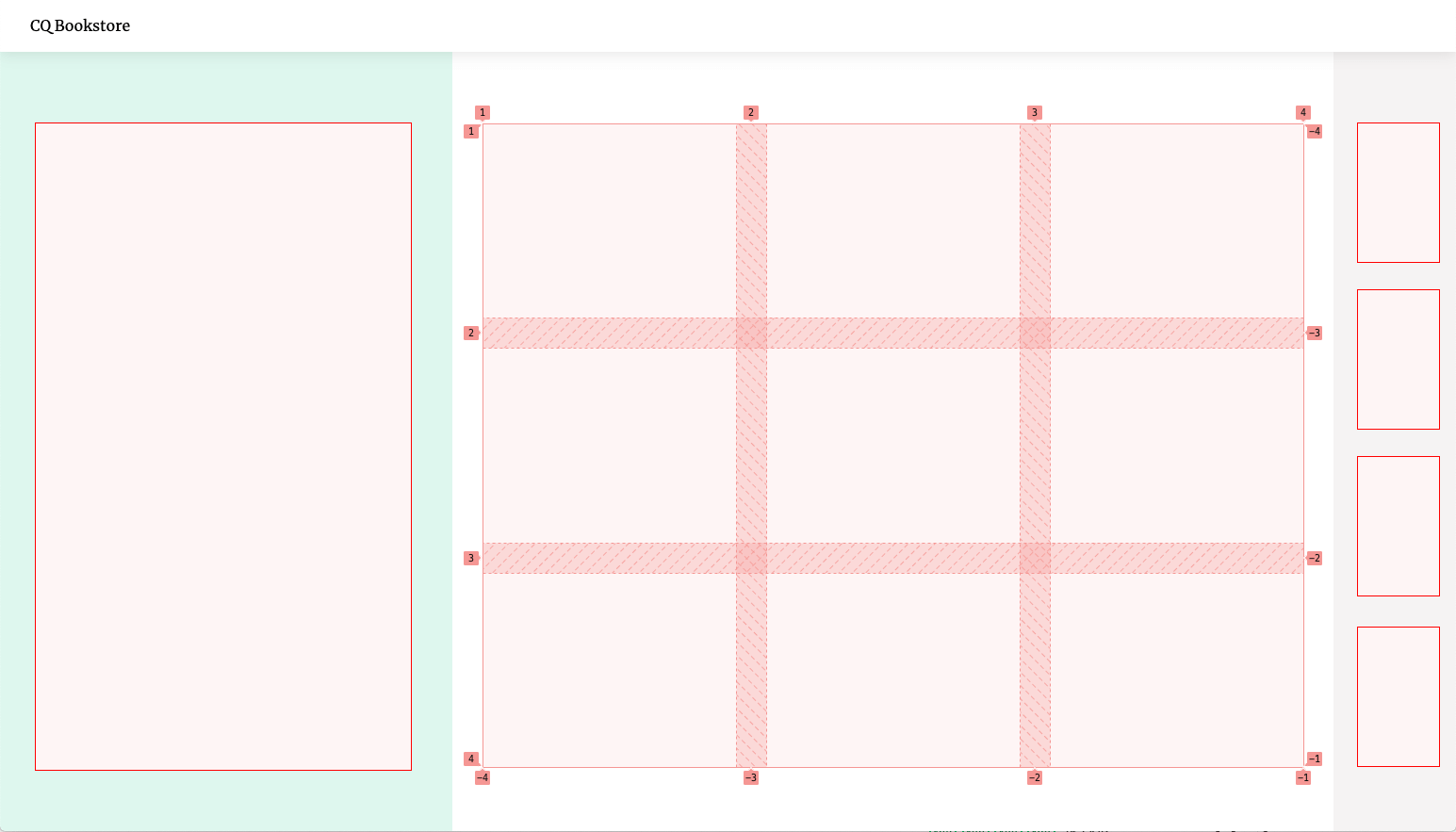
For example, the layout for our bookstore looks like this:
It’s a grid divided into three sections, the middle one containing a nested flexible grid itself.
The parts of the layout are only concerned with the alignment and dimensions of boxes. They have no effect whatsoever on their children other than giving them a certain amount of space to fill. Just like a bento box, it doesn’t care what we put into it, so we could easily re-use the layout for a completely different product. It is content-agnostic.
That’s why Container Queries pair so well with Web Components. They both offer ways to encapsulate logic to build smart, independent building blocks. Once they’re defined, they can be used anywhere.
Container Queries bring us one step closer to “Intrinsic Layouts” and a future of truly independent, component-driven design. Exciting stuff ahead!
"Asset Pipeline" is a fancy way of describing a process that compiles CSS, Javascript or other things you want to transform from a bunch of sources to a production-ready output file.
While some static site generators have a standardized way of handling assets, Eleventy does not. That’s a good thing - it gives you the flexibility to handle this any way you want, rather than forcing an opinionated way of doing things on you that might not fit your specific needs.
That flexibility comes at a price though: you need to figure out your preferred setup first. I’ve tinkered with this a lot, so I wanted to share my learnings here. BTW: My personal setup “Eleventastic” is also available on Github.
The most common requirement for an asset pipeline is to build CSS and Javascript. That process can have different flavors - maybe you need to compile your stylesheets through Sass or PostCSS? Maybe you want Tailwind? Maybe your Javascript is “transpiled” in Babel (translated from modern ES6 to the more compatible ES5 syntax) or bundled by webpack? Or maybe you want to do something entirely different, like build SVG icon sprites or optimize images?
Whatever you want to achieve, it usually involves plugging some tool into your Eleventy workflow. I’ve looked at several ways to tackle that problem - here are a few possible approaches you can take.
One solution is to let Eleventy handle just the SSG part (producing HTML) and define other processes to take care of your assets outside of it. The most common way to do this is through npm scripts. If you’re not familiar with these, they are essentially shortcuts to run node commands, defined in your package.json file.
The watch:sass and build:sass scripts here both run the Sass compilation command, just with a different configuration depending on context.
With utilities like npm-run-all, you can even run multiple scripts at once. So one “main command” like npm start will run Eleventy and simultaneously start watching your Sass files for changes, and recompile them when they do.
This solution is extremely flexible. There are node tools for everything, and there’s no limit to what you can do. However depending on how complex your build is, the setup can get a bit unwieldy. If you want to manage multiple asset pipelines that have to run in a specific order with a specific configuration, it’s not that easy to keep track of things.
And since each of these scripts is a separate process that runs outside of Eleventy, it has no knowledge about any of them. You can tell Eleventy to watch for changes that these external builds cause, but things can get complex if tasks depend on each other. You can also run into situations where multiple passes are required to achieve the desired output, and since Eleventy can’t optimize for processes outside of itself, large pages can take longer to build.
Another popular solution is to use Gulp to manage assets. Although it is not the hottest new tech on the block anymore (pssst: it’s OK to use tools that are older than a week), it’s still a perfect tool for the job: Gulp takes in a bunch of source files, runs them through any transformations you want and spits out static files at the end. Sounds exactly right!
This is more readable and versatile than npm scripts, but really you’re doing the same thing under the hood. Gulp runs all the different processes behind the scenes and outputs the finished .css or .js files into our build folder.
The drawback here is that it locks you into the Gulp world of doing things. You often need gulp-wrapper packages for popular tools (e.g. gulp-sass instead of node-sass) to work with the “streaming” nature of it. Plus you’re still running external builds, so all of the pitfalls that come with npm scripts still apply.
The underlying issue with both these methods is the same: they need external build processes. That’s why some Eleventy setups are going a slightly different route: instead of running asset pipelines on the outside, they teach Eleventy itself to handle them. That way everything runs through a single, integrated process.
Think of your assets as just another static “page” here. Instead of markdown, a template takes Sass or ES6 as input, and instead of generating HTML, it runs it through a tool like node-sass or webpack and outputs CSS or JS.
By leveraging Javascript templates, you can configure Eleventy to process almost any file you want. To use them, first add the 11ty.js extension to the list of recognized input formats in your .eleventy.js config file:
// .eleventy.js
module.exports=function(eleventyConfig){// add "11ty.js" to your supported template formatsreturn{templateFormats:['njk','md','11ty.js']}}
Now you can set up your asset pipeline by making a new template somewhere in your input folder. Let’s call it styles.11ty.js for example. It could look something like this:
// styles.11ty.jsconst path =require('path')const sass =require('node-sass')
module.exports =class{// define meta data for this template,// just like you would with front matter in markdown.asyncdata(){return{permalink:'/assets/styles/main.css',eleventyExcludeFromCollections:true,entryFile: path.join(process.cwd(),'/main.scss')}}// custom method that runs Sass compilation// and returns CSS as a stringasynccompileSass(options){returnnewPromise((resolve, reject)=>{constcallback=(error, result)=>{if(error)reject(error)elseresolve(result.css.toString())}return sass.render(options, callback)})}// this function is mandatory and determines the contents of the// generated output file. it gets passed all our "front matter" data.asyncrender({ entryFile }){try{returnawaitthis.compileSass({file: entryFile })}catch(error){throw error
}}}
The permalink property here lets you define which file the template generates and where to put it. You can use any type of data as input, then transform it somehow and return it in the render method. We’ve essentially done the same thing as defining a Sass task in Gulp, but this time it’s part of the Eleventy build itself!
This gives you even more control over the process. For example - if the compilation fails, you can use that information in the build. You can catch errors in the Sass code and display a message as an overlay in Eleventy’s dev server:
Showing a compilation error as a custom code overlay in your local site build
Check out the Eleventastic source to see how to achieve this. (HT to “Supermaya” by Mike Riethmuller for the idea)
A single template can also build multiple files this way. Using Eleventy’s pagination feature, you can i.e. generate different Javascript bundles from different source files:
// scripts.11ty.jsconstENTRY_POINTS={app:'app.js',comments:'comments/index.js',search:'search/index.js'}
module.exports =class{// again, the data() function does esentially the same// as defining front matter in a markdown file.asyncdata(){return{// define a custom property "entryPoints" firstentryPoints:ENTRY_POINTS,// then take each of the files in "entryPoints"// and process them separately as "bundleName"pagination:{data:'entryPoints',alias:'bundleName',size:1},// for each bundle, output a different Javascript filepermalink:({ bundleName })=>`/assets/scripts/${bundleName}.js`,// keep the scripts.11ty.js itself out of collectionseleventyExcludeFromCollections:true}}// a custom helper function that will be called with// each separate file the template processes.asynccompileJS(bundleName){const entryPoint = path.join(process.cwd(),ENTRY_POINTS[bundleName])// do compilation stuff inhere like// run file through webpack, Babel, etc// and return the result as a string// --- omitted for brevity ---return js
}// output the compiled JS as file contentsrender({ bundleName }){try{returnawaitthis.compileJS(bundleName)}catch(err){
console.log(err)returnnull}}}
I personally prefer the fully-integrated way of doing things, because it’s easier for my brain to think of assets this way. HTML, CSS, JS, SVG: it’s all handled the same. However, your personal preference might differ. That’s OK - there really is no “right way” of doing this.
The beauty of unopinionated tools like Eleventy is that you get to choose what fits you best. If it works, it works! 😉
I took a stab at building a plugin for Eleventy that lets me highlight selected pieces of text and provide users with an easy way to share them.
This feature was first made popular by Medium, where authors can pick a “top highlight” in a post and hovering it will show a tooltip with sharing options. I wanted something like this for independent blogging too, so I came up with a custom solution.
Here’s how that looks in action:
Here’s some highlighted text you can share! You shouldn’t though, this is obviously just a demo. Lorem Ipsum Dolor to you, friend!
The base of this feature is a <mark> tag wrapped in a custom <share-highlight> element.
If the Web Share API is supported (currently in Safari, Edge and Android Chrome), clicking the element will bring up your share options and insert the quoted text and a link to the current page. You can share it on any platform that registers as a share target.
Here's how sharing looks in Android Chrome
If the API is not supported, the component will fall back to sharing on Twitter via tweet intent URL. The tooltip will show the Twitter icon and clicking the highlight opens a new tab with a pre-filled tweet:
If you want to use this on your own site, follow these steps. (keep in mind that this is an early version though, and there are probably still some issues to sort out.)
Download the plugin with NPM by running npm i eleventy-plugin-share-highlight --save on the command line in your project’s root folder (where the package.json file is).
Add the plugin to your .eleventy.js configuration file:
// .eleventy.jsconst pluginShareHighlight =require('eleventy-plugin-share-highlight');
module.exports=function(eleventyConfig){
eleventyConfig.addPlugin(pluginShareHighlight,{// optional: define the tooltip label.// will be "Share this" if omitted.label:"Teilen"})}
This will register the highlight shortcode. You can use it in your templates or markdown files like this:
<!-- blogpost.md -->
{% highlight %}Here's some highlighted text you can share!{% endhighlight %}
This will highlight the containing text in a <mark> tag and wrap it in the custom element <share-highlight>. So the output HTML will look something like this:
<share-highlightlabel="Share this"><mark>Here's some highlighted text you can share!</mark><share-highlight>
If Javascript or Custom Elements are not supported, or if your post is displayed e.g. in an RSS reader, the <mark> tag will still be valid and give the highlighted text the correct semantics.
To further enhance that with the instant sharing function, you need to add the custom element definition first. Depending on your setup, you can either include that as part of a bundle by importing it directly:
To style the highlight, add this piece of CSS and customize it to match your design:
/* general styles for text highlight */mark{background-color: yellow;}/* styling if webcomponent is supported */share-highlight{/* default state */--share-highlight-text-color: inherit;--share-highlight-bg-color: yellow;/* hover/focus state */--share-highlight-text-color-active: inherit;--share-highlight-bg-color-active: orange;/* tooltip */--share-highlight-tooltip-text-color: white;--share-highlight-tooltip-bg-color: black;}
This is my first Eleventy plugin and also my first web component. I’m fairly confident that the Eleventy part is sound, but I don’t have much experience with web components, and I have some concerns.
My biggest issue with this is accessibility. I want the element to be keyboard-accessible, so I made it focusable and added keyboard listeners to trigger it with the Enter key. The tooltip label also doubles as the aria-label property for the component, but I don’t quite know how screenreaders handle custom elements with no inherent semantics.
I guess the cleanest option would be to use an actual <button> to trigger the share action, but I also need the element to be inline-level, so the highlighting doesn’t break text flow.
If you know your way around webcomponents and have a suggestion on how to improve this thing, please feel free to submit a PR!
The iconic 1996 "Space Jam" website was recently relaunched to promote the new movie. Thankfully, the developers still kept the old site around to preserve its intergalactic legacy.
It’s not often that a website stays up mostly unchanged for 25 years. So out of curiosity, I ran a quick check on both sites.
Unsurprisingly, the new site is a lot heavier than the original: with 4.673KB vs. 120KB, the new site is about 39 times the size of the old one. That’s because the new site has a trailer video, high-res images and a lot more Javascript:
The new site has gained some weight
This is keeping with the general trend of websites growing heavier every year, with the average site weighing in at around 1.900KB now.
But since our connection speeds and device capabilities are significantly better now - that’s fine. Everything is way faster now than it was back in the days of Michael Jordan’s first Looney Tunes adventure.
1996 was a different time. The Spice Girl’s “Wannabe” was in anti-shock discmans everywhere, and the most common network connection was 56k dial-up modems. So of course the original developers had a smaller performance budget to work with, and the site is much lighter. Fair enough - so how long did it take to load the original Space Jam site back then?
I ran a webpagetest with a simulated '96 connection: dial-up on an average desktop computer. Dial-up had a maximum speed of 56 kbit/s, but in reality it came in at something around 40-50 kbit/s.
Here’s how that looked (fire up the dial-up noise in another tab for the full experience):
We can see the first content (the “press box shuttle” menu item) after 4 seconds. The other menu items -all separate GIF images- come in slowly after that. Since the HTML renders as soon as it is parsed, you could theoretically already click on the items before the rest of the page has finished though. The whole site is done after 28.1 seconds in this test.
Now let’s look at the current, futuristic state of the web. Luckily we don’t use dial-up anymore. The most common connection these days is a mobile 3G network, and the most common device is an Android phone (a Moto G4 in this test). A typical 3G connection comes in at around 1.5 Mbp/s, so it is roughly 30 times faster than dial-up. This shouldn’t take long:
Funnily enough, the first meaningful paint also shows up after about 4 seconds. It’s not actual content though, it’s the loading screen, informing us that we’ve now loaded 0% of the site.
We reach 100% at 12 seconds, but the first real piece of content is not rendered until 21.5 seconds: it’s a youtube video in a modal window. The site is finally ready after 26.8 seconds, although actually playing the video would take some more loading time.
Right. So after 25 years of technological progress, after bringing 4.7 billion people in the world online, after we just landed a fifth robot on Mars, visiting the Space Jam website is now 1.3 seconds faster. That seems… underwhelming.
__
I know that this is just a movie promo site. And of course the requirements for a website are different now - people expect rich content. But I think this speaks to a larger point:
Although connection speeds and devices keep getting better and better, the web is actually getting slower. We see the increasing bandwidth as an invitation to use more and more stuff in our websites. More images, more videos, more JavaScript.
We just keep filling the available space, jamming up the pipes in the process so nothing actually gets faster. Well, at least the dial-up sound is gone now.
I'm a fan of webmentions. I've written about how to use them before, and I'm quite happy with having them on my site.
However, it can get difficult to see what’s going on with them - especially if there’s a lot of “background noise”. Many sites just scrape content from well-known blogs and republish it for SEO juice. If that content includes a link to your site, it can lead to webmention spam.
Unlike on social media, you also don’t get notifications or reports about incoming webmentions. You’re just handed a bunch of raw data to use however you like. That’s part of the beauty of the Indieweb though: you can tailor it to whatever suits you best.
I recently started playing around with the data I get from webmention.io to see if it could be displayed in a more meaningful way. The result is a new side project I call:
✨✨✨ Webmention Analytics ✨✨✨
You can see it in action in this demo on my site.
Breakdown of webmentions per day
I built this with Eleventy and Netlify, mainly because that’s my favorite tech stack to tinker with. But for analytics that don’t have to be real-time, static site generators are actually a really good fit.
Expensive computations like parsing and analyzing 8000+ data points like this can be run once a day through a periodic build hook. The reports it generates are then instantly available to the user, while still being up-to-date enough.
If you also use webmention.io to show webmentions on your site, you can fork the code on Github and make your own instance of webmention-analytics. Just follow the instructions in the README to get started.
Keep in mind that this is still a very early version of a weekend side project, so there's probably a few things to iron out. Cheers!
Static Site Generators are all-or-nothing. Each time they build a new version of the site, they throw away everything that was created before and start from scratch.
That’s usually what you want to ensure everything is up-to-date. But there are special cases when keeping parts of the previous build around makes sense. For example, If you fetch lots of data from an external source during your build, it might make sense to cache that data and re-use it again in the future.
I recently found such a case when working on the Eleventy webmentions feature. For each build, a script queries the webmention.io API and fetches all the webmentions for the site. That can be a lot of data - and most of it stays the same, so fetching everything new again each time is sort of wasteful.
A better solution is to store the fetched webmentions locally in a separate _cache folder as JSON and give them a lastFetched timestamp. On the next go, we can load the old data straight from there and only query the API for webmentions newer than that timestamp.
My webmentions code does exactly that - but it had a big problem: that only worked locally. Since Netlify (where my site is hosted) throws everything out the window each time, I couldn’t use the cache there.
To edit anything related to the Netlify build process itself, you need a build plugin. There is a directory of plugins available for you to choose from, but you can also define your own plugins and deploy them alongside the rest of your code.
To define a custom plugin, make a new directory called plugins and within that, a new directory for your code:
Your plugin should contain at least two files: a manifest with some metadata, and the actual plugin code.
For the manifest file, let’s just set a name:
# manifest.ymlname: webmention-cache
The meat of the plugin is in the index.js file. There are lots of things you could do here- but for this usecase, it’s enough to define an object with two functions. These are hooks that will be called on specific parts of the build process that Netlify runs.
Both functions will be given some arguments, and among them is the utils object we can use to access the internal build cache:
// index.js
module.exports ={// Before the build runs,// restore a directory we cached in a previous build.// Does not do anything if:// - the directory already exists locally// - the directory has never been cachedasynconPreBuild({ utils }){await utils.cache.restore('./_cache')},// After the build is done,// cache directory for future builds.// Does not do anything if:// - the directory does not existasynconPostBuild({ utils }){await utils.cache.save('./_cache')}}
The onPreBuild hook looks for a previously cached _cache folder and restores it within the build.
The onPostBuild hook takes the final build output, looks for changes in the _cache folder and saves it for later.
Because these hooks only look at changes that happen between the start and end of your build, your code needs to create the cache directory itself and write files to it as it runs. You can do that by using node’s filesystem functions, similiar to what I’ve done here.
It's important to note that this will not overwrite any existing files from your repository, so it only works when there is no _cache folder already committed to your site. It might make sense to add it to your .gitignore file.
The last thing to do is to let the Netlify build script know you intend to use your plugin. You can register it with a line in your netlify.toml configuration file:
I don't think I have to tell anyone why this year sucked, what with the pandemic and all. 2020 is going down in history as a massive crapstorm.
Still, I want to continue the tradition of “end-of-the-year” blogposts and since there’s already enough doom out there these days, I’m trying to focus on the good things that happened instead.
The web industry is among the fortunate ones that are very well suited for remote and distributed work, which is why I was able to keep working from home throughout most of the year.
We rented a great new office in the spring that I’ve hardly been to since, but our team at Codista is quite used to working remote and we already had all the necessary infrastructure in place.
We had more than enough projects on our hands and we did some really interesting, challenging stuff that I can’t talk about (yet) 😉 - so all in all, work was good.
When the first lockdown hit, I kept occupied by building things - mostly in and around Eleventy, which helped me get ideas off the ground quickly. Here are some of these:
Eleventastic: my personal starter kit for Eleventy projects. I wanted to get rid of “external” build tools like Gulp and manage all pipelines inside Eleventy itself.
Eleventy Resumé: a simple microsite that functions as a CV/Resumé in web and print.
Whimsical Website Club: a collection of websites that spark joy by doing things a little bit less serious.
I had some talks planned for 2020 which of course didn’t happen. I did a few online talks though and I participated in Inclusive Design 24, a free 24-hour livestream event where I talked about another side project, the “Emergency Website Kit”:
The Webclerks team and I had the pleasure of hosting our own little virtual meetup event “Vienna Calling” on Twitch, and we had a phenomenal lineup. A big thank you again to all the speakers who joined us, as well as the rest of the team who made this happen behind the scenes.
BTW: You can find the full event as a playlist on Youtube:
In the summer, the situation improved enough for me and my girlfriend to take some much needed vacation time. With international travel still closed, we decided to go on a road trip through Austria instead and it was awesome. This country has some really beautiful places in store.
The Kanisalpe mountain range in Vorarlberg, Austria
This year, more than ever, I realized the enormous impact the web has on all of us, and how important it is to keep it free and open. I know we’re all sick of doing things online all the time, but imagine for a moment what this year would have looked like had the web never been invented.
Millions of people would be completely isolated, even more would be out of their jobs. Schools could not operate. Civil rights movements would be almost impossible to organize. Global research projects like the development of a vaccine would take years longer. And you probably wouldn’t have seen the faces of your loved ones in months.
The web has become such an integral part of our lives that we sometimes take it for granted. It’s not. In fact this shitshow of a year should probably remind us that we need to take really good care of the things that are still connecting us.
I’m not going to compare my goals from last year with what I’ve accomplished in 2020. I don’t think it matters. Give yourself a break this year - it’s OK if things didn’t turn out the way you wanted.
I’ll see you all in 2021. And hopefully we’ll all have a vaccine in our system and a better year ahead of us.
The web needs to take itself less seriously. It's barely out of its twenties and suddenly it's all like "I can't make fansites for hippos anymore, I have businesses to run".
While we’re all laser-focused on shipping the newest feature with the hottest software and the best Lighthouse scores, I’ve been missing a bit of the joy on the web.
Apps are currently conveying little care for UX, guidance, richness, and — well, for humans trying to communicate through a computer, we’re certainly bending a lot to… the computer.
I really liked that post, so I made small website meant to showcase how a more personal web could look like, and hopefully give someone else inspiration to make their own corner of the web a bit weirder.
Introducing: The Whimsical Web - a curated list of sites with an extra bit of fun.
I’ve collected a few of my favorites to start, but anyone can add a site to the list if it’s fun, quirky and personal.
Just open an issue on Github and let me know.

 Login
Login