❌

Reading view

There are new articles available, click to refresh the page.

Working with MDX in Next.js

Several weeks ago, I completely redesigned, rewrote, and re-engineered the Pierre Docs. What originally started as a few Notion pages had already turned into a set of low-key static pages on our logged out site, but after a slew of awesome product updates, our very manual setup was severely lacking and we simply needed more docs.
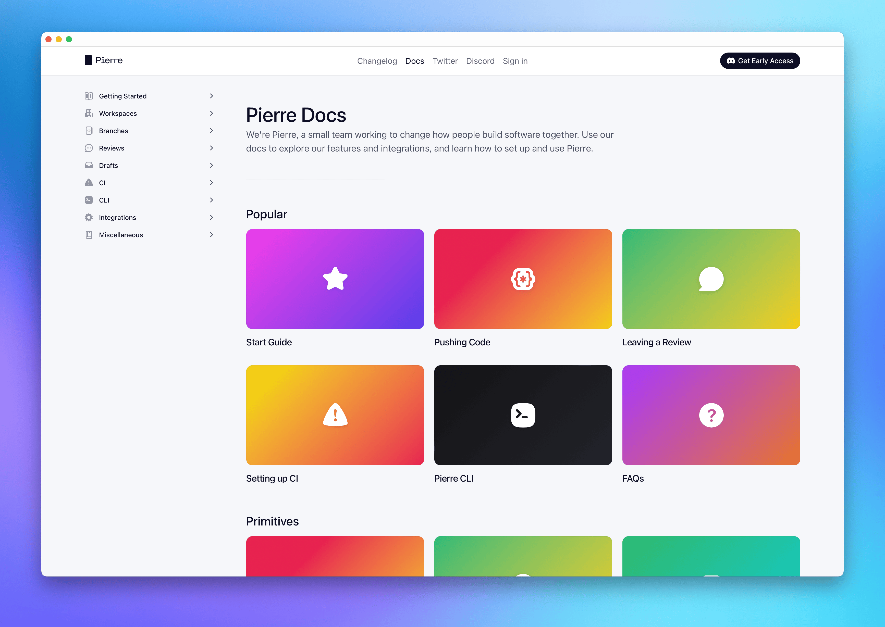
The homepage for the new Pierre Documentation.

I needed an easy way to write and maintain dozens of new pages of documentation. I had just recently redone the Pierre Changelog from a similar manual setup to use MDX and dynamic routes in Next.js, and I wanted to do the same for our docs, too.

Learning new things

There’s a ton about Next.js and React that I didn’t fully know heading into this, so it took me a bit to get up to speed on a few concepts. I’m reiterating them here for my own memory and reference, but at the same time, I want to help others who might be in a similar spot. There’s no shortage of advice and posts out there, but none felt like they explained things in a helpful way for me.

Okay, so here’s a few things I needed to learn or remind myself heading into this project.

  • Files or folders with brackets in their names like [slug] or [slug].js are dynamic route segments. These allow you to group files and folders of related content while generating routes for your content. In short, you can render any number of MDX pages using this page as a template.

  • There’s also a special catch-all version of dynamic routes that works across nested folders by prefacing your dynamic segment with .... In my case with the Pierre docs, app/src/docs/[...slug]/page.tsx is the dynamic segment that allows us to render any docs MDX page, no matter the subfolder.

  • The generateStaticParams function works with dynamic routes to generate each static page. This function is used within those dynamic segments, and when it’s told where to look for say a bunch of MDX files in our app/src/docs/content/ directory, it will loop over those to statically generate each page. Neat!

Now there’s also some stuff I already knew that bears repeating:

  • MDX is a format that lets you write JSX in your Markdown documents. You can create and extend React components that can be used alongside Markdown content. Super nice for our alerts, buttons, and icons.

  • Grouping and ordering MDX files still seems like a pain in the ass, and what I mean by that is specifically around generating our docs side navigation. Our best approach here was generate the folders of static pages and use a separate JSON object to order and generate the nav.

  • There are so many ways to manage MDX, and most of them require the use of plugins to get all the functionality you really want. No issue here, but it’s worth noting that I ended up using next-mdx-remote, some Rehype plugins, and some Remark plugins. All told, it’s been great for me.

Okay with that stuff out of the way, let’s get to the good stuff—how I built the Pierre Docs using MDX and Next.js.

Implementation goals

Right before doing the Pierre docs, I had just redone the Pierre Changelog. The first iteration of it was a single page where individual entries were separate component imports and you’d link to entries with a URL hash.

It looked like this:

<div className={styles.list}>
  <GithubMirror />
  <BranchSummaries />
  <MultiplayerEditor />
  <Mentions />
  <BlendedDiffs />
  ...
</div>

It worked for a bit, but it obviously wouldn’t go anywhere as we grow and ship more. It was already annoying after a handful of posts. What I worked up for the second iteration of the Changelog though was built for a single, flat directory. That wouldn’t suffice here.

Plus, I had some specific goals in mind for what I’d need to build.

  • Must support dozens of pages
  • Must support any number of nested directories
  • Must be easy to contribute to by anyone on the team
  • Eventually, must be abstracted to easily scale to other content directories

Okay, so with that in mind, I set out to get some help and start building.

Setting up the file structure

Our Next.js app has (what seems to me like) a fairly straightforward setup. For content that doesn’t require signing in, we use some middleware to render our logged out and marketing pages. The rough structure looks a bit like this:

pierre/
├── src/
│   ├── app/
│   │   ├── (authenticated)/
│   │   ├── changelog/
│   │   ├── docs/
│   │   ├── og/
│   │   ├── signin/
│   │   └── ...
│   ├── components/
│   ├── lib/
│   ├── primitives/
│   └── ...
├── next.config.mjs
├── package-lock.json
├── package.json
└── ...

Looking inside the docs folder, here’s what we’re working with:

docs/
├── [...slug]/
│   └── page.tsx
├── components/
├── content/
├── layout.tsx
├── page.module.css
└── page.tsx

The local (to the docs source) content folder is where we put all our MDX files. The page.tsx file is the main component that renders the MDX content, and the [...slug] folder is where we generate all our static pages using those fancy dynamic routes.

You could put your content elsewhere, but in the interest of limiting scope and ensuring easy access, I kept it simple and put it all in Git as local MDX files. Eventually I could see us looking into some external CMS.

Rendering MDX

Now that we have our files in place, we can start figuring out how to render the MDX into static HTML. The [...slug]/page.tsx file is where we fetch and render the local MDX content. We use the generateStaticParams function within to generate our static pages with next-mdx-remote.

// app/src/docs/[...slug]/page.tsx

import fs from "node:fs";
import path from "node:path";

export const runtime = "nodejs";
export const dynamic = "force-static";

const contentSource = "src/app/docs/content";

export function generateStaticParams() {
  // Recursively fetech all files in the content directory
	const targets = fs.readdirSync(path.join(process.cwd(), contentSource), {
		recursive: true,
	});

  // Declare an empty array to store the files
	const files = [];

	for (const target of targets) {
    // If the target is a directory, skip it, otherwise add it to the files array
		if (
			fs
				.lstatSync(
					path.join(process.cwd(), contentSource, target.toString()),
				)
				.isDirectory()
		) {
			continue;
		}

    // Built the files array
		files.push(target);
	}

  // Return the files array with the slug (filename without extension)
	return files.map((file) => ({
		slug: file.toString().replace(".mdx", "").split("/"),
	}));
}

Some more things to note here that I learned along the way:

  • There are apparently two ways to work with this kind of stuff in Next.js—called runtimes—and that’s using Node or using the edge. Node is what we want since we’re statically rendering this content. The runtime and node related imports are all in support of that. Update: nodejs is the default, so we don’t need to declare this here. Leaving it in for posterity.

  • Since we want these rendered HTML pages to be static, we can force that behavior in the Next.js app directory by setting dynamic to force-static. Since we’re using generateStaticParams, this is also optional, but it’s always good to be explicit.

  • Getting that list of targets in the source directory will include sub-directories alongside files, so we need to filter those out. That’s what the isDirectory check handles.

The final piece of that function is to push all the files into an array and return them with the slug. We’ll use this later to help generate the pages by their slug.

Okay, now onto rendering the page! To do that, we need to build a default function for the page.tsx file that takes the information from the magical generateStaticParams function and renders the MDX content.

// Continuing in app/src/docs/[...slug]/page.tsx

// Add new imports
import { useMDXComponents } from "@/mdx-components";
import { compileMDX } from "next-mdx-remote/rsc";
import rehypeHighlight from "rehype-highlight";
import rehypeSlug from "rehype-slug";
import remarkGfm from "remark-gfm";


interface Params {
	params: {
		slug: string[];
	};
}

export default async function DocsPage({ params }: Params) {
	// Read the MDX file from the content source direectory
	const source = fs.readFileSync(
		path.join(process.cwd(), contentSource, params.slug.join("/")) + ".mdx",
		"utf8",
	);

	// MDX accepts a list of React components
	const components = useMDXComponents({});

	// We compile the MDX content with the frontmatter, components, and plugins
	const { content, frontmatter } = await compileMDX({
		source,
		options: {
			mdxOptions: {
				rehypePlugins: [rehypeHighlight, rehypeSlug],
				remarkPlugins: [remarkGfm],
			},
			parseFrontmatter: true,
		},
		components,
	});

	// (Optional) Set some easy variables to assign types, because TypeScript
	const pageTitle = frontmatter.title as string;
	const pageDescription = frontmatter.description as string;

	// Render the page
	return (
		<>
			<h1 className={styles.pageTitle}>{pageTitle}</h1>
			<p>{pageDescription}</p>
			<div className={`${mdStyles.renderedMarkdown} ${styles.docsBody}`}>
				{content}
			</div>
		</>
	);
}

Okay so let’s walk through a few things…

We’re importing a few new things—the useMDXComponents function and a few plugins for our MDX content. We’re also importing the compileMDX function from next-mdx-remote/rsc to render the MDX content.

Here’s a simplified version of the src/mdx-components.ts file:

// src/mdx-components.ts

import type { MDXComponents } from "mdx/types";
import Image, { ImageProps } from "next/image";
// other imports...

export function useMDXComponents(components: MDXComponents): MDXComponents {
	return {
		a: ({ children, href }) => (
			<a href={href} className="styledLink">
				{children}
			</a>
		),
		hr: (props: React.ComponentProps<typeof Divider>) => (
			<Divider
				style=
				{...props}
			/>
		),
		img: (props) => (
			<Image
				style=
				{...(props as ImageProps)}
			/>
		),
		// etc
		...components,
	};
}

If you’re new to using MDX components, this basically let’s you override default HTML elements rendered by MDX and make your own components available to use in .mdx files. For example, in the above snippet we change all default anchor elements to have the class styledLink. We also override the default horizontal rule to use our Divider component.

Back to the rest of the page…

Our components and the MDX plugins that we want are passed to the compileMDX function to render the content. Those are straightforward, so I won’t get into them. We also parse the frontmatter from the MDX file to get the page title and description. We also use fetch a few other things from our page frontmatter—icon, color, OG image, etc—but we won’t get into that here. Lastly, we put it all together at the end in the return to build the page’s HTML.

For the Markdown styling, we have a stylesheet that we made for our file explorer when we added rendered Markdown support. That’s the mdStyles.renderedMarkdown part. There wasn’t much to tweak here either since everything else fell into customizing MDX components.

From here, we have MDX pages that can be dynamically rendered at any level of the source directory, with easy frontmatter access and custom components, plus a set of functions that can be easily extended into other areas of the site.

Sidenav

One bummer about directories of Markdown/MDX has always been building navigation for those pages—seemingly no matter the framework or language. Setting the order, adding icons, controlling states—woof. We could use fs to read from the directory and build a nav ourselves, but how would we order a dynamic set of pages within each sub-directory? Frontmatter could maybe help, but then you’re stuck updating values across multiple pages.

The easiest solution is still building a single config file of sorts for the navigation using JSON or YML. We took that route with the docs pages—here’s a snippet of it.

// src/app/docs/Nav.tsx

export const DocsNav = [
	{
		header: "Getting Started",
		icon: "IconBook",
		color: "purple",
		items: [
			{ href: "/docs/getting-started", label: "Overview" },
			{ href: "/docs/getting-started/new", label: "Create a New Workspace" },
			{
				href: "/docs/getting-started/join",
				label: "Join an Existing Workspace",
			},
			{ href: "/docs/getting-started/import-code", label: "Import Code" },
			{ href: "/docs/getting-started/ssh", label: "Setup SSH" },
		],
	},
	{
		header: "Workspaces",
		icon: "IconBuilding",
		color: "blue",
		items: [
			{ href: "/docs/workspaces", label: "Overview" },
			{ href: "/docs/workspaces/navigation", label: "Navigation" },
			{ href: "/docs/workspaces/members", label: "Members" },
			{ href: "/docs/workspaces/repositories", label: "Repositories" },
			{ href: "/docs/workspaces/notifications", label: "Notifications" },
			{ href: "/docs/workspaces/presence", label: "Presence" },
			{ href: "/docs/workspaces/settings", label: "Settings" },
		],
	},
  // ...
];

Elsewhere, we use that JSON to build our sidebar as its own component that can then be rendered wherever we want in our docs layout. Here’s a look at how we built that with our own components:

import { Colors } from "@/primitives/Color";
import { Column } from "@/primitives/Layout";
import * as Icons from "@/primitives/icons";
import { createElement } from "react";
import { DocsNav } from "./Nav";
import { NavHeader } from "./NavHeader";
import { NavItem } from "./NavItem";

export const DocsMenu = () => {
	return (
		{DocsNav.map((menuItem) => (
			<NavHeader
				key={menuItem.header}
				title={menuItem.header}
				color={menuItem.color as keyof typeof Colors}
				icon={createElement(Icons[menuItem.icon as keyof typeof Icons])}
				items={menuItem.items}
			>
				<Column gap={1} style=>
					{menuItem.items.map((item) => (
						<NavItem href={item.href} key={item.label}>
							{item.label}
						</NavItem>
					))}
				</Column>
			</NavHeader>
		))}
	);
};

We used the same approach overall with our docs homepage, except we created a separate JSON blurb and map since we only wanted to show a subset of pages that we hand-selected. This gave us a bit more flexibility, but it’s also something we could maybe improve down the line as well to avoid the repetition.

Up Next: Abstraction

The last goal for me was to be able to abstract all of this so I can use it elsewhere—like on the Changelog or in the Styleguide I’ve been (very) slowly chipping away at. I’ll save that for another post as I’m still working on that part.

Suffice to say it has also felt relatively straightforward to do and I love that I’m able to get this stuff working elsewhere with ease now.

See you again for the next part!

Shipping Blended Diffs

It’s been a whopping five years since I last shipped one of my Shipping blog posts, and boy do I have a good one to come back with. I’ve been working on Pierre for most of the last year and we’ve been shipping some amazing stuff.

Let’s talk about the latest, designing and shipping blended diffs in Pierre!

Blended diffs

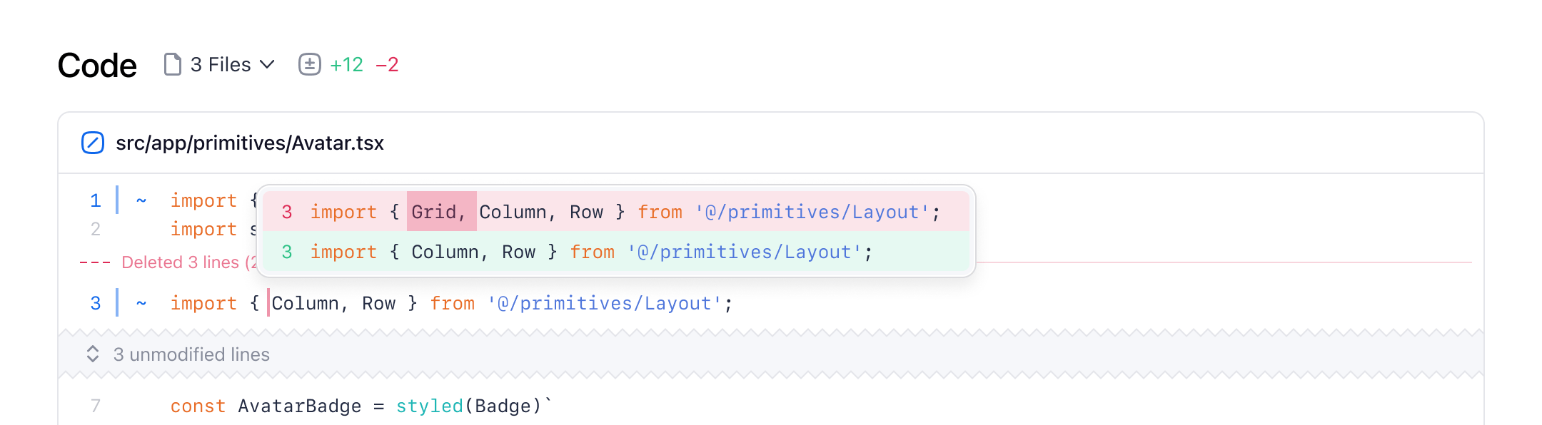
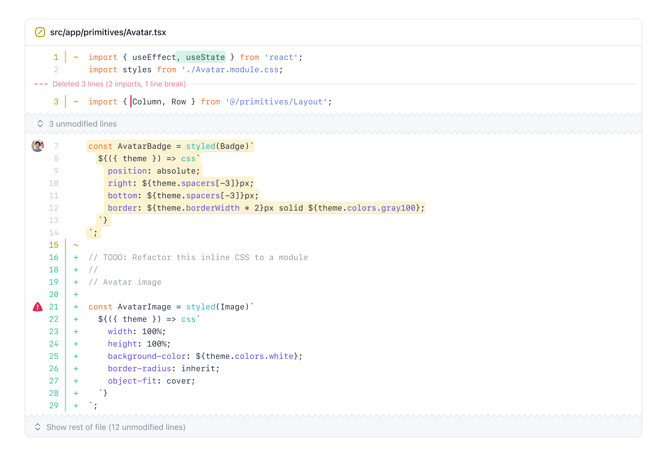
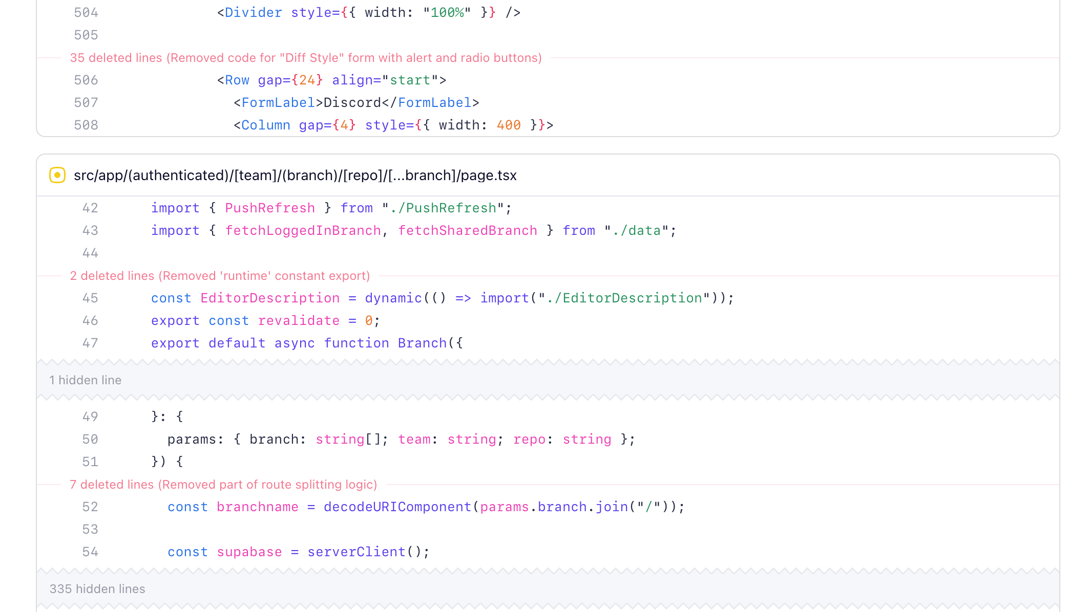
The final version of blended diffs in Pierre, complete with collapsed deletions, new modifications, and overall lighter design.

Since starting Pierre, we’ve been focused on finding ways to rethink the tools and features we’ve relied on for decades as developers. A few months ago, I decided to do a deep dive into how we can render code changes differently. Just a fun and open-ended exploration in Figma of any and all ideas that came to mind. Most of my Figma files end up looking something like this:

One of six Figma pages. I always make it a goal to generate as many artboards/frames as possible. It’s fun to see the turning point towards blended diffs in the middle of the page.

And since designing diffs and code changes is an area I’ve thought a fair amount about since first shipping split diffs at GitHub back in 2014, I was very excited to dive in.

Early explorations

An early mockup of a file tree table of contents, inline actions on hover, diff options, and more. None of this shipped, but maybe in a future update.

Most of my early explorations like the one above started by adding features to our diffs and reviews, which quickly started to feel like the wrong approach. Instead of adding a bunch of new or improved stuff—which, honestly, we still want to do at some point—what would happen if we started by trying to remove bits and pieces? That’s ultimately what led me to something I started calling blended diffs.

Finding a new style

Blended diffs are an all new diff style that emphasizes a file’s finished state, minimizes deletions, simplifies one-line modifications, and creates more space for context. All in an effort to decrease review time and make code changes more approachable.

The first iteration that added a new ~ indicator and blue “modified” line treatment.

This was the first iteration of a new “modified line” treatment where I treated the 1-line diff as just that, one line with an inline change. Until this point, single line changes show up as two lines of a diff, like this:

- This is the deleted line
+ This is the new line

And this started to really bother me because I spent more time looking at the two lines rather than the one-word inline change. Newer diff tools of course have added inline highlighting to help with this, but it was still the same thing at heart. So I kept pushing.

The first attempt at a blended diff with modifications and a faded deletion.

The very next iteration dropped the notion of a split or stacked diff, instead blending the changes inline with the rest of the file. See what I did there? I was still stuck on all blue here, which I quickly realized wasn’t ideal as it’s unclear if the change was a deletion or an addition. Several iterations later, I landed on a balance of those blue modified indicators and green or red inline treatments.

All one-line modifications have blue line numbers and ~ indicators. One-line additions have a green background, while one-line deletions are indicated with a red vertical bar.

Clicking on the red bar for deletions would toggle a popover to show a regular diff.

This iteration also included the first ideas for inline summaries of deletions and hidden lines. The dream was to show the number of lines and a semantic summary of what was behind that hidden deletion. For example, 2 constants, 1 line break or 1 unused Button function. Originally this was going to be something I planned to push for down the line, but once we got into code, we switched gears on that once we got to building it.

One of the last elements of the new blended diffs was a column left of the line numbers. I really liked the idea of a left-hand column called “the gutter”. The blended diff gutter is a consistent space for context on any line—annotation markers, avatars for comments, and eventually even more. I see this scaling to more custom annotations, like todos or linters, and whatever else we can dream up.

Planning with the team

As the design iterations started feeling better and better, it felt time to get out of Figma and write down my thoughts to better articulate product direction and get some early feedback. Writing about a feature is arguably more powerful and meaningful than just designing it.

Our team likes to spike out our ideas and then gather our thoughts before we fully (or over) commit to something. We built that right into Pierre with branches—you can start writing and getting a review before pushing any code.

Product doc for blended diffs with Figma embed, motivation, goals, and more.

The biggest question sparked by the PRD was how to launch this new diff style—alongside stacked and split, in place of one, or in place of both? Adding a third diff style would be the safest. Replacing one of them would be a little risky. Replacing both would be making a bigger bet. So after some back and forth, we went big.

Blended diffs would replace both existing diff styles—making for less code to maintain, less bloat, and a more opinionated product.

Building it

After getting a clear direction set in stone between design and PRD, we started building. We went back and forth between more rounds in Figma and writing code, a process I really love when working with a product engineer. There’s no better way to fine-tune the details than to ping-pong between design and code, and designer and engineer.

Ian led the charge on building out blended diffs while I provided some frontend support. It ended up being super helpful to be dropping the old diff styles because it was significantly less code to be working around. Our stacked and split diffs naturally shared some code, so adding a third was going to be messy. Making that early bet let us move much faster.

Design-wise, we started with the inline deletion summaries on the left and intersecting the line numbers. This felt too busy once we tried using it, and leading with the number of lines instead of the summary felt like we were burying the lead. We ended up moving the summaries to the right (on desktop) and leading with our AI generated summaries. This has the effect of you noticing a subtle indicator that there’s a deletion, and then you can choose to dig in or not without it taking away too much attention.

Jacob hooked it up so that deleted lines are fed into an AI model to summarize the deletions for us on the fly (and then cached). We experimented with summarizing more parts of the diff, including every line of every file, but that ended up being less accurate and obviously slower and more expensive. We also took some time to fine-tune the spacing and style, ensuring those hidden deletions didn’t interrupt the flow of the lines of code too much.

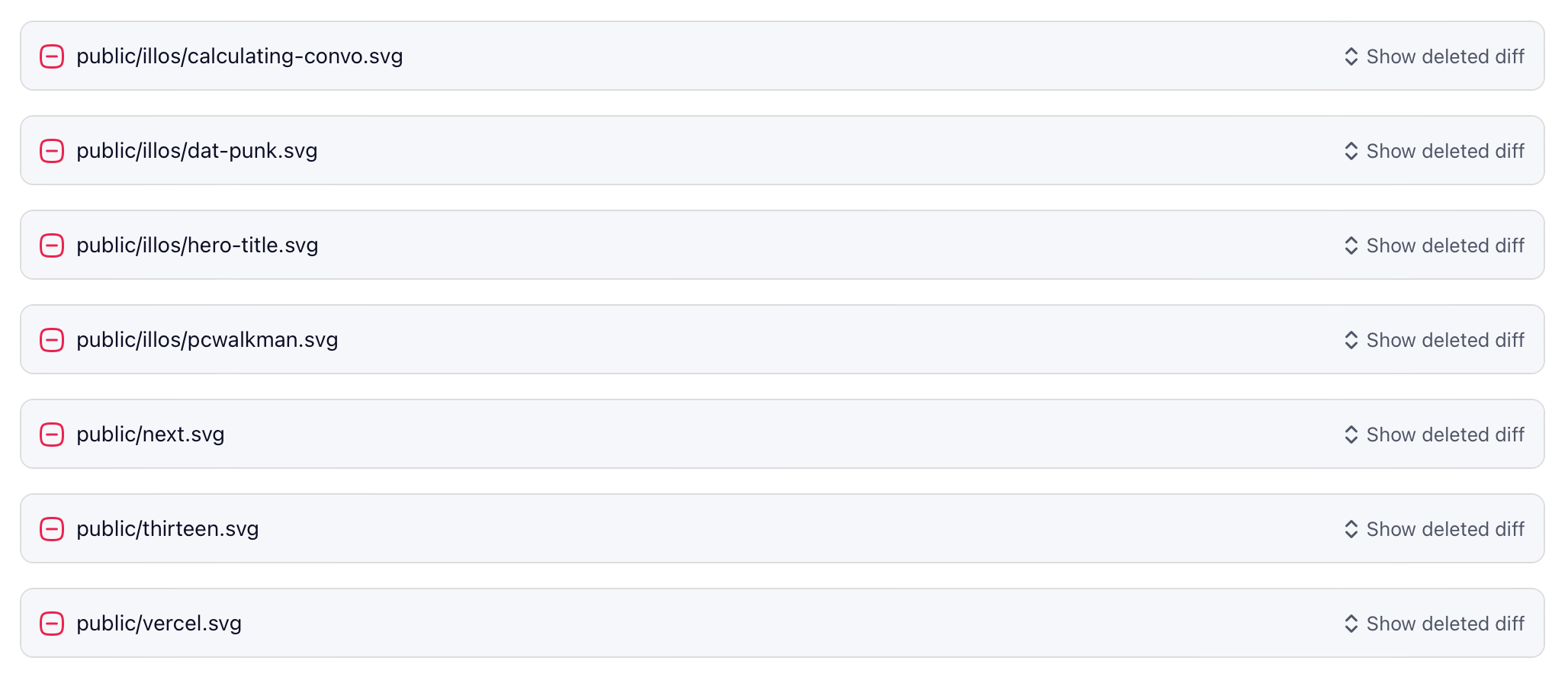
While we were in there working on the new diff styles, we also took some time out to further minimize deleted files. Now the stuff you don’t need to see as much—like a list of deleted images—can be collapsed to save space, reduce review time, and further improve comprehension.

Deletions

The same treatment also now applies to very large diffs, like package lockfiles. All minimized and tucked away until you really need to dig in. We really focused in on the idea of comprehension with blended diffs. If we could help people understand what happened faster, and remove the noise, we could make code reviews faster and more enjoyable independent of any other workflow improvements.

Building like this took longer than expected given the holidays, but the extra bake time really helped us hone details around style, interaction, and performance as we continued to use it internally. It also helped a ton that we have super easy and Pierre-native comments for our Vercel branch deploys—the engineers could just screenshot a visual bug for me and it’d show up for me in the branch to fix.

I can’t say it enough times—product designers and product engineers pairing from design to code is absolutely essential to great products. I’m super proud and thankful to be working with this team and building something like Pierre.

A diff canvas

There are like a dozen more ideas we landed on while working on blended diffs, but I don’t want to tip our hat too much before we’re ready. We’re very committed to changing how product engineers work, and diffs are just one piece of that. We truly believe these new diffs are a blank canvas for us to keep building on.

Keep an eye on the Pierre Changelog and join our community Discord to get access to our private alpha.

macOS web apps

With the release of macOS Sonoma and Safari 17.0 earlier this week, we can now add web apps to the dock. Here’s a brief rundown of my experience testing them and customizing how Pierre appears when added to the dock.

Dockable web apps

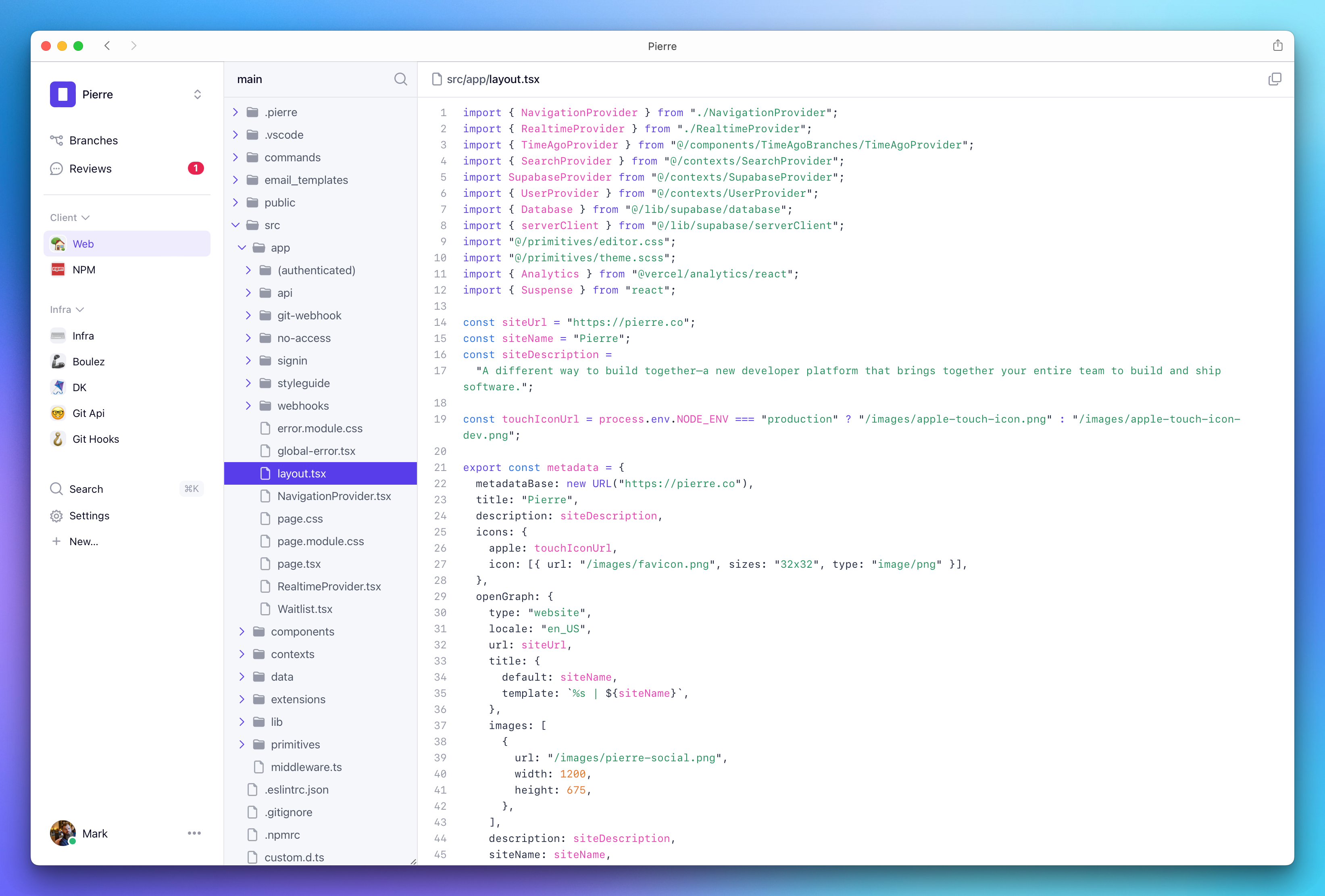
A look at Pierre’s file explorer when using the new dockable web apps in macOS Sonoma.

Adding to the dock

First, a brief intro how to add to the dock. Click the Share icon and select Add to dock, or choose File > Add to Dock… from the menu bar.

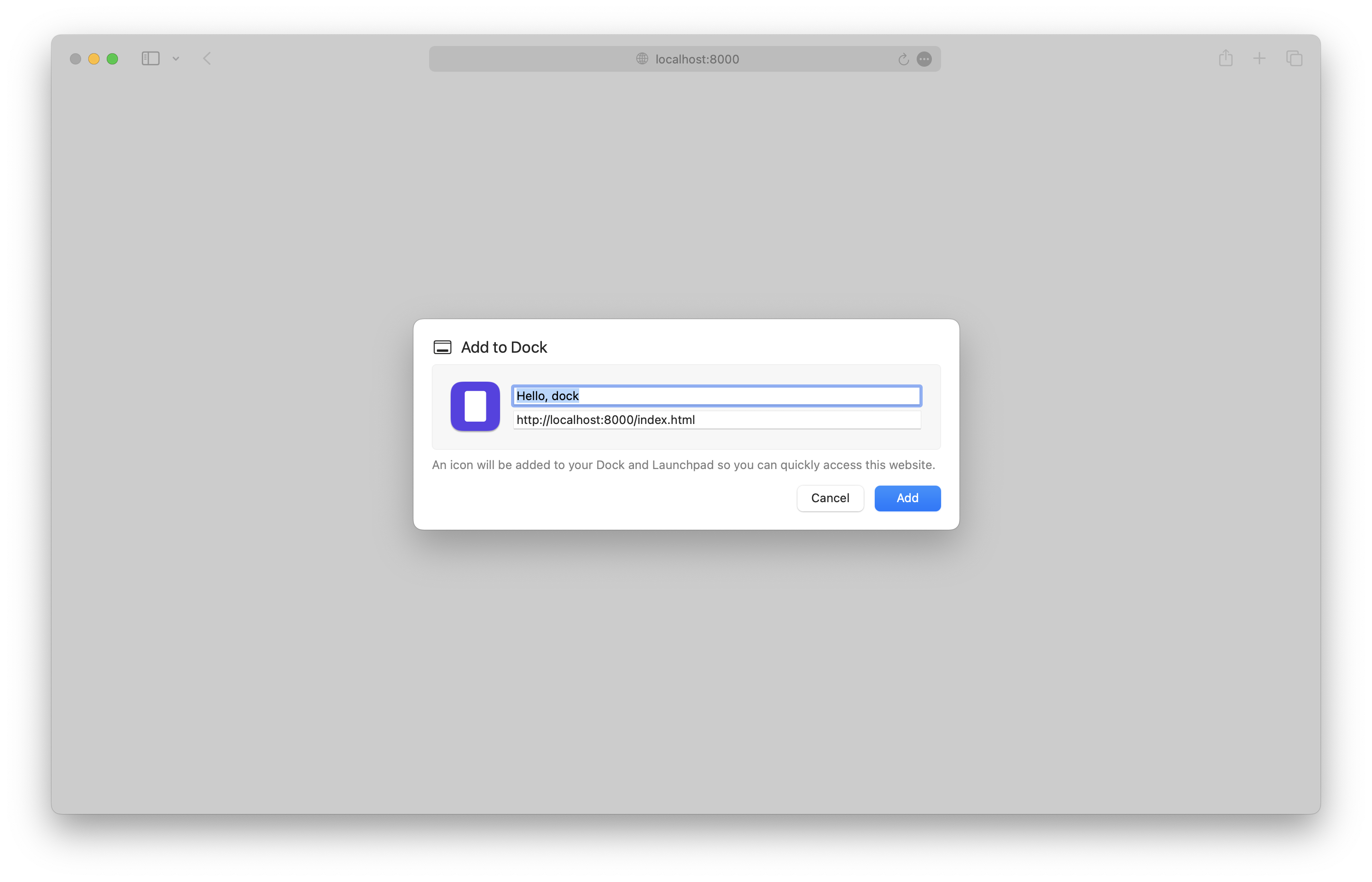
Add to dock

You can configure name, URL, and icon as soon as you create the web app. Additional options can be found in the web app’s Settings.

  • Name
  • URL
  • Icon
  • Show navigation controls: toggles the back and forward buttons in the title bar
  • Show color in the title bar: toggles macOS’s default title bar styling to matching the page background-color.

There are also some privacy settings, but that’s not relevant to the discussion around styling obviously.

Web app limitations

Web apps are very slimmed down from Safari proper.

  • No address bar
  • Can’t open the web inspector directly, but can open it in Safari and then select the web app from the menu bar (Develop > Computer Name > Web App Name)
  • Can’t open links in new tabs, but can open links in new windows
  • Can’t use Safari extensions

And some other notable behavior:

  • Safari copies cookies to the web app at time of creation, and then keeps them separate after that
  • Web apps try to keep authentication flows within the app (for example, Google auth for Pierre worked within the web app without issue)
  • Autofill is available for passwords and more

I’m sure there’s more, so let me know on Twitter/X if you find anything else.

Theme color

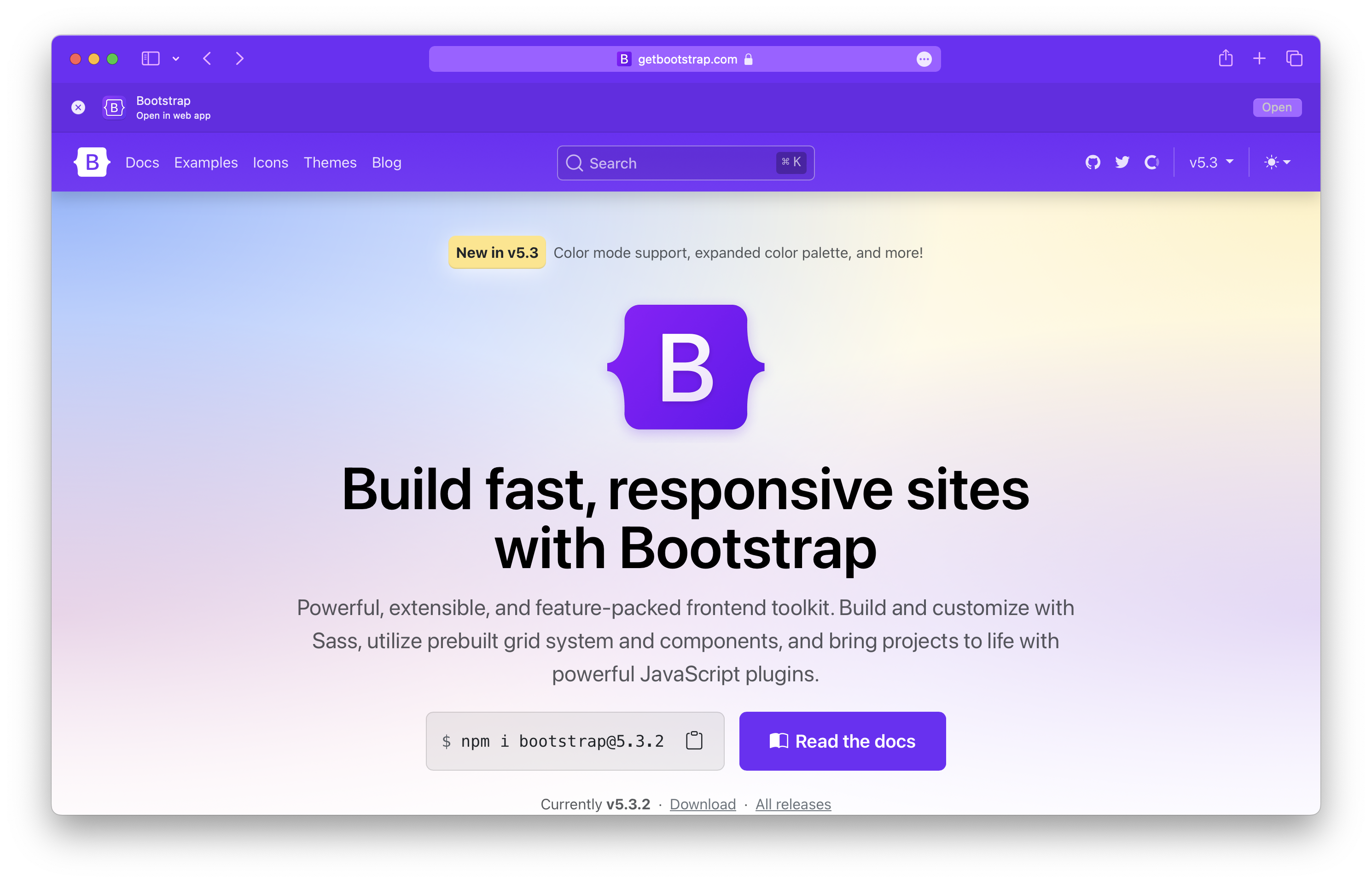
Annoyingly, these web apps don’t seem to respect any theme color value. You can see if a site has a theme color in Safari by using the Compact tab layout. Shown here is the Bootstrap homepage with the theme color applied.

Sidebar: nice to see the Open in web app banner for websites after you create them.

Theme color

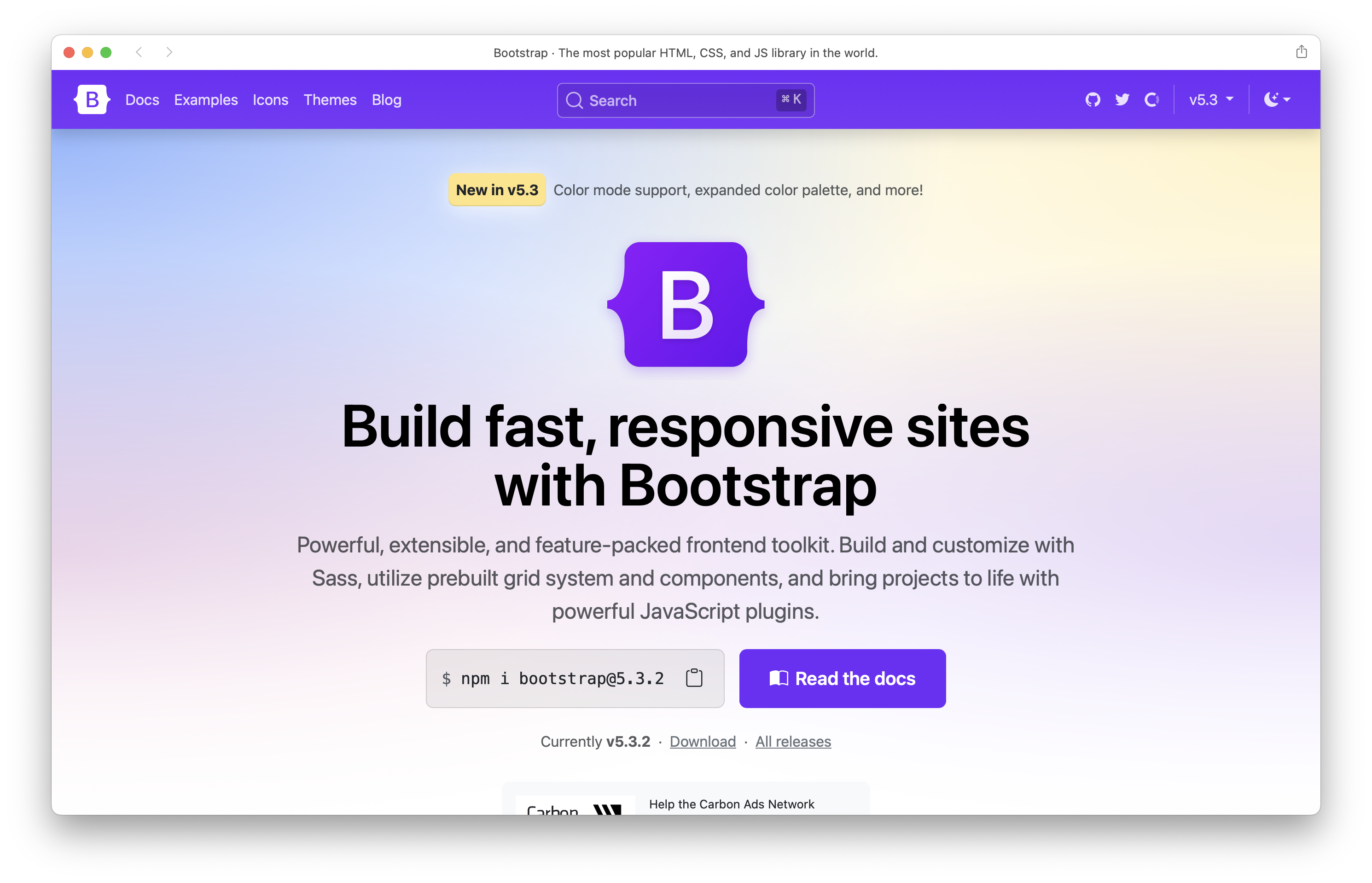
Compared to the same page in a new Safari web app, with the Show color in title bar option enabled. Missed opportunity.

No theme color in app

The theme-color meta tag has no affect:

<!-- Doesn't work -->
<meta name="theme-color" content="#712cf9">

And configuring theme_color in manifest.json doesn’t work either. Setting background_color does though. Here’s Bootstrap’s current manifest file. Note that the name, icon, and start URL are all pulled from the manifest file, though.

{
  "name": "Bootstrap",
  "short_name": "Bootstrap",
  "icons": [
    {
      "src": "android-chrome-192x192.png",
      "sizes": "192x192",
      "type": "image/png"
    },
    {
      "src": "android-chrome-512x512.png",
      "sizes": "512x512",
      "type": "image/png"
    }
  ],
  "theme_color": "#7952b3",
  "background_color": "#7952b3",
  "display": "standalone"
}

Checking the Show color in title bar option currently seems to only pull from the <body>’s background-color, which leads to some less than ideal results? Still unclear to me.

Styling

In some situations, you’ll may want to tweak your site’s styling to better fit in with the web app itself. You can scope styles for this with a display-mode media query.

@media (display-mode: minimal-ui) {
  /* ... */
}

All the display-mode values seem to be supported:

  • fullscreen
  • standalone (no toolbar on macOS, home screen web app on iOS/iPadOS)
  • minimal-ui
  • browser (default)

So far my only real use case for this was to add a border to the top of the site to separate it from the title bar, but that’s not very reliable because there’s no media query or control for detecting the title bar or anything else (unless a user toggling that changes the display mode?). For now I’m sticking with the minimal-ui mode.

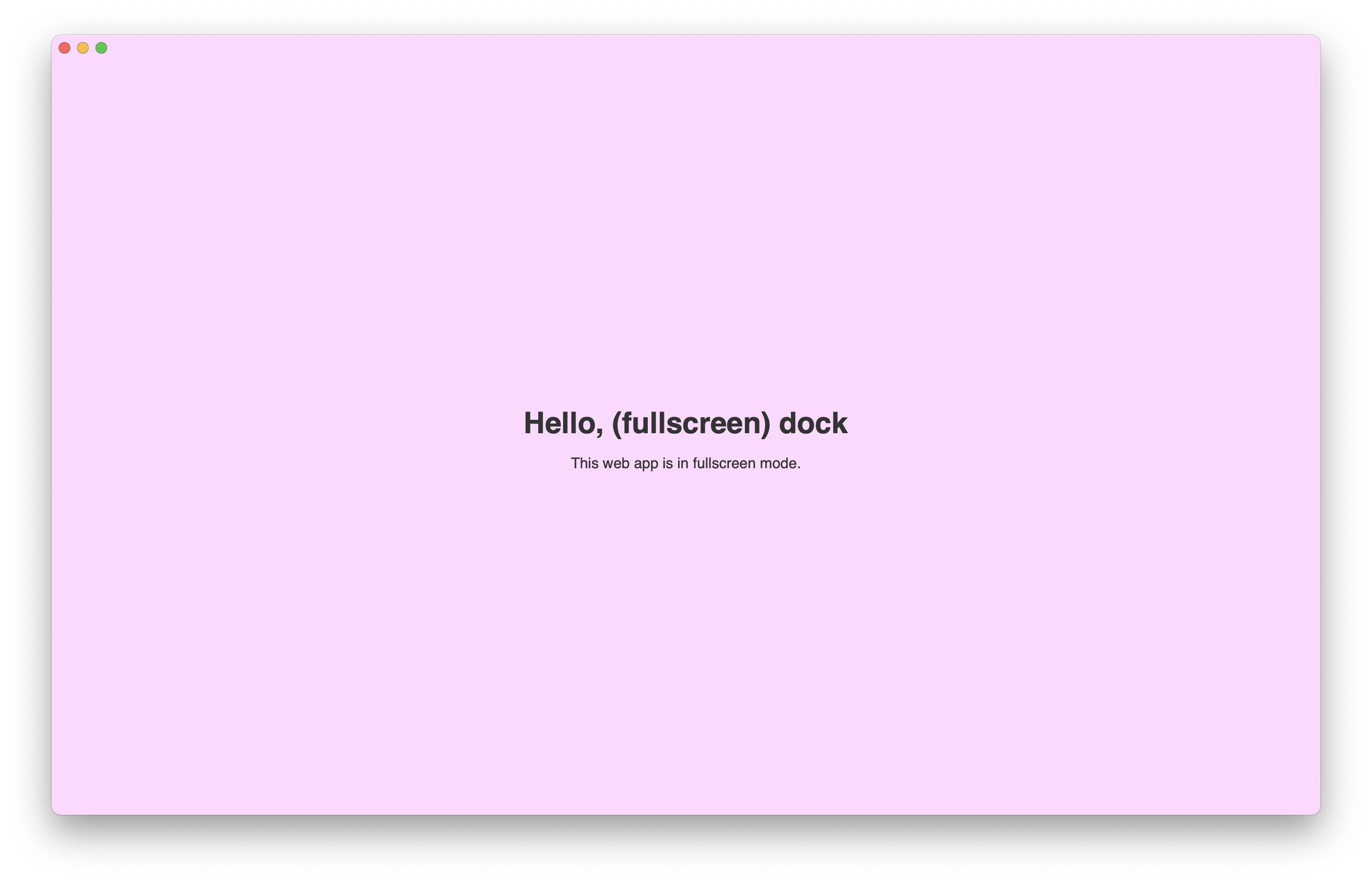
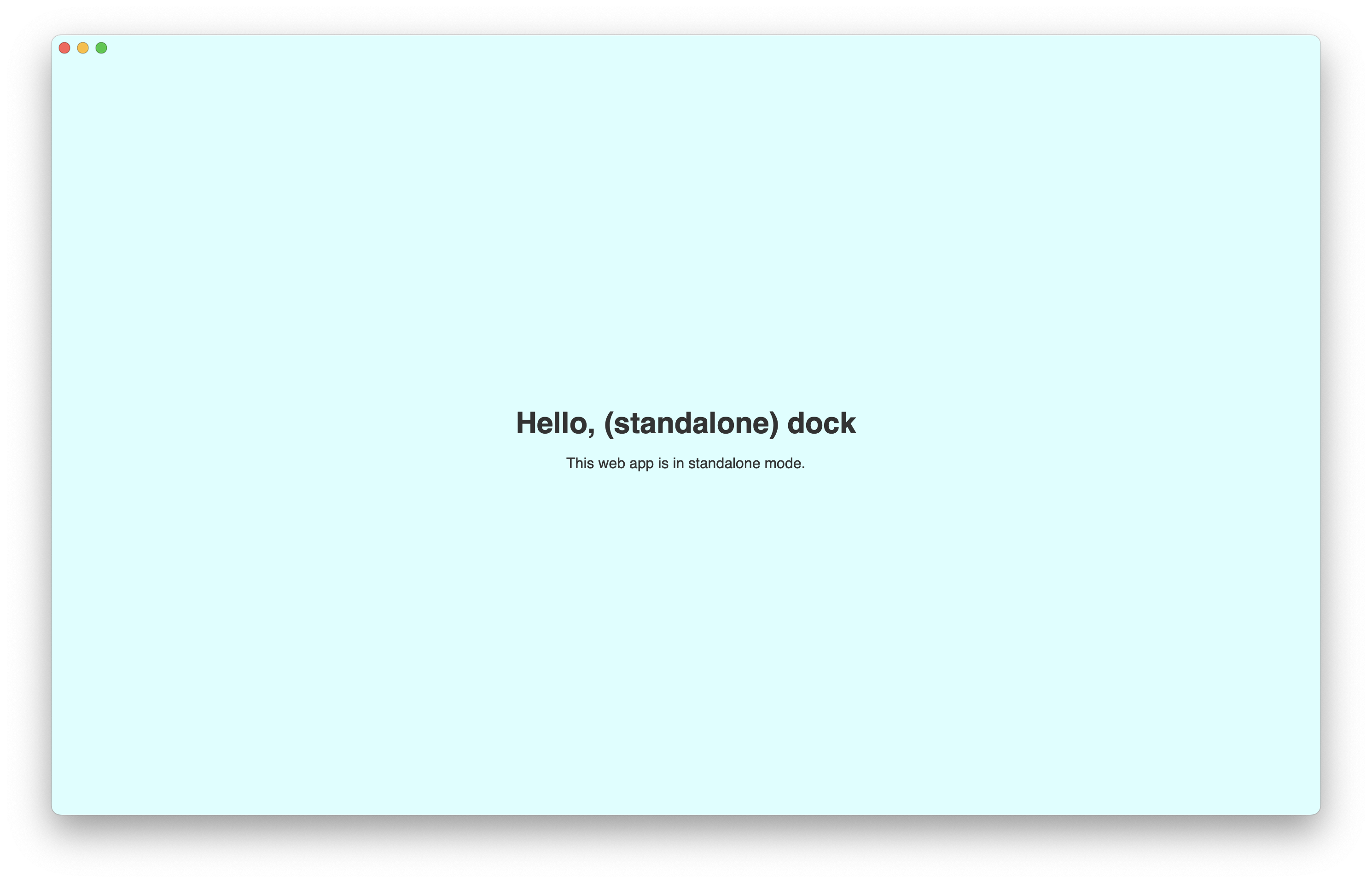
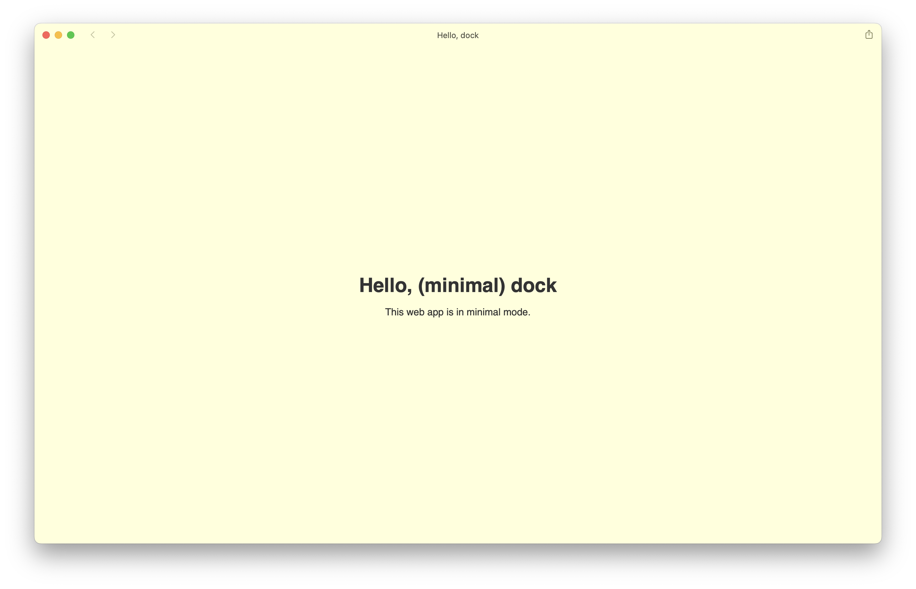
Here they are in three super simple examples. Fullscreen and standlone appear to be the same on macOS, but on iOS/iPadOS there’s a difference as mentioned above. minimal-ui seems like the most practical for apps that required page navigation, while standlone seems best for single page apps.

Fullscreen web app

Standalone web app

Minimal UI web app

Anything else?

I only played with this for a day or so with Pierre, Bootstrap, and these little test apps. I’m curious what else others have learned thus far, so holler on Twitter/X. I’m also hoping to eventually dive into the notifications and badging more for Pierre and may write up some thoughts around that.

Using Bootstrap in Hugo with npm

Up until the latest redesign of the Bootstrap documentation, our blog and Icons sites were including Bootstrap’s compiled CSS and JavaScript via CDN. This worked great overall and gave, but I found myself needing and wanting more granular control over the final production assets. In particular, I wanted the source Sass files, but just the compiled JS for now. Despite using Hugo for years now in Bootstrap’s docs, I’m a complete Hugo newbie, so I had no idea how to actually include Bootstrap with npm in a Hugo project. So I set out to fix that.

The solution I used is straightforward, but I didn’t see many clear and concise answers on it outside some forum threads: use the Hugo mounts system. So, after you create your package.json and npm i bootstrap, you setup your Hugo config to pull from the node_modules directory.

Here’s how it looks in our config.yml for the blog.

module:
  mounts:
    - source:           node_modules/bootstrap/scss
      target:           assets/scss/bootstrap
    - source:           node_modules/bootstrap/dist/js/bootstrap.min.js
      target:           assets/js/bootstrap.min.js

Now we can import Bootstrap’s styles with @import "bootstrap/{filename}"; as we’ve mounted Bootstrap’s source scss directory as part of our regular assets directory in Hugo. Here’s how the start of our stylesheet looks in the blog repo:

// src/assets/scss/style.scss

@import "bootstrap/functions";
@import "bootstrap/variables";
@import "bootstrap/maps";
@import "bootstrap/mixins";
@import "bootstrap/utilities";
@import "bootstrap/root";
@import "bootstrap/reboot";
@import "bootstrap/type";
@import "bootstrap/images";
@import "bootstrap/containers";
@import "bootstrap/grid";
@import "bootstrap/tables";
// @import "bootstrap/forms";
@import "bootstrap/buttons";
@import "bootstrap/transitions";
@import "bootstrap/dropdown";
// @import "bootstrap/button-group";
//
// ...and the rest of the Bootstrap imports

From here, you can use the Sass functions, maps, mixins, mixins, and any component you need. Read the Bootstrap Sass docs for more info. Importing the compiled CSS looks something like this:

{{- $style := resources.Get "scss/style.scss" }}
<link href="{{ $style.Permalink | relURL }}" rel="stylesheet">

On the JavaScript side, things are simpler since we’re just importing Bootstrap’s compiled and bundled JS file.

{{ $bootstrapJs := resources.Get "/js/bootstrap.min.js" }}
<script src="{{ $bootstrapJs.Permalink | relURL }}"></script>

I decided I only really wanted the source Sass files and the compiled JavaScript for now. This way my dependencies and build steps would stay quite simple. To build your own JS bundle, you’d need your own bundler or an ESM shim like es-module-shim. Skipping that saved time and energy in keeping shipping the latest design updates.

Lastly, there’s also the official Hugo module for Bootstrap’s SCSS and JS if you need it. I wanted to know how everything was working, so I went with the solution shown here instead of the module, but you should be good to go with either.

Fun with the dialog element

There’s a new element in town and it’s the <dialog>. Support for it just landed in Safari with their newest update (v15.4) across all Apple’s devices. With that update, the <dialog> element is now supported in every evergreen browser. It’s a great step forward for frameworks and libraries looking to make better use of native behaviors, but it’s also not without its limits.

Default styles

Chrome, Safari, and Firefox all render dialogs similarly—black border, black text, white background. They’re all positioned absolutely without a predefined z-index. There’s also no default ::backdrop styling. Check out the CodePen demo.

Dialog element in Chrome

Dialog element in Safari

Dialog element in Firefox

Only minor differences in the border-width it seems.

When there’s too much content, all dialogs will have an inner scroll. This makes adding a modal header a little annoying as you’ll have to ether add position: sticky, or create some custom components within to handle the scroll.

Functionality

By default, there’s no HTML magic you can use to toggle <dialog> elements—you have to write some JavaScript to open and close them programmatically. However, you can force a <dialog> open with the open attribute, which you can see in action in my previously linked CodePen.

Here’s what else you can do with a <dialog>:

  • Open regular, absolutely positioned dialogs with the show() method if you don’t want a modal or backdrop
  • Open modal dialogs with the showModal() method to open fixed position dialogs that block other page interactions
  • Close dialogs with the close() method
  • Use Esc to close the dialog without any additional code
  • Style and animate the ::backdrop pseudo-element
  • Add a specific autofocus attribute inside the <dialog> to automatically focus on it (otherwise, the first focusable element will be focused)

Unfortunately, because the modal <dialog> backdrop is a pseudo-element, you cannot trigger JavaScript events off it. This makes it impossible to click the backdrop to dismiss the dialog. There’s likely a solution here with non-modal <dialog>s, but I haven’t implemented a smooth solution to this yet.

Regarding dialogs autofocus-ing on the first focusable element, I suggest including a dismiss button near the top. When dialogs are too long and they scroll, it will automatically jump to that focused element. That means if you only have a dismiss button or single action at the bottom of the dialog, your visitors will miss the top portion.

Suggested styling

Dialogs leave a lot to be desired with that default styling, but they are just as style-able as any other element. I put together a CodePen demo that shows some suggested styles and implements easy toggling and closing via JavaScript.

See the Pen Using the <dialog> element by Mark Otto (@emdeoh) on CodePen.

Most dialogs include an inner header element with title and dismiss button, so I’ve implemented the same into my CodePen demo. I’ve also the position: sticky style I mentioned earlier to the dialog header so that when the dialog has an inner scroll, the dialog title and dismiss button are always visible. The dismiss button here also traps that default autofocus. Lastly, the backdrop is styled with a translucent background-color and a quick little fade-in animation.

Lastly, I made it all dark mode friendly with the help of some CSS variables and the prefers-color-scheme media query.

Show and hide

On the JS side, showing and hiding the dialog is easy enough. In my demo, this is accomplished with data attributes:

  • data-toggle is added to any triggering element and it’s value is the specified target <dialog>
  • data-close is a boolean attribute that finds the nearest <dialog> to hide

Here’s the complete JS in action.

let toggler = document.querySelectorAll('[data-toggle]')
let closers = document.querySelectorAll('[data-close]')

if (toggler) {
  toggler.forEach(function (element) {
    let target = element.getAttribute("data-toggle")
    let targets = document.querySelectorAll(target)

    element.addEventListener("click", (event) => {
      targets.forEach(function (e) {
        e.showModal()
      })
    })
  })

  closers.forEach(function (element) {
    element.addEventListener("click", (event) => {
      let dialog = element.closest('dialog')
      dialog.close()
    })
  })
}

You can see it all in the demo.

Details element

Before the <dialog> support for Safari dropped this week, I was playing with the <details> element to build dropdowns and modals. It was definitely a fun and worthwhile experiment, and there’s a lot more I want to explore here around keyboard navigation and better modal styling/positioning. For now though, it’s a good comparison to the new <dialog> element and how you can create custom HTML elements.

See the Pen Modals, dropdowns, and more by Mark Otto (@emdeoh) on CodePen.

Check it out on CodePen.

Resources

Horizontal scrolling nav

Continuing with my JavaScript fun, I wanted to do an updated pass on the horizontal navs I’ve previously built for both GitHub Mobile (prior to the current responsive version and native apps) and this Bootstrap dashboard example.

The goal? Build a responsive horizontal navigation with an overflow scroll that automatically scrolls the active nav link into view. The responsive part is that the navigation links scroll horizontally—easy enough, and scales decently well across all viewports. The scrolling part and active link setting is done in JS and, thanks to work on the upcoming redesign of Bootstrap’s docs, relatively straightforward.

Here’s the final demo via CodePen.

See the Pen Scrolling nav by Mark Otto (@emdeoh) on CodePen.

Here’s a look at what’s under the hood. For the HTML, I’m using the barebones: a <nav>, <ul>, and the nav links. The <nav> is what scrolls, while the <ul> holds the links to a single line at all times.

<header>
  <h1>Demo</h1>
  <nav>
    <ul>
      <li><a href="#">Home</a></li>
      <li><a href="#">World</a></li>
      <li><a href="#">Politics</a></li>
      <li><a href="#">Business</a></li>
      <li><a href="#">Opinion</a></li>
      <li><a href="#" class="active">Tech</a></li>
      <li><a href="#">Science</a></li>
      <li><a href="#">Health</a></li>
      <li><a href="#">Sports</a></li>
      <li><a href="#">Arts</a></li>
      <li><a href="#">Books</a></li>
      <li><a href="#">Style</a></li>
      <li><a href="#">Food</a></li>
      <li><a href="#">Travel</a></li>
    </ul>
  </nav>
</header>

The CSS for the <nav> and <ul> get a little clever, though. I set a fixed height (equalling that of the computed link height) and overflow-y on the <nav> to “crop” the links within. But, that doesn’t stop the annoyance of scrollbars appearing on scroll and thus covering up the links. So, among some additional baseline styles, the <ul> has a large padding-bottom value to push any visible scrollbar out of sight. This has it’s own usability concerns—scrollbars show that something can scroll, how much content there is, etc—but there’s no elegant way to address this across all browsers and devices.

nav {
  position: relative;
  z-index: 2;
  height: 2.5rem;
  overflow-y: hidden;
  scroll-behavior: smooth;
}

ul {
  display: flex;
  flex-wrap: nowrap;
  padding-bottom: 1.5rem;
  padding-left: 0;
  margin-block: 0;
  overflow-x: auto;
  list-style: none;
  text-align: center;
  white-space: nowrap;
}

On the JavaScript side, we get started with querying for our selector, check if it exists in the page, and set some variables for the navigation links and active link.

let nav = document.querySelectorAll('nav')

if (nav) {
  let navLinks = document.querySelectorAll('nav a')
  let activeLink = document.querySelector('.active')

  //
}

Our first line of JS then is to immediately (on page load) scroll the active link into view of the containing element. In the CodePen, I set a link that should be offscreen as the .active element so anyone can see the scroll happen on page load. During my work on the Bootstrap docs, I found a helpful JS method for this, scrollIntoView.

let nav = document.querySelectorAll('nav')

if (nav) {
  let navLinks = document.querySelectorAll('nav a')
  let activeLink = document.querySelector('.active')
  activeLink.scrollIntoView({ behavior: "smooth", inline: "center" })

  //
}

The behavior tells the browser how to animate the scroll while inline tells the browser to align the scroll horizontally. (For vertical alignment, if needed, there’s the block parameter.) From here, we need to add an event listener to each nav link to set the .active class and scroll the clicked link into view. This last bit of code could be cleaned up with a scrollIntoView function to de-dupe that line, but it didn’t feel worthwhile at the moment and adds a little more JS.

let nav = document.querySelectorAll('nav')

if (nav) {
  let navLinks = document.querySelectorAll('nav a')
  let activeLink = document.querySelector('.active')
  activeLink.scrollIntoView({ behavior: "smooth", inline: "center" })

  navLinks.forEach( function(link) {
    link.addEventListener("click", (event) => {
      navLinks.forEach( function(link) {
        link.classList.remove('active')
      })
      link.classList.add('active')
      link.scrollIntoView({ behavior: "smooth", inline: "center" })
    })
  })
}

Put it all together, you have a functional side-scrolling, responsive navigation. You may not even need the .active class toggling, but it completes the demo here, so I’ve included it for the sake of completeness.

Toggling classes with JavaScript

During my recovery I’ve made it a point to double down on improving my rather limited JavaScript skills. Courses have been helpful, but it seems that no matter the course, I do my best learning by making things myself. So I’ve been tinkering around and trying to build some new projects.

My latest experiment was to build something that allows me to toggle a class on an element with a particular id.

<button type="button" data-toggle-target="#example" data-toggle-class="blue">
  Toggle
</button>

<div id="example">
  This element will have the <code>.blue</code> class toggled on it.
</div>

The gist is that I want to use a <button> to toggle any class I want on another element of my choosing, all using data attributes so that it’s infinitely flexible and functional in any context.

Nothing big, but something I knew I wanted to demo it for the Bootstrap team so we could add a potentially new component in Bootstrap. After seeing what my original demo turned into with that pull request, I realized I had set my sights too low. Instead of toggling classes with a target with only an ID, why not specify targets by classes, attribute, or any other selector? So I rebuilt it to do just that.

Here’s the final demo via CodePen.

See the Pen Toggle anything via data-attribute by Mark Otto (@emdeoh) on CodePen.

Here’s a walk through the JavaScript I wrote.

First, we find all the elements that have the data-toggle-target attribute so we can trigger our JavaScript on them.

let toggler = document.querySelectorAll("[data-toggle-target]")

Second, we add a quick check to see if there are any matching elements with that selector. This way our JavaaScript will only run if there are any elements to actually toggle.

if (toggler) {
  //
}

From there, we use a forEach loop to execute code against every matching instance of our selector from the toggler var. Within that loop, we then access the data attributes so we can use them later.

if (toggler) {
  toggler.forEach(function (element) {
    let target = element.getAttribute("data-toggle-target")
    let targets = document.querySelectorAll(target)
    let toggleClass = element.getAttribute("data-toggle-class")

    //
  }
}

Finally, we add an event listener to eacch toggling element (aka, the button) that toggles the specified class from toggleClass.

let toggler = document.querySelectorAll("[data-toggle-target]")

if (toggler) {
  toggler.forEach(function (element) {
    let target = element.getAttribute("data-toggle-target")
    let targets = document.querySelectorAll(target)
    let toggleClass = element.getAttribute("data-toggle-class")

    element.addEventListener("click", (event) => {
      targets.forEach(function (e) {
        e.classList.toggle(toggleClass)
      })
    })
  })
}

If I had to improve things further, I’d like the trigger to be customizable to click, change (for form elements), hover, and focus. I’d also consider toggling ids and other selectors on the target element. Maybe in another post and experiment.

Diffing Sass maps

I’ve been working on some baseline Sass tests for Bootstrap and had the need to diff two different Sass maps—the expected and the actual. Bootstrap provides thousands of default variables and several default Sass maps that are extended and reused under the premise of improved customization. What we’ve run into is some Sass limitations that forced us to make a few architectural changes.

The main problem isn’t the limitation—that once a variable or map has been used, it cannot be modified later—but rather that we weren’t testing for this enough. With that in mind, I set out to try some homegrown tests for how to compare what we expected to happen in our Ssas with what’s actually happening.

This post is a rundown of what I tried out and where I ended up. To start, let’s assume these are our two maps.

// What we want to see
$expected-colors: (
  "primary": "",
  "secondary": "",
  "success": "",
  "info": "",
  "warning": "",
  "danger": "",
  "light": "",
  "dark": "",
  "custom": ""
);

// What we're actually seeing
$colors: (
  "primary": "",
  "secondary": "",
  "success": "",
  "info": "",
  "warning": "",
  "danger": ""
);

Compare via @debug

Intitially I just needed to know that two maps—the expected and the actual—matched without any warning or error in the CLI. That’s easy enough with @debug and showing the map keys.

@debug "The following maps should be the same, ending with the custom key.";
@debug map.keys($expected-colors);
@debug map.keys($colors);

Which outputs the following:

Debug: The following maps should be the same, ending with the custom key.
Debug: "primary", "secondary", "success", "info", "warning", "danger", "light", "dark", "custom"
Debug: "primary", "secondary", "success", "info", "warning", "danger"

This is helpful for manually checking if something is looking right, but not the best for proactively flagging an issue mid pull request.

Adding in @warn

Making use of @warn—which one could configure to fail a CI build—allows us to compile the entire Sass file and output all the issues to the CLI. @error wouldn’t work for this as it’d stop the compiling at the first error.

Here I setup an actual condtion—these two maps must equal one another. If they don’t, warn me and show me the difference.

@if map.keys($colors) != map.keys($expected-colors) {
  @warn "Keys in $colors don't match expected output.";
  @debug "Expected: " + map.keys($expected-colors);
  @debug "Actual:   " + map.keys($colors);
}

Which outputs the following:

Warning: Keys in $colors don't match expected output.
  test/index.scss 31:3  root stylesheet

Debug: Expected: "primary", "secondary", "success", "info", "warning", "danger", "light", "dark", "custom"
Debug: Actual:   "primary", "secondary", "success", "info", "warning", "danger"

This is great, but I still have to manually make the comparison for what’s different between expected and actual. To improve that, I needed to diff the two maps somehow.

Creating diff-map

There’s no built-in map-diff or map.diff feature in Sass, so I wrote a basic function to get me close enough. This diff-map function removes the keys found in both maps and shows me what’s left over in the expected map.

@function diff-map($actual, $expected) {
  $actual-keys: map.keys($actual);
  @each $key in $actual-keys {
    $expected: map.remove($expected, $key);
  }
  @return $expected;
}

@debug diff-map($colors, $expected-colors);

Which outputs the following:

Debug: ("light": "", "dark": "", "custom": "")

Okay, now we’re getting somewhere. This doesn’t account for a situation though in which we have more keys in the output than the expected map.

Improving the function

Next I updated the function to ensure a diff happens in either direction. I added some @if/@else statements to ensure that the larger map (determined via length($map)) has it’s duplicate keys removed and we don’t end up with negative numbers. From there, we use @debug to print the number of remaining keys and list them.

This iteration of the function isn’t the prettiest, but it’s effective. Side note: there’s no real way to get a Sass map’s “name”, just it’s array of keys. Super sad.

@function diff-map($actual, $expected) {
  @if $actual == $expected {
    @debug "Maps have no differences.";
  } @else {
    @if length($actual) > length($expected) {
      $difference: length($actual) - length($expected);
      $keyword: if($difference > 1, "keys", "key");
      @debug "Actual has #{$difference} more #{$keyword} than expected.";
    } @else if length($actual) < length($expected) {
      $difference: length($expected) - length($actual);
      $keyword: if($difference > 1, "keys", "key");
      @debug "Actual has #{$difference} fewer #{$keyword} than expected.";
    }

    $actual-keys: map.keys($actual);
    @each $key in $actual-keys {
      $expected: map.remove($expected, $key);
    }
    @return $expected;
  }
}

@debug diff-map($colors, $expected-colors);

Which outputs the following:

Warning: Keys in $colors don't match expected output.
    test/index.scss 154:3  root stylesheet

test/index.scss:188 Debug: Actual has 3 fewer keys than expected.
test/index.scss:199 Debug: ("light": "", "dark": "", "custom": "")

The debug statements in the CLI tell me that there are three fewer keys than expected and succinctly lists them out.

I’m not done with this yet, but wanted to at least share what I stumbled into. Ideally this function could be improved to also account for more situations in which maps can be compared (e.g., actual and expected have unique keys).

Check it out in this pull request in the Bootstrap repo and let me know what you think!

Learning CSS with utilities

One of the premises behind Bootstrap’s utilities is that each property: value pairing is attached to a class named after that pair—.property-value. Because of this pattern, creating and using utilities is an incredibly effective technique for learning CSS.

When I wasn’t as familiar with flexbox, the CSS-Tricks cheat sheet was indispensable, but I still found myself having to go back to it time and time again. Same with CSS Grid.

Originally added in v4 and refined in v5, Bootstrap has flexbox utilities and a flexbox-based grid to use flexbox instead of floats. With the need for a slew of new supporting utilities, I taught myself flexbox by writing out every new class we’d need.

.d-flex { display: flex; }
.flex-row { flex-direction: row; }
.flex-column { flex-direction: column; }
.justify-content-center { justify-content: center; }
.align-items-center { align-items: center; }
// etc

Writing all these out by hand for v4 gave me the muscle memory to remember specific patterns and behaviors for flexbox properties and values. It’s incredibly helpful that learning Bootstrap (and Tailwind, Rebass, Atomic, etc) is very much akin to learning CSS itself. Regardless of the tooling, you have to learn the properties and values, so why not get in the habit of writing them from the start?

Utility driven frontend isn’t going anywhere, and neither is component driven frontend. They ebb and flow, and if you can understand what’s underneath them, you’re in the best position to learn any other tools and languages.

Force pushing to different Git remotes

My Git/GitHub workflow has continued to evolve and now makes extensive use of rebasing and squashing instead of merge commits. While this is easy for branches in projects I maintain, it’s more complicated for forks of my projects. In those cases, I need to checkout, rebase, squash, and force push a branch to a different remote with a different branch name.

Once you get your own copy of the fork’s branch locally and you’re ready to force push your rebased and/or squashed changes, here’s how you can push your changes from the terminal:

git push remoteName localBranch:remoteBranch --force

Before you push, you may need to add the fork as a new Git remote:

git remote add remoteName git:https://github.com/user/repo.git

Not familiar with force pushing, or squashing and rebasing? Consider exploring the GitHub rebase docs.

Global CSS options with custom properties

I’ve been toying around with some ideas for how to use custom properties (aka CSS variables) for global settings in a project. The idea is to provide control to designers/developers over consistent styles across multiple components. See it in action in this CodePen, or read on for details.

With Sass, this is pretty easy:

// Global option
$enable-shadows: false;

// Mixin that consumes the shadow
@mixin box-shadow($shadow...) {
  @if $enable-shadows {
    box-shadow: $shadow;
  }
}

// Put it to use
.component {
  @include box-shadow(0 .5rem 1rem rgba(0,0,0,.1));
}

By default now, box-shadows won’t be included in your compiled CSS, unless you change $enable-shadows to true. Doing this with custom properties isn’t as difficult as you might think, though.

With custom properties, the logic is quite similar thanks to fallback values. If there’s a global --enable-shadows option present, that will take precedence over the fallback value. To enable the .component’s box-shadow, comment out or remove --enable-shadows.

// Global option
:root {
  --enable-shadows: none;
}

// Put it to use
.component {
  box-shadow: var(--enable-shadows, 0 .5rem 1rem rgba(0,0,0,.1));
}

You can also go about this in another way by specifying a global shadow variable and overriding that at the component level with a utility or a modifier class.

// Global option
:root {
  --component-shadow: 0 .5rem 1rem rgba(0,0,0,.1);
}

// Put it to use
.component {
  box-shadow: var(--component-shadow);
}
.remove-shadow {
  // Because the custom property is within this ruleset,
  // it will only remove the shadow for this class
  --component-shadow: none;
}

And with that, you have some basic control over global options in your CSS without the need for a preprocessor.

Publishing npm packages with dist tags

Last month I published the next release of Bootstrap Icons, but I screwed up the distribution tags. Instead of publishing the latest release, I published the next release. That meant my actual latest release wasn’t going to be the version folks get when they updated or installed the package today because next is for upcoming pre-release versions. I’ve screwed this up in the past with Bootstrap proper, too, because I never fully understood them.

Until today, I didn’t even know these things were called distribution (dist) tags. TIL. And today I’m writing it down to remember it for next time.

So how do you use these things or fix problems like this? Turns out npm has you covered with some approachable docs, and you don’t need to release a new version or blow anything up in the process to fix a mistake like this.

npm has dist-tag with some various options to review, add, and remove these tags:

$ npm dist-tag add <pkg>@<version> [<tag>]
$ npm dist-tag rm <pkg> <tag>
$ npm dist-tag ls [<pkg>]

In this case, I had to remove the next dist tag and create a new latest dist tag. It looked like this:

$ npm dist-tag rm bootstrap-icons next
$ npm dist-tag add bootstrap-icons@1.0.0-alpha3 latest

And with that, all was well. If you need a primer on managing alpha or beta releases, check out this Medium article.

Faster rebasing with git reset

Lately I’ve been needing to rebase and squash my commits more frequently. I’ve always been averse to doing anything like this because I’ve basically always screwed it up when using the command line. But thanks to this pro-tip I stumbled on, rewriting commits on an existing branch and PR has never been easier.

Rather than do the git rebase -i dance, this approach resets your changes so you can selectively add what you need and write new commits. So much more approachable to me with my Git experience.

Here’s the crux of the tip from the post that uses git reset to uncommit the differences between your feature_branch and master:

# Switch to the master branch and make sure you are up to date.
git checkout master
git fetch # this may be necessary (depending on your git config) to receive updates on origin/master
git pull

# Merge the feature branch into the master branch.
git merge feature_branch

# Reset the master branch to origin's state.
git reset origin/master

# Git now considers all changes as unstaged changes.
# We can add these changes as one commit.
# Adding . will also add untracked files.
git add --all
git commit

From here, add your files and changes in pieces as you like, write new commit messages, and then push your branch. If your branch is already pushed to origin, you may need to force push (git push origin feature_branch --force). Be aware force pushing can have unintended consequences, so test these things out first in a safe environment.

This page is nearly 10 years old and it’s still highly relevant. It also includes details on how to do a proper git rebase for comparison. Hope it’s as helpful to you as it’s been to me with my open source projects and more.

Moving RSS

Somehow I never migrated this site’s RSS feed from Feedburner. Well, nearly a decade after it was shut down by Google, I’m finally moving to a new feed that’s been around for years and just never shared.

Please point your readers to https://markdotto.com/atom.xml.

Thanks!

Null variables in Sass

Bootstrap is a large and complex frontend library with some powerful functionality and customization built-in. Occasionally though, we get asked to make things even more customizable for folks with more CSS properties and default variables.

This is largely because Bootstrap’s CSS relies on some limited global inheritance of general styles (font, color, line-height, and more), but developers and designers often want to customize things further. So we were typically faced with adding CSS we didn’t need at the outset, and that you might need. This just didn’t seem right for any of us.

Back in January, thanks to one of our maintainers Martijn, we started using null value default variables to combat that bloat while still increasing our level of customization.

Here’s a basic example:

$body-text-align: null !default;

body {
  text-align: $body-text-align; // Won’t compile
}

As you can see, the Sass compiler will ignore the entire property: value; declaration because the value is null. But, if someone customized this before compilation by overriding that default value, the CSS would compile. Here’s an example of how you’d override that default variable.

// First, override `!default` variables
$body-text-align: left;

// Second, import Bootstrap
@import “bootstrap”;

And here’s how it compiles to CSS.

body {
  text-align: left;
}

It’s also worth mentioning that these null values can be used in mixins, too. Check out this old Treehouse article for details.

Historically, more flexibility in our default styles meant more code for everyone, but with null value default variables, we can continue to provide more customization when warranted without knowingly adding bloat to our compiled CSS. I still owe Bootstrap a fresh pass at this to see what we can remove.

Hopefully we can continue to find more techniques for increased customization and smaller file sizes. Please share if you have them!

CSS dark mode

Dark mode is finally coming to CSS, and you can start experimenting with it thanks to Safari Technology Preview. With their latest release, the experimental browser includes support for the prefers-color-scheme media query. Variables in CSS are also coming, making dynamic light and dark modes for your visitors easier than ever.

Here’s an abbreviated set of the variables and media query I’ve put to use for my sites.

:root {
  --body-bg: #fafafa;
  --body-color: #555;
  --link-color: #222;
  --link-color-hover: #000;
}
@media (prefers-color-scheme: dark) {
  :root {
    --body-bg: #212529;
    --body-color: #6c757d;
    --link-color: #dee2e6;
    --link-color-hover: #fff;
  }
}

You should use this time to experiment with how you’d adapt your own styles to put the new media query to work. For example, picking the dark colors for my site wasn’t too difficult, but I found screenshots were far too intense for comfortable reading. A quick opacity and transition brings some added comfort while reading at night.

@media (prefers-color-scheme: dark) {
  img {
    opacity: .75;
    transition: opacity .5s ease-in-out;
  }
  img:hover {
    opacity: 1;
  }
}

Shipping system fonts to GitHub.com

I’m finally publishing this blog post I drafted over a year ago. It was incomplete when I started to revisit it months ago, but I figured it’s better to share it now than sit on it forever. I’ve called out the additions and edits I made since that original draft. Some details are fuzzy, but the core remains intact.

Last week July, GitHub.com received a slightly updated design featuring more modern fonts. Instead of showing decades old fonts that don’t take advantage of newer, high DPI screens, or dynamic font rendering, we now try to serve the best font possible based on your operating system or device. Awesome!

This posts explains why we made the change, how we coded and tested it, how we shipped the new fonts, and what we’ve done since initially making the move.

Before and after

Before we dive into the why, here’s a quick comparison of GitHub on macOS before and after the font change.

before You can really tell this is from well over a year ago given the light header, low contrast, and lack of saturation in all our colors.

after

And now, with the dark header, color changes, and multiple product ships over a year later.

now Compared to the previous figure, there’s clearly a stronger hierarchy and emphasis on key actions.

Why change

Our old font stack wasn’t exactly broken, but it was decades old. That stack featured Arial and Helvetica for Windows and Mac users respectively. Helvetica was created in 1957 when the personal computer was a pipe dream. Arial was created in 1982 and is available on 95% of computers across the web. Millions, if not billions, of web pages currently use this severely dated font stack to serve much younger content to much younger browsers and devices.

As display quality improves, so too must our use of those displays. System fonts like Apple’s San Francisco and Microsoft’s Segoe aim to do just that, taking advantage of retina screens, dynamic kerning, additional font-weights, and improved readability. If operating systems can take advantage of these changes, so too can our CSS.

Speaking of which, the saying goes that the best UI is no UI. With system fonts, page content can feel more like it belongs on your particular computer or device. Pages on my iPhone rendered in San Francisco feel more like a page made just for my iPhone, and I know from experience when I use my Nexus, I feel the same with Roboto there.

What’s changed

While the move to the system font families is quite obvious visually, we (a combination of product designers and web designers before our Design Systems team was formed) shipped a few other changes.

Here’s what’s new:

  • New fonts in our global font-family for the “system fonts” approach.
  • Larger base font-size for all pages, moving from 13px to 14px.
  • Improved type scale with clearer and more consistent heading sizes, weights, and line heights throughout.

Together, these changes have given us a much easier to read site and a stronger, more considered system to build on moving forward.

The stack

The new GitHub font stack has a handful of system fonts, plus some extras as fallback and emoji. Developers love their emoji like anyone else—maybe more.

font-family: -apple-system, BlinkMacSystemFont, "Segoe UI",
 Roboto, Oxygen, Ubuntu, Cantarell, "Fira Sans", "Droid Sans",
 "Helvetica Neue", Arial, sans-serif,
 "Apple Color Emoji", "Segoe UI Emoji", "Segoe UI Symbol";

This font stack has since been updated and iterated upon:

font-family: -apple-system, BlinkMacSystemFont, "Segoe UI",
 Helvetica, Arial, sans-serif,
 "Apple Color Emoji", "Segoe UI Emoji", "Segoe UI Symbol";

Here’s the rundown on what was originally included and what’s changed since we made the changes over a year ago:

  • -apple-system and BlinkMacSystemFont target default fonts in Safari and Chrome on macOS and iOS.
  • Segoe UI is explicitly named for all browsers on Windows 7+. Friendly side note, our Windows audience is either on Windows 7 or Windows 10—hardly anyone is on 8.x.
  • Roboto is for Android and ChromeOS devices. We ended up removing Roboto because it caused issues in some distros of Linux. We definitely need to revisit it.
  • As fallback, Helvetica Neue and Arial are included. Fun fact, regular Helvetica is actually aliased to Arial in the Windows registry, so you’ll never get regular Helvetica there anyway.
  • And lastly, Apple Color Emoji, Segoe UI Emoji, Segoe UI Symbol ensure that we render the best emoji possible on macOS and Windows.

As you can see, we originally had a few more fonts in there, but after shipping, we heard a ton of feedback from users with browsers, operating systems, and font settings we didn’t anticipate. This included Roboto, Oxygen, Ubuntu, Cantarell, Fira Sans, and Droid Sans. Interestingly enough, Linux users were the most upset at the change given Linux system fonts seem to be rather large and clunky, and their system fonts so inconsistent across distros.

Dealing with Chrome

Rather surprisingly, we’re well over a year past this original bug report and Chrome still doesn’t have this issue resolved.

Turns out Chrome has fixed this with v64! Huzzah!

Sadly at the time of writing this, Chrome still hasn’t resolved a bug in how they render San Francisco in macOS. You can follow the history of it on the Chromium bug report.

It’s subtle, but it’s definitely noticeable, especially when moving between other macOS apps and Chrome. Rather than utilizing the adaptive kerning of the new Apple font, Chrome applies a generic spacing multiplier across the entire font. This isn’t as noticeable for the SF Display variation of the font (which normally kicks in at 19pt and above), but it is obvious with the SF Text variant for body copy. Note how in the above screenshots the text wraps at different points.

It’s definitely a bummer to see this bug stick around given so many of our website’s visitors are on Chrome. It’s at least somewhat good that Windows Chrome users outnumber the Mac ones, though!

How we did it

Rolling out code changes on GitHub can happen in a handful of ways, but for any sufficiently large project, we use feature flags to help. These flags allow us to enable a change on a per-user, per-team, per-organization, or per-repository basis with ease. It also allows us to “staff ship” something to every GitHub employee—this is how we chose to roll out the system font change.

These feature flags are made accessible in our views, controllers, and more through a small Rails helper. (GitHub is one big Rails app right now in case you were wondering.) In our case, we had the system_fonts feature flag attached to a system_fonts_enabled? method. In practice, this allowed us to conditionally load an additional stylesheet that reset the font-family, provided our font-size and line-height adjustments for the new fonts, and housed any component-level overrides to ensure the font changes didn’t break anything.

<%= stylesheet_bundle “system-fonts” if system_fonts_enabled? %>

Creating that stylesheet and it’s conditional inclusion was the quickest part of the entire project. Once the new font-family was included there, we started browsing pages to see what was broken. That entire workflow really sucks in hindsight, but we don’t do visual diffing at GitHub (no reason why really) and it was the most straightforward path.

As we found things that needed fixing, we put overriding styles in that system-fonts.scss stylesheet with clear comments to explain why the override was needed. Here’s a snippet of what became a ~300 line stylesheet.

body {
  font-size: $body-font-size;
  line-height: $body-line-height;
}

// To ensure text resides vertically right in the middle of our buttons, we bump
// the line-height to 1.6. Otherwise, the button will be an odd-pixel height and
// text will appear to sit too low.
.btn,
.form-control {
  font-size: $body-font-size;
  line-height: 1.6;
}

// Forms need to have their padding match buttons otherwise they're different
// heights when placed inline with one another.
.form-control {
  padding-top: 6px;
  padding-bottom: 6px;
}

// Specificity wars; undo the above override so it doesn't fubar our header search.
.header-search-wrapper,
.header-search-input {
  padding-top: 0;
  padding-bottom: 0;
}

Those code comments were super important early on as this override file was temporary from the get-go. It ensured the work we’d do later to remove this file was as smooth as possible and would ideally even lead to less CSS than when we started.

After we shipped the change and merged it all into master, we had did whole iterate-with-customer-feedback–and–clean-up-the-code dance. We adjusted the font-family and slowly started to move those overrides back to their original rules in our existing stylesheets. This was more problematic for some overrides than others, but in addition to removing the system-fonts.scss file, it led to a good amount of general CSS cleanup.

Before shipping, we staff shipped the font change to all GitHubbers to let it sync in and try to catch as many bugs as we could. We left it in staff mode for two weeks, making additional tweaks here and there before rolling it out to all our users.

One year later

My original draft of this post ended with the above section. Now, over a year later, I can add more context, talk about the iterative updates that went into the typography of GitHub.com, complain once more about this ridiculously old Chrome bug, and hype our Design Systems team.

Near the beginning of 2017, we made a few other design changes to GitHub.com. Within a PR for that, I snuck in one more font change—adding SF Mono to our monospace font stack. It was a subtle change, but a good one for those who could benefit from it. Until the San Francisco fonts, no one on Mac or Windows had a shared sans-serif and monospace font experience. It’s small, and most folks likely don’t care about it, but it was cool to be able to merge that change six months later and complete the picture for macOS system fonts. Maybe we can help Windows and Linux soon!

Several weeks after making the SF Mono change, we also looked into shipping an update to the font stack to clean up some of those browser-specific aliases. We merged the change after some quick testing and assumed everything was going to be spectacular. Thankfully our users are always quick to notice problems and were quick to point out to our Support teams that the new system-ui alias caused issues in WebKit and Blink browsers with non-English languages. We reverted the change back to the previous version and haven’t touched it since.

After our Design Systems team officially formed up earlier this year, they continued to iterate on the code and documentation side of our typography. Making the change to the font stack and their various font-size/line-height pairings was only the beginning. The team stepped up and overhauled all our Sass variables and mixins, and then documented it in our new upcoming style guide. Since making those changes, they’ve also heavily overhauled our CSS toolkit, Primer, to better organize all our CSS, including typography, for easier usage across other properties. As such, we were able to easily put our system fonts in more GitHub web projects, too. Woohoo!

Managing features in Bootstrap

Several months ago someone asked me how we manage and develop features in Bootstrap. Overall it’s rather ad hoc, but there are some specific guidelines we follow here and there.

It’s a product

The first thing to keep in mind is that we consider Bootstrap to be a real product. It has features, a development team, releases, and users. It has a mission of sorts—to make web design and development easier for folks. When we add or remove features, we’re attempting to balance that goal with our own experiences and interests, and those of our users.

That mentality governs a lot of how we approach things with Bootstrap. We care a lot about it, we’re impacting real people’s lives, and we’re a small team having fun doing it. Feature wise, we figure out what we could do, and then figure out what we want to do and how best to do it.

In more practical terms, that means we don’t do something unless we believe we can do it well. And we say no to a lot of feature requests—focus and quality means more to us than implementing x, y, or z.

General feature requests

Tracking what to work on mostly happens on GitHub. The Bootstrap issue tracker is our primary means of managing new features and updating existing ones. Anyone can ask us to implement something brand new or to extend an existing feature with an issue or pull request. Those we agree with or would like to get to are left open to implement and assigned a milestone for when to release. Others are commented on, cross referenced, and closed.

Opening an issue or pull request doesn’t inherently mean we will do something though. We’re actually quite selfish about things. We build features we ourselves would like to see in other products and sites. There are tons of components we think make for bad experiences, shitty interactions, or are simply a pain for us to build and maintain (shoutout to datepickers).

A side effect of that has also been that there’s an immensely large community out there doing all the things we can’t or don’t want to do. That’s huge for the folks that need and want those things, and I couldn’t be happier at the impact we’ve had there.

Major releases

During the development of a major release (e.g., the forever upcoming v4), we don’t share much publicly until we’re ready for outside help and testing. This keeps us focused and involves the fewest decision makers as possible—just like any other product.

We track features we want to build and overhaul in the next major release in private. We have two private repositories on GitHub for that—twbs/team and twbs/derpstrap. Our team compiled a list of things we all wanted to see added, removed, or changed in v4 based on the trends we saw in the Bootstrap issues on GitHub. That list become our own master feature issue and have since used it to guide all our v4 work.

Major releases are a chance for us to rewrite everything. We adopted this approach really early on to keep us interested in it over time. When you can experiment, have fun, and try new ideas on a longstanding proejct, it’s obviously more encouraging to continue working on it. So we change things up every now and then. Again, that’s selfish, but much more enjoyable long term.

Development

Regular development (minor and patch releases) happens in our issues and pull requests, either from us or contributors. New features usually end up becoming pull requests before making their way into the project.

Overall our development flow looks like this:

  • After we figure out what to build, we cut a branch and start adding the CSS, JS, and docs.
  • Open a pull request and /cc the team and original issue opener.
  • Include any relevant information, screenshots, and a current state of affairs to tell folks where you’re at in the process.
  • Once tests pass and the feature is complete, we merge to master.
  • We make a note in our ship list, an issue we open right after shipping the previous release to serve as a changelog.
  • When an upcoming version is almost ready to ship, we create the release on GitHub and share it with the world.

Not every feature that sees a PR gets merged though. Sometimes we start to code a change and it just turns out bad. The code could suck, it could be too much code, or the feature could just not align with n number of other things. We’re not shy when it comes to turning down large pull requests—we’ve got the entire project to think about first.

Smaller contributions are also better than larger ones. Once a specific pull request passes a certain point—be it number of lines changed or sheer scope of changes—it’s neary impossible to review properly.

Honestly though, sometimes I skip a lot of those steps. In major releases, I cut a private branch or fork and just get down to it in the development branch. No branches, no pulls—just coding for days. With minor feature releases I sometimes just push right to master as well, but that’s less ideal for history’s sake and should be discouraged.

Simple and focused

In short, we keep things simple and focused. Since Bootstrap is a side gig for most of us, a lightweight and approachable development process is very useful. We love helping folks build awesome stuff by building our own awesome stuff. It involves saying no a lot, and most importantly, thinking of Bootstrap as more than just an open source project.

Nesting in Sass and Less

Nesting is supposed to make your CSS easier to read, extend, and maintain. For some situations, it does, but for designing CSS systems at scale, nesting your CSS is almost always a terrible idea. Allow me to explain with some general assumptions and examples.

Assumptions

No matter the build tool or preprocessor, there are a small set of general CSS guidelines I think most folks can agree on:

  • Less compiled CSS is better.
  • Less specific CSS is better.
  • Fewer selectors is better.
  • Smaller compiled file size is better.
  • Component-based CSS is better.

Running with that, here are some examples of nesting.

Nesting elements

I find this to be the most common form of nesting and is probably just fine for most sites. It’s not necessarily bad, but nesting like this makes your CSS more specific. It also doesn’t force you to write reusable components, which is what you want for building most apps.

.parent {
  h1 { }
  span { }
  a { }
}

Consider rewriting that code to something like:

.parent-heading { }
.parent-subheading { }
.parent-permalink { }

Those classes have lower specificity, more meaningful selectors, and are component-based.

Nesting classes

Nested classes means you’re heading in the right direction, but are held back by overly specific CSS.

.parent {
  .parent-child { }
  .parent-child2 { }
  .parent-modifier { }
  .parent-modifier2 { }
}

You’ve got a parent element encapsulating all the children classes, but those children classes are already properly scoped as legit classes. Rewrite it just by removing the parent:

.parent-child { }
.parent-child2 { }
.parent-modifier { }
.parent-modifier2 { }

The result is the same number of selectors, but with lower specificity.

Un-nesting with &

The un-nesting example is perhaps the most confusing way to nest CSS.

.child {
  .parent & { }
}

When used at the end of a nested selector, the & puts everything to the left of it before the parent selector. So the above example compiles to .parent .child { }. This is confusing in a few ways:

  1. The & puts that selector at the beginning of the top-most parent.
  2. It’s the opposite of how regular nesting works.
  3. It clouds your vision of the compiled CSS.

Rather than go that route, try something like this:

.child { }
.child-modifier { }

The result is a component-based approach with lower specificity and clearer insight into what your compiled CSS will be.

BEM nesting with &

Nesting for BEM—or any other flavor CSS architecture—is helpful at first, but comes as a cost.

.block {
  &__element { }
  &--modifier { }
}

While you’re saving a few bytes in your source file by not writing .block each time, you lose out on the ability search for your classes. When you’re debugging something with a browser’s Inspector, you only see the final, compiled class. So, when you need to search your code base for .block__element, you won’t find it. That’s easy enough to get around, but that’s unnecessary cognitive overhead.

Instead, keep it simple and just write it all out:

.block__element { }
.block--modifier { }

Easy to read, easy to search, and with no sacrifice to your compiled CSS.

Nesting pseudo-classes with &

Nesting with pseudo-classes feels like the only practical way to nest your CSS.

.btn {
  &:hover,
  &:focus { }

  &:active { }
}

What makes it different from the previous example is that this is all one element and class, just with different states. It’s not multiple half-classes that do different things. That means searching your codebase for it is super easy and more intuitive—just find .btn.

Moreover, and perhaps more helpful, is this makes your code more mixin- and extend-friendly (though the true merits of the latter are up for debate).

Wrapping up

Bottom line? If you’re building pretty simple sites, nest to your heart’s content. However, if you’re building large apps or sites—Twitter, Bootstrap, GitHub, NY Times, etc—avoid it and keep your CSS simple, performant, and easy to parse.

❌