❌

Reading view

There are new articles available, click to refresh the page.

The Index: Issue #206

CSS Golf

A fun spin on CSS challenges here where you try to fix an issue in as little "strokes" as possible.

FaceTypes

As the strap-line says, a collection free fonts that are actually worth using.

I made a weird web page every single day in October and lived to tell the tale

A nice write-up from Jenn with some very sage advice for people using LLMs a lot for their development work.

Open source says no

A collection of open source projects that have explicitly banned AI contributions.

Big walk used AI in 'the final stretch' of development, kicking off intense awards debate

This caused quite the discourse on Bluesky 😬

Some little ways I’m using CSS :has() in the real world

Here's one from the Piccalilli archives that you might have missed to wrap up this issue.


P.S. this is a good website from personalsit.es.

Sponsor message

Get JavaScript for Everyone

JavaScript for Everyone has a huge new update!

Mat Marquis has been hard at work to create 3 new modules, 20 new lessons β€” including practical exercises β€” and 13 re-worked lessons.

It's a lot of good new stuff and people that have previously purchased the course get all of this for free!

Use the link here to save 20% off your purchase.

Get the course and save 20%

JavaScript for Everyone: New Game+

We have great news. After months of effort, 3 new modules, 13 completely re-worked lessons and 20 new lessons (including practical exercises), JavaScript for Everyone's Updated content is now live!

Check it out!

We took feedback from the community about what they thought was missing from the course and overwhelmingly, people wanted practical exercises. It makes sense: JavaScript is a complex language to learn and there's not many better ways to cement new knowledge than by actually building with it.

Mat took this feedback as a challenge, formulated a plan and got to work, disappearing into a text editor and reappearing with pretty much a whole course's worth of new and updated material.

It's really inspiring to me, personally, because doing anything while it felt like our industry was being decimated felt impossible. Mat's resolve to keep doing what he does well: teach people, has been unmatched and the benefactors of that effort are everyone.

JavaScript for Everyone was already the canonical, high quality educational resource for learning JavaScript, but now, it's at a whole new level.

So what are you waiting for? Take it for a spin and truly understand how JavaScript works!

Check it out!

The Index: Issue #205

Poznote

In our endless search for a Notion replacement, this one is showing real promise.

Fixing illustrations on a dark background with CSS

The drop-shadow property is so overlooked considering how useful it is. This is a great use of it!

Death comes for XSLT

It's so frustrating that browsers are ignoring the one main rule: don't break the web.

How to quit Spotify and improve your life in the process

This one weird trick to improve your life.

(We recommend TIDAL or Qobuz)

Introducing adaptive dark mode

It's interesting to see this concept back β€” this time from Safari β€” considering how much of a dreadful job Google did half a decade ago in Chrome. We'll see how it goes!

CSS nesting: use with caution

Here's one from the Piccalilli archives that you might have missed to wrap up this issue.


P.S. this is a good website.

Sponsor message

Design and development partners for brands that adapt fast and thrive.

When anyone can make anything, we can make you stand out.

AI technologies have given anyone the ability to bring their ideas to life, but to produce a high quality service that actually works for the people it needs to work for requires experience, specialist skills and creativity.

We’ve got heaps of all of that here at Set Studio and we've got availability starting in 2027, so check us out and see what we're about.

Check out our work

The Index: Issue #204

CSS-Tricks has a new owner!

This really is a big win for the web and it should fill you with hope. We're not done yet!

The Serotonium β€” Music shared with friends

This does exactly what is says on the tin and the volume of extremely good recommendations is mind-blowing.

Anthropic files its β€˜IPO’ β€” but all the key numbers are missing

If the immediate glazing of Anthropic's IPO documents on social media was getting you down, then have a read to get yourself back level again.

Digital recipe management for fastidious cooks

An interesting look into the world of managing your recipes and what options there are.

Local Wikipedia

This is such a cool tool that allows you to filter Wikipedia by your chosen location.

CSS nesting: use with caution

Here's one from the Piccalilli archives that you might have missed to wrap up this issue.


P.S. this is a good website.

Sponsor message

Design and development partners for brands that adapt fast and thrive.

When anyone can make anything, we can make you stand out.

AI technologies have given anyone the ability to bring their ideas to life, but to produce a high quality service that actually works for the people it needs to work for requires experience, specialist skills and creativity.

We’ve got heaps of all of that here at Set Studio and we've got availability starting in 2027, so check us out and see what we're about.

Check out our work

If we stop, we lose

It's been a rather morale draining era in the making websites industry since the wider tech industry decided to gamble everything on LLMs. We at Piccalilli see it amongst the community and feel it ourselves.

You'll also have noticed the velocity of posts has slowed down somewhat on this website with no new courses announced either. There's a couple of reasons for that. First, the numbers have taken a dramatic tumble β€” industry-wide β€” but also, aside from being very busy in the studio, we've been tired. Swimming against this particular current will do that, even for folks like us that have always operated like that.

Something else you might have noticed is that a lot of other educators have gone a lot quieter this year too. I'm writing this post today to hopefully try and fix that.

A shot in the arm

I had a delightful conversation with CSS-Tricks head honcho, Geoff, yesterday. Aside from the excellent vibes as a result of CSS-Tricks being back as an independent publisher, I started in a rather glum mood. After spending a few minutes listening to Geoff's exciting plans though I really perked up.

We're nowhere near CSS-Tricks here, but we've always looked up to them as an example of what years and years at the top of your game looks like. Sure, the DigitalOcean acquisition didn't work out, but the fact that the publication is not only back, but well up for the fight against the supposed death of web education is really inspiring to me. I needed that win, as did many others.

I needed it so much, it's spurred me on to write this article to hopefully give us all a shot in the arm.

There is no inevitable future and education will always matter

A comment I see all the time is "we don't need articles and courses because we can just ask an LLM now", which I guess is true, but I could also eat an entire can of spray cheese. It ain't gonna nourish me!

AI technologies have given anyone the ability to bring their ideas to life, but to produce a high quality end product that actually works for the people it needs to work for requires experience, specialist skills and creativity. That is a reality, which aside from Silicon Valley's best efforts, is why there are still working developers out there, regardless of "frontier model" power. Human developer's experience is necessary because LLM outputs still (somehow, after hundreds of billions of investment) fall short.

Let me repeat that: their experience is necessary. Who inevitably contributed to that experience? Yep: educators.

Let's get to work then

This article is mainly addressed to fellow educators, but also to people that write on their personal blogs. You must keep going because people still need us. If we don't, we lose.

The LLM era is opening up an enormous skills gap that's only going to get wider as the industry continues to pull up the ladder, eliminating entry level positions. We're needed to help people really understand how all of this stuff works, so even if they are at the behest of LLM mandates, they can produce better outputs.

The technology is going nowhere β€” that toothpaste is long out of the tube β€” but how many other hype cycles have underwhelmed in the end?

Spoiler, all of them

The economics of the AI industry simply do not work and the technology β€” albeit ever-present in development β€” will fall into its actual place eventually, as a niche tool.

With all of this in mind, we're fighting back too, so I'm opening up the guest authoring on this site again, just like Geoff is over on CSS-Tricks. I'm determined to get this website cooking again and I would love to share your words with the rest of the industry.

Let's buck up our ideas and get cracking, everyone. There's lots to teach and I know we've got plenty of fight left in us.

To quote our very own Mat Marquis:

You and me, we’re not done until we say we’re done

Don't let the bastards grind you down.

The Index: Issue #203

Overgrown, when plants invade your abandoned tabs

This is fun.

All my hobbies are getting slopped up, and it’s exhausting

Video game orientated, but I'm sure many of you will resonate with this.

FreeMix

The AT protocol strikes again! This could end up being a proper Soundcloud challenger. In fact, an improvement on Soundcloud.

Building an atproto link aggregator

Again, the AT protocol continues to empower people making useful stuff for themselves and everyone else.

The story of Tupo, my new daily logic puzzle

A great write up of a very good, new puzzle game.

JavaScript, when is this?

Here's one from the Piccalilli archives that you might have missed to wrap up this issue.


P.S. this is a good website from personalsit.es.

Sponsor message

Design and development partners for brands that adapt fast and thrive.

Has your organisation gone too deep with frameworks or [gasp] LLMs and feel like you're stuck?

We're helping clients get away from that noise and instead, focusing their efforts and budgets on actually doing stuff that will help them reach their goals. We do all of that while running this publisher, Piccalilli too!

Our availability opens up again in late 2026 into 2027, so check out what we're about. Maybe we can be the key that unlocks your success in 2027 onwards.

Check out our work

Native masonry layouts with CSS grid lanes

Native masonry layouts have been a long time coming to CSS and after years of debate over how they should work and fit into the language, we finally have display: grid-lanes.

If you want the full backstory on how we got here, Sunkanmi Fafowora has a great overview of the grid-lanes announcement over on CSS-Tricks. Here, I want to focus on the technical side of masonry, why it took so long to get right, and how display: grid-lanes works.

How we got here

Masonry has been a long-running CSS challenge. Back in 2017, Rachel Andrew opened a CSSWG issue about creating a native Pinterest-style layout. As Rachel noted back then, the closest native CSS got to this was multi-column layout (column-count), but that flows items top-to-bottom. Masonry needs to flow items across rows, tightly packing them into whatever column currently has the most available vertical space.

A browser screenshot of a pintrest page, showing a masonry layout, split over 3 columns

That same year, Tab Atkins-Bittner shared a clever Grid hack to approximate the layout. It relied on knowing each item’s height in advance, making it less practical for dynamic content.

.hacky-masonry {
  display: grid;
  grid: auto-flow dense 1px / repeat(3, 1fr);
}

/* Manually set each item's row span */
.item {
  grid-row: span 50; /* Matches the item's 50px height */
}

As cool as this hack was, having to know the exact height of every item ahead of time wasn’t very practical, especially when you’re dealing with dynamic content, where heights can change. When I spoke with Tab Atkins-Bittner for my piece on the evolution of CSS Masonry, they put the broader challenge of designing CSS layouts this way:

β€œFlexbox was the first of the modern layout algorithms; we made a lot of mistakes and missteps while writing it, because we were trying to figure out how a modern layout model should work.”

That same process of figuring things out played a role in masonry's development and until CSS had a better answer, many of us ended up reaching for David DeSandro’s legendary Masonry.js library instead.

But the challenge wasn't just figuring out how to make masonry work in CSS. There was also the question of how it should fit into the language. Should it be part of Flexbox, an extension of Grid, or its own display value? For years, the CSS Working Group went back and forth without settling on a final syntax.

Mozilla first explored adding masonry to Grid, and WebKit later picked up that approach. It lets you keep display: grid and use a special value for the tracks to enable masonry.

.masonry {
  display: grid;
  grid-template-columns: repeat(auto-fill, minmax(14rem, 1fr));
  grid-template-rows: masonry;
}

This kept Grid's familiar column definitions while letting the browser pack items vertically instead of aligning them into rows. You can read more about WebKit's reasoning in Help us choose the final syntax for Masonry in CSS.

Google's Chromium team had a different take. They argued that masonry's layout algorithm was different enough from Grid to deserve its own layout mode, proposed as display: masonry .

.masonry {
  display: masonry;
  masonry-template-tracks: repeat(auto-fill, minmax(14rem, 1fr));
  gap: 1rem;
}

Their reasoning, along with an alternative syntax, is explained in An alternative proposal for CSS masonry.

The debate continued through several rounds of proposals, including WebKit's broader item-flow idea for unifying aspects of Grid and Flexbox, but that approach was eventually dropped in favor of a simpler direction.

In January 2025, the CSS Working Group agreed to reuse CSS Grid's track-definition and placement properties for masonry. By December 2025, the group had settled on a name for the new layout mode, grid-lanes. WebKit announced the direction in Introducing CSS Grid Lanes.

How grid lanes works

The nice thing about display: grid-lanes is that you don't have to figure out where every item goes yourself. You define the tracks along one axis, just as you would with regular CSS Grid and the browser handles placement along the other.

For a typical masonry layout, that means defining your columns with grid-template-columns and letting the browser stack items into whichever lane makes the most sense.

You still get familiar Grid properties like grid-template-columns, repeat(), minmax(), gap, and explicit placement. Under the hood, though, Grid Lanes uses a different layout algorithm: it maintains tracks along the grid axis and packs items along the stacking axis. That makes it possible to build responsive masonry layouts without calculating item heights yourself.

A Basic Masonry Layout

.masonry {
  display: grid-lanes;
  grid-template-columns: repeat(auto-fill, minmax(14rem, 1fr));
  gap: 1rem;
}

This defines as many columns as fit, with each column at least 14rem wide. The browser handles the rest, placing items into lanes as it lays them out. Unlike regular Grid, items don't need to share row heights, so each lane can grow independently.

Here’s how this layout would look:

A wireframe diagram comparing masonry website layouts for tablet and desktop. The left side shows a tablet view with a 2-column grid for screen widths 768px to 1024px. The right side shows a desktop view with a 3-column grid for screen widths 1024px and above.

The fill algorithm

Unlike regular CSS Grid, Grid Lanes doesn't try to line everything up in rows. Instead, the browser keeps track of how much space each lane takes up and uses that to decide where the next item should go.

The process is pretty simple:

  1. Check how much each lane is filled.
  2. Place the next item in a suitable lane, usually the shortest one.
  3. Update that lane's position and repeat.

For example, with three columns, the first three cards go into separate lanes. If column 2 is now the shortest, the next card goes there.

.masonry {
  display: grid-lanes;
  grid-template-columns: repeat(3, 1fr);
  gap: 1rem;
}

Controlling item placement

Most of the time, you'll let the browser handle placement. But you can still use familiar Grid properties when you want more control. For example, grid-column: span 2 lets an item span two columns instead of occupying just one.

.featured-item {
  grid-column: span 2;
}

The browser actually places these explicitly positioned and spanning items first, before it runs the masonry algorithm for the rest of the auto-placed items. Spanning items affects how the remaining space is distributed, so placement can get more complicated than simply choosing the shortest lane, especially in larger layouts with lots of moving pieces.

Since items can appear in a different visual order from their source order, it's also worth checking that the layout still makes sense when read from the HTML. This matters for accessibility, too, as screen readers generally follow the document order rather than the visual layout. We’ll cover this in more detail later.

A note on fit-tolerance

The Grid Lanes spec is still evolving, but its direction is becoming clearer. The CSS Working Group dropped the broader item-* proposal for unifying flow controls across layout modes and settled on display: grid-lanes for masonry. Another change is the rename of flow-tolerance to fit-tolerance, a property that helps control how the browser chooses between lanes of similar heights.

Say you have two lanes; one is 400px tall and the other is 398px. The second lane is technically shorter, but only by 2px. With a tolerance of 1em , the browser can treat both lanes as close enough in height and choose the lane that better preserves the source order, rather than always picking the shortest one. This can help prevent items from jumping ahead of earlier items just to fill tiny gaps.

Here’s how different values affect the layout:

.masonry {
  fit-tolerance: 0; /* favor the shortest lane */
}

.masonry {
  fit-tolerance: 1em; /* Treat lanes within 1em as close enough */
}

.masonry {
  fit-tolerance: infinite; /* Prioritize source order over compact packing */
}

A value of 0 favors tighter packing, while a larger tolerance gives the browser more flexibility to keep items closer to their source order. infinite prioritizes source order, even if that leaves more empty space in the layout. The default is normal, which resolves to 1em.

FYI

infinite prioritizes source order, but it won’t guarantee it in every case. Similarly, 0 removes the tolerance for treating lanes of similar heights as equivalent.

Switching directions

Masonry doesn't have to flow vertically. With Grid Lanes, the tracks you define also determine the direction items are packed in. When you define grid-template-columns, items are packed vertically into columns. When you define grid-template-rows, items are packed horizontally into rows. The first is the familiar Pinterest-style layout, while the second creates a brick-like arrangement.

Check out this Waterfall and Brick demo, by ICS Creative, to switch between the two layouts and see the difference. Both use display: grid-lanes, just with different track definitions.

The WebKit team has also published the Field Guide to Grid Lanes. It includes an interactive playground, a reference for the different properties and values, and six demos covering layouts like photo galleries, recipe cards, timelines, and pinboards.

Subgrids in masonry layouts

One of the arguments for keeping masonry part of CSS Grid was that it would preserve features like subgrid.

If masonry had its own display: masonry layout mode, getting nested elements to align with their parent's grid tracks could have required changes across multiple CSS specifications. Keeping masonry within the Grid model means subgrid can work alongside it.

Say you're building a masonry layout of recipe cards, each with a title, an image, and a list of ingredients. subgrid lets the cards use their parent's grid tracks rather than defining their own, making it easier to align their internal elements.

.masonry-container {
  display: grid-lanes;
  grid-template-columns: repeat(auto-fill, minmax(300px, 1fr));
}

.recipe-card {
  display: grid;
  /* The card's internal columns align with the parent masonry grid */
  grid-template-columns: subgrid;
}

Where we’re at today

Grid Lanes has come a long way from the early proposals and workarounds, but there's still work to do. The specification is an Editor’s Draft, which means details can change as the CSS Working Group continues to refine the layout model.

Browser support is another thing to keep an eye on. As of writing this article, Grid Lanes works in Safari 26.4 and later, but support in other browsers is still evolving. Check Can I Use for the latest updates, and consider using a simpler fallback for browsers that don't support it.
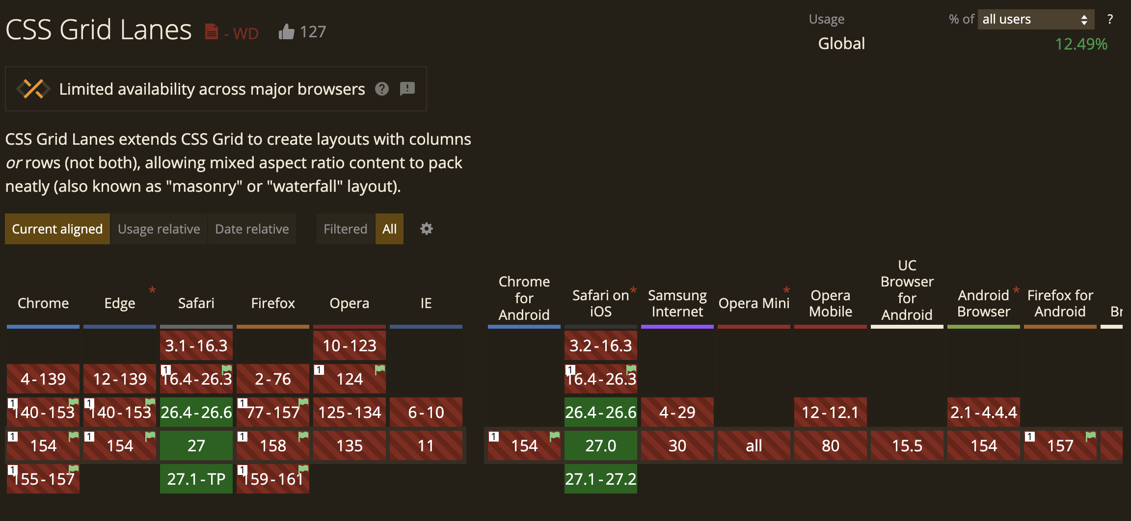
A Can I Use screenshot showing only support for later versions of Safari

Wrapping up

Grid Lanes has come a long way from the early proposals and workarounds. Here's a quick recap of where things stand now:

  • Masonry uses display: grid-lanes as a separate layout mode.
  • Lanes are defined by grid-template-columns or grid-template-rows.
  • Items are automatically placed into lanes based on available space.
  • fit-tolerance controls how much difference between lanes is treated as a tie.
  • The DOM source order stays intact, even when the visual order differs.
  • Unsupported browsers can use a simpler fallback layout.

The Index: Issue #202

Tiny Little Office

This is really smart. It's a word processor, along with other common office software like spreadsheets, but it's completely URL powered.

Introducing the Accessible Components Library

You could not be in better hands than with TetraLogical and they've produced a really good collection of common components, all with thorough documentation, accessibility requirements and testing scenarios.

we were online

Something we've certainly noticed about this particular morale-draining era is there seems to be a real drive to create websites centered around a shared human experience and long may it continue.

What 10,000 home pages put in their head

So much about web performance is linked to what's in your <head> which this article (and very useful looking tool) breaks down well.

Study explores how AI use affects performance on math and reasoning tasks

A worrying read for fans of healthy cognition.

A handful of reasons JavaScript won’t be available

Here's one from the Piccalilli archives that you might have missed to wrap up this issue.


P.S. this is a good website from personalsit.es.

Sponsor message

Design and development partners for brands that adapt fast and thrive.

There's been a drive to ship ship ship in this AI era but increasingly that means a lot of volume and very little substance.

At Set Studio, we move incredibly fast because we center everything around a solid strategy and work with the amazing capabilities that modern browsers give us, underpinned by progressive enhancement, to make sure every user gets a high quality equitable and accessible experience.

We're also the agency behind The Index and Piccalilli because we think it's important to share this way of working with the wider community.

With availability opening up in 2027, we're the agency you can actually trust to do right by you and your user base. Reach out to us for a chat and let us show you how.

Check out our work

The Index: Issue #201

2027 web platform feature ranking

This is the second year we're doing this, and last year's 1900+ rankings not only helped us push the right proposals in the Interop process, it was also used to prioritize web platform feature development in Firefox.

Certainly beats thumbs up in GitHub issues! Make your voice heard.

This hue shall pass

A fabulous colour contrast tool from the great folks over at Clearleft.

Dark forestry

Not only an outstanding and important piece of writing, but the design and effects are lovely.

Destroy any website

This is very fun! Destroy your least favourite websites (like the pre-loaded example) for a vibe boost.

css.earth

Explore earth, other planets and even other galaxies, all rendered with HTML and CSS, via PolyCSS.

The box model and box sizing

Here's one from the Piccalilli archives that you might have missed to wrap up this issue.


P.S. this is a good website from personalsit.es.

Sponsor message

Design and development partners for brands that adapt fast and thrive.

Has your organisation gone too deep with frameworks or [gasp] LLMs and feel like you're stuck?

We're helping clients get away from that noise and instead, focusing their efforts and budgets on actually doing stuff that will help them reach their goals. We do all of that while running this publisher, Piccalilli too!

Our availability opens up again in late 2026 into 2027, so check out what we're about. Maybe we can be the key that unlocks your success in 2027 onwards.

Check out our work

The Index: Issue #200

It's issue #200 of The Index! A real milestone that we should celebrate with a dedicated CSS links issue. Let's get stuck in to the good links.

Multiple-column layout, rows, rules, and floats

The Bossβ„’ is here with some fantastic news on layout capabilities that we can use. They should really open the door to more creative layouts, which is great.

Our CSS isn’t opinionated enough

This really resonates as Craig is describing issues that inspired CUBE CSS. Semantic state changes are a really good way of doing things too.

Controlling when CSS custom property values are computed

Jake, the fountain of technical knowledge, is here with another must read.

CSS scroll-triggered animations are here, and I completely missed them

A very good guide on scroll-triggered animations with some sage advice on usage too. Not many better people to cover this than Cyd!

Detect when elements overlap with CSS

We're enjoying how Ahmad is covering stuff that will be tripping people up all the time in their jobs as front-end devs. It's great to see.

A pragmatic guide to modern CSS colours - part one

Here's one from the Piccalilli archives that you might have missed to wrap up this issue.


P.S. this is a good website from personalsit.es.

Sponsor message

Mozilla Festival

Mozilla Festival is co-built by developers and designers from around the world. Come gather, share, and connect with us in Barcelona, October 28-30.

Last year, more than 2,000 people came together to unlearn old ways of building tech. This year, with eight tracks and a spot in Barcelona's Open Tech Week, MozFest gives your ideas room to run wild. Join us for three days of conversation and hands-on building.

Get your badge

The Index: Issue #199

Blurry before beautiful: image previews for the web

A very good looking proposal!

The root scroller and how not to lose it

Yet another in-depth, fantastic article by Kilian at Polypane.

fonts.xyz

You know us by now: we see a good place to get fonts and we share it. This is a very nice offering with loads to choose from.

β€œAI, make the website good”

With these seismic changes, I will continue to make the argument that craft defined as caring about the quality of output (independent of the tools used to generate the output) is more important than ever. Caring about what you ship will always have real-world value to visitors/consumers/users real people.

Well said, Zach!

I spent three sweltering days shredding the high seas at jogging pace, and it ruled

A long read but absolutely outstanding prose.

It’s about time I tried to explain what progressive enhancement actually is

Here's one from the Piccalilli archives that you might have missed to wrap up this issue.


P.S. this is a good website.

Sponsor message

Mozilla Festival

Mozilla Festival is co-built by developers and designers from around the world. Come gather, share, and connect with us in Barcelona, October 28-30.

Last year, more than 2,000 people came together to unlearn old ways of building tech. This year, with eight tracks and a spot in Barcelona's Open Tech Week, MozFest gives your ideas room to run wild. Join us for three days of conversation and hands-on building.

Get your badge

Stop buttons triggering zoom when they’re double tapped

I stumbled across this great project by Barry Prendergast. It's a web-based radio player with a lush UI. On mobile I spotted that as I was rapidly flicking through the stations to find one that was on air, the browser was zooming in and out.

Here's a screen clip:

Watch the video.

I thought this behaviour was related to their viewport meta tag setup, but they have that set up perfectly:

<meta name="viewport" content="width=device-width, initial-scale=1.0">

Now, you could prevent the zooming by adding , maximum-scale=1.0, user-scalable=no to the content attribute, but don't do that because it prevents zooming at all, which is a WCAG violation.

What's actually happening here is the browser is responding to the double tap gesture, which in the case of Safari on iOS, zooms into the button element I'm tapping. Luckily there's a CSS one-liner for us that gets the job done.

.button {
  touch-action: manipulation;
}

As per MDN:

Enable panning and pinch zoom gestures, but disable additional non-standard gestures such as double-tap to zoom. Disabling double-tap to zoom removes the need for browsers to delay the generation of click events when the user taps the screen. This is an alias for "pan-x pan-y pinch-zoom" (which, for compatibility, is itself still valid).

Let's see it in action. First, here's a couple of buttons without touch-action. Try rapidly tapping on your phone/touch device:

See the Pen Buttons without touch-action applied by Andy Bell (@piccalilli) on CodePen.

This link has no CodePen framing to make that easier for you

Here are the same buttons with touch-action applied:

See the Pen Buttons with touch-action applied by Andy Bell (@piccalilli) on CodePen.

Again, here's a frameless version for you

Handy!

The Index: Issue #198

You’ll miss publishers when they’re gone

Yet again, the industry has been let down by DigitalOcean and their abandonment of CSS-Tricks. It's time to step up and protect publishers whose goal is simply, to educate and share knowledge.

It’s official: Airline websites are slow, but they don’t have to be

The great folks at Calibre just don't miss. Another great deep-dive.

Gigs worth leaving the house for

Nothing sounds good is a great service and they've expanded with this immense resource for finding gigs near you.

BBC News RSS Feeds (that don't suck!)

BBC News get a lot wrong, including their RSS feeds, so Dan has fixed that part at least.

Snail racing simulator

This is just delightful.

A highly configurable switch component using modern CSS techniques

Here's one from the Piccalilli archives that you might have missed to wrap up this issue.


P.S. this is a good website from personalsit.es.

Sponsor message

Save 35% on courses

Our huge 35% discount on all courses ends on Tuesday. Use the coupon code PRICEFALL at checkout.

Don’t miss out!

Save 35% on courses

A decent custom checkbox pattern for until ::checkmark is ready

Now that we can better customise <select> elements, it's only natural to side-eye other form <input> types that have caused us visual headaches.

Sure, we should be applying the lightest of touches to form elements, especially, but even with a bit of visual-massaging, checkboxes are limited, aside from a bit of accent-color.

See the Pen Standard checkbox with accent colour by Andy Bell (@piccalilli) on CodePen.

There is a brighter future incoming, if you're to read the spec:

The ::checkmark pseudo-element represents an indicator of whether the item is checked, and is present on checkboxes, radios, and option elements.

β€” W3C forms level 1

Match that with appearance: base, which is also incoming, and we're looking at this sort of CSS:

input[type="checkbox"] {
  appearance: base;
}

input[type="checkbox"]::checkmark {
  content: url("data:image/svg+xml,%3Csvg aria-hidden='true' focusable='false' width='24' height='24' viewBox='0 0 24 24' xmlns='http://www.w3.org/2000/svg'%3E %3Cpath fill='none' stroke='currentColor' stroke-linecap='round' stroke-linejoin='round' stroke-width='2' d='m5 12l5 5L20 7' /%3E %3C/svg%3E");
}

We're miles off from that capability yet β€” it doesn't look like any browser is working on it β€” so allow me to show you how to build a nice custom checkbox pattern for until we have the browser capabilities we're after.

HTML first, always

It's always right to start with some good quality markup:

<label for="custom-checkbox" class="checkbox">
  <span class="checkbox__box">
    <input type="checkbox" name="custom-checkbox" id="custom-checkbox" value="Some value that this control toggles">
    <svg aria-hidden="true" focusable="false" width="24" height="24" viewBox="0 0 24 24" xmlns="http://www.w3.org/2000/svg">
      <path fill="none" stroke="currentColor" stroke-linecap="round" stroke-linejoin="round" stroke-width="2" d="m5 12l5 5L20 7" />
    </svg>
  </span>
  <span>A long label for this checkbox to make sure we get a nice wrapping behaviour</span>
</label>

The markup is pretty straightforward here. Inside the parent <label> β€” which is linked to the input both by being a parent and the for/id attributes β€” we have a container for the input and icon, along with a text label.

The reason I'm using <span> elements here is because aside from the input/SVG only phrasing content is permitted. I don't think a <div> would do any harm here, but it's best to do things right.

On the SVG checkmark element, there's an aria-hidden="true" attribute. This stops the SVG β€” a visual element β€” getting in the way for assistive technology. I've also added focusable="false". This is actually a relic from the Internet Explorer days hell, but I keep it on visual only icons, just in case.

Right, we're in good shape. Let's make it look good.

Some CSS

The first thing to do is layout:

.checkbox {
  display: flex;
  align-items: baseline;
  gap: 1em;
  text-wrap: balance;
}

Flex is more than capable here. I like to align on the baseline in this sort of context because as the viewport gets small and the text wraps, we don't want a vertically centered layout. It looks rubbish!

Speaking of balance, I'm using text-wrap: balance here for the same compressed viewport context and dealing with wrapping text. Keeping a consistent edge (rag) is extra important for small microcopy, such as labels.

Let's tackle the input itself.

.checkbox input {
  margin: 0;
  width: 100%;
  height: 100%;
  appearance: none;
  position: absolute;
  top: 0;
  left: 0;
  border-radius: 0.2em; /* This is so the focus ring has a matching radius to the visual box */
}

We've got to be really careful here because we don't want to mess up the focusability of our element. Combining appearance: none and absolute positioning, our element is still there, but its no longer in the way, visually. It can still receive focus and will present a focus ring, which is exactly what we need!

Let's tackle the "box" part, which is also this <input>'s parent.

.checkbox__box {
  position: relative;
  background: transparent;
  color: currentcolor;
  border: 1px solid;
  width: 1.4em;
  height: 1.4em;
  transform: translateY(0.75ex);
  flex-shrink: 0;
  border-radius: 0.2em;
}

A lot of this is self explanatory but I'll pick up the key parts:

  1. I'm using position: relative so the <input> stays inside this box
  2. The transform rule is a bit of a magic-number but because it's a relative ex unit, it scales quite nicely, regardless of parent font size. Most importantly the ex enhances that baseline alignment and fixes the initial alignment of the <input>

I really like how Ahmad Shadeed approaches this too. That's the beauty of CSS: there's plenty of ways to do things well!

Let's deal with the SVG checkmark next:

.checkbox__box svg {
  position: absolute;
  top: 50%;
  left: 50%;
  transform: translate(-50%, -50%);
  pointer-events: none;
  display: none;
  width: 1em;
  height: 1em;
}

I guess I could use logical properties here, but we're positioning an icon in a box, so the "old" way works perfectly well.

The idea here is to visually hide the checkmark when the checkbox isn't checked and show it when it is. We'll deal with that CSS next.

FYI

This is a situation that very few people will likely find themselves in. What I'd recommend is having a couple of SVG elements that get toggled in that context.
.checkbox__box:has(input:checked) {
  background: white;
}

.checkbox__box input:checked + svg {
  display: block;
}

We're in checked state territory here. I'm setting a white background using :has() which is yet another useful use-case for this endlessly handy addition to CSS.

The following block of CSS uses a traditional next sibling selector to show the SVG element when the input is checked. You could use :has() here too, if you're feeling fancy.

With all of that CSS in place, we're looking good.

See the Pen Custom checkbox by Andy Bell (@piccalilli) on CodePen.

This approach could also work for radio buttons

There's nothing stopping you using this approach for radio buttons. Check out this demo where I'm using a circle icon instead of a checkmark. It works well!

See the Pen Custom radio buttons by Andy Bell (@piccalilli) on CodePen.

The em units usage allows this whole component to scale

The eagle eyed amongst us will have noticed that aside from the transform rules, I've consistently use em units. The reason for this is so our checkbox can scale with no other intervention.

See the Pen Custom checkbox - massive edition by Andy Bell (@piccalilli) on CodePen.

The only change here, versus the first demo is a font-size declaration on the .checkbox component.

A handy pattern, right?


A big thanks to Jake Archibald and Heydon Pickering for checking my homework.

The Index: Issue #197

Mindful Design Products

This is exactly what we need to counter the great slopification of what used to be useful products. Calm, considered and above all, useful.

Scott's written about the why here, too.

How the heck do record players work?

An absolutely fascinating read with some delightful multi-media demos that really help you understand.

CSS Layout News in the ATmosphere

Rachel's newsletter is one of our all time favourites here. Great to see it back!

Using maths to balance your heading styles

You know us, if it's type scale related, we're interested.

Donnie had a good follow-up article too.

An Ode to links

We must never forget how lucky we are to have links.

Publishing on the Atmosphere with Standard.site

Here's one from the Piccalilli archives that you might have missed to wrap up this issue.


P.S. this is a good website.

Sponsor message

Save 35% on courses

The summer is over and the autumn (or fall, for our American friends) is here, so we're offering a huge 35% discount on all courses if you use the coupon code PRICEFALL at checkout.

The offer runs until September 22, so don’t miss out!

Save 35% on courses

Save 35% on all courses for two weeks only

The summer is over and the autumn (or fall, for our American friends) is here, so we're offering a huge 35% discount on all courses if you use the coupon code PRICEFALL at checkout.

This is the time of year where people, fresh off a summer break, like to skill up, so we're making that easier with this large discount.

We're running the discount for only two weeks β€” ending September 23 β€” so make sure you don't miss out.

Purchasing Power Parity (PPP)

Our PPP discounts are always based on the full price of the course, so our system will work out which deal is going to be the best for you.

If your PPP discount is cheaper than the PRICEFALL discount, we'll present that. If the PRICEFALL discount is cheaper, we'll present that.

We're all about people getting incredibly high quality education that's as affordable as possible.

If you need to convince your boss

We've got you covered with letter templates for every course:

  1. Complete CSS
  2. JavaScript for Everyone
  3. Mindful Design

Check it out!

The Index: Issue #196

Before we get into this week's links, I just thought I'd let you know we're having a summer break next week, so the next issue won't be with you until September 11!

Midnight Vinyl Club

A handy service that helps you explore music and find the best prices for vinyl.

The search for a Spotify alternative

There are so many better options than Spotify for music and Elliot helpfully breaks plenty of options for you.

Little websites everywhere

This is a great piece. As we see it, the web β€” at large β€” always wins and those green shoots will come.

ReelSwap

A really cool service for cataloging physical media. The bookshelves are really nicely done too.

WireLoop

An extremely satisfying web-based game.

NaN, the not-a-number number that isn’t NaN

Here's one from the Piccalilli archives that you might have missed to wrap up this issue.


P.S. this is a good website from personalsit.es.

Sponsor message

There's no sponsor this week so I thought I'd use this slot to give a pep talk to those who are feeling incredibly beaten down by the industry right now (including myself).

We will win in the end. It might not feel like winning at first, but the current direction of travel is not inevitable.

We do have to fight back though, so don't let the bastards grind you down. We need you!

Personal website redesign project post: A CLI for adding new music to the collection

Right, we are at the end of iteration one.

An Obsidian markdown file called "core features and iterations." It lists a development roadmap across four iterations, including tasks like "basic shell version of the site," "look and feel design," "AT protocol integration," and "last.fm integration."

The last thing to do is to make my life a little easier. Markdown files work perfectly fine for the music collection, but they're a bit of a faff. Mostly because I always forget the front matter structure, so to fix that, I created myself a Command Line Interface (CLI) which is a series of questions, resulting in a new item being added to the collection.

I add a lot of music to my collection because I'm truly trying to get away from streaming platforms completely, so something that makes the process of keeping it up to date simple is very much needed.

Let's break down the tool I built, piece-by-piece.

import * as p from '@clack/prompts';
import fs from 'node:fs';
import path from 'node:path';
import { Readable } from 'node:stream';
import { finished } from 'node:stream/promises';
import slugify from 'slugify';

// The root is the current working directory
const REPO_ROOT = process.cwd();

// Music collection content location
const MUSIC_COLLECTION_ROOT = path.join(
  REPO_ROOT,
  'apps',
  'web',
  'src',
  'content',
  'music-collection'
);

// For storing the album artwork
const ARTWORK_ROOT = path.join(REPO_ROOT, 'public', 'images', 'music-collection');

First up, I'm using Clack to do the heavy lifting for me. It's a fantastic tool that helps you to create a step-by-step CLI flow, which is exactly what I want. It'll keep all of the data up to date, so when I get to the end of the flow, I can generate the markdown file with front matter.

This first snippet is mostly me initialising the tools and setting some immovable constants β€” hence the all caps screaming naming convention.

// Generates a nice unique filename for the artwork
function generateUniqueFilename(url) {
  const extension = path.extname(new URL(url).pathname);
  return `${Date.now()}-${Math.floor(Math.random() * 1000)}${extension}`;
}

// Downloads the remote artwork and places in ARTWORK_ROOT
async function downloadImage(url, filename) {
  const request = await fetch(url);

  const filePath = path.resolve(ARTWORK_ROOT, filename);

  // Flags: if file is already there, this will exit stage left because we're
  // in a pickle if a uniquely generated image name is duplicated
  const fileStream = fs.createWriteStream(filePath, { flags: 'wx' });

  await finished(Readable.fromWeb(request.body).pipe(fileStream));

  return filePath;
}

Let's look at album artwork now. What I want to be able to do is pop a URL as an answer to the artwork question so the system can download it and place a copy in my repository.

For all of that to work, I need to make sure each image file has a unique filename. That's where the generateUniqueFilename() function comes in. First, it extracts the image format from the passed url property. From there, I construct a new string, starting with the date and a random number. Lastly, I stitch the extension back on to the string and job done.

The downloadImage() function then grabs the original image and the desired filename. It grabs the image using fetch, renames it, moves it to the ARTWORK_ROOT and again, job done.

// Takes the front matter and creates a markdown file
function createMusicItem(frontMatterTemplate, title) {
  const slug = slugify(title, {
    lower: true,
  });

  const filePath = path.join(MUSIC_COLLECTION_ROOT, `${slug}.md`);
  fs.writeFileSync(filePath, frontMatterTemplate);
  return filePath;
}

The function name here does a good job of explaining what's happening. Front matter data is passed in, along with the title of the album. Next, a new slug is generated from the title, then a new markdown file is created using the frontMatterTemplate string, which we'll cover in a moment.


async function main() {
  p.intro('Let’s add a new item to the music collection');

  const musicItem = await p.group(
    {
      album: () =>
        p.text({
          message: 'What’s the album name?',
          placeholder: '',
          validate: (value) => {
            if (!value) return 'Album is required!';
          },
        }),
      artist: () =>
        p.text({
          message: 'Who is it by?',
          placeholder: '',
          validate: (value) => {
            if (!value) return 'Album is required!';
          },
        }),
      artworkURL: () =>
        p.text({
          message: 'What’s the artwork URL?',
          placeholder: '',
          validate: (value) => {
            if (!value) return 'Album is required!';
          },
        }),
      formats: () =>
        p.multiselect({
          message: 'What format(s)?',
          options: [
            { text: 'Vinyl', value: 'Vinyl' },
            { text: 'CD', value: 'CD' },
            { text: 'Digital', value: 'Digital' },
          ],
        }),
      isMasterpiece: () =>
        p.confirm({
          message: 'Is this a masterpiece?',
        }),
    },
    {
      onCancel: () => {
        p.cancel('Operation cancelled.');
        process.exit(0);
      },
    }
  );
  
  // For readers: the rest of the function follows shortly
}

A Big Block Of Codeβ„’ was unavoidable here unfortunately, so allow me to explain what's going on. The p variable is Clack, and the first thing I'm doing is popping a little message on the screen β€” "Let’s add a new item to the music collection". From there, I define a new group of questions.

For each of those questions in the group, I'll get back the response data. Because I'm defining musicItem as the group, I can get the data out like so: musicItem.title. That's very handy indeed! It's all very similar to the zod stuff we used for the Astro collection earlier in the series too.

With all of the questions in, it's time to respond to the data I get back.


// There's a 0 percent chance I'll add a top ten like this, so we're looking
// only for the masterpiece tag at this point
const tags = musicItem.isMasterpiece ? ['Masterpiece'] : [];

// Create a nice unique filename for the art image
const artworkFileName = generateUniqueFilename(musicItem.artworkURL);

// We've got all the data for markdown now, so create that front matter
const frontMatterTemplate = `---
title: '${musicItem.album}'
artist: '${musicItem.artist}'
cover: '${artworkFileName}'
formats: ['${musicItem.formats.join("', '")}']
tags: ['${tags.join("', '")}']
pubDate: ${new Date().toISOString()}
---
`;

As I say in the code comment, I'll never add a top 10 item like this, so my focus is day-to-day collection additions. I do however have an option to declare an album as a masterpiece, so if the clack answer is true for isMasterpiece, I assign ['Masterpiece'] as the value for tags.

Next, I use the function from earlier to determine an artworkName and that's all the data I need to generate a nice block of front matter data.

// Wait until the image is ready
await downloadImage(musicItem.artworkURL, artworkFileName);

// Run the file creator
createMusicItem(frontMatterTemplate, musicItem.album);

p.outro('βœ… Album added!');

return true;

Lastly, I use the downloadImage function from earlier and then the createMusicItem with all of that lovely data. I put a little success message on the screen and return true. The reason for that is I initialise the main function like so:

main().catch(console.error);

By returning true, the process will just end, but by stitching catch to main(), if there are errors, I'll get a log.

Rigging up the script

From my command line, I want to be able to run npm run music:add, not node packages/utils/new-music-collection-item.js. That's easy enough to sort though.

I opened up the root package.json and added the following to the existing "scripts" property:

"music:add": "node packages/utils/new-music-collection-item.js"

Job firmly done.

Wrapping up

That is iteration one done. Well it's been done for a while now, but me writing about iteration one is finally done. Like I mentioned a couple of posts ago, a very weird symptom of this project is that I've felt like I can't progress to iteration two β€” the actual design work β€” until iteration one is fully written up. I have no idea why either. Brains are weird, man.

Anyway, the next post in this series will tackle exactly that: the creative process. This should all time well with the investments we've put into our own design system software too, so I'm looking forward to showing you all that. Because I do the production work, then write about it in this series, expect a bit of a delay now while I actually do the work.

For now, I've got a basic UI and a fully functional website. Sure, it's got a few rough edges, but it's a website. If you've also been in "pause mode" like I have, what I will say is get an ugly version live first β€” especially if you don't have a website already. It's better to have something than nothing.

Catch you in the next one.

The Index: Issue #195

Bulleted

This is the stuff that's exciting about the AT protocol. Not the "new twitter" bullshit, but the endless possibilities that this technology opens up. It's using the fancy new private data stuff too.

The future of CSS: target multiple classes with the class prefix selector

As Bramus says in the article, we can sort of do this already, but those substring selectors don't perform well. This new method is a very good improvement!

Ruminations on notifications

A good write-up on how annoying and harmful notifications are.

HTML can do that

So much good stuff has arrived in HTML that gives us rich functionality for free and Chris helpfully breaks that down for us.

Introducing Microlighter

An extremely lightweight syntax highlighter using the new ::highlight() functionality? Yes please!

Why I’m excited about text-box-trim as a designer

Here's one from the Piccalilli archives that you might have missed to wrap up this issue.


P.S. this is a good website from personalsit.es.

Sponsor message

Save 20% on all courses

Take your career to the next level by taking our premium courses and save 20%.

Use the code NEXTLEVEL at checkout to get our courses for only Β£199.20.

By taking our courses, you’re supporting independent publishing, rooted in doing right for workers in design, development and leadership.

Take your career to the next level

❌