Check out the hottest new typefaces in our monthly roundup.
Summer is fast becoming a memory. We've all had our holidays, switched off our out-of-office replies, and are wondering whether to put a jumper over our T-shirt. And as we power up our laptops once more, there's oodles of typeface goodness to lap up.
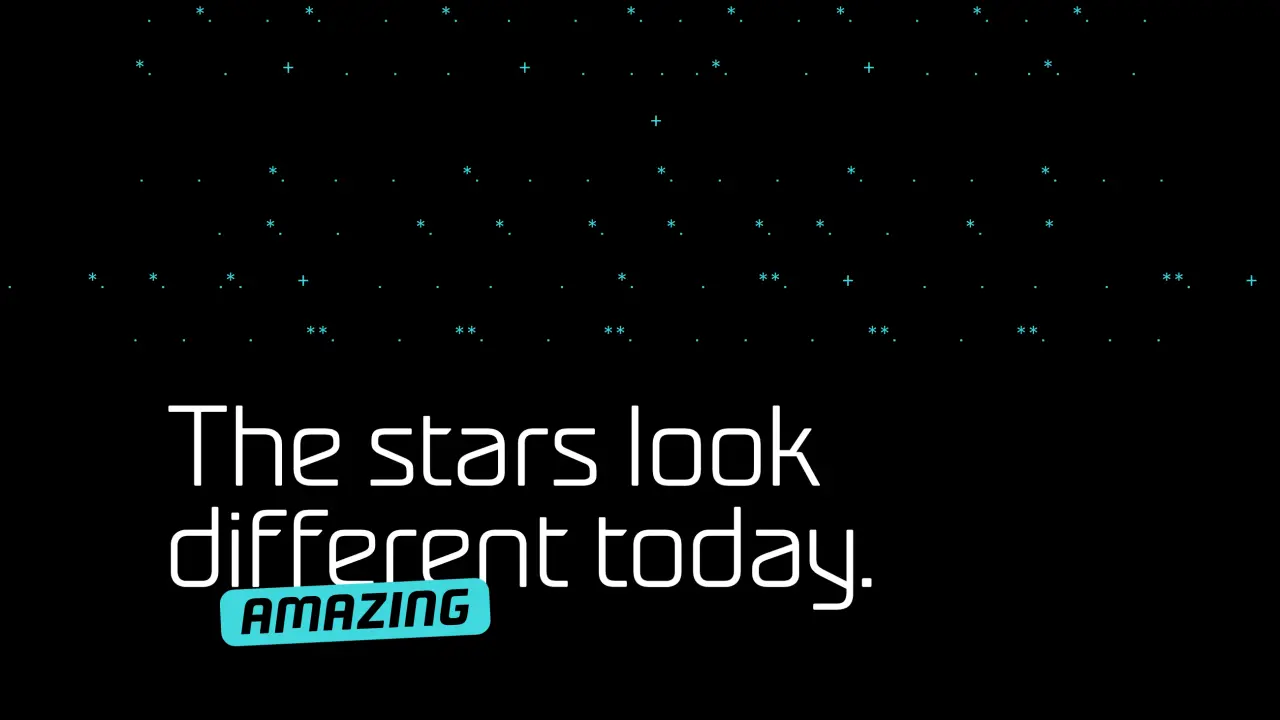
This month's releases include a Victorian grotesque revival with a political conscience and a Peignot update from Production Type. There's Castillon, a serif that fuses British and French calligraphic traditions with those from Estonia; Tüpokompanii's Vee arrives as a younger sister to the Bauer Venus of 1907.
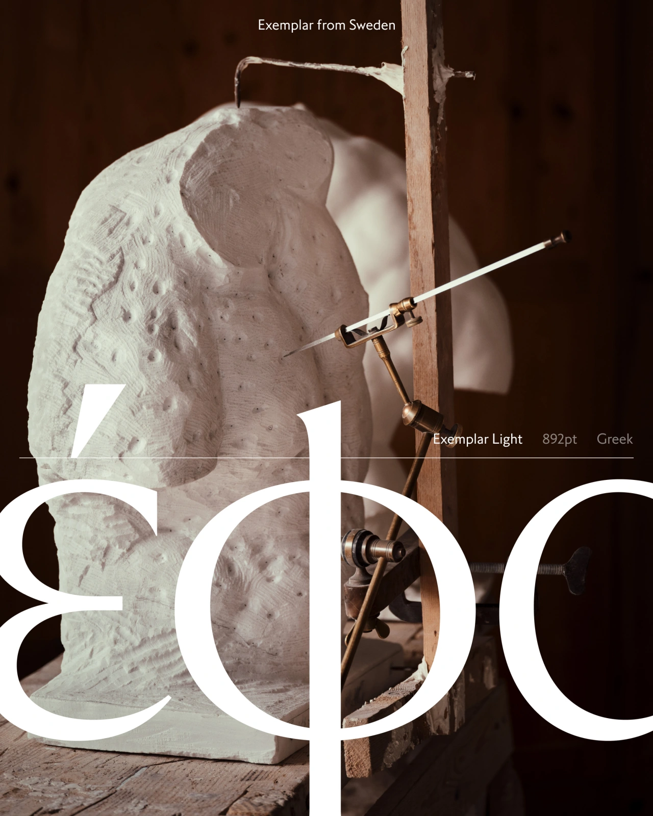
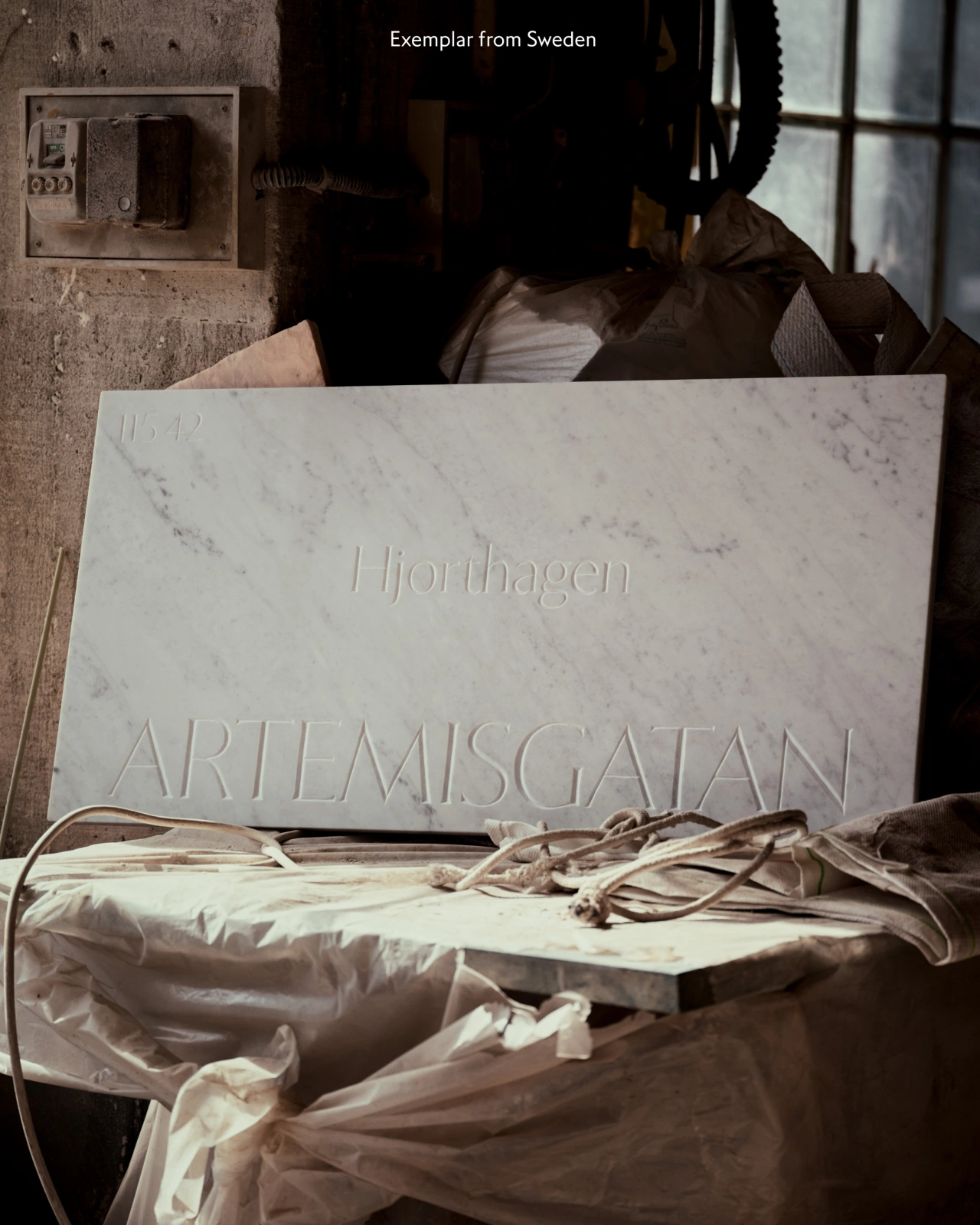
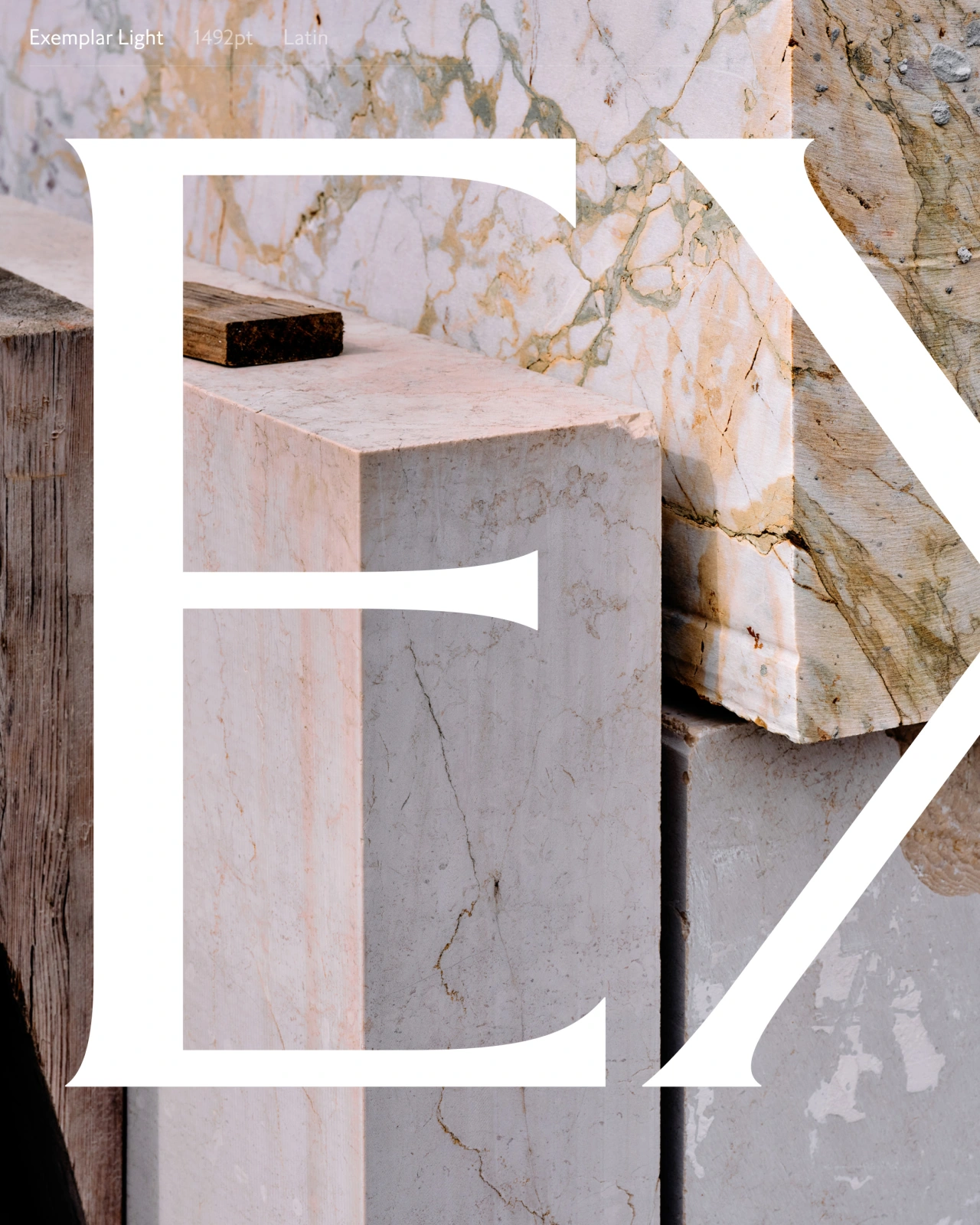
The real standout story, though, has to be Exemplar. Göran Söderström began drawing it way back in 1994, before many people reading this article were born. It is now, more than three decades on, complete. To celebrate, he carved its history into marble street signs in Italy. And after all that work, who could deny him that?
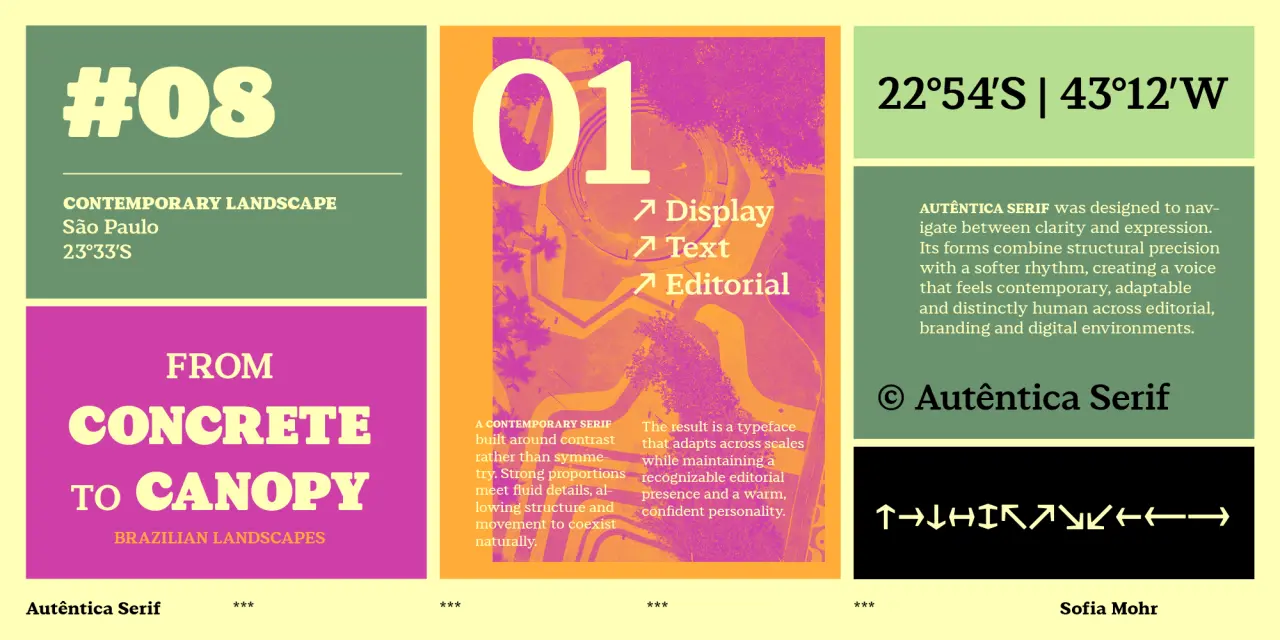
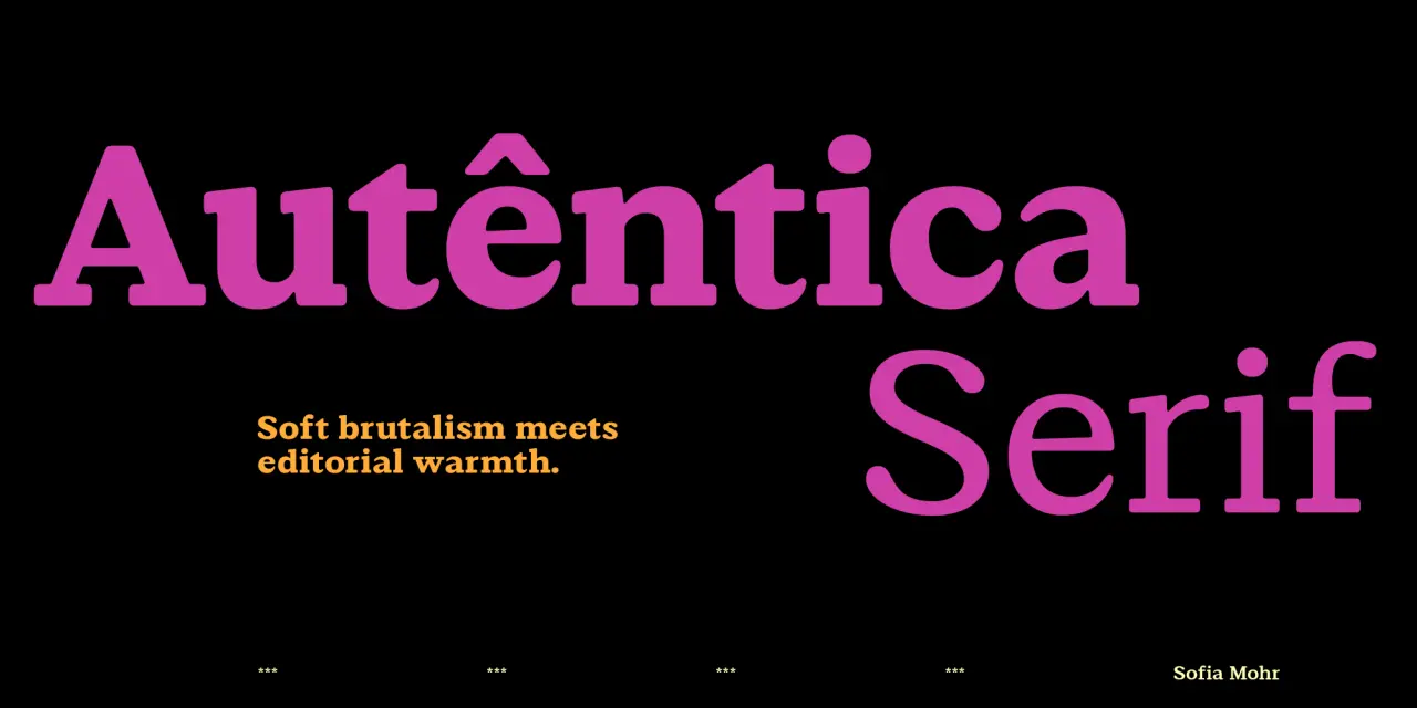
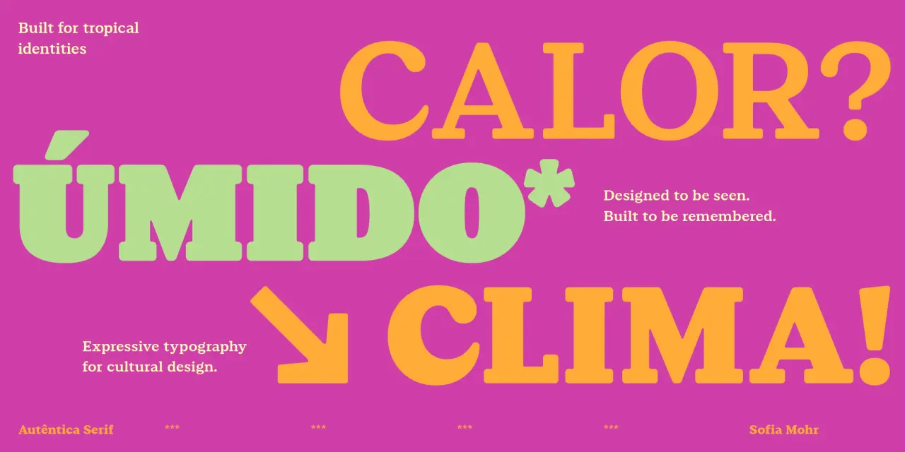
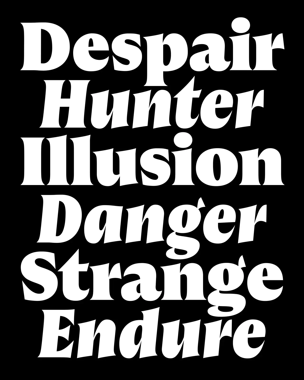
We've been watching Sofia Mohr's Autêntica superfamily expand across the year with admiration, and this serif release doesn't disappoint. Where Autêntica Sans established the family's rhythm and editorial personality, this new release translates those qualities into something warmer and more sculptural; inspired, she says, by Brazilian Brutalism and its dialogue with landscape and light.
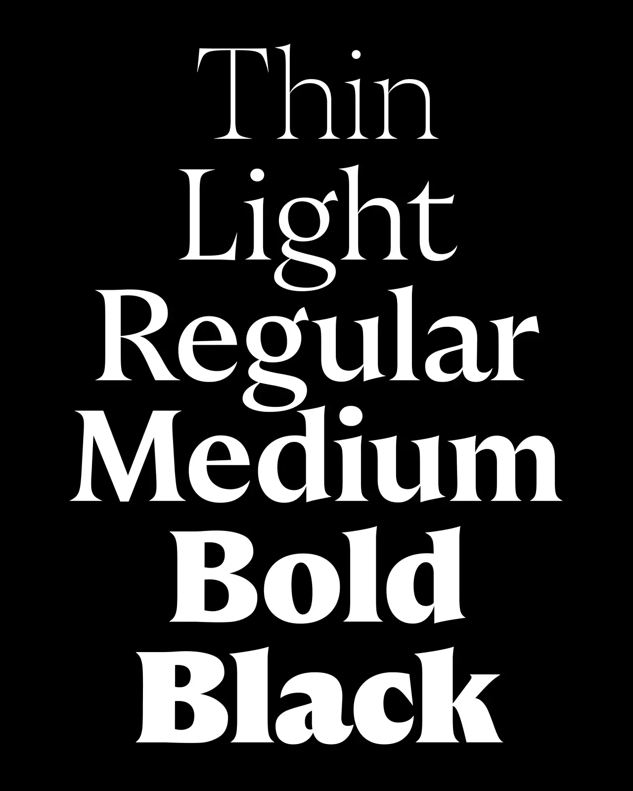
With its bold, rounded serifs, softened corners and fluid terminals that open into subtle drop-like shapes, this is not a standard serif by any means. Six weights and a variable font make it very versatile, and this font could be a good choice to use for branding, packaging, editorial and cultural projects.
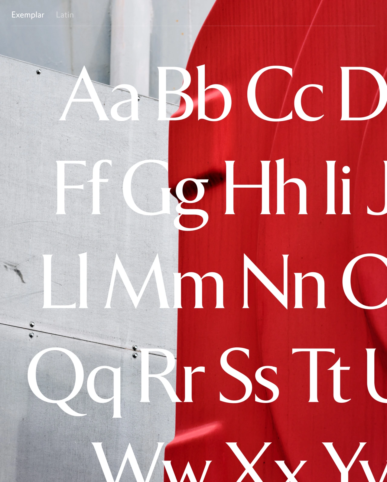
Thirty-two years: that's how long Göran Söderström of Letters from Sweden has been working on Exemplar. He began drawing it in 1994 on a Power Macintosh 7100. Finally, it's complete: five weights with italics, 791 glyphs, supporting Latin, Cyrillic, Greek and Arabic across 370 languages.
To mark the occasion, Letters from Sweden carved the typeface's three-decade history into marble street signs in Pietrasanta, Italy: one sign per decade, per address where each version of the typeface was designed. They even made a short film about it. They're very excited. And rightly so: this is a significant piece of work: a humanist serif that's been lived with, tested, refined and reconsidered across three decades of design practice. Indeed, Exemplar's multilingual scope alone—370 languages!—puts it in a different category from most typefaces.
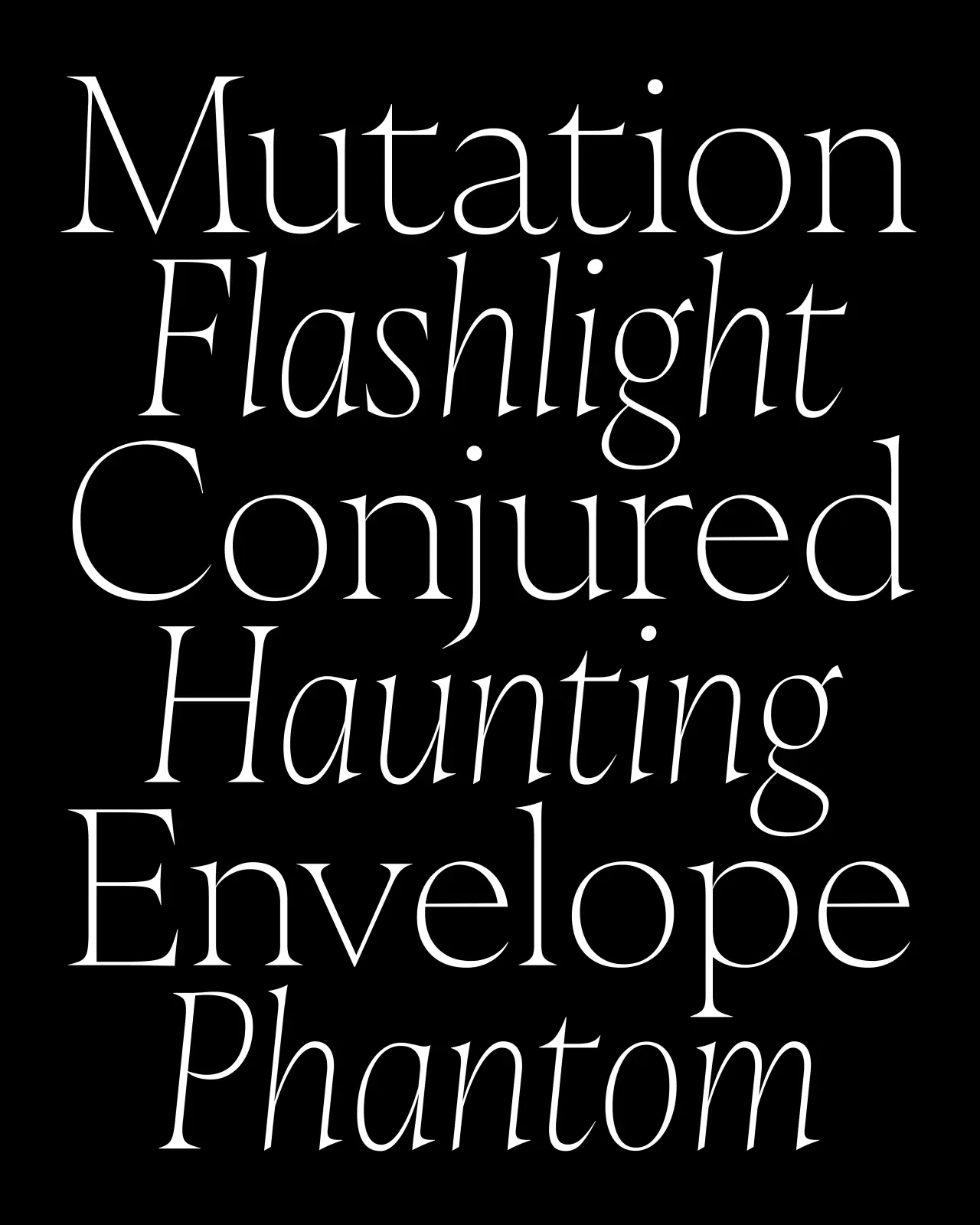
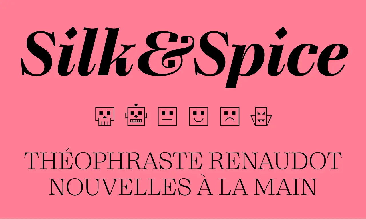
We always have high expectations for the work of Malou Verlomme, who co-designed 00 Quatorze, which we covered in December 2025. And we're happy to report that with Castillon, they've been met. Released through 205TF, this serif sits at the intersection of two typographic traditions: British and French; the broad-nib pen and the stone chisel.
The contrast between thick and thin strokes is pronounced, as is the tension between structural capitals and more fluid lowercase forms. As its makers put it: "The serifs seem to waver between lapidary incision and calligraphic stroke", creating a lovely tension that could help bring designs across a number of applications to life. Six weights with matching italics, only slightly inclined and deliberately narrow, complete this confident family.
Three years in the making, Foundry Kingdom is described by designer Stuart De Rozario in unusual terms. "[It] is not champagne, it is a pint of bitter in the local pub," he says. "It is not the King's horse at Ascot, but the drayman's horse hauling beer barrels through narrow streets. It is not spectacle or ceremony, but industrial labour: the quiet dignity of work."
Rooted in the early grotesques of the 19th century, Foundry Kingdom is a homage to that English lineage at the point before it diverged into the German neutrality that eventually led to Helvetica. Within its DNA lie historic forms that were meant to be read quickly and clearly under pressure: railway lettering, newspaper type, hot-metal printing.
Named as a tribute to Isambard Kingdom Brunel, its strokes are heavy, the proportions functional. Meanwhile, details such as bold terminals on the a, c, g, j, r, s, t and y; a two-storey a, and a double-storey g add plenty of character to the mix. Foundry Kingdom is available across fourteen styles from Light to Black.
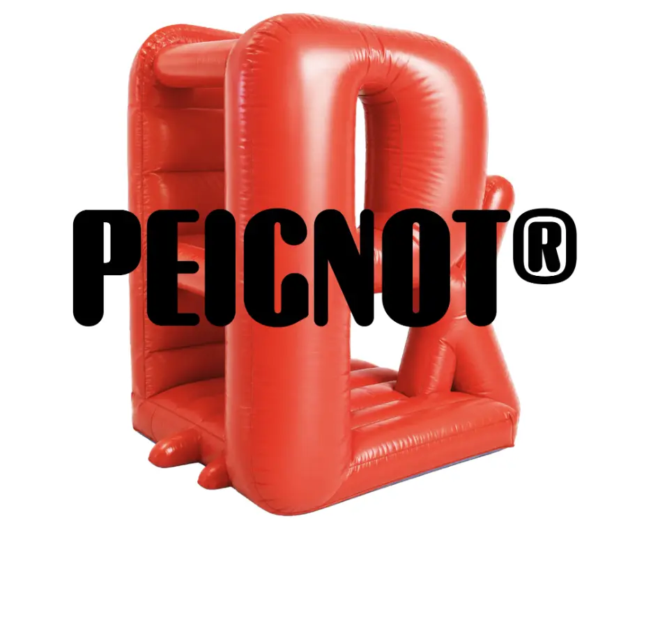
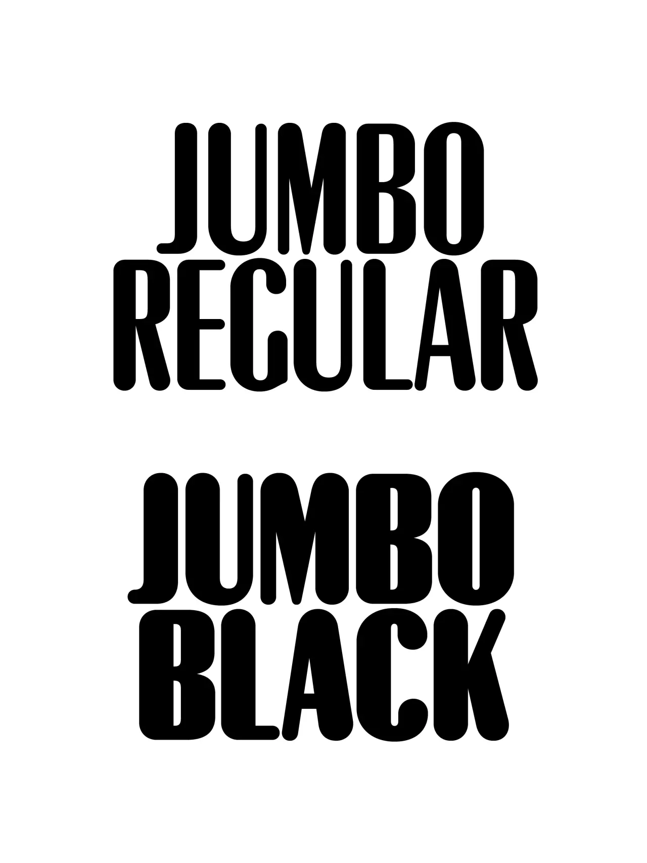
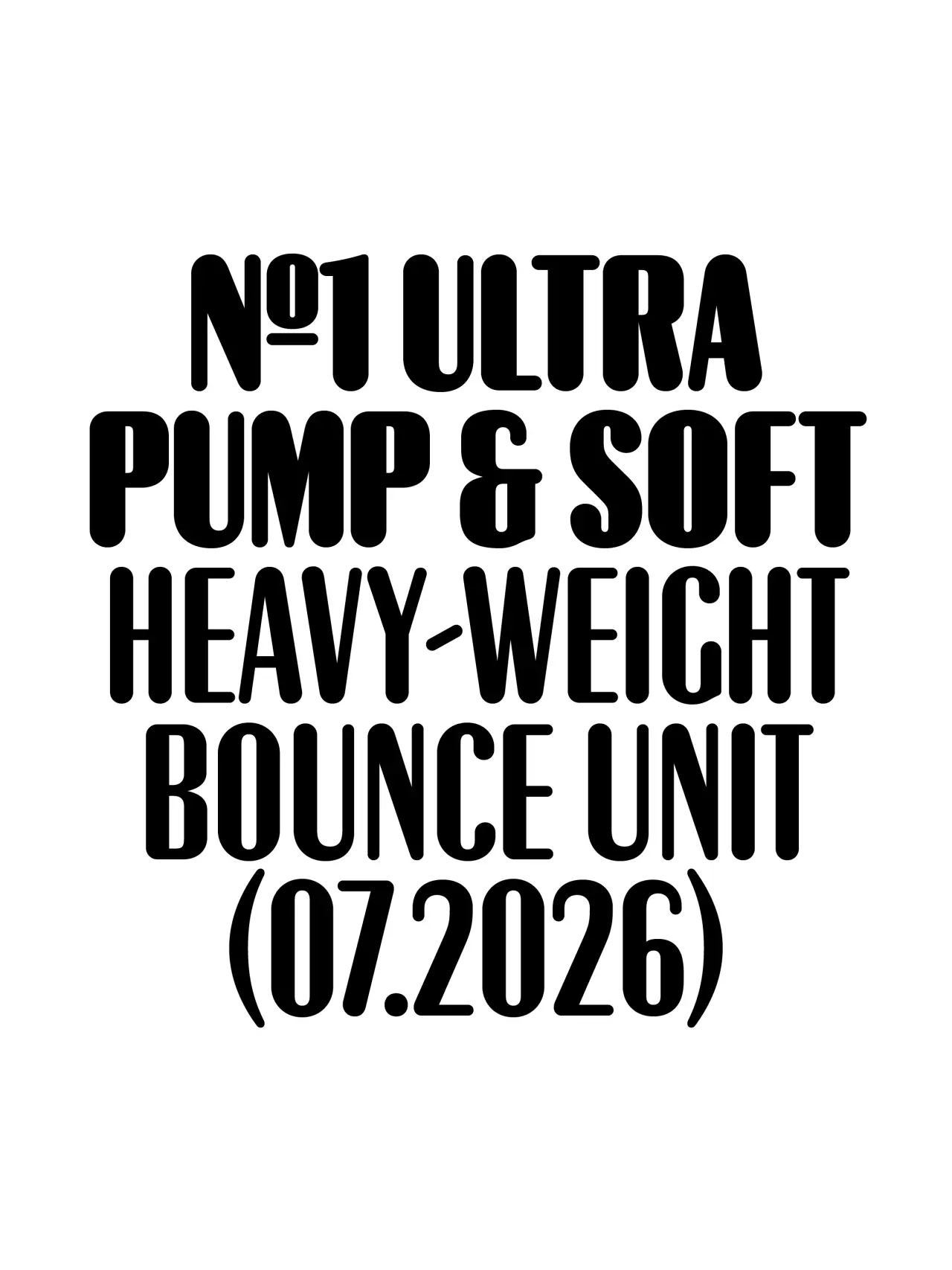
Peignot is one of the classic display typefaces of the last century. Production Type's House of Cassandre imprint has been stewarding that legacy, and Peignot Jumbo is its latest, carefully considered extension. The concept was a simple one. As Production Type's Deniz Eser Uslu puts it: "There never was an original rounded version of Peignot in the foundry archives, so we decided to make one."
Peignot Jumbo is calibrated for maximum display impact, with all the drama of the original at scale, without any of the compromise at smaller optical sizes. It's a strong choice if you need your typography to be distinctive, whether you're working in a cultural institution, the fashion industry, or in high-impact editorial.
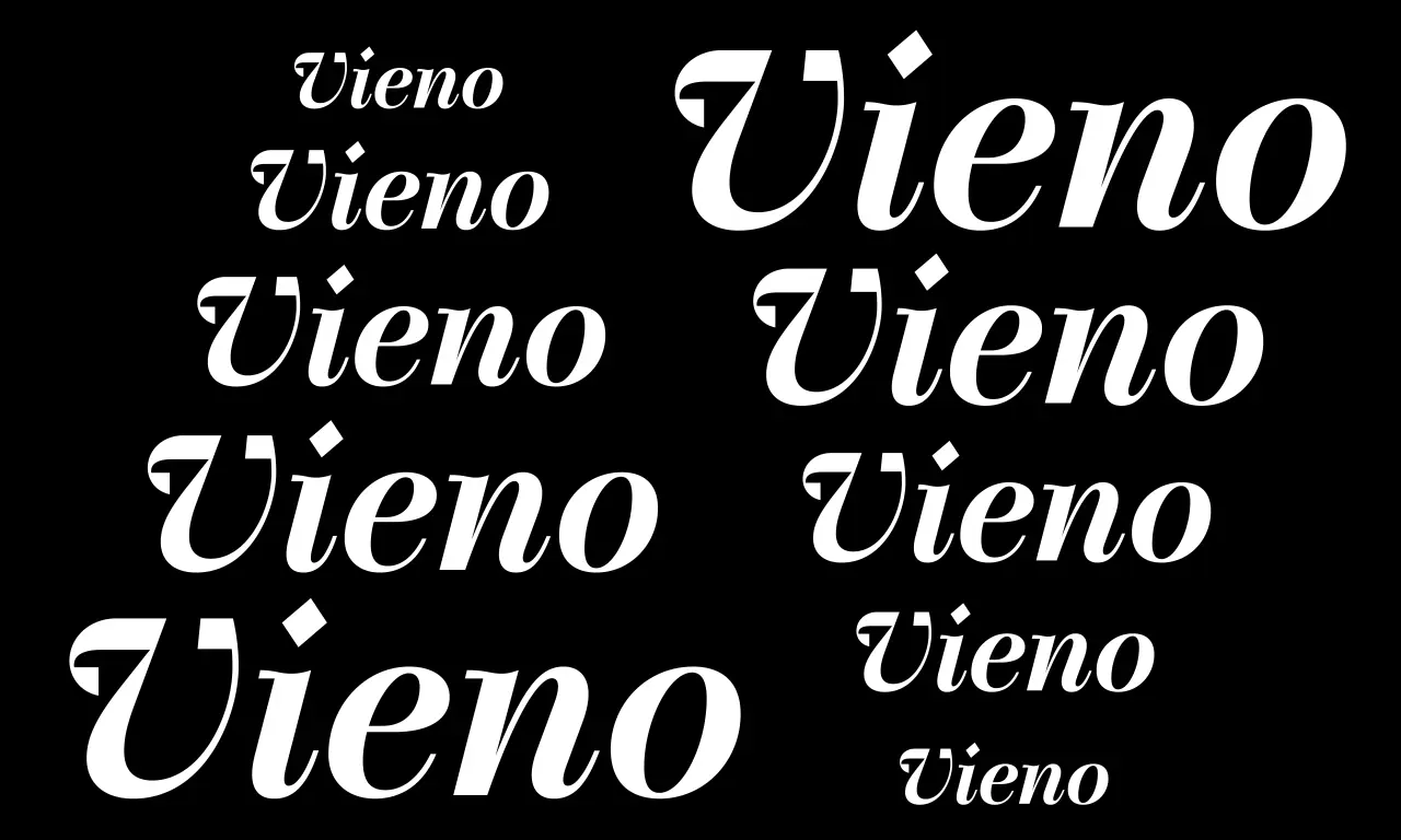
Vieno is certainly ambitious. In developing it, Spoke's Teo Tuominen took the discipline of Bodoni and Didot as his starting point, then deliberately pursued the contradictions rather than resolving them. The result: a serif that consciously sets organic and mechanical forms against each other, leading to a beautiful tension between tradition and modernity.
Despite these historical inspirations, though, Vieno is also pretty original. As Teo puts it: "The terminals are mechanical, rigid squares, the dots are shaped like a diamond, and sharp angles can be found throughout the character set."
Vieno comes in 15 weights from Extralight to Black, each with matching italics, plus a complementary monospaced style for contrast. The character set includes old-style and tabular figures, ligatures, circled numerals, inferiors, superiors, fractions, alternates and a set of distinctive icons.
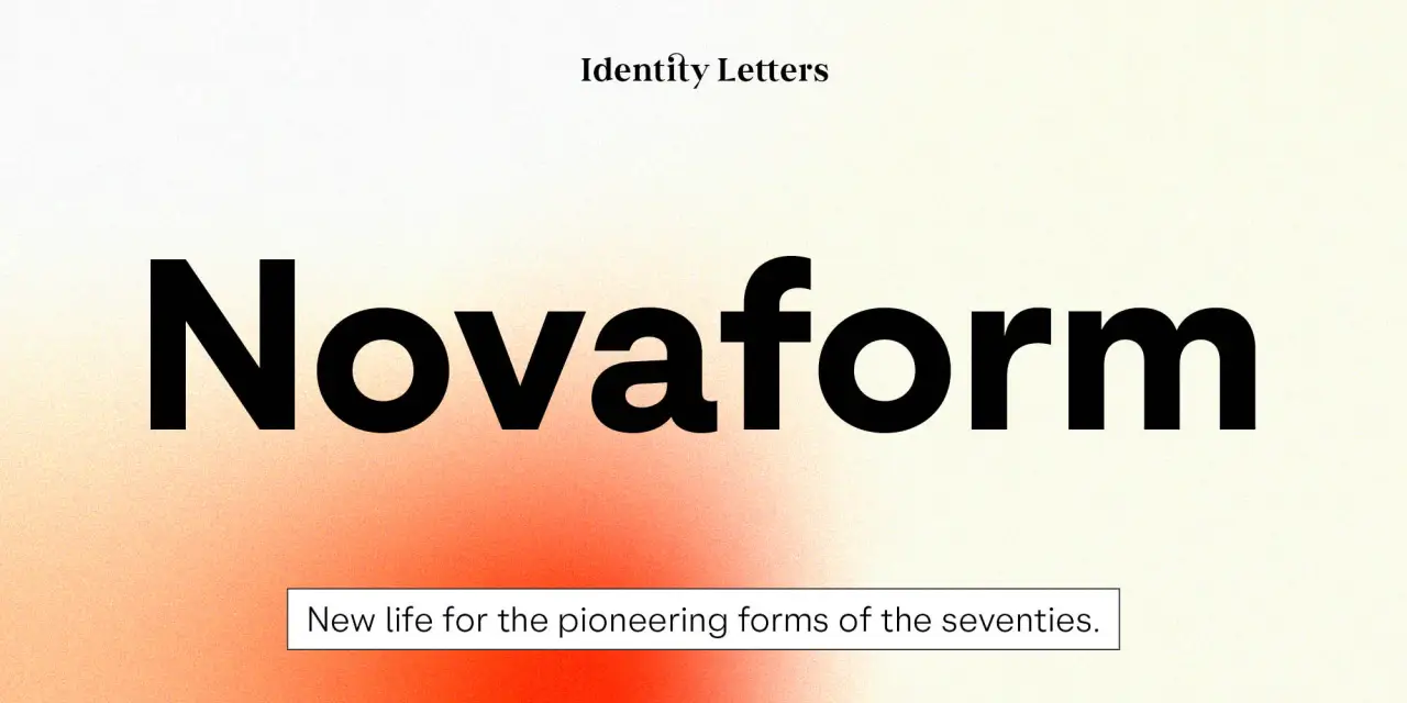
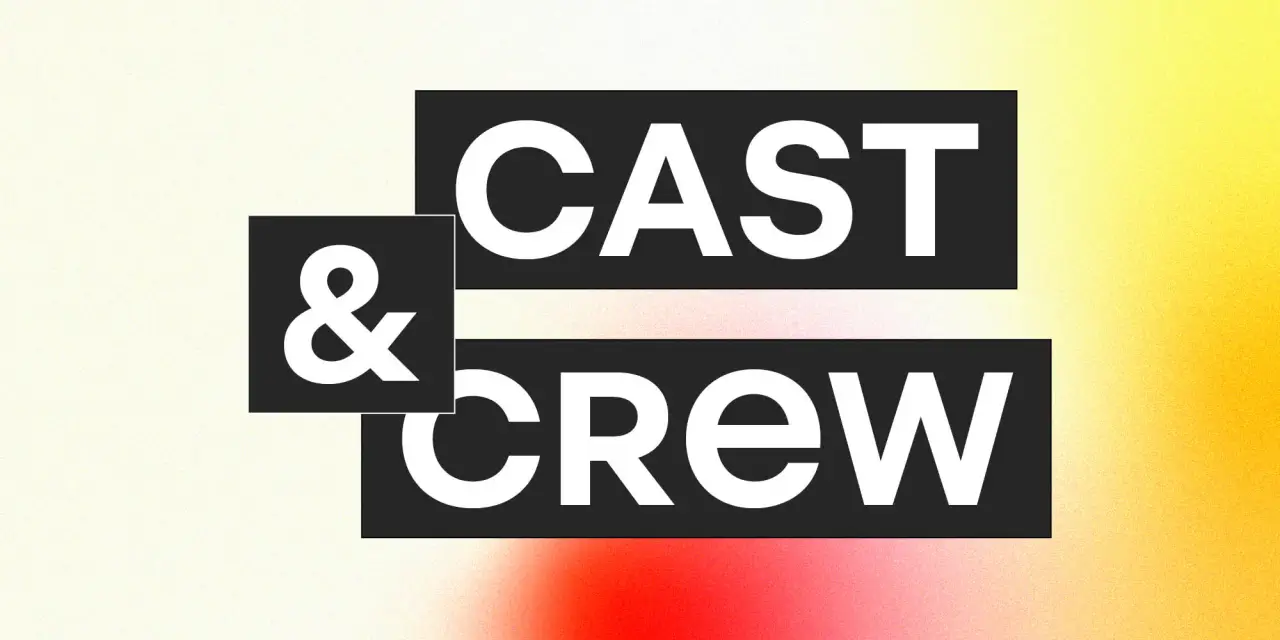
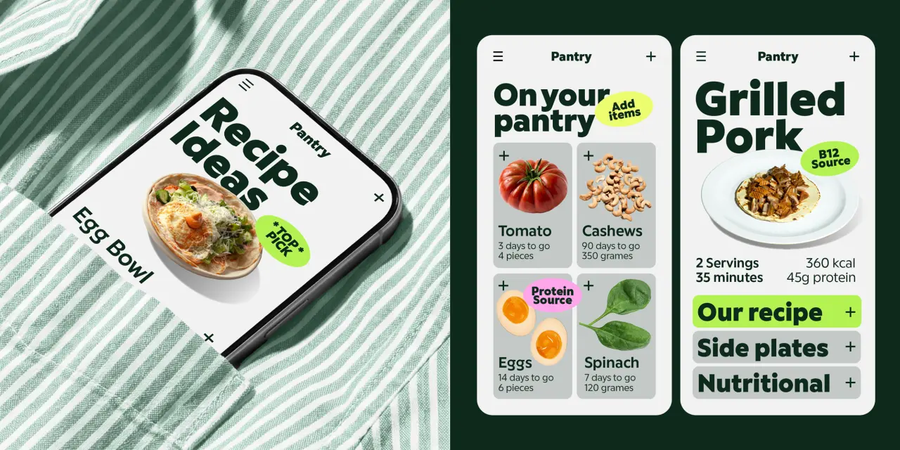
We all love a 1970s geometric type revival. And better still, Novaform is a more nuanced entry into that genre than most.
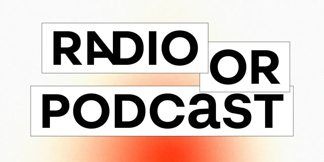
It's inspired by an era when classic faces like Kabel and Futura were reimagined with interlocking uppercase ligatures, tremendous x-heights, and a boldness calibrated for display.
As Identity Letters point out, though: "These hallmarks of the phototypesetting era were exclusively designed for display use." By contrast, Novaform has been designed to be more approachable, look more natural and read well in body text.
Ten weights, stylistic sets, hallmark ligatures and a Unicase mode let designers dial up or dial down the showiness as required. The Unicase mode, in particular, makes the typeface's most distinctive quality available as a choice, not a constraint.
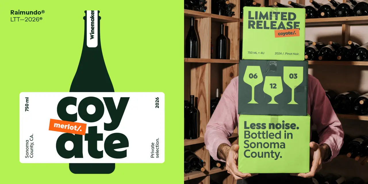
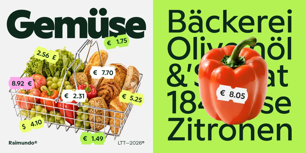
Raimundo was designed by Enrique Hernández, the father of one of Latinotype's founders, and this familial link seems to have added an extra layer of warmth to its DNA. Type designer Jorge Cisterna describes it as "that friend who gives you straight advice with a pat on the back. A raspy, confident voice that always has a joke behind every line."
Sitting somewhere between geometric and grotesque, the font features rounded forms, open counters and a weight range that moves from quiet to loud, while alternate forms for a, e and g allow the tone to shift from neutral to expressive in small, controlled increments.
The 541-glyph character set includes typographic emoticons, and not by accident: this is a consumer-facing typeface, not a corporate one. Eight weights from ExtraLight to ExtraBold make it a strong choice for food retail, packaging, digital products and brand identities.
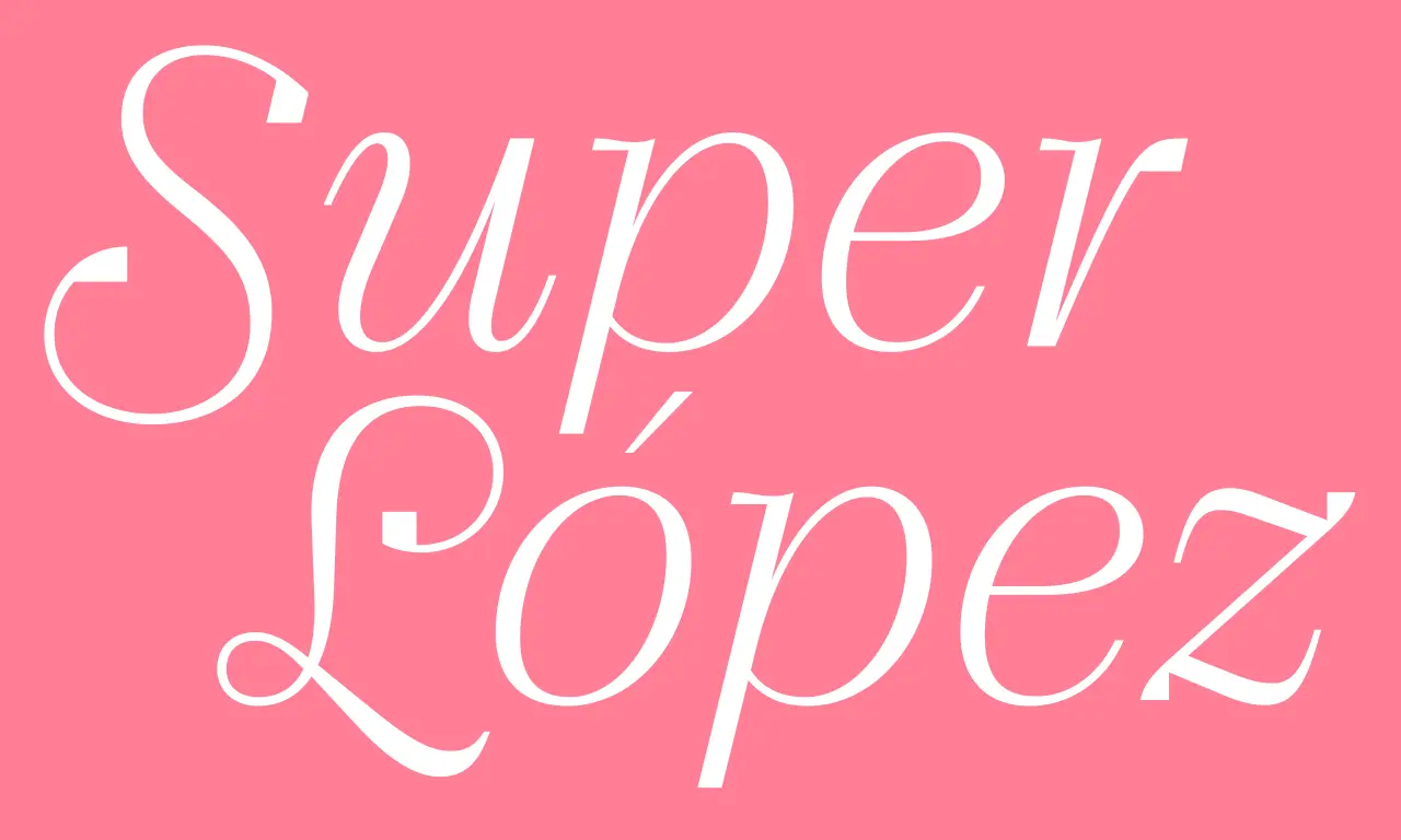
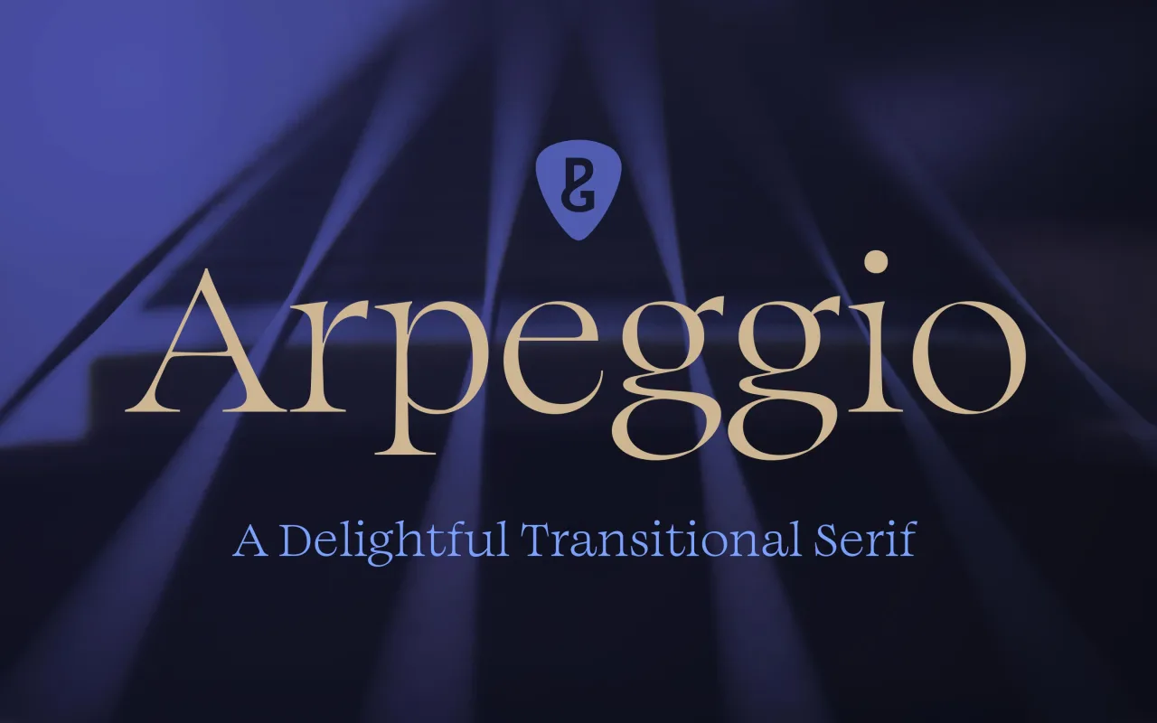
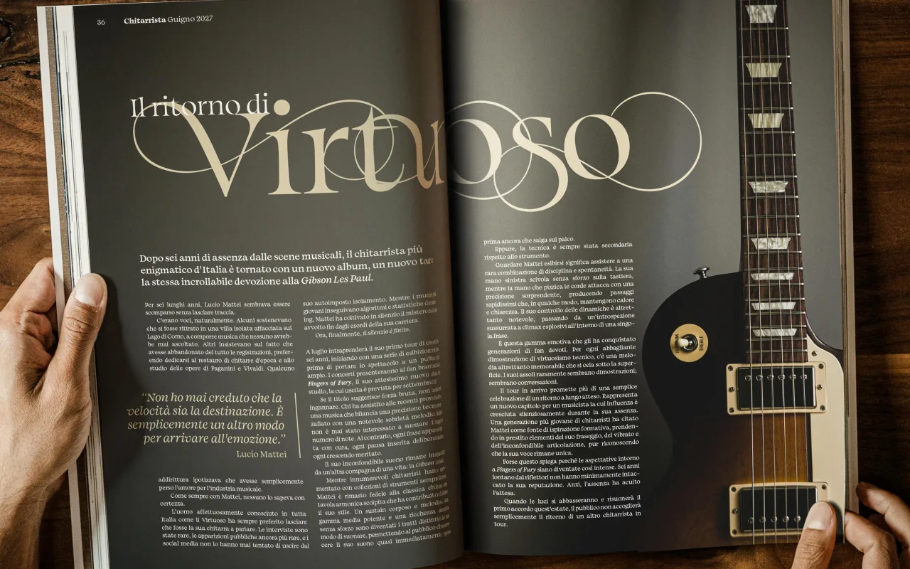
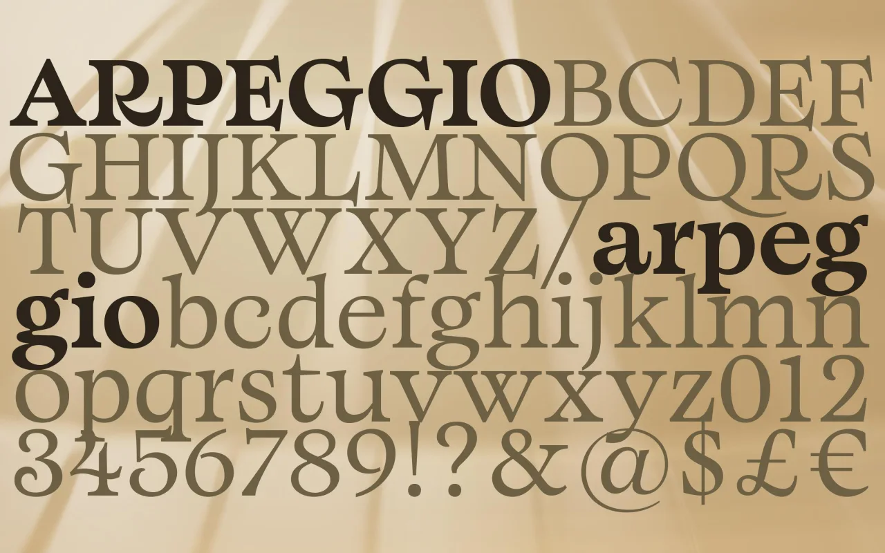
Paulo Goode, whose typeface Raxmus we featured in our May roundup, returns with a typeface that's very, very different. Where Raxmus was flared and stone-carved, Arpeggio is a transitional serif; warm, readable and disciplined. It could serve as a workable alternative to Baskerville; not to mention Caslon, Mrs Eaves, Georgia, Perpetua and Bookman.
Described by Paul as "an original text typeface that balances disciplined rhythm with expressive character", it oozes clarity and confidence in the text weights whilst the Display collection amplifies the characterful nuances with sharpened forms, graceful swashes and exuberant flourishes. A strong choice for books, magazine design or a luxury brand identity.
There are twenty-seven fonts in all across Thin to Black weights, with 500+ glyphs covering all Latin European languages. Variable fonts are available on request.
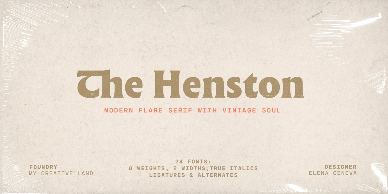
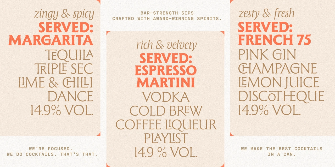
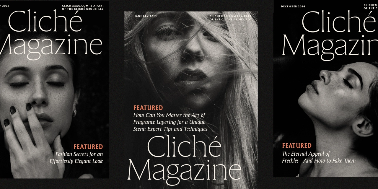
Elena Genova of My Creative Land, whose typeface Differently was featured in our July round-up, returns with a flared serif inspired by the incised letterform tradition exemplified by Berthold Wolpe's Albertus and Hermann Zapf's Optima. The design is subtle enough for display, whilst maintaining legibility at subhead and text sizes.
The companion italics draw on calligraphy, and there's a well-chosen selection of ligatures, swash capitals, alternates and stylistic sets. There are two widths, each with eight weights from Thin to Black, with true italics included in Regular. This would be a good choice for a brand website, a magazine cover or a book cover.
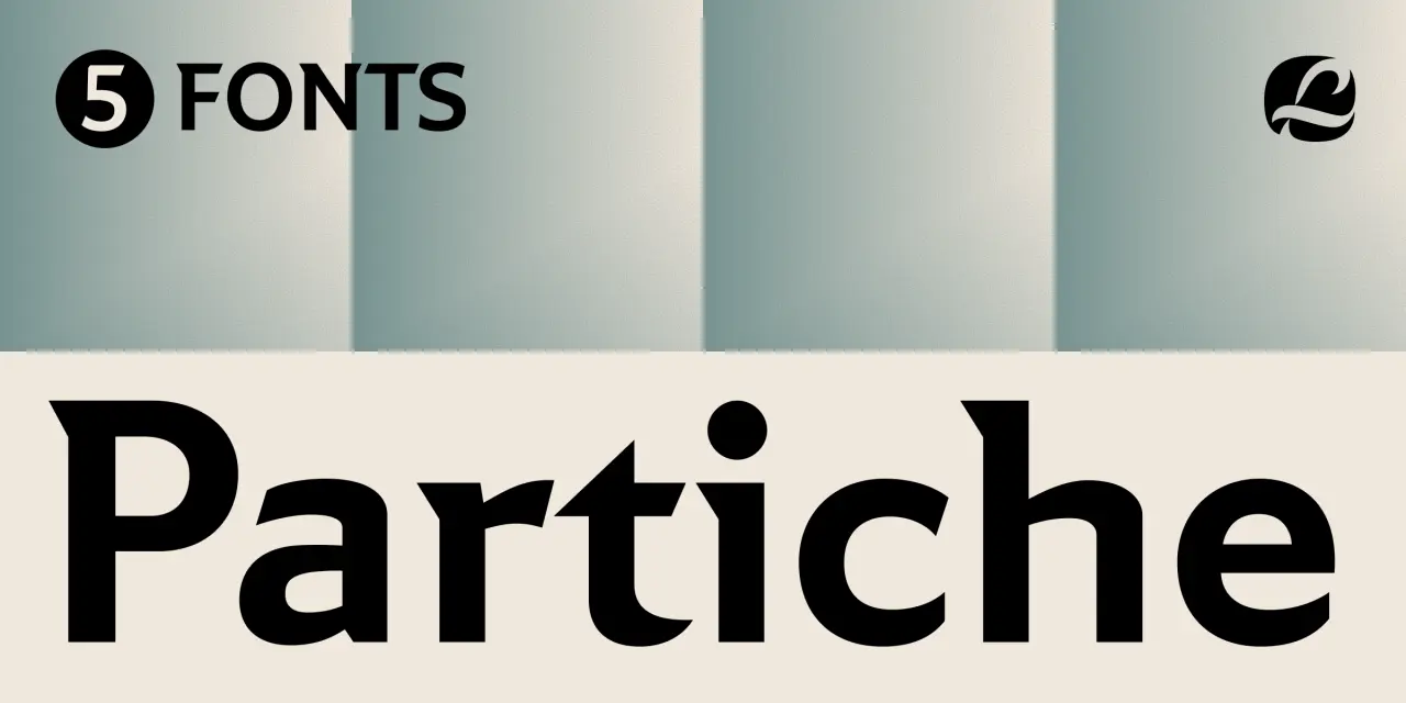
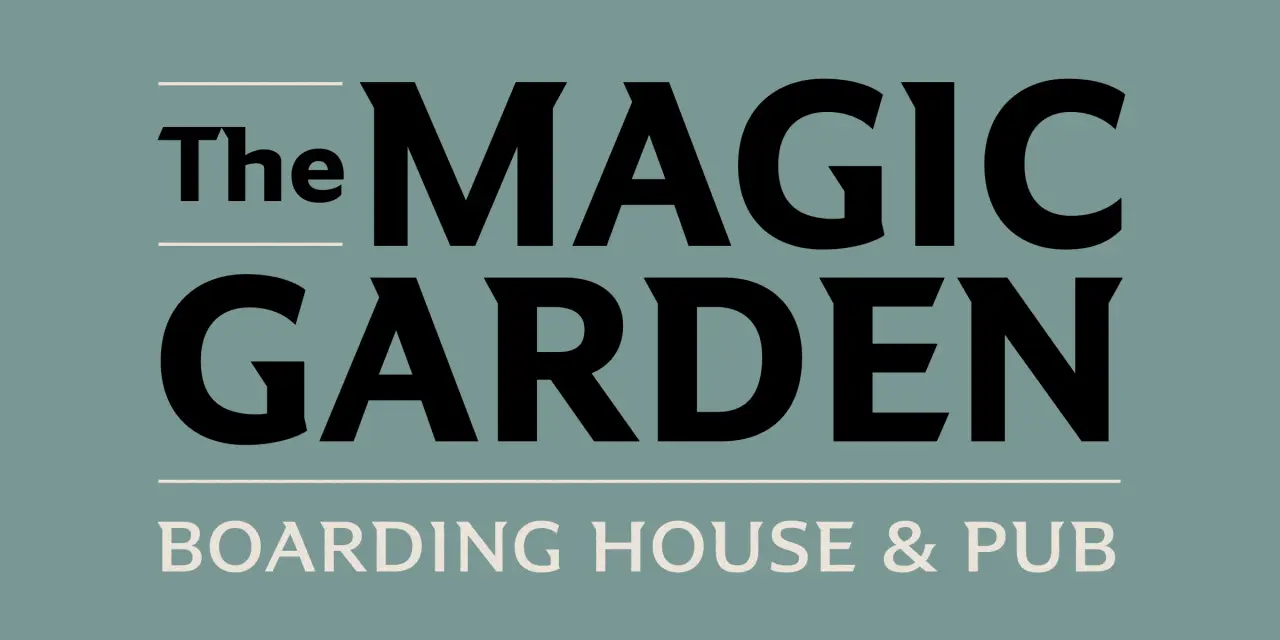
Created by Richard Lipton, who's been designing type for more than 40 years, Partiche is an expressive sans with a calligraphic eye. It was inspired by the graphic sensibility of Seymour Chwast, the Push Pin Studios co-founder whose mid-century work was characterised by wit, warmth and visual intelligence.
The details Lipton takes from that source are specific: wedge-shaped terminals, sculptural spurs, unexpected details. On the surface, Partiche looks monolinear, but closer inspection reveals the calligraphic thinking underneath. Small caps and a purposeful set of alternates make this font a good choice when a design needs both character and utility.
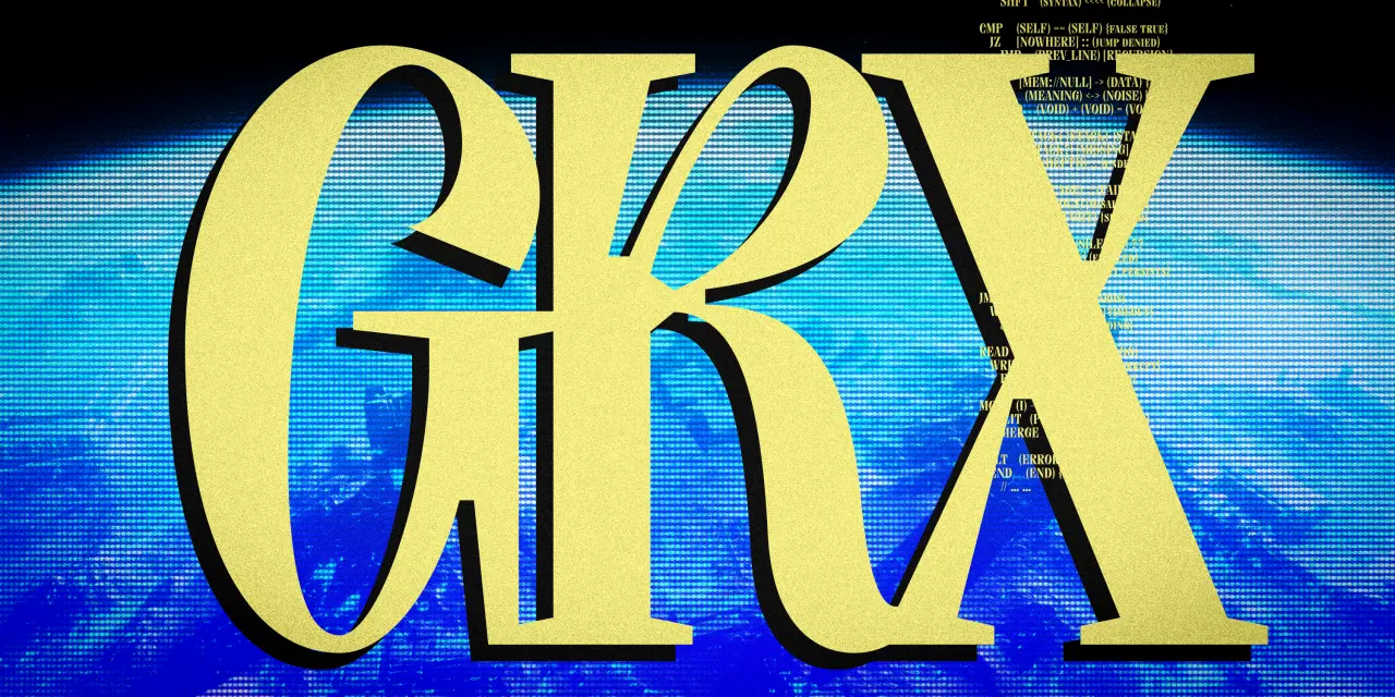
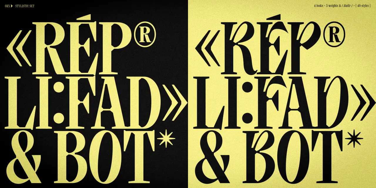
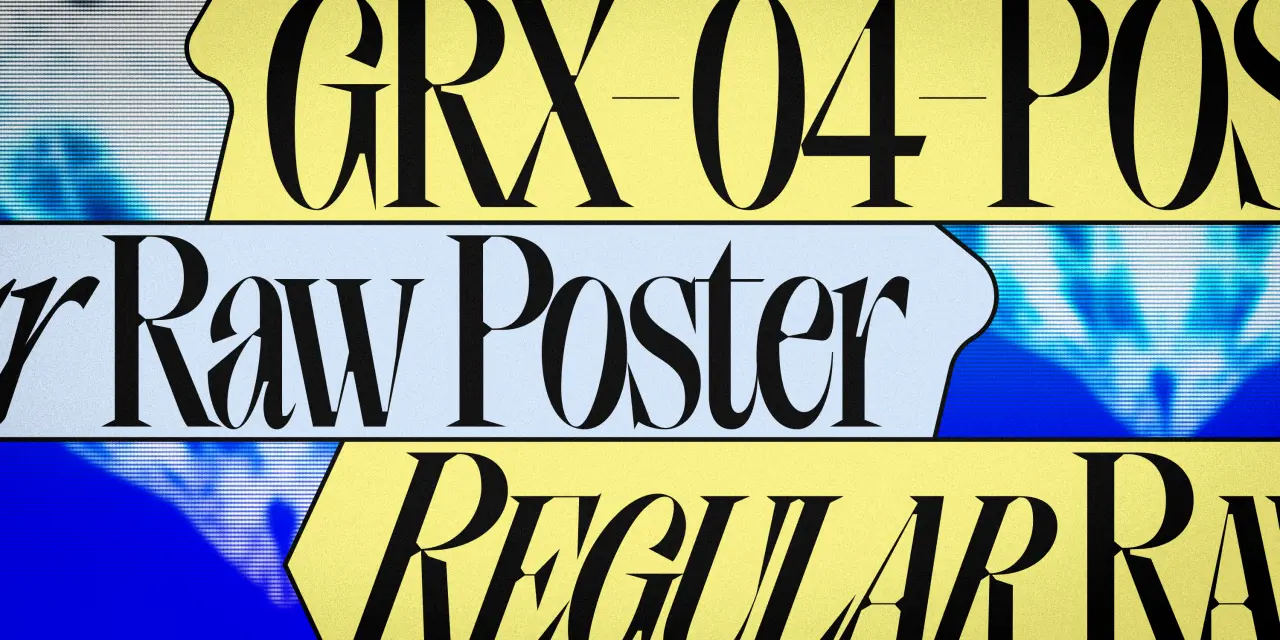
The latest typeface from The Designers Foundry is built across four sub-families: GRX, GRX Raw, GRX Poster and GRX Poster Raw. The base GRX contrasts bold, rugged serifs with controlled strokes. Raw adds rough texture inside the letterforms, giving the type a handmade weight. Poster sharpens the terminals and amplifies the contrast between thick and thin. And Poster Raw combines both directions simultaneously.
There are five weights per sub-family, and built-in stylistic sets and discretionary ligatures for further expressive control: 40 styles in total. The idea is to give creative latitude while retaining a level of formality. The Poster Raw styles in particular have a graphic intensity that would work well in editorial and poster design.
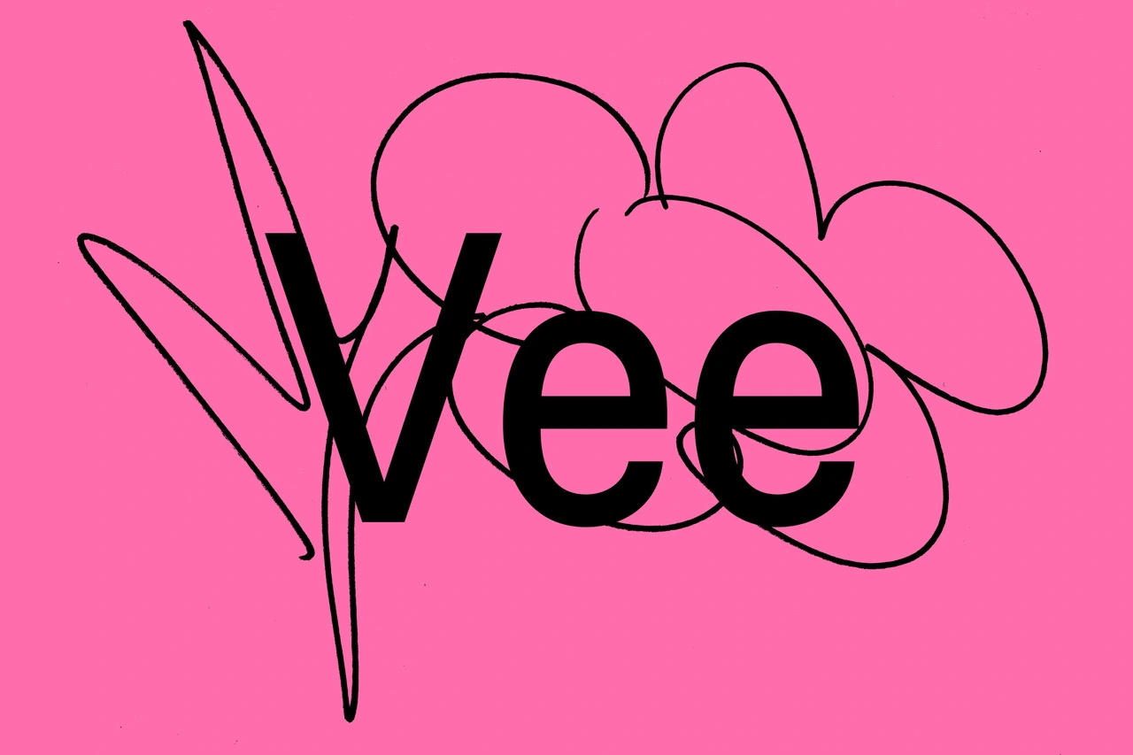
Vee draws inspiration from Venus, a sans-serif typeface family released by the Bauer Type Foundry in 1907 that was popular throughout the first half of the 20th century. Having worked with Venus herself, graphic designer Laura Pappa was eager to develop a typeface that references its distinctive character while introducing new qualities of its own.
A collaboration between Laura and Estonian type studio Tüpokompanii, Vee is described as "Venus' younger, more mischievous sister." To accompany its release, Tüpokompanii published a print companion called "Let yourself be bad at things": a conversation between the foundry and Pappa about the origins of their working process, the development of Vee, and the values embedded in their typefaces. It's a thoughtful pairing of typeface and text, and suggests a foundry that thinks carefully.
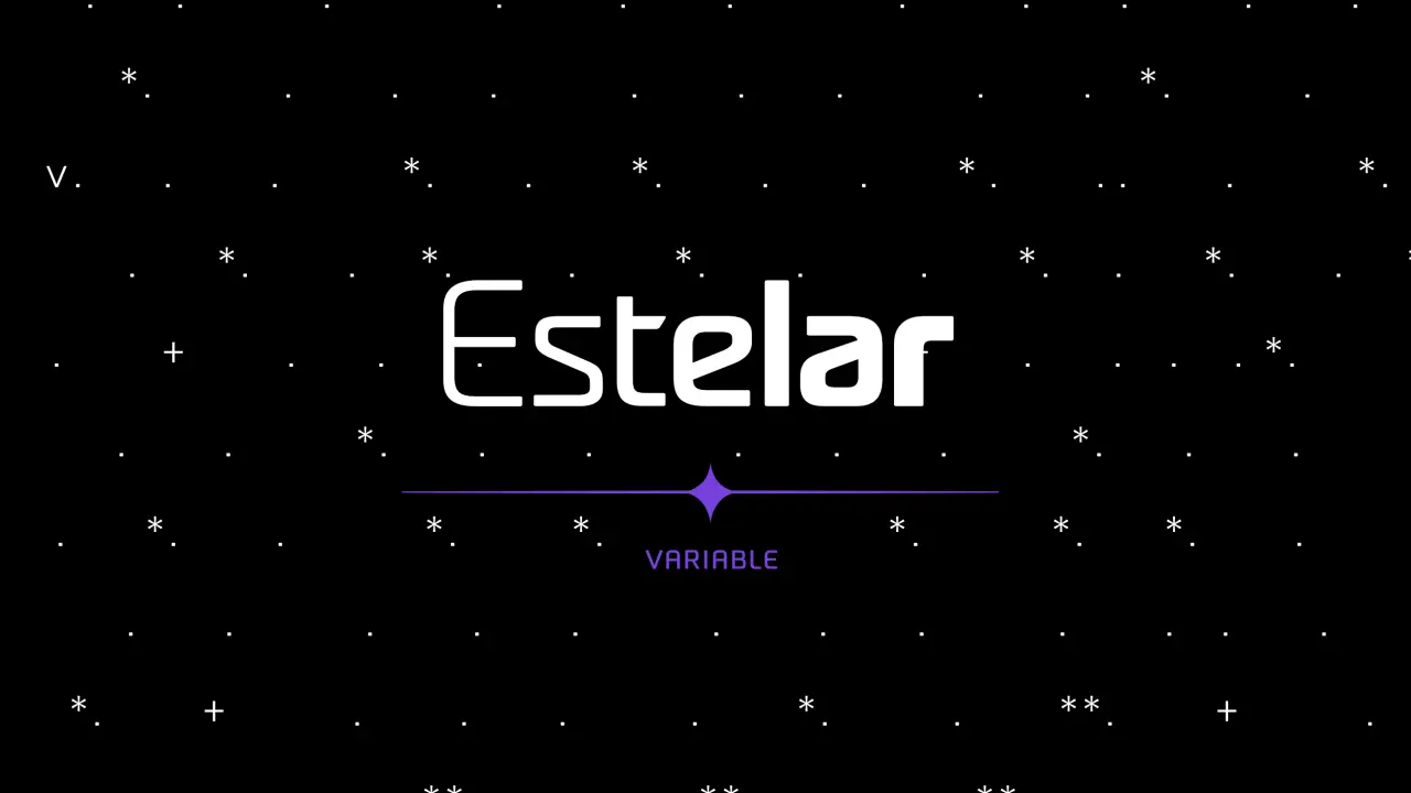
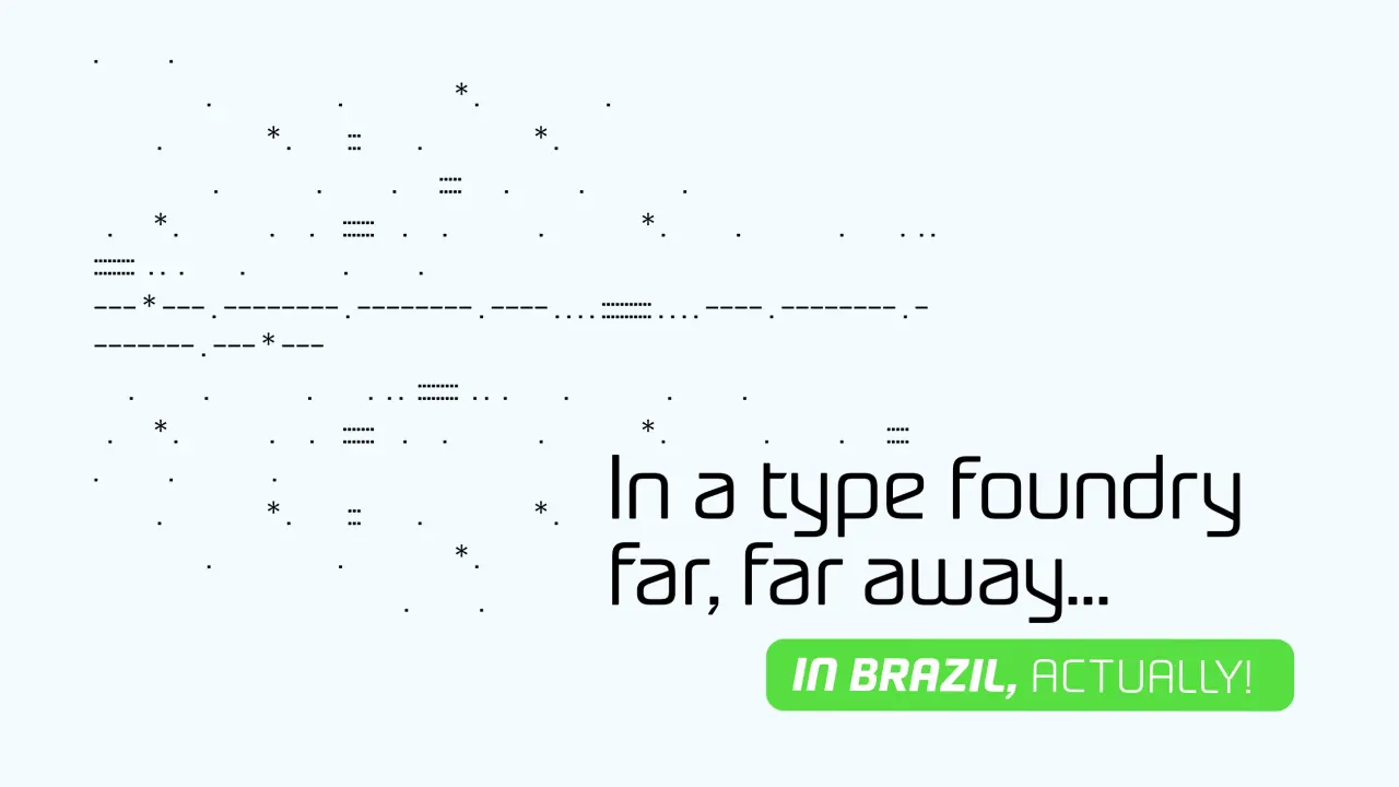
Estelar came out of a sketch. Mauricio Zanon of Zanon Studio, based in Rio Grande do Sul, Brazil, was working on a visual identity project that required a handful of modularly designed letters, and something in those early letterforms suggested a typeface rather than a logotype. Estelar grew from there, developed through the FontePro course from Plau, and ultimately became Zanon Studio's first commercial type release.
The design sits at the intersection of futuristic and calligraphic: technological characteristics softened by a handwritten quality that prevents it from feeling cold or mechanical. A variable axis covering weight and slant, plus 16 individual static weights from Thin to ExtraBold, 400 glyphs, and support for 95 languages give it plenty of range. A good choice for logos, impactful titles and websites.
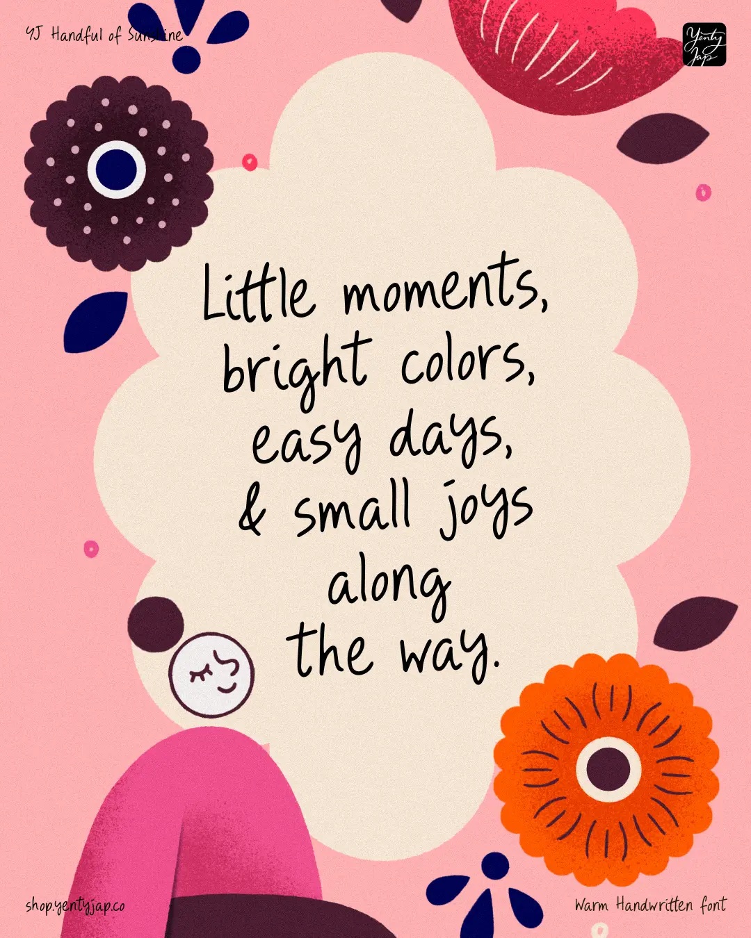
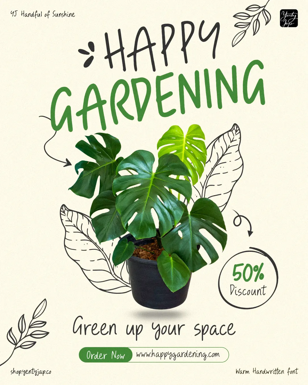
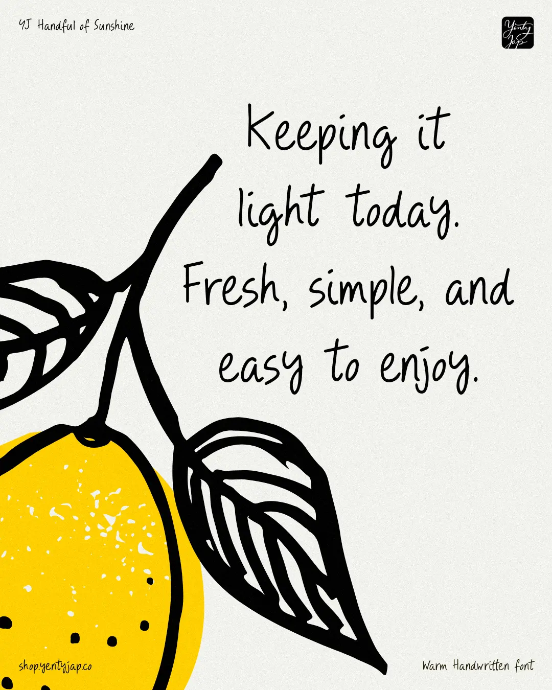
Aussie designer Yenty Jap closes this month's round-up with something welcoming and cheerful. YJ Handful of Sunshine is a hand-drawn display typeface with two character sets (Standard and Stylistic Alternates). It's designed to bring a calm, human handwriting voice into modern branding, and is inspired by everyday writing, journaling and note-taking.
The strokes are light and relaxed, with rounded terminals that keep the texture soft. Rhythm is loose but controlled, giving each word a natural flow without losing clarity. Spacing is open, allowing text to breathe in menus, packaging, and signage. Proportions stay steady across the alphabet, creating a handwriting style that feels warm, modern, and human.
This font would be a good choice for use in hospitality, lifestyle, and boutique branding, and more broadly, for anyone trying to give their designs a warm, handmade feel.
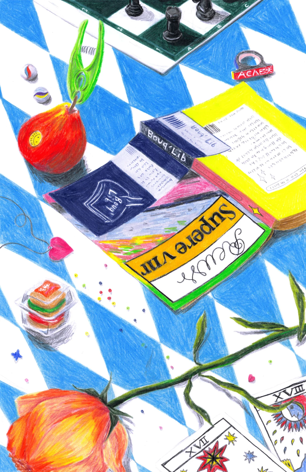
The French illustrator behind Champ Magnétique is taking her hot pinks and oranges from screen to canvas, and finding that how she paints and what she paints both come back to a gentler pace.
There isn't a creative I know who doesn't feel the speed of change right now. The overwhelming need to "step up" and keep going is real. Maybe that's why so many of us are deliberately slowing down, and finding ways to remember why we create in the first place—turning to analogue pursuits, perhaps, or opting for things we can actually grasp.
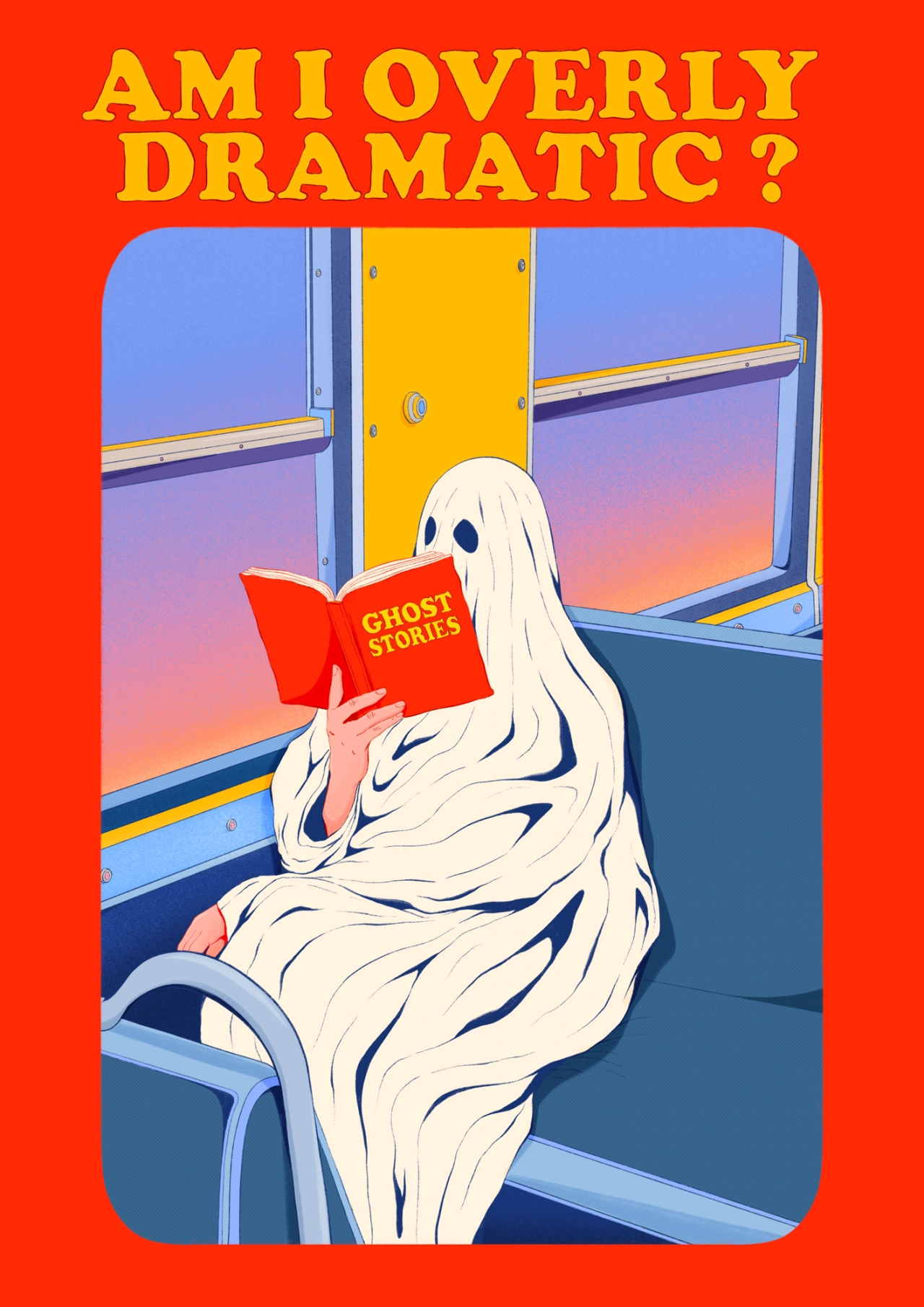
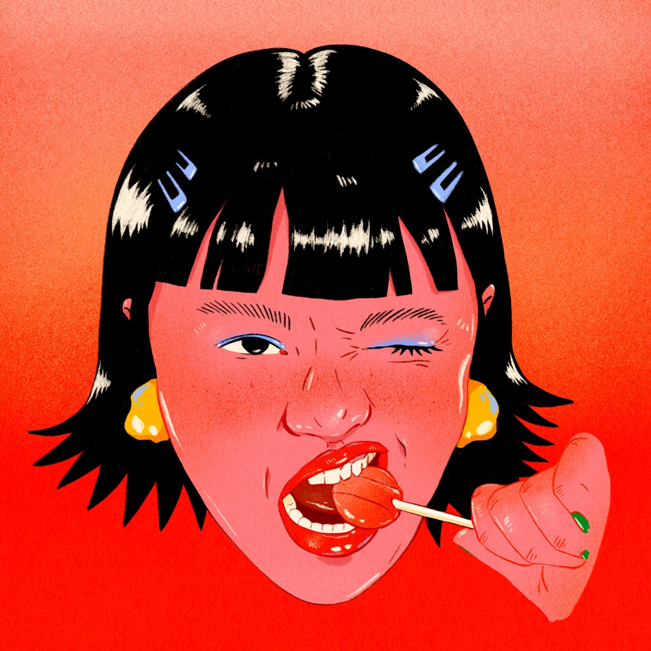
Clara Biel, aka Champ Magnétique, is slowing down in two different ways. The French illustrator draws the everyday places we often rush through, and she's increasingly turning to painting on canvas – a practice that calms her.
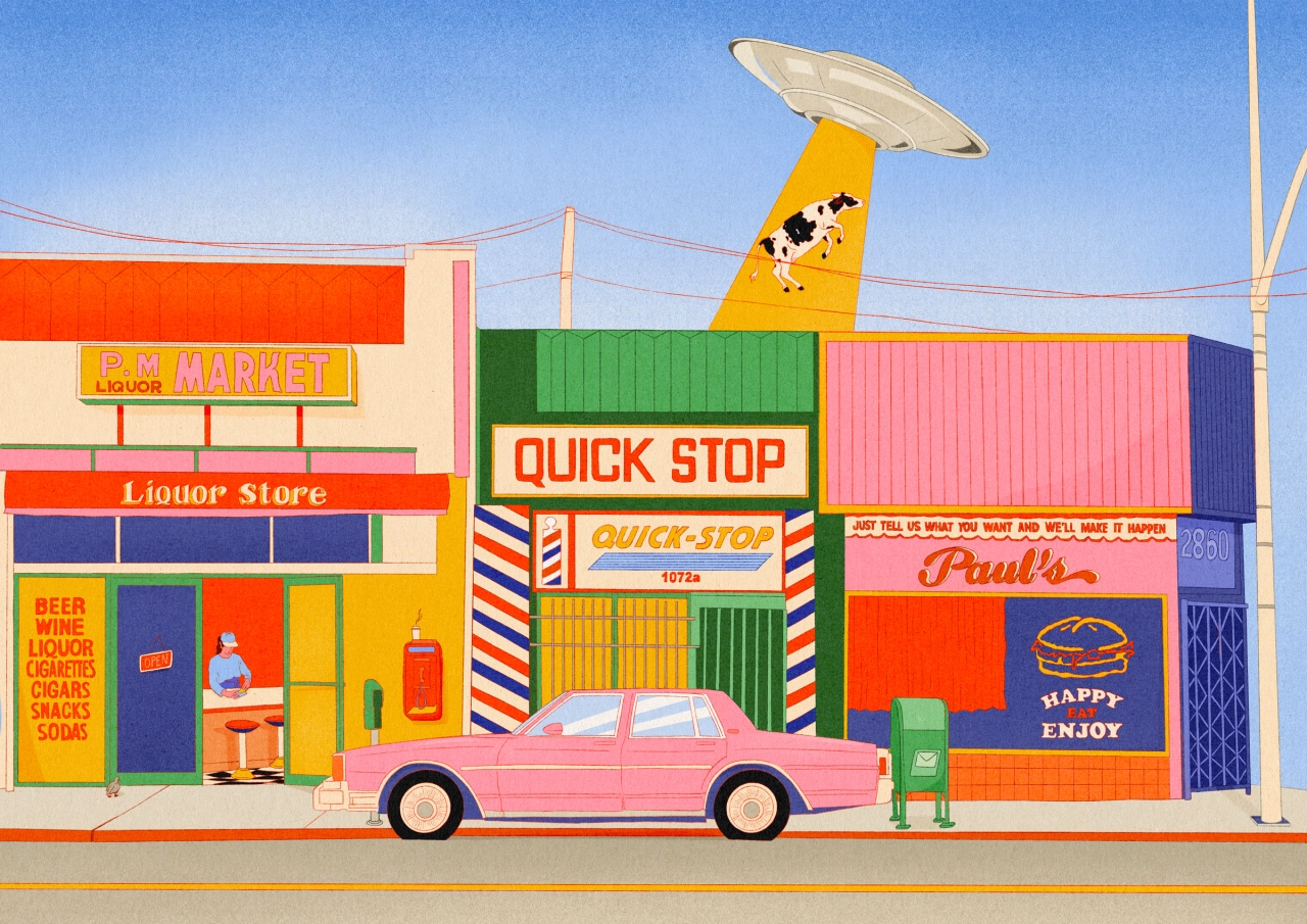
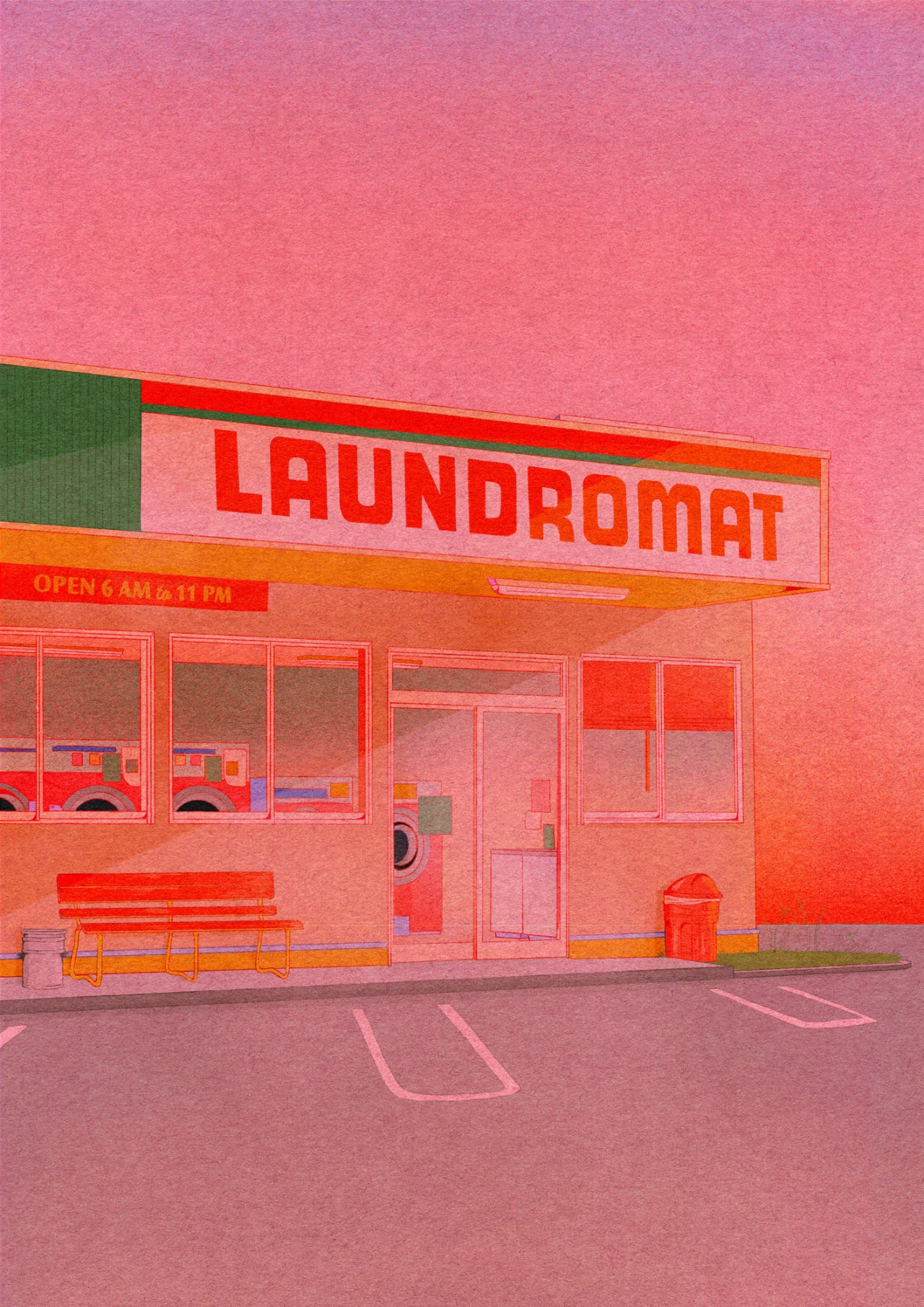
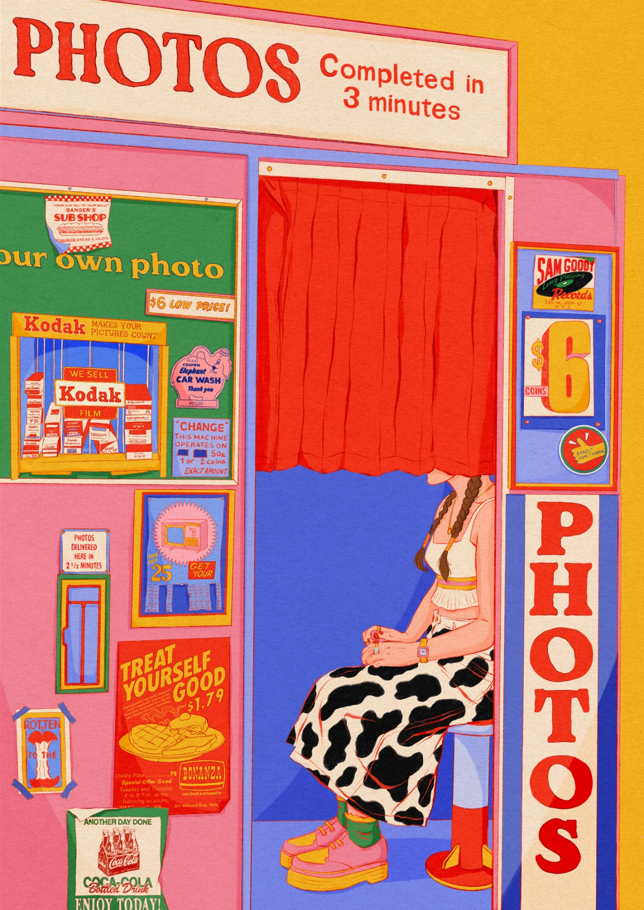
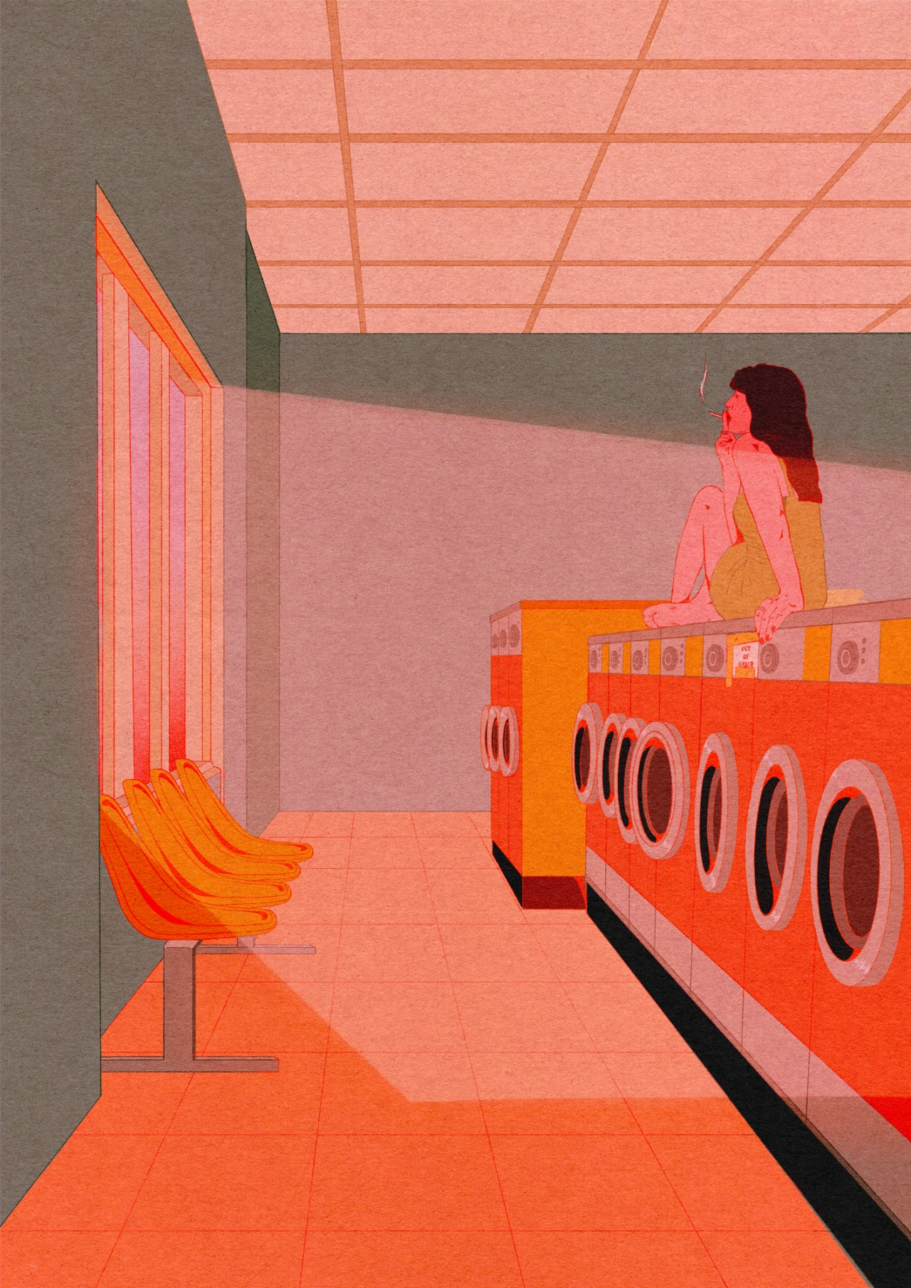
What does she paint? Oh, anything from a laundromat or photo booth to a supermarket or pool hall. "These places feel like real time capsules," she tells Creative Boom. "There is something almost frozen about them, as if they've remained untouched while the world continues to change around them."
Yeah, it makes sense. I yearn for the comfort of familiarity like anyone. For Clara, they're also spots where she can dream up various scenarios. "I'm drawn to the contrast between the ordinariness of these settings and the richness of what might be happening inside," she says. "They are familiar places that most of us have experienced, but we don't necessarily stop and look at them. With my painting, I like to slow things down and give these everyday moments a sort of significance. I then invite the viewer to wonder what's gone on."
What strikes you most about Clara's illustrations is the colour palette. Hot pink, red and orange run throughout, a recurrent theme she says just happened naturally. "I've simply always been drawn to bright, pop colours and to combinations that have a certain warmth and intensity to them."
She puts it down to her love of the 1980s, "the packaging, interiors, shop fronts, and all those slightly artificial, colourful environments", plus the Pop Art of Andy Warhol and Tom Wesselmann, who "could make colour feel almost tangible". And The Beatles, especially the world of Sgt. Pepper's Lonely Hearts Club Band and Yellow Submarine. "That mix of colour, fantasy and a certain playful weirdness really speaks to me," she says.
The same dreaminess runs through her posters for festivals such as La Bonne Aventure and Foreztival. She's not interested in drawing the stage or crowd. She'd rather capture the feeling a festival leaves behind. "The image can then become less of a representation of the festival itself and more like a memory, a sensation, or a fragment of a dream," she says.
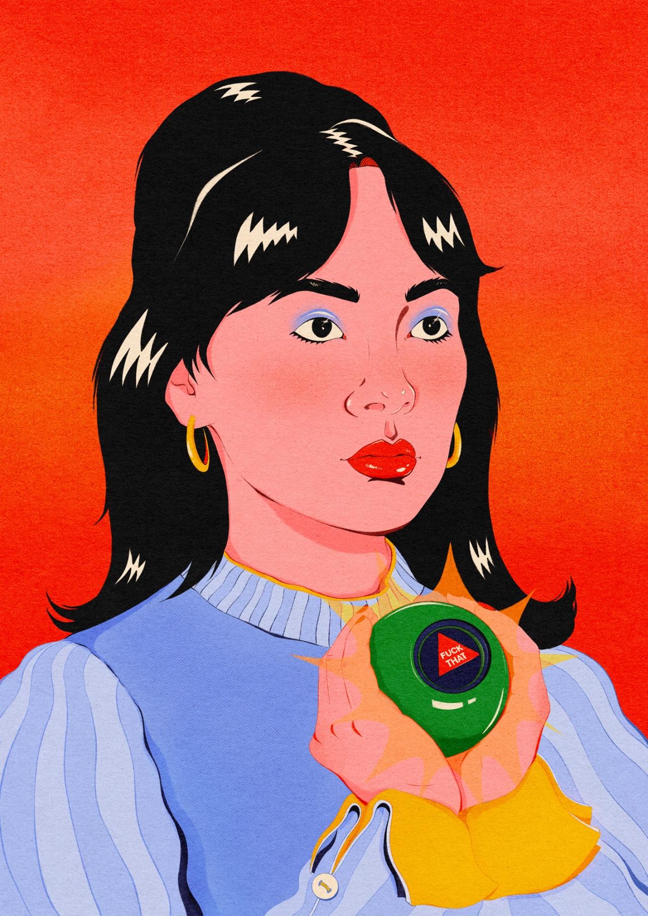
On some of her works you'll notice words. "Keep a tender heart" reads one. "Karma is real" states another. "Am I overly dramatic?" makes me wonder if Clara has read my mind. In fact, they're thoughts plucked from her own life. "There's something comforting for me in putting these feelings into an image, because even though they come from a very personal place, I know that other people might recognise themselves in them too," she says. "Making these images can feel quite cathartic, a way of giving a shape to a deep or complicated feeling, and somehow getting it out of myself."
It's nice to know she's happy to laugh at herself, too. "Some of these phrases are deliberately dramatic or slightly ridiculous, and I like not taking myself too seriously. I think humour can make something personal feel much more open and relatable."
So why pick up a paintbrush now? Is she hankering after simpler times like the rest of us? "I've been painting since I was very young," she says. "It has always been a way for me to escape, to get lost in something, so I'm really happy to be reconnecting with that part of myself now."
Painting also gives her something digital work can't. "Everything exists on a screen," she continues. "Turning an illustration into a painting is a way for me to make the work more tangible, to give it a physical presence and leave a trace behind." She sees her digital illustrations "almost as sketches, while the painting becomes the final form of the work."
And then comes the calm. "Being in front of the canvas, mixing the colours, making decisions with my hands – it becomes a completely different kind of experience. Time seems to slow down, and for a while I can really disconnect from everything else. It feels like a moment outside of time." Is it just me who let out a big, long breath then?
I didn't ask Clara about AI. She brought it up herself when I asked about the hardest part of freelance life. Mostly, it's the usual instability. "There's always a little voice in the back of my head wondering if I'll still have a client tomorrow," she says. But with AI, she's not worried. "I feel that people are increasingly looking for things that feel human and made by hand," she says. In France in particular, she's meeting more and more clients who want to work with artists to create something unique rather than generic. I mean, come on, it's obvious when someone has used AI, and we all know how bad it looks for the brand.
"There's something quite wonderful about seeing people value the human touch behind an image again—all the personality, imperfections and choices that come with an artist's hand," she says. I'm seeing this shift elsewhere, too. The mass market doesn't trust AI-generated stuff and dislikes anyone who uses it.
"It's scary, though, because we don't know what's going to happen next," she says. "But there might be lots of unexpected opportunities and new directions to play with. I think that's what keeps me excited."
In her grad film, a clay squirrel gets so distracted making tea that she forgets the cake completely. Here, the animator explains how live-action reference, a multiplane set, and lots of handmade clay brought the story to life.
You see a squirrel baking a cheesecake. Mid-recipe, she reaches for the sugar and pours it into her tea instead, without quite noticing. She sips it, enjoys it, and completely forgets what she was meant to be doing, until the oven timer goes off and she remembers: there's no sugar in the cake. That's the plot of Suuugar!, Qiaoyu Liao's graduate film, and before you ask – yes, it's supposed to be utterly relatable. And it made me think of the many times I've nearly, and wholly, poured coffee into my yoghurt bowl. "The idea came from something very simple: how easily we can get distracted by small things, even when we're in the middle of doing something important," she says. "It's something I recognise in myself a lot, and I wanted to turn that very ordinary experience into a playful story."
Liao is a stop motion animator from China, though animation wasn't her starting point. She studied traditional Chinese painting for her undergraduate degree in Shanghai before moving to London for an MA in Character Animation at Central Saint Martins, where she first encountered stop motion and became hooked. "There is something really special to me about bringing something handmade to life frame by frame," she says, "the physicality of the materials, the imperfections, and the fact that everything you see on screen has existed and been touched in the real world."
When it comes to her inspiration, it usually comes from observations in everyday life and from "looking inward at my own habits, emotions and experiences". She adds, "I'm often drawn to small, ordinary moments that might seem insignificant at first, and I enjoy finding something playful or slightly absurd within them." This is why Suuugar has that familiar feeling to it, because it's influenced by the real, human-centred things that happen to, well, every human. And these moments are exaggerated just enough to become funny and rouse a little smirk in us all.
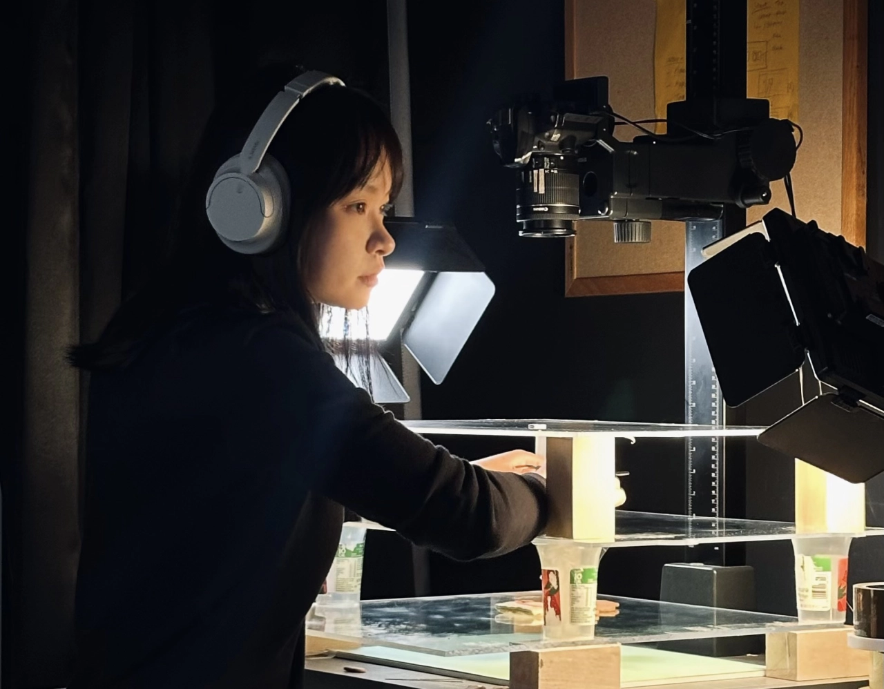
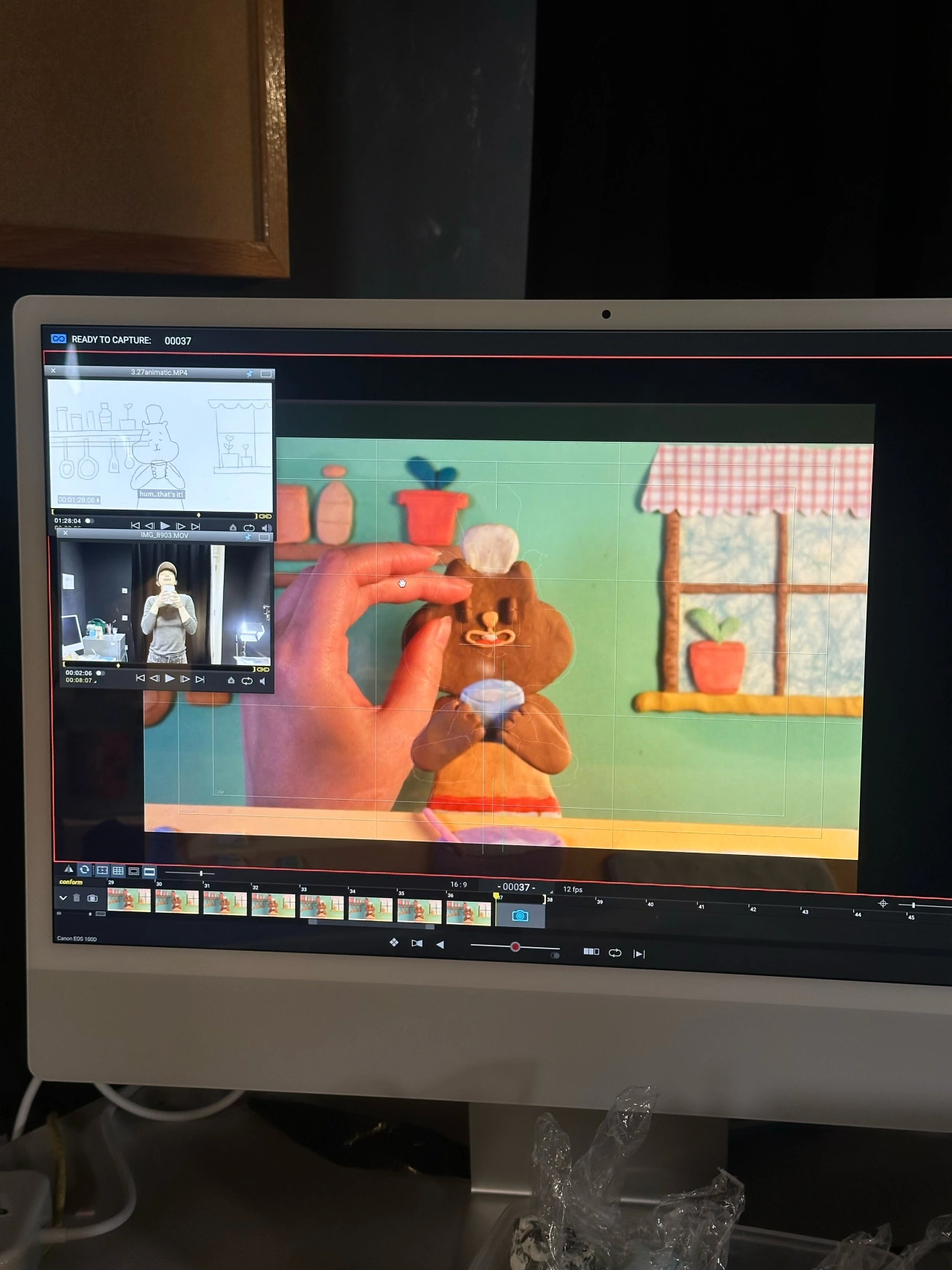
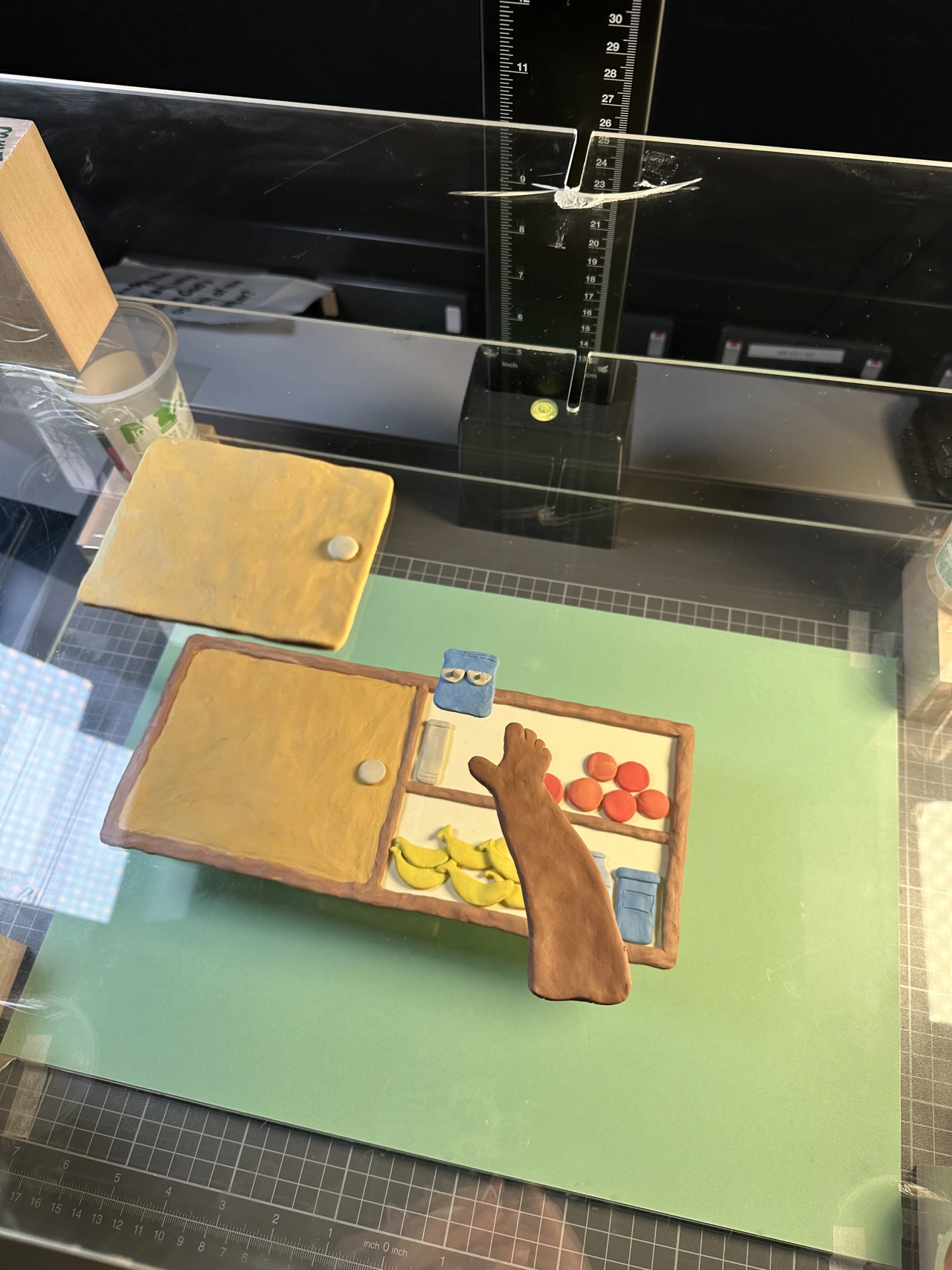
Qiaoyu on set with the multiplane setup for Suuugar!Animating Suuugar! in Dragonframe, using my live-action reference and animatics as guides for the character performance.BTS of the multiplane setup for Suuugar!, with props arranged across different layers.
As for the process, Liao shot everything from directly overhead, a top-down approach she'd first tried in an earlier short, Jamming!, which gives the film a flat, illustration-like feel. "I really enjoy working this way because it allows me to preserve the tactile quality of physical materials in stop motion, while also thinking about composition, colour and the relationships between different elements almost as if I were creating a painting." To get depth without losing that flatness, she built a multiplane set – background, character and foreground props arranged across separate transparent layers, physically apart from one another but shot from the same angle above. "There is physical distance between these layers, which creates a subtle sense of depth and dimensionality while still maintaining a composition that feels quite close to a flat image. I really enjoy this balance between a two-dimensional image and a physical three-dimensional space."
Clay was the obvious material choice, chosen specifically for what it won't hide. "I love the handmade traces that clay naturally retains, as well as the subtle – and sometimes exaggerated – changes that come from reshaping it frame by frame. It doesn't have to remain perfectly smooth or consistent in every frame, and for me, those small imperfections are part of what makes stop motion so charming."
Because the story itself is so simple, the film lives or dies on performance. Before animating a single frame, Liao filmed herself acting out nearly every shot as a live-action reference, studying her own timing, pauses and the real-life reactions that happen when our minds start to shift – which is then simplified or exaggerated depending on the character and rhythm of the animation. "I wanted the humour to come primarily from the character's behaviour and performance itself".
So when you're watching Suuugar!, Liao wants her audience to get distracted right alongside the squirrel, and to only catch up to what's actually going on when she does. "Beyond the humour, there is also something recognisable in that experience," she says, "how easily instant gratification can pull us away from things that might matter more."
"I think that's what I enjoy about storytelling: starting with something personal and specific, and hopefully finding a feeling in it that other people can recognise in themselves too."
The Melbourne-based motion designer discusses procedural software, editorial deadlines and why perfectionism is the enemy of good work getting seen.
"You can look at anything around you and wonder how you could interpret this in design or motion," says Rob Farmer. A walk after dinner, a flock of gulls, the static hiss of a TV screen – all of it gets filed away as potential creative material. "I often like to find patterns in nature and try to think of them as design algorithms or codes, such as how repeating shapes and forms can mimic those patterns found in nature."
Growing up in Geelong, an hour from Melbourne, Rob didn't start university until he was 27. Before that came what he calls "a lot of gap years": a couple of years in London, a ski season in Utah, stints in retail while he tried to work out what to do with his life. "I think I was always interested in design and illustration and branding, but I didn't know it was something you could study," he says.
Once he found it, though, it stuck – he landed an internship at a brand agency in Brooklyn straight after graduating and stayed three years. It was there, frustrated at not always getting to do what he wanted on client work, that he started posting his own experiments on Instagram. "I was headstrong about creating space for my work that was outside the bounds of client work, agency hierarchy, and feedback," he says. "It's helped me to better understand design as my hobby, and design as my job."
When he's nestling away at work, it will follow a more loose, low-pressure system. Typically this will mean that when an idea arrives, he will grab his laptop or notes app and get a sketch down – "it could be a super rough five-minute sketch, or it could almost be finished in an hour" – then screenshots it into an Instagram planning app, where it sits in a queue of incomplete ideas until he's ready to finish it.
"If I didn't have this kind of visual queue of unfinished sketches, I'd forget about them," he says. It's also become a working library of sorts, and when a brief lands that needs a certain feel, there's often something in that queue that already fits. For the actual making side of things, he will usually reach for the Cavalry App. "I like the procedural nature of it," he says, "seeing how digital parameters like noise, randomisers and more can mimic those patterns in nature."
When asked about his favourite projects of late, there's one piece he keeps coming back to which, perhaps unsurprisingly, started as a rough sketch. This piece is an illustration for a New York Times Book Review piece on AI and the em-dash, commissioned by Matt Dorfman. "The original sketch for the piece was this very loose half-baked idea of an em-dash tattoo," Rob says. "Matt really saw the vision and pushed me to make it better and better." He's since illustrated a New York Times Magazine cover and a piece for the Design Museum's Future Observatory Journal – a full-circle moment for someone who loved the museum while living in London.
Above everything, Matt hopes he's able to inspire others and wants people to stop sitting on their own ideas. "I hope there's some inspiration in there," he says of his portfolio, "maybe others can see something in there and use that as a starting point for an idea of their own. Through sharing my work, I hope I can encourage people to share their work – I think there would be a lot of great work out there that never gets shared because of perfectionism.
"I'm not saying all work needs to be shared or made public, and it's probably important to have some work that remains intimate, but I think perfectionism gets in the way of a lot of great work being put out there in the world."
It's not about you; it's about a broken business culture. Our latest Dear Boom dilemma looks at how to tackle ghosting from clients.
You've spent a lot of time, effort and emotional energy forging a working relationship. It's all going well. Then… nothing. The founder who said they loved your first concept simply vanishes. A marketing lead who's briefed you thoroughly and has promised a purchase order suddenly leaves you high and dry.
It's a horrible situation to be in. From a financial standpoint alone, it can be crippling. But more fundamentally, you also start to doubt yourself. Was the quote too high? Were the concepts lame? Did they find someone cheaper, or use AI? Did you have some food on your face during the Zoom call that everyone was too polite to point out?
Horrific, right? But here's what we've learned from our community on LinkedIn and Instagram. In 2026, ghosting has become systemic. So you shouldn't take it personally. Because it's not really about you at all.
Why silence has become the default
"I've seen a lot of this so far this year, and it can feel really hollow at times," says director and cinematographer Rob Pinney. "I'm still getting a good number of approaches for new projects, but many more of those now end up with a dead email chain than before."
So what's behind the trend? "There seems to be a lot more budget hesitancy right now," Rob suggests. "And I suspect some of that is to do with clients weighing up that potential spend on video production, in my case, versus what they could do with it elsewhere, including with AI tools."
Film director Farai Dube has had similar experiences. "It's a lot of stop and start," he says. "When you're at the start of the conversation, there's actually a budget, but that's in jeopardy depending on sales and generally how much money's coming in. I get that: the part that's frustrating is keeping you on the hook. I'd rather have clarity upfront."
Yet it's not just cash-strapped clients who are guilty of ghosting. Creative director Rich Holt, for instance, complains about "recruiters who appeal for specific people to contact them—even though they're supposed to know the industry and have CVs on their desk already—and then just never reply." Director and lecturer Luke Tonge, meanwhile, calls out: "folks not replying when you invite them to speak at an event. It can hold up planning for weeks and even months."
So why does ghosting seem to be getting so much worse these days?
The fear factor
Graphic designer and photo retoucher Sandrine Bascouert reckons there's something deeper going on than just laziness or poor organisation. "I think some people are afraid of communication as a whole," she says. "Ghosting has become a way to avoid normal conversations where there could be feelings hurt and disappointment."
That certainly chimes with my experience as a member of Generation X. When I first entered journalism in the 1990s, almost the entire job was phoning people. As long as you were polite and respectful, everyone was happy to chat.
By around the mid-2000s, though, I noticed that many creatives under 30 were screening their calls and wouldn't pick up if they didn't know the caller personally, even if they were actively trying to promote themselves and their work, which never made any sense to me.
Eventually I admitted defeat, and switched to email. But by the mid-2010s, many creatives were keeping their emails private—despite, again, ostensibly wanting self-promotion—and I had to start relying on social media DMs instead.
In 2026, many of those creatives are now seniors and CEOs. So it's no surprise to me that some might lack the ability to have difficult conversations, and not be willing to put in the emotional labour when times get difficult. I don't wish to generalise about an entire generation, of course. But still.
Good reason or bad actor?
Poor communication skills, though, are only one reason for ghosting: there are plenty more. If we're being generous, for instance, we might assume that there's been something like a family emergency, and the other party just doesn't have the capacity to even open their inbox right now.
At the other end of the spectrum, some people can just be dicks. We've all heard of companies who interview people, ask for their ideas, and then simply steal them. There was never any job, freelance work or collaboration opportunity in the first place. It was all a scam.
Then there are those who sit somewhere in the middle, who aren't malicious, but just fail to cope. That doesn't help you, of course. As designer Nicholas Robb points out: "It starts to feel unfair after you've done a couple of calls with the stakeholders, bordering on consultation to help them scope it up. It would take 30 seconds to email back and say 'not interested + a reason why'."
Yet as an entrepreneur himself, he can also empathise. "I think business owners in particular are just so overwhelmed these days that they can't afford the time or mental space to do even that," he reflects. "So I try not to take it personally."
How we should respond
Other than not beating yourself up for being ghosted, though, what can you practically do?
As a rule of thumb, designer Alexander Clark has developed a script. "After two or three of my emails go unreplied, I write this", he says, "Since I've not heard from you, I'll be pausing this and moving forward with other projects. Please let me know when you'd like to proceed or if you've changed priorities." It usually yields a response within a day."
This is a good strategy because it removes all ambiguity. You've stopped chasing them (giving them the power) and are about to close the door (giving you the power). They have no choice but to make a decision. At this point, silence and doing nothing becomes a decision in itself.
And if that's what happens? Then move on, feeling empowered that you took control of the situation. And remember: their silence is not a poor reflection on you; it's a poor reflection on their lack of professionalism and communication skills.
Setting boundaries upfront
Ultimately, prevention is always better than cure. So if you want to avoid getting ghosted, it's always good to set boundaries upfront, such as a deadline for responding to proposals. That might seem a little overbearing, but remember that clients and employers are often super-busy, and a deadline can actually be helpful for them too.
Content creator Jacob Elias Nurse offers a further suggestion: have a lot of plates spinning. "One thing I've learned from my nine months of being a full-time freelancer is that keeping busy helps you not worry too much about replies from companies that want to dangle a carrot in your face," he explains. "If you keep grinding at your craft, the money will follow."
He even finds a way to frame ghosting as a positive. As he puts it: "Their disrespect isn't a reflection of your craft or your quote. If anything, it helps you weed out who you want as a client and who you don't want as one."
Founder and creative director Kirsten Murray agrees. "A person who ghosts you is not someone you want to work with," she says. "Mutual respect and open communication make for the best creative partnerships."
So maybe that's the main takeaway. Ghosting sucks, for sure, but it's not necessarily a calamity. In fact, in the long term, it could be a good thing: saving you from a nightmare client and freeing you up to find a good'un instead.
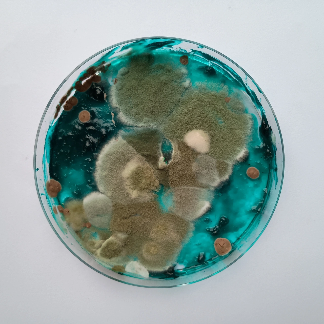
Thibault Barillon of Robocobra Quartet explain why he grew petri dishes of fungus to illustrate their 100-track release.
When I was a student, I shared a room with a lovely bloke, but he did have some unsavoury habits. For instance, he had a pint glass by his bed and his ambition over the course of several weeks was to gradually fill it to the top with his own phlegm (he was a heavy smoker). I can't remember exactly how far he got, but it was pretty far advanced. (My brain seems to have blocked out the details, which is probably a sign I needed psychic protection at this point.)
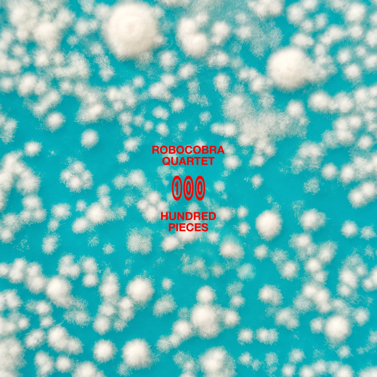
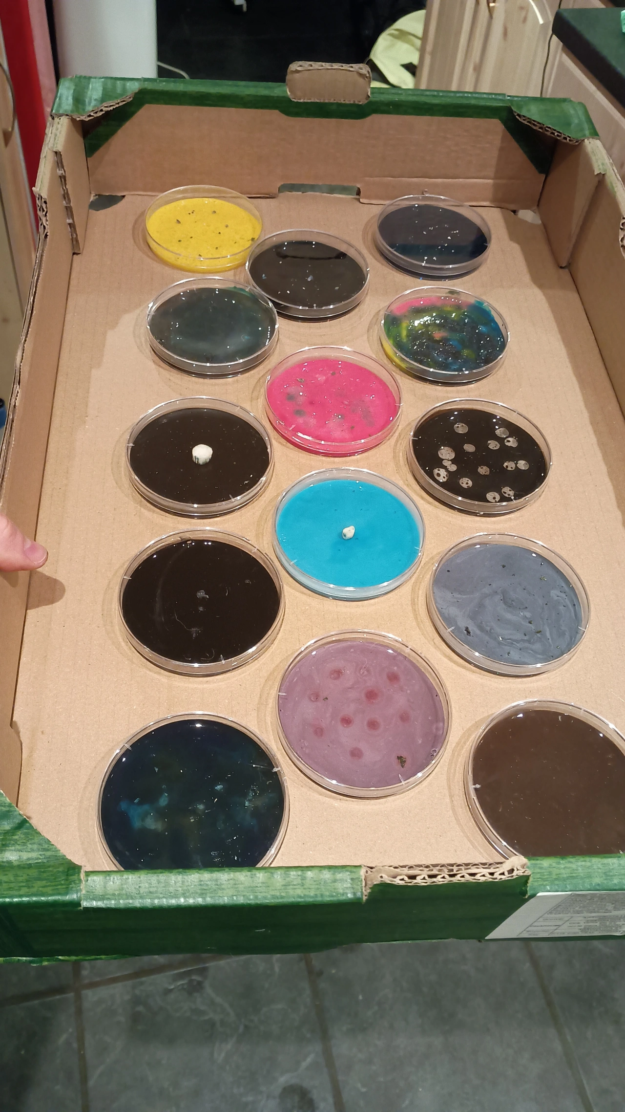
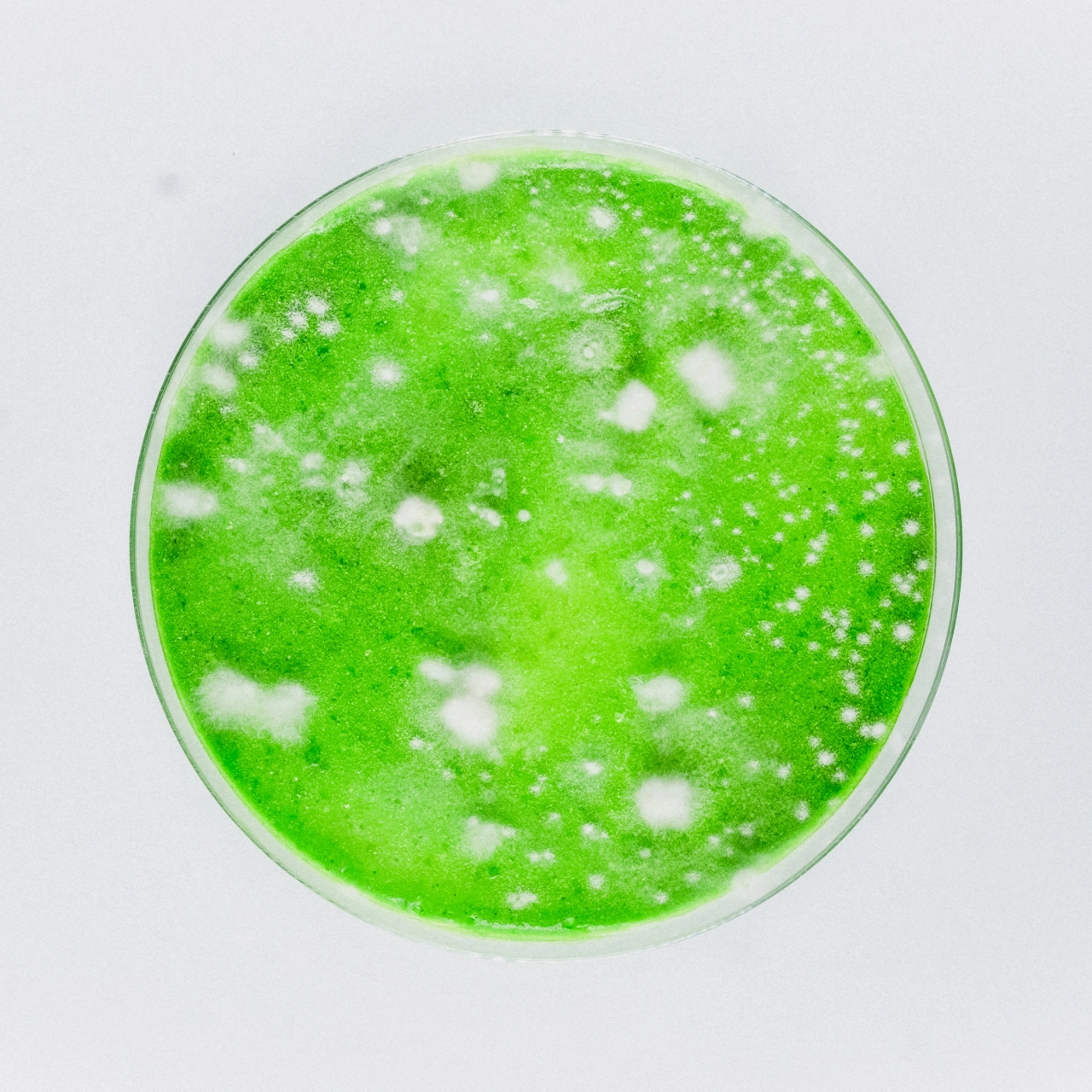
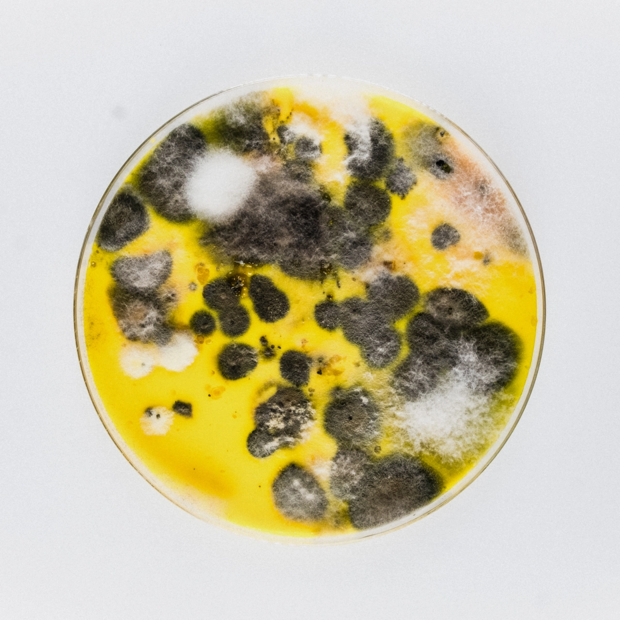
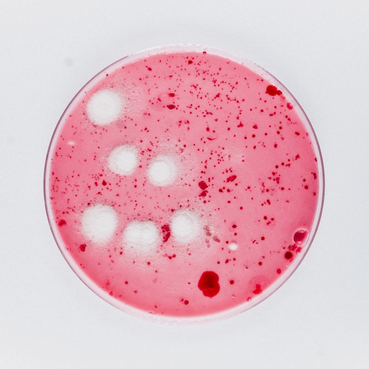
So when I first saw the artwork for Belfast group Robocobra Quartet's 100-track album Hundred Pieces, my mind immediately went to unpleasant places. But thankfully, it turns out the contents of those images didn't come from the band members' bodies; they were produced through something of a home science project.
Robocobra Quartet, whose unique sound combines influences from jazz, hardcore punk and contemporary classical, was inspired to create the 100-track, five-hour record by Serbian artist Marina Abramović, whom the Evening Standard described as "perhaps the single most important figure in performance art". So it seems appropriate that they took an equally experimental approach to the cover art.
A dish served cold
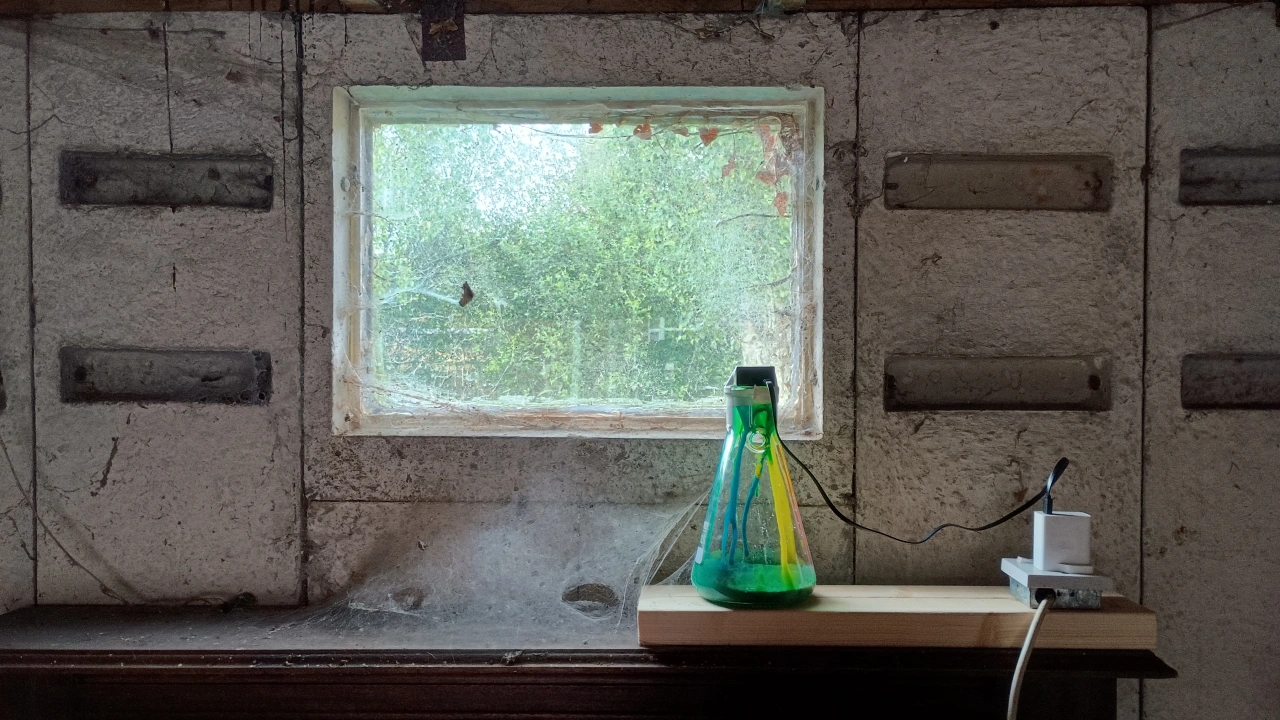
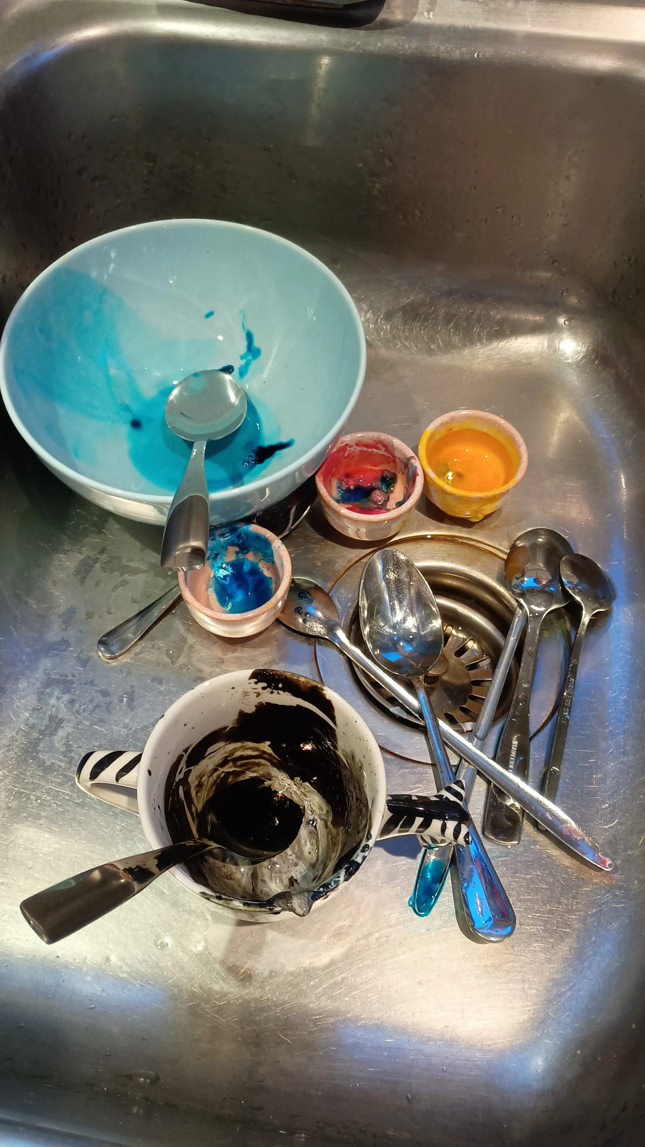
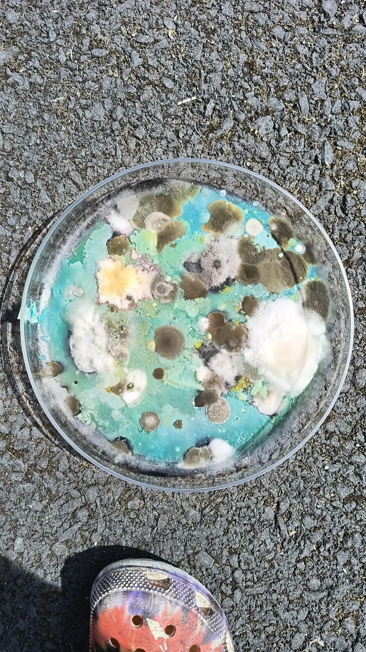
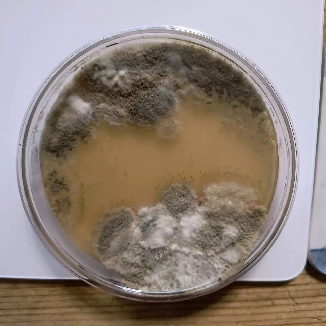
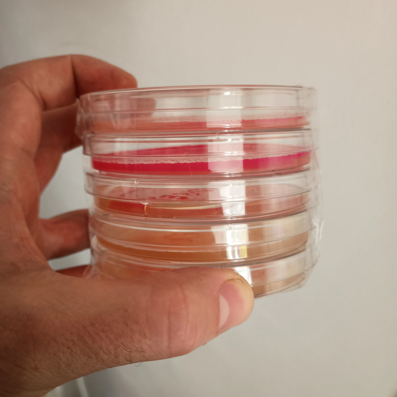
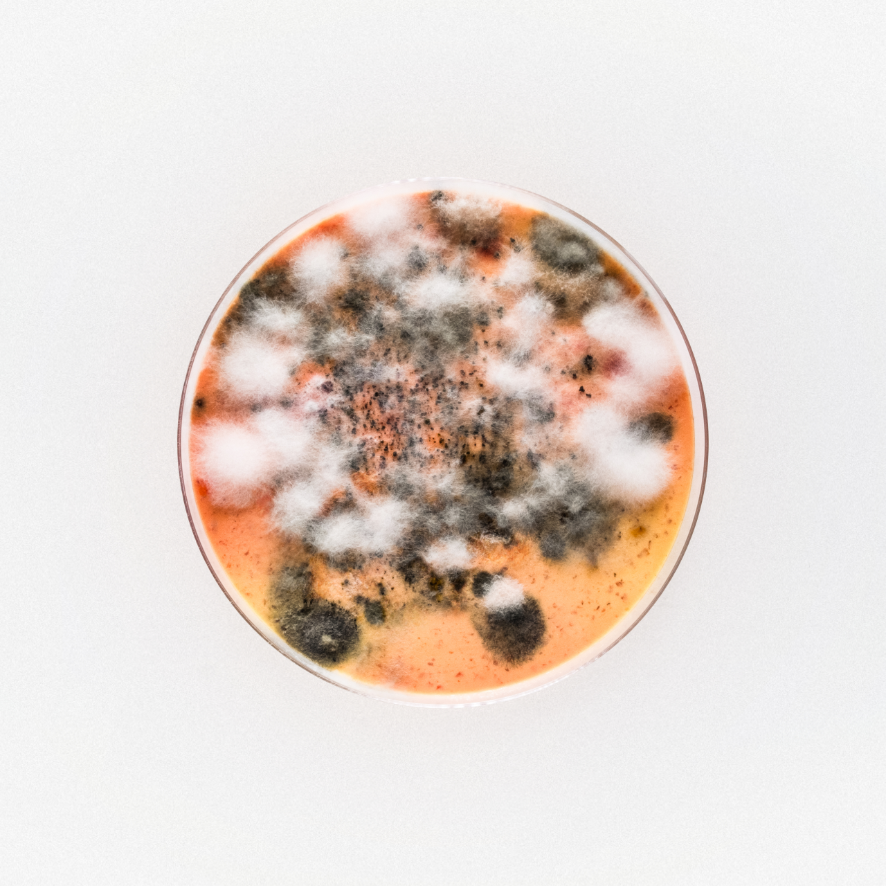
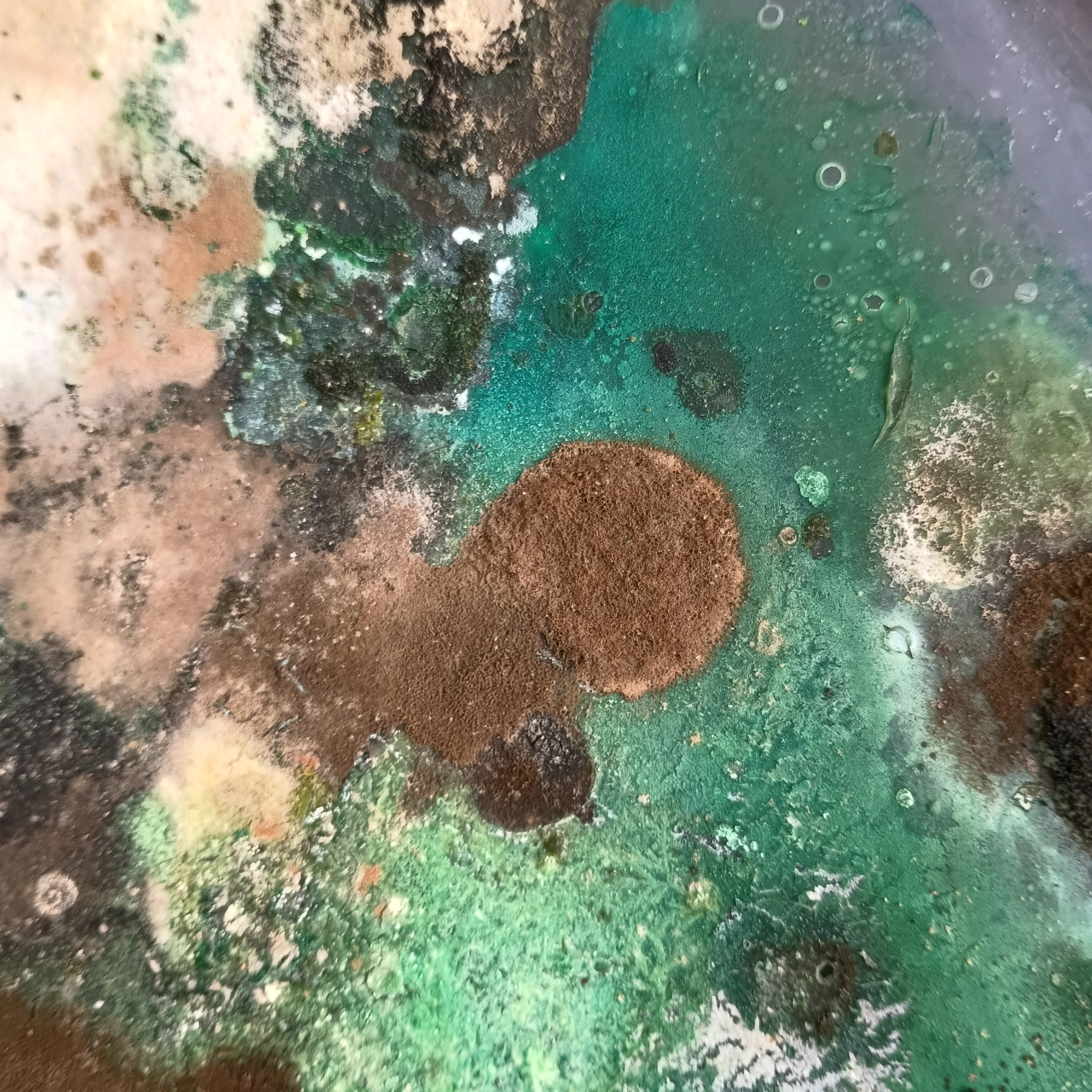
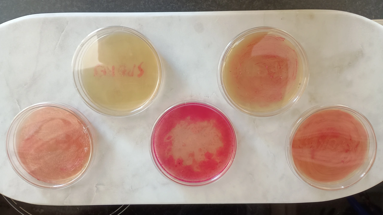
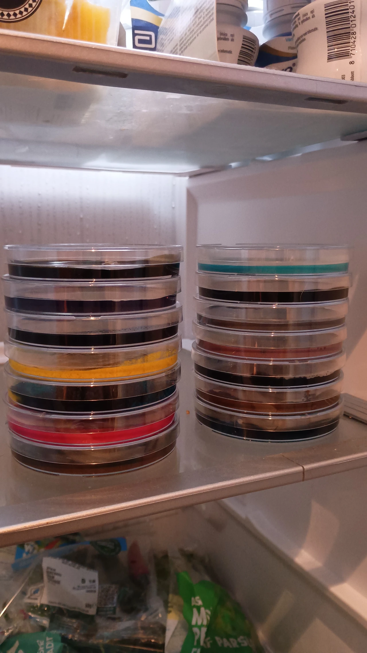
It all came about because, while writing the album, saxophonist Thibault Barillon started growing 100 petri dishes of fungus at home... as you do.
"One day I just bought some agar plates and started experimenting," he recalls. "I found joy in inventing my own techniques for what type of mould would grow from different organic matter I'd put on the plate a few days earlier. This started before we knew Hundred Pieces would become a thing, without grand plans or intent."
As time went by, the band became more aware of the parallels with Thibault's petri dish process and the process of recording the album: namely, "chance-based moments and letting songs find themselves, melodies and riffs as spores spreading and growing, the cross-pollination, the joy of the process and the beauty of art taking a life of its own that the artist hadn't intended."
As each petri dish turned into a unique riot of colour and organic growth, each was shot exactly the same way, from exactly the same angle: dead-centre, in a square white-background frame. "The petri dishes were an exploration of beauty in the natural world, scientific drawings and experiments that touch us emotionally without an artist's intent being behind it," explains Thibault. Some dishes were shot again days or weeks later as the cultures developed further, reflecting similar dynamics in the recording of the album.
Now each of these 100 images will accompany one of the 100 tracks on the album, and a rapid-fire GIF cycling through them will be used as the Spotify canvas for the key track, Haha, which drops in about a week.
No need for a moodboard
To me, the most interesting part is that none of this was briefed, storyboarded, or moodboarded into existence. It was just grown in a home, on a whim, and only later did the band notice it was already telling the same story as the music.
For a band whose press notes proudly state the album was "created with absolutely zero use of AI", there's an irony to the fact that this cover was made, in a sense, generatively. But while the band leaned into the chaos of nature, they also kept a level of control by imposing a strict photographic system. It's often in these spaces between anarchy and a clear vision that creativity springs forth most effectively.
It's also worth noting that none of this required a large budget, a team of experts or a professional brainstorming session. And perhaps that's exactly why this album's artwork probably won't look like any other when it's released in November.
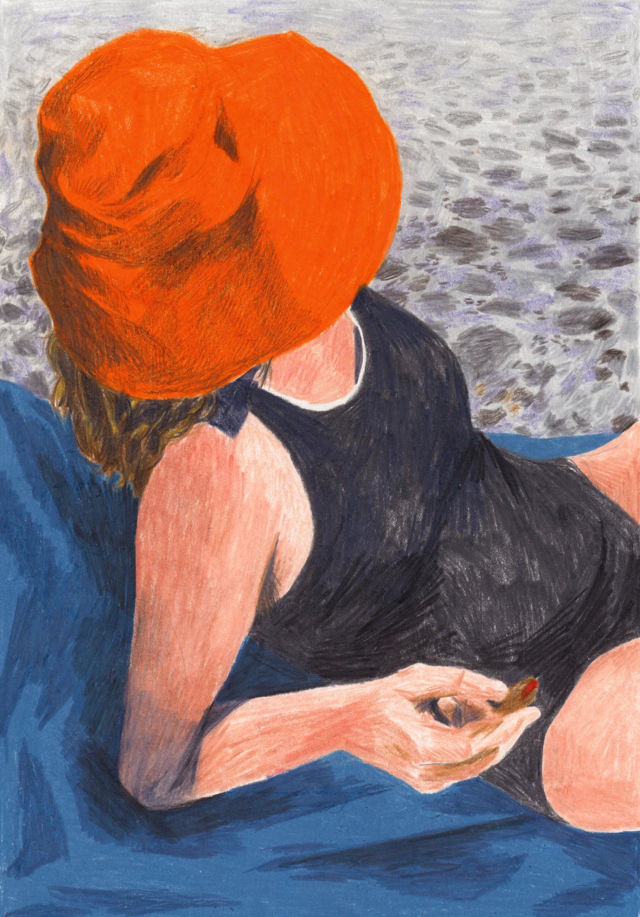
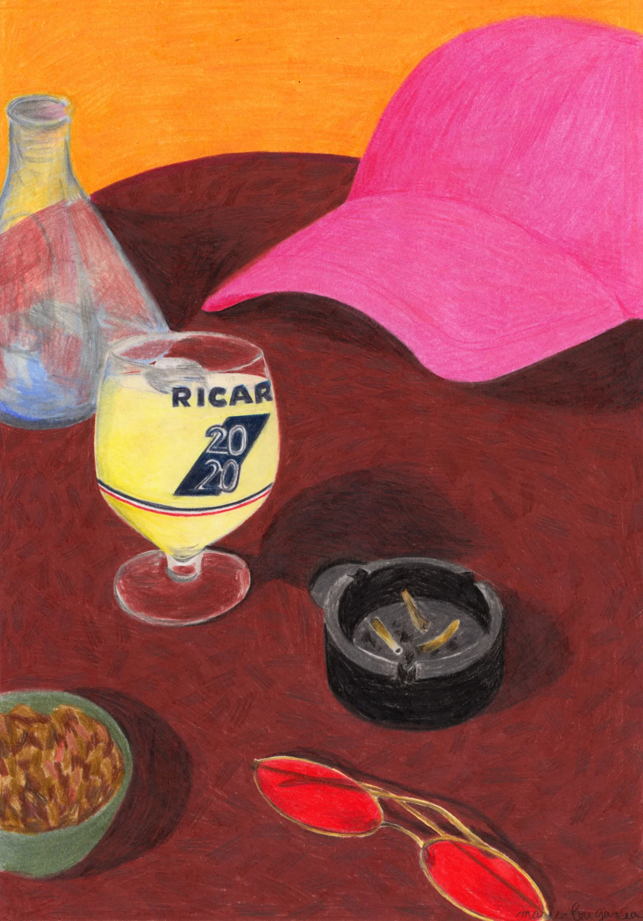
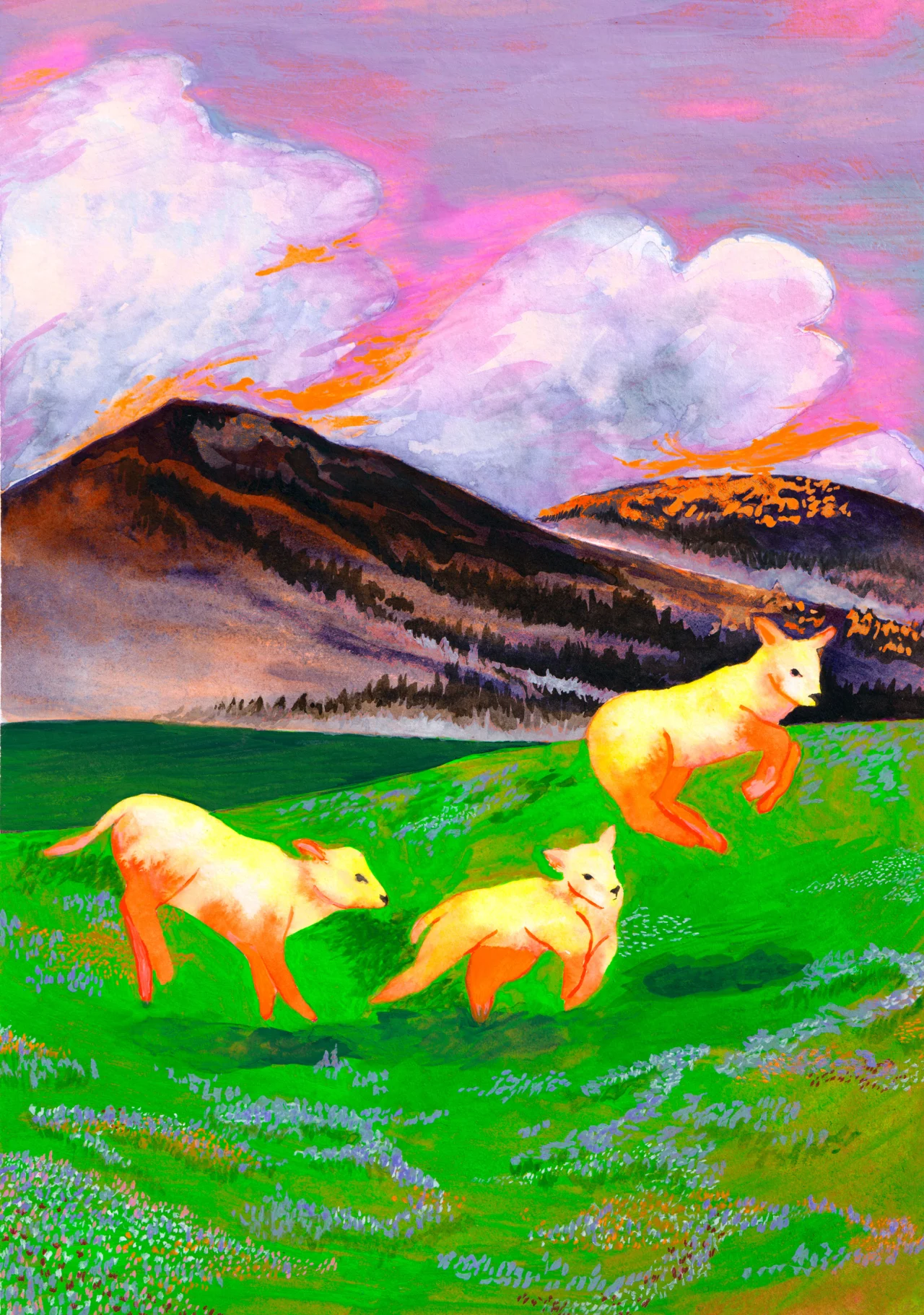
She was once a graphic designer until she rediscovered drawing during lockdown. Now the Paris-based illustrator saves up peaceful moments from her life, then turns them into beautiful, calm artworks.
You always try to look for a theme in people's work. A thread that stitches it all together. Not a style, per se. More of a "what motivates this artist to draw"? Marie-Lou Garcia's soft, serene artworks celebrate moments of calm in her life. When she's most relaxed and happy. I feel calm just looking at them myself, finding peace as I head down to London for another busy week.
"I am inspired by trips, holidays, or simply daily times," Marie-Lou tells Creative Boom. "I make a 'mental image' of a moment, an atmosphere, a colour palette or a pattern, and it finally takes form when I am mentally ready." That often happens during a break. 'Figolu au bord du Tarn', for example, is about an adventure with a best friend. "We hitchhiked with one goal: seeing the sea! She was eating a Figolu near the river, and this scene was so poetic for me. So I kept this moment in my head during the rest of the trip. Once the journey was over, I drew it on the return train."
Figolu au Bord du Tarn
I've found the same with writing. I'll save these little moments for later and enjoy revisiting them when alone. It's taken me a long time to "be present" and not immediately think of blog posts to write, stories to dream up. But that's probably because I see writing as a passion, not the profession it's become and the lines get blurred. Illustration was once a hobby for Marie-Lou, too, and only became her full-time thing during the pandemic. "I have always drawn. But during my graphic design studies, I completely stopped," she says. "I found creative fulfilment elsewhere for 10 years. It took the 2020 lockdown for drawing to come back with a vengeance." She bought a box of oil pastels, and after six months of practice, she felt she wanted to go pro. "Little by little, I finally left graphic design in favour of illustration."
The creativity extends to scarves and textile pieces, made to order. Does that change anything when a drawing has to live on cloth and be folded, worn and washed? In a former life, Marie-Lou worked as a textile graphic designer, so she learned about placement on garments and how to keep things readable on fabric. "Making my own textile was, for me, an obvious step and a chance to play with my drawings. I have to think about the drawing's size, the details, the way the scarf folds around the neck or the head. It's another way to think about composition."
Portrait de Simon
If you're as taken by her work as I am, then you can order a print, scarf or risograph via her online shop – a decision she made when she ended up with more drawings than she could cope with. After a quick look at fine art printing options, she invested in her own printing machine and now makes everything herself. "I also learned everything behind the scenes: managing stock, cleaning scans, orders, printing tests, and of course taking pictures for social media!"
Among her many portfolio projects is a graphic novel, which she began two years ago with Pauline Faivre, a friend and author. "We had a shared desire to write about femininity and the feminine heritage passed down from a mother to a daughter. The graphic novel explores these themes: the mother-daughter relationships and the maternal grief. A subject that Pauline treats in a poetic and introspective way."
Flamboyant
Then there's Studio Sthéno, a creative graphic design and illustration studio she co-founded alongside designer Léa Laforest. "Since I've been working, I've never just had one job. I've always worn several hats. Teaching and graphic design with Sthéno nourished each other for several years. Then illustration let me approach the image differently, which nourished my graphic design and gave me new perspectives on how I teach. Nowadays, I decided not to juggle it all, so I stopped graphic design and reduced my teaching time. As for the rent, I could just say that the illustration work pays the studio's rent!"
It sounds like Marie-Lou is like many of us: always exploring and adapting, being open to change wherever the wind takes her. These things might come from personal life events or stressful periods, or from a hunch that feels like the right next step. No matter, choosing this path is never easy. Has there ever been a job or moment that nearly broke Marie-Lou? Yes. Right after her studies. "With no income and no direction, I felt a little lost. It was hard! I had some pretty mediocre internship opportunities in Lyon, so I wouldn't just 'do nothing'. Finally, I found a permanent contract at Kenzo Kids, and I left after two months for an opportunity in Paris. I left everything – my recent flat, my job, and later my love life. Parisian life opened up so many possibilities for me, and it ended up changing me a lot; I found my place."
Colère
Browse her website, and you'll see it's set in Dindong by Clara Sambot from Bye Bye Binary. Was that a considered choice? And how much do the politics of who makes her tools matter to her? It's very important to her, she says. "When I created my artistic direction, I was looking for a militant font, a theme you can find in some of my drawings. This political dimension is important in my work and in my personal life. Even if I'm not as active as I would like to be, I like talking about politics, and I have convictions. This is why I like to play with a little bit of insolence in my drawings!"
Illustration has had a rough few years between shrinking budgets and AI. And it's not been easy for Marie-Lou either. "It's necessary to find a way to satisfy all budgets," she says. "When it comes to AI, I'm internally angry; I try to educate my family about the damage caused by AI-generated images. 'No AI' collectives, associations, and people fighting AI-generated images inspire me and make me feel more creative. AI had better watch out; we are not going to let this happen!"
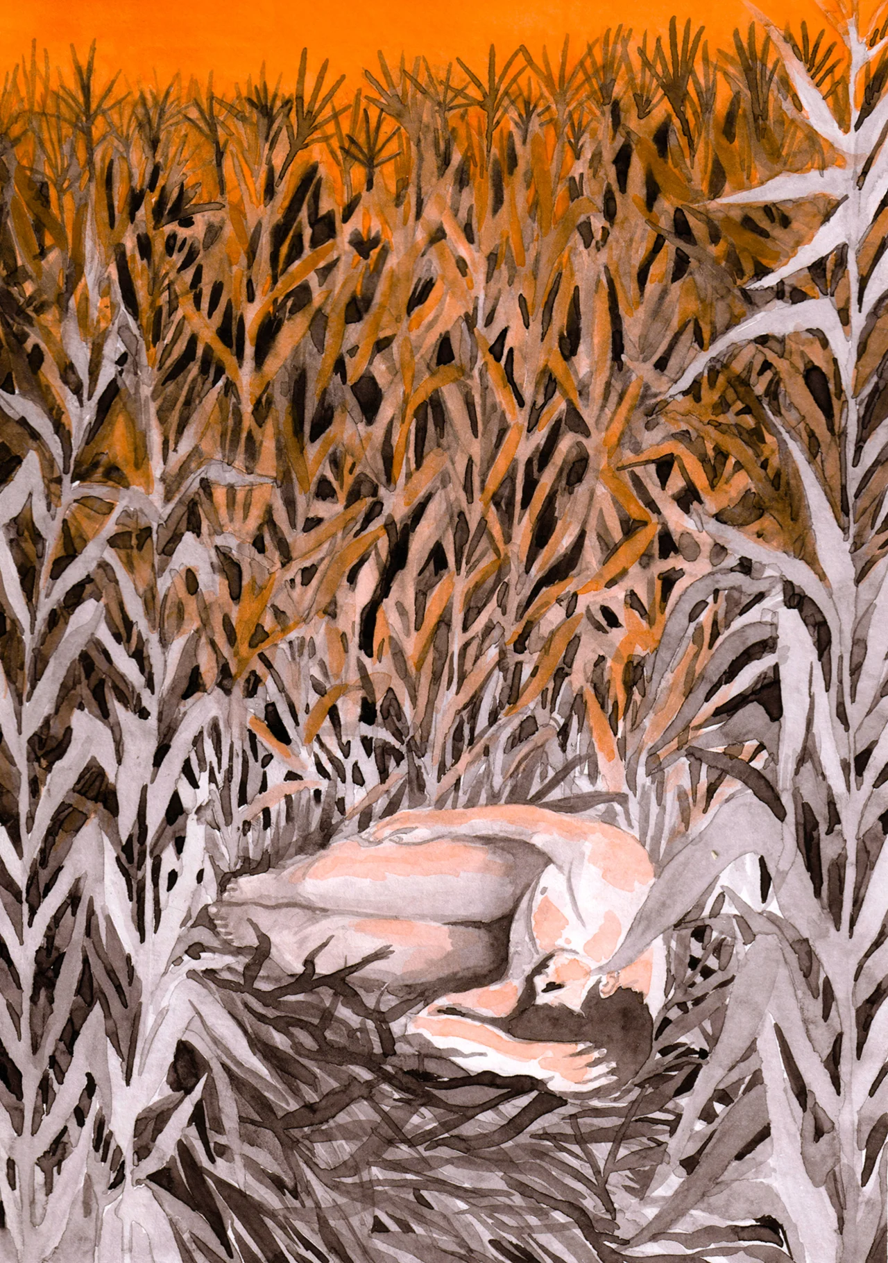
Champ de Maïs
For someone who has already weathered a few storms in this ever-changing industry, what advice does she have for other artists just starting out? Funny enough, she says not to worry about mixing hobbies with work or doing things your own way. "I think the border between creatives' jobs and personal life isn't so clear in this case. This is exactly what I like. Sometimes it happens that you start working at 10PM, after a lazy day; you can't order inspiration. No two days are the same, and that is what makes this job beautiful."
More than anything, she says, "Don't overcontrol things, and don't be afraid of freedom". Now where did I put my notepad?
The illustrator's crowded scenes are so densely packed and filled with tiny details, stories, hopes and wishes.
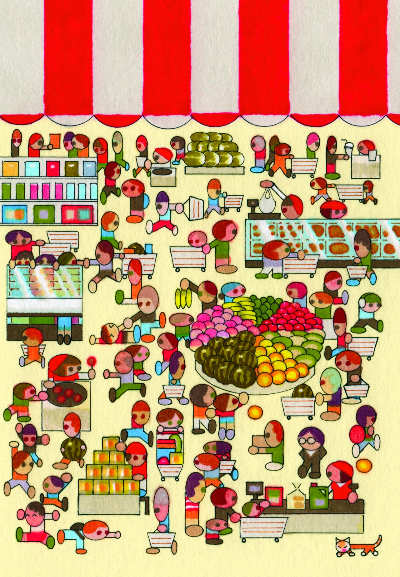
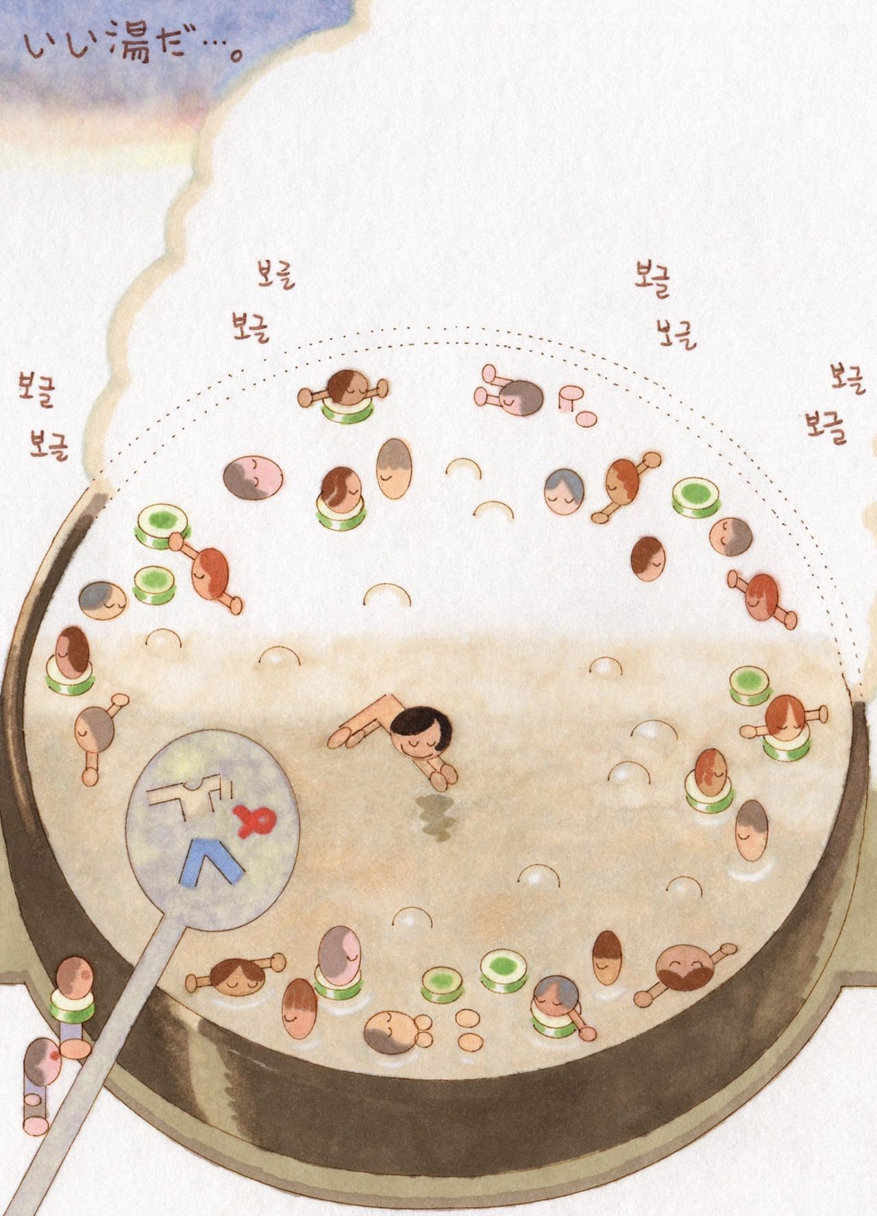
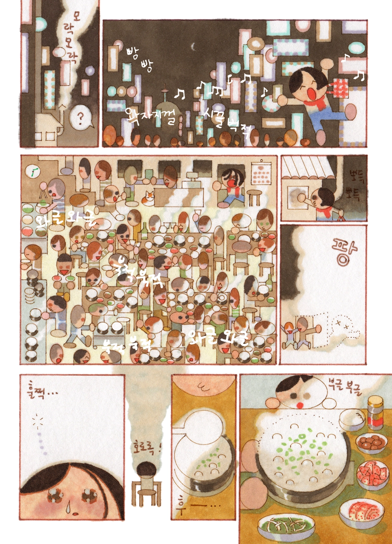
Look closely at Saehan Parc's illustration portfolio and there's always more going than the first glance lets on. There's a market stall scene stuffed with dozens of tiny shoppers, baskets and stray cats; or a public bath rendered from directly above, packed edge to edge with bathers in steaming water. There is no white space or gaps left empty – and we love it!
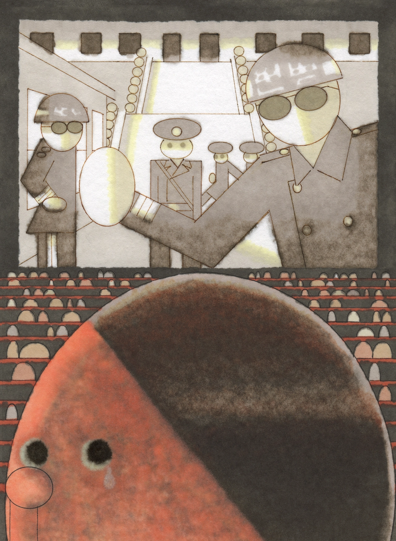
Saehan's path to where she is today began with a big jump. At 21, she quit art school and moved to France, enrolling at HEAR – the Haute École des Arts du Rhin – to study narrative image-making and printmaking through to 2017. It was a shift from how she'd worked before. "I used to work in digital mostly. Then I learned the fun behind manual work here, which I'm still doing after years." Not long after graduating, Korean publisher Jjokk Press commissioned her to write and illustrate a 16-page comic. Still finding her footing, Saehan presented her now-signature geometric style for the first time, unsure how it would land. "It surprisingly worked well," she says, "so it gave me courage to continue."
Editorial collaborations followed, then a conversation with publisher Editions 2024, who asked if she had a children's book project in the works. She didn't – but the question got her started anyway. A month later she had a story and sample pages ready, and Papa Ballon was published in 2021, her first children's book. Two more followed, Coucou Sommeil and Bibimbap, both now translated beyond France and Korea.
Inspiration for Saehan rarely comes from picture books alone, and there are many nooks and crannies out there which might spark an idea. "Music, movies, art shows, novels, poetry," she lists, "especially music I think, not only music itself but also the aesthetics of related visuals." Her process splits depending on the job: commissions go through a rough croquis stage – a rapid, preliminary sketch of a human figure, which is a technique typically used in live drawing – before the final illustration; whereas personal work skips the sketching process altogether. "I don't have croquis or sketch on paper; I start directly on the line work with normographe, then to the colouring," she says, using the technical drawing tool to keep her lines precise even without a pencil guide first. "I like playing with this kind of spontaneous process without undoing it when it's for my own."
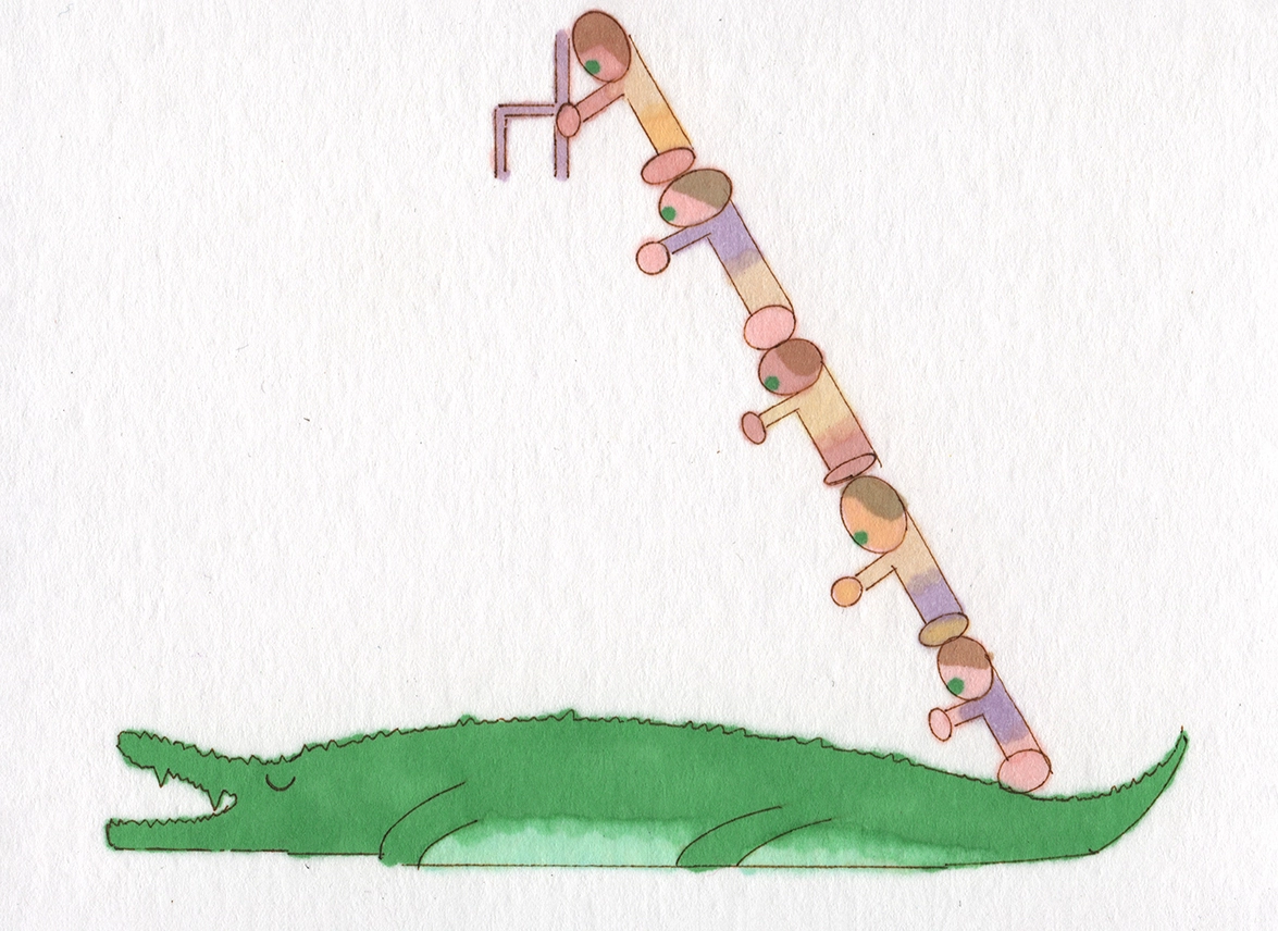
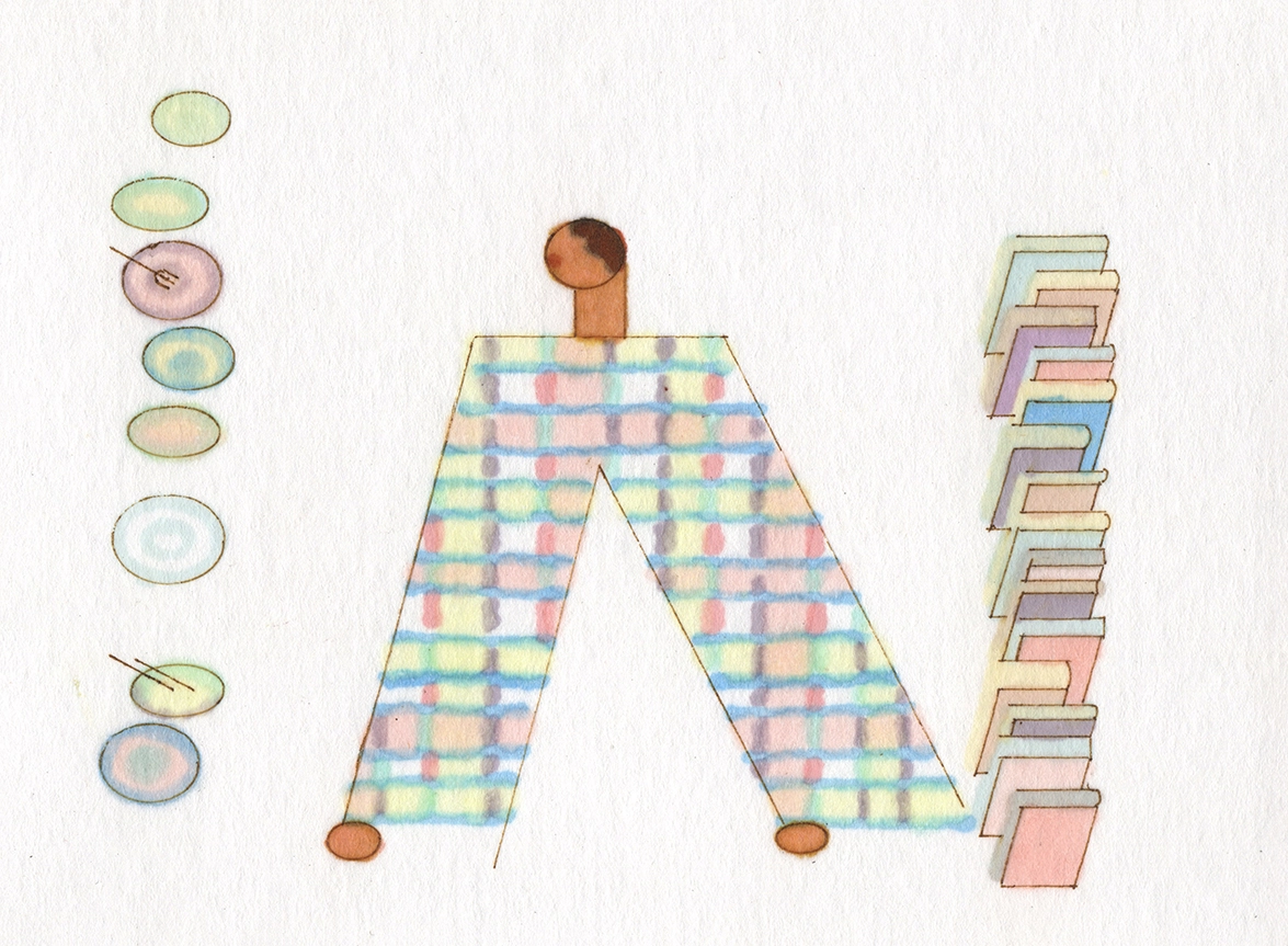
That spontaneity shaped her recent solo show at Cusp Dot in Hangzhou, where two pieces – a crocodile flattened beneath a diagonal stack of tiny figures, and a pair of patterned trouser legs flanked by rows of painted eggs – grew directly out of the structure of Chinese characters. Both are among her favourites from the show, built from that same instinct for pattern and repetition seen across all that she makes.
When asked about how she wants her audience to respond to her work, she says there's no loaded meaning, especially outside of text-driven children's books. What she wants is arguably harder to pull off, but not impossible at all: "I hope that it makes the audience want to draw too, because it seems funny. I think I can say that it's my only wish."
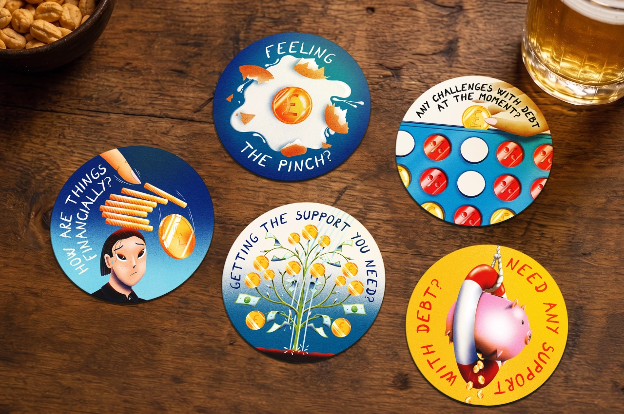
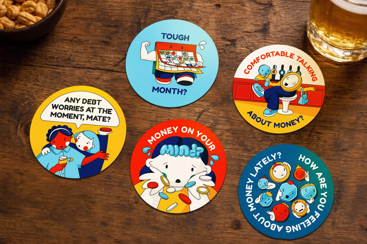
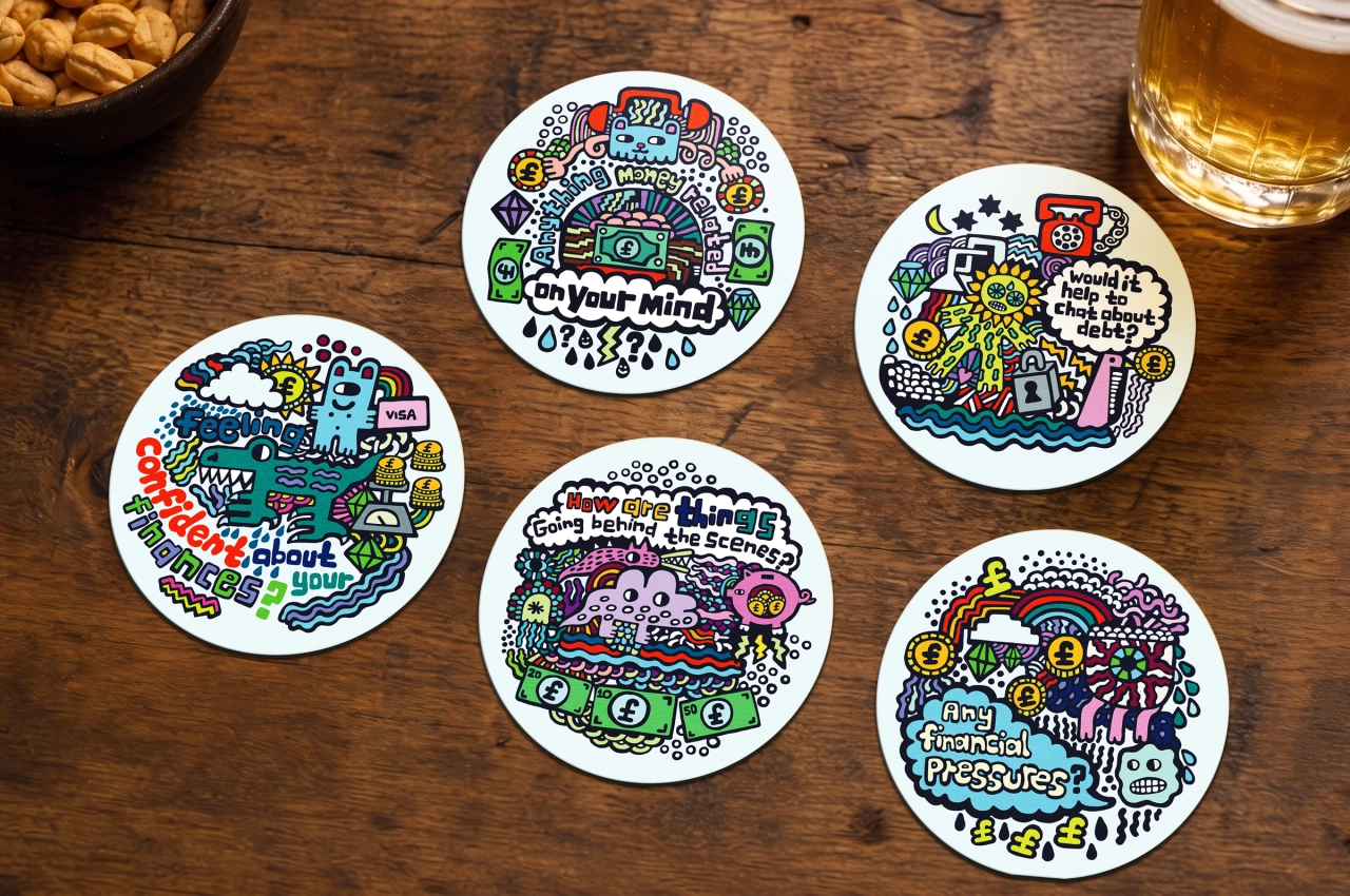
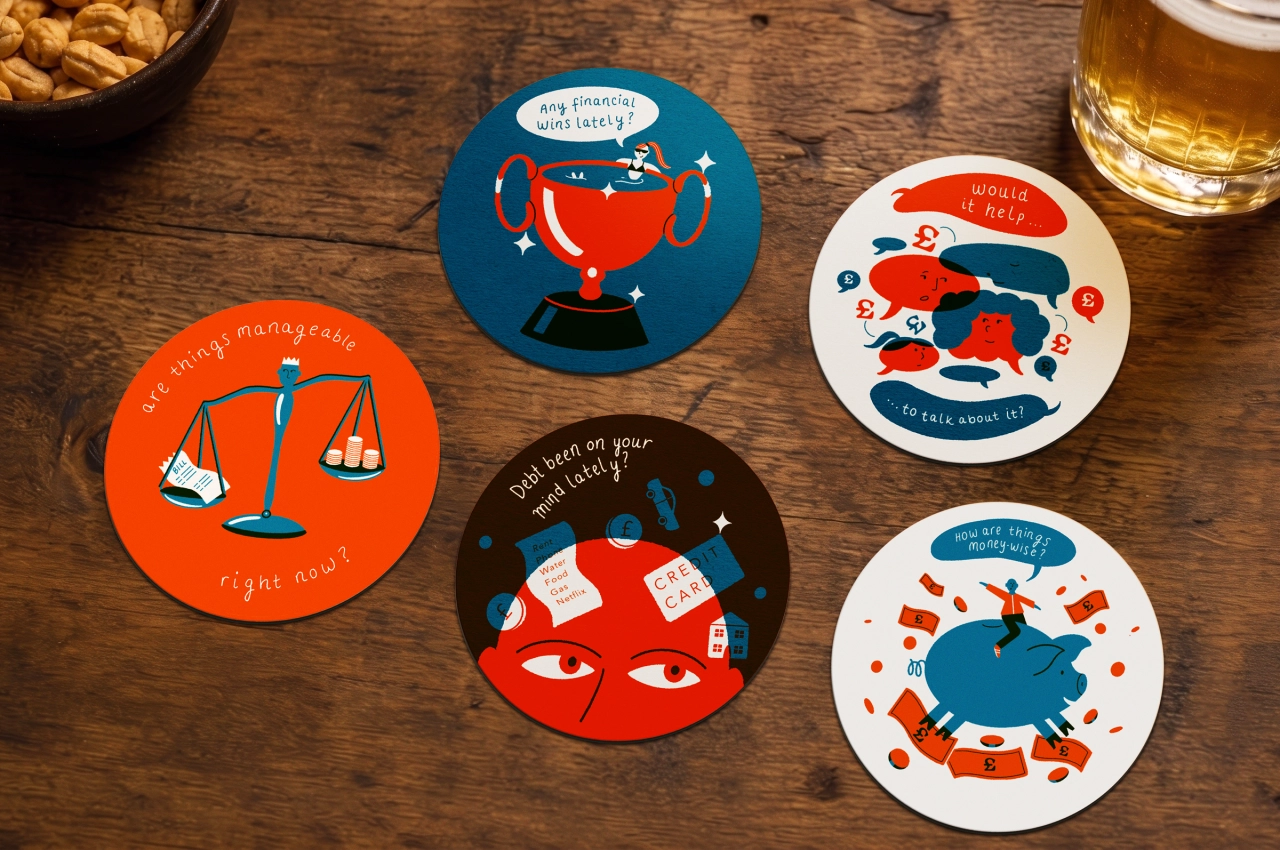
As part of a campaign titled 'Say It Over a Drink', 25 illustrated coasters are getting pub-goers in the UK talking about debt.
Anyone who's ever worked for government, a public body or a charity will be familiar with the challenge. Your goal is to get people talking about an issue that's typically brushed under the carpet, whether that's menustration, mental health or suicide. But subjects are taboo for a reason. Stick a huge, imposing billboard in their face, and they may turn away, or tune it out. Sometimes, then, it's better to come at things from a sideways angle. And here's a great example.
Lowell calls itself Europe's leading credit management company and claims to have helped over 3.5 million customers become debt-free since its founding in 2004. But you can't help people who don't want to be helped. And most of us will know exactly what it's like when you get into seemingly unsustainable debt and feel the overwhelming urge to just bury your head in the sand.
Part of that is not wanting to face up to the problem. Another important part is not wanting the social shame of admitting your problem, which leads to a horrible Catch-22. Opening up to friends is necessary to get the emotional support you need. But the stigma of doing so keeps you trapped in a mental vicious circle.
Lowell's is trying to square that circle with a campaign called Say It Over a Drink. But rather than posters, billboards or TV ads, they're doing things subtly. They've commissioned five illustrators—James Cluer, Emily Birch, Sam Peel, Ery Burns and
Becky Mann—to create 25 coasters. Each carries a simple prompt designed to help someone say the first sentence about money they've been avoiding. And they're distributing them across pubs, cafés and restaurants across the UK.
Context is king
So why is that a good move? I think it's all about context. A poster or billboard is normally only glanced at, so it's designed to provoke an instant, powerful reaction. "I want to buy that!" in the case of commerce. "I want to vote for/against that!" in the case of something political. But in a case like this, the instant reaction of the person in debt is just going to be that shame and embarrassment I mentioned earlier. Counterproductive, basically.
A coaster, in contrast, sits on the table in a bar and largely gets ignored. When there's a lull in the conversation, or the person you're out with heads to the loo (and there's no phone reception), you might pick it up and start playing with it, tap it against the table, subconsciously start peeling away at its corner. You probably won't even notice the words on it for a couple of minutes, if at all.
When you do, though, you're probably going to be in the right mindset to take those words in. And if you're having a relaxed and pleasant night out with a friend, you're going to be more likely to actually start talking about it. Makes sense, right?
The idea originally sprang from Lowell's research among its 300 customers, of which one in four said they would rather talk to their family about sex than debt, and 69% would rather have their search history leaked than reveal their bank balance.
Leaving aside how slippery those surveys can be (it all depends on how the questions are asked), that sounds about right. Maybe it's normal to talk about money in some cultures, but in England certainly "I'm a bit skint this month" or "I can't come out till payday" is about as far it'll go.
In that light, these illustrations do a good job of shifting that mindset. There's nothing scary or off-putting in the scenes they depict: a fortune teller, an empty wallet, a person pushing a huge coin up a hill. But they do a good job of setting the scene while the questions they illustrate ("Is debt on your mind lately?", "What's your biggest money worry?", "That debt still stressing you out?") serve as excellent prompts for a society that generally wants to get their mates to open up, but doesn't really know how to go about it.
As John Pears, UK CEO at Lowell, puts it: "A coaster might seem like an unusual place to tackle debt, but that's exactly why it works. It meets people in moments when they're already talking, catching up and connecting. We hope these simple prompts help make it easier for someone to open up, because asking for help often starts with a conversation."
This clever poster turns a sentence into a train journey: a simple but effective design trick, delivered in style.
Let's be honest, we all know what a travel ad looks like. Beautiful scenery, with not a bulldozer or screaming infant in sight? Check. Catchy yet ultimately bland and empty slogan? Check? Smiling, impossibly attractive people? Check.
Of course, there's nothing wrong with that. Holidays for most of us are just a welcome break from everyday life, and a little bit of fantasy never did anyone any harm. And I've got nothing personally against impossibly attractive people; some of my best friends count among their number.
But if you're trying to sell consumers on something they wouldn't normally do, and in fact might be nervous of doing in a foreign country where they don't speak the lingo, you'll need to work a little harder.
That's exactly the challenge that the global brand consultancy We Are Pi, working with social agency Butterfly Effect, were presented with. They were approached by Interrail B.V, the Dutch company behind the European rail travel scheme that makes it cheap and easy to travel across the continent with a special pass.
As well as boosting the scheme, there was also a bit of brand housekeeping to do. Up until this point, Interrail B.V. had two brands for essentially the same rail pass: Interrail for people living in Europe, Eurail for visitors from elsewhere. The latter needed to be folded into the Interrail brand, following the business changing its name from Eurail B.V. to Interrail B.V. earlier in the year.
Better than flying
The campaign indirectly challenges the notion that because flying is quicker, it's better. Instead, it leans into the idea that the longer journey isn't an inconvenience; it's part of the adventure, via a brand concept they've dubbed The Interrail Effect.
This was backed up by a customer survey in which around 70% of Interrail customers said their trip changed how they see the world. A similar number considered the experiences more impactful than other types of travel, and around a quarter considered it much more impactful than other holidays they'd taken.
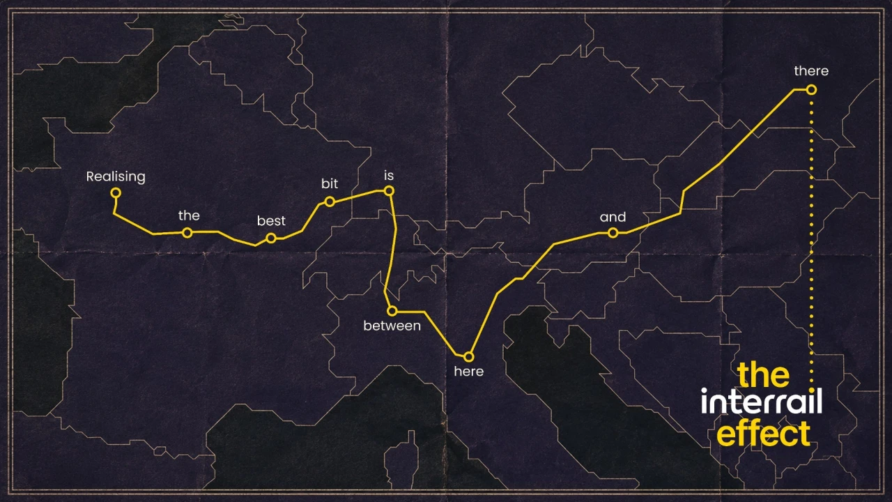
To get this across visually, the launch poster shows a stylised map of Europe. Running across it is a single yellow line representing a train route; only the stops aren't cities – they're words. Joining them together gives you the sentence: "Realising the best bit is between here and there."
It's a common design trick, but it works because it forces the reader to make a bit of an effort. Had the sentence been instantly legible, it wouldn't make half as much impact.
There's a nice extra touch too: the journey doesn't end with the last word; the line continues, albeit it's now dotted and straight. It's a subtle way to evoke the idea of exploring and making it up as you go along, without beating people over the head with the idea.
Creator-led campaign
Another element of the campaign is a series of short video clips made by 30 creators from the US, Canada, Australia and Europe, who were asked to travel across the continent with Interrail over summer and share their experiences.
These clips sit in a comfortable space between standard YouTube shorts and glossy, cinematic films. The former would have been a bit "So what?", the second would have seemed a bit overblown for a target audience that's likely to be sleeping in the cheapest hostel. The sweet spot they've reached feels, in the words of Goldilocks, just right.
Ultimately, there's nothing particularly new in this campaign, but at the same time, there didn't need to be.
As Özlem Birkalan, chief brand and commercial officer at Interrail, puts it: "'The Interrail Effect' isn't something we invented. It's something travellers have described to us for decades, in their own words, after every journey. What's changing is that we're finally building the brand around it. Not around where people travel, but around what travelling like this does to them."
The campaign launched globally on 10 September in the UK, Australia and the US, and will roll out across a mix of paid, owned and earned channels including paid media, organic social, EDM, partnerships and PR as well as participating creators' own Instagram, TikTok and other social platforms.
Led by Samar Maakaroun, these two identities for a maker space and event space highlight how strong brand architecture is built on discipline, not decoration.
Msheireb Downtown Doha is a planned city in Doha, the capital of Qatar, that's designed to regenerate the historical district of Mushayrib (literally, 'a place to drink water' in Arabic). It's been promoted as being the world's first sustainable downtown regeneration project, and one of the smartest cities on Earth. And Doha Design District (DDD) is its hub for design, innovation, and collaboration.
Director Dana Kazic approached Samar Maakaroun and her team at Pentagram with a challenge: introduce two distinct spaces within the district, while strengthening, rather than fragmenting, the parent brand.
One would be a maker's space dedicated to experimentation and artistic development; the other, an event space that becomes a destination for exhibitions, events, and public engagement. They'd be positioned physically opposite each other.
Striving for connection
It sounds like either a massive challenge or the stuff of nightmares, depending on how much experience you've had dealing with having to juggle the competing demands of brands and sub-brands, not to mention different languages.
In these scenarios, the client typically wants the two sub-brand spaces to feel connected. But in practice, they often get two names that share a typeface and a colour palette, but not much else. The connection is clearly expressed in a brand guideline PDF, yet never really translates to what the public actually sees and feels.
To avoid that scenario, Samar—whose identity for The Mosaic Rooms in London we covered back in April—and her team took the time to get things right. As they put it: "The relationship had to allow equity to move in all directions: from DDD to the sub-brands, between the sub-brands themselves, between languages, and back again into the wider district."
Naming and letter design
Next up came the naming process. The team explored a range of ideas, from letter repetitions connected to the DDD symbol to Arabic words that had a spatial dimension and were easy to say out loud. The main thing was that the names needed to work together naturally and feel like two halves of a whole.
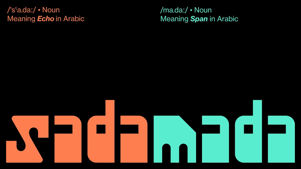
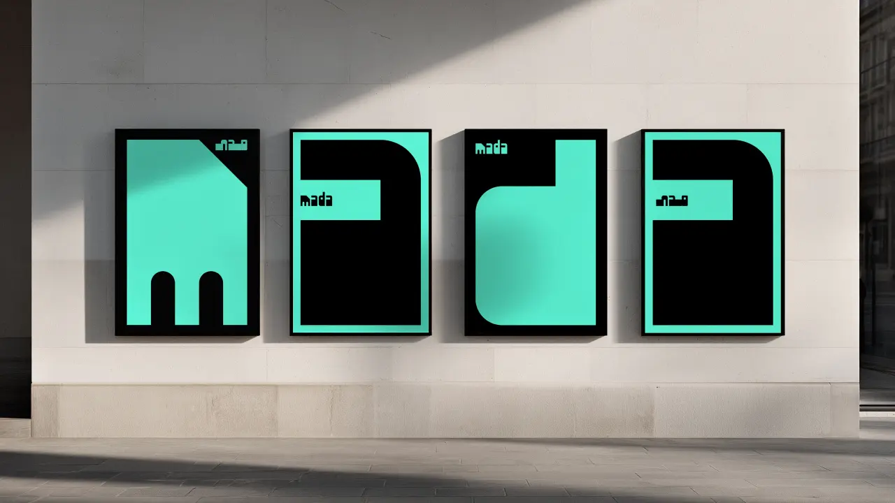
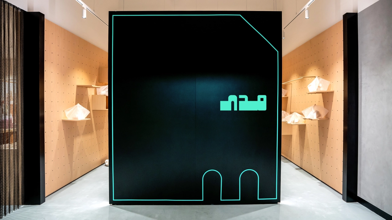
They found the solution in a pair of Arabic words that already had a relationship with each other. Mada, meaning range, reach or possibility, was chosen for the maker's space. Sada, meaning echo, was chosen for the space where finished work meets an audience.
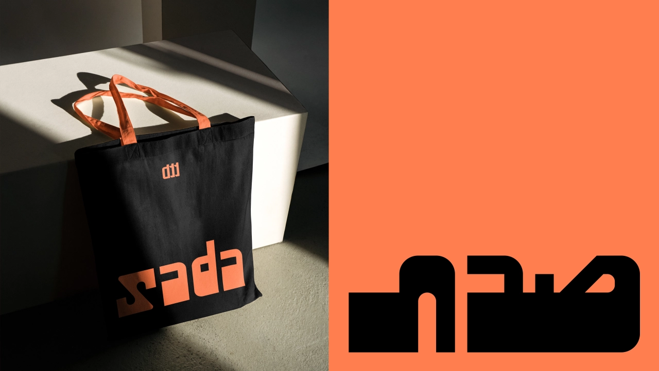
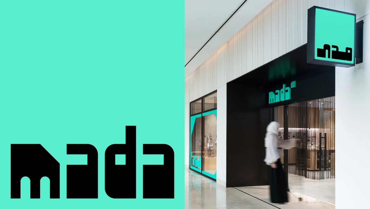
From a visual point of view, "sada" and "mada" are built from almost identical letterforms, mirrored and rearranged, rather than drawn from scratch as two separate typefaces. Or to put it another way, one looks like the echo of another. This means the relationship between the two spaces doesn't need to be hammered home: it's immediately, instinctively obvious.
At a deeper level, there's a sense of culture and history baked into their DNA. Both names carry the letter D, which has been lifted from the existing Doha Design District symbol, while the other letterforms are inspired by the architecture of Msheireb, the downtown Doha district the whole scheme sits within.
Again, this works elegantly in making the whole brand architecture work harmoniously together. Every curve and notch in the wordmarks echoes something structural in the area, making them feel like a natural part of their surroundings, rather than something tagged on.
Key takeaway
Here's what I think anyone working on a sub-brand can learn from this. It's terribly easy, especially when you're on a tight deadline, to go with the obvious solutions to making multiple brands work together. Use the same typeface, the same colour, the same grid system. And bosh! You have a unified system. Well, kinda.
This approach might look good in a presentation, but in the real world, where your designs are having to live, breathe and do their work, they run the risk of looking like an afterthought, stapled on to the parent brand rather than being an organic part of it.
What Pentagram did here was different. Rather than seeing the existing brand at surface level—the type, the colours—they delved deep into its ethos instead, and located the connective tissue that would make the new sub-brands feel naturally part of it.
The result? No one has to stand there explaining that Sada and Mada are part of the Doha Design District. It's just obvious. And that's the job.
In crafting a new identity for itself, the Bath-based agency focused on fundamentals, rather than just slick visuals.
If you've worked in an agency for a while, you'll recognise the pattern. After a few years in business, you've got a lot of work under your belt, some of which your clients actually allow you to share. But each time you upload a new case study, a small part of you inwardly cries.
What once felt like a cutting-edge website now feels a little listless and flat. You put so much work into these things for other people; you think, why can't you give your own studio the same level of love?
But there's a danger lurking here. While we know what's good for others, we don't always know what's good for ourselves. Rather than having a proper strategy for an internal rebrand, it's tempting to just rush in and refresh everything to look buzzing, colourful and cool.
Yet while that might give you a short-term high, this kind of approach typically builds up trouble for the future. Because what's visually on-trend right now will seem just as dated a few years from now. And if there's no underlying strategy or goal behind your agency rebrand, it's destined to die on the vine.
Which is why it's good to hear that not only has Bath-based branding agency Thisaway rebranded, but they've done so on the basis of something more grounded than "make everything look shiny and cool". The foundation, instead, is a promise to clients and their customers.
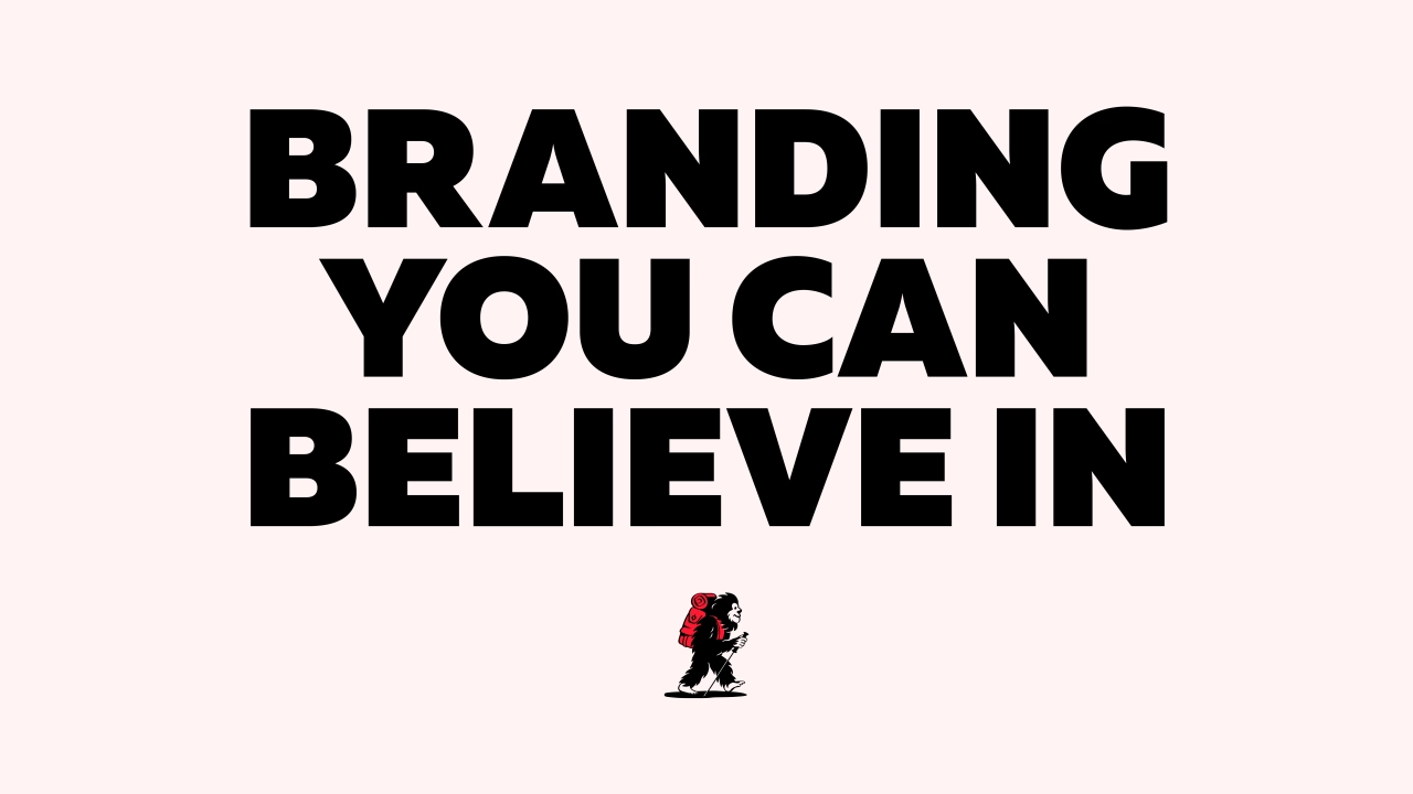
They've titled this new positioning "Branding You Can Believe In". We chatted to founder Graeme Cook to find out more.
Bold and confident
"We've been talking about rebranding for around three years," he begins, "but we started the actual process over a year ago. We felt like we had outgrown the previous brand, and our approach, point of view and experience were no longer reflected in it."
Having delivered some big projects for well-known clients such as Team GB and The Jockey Club, and picked up a few awards along the way, they wanted to project a bolder and more confident face to the world. But at the same time, they recognised that without their clients, they'd be nothing. So first, they went to exactly those clients and asked for honest feedback.
"We just asked them why they chose us, what we were good at, where we could improve," recalls Graeme. "What struck us was how simple some of the responses were. Things like: we listen, there are no egos, we're collaborative and communicative. There wasn't a big 'wow' moment, but it reinforced our gut feel for our direction of travel."
It's exactly the kind of honesty, in other words, that's helped build the business. "We're not snake oil salespeople," he stresses. "We don't deal in bullshit or pseudo-marketing speak. And we're not giving our latest 'hot take' on LinkedIn every week. We tell it like it is."
Truth & Dare
With that in mind, the team wanted the identity to reflect the principle of 'Branding You Can Believe In' and the honesty it brings. "We've seen some agencies go down an almost sci-fi or futuristic route with their rebrands," Graeme reflects. "But we wanted to feel more grounded, direct and no-nonsense, with hints of charm, intelligence and personality scattered throughout."
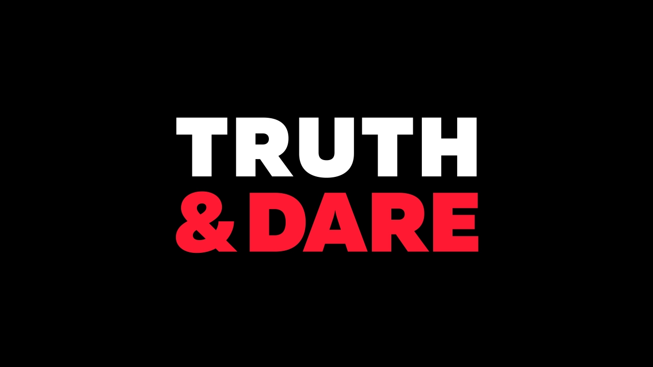
That feedback fed directly into the agency's new operating philosophy, "Truth & Dare", which sits behind the "Branding You Can Believe In" promise as the "how" to its "what".
"Truth" is all about how the team will talk to a client, its stakeholders and its audiences until a big idea emerges that's grounded in what people actually said. "Dare" is what happens next: using that idea as a springboard to push a brand as far as possible, both visually and verbally. "Truth & Dare" subverts the usual phrase "Truth or Dare" to emphasise that Thisaway pairs research with risk, rather than treating them as separate.
Visual strategy
Bold typography and a minimal colour palette help to communicate this directness, and the result is a relatively pared-back identity that lets the work be the focus, while still reflecting the agency's approach. It's a tricky balance to pull off, but it very much feels like they've nailed it.
Part of that comes from not cutting corners. "We stayed away from anything too AI- or CGI-generated and commissioned illustrator Rob Ball to produce a set of 'mythical' characters that could be used across our website and creds documents," says Graeme. "The idea behind each character is that you may or may not 'believe' they exist. We then brought each one to life with some subtle animation. The hand-drawn nature of the characters felt like a lovely, considered, and crafted element to our identity, and a subtle representation of our thorough approach."
That doesn't mean they're anti-AI in general, though; quite the reverse. "We've utilised it a lot in the concept stages of projects, and it's been really useful in helping to communicate and sell ideas," Graeme reveals. "It's also helped speed up some processes on the strategic side of things in terms of acting like a junior researcher, doing a lot of the grunt work in pulling out interesting insights, etc."
But there are limits. "There still seems to be a big grey area around using AI for final assets that are handed to the client, and I do think there's a bit of scaremongering happening where people are promoting a 'use it or die' mantra. We use it as a tool; it's great at some stuff, but still awful at other stuff!"
Overall, Graeme says, the process of the rebrand has pulled the team together. "Everyone has felt like they have been involved, listened to, and have helped shape what we've developed," he reflects. "It's also transformed our credentials decks and how we present and pitch. We need to ensure we use this as a catalyst, and hopefully our best work is in front of us."
After Effects gives motion designers a huge amount of creative control, but building every animation from an empty composition is not always practical. A well-made template provides the structure, timing, and technical setup, leaving you to concentrate on the details that make the project your own.
The templates in this collection cover many common production needs, including titles, logo reveals, slideshows, video openers, intros, lower thirds, animated typefaces, and icons. Some provide a complete sequence, while others handle one specific part of a larger edit. Colors, typography, footage, audio, and timing can usually be changed to suit personal and client projects.
Free templates vary considerably in quality. Some are carefully organized and include helpful documentation, while others may require fonts, plugins, presets, or older versions of After Effects. Checking these details before downloading will save time later.
The best results come from treating an After Effects template as a foundation rather than a finished design. Small changes to the pacing, type, color, and movement can make a familiar animation feel far more appropriate for your content. The collections below offer plenty of options for different styles, skill levels, and video formats.
If you’re new to the program, you might like to take a look at our collection of After Effects tutorials.
What to Look for in an After Effects Template
A polished preview does not tell you everything about a template. Before downloading, check how the project was built and whether it will work with your version of After Effects.
After Effects compatibility: Confirm the minimum version required to open the project.
Plugin requirements: Check whether the template relies on paid or third-party plugins.
Included assets: See whether fonts, sound effects, music, footage, and images are supplied or need to be downloaded separately.
Project dimensions: Check the resolution, frame rate, orientation, and duration.
Layer organization: Clearly named compositions, layers, and placeholders will make editing much simpler.
Documentation: Look for written instructions or a video showing how the main controls work.
License terms: Confirm whether commercial and client work is permitted and whether attribution is required.
Titles After Effects Templates
A title sequence is often the first design element viewers see, so typography, timing, and movement all matter. Even a simple title can give a video personality and prepare the viewer for what follows.
Designing animated titles from scratch is rewarding, but it can also take hours of testing keyframes, transitions, and effects. A good template handles much of that groundwork while leaving plenty of room for your own creative choices.
This collection features free title templates for a range of styles and project types. Each can be customized in After Effects with your preferred text, colors, fonts, and timing to create an opening that fits your video.
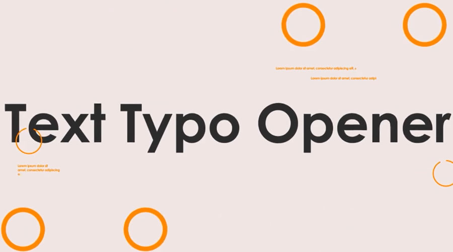
The free Funny Shapes title templates give you playful and bouncy text animations. The package includes five compositions and seven text placeholders. The shapes move in amusing patterns, giving your video a nice touch of fun.
This extensive After Effects template includes over 800 animated text effect elements. Each element is easy to edit with simple text and color controls. These text elements are perfect for bold titles, clean openers, and social videos that need modern animated typography.
This free title template recreates the 2001 Space Odyssey film’s familiar typography style and effects in After Effects. You can quickly adjust the text size and spacing for unique branding while honoring the original 2001 look.
Try the Retro Movie Titles template if you’re looking for retro-style typography. The template comes with easily editable layers and full color control, making it easy to customize the title to match your brand.
The glitch effect will help make your videos stand out. This template pack makes it easy to add your own text and is a perfect choice for anyone looking for a retro or vintage effect.
This free kinetic title template includes seven scenes with two media placeholders. Each element is labeled to help speed up the editing process, and the design is suitable for various purposes, including corporate slideshows and personal videos.
This well-organized title animation opener template is ideal for promoting anything. It contains 110 animated elements pre-rendered into .mov files with a JPEG + Alpha codec. It also includes nine pre-designed text scenes, and you can easily add more.
Flipped Titles is a clean and well-organized free template for After Effects. It includes seven unique full-screen titles with some cool and creatively animated effects.
Add a simple yet impressive title to your next video project with this free swirling letters titles template. Easily add a video, edit the text, and match your colors to make this title template your own.
If you’re looking for an elegant After Effects Title template, look no further than this template pack. It includes 16 different typography styles and a detailed help file to help you customize the project to your needs.
These title templates will come in handy if you want to give your titles an abstract look and feel. The template includes nine different titles and graphics, and it is easy to customize with your own colors.
This modular 4K After Effects template includes 10 title scenes with up-and-down rolling text animations. It offers editable timing controls and easy text customization. It is ideal for openers, title sequences, or social media videos that need modern kinetic typography.
This free After Effects template includes animated titles and lower thirds in a clean, minimal style. It’s simple to edit with text placeholders and color controls. Great for presentations, YouTube videos, or social content that needs clear and simple text animation with no extra setup.
This 4K After Effects template includes nine full-screen animated titles. Each title template is fully editable with text and color controls. These clean titles are ideal for openers, presentations, or promotional videos that need a clear, modern, and simple title animation.
This free titles template has a modern aesthetic, with smooth animations and beautiful typography. The title is easy to customize with editable text and color controls. It is perfect for corporate videos or presentations that need a quick title animation with a professional look. It is compatible with After Effects 2023 and above.
This Free Minimal Titles pack includes 20 animation styles and titles and a royalty-free music track that can be used even in commercial projects. To use it, you just need to add your text and render the file.
Make your headlines pop with this bold titles template. It is a collection of 25 free-to-download titles that can be quickly customized to match your brand.
This style library for After Effects and Adobe Premiere is a great way to add style to your titles without wasting time creating them from scratch. You can quickly download and import this style library and use it in your projects.
If you’re looking for stylish typography, use this free pop-up title template for After Effects. The template allows you to edit the text and customize your titles’ colors and duration.
Free Classic Kinetic Titles is a universal and multi-purpose title template perfect for your company’s business presentations. The project includes a color controller for quick changes and editable text layers.
If you’re looking for a smooth and elegant title pack, check out this pack of six free After Effects titles. The titles feature a fresh and modern style that’s perfect for young startups and small businesses.
Logo Reveal After Effects Templates
Logo reveals turn a static brand mark into a short animated sequence. By combining motion, sound, and visual effects, they give a logo more presence at the beginning or end of a video.
The best logo animations are usually brief. A few well-timed movements can say more than an overly complicated sequence, whether the logo belongs to a global company, a local business, or a personal creative project.
The free After Effects templates below cover styles ranging from restrained and minimal to energetic and cinematic. They can be adapted for promotional videos, presentations, social media, YouTube channels, and client work, subject to each template’s license.
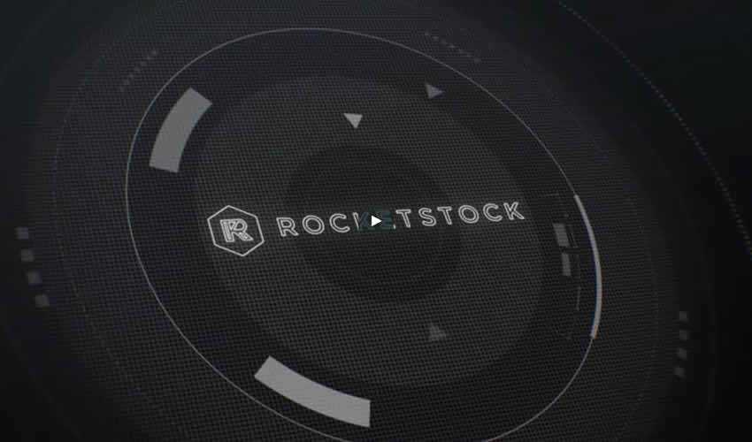
The Orbital Free HUD logo reveal is another free template perfect for any tech company. This logo reveal features a futuristic style and includes the complete AEP project file with background textures and elements.
This logo reveal or intro template uses bold typography and kinetic transitions to present your brand beautifully. It is easy to customize. Simply swap in your logo, edit the text, tweak the colors, then render. It would be an ideal template for app launches or brand reveals.
This free After Effects logo pack includes three reveals in a modern and minimal style. They include a simple circle reveal, a mouse click-to-reveal, and an animated button push.
If you’re looking for a more classic-style logo opener, try the White Scroll logo reveal. The template comes with three background versions and three different logo placement options.
This free After Effects logo reveal template uses pixelation and static noise to give your logo reveal a glitchy look and feel. This is a great template for gaming content or digital-themed videos.
A unique way to reveal your logo is to use an animated search bar with a sample question. Your logo then shows up as the answer. You can customize the text and quickly drop in your logo.
This logo reveal template would be great for a startup or a small business. It is easy to use and includes detailed instructions on how to customize and render your logo reveal project.
The Battle Logo Reveal template would be perfect for a sports or gaming brand. It comes with a detailed help file, a logo placeholder, and an extensive set of backgrounds that you can use to customize your logo reveal.
This premium animated logo reveal features a dark blue background paired with light blue HUD elements. It’s a perfect logo template for any tech company looking to stand out online.
This free logo reveal template features a clean and high-energy animation with bold transitions and dynamic light effects. It’s very easy to customize. All you have to do is drop in your logo and edit the colors or background. It is perfect for intros, brand openers, or YouTube channels that want a sharp, professional-looking logo animation without any extra setup.
This simple 4K logo reveal template is super-easy to make your own. All you have to do is swap out the logo placeholder and edit the text layer. It is compatible with After Effects CS6 and above.
This logo reveal template uses MoGraph Lines. They are animated lines used to connect elements and add flow or rhythm to animated scenes. The template is compatible with After Effects 2022 and above.
The MoGraph in this logo reveal templates are animated geometric elements used to create movement or transitions within a composition. This bold style is perfect for many business types. It is compatible with After Effects 2022 and above.
If you’re looking for a 2D style logo reveal, try this 2D logo introduction Template. This template allows you to easily customize the colors and insert your own logo. It also includes a detailed help file.
This free template pack contains three different logo reveals suitable for any corporate video. This template is an excellent choice for a modern and professional logo reveal.
This elegant logo reveal would be perfect for a high-end fashion or luxury brand. The template includes logo placeholders, editable text layers, and an intelligent color controller.
The free Fast Flip After Effects logo reveal template is a great starting point if you’re on a budget. It uses stock photography, which you can replace with photos of your team or company to reveal an elegant logo at the end. All you have to do is customize the colors, replace the images, and add your logo.
Try the Blue Action Logo Reveal template if you’re looking for a minimalist logo opener. It features a dynamic animation style, and includes a logo placeholder and editable text layers. You can also easily adjust the colors.
Try this logo reveal template if you’re looking for an action-packed, hi-tech animation style. To edit the project, drop your logo or text into the logo composition and then render the project.
If you want a logo reveal template designed in a Matrix-style, try the Hi-Tech Logo Reveal template. This template contains two color versions, logo placeholders, and two editable text layers.
Slideshow & Gallery After Effects Templates
A good slideshow depends on more than placing images in sequence. The order, timing, transitions, and music all influence how the work is presented. It can be used to showcase a portfolio, document an event, tell a visual story, or bring a set of photographs to life.
Galleries take a slightly different approach, displaying several images within the same composition. Grids, frames, and animated layouts allow related photos to be viewed together without making the screen feel crowded.
Building every layout and transition from scratch takes time. The free After Effects slideshow templates below have the structure, while giving you control over the images, colors, typography, pacing, and soundtrack.
This free After Effects template presents your photos in a nostalgic Polaroid style. It’s perfect for sharing personal memories, travel adventures, or family events. The template includes 16 image and 16 text placeholders.
This After Effects template gives you a wall gallery-style photo slideshow with smooth camera moves and realistic lighting. It includes multiple image placeholders and editable text layers. It would be excellent for weddings, personal portfolios, or family photo collections.
Try the Bold Slideshow if you want a bold and colorful look. This template includes a detailed help file, editable placeholders and text layers, and full color control so you can easily customize the colors to match your brand.
The Old Slideshow template is an excellent choice if you’re looking for a retro-style gallery or slideshow. The template comes with full-color control, so you can easily customize the color scheme.
Try the Wall Slideshow if you want a cool-looking, modern gallery to display your family photos and albums. The template is easy to customize and comes with full-color control.
This Modern Zoom Telescopic Slideshow Video features a unique zoom effect visualized through a telescopic transition. It also includes multiple light leaks and six image placeholders.
This template features a vintage-style slideshow of polaroid photos. It’s a great choice if you want to combine all your photos and create a truly unique photo album.
Parallax is a popular animation effect used on many websites. Thanks to this template, you can also use the effect in your videos. This template contains nine image or video placeholders and nine text placeholders.
This Creative Slideshow template features a dynamic, fast-paced animation style and bold typography. It would be perfect for a corporate video presentation and includes full-color controls and editable text layers.
This free After Effects slideshow template includes 23 image or video placeholders and six text layers. It has smooth transitions, clean animation, and allows for simple customization. Replace the media, edit the text, and render. It would be great for photo reels, travel videos, or quick promo videos.
This After Effects template creates a polaroid-style photo slideshow with a rustic aesthetic. It includes multiple media and text placeholders and would be perfect for wedding photoshoots, travel reels, or event highlights that need a vintage or a touch of romance.
This free After Effects template features a digital filmstrip animation with photo or video frames moving in sequence. It includes 18 media placeholders and 10 text layers. The layout is simple to edit and renders in full HD. It is compatible with After Effects CS4 and above.
Use this template if you’re working on a video that needs fast-moving animation. This slideshow would be perfect at the beginning of a video to introduce the different concepts.
The Modern Tile Slideshow is an excellent choice for professional and corporate videos. The slideshow template features a unique, tiled look and a 3D tile drop-down effect to reveal your images and transition between them in 3D. The template also includes multiple light leaks.
This dynamic template features a modern and colorful style paired with minimal typography. It’s an excellent choice for both business and personal video slideshows. The template includes 23 media placeholders, 19 editable text layers, and an intelligent color controller.
Consider the Stylish Spinning Columns Slideshow Template if you’re working on a high-end project. The template includes six image placeholders, a modern spinning column transition effect, and multiple light leaks.
This After Effects template is perfect for corporate and business slideshows. The template features elegant slide transitions and includes several placeholder images. You can easily add more and customize text and colors to match your brand.
In this template, you will find 14 image placeholders arranged in a stunning grid layout. Thanks to the intelligent color controller, you can easily adjust the colors and replace the text with your own.
If you want a clean slideshow that you can use to present your family photos or if you need a clean slideshow for a corporate project, the Clean Slideshow template is the right choice. It features a stylish design, simple text animations, and smooth transitioning effects.
Opener After Effects Templates
Video openers have a lot to accomplish in a short amount of time. They combine footage, typography, graphics, and sound to establish the pace of a video before the main content begins.
Getting those elements to work together can involve detailed editing and plenty of keyframes. A pre-built template provides the timing and structure, while After Effects presets can help with individual animations and effects.
This collection includes free After Effects opener templates for YouTube videos, presentations, promotions, event films, and other creative projects. The styles range from quiet and minimal to fast, colorful, and effects-heavy. Replace the sample footage and text, adjust the colors, add your soundtrack, and shape the opener around your own content.
This free After Effects template uses rapid animation and bright motion graphics to create a dynamic opener for any video. The template includes 12 media and 12 editable text placeholders. It’s perfect for music videos or urban-themed projects.
This creative and colorful opener template works well for travel, fashion, or kids’ brands. It’s also a great choice for simple video or photo slideshows, showreels, corporate presentations, or even a family album.
This classic YouTube opener can be used in business and corporate projects. It comes with full-color control, and you can easily change the text and other elements to make it your own.
Try this Glitch Media opener template for any grunge or retro-style video project. It comes with a detailed help file, animated fonts, and full color control
This mosaic opener template is versatile and works for many types of projects. It has a unique mosaic design, and you can easily add your own text and change the colors.
This After Effects opener has a fun, hand-drawn style with doodle textures and comic-style speech bubbles. It comes with six editable text spots, a logo slot, and a photo cut-out. It’s great for social media clips, creative presentations, or talk-show intros.
This After Effects opener uses bold text, smooth animation, and bright transitions to create a fresh news-style intro. The template is easy to edit with text and media placeholders. Replace the footage, update the titles, and render, and your intro will be ready.
This slideshow-style opener template uses clean transitions, a simple layout, and subtle motion to present your photos or video clips. Just swap the placeholders with your media, edit the text and colors, then render. It is compatible with After Effects 2022 and above.
This free 4K opener template provides a rapid editing setup for Adobe After Effects. It supports multiple aspect ratios (horizontal, vertical, and square). Use the horizontal format for YouTube, the vertical format for social media, and the square format for posts.
This is another opener template that would work well for a company that targets a young audience. It features an energetic, fast-paced animation style. It comes with 16 image or video placeholders and six text placeholders.
This free After Effects template includes eight scenes and a logo reveal, making it ideal for promoting digital products or online services. It includes 45 text placeholders, 12 media placeholders, and a logo placeholder, along with color controllers for quick customization.
If you’re looking for a stylish and elegant opener, look no further than this parallax opener. The template includes a stunning parallax animation with eight editable text layers, eight photo or video placeholders, and one logo placeholder.
Try this template if you’re looking for a modern opener. It features a fast-paced animation in a slideshow style. You can easily change the colors and fonts, add your own elements, and render the project.
If you need something simple to quickly create a video opener, this is the free After Effects intro template you need. The template is as simple as possible, and you can easily customize colors and add your chosen text.
Looking for a sleek and edgy way to introduce your video? Check out this glitch template for After Effects. The best part is that no plugins are required – simply edit and render. Even if you’re new to After Effects, you’ll find this glitch intro template easy to customize to your needs.
Use this opener to engage your Instagram or YouTube followers and stand out in their feed. The template comes with 27 image and video placeholders, 20 editable text layers, and one logo placeholder.
If you need a creative and unique way to present your design client work or portfolio, try this modern website presentation template. You can also use it to showcase your website templates or CMS themes.
This free After Effects intro template comes with 15 image placeholders and can be used for corporate videos or any video promoting a fashion or jewelry brand.
Intro After Effects Templates
An intro gives recurring video content a consistent identity. It can combine a channel name, series title, logo, short clips, and music into a sequence that viewers soon recognize.
The most effective intros are usually short enough to avoid delaying the main content. Clear typography, purposeful movement, and well-timed sound can establish the visual style in just a few seconds. They work particularly well for YouTube channels, podcasts, tutorials, episodic content, and branded video series.
These free After Effects intro templates provide the animation and timing needed to build your sequence. Add your logo, replace the text and footage, adjust the colors, and choose music that fits the character of your content.
The Multiscreen Spotlight template displays multiple video or photo panels arranged in a grid layout with animated transitions and glowing spotlight effects. You can edit the text, replace media placeholders, and adjust colors. It is compatible with After Effects CC and above.
The Boiled Down opener template makes things bold and fast. It has six media placeholders, one logo slot at the end, and 17 text-replaceable comps. The resolution is 4K, and it is compatible with After Effects 2020 or later.
This free opener template, as the name suggests, features overly large, bold text and some lovely clip transitions. It would be perfect as the opener or intro of any travel or vacation-related video.
This free Retro Wave Intro template is perfect for any vintage or retro project. The template has a colorful design, two editable text layers, one logo placeholder, and a full-color controller.
If you’re a fan of the cyberpunk style, don’t miss this Cyberpunk Intro. This is an excellent choice if you want to have a cinematic look in your videos, and it would also be an ideal fit for a tech company.
This free intro template features bold titles and duotone colors. You will get five image or video placeholders, four text placeholders, one logo placeholder, and a custom color controller.
This free After Effects template displays your logo with a hint of elegance. The animation starts by outlining your logo and gradually reveals the full design. The animation’s simplicity adds to its beauty, making it the ideal choice for anyone looking for a refined, polished way to showcase their brand.
This bright, clean After Effects intro template features seven media and seven text placeholders. It features an elegant animation perfect for corporate or business video projects.
Lower Thirds After Effects Templates
Lower thirds may occupy a small part of the screen, but their design still requires careful thought. Names, job titles, locations, and other details need to be readable without drawing attention away from the footage.
Good lower thirds use clear type hierarchy, controlled movement, and enough contrast to remain legible against different backgrounds. They are useful for interviews, documentaries, news videos, presentations, YouTube content, and branded productions.
These free After Effects lower-third templates offer a range of layouts and animation styles. Each can be edited to match your visual identity by changing the typography, colors, timing, shapes, and displayed information. Some collections also include several coordinated designs for speakers, locations, captions, and social media details.
Your projects will instantly look more elegant with these 2D lower thirds, thanks to the use of stylish typography and various design elements. You can also use your preferred animated fonts and change the colors to match your brand.
The Lower Thirds After Effects template features a classic black-and-white style. Your text appears as a stylish box, and you can easily edit the colors and adjust the text and the duration.
This huge template pack includes 24 lower third templates in a bold and colorful style. You can easily adjust the colors to match your brand and set your desired duration.
Another combo pack, this titles and lower-thirds After Effects template features a modern and minimal style that can be used in various video projects. This template comes with full-color control and a detailed help file.
If you love minimalism, try this free lower third pack. The template includes 20 lower thirds and ten premade color schemes. Customize the colors, set the duration, replace the text, and render your project.
This After Effects template pack includes titles and lower thirds, so it’s an excellent choice for those who need both for their video projects. The template is incredibly easy to edit as it comes with text boxes that automatically adjust to your text size and width.
This free sports-themed lower thirds template features a callout with a performance chart and space for a headline and profile picture. With its modern and classy design and customizable features, this template is a great way to add some extra flair to any sport-related video.
This creative and colorful pack of lower thirds also includes images and cartoon-style icons that you can use for extra eye candy. The package comprises 15 titles, lower thirds, and a detailed help file.
Consider this template if you’re looking for an elegant lower thirds template. It comes with lower thirds, transitions, a logo reveal, and more. With five text placeholders and a spot for your logo and tagline, this template is an excellent choice for corporate videos.
This simple lower thirds template has been designed in a flat and modern style. It features a circular call-out container that’s easy to use and customize. It’s an excellent choice for modern companies and businesses.
This is another elegant and stylish After Effects template with four different graphics. All the text layers and colors are easy to edit, and the project renders super fast, which makes it an excellent choice if you have a rush project.
This dynamic template offers eight beautiful animations that you can fully customize with colors of your choice. With 24 text placeholders, you can quickly replace them and enjoy fast rendering. These lower thirds are a great way to add visual appeal to your next video.
This free lower thirds template includes a left-to-right call-out with floating rating sliders underneath. It’s perfect for brands, businesses, and projects that want to add a touch of modern style to their videos and presentations.
This modern, beautifully designed free lower thirds template features two call-out boxes, a flawless entrance animation, and a bounce effect.
Animated Text & Font Templates for After Effects
Animated typefaces give individual letters their own movement and character. Text can bounce, stretch, rotate, flicker, or appear one character at a time, making them a playful option for video titles, captions, and short promotional graphics.
Rather than animating every letter by hand, these After Effects templates include pre-built animations, text placeholders, and adjustable controls. You can type your own words, change the colors, refine the timing, and combine different letter movements to suit the project.
The free animated typefaces in this collection cover several visual styles, from clean geometric movement to rough, hand-drawn effects. They are particularly useful for music videos, social media clips, opening credits, and other projects where typography takes a leading role.
This animated typeface features a glitchy look, so it’s perfect for videos that use glitchy animations. The colors are easy to customize, and you don’t have to worry about dropping each letter on a separate timeline with this typeface.
The Alquimia Animated Font has a truly unique look. The font can be freely used in both personal and commercial projects, and you can easily modify the colors.
The Paper is a perfect choice if you’re working on a video that requires a creative touch. The font includes a full alphabet, numerical characters, basic currency symbols, and basic math symbols.
This free preset includes all 26 letters, numbers (0-9), and After Effects AEP file for quick customization. The preset’s glowing neon aesthetic will create an energetic and modern look and feel to any After Effects creation.
Consider the Helvetica Neue animated font if your next project needs an elegant or classic touch. This After Effects template font has 43 unique letter, number, and punctuation compositions.
The Sketch Animated Font is perfect if you want a handwritten look and feel. It includes capital letters, lowercase letters, numbers, and punctuation marks.
The Pain On animated typeface is a must-have if you want to add a unique style to your videos. Each character paints white, black, and blue colors, which can easily be customized to match your own brand colors.
The Animography font is a full-featured animated font created as a collaborative project between 110 animators and one designer. It has a distinct, bold look and can be used for corporate videos.
Animated Icon Templates for After Effects
Static icons already communicate a lot with very little space. Add movement, and they can also show an action, change of state, or response. A loading symbol can rotate, a notification can pulse, and a button can confirm that it has been selected.
These small animations work well in app demonstrations, interface presentations, explainer videos, infographics, and social media content. Careful timing keeps the movement clear without distracting from the information around it.
The free animated icon templates below save you from keyframing every shape individually. They include coordinated icon sets in several styles, with controls for adjusting colors, scale, timing, and movement to match the rest of your project.
Consider this lovely pack of animated icons if you’re looking for a stylish design. The icons have been designed with a modern, thin-line style and are perfect for various projects, such as tech videos, fashion videos, and more.
Technicons is a set of technical icons for After Effects. This icon pack comes with 30+ animated icons, and you’ll also find a variety of business icons, making this pack suitable for all kinds of projects.
This free icon pack includes 20 different icons for business and personal projects. The icons are all pre-rendered footage, so you can use them in any video editing or motion graphics software. The project file is also included in the download.
This is another icon pack with a large selection of icons for business, technical, and other types of videos. The icons feature a modern, flat design, and you can change the size and color of each icon.
This creative icon pack has 15 icons perfect for any technical niche. The template’s intelligent color controller makes it easy to customize the icons with your brand colors.
Consider this social media icon pack if you’re looking for icons with a unique design. This icon pack is an excellent choice for any food-related business or brand that specializes in children’s products and uses video as part of its marketing strategy.
Check out this free icon pack if you need social media icons for your project. You’ll find icons for all major social media networks, and you can use the default colors or customize them with your own.
This icon pack includes an impressive 1,000 icons covering almost any niche. You’ll likely use this library repeatedly in your projects, especially since it was designed using flat design.
Consider the Anicons icon pack if you want a complete icon library that can easily be customized. The icon pack allows you to quickly animate and adjust the icon parameters easily. The package contains 40+ icons.
How to Install an After Effects Template
Most After Effects project templates do not need to be installed. They are downloaded, extracted, and opened like any other project file. Keep all supplied folders together so After Effects can locate the linked assets.
Download the template and extract the ZIP archive to a dedicated project folder.
Read the included documentation before opening or moving any files.
Check the required After Effects version, fonts, and plugins.
Open the supplied .aep file through File > Open Project.
If After Effects converts an older project, save the converted version as a new file.
Relink missing footage, images, or audio when prompted.
Open a .mogrt file through File > Open Project when it needs to be edited in After Effects. Templates intended for Premiere Pro should be added through its Graphics Templates panel.
How to Customize an After Effects Template
Template creators organize projects differently, but most use clearly labeled compositions and placeholder layers. Work on a duplicate of the original project so you can return to the untouched version if an edit causes problems.
Open the main composition and identify the editable text, image, video, and logo layers.
Replace placeholder media while preserving its position, scale, and timing.
Edit the text, then check that longer words do not extend beyond the composition.
Change the colors and fonts to match the project rather than the preview.
Adjust keyframes or layer durations when the original animation feels too fast or slow.
Review any controller, Essential Properties, or Effect Controls layers supplied by the creator.
Preview the entire sequence before rendering to catch missing media, clipped text, or abrupt cuts.
Tips for Improving Performance
Templates can contain large footage files, complex effects, 3D layers, and many nested compositions. A few temporary adjustments can make editing and previewing them much more manageable.
Reduce the preview resolution to Half or Quarter while editing.
Use a Region of Interest when working on one small part of the composition.
Keep source files and the disk cache on a fast local drive when possible.
Close unused panels and other memory-heavy applications.
Temporarily disable motion blur, depth of field, shadows, and demanding effects.
Use proxies or pre-rendered compositions for large video files and complex scenes.
Remove unused footage and compositions from a working copy of the project.
Clear the memory and disk cache if previews become unreliable or storage space runs low.
Final Thoughts & Recommendations
The most useful After Effects template is rarely the one with the busiest preview. A simpler project with clear controls, organized layers, and restrained animation is often easier to adapt and more useful across different types of work.
Choose a template that suits the pace and purpose of the video. A rapid sequence may work well for an event promo but feel out of place in a documentary or portfolio presentation. Typography and movement should support the content rather than compete with it.
Before committing to a template, check its license, After Effects version, plugin requirements, and included assets. Open the project and test a short section before replacing every placeholder. This can reveal performance issues or missing dependencies early in the process.
Finally, spend time changing more than the sample text. Adjust the timing, type choices, colors, transitions, and sound so the finished sequence belongs to the wider project. Free After Effects templates can remove hours of setup, but thoughtful editing is what stops the result from looking like the original preview. Keep an untouched copy nearby, make deliberate changes, and give the animation enough space to do its job.
Check out the hottest new typefaces in our monthly roundup.
Summer is fast becoming a memory. We've all had our holidays, switched off our out-of-office replies, and are wondering whether to put a jumper over our T-shirt. And as we power up our laptops once more, there's oodles of typeface goodness to lap up.
This month's releases include a Victorian grotesque revival with a political conscience and a Peignot update from Production Type. There's Castillon, a serif that fuses British and French calligraphic traditions with those from Estonia; Tüpokompanii's Vee arrives as a younger sister to the Bauer Venus of 1907.
The real standout story, though, has to be Exemplar. Göran Söderström began drawing it way back in 1994, before many people reading this article were born. It is now, more than three decades on, complete. To celebrate, he carved its history into marble street signs in Italy. And after all that work, who could deny him that?
We've been watching Sofia Mohr's Autêntica superfamily expand across the year with admiration, and this serif release doesn't disappoint. Where Autêntica Sans established the family's rhythm and editorial personality, this new release translates those qualities into something warmer and more sculptural; inspired, she says, by Brazilian Brutalism and its dialogue with landscape and light.
With its bold, rounded serifs, softened corners and fluid terminals that open into subtle drop-like shapes, this is not a standard serif by any means. Six weights and a variable font make it very versatile, and this font could be a good choice to use for branding, packaging, editorial and cultural projects.
Thirty-two years: that's how long Göran Söderström of Letters from Sweden has been working on Exemplar. He began drawing it in 1994 on a Power Macintosh 7100. Finally, it's complete: five weights with italics, 791 glyphs, supporting Latin, Cyrillic, Greek and Arabic across 370 languages.
To mark the occasion, Letters from Sweden carved the typeface's three-decade history into marble street signs in Pietrasanta, Italy: one sign per decade, per address where each version of the typeface was designed. They even made a short film about it. They're very excited. And rightly so: this is a significant piece of work: a humanist serif that's been lived with, tested, refined and reconsidered across three decades of design practice. Indeed, Exemplar's multilingual scope alone—370 languages!—puts it in a different category from most typefaces.
We always have high expectations for the work of Malou Verlomme, who co-designed 00 Quatorze, which we covered in December 2025. And we're happy to report that with Castillon, they've been met. Released through 205TF, this serif sits at the intersection of two typographic traditions: British and French; the broad-nib pen and the stone chisel.
The contrast between thick and thin strokes is pronounced, as is the tension between structural capitals and more fluid lowercase forms. As its makers put it: "The serifs seem to waver between lapidary incision and calligraphic stroke", creating a lovely tension that could help bring designs across a number of applications to life. Six weights with matching italics, only slightly inclined and deliberately narrow, complete this confident family.
Three years in the making, Foundry Kingdom is described by designer Stuart De Rozario in unusual terms. "[It] is not champagne, it is a pint of bitter in the local pub," he says. "It is not the King's horse at Ascot, but the drayman's horse hauling beer barrels through narrow streets. It is not spectacle or ceremony, but industrial labour: the quiet dignity of work."
Rooted in the early grotesques of the 19th century, Foundry Kingdom is a homage to that English lineage at the point before it diverged into the German neutrality that eventually led to Helvetica. Within its DNA lie historic forms that were meant to be read quickly and clearly under pressure: railway lettering, newspaper type, hot-metal printing.
Named as a tribute to Isambard Kingdom Brunel, its strokes are heavy, the proportions functional. Meanwhile, details such as bold terminals on the a, c, g, j, r, s, t and y; a two-storey a, and a double-storey g add plenty of character to the mix. Foundry Kingdom is available across fourteen styles from Light to Black.
Peignot is one of the classic display typefaces of the last century. Production Type's House of Cassandre imprint has been stewarding that legacy, and Peignot Jumbo is its latest, carefully considered extension. The concept was a simple one. As Production Type's Deniz Eser Uslu puts it: "There never was an original rounded version of Peignot in the foundry archives, so we decided to make one."
Peignot Jumbo is calibrated for maximum display impact, with all the drama of the original at scale, without any of the compromise at smaller optical sizes. It's a strong choice if you need your typography to be distinctive, whether you're working in a cultural institution, the fashion industry, or in high-impact editorial.
Vieno is certainly ambitious. In developing it, Spoke's Teo Tuominen took the discipline of Bodoni and Didot as his starting point, then deliberately pursued the contradictions rather than resolving them. The result: a serif that consciously sets organic and mechanical forms against each other, leading to a beautiful tension between tradition and modernity.
Despite these historical inspirations, though, Vieno is also pretty original. As Teo puts it: "The terminals are mechanical, rigid squares, the dots are shaped like a diamond, and sharp angles can be found throughout the character set."
Vieno comes in 15 weights from Extralight to Black, each with matching italics, plus a complementary monospaced style for contrast. The character set includes old-style and tabular figures, ligatures, circled numerals, inferiors, superiors, fractions, alternates and a set of distinctive icons.
We all love a 1970s geometric type revival. And better still, Novaform is a more nuanced entry into that genre than most.
It's inspired by an era when classic faces like Kabel and Futura were reimagined with interlocking uppercase ligatures, tremendous x-heights, and a boldness calibrated for display.
As Identity Letters point out, though: "These hallmarks of the phototypesetting era were exclusively designed for display use." By contrast, Novaform has been designed to be more approachable, look more natural and read well in body text.
Ten weights, stylistic sets, hallmark ligatures and a Unicase mode let designers dial up or dial down the showiness as required. The Unicase mode, in particular, makes the typeface's most distinctive quality available as a choice, not a constraint.
Raimundo was designed by Enrique Hernández, the father of one of Latinotype's founders, and this familial link seems to have added an extra layer of warmth to its DNA. Type designer Jorge Cisterna describes it as "that friend who gives you straight advice with a pat on the back. A raspy, confident voice that always has a joke behind every line."
Sitting somewhere between geometric and grotesque, the font features rounded forms, open counters and a weight range that moves from quiet to loud, while alternate forms for a, e and g allow the tone to shift from neutral to expressive in small, controlled increments.
The 541-glyph character set includes typographic emoticons, and not by accident: this is a consumer-facing typeface, not a corporate one. Eight weights from ExtraLight to ExtraBold make it a strong choice for food retail, packaging, digital products and brand identities.
Paulo Goode, whose typeface Raxmus we featured in our May roundup, returns with a typeface that's very, very different. Where Raxmus was flared and stone-carved, Arpeggio is a transitional serif; warm, readable and disciplined. It could serve as a workable alternative to Baskerville; not to mention Caslon, Mrs Eaves, Georgia, Perpetua and Bookman.
Described by Paul as "an original text typeface that balances disciplined rhythm with expressive character", it oozes clarity and confidence in the text weights whilst the Display collection amplifies the characterful nuances with sharpened forms, graceful swashes and exuberant flourishes. A strong choice for books, magazine design or a luxury brand identity.
There are twenty-seven fonts in all across Thin to Black weights, with 500+ glyphs covering all Latin European languages. Variable fonts are available on request.
Elena Genova of My Creative Land, whose typeface Differently was featured in our July round-up, returns with a flared serif inspired by the incised letterform tradition exemplified by Berthold Wolpe's Albertus and Hermann Zapf's Optima. The design is subtle enough for display, whilst maintaining legibility at subhead and text sizes.
The companion italics draw on calligraphy, and there's a well-chosen selection of ligatures, swash capitals, alternates and stylistic sets. There are two widths, each with eight weights from Thin to Black, with true italics included in Regular. This would be a good choice for a brand website, a magazine cover or a book cover.
Created by Richard Lipton, who's been designing type for more than 40 years, Partiche is an expressive sans with a calligraphic eye. It was inspired by the graphic sensibility of Seymour Chwast, the Push Pin Studios co-founder whose mid-century work was characterised by wit, warmth and visual intelligence.
The details Lipton takes from that source are specific: wedge-shaped terminals, sculptural spurs, unexpected details. On the surface, Partiche looks monolinear, but closer inspection reveals the calligraphic thinking underneath. Small caps and a purposeful set of alternates make this font a good choice when a design needs both character and utility.
The latest typeface from The Designers Foundry is built across four sub-families: GRX, GRX Raw, GRX Poster and GRX Poster Raw. The base GRX contrasts bold, rugged serifs with controlled strokes. Raw adds rough texture inside the letterforms, giving the type a handmade weight. Poster sharpens the terminals and amplifies the contrast between thick and thin. And Poster Raw combines both directions simultaneously.
There are five weights per sub-family, and built-in stylistic sets and discretionary ligatures for further expressive control: 40 styles in total. The idea is to give creative latitude while retaining a level of formality. The Poster Raw styles in particular have a graphic intensity that would work well in editorial and poster design.
Vee draws inspiration from Venus, a sans-serif typeface family released by the Bauer Type Foundry in 1907 that was popular throughout the first half of the 20th century. Having worked with Venus herself, graphic designer Laura Pappa was eager to develop a typeface that references its distinctive character while introducing new qualities of its own.
A collaboration between Laura and Estonian type studio Tüpokompanii, Vee is described as "Venus' younger, more mischievous sister." To accompany its release, Tüpokompanii published a print companion called "Let yourself be bad at things": a conversation between the foundry and Pappa about the origins of their working process, the development of Vee, and the values embedded in their typefaces. It's a thoughtful pairing of typeface and text, and suggests a foundry that thinks carefully.
Estelar came out of a sketch. Mauricio Zanon of Zanon Studio, based in Rio Grande do Sul, Brazil, was working on a visual identity project that required a handful of modularly designed letters, and something in those early letterforms suggested a typeface rather than a logotype. Estelar grew from there, developed through the FontePro course from Plau, and ultimately became Zanon Studio's first commercial type release.
The design sits at the intersection of futuristic and calligraphic: technological characteristics softened by a handwritten quality that prevents it from feeling cold or mechanical. A variable axis covering weight and slant, plus 16 individual static weights from Thin to ExtraBold, 400 glyphs, and support for 95 languages give it plenty of range. A good choice for logos, impactful titles and websites.
Aussie designer Yenty Jap closes this month's round-up with something welcoming and cheerful. YJ Handful of Sunshine is a hand-drawn display typeface with two character sets (Standard and Stylistic Alternates). It's designed to bring a calm, human handwriting voice into modern branding, and is inspired by everyday writing, journaling and note-taking.
The strokes are light and relaxed, with rounded terminals that keep the texture soft. Rhythm is loose but controlled, giving each word a natural flow without losing clarity. Spacing is open, allowing text to breathe in menus, packaging, and signage. Proportions stay steady across the alphabet, creating a handwriting style that feels warm, modern, and human.
This font would be a good choice for use in hospitality, lifestyle, and boutique branding, and more broadly, for anyone trying to give their designs a warm, handmade feel.
A new Norfolk exhibition captures young British champions at home in their living rooms.
Think about photographing sports professionally, and a certain type of image comes to mind. An athlete in action, typically mid-air, sweat beads and straining muscles frozen in a moment in time. The split-second between drama and failure, evoking all the passion, all the intensity, of the sport in one dramatic image.
But that's not everything that taking part in a sport entails. It's not even most of it.
Yes, that dramatic moment might be what you're working towards. But the "working towards" matters too: it's where the real battle of a sportsperson actually takes place. And that's exactly what award-winning artist and documentary photographer Debby Besford's decade-long project focuses on instead.
Away from the arena
Now on show in an exhibition in Norfolk titled The Art of Roller Skating, Debby's images take these girls away from the rink and into the domestic setting. And in doing so, they provide a whole new perspective on these sporting champions.
Ellen, 2015Ellen, 2019Megan, 2019
It's a subject Debby has intimate knowledge of. Having grown up in Great Yarmouth, as a teenager she trained as an artistic roller skater and travelled all over the country to competitions. Later on, became a national skating judge.
For the past decade, she has been creatively documenting the journeys of young roller skaters based in East Anglia as they train and develop their skills towards British and World Championship level.
In these pictures, the girls don the glittering, sequinned costumes they skate in. But rather than standing at a rink barrier, Debby's placed them on their parents' beige carpets, in front of floral wallpaper, next to the TV, or a chest of drawers.
The juxtaposition is instant and arresting. These spectacular costumes, designed to be visible and entrancing from the furthest seat in the arena, look decidedly odd when surrounded by the ordinary clutter of a teenage bedroom. The scene sits awkwardly between school photo and fashion editorial, and it's exactly this sense of unease that makes these pictures so compelling.
Deep heritage
From 26 September until April, more than 40 of these photographs go on show at Time and Tide Museum in Great Yarmouth, in an exhibition called The Art of Roller Skating. It's a place with deep skating heritage: Gorleston Rollerdrome, the Winter Gardens, and now the Breydon Arena all feature in the town's story, which continues today through the Retro Skating Academy.
And yet artistic roller skating has long been undervalued by the culture at large. From figure work to free skating and disco routines, it's a hugely demanding sport, but lives permanently in ice skating's shadow.
The exhibition's other strand, The Jump Series, is pure spectacle that aims to right that balance. These still images and slow-motion videos capture each skater rotating in mid-air, revealing their physical strength, emotion and intense determination in the pursuit of "the perfect jump".
Molly, 2019 from The JumpDulcie, 2019 from The JumpYoung Debby in Living Room, 1977
The show also includes a full archive: posters, programmes, newspaper cuttings and championship sportswear stretching back to the 1960s, tracing the sport's 1970s and 80s heyday and its particular appeal around Great Yarmouth.
This historical context helps us connect further with Debby's portraits and make the case that this often-overlooked sporting culture deserves as much attention as the more fashionable ones.
The French illustrator behind Champ Magnétique is taking her hot pinks and oranges from screen to canvas, and finding that how she paints and what she paints both come back to a gentler pace.
There isn't a creative I know who doesn't feel the speed of change right now. The overwhelming need to "step up" and keep going is real. Maybe that's why so many of us are deliberately slowing down, and finding ways to remember why we create in the first place—turning to analogue pursuits, perhaps, or opting for things we can actually grasp.
Clara Biel, aka Champ Magnétique, is slowing down in two different ways. The French illustrator draws the everyday places we often rush through, and she's increasingly turning to painting on canvas – a practice that calms her.
What does she paint? Oh, anything from a laundromat or photo booth to a supermarket or pool hall. "These places feel like real time capsules," she tells Creative Boom. "There is something almost frozen about them, as if they've remained untouched while the world continues to change around them."
Yeah, it makes sense. I yearn for the comfort of familiarity like anyone. For Clara, they're also spots where she can dream up various scenarios. "I'm drawn to the contrast between the ordinariness of these settings and the richness of what might be happening inside," she says. "They are familiar places that most of us have experienced, but we don't necessarily stop and look at them. With my painting, I like to slow things down and give these everyday moments a sort of significance. I then invite the viewer to wonder what's gone on."
What strikes you most about Clara's illustrations is the colour palette. Hot pink, red and orange run throughout, a recurrent theme she says just happened naturally. "I've simply always been drawn to bright, pop colours and to combinations that have a certain warmth and intensity to them."
She puts it down to her love of the 1980s, "the packaging, interiors, shop fronts, and all those slightly artificial, colourful environments", plus the Pop Art of Andy Warhol and Tom Wesselmann, who "could make colour feel almost tangible". And The Beatles, especially the world of Sgt. Pepper's Lonely Hearts Club Band and Yellow Submarine. "That mix of colour, fantasy and a certain playful weirdness really speaks to me," she says.
The same dreaminess runs through her posters for festivals such as La Bonne Aventure and Foreztival. She's not interested in drawing the stage or crowd. She'd rather capture the feeling a festival leaves behind. "The image can then become less of a representation of the festival itself and more like a memory, a sensation, or a fragment of a dream," she says.
On some of her works you'll notice words. "Keep a tender heart" reads one. "Karma is real" states another. "Am I overly dramatic?" makes me wonder if Clara has read my mind. In fact, they're thoughts plucked from her own life. "There's something comforting for me in putting these feelings into an image, because even though they come from a very personal place, I know that other people might recognise themselves in them too," she says. "Making these images can feel quite cathartic, a way of giving a shape to a deep or complicated feeling, and somehow getting it out of myself."
It's nice to know she's happy to laugh at herself, too. "Some of these phrases are deliberately dramatic or slightly ridiculous, and I like not taking myself too seriously. I think humour can make something personal feel much more open and relatable."
So why pick up a paintbrush now? Is she hankering after simpler times like the rest of us? "I've been painting since I was very young," she says. "It has always been a way for me to escape, to get lost in something, so I'm really happy to be reconnecting with that part of myself now."
Painting also gives her something digital work can't. "Everything exists on a screen," she continues. "Turning an illustration into a painting is a way for me to make the work more tangible, to give it a physical presence and leave a trace behind." She sees her digital illustrations "almost as sketches, while the painting becomes the final form of the work."
And then comes the calm. "Being in front of the canvas, mixing the colours, making decisions with my hands – it becomes a completely different kind of experience. Time seems to slow down, and for a while I can really disconnect from everything else. It feels like a moment outside of time." Is it just me who let out a big, long breath then?
I didn't ask Clara about AI. She brought it up herself when I asked about the hardest part of freelance life. Mostly, it's the usual instability. "There's always a little voice in the back of my head wondering if I'll still have a client tomorrow," she says. But with AI, she's not worried. "I feel that people are increasingly looking for things that feel human and made by hand," she says. In France in particular, she's meeting more and more clients who want to work with artists to create something unique rather than generic. I mean, come on, it's obvious when someone has used AI, and we all know how bad it looks for the brand.
"There's something quite wonderful about seeing people value the human touch behind an image again—all the personality, imperfections and choices that come with an artist's hand," she says. I'm seeing this shift elsewhere, too. The mass market doesn't trust AI-generated stuff and dislikes anyone who uses it.
"It's scary, though, because we don't know what's going to happen next," she says. "But there might be lots of unexpected opportunities and new directions to play with. I think that's what keeps me excited."
In her grad film, a clay squirrel gets so distracted making tea that she forgets the cake completely. Here, the animator explains how live-action reference, a multiplane set, and lots of handmade clay brought the story to life.
You see a squirrel baking a cheesecake. Mid-recipe, she reaches for the sugar and pours it into her tea instead, without quite noticing. She sips it, enjoys it, and completely forgets what she was meant to be doing, until the oven timer goes off and she remembers: there's no sugar in the cake. That's the plot of Suuugar!, Qiaoyu Liao's graduate film, and before you ask – yes, it's supposed to be utterly relatable. And it made me think of the many times I've nearly, and wholly, poured coffee into my yoghurt bowl. "The idea came from something very simple: how easily we can get distracted by small things, even when we're in the middle of doing something important," she says. "It's something I recognise in myself a lot, and I wanted to turn that very ordinary experience into a playful story."
Liao is a stop motion animator from China, though animation wasn't her starting point. She studied traditional Chinese painting for her undergraduate degree in Shanghai before moving to London for an MA in Character Animation at Central Saint Martins, where she first encountered stop motion and became hooked. "There is something really special to me about bringing something handmade to life frame by frame," she says, "the physicality of the materials, the imperfections, and the fact that everything you see on screen has existed and been touched in the real world."
When it comes to her inspiration, it usually comes from observations in everyday life and from "looking inward at my own habits, emotions and experiences". She adds, "I'm often drawn to small, ordinary moments that might seem insignificant at first, and I enjoy finding something playful or slightly absurd within them." This is why Suuugar has that familiar feeling to it, because it's influenced by the real, human-centred things that happen to, well, every human. And these moments are exaggerated just enough to become funny and rouse a little smirk in us all.
Qiaoyu on set with the multiplane setup for Suuugar!Animating Suuugar! in Dragonframe, using my live-action reference and animatics as guides for the character performance.BTS of the multiplane setup for Suuugar!, with props arranged across different layers.
As for the process, Liao shot everything from directly overhead, a top-down approach she'd first tried in an earlier short, Jamming!, which gives the film a flat, illustration-like feel. "I really enjoy working this way because it allows me to preserve the tactile quality of physical materials in stop motion, while also thinking about composition, colour and the relationships between different elements almost as if I were creating a painting." To get depth without losing that flatness, she built a multiplane set – background, character and foreground props arranged across separate transparent layers, physically apart from one another but shot from the same angle above. "There is physical distance between these layers, which creates a subtle sense of depth and dimensionality while still maintaining a composition that feels quite close to a flat image. I really enjoy this balance between a two-dimensional image and a physical three-dimensional space."
Clay was the obvious material choice, chosen specifically for what it won't hide. "I love the handmade traces that clay naturally retains, as well as the subtle – and sometimes exaggerated – changes that come from reshaping it frame by frame. It doesn't have to remain perfectly smooth or consistent in every frame, and for me, those small imperfections are part of what makes stop motion so charming."
Because the story itself is so simple, the film lives or dies on performance. Before animating a single frame, Liao filmed herself acting out nearly every shot as a live-action reference, studying her own timing, pauses and the real-life reactions that happen when our minds start to shift – which is then simplified or exaggerated depending on the character and rhythm of the animation. "I wanted the humour to come primarily from the character's behaviour and performance itself".
So when you're watching Suuugar!, Liao wants her audience to get distracted right alongside the squirrel, and to only catch up to what's actually going on when she does. "Beyond the humour, there is also something recognisable in that experience," she says, "how easily instant gratification can pull us away from things that might matter more."
"I think that's what I enjoy about storytelling: starting with something personal and specific, and hopefully finding a feeling in it that other people can recognise in themselves too."
In a campaign for Everyone's Invited, Don't Panic has pinned real school leavers' shirts to a billboard, each one carrying a young person's handwritten testimony of AI-enabled sexual harm.
When you leave school here in the UK, there's a beloved tradition: everyone signs each other's white shirts to celebrate the occasion. Yes, there'll be banter and silliness. Sometimes heartfelt best wishes. A talented lass with a biro might draw something meaningful. You'll look back on those scrawls with fond memories. But my generation didn't have social media, let alone artificial intelligence, so whatever happened at school mostly stayed there.
Which is what makes a new campaign by Don't Panic for Everyone's Invited so arresting. Titled 'Call It What It Is', it argues that AI is accelerating sexual harm among young people, including sexual deepfakes, nudifying technology and manipulative AI chatbots – harms that just didn't exist when most of us were at school. At its heart is a large-scale billboard built around those signed leavers' shirts, each one scrawled with a real experience from a young person to drive the message home. The aim is to build pressure for change, from education and safeguarding to greater accountability from government and tech firms.
“We cannot tackle this alone," says Soma Sara, founder of Everyone’s Invited. "The complexity and speed of this emerging threat demands action from all of us, from tech companies and policymakers to schools, parents and young people themselves. Technology isn’t just hosting sexual harm – it’s accelerating it."
The execution is deliberately handmade. Real white shirts are fixed to the billboard in two rows, almost like a traditional school photograph. Handwritten testimonies are surrounded by doodles and drawings, which only add to the impact. This human approach feels right, given the technology it's calling out.
"Leavers' shirts are usually a symbol of everything you leave behind," says Georgia Stephenson, creative director at Don't Panic London. "We wanted to turn that idea on its head, and use them to reveal the harmful experiences young people are still carrying with them. By placing real testimonies onto something so familiar, we’ve made an invisible kind of harm impossible to ignore: words that are usually kept private, worn out in public."
Young people can still get involved and share their experiences anonymously through a Everyone's Invited, where testimonies will help build more evidence the campaign needs to push for that change.
The Melbourne-based motion designer discusses procedural software, editorial deadlines and why perfectionism is the enemy of good work getting seen.
"You can look at anything around you and wonder how you could interpret this in design or motion," says Rob Farmer. A walk after dinner, a flock of gulls, the static hiss of a TV screen – all of it gets filed away as potential creative material. "I often like to find patterns in nature and try to think of them as design algorithms or codes, such as how repeating shapes and forms can mimic those patterns found in nature."
Growing up in Geelong, an hour from Melbourne, Rob didn't start university until he was 27. Before that came what he calls "a lot of gap years": a couple of years in London, a ski season in Utah, stints in retail while he tried to work out what to do with his life. "I think I was always interested in design and illustration and branding, but I didn't know it was something you could study," he says.
Once he found it, though, it stuck – he landed an internship at a brand agency in Brooklyn straight after graduating and stayed three years. It was there, frustrated at not always getting to do what he wanted on client work, that he started posting his own experiments on Instagram. "I was headstrong about creating space for my work that was outside the bounds of client work, agency hierarchy, and feedback," he says. "It's helped me to better understand design as my hobby, and design as my job."
When he's nestling away at work, it will follow a more loose, low-pressure system. Typically this will mean that when an idea arrives, he will grab his laptop or notes app and get a sketch down – "it could be a super rough five-minute sketch, or it could almost be finished in an hour" – then screenshots it into an Instagram planning app, where it sits in a queue of incomplete ideas until he's ready to finish it.
"If I didn't have this kind of visual queue of unfinished sketches, I'd forget about them," he says. It's also become a working library of sorts, and when a brief lands that needs a certain feel, there's often something in that queue that already fits. For the actual making side of things, he will usually reach for the Cavalry App. "I like the procedural nature of it," he says, "seeing how digital parameters like noise, randomisers and more can mimic those patterns in nature."
When asked about his favourite projects of late, there's one piece he keeps coming back to which, perhaps unsurprisingly, started as a rough sketch. This piece is an illustration for a New York Times Book Review piece on AI and the em-dash, commissioned by Matt Dorfman. "The original sketch for the piece was this very loose half-baked idea of an em-dash tattoo," Rob says. "Matt really saw the vision and pushed me to make it better and better." He's since illustrated a New York Times Magazine cover and a piece for the Design Museum's Future Observatory Journal – a full-circle moment for someone who loved the museum while living in London.
Above everything, Matt hopes he's able to inspire others and wants people to stop sitting on their own ideas. "I hope there's some inspiration in there," he says of his portfolio, "maybe others can see something in there and use that as a starting point for an idea of their own. Through sharing my work, I hope I can encourage people to share their work – I think there would be a lot of great work out there that never gets shared because of perfectionism.
"I'm not saying all work needs to be shared or made public, and it's probably important to have some work that remains intimate, but I think perfectionism gets in the way of a lot of great work being put out there in the world."

 Login
Login